This is the latest in my somewhat infrequent series on the style of my favourite people in the menswear industry. For those that want to catch up, the previous instalments have been:
- Personal style: How to dress like Bruce Boyer (and part 2)
- Wearing sports jackets and texture: How to dress like Alan See, and
- The sartorial journey: How to dress like George Wang
The next to feature is Andreas Weinås, editor of Swedish style guide Manolo.se and menswear magazine King Magazine. He is of course also a frequent and influential poster on Instagram.
Andreas has a subtler and perhaps more conservative style than some people we feature here, and is a master of everyday, highly wearable clothing.
We have used this piece as an excuse to revisit some of the fundamentals of combining colours, patterns and textures in menswear outfits.
“In terms of background, my interest in clothing began quite late (early twenties) and developed quickly in the direction of tailoring. I wanted to know more about the foundations so I studied textile economics in Sweden for three years, resulting in a deeper knowledge about textiles (fibres, weaving, knitting and pattern making) and the financial side of the business.
Normally this education leads to a position as buyer at fashion companies like H&M but instead I was recruited by Egmont Publishing as the Editor for the niche publication called Manolo.
I was honoured when Simon asked me to write some of the thoughts and ideas I have when combining colours, patterns and garments in my outfits.
Please do not consider this a set of rules, however. Rather it should be seen as a source of inspiration, about which you should constantly ask yourself whether it’s relevant to your style and to your personality.
Combining patterns
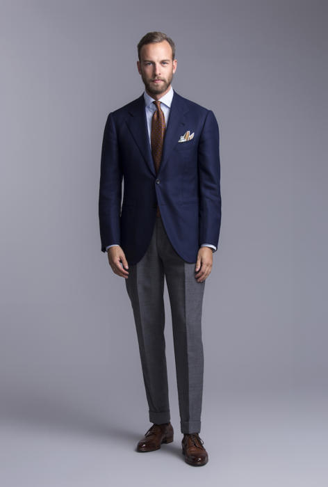
Everyone probably has an opinion about whether you should match stripes with stripes, checks with checks and if so, in what way.
My personal approach is to try and have a least one solid garment out of the “triangle” of shirt, jacket and tie. If I wear a checked jacket and patterned tie I tend to prefer a solid shirt; or if a Bengal-stripe shirt and checked jacket, then a solid tie.
The other important part about combining patterns is to look at the scale of each one.
A narrow pinstripe suit is hard to combine with a Bengal stripe shirt, where a block-stripe tie with that stripe is rarely a problem because of the difference in scale.
In the example above, the checked jacket and striped shirt are balanced by a solid brown-grenadine tie. I feel a block stripe or heavily patterned tie would put the already busy outfit over the edge. The dark and solid grey trouser helps add contrast.
(Total look by Orazio Luciano)
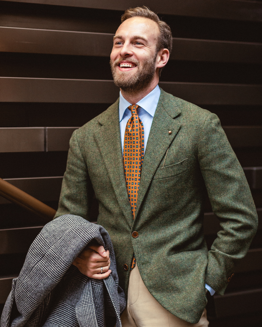
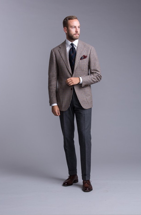
I also like to always have one part textured or patterned in the above-mentioned triangle.
Wearing a solid shirt, suit and tie can obviously look great (just look at Cary Grant) but it can sometimes feel a little flat (politicians in dark suits, white shirts and bright-red ties come to mind).
Just adding a small pattern to the tie or texture in the jacket can create some depth and bring the outfit to life.
The image above is an example of how important I believe texture and/or a small pattern can be.
The look of mainly solid garments would be less interesting if the tie was a solid orange instead of a discrete floral print. The same thing goes for the texture of the tweed jacket against the plain shirt.
- Bespoke Jacket: Sartoria Corcos in a vintage green tweed
- Shirt: Fray
- Tie: Shibumi
- Trousers: A design collaboration between Manolo and Ströms in Sweden
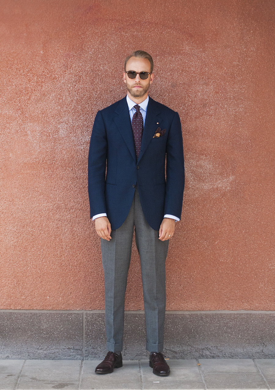
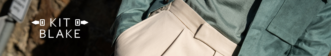
Combining colours
I like to pick up colours and shades from different parts of the outfit in a subtle way. For example, in the image above the light blue of the shirt is picked up in the small flower of the tie.
This is one reason why I find patterned ties and pocket squares, with multiple shades and nuances, to be easier to combine than solid ones.
In the picture I also matched the colour of the tie with the dark burgundy shoes. Since the two pieces are quite far apart, with different textures and material, it tends to feel like less obvious matching.
The rest of the outfit could be called the ‘menswear uniform’. A navy jacket with grey trousers (fresco for summer, flannel for winter) is probably the combination I wear most frequently.
To some it might be boring, but I call it consistent. I find it a great base out of which to elaborate with shirts, ties and shoes.
- Bespoke jacket: B&Tailor through Robin Pettersson in a VBC Navy Hopsack
- Bespoke trousers: Zaremba in a grey Minnis fresco
- Shirt: Eton
- Tie: Shibumi
- pocket square: R Culturi
- Shoes: Yanko
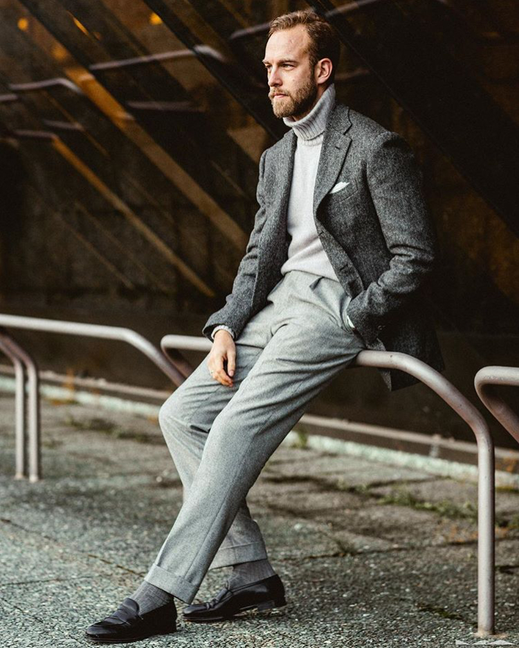
Combining textures
Sometimes, and especially in a more casual outfit, texture can be even more important than colour or pattern.
Wearing a turtle neck or polo shirt with tailoring, for example, limits the possibilities for pattern and therefore puts more emphasis on textures and tones.
In these more monochrome outfits I also think it’s important to get the right amount of contrast. In the outfit above I wear three or even four shades of grey, but every garment has a different texture to help separate them.
- MTM tweed jacket: Saman Amel “Napoli” in an Abraham Moon lambswool tweed
- 4-ply cashmere sweater: Fedeli for Michael Jondral
- Trousers: Design collaboration between Manolo and Ströms in Sweden.
- Loafers: Edward Green
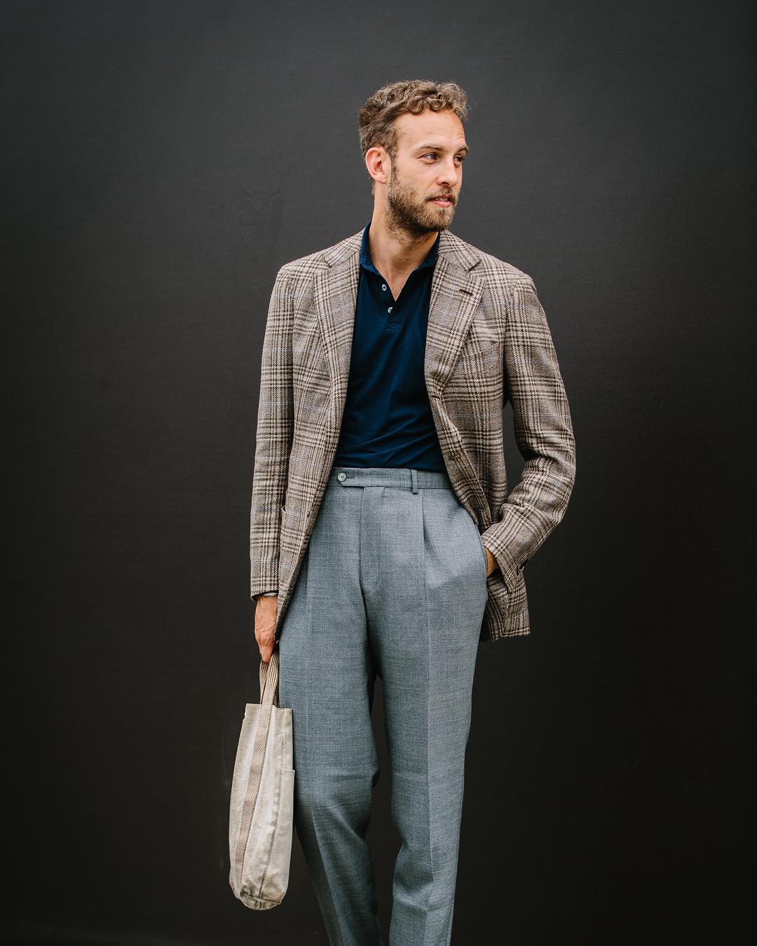
Adding contrast
A few years back I always tended to have my trousers a lighter shade than my jacket.
These days I think it’s more about finding the right amount of contrast between the two: too much and I would be uncomfortable; too little and the garments tend to blend together.
I think the contrast between jacket and trousers is the most important since they are the most prominent pieces of the outfit, although the shirt also plays an important role.
In general I would recommend wearing a lighter shirt than both the jacket and tie – but this is one of those rules I tend to consider differently in a casual outfit.
I think most people would agree that a dark-coloured dress shirt (especially with a light-coloured tie) is something more associated with the Eurovision song contest than sartorial elegance.
However, if the look is casual with, for example a polo shirt, I think navy, forest green or dark brown can look wonderful, even with light coloured jackets (as above) – and add that contrast against a light coloured trouser.
This is especially true if the contrast created against the jacket is balanced out by a pair of trousers in a shade just in between the two.
That image has a navy polo shirt under a lighter jacket. I believe the key here is to create a balance in contrast between shirt, trouser and jacket. A navy trouser would need a white or light-coloured polo to balance out the contrast.”
- Bespoke jacket: Zaremba in a Loro Piana wool/linen/silk fabric
- Polo shirt and trousers: Oscar Jacobson
- Tote bag: Hermès
Many thanks to Andreas for his thoughts. You can find more of Andreas’s writing at Manolo.se and his Instagram at @andreasweinas.
Some of these topics were covered historically on Permanent Style in more detail, such as:
All photography Ted Olsson, except (numbering from the top) 4 Milad Abedi, 5 Viola Weinås, 6 Milad Abedi, 7 Jamie Ferguson


Nice article about a very nice guy with superb style!
I’m always a little confused about other’s shoes -v- my own in that my non-black shoes are always much ligher in colour than those I see posted here or in similar forums/blogs. For browns I am not so concerned but for burgundy and such it would be much better if they were darker as per the photo above.
In one part I’d guess Crockett & Jones just generally don’t dye as dark but looking at the normal brands of shoe polish/creams like Saphir and they are also fairly light in colour. Am I missing something obvious of how to get the very dark non-black shoes?
Hi Bob,
Many shoemakers don’t make very dark browns or burgundy. Partly, I know a couple of brands have told me, they just don’t sell as well as lighter or brighter ones, even if they are very practical. Tan always sells well, even if it doesn’t go with most trousers.
And partly, it’s because it is much easier to darker your shoes with polish or cream, over time, but hard to lighten them. Shoes also tend to darken over the years, with wear.
Saphir and others all make dark-brown creams and polishes, and I’d suggest very subtly trying to darken your shoes. Perhaps use a darker polish for every 3rd or 4th one you do of the matching colour.
Simon
But are there any dark polishes, particularly with burgundy? The Saphir one is about the shoes natural colour, possibly a touch darker. I bought the Shoe Snob’s one which was a bit darker but still a lot brighter than I’d desire or as Andreas’. Unfortunately the shoes actually lightened from when they were first purchased, which to be honest I’d say seems the more common result for me.
You can also try other, darker colours Bob. Try a touch of black occasionally on burgundy, for example. Start very subtle
Hi Simon
You mention tan shoes are not particularly versatile in terms of trousers. What colours does it work with? Presumably not mid to dark greys and navy is a big no-no. I ask because I’m thinking of buying Crockett & Jones Durham model: https://www.crockettandjones.com/durham-tan-scotch-grain/
But its only available in tan. Looks quite a dark tan, maybe more versatile – but could be just the lighting etc
Yes, that’s a little darker, but you’re right it’s not going to work with dark grey and only with navy in a casual trouser (jeans or maybe chinos).
Tan is great with mid- to light greys, cream and khaki colours. Also greens often
As evidenced by many pictures of Bruce Boyer with tan shoes and trouser colours you list. Thanks for the feedback
Great article Simon. Im a hopeless dresser and men like Andreas give me such amazing inspo! Im afraid I am not a bank manager like Andreas so funds are a little tight, would I be able to replicate these kind of looks using tailors such as Moss Bros or Paul smith tailoring?
Best
Rob
Absolutely, the themes are universal.
Andreas isn’t a bank manager though – I think you’re thinking of Olof
Brilliant distillation of what can be confusing to understand fundamentals into easy to follow advice.
Well done Andreas and Simon.
Despite the fact that the ‘Italian blazer, flannels and brown shoes look’ seems to have become ubiquitous amongst online menswear enthusiasts, I find it almost impossible to wear in real life.
It’s too casual for the office but way too formal for casual wear, which leaves you with…. a smart-casual outfit to wear for the occasional meal at a posh restaurant and the odd ‘dress down Friday’. Hardly scenarios which require serious investment in bespoke clothing.
Thanks Matt. It’s a good point, and I think applies to anyone that works in a formal office environment, as it sounds like you do?
I guess much more applicable to someone that doesn’t have to wear a suit or a tie every day.
I totally agree with this.
However, I’d also say that one can take inspiration from these looks and apply them to more or less formal situations. For me at least, this means introducing some form of knitwear instead of the jacket (and tie). So on the weekend (in winter), I often wear (in the winter) flannels, brown shoes, a shirt and a half zip/shawl collar/crew neck cashmere knitted top, for example. In the summer, the trousers might be cotton, fresco or a linen-cotton blend, with (in the UK) a thinner cashmere or cashmere-silk/cotton piece on top.
In terms of texture and colour, I find that the advice and inspiration discussed on the site (and above) can be really informative. For higher twist wools, read finer (perhaps merino) wool. For more texture/patterned fabrics see thicker/cable knit. I find the suggestions on formality and colour combinations work well. Even advice on darker polo shirts can apply – I love to wear grey flannels and a navy blue long sleeve polo with my navy Anderson and Sheppard shawl collar cardigan. Likewise the advice on monochrome outfits. I’m a real fan of wearing charcoal flannels with a white (or pale blue) button down oxford with a more textured light-grey lambswool half-zip.
Great points, thanks
The boy done well !
Particularly liked his no tie ensembles.
The one faux pas was look three . Way too contrived and committed the cardinal sin of light jacket with dark trousers. Always guaranteed to make you look like a game show host.
Mr. Weinas is indeed an inspiration of a man who has perfected an elegantly understated contemporary approach to dress. With a strong underpinning of classicism and a respect for his own individuality, he’s developed a naturally assured style which admires tradition without simply copying it. But then, as a fan, I’ve come to expect nothing less of Mr. Weinas.
Beautiful outfits. True style. The sad thing is I know no matter how much I spend, or how hard I try, I’d never manage to look this good. I just don’t have the knack.
Go on Phil, I think you can. Certainly reading PS and learning from people like Andreas is the way to start
Your trouser length is better. His is an irritating tiny too short.
A bit the antithesis of this article, but is it alright to wear a dark navy tie w/ a dark navy suit, even if the shades are slightly different? Going to a wedding where “Black Tie” (according to the bride) means “formal” rather than “tuxes” and my girlfriend seems to be set on something monochromatic for me.
I’d like to avoid wearing/buying a black suit if I can.
Well, I wouldn’t wear a navy suit to an event described as ‘black tie’ but it sounds like the bride has rather different ideas of what is meant by that.
Certainly a dark navy tie with a dark navy suit can look nice, and sharp.
Hi Simon,
On this topic, Andreas Weinas is a very good choice indeed!
On “ties and shoes”, I would appreciate to know the rule Weinas has in mind in this comment (related to the pic featuring the navy blazer):
“In the picture I also matched the colour of the tie with the dark burgundy shoes. Since the two pieces are quite far apart, with different textures and material, it tends to feel like less obvious matching”.
I once read from yourself something that goes along the same line too.
John
Thanks John.
Andreas means that he has used the same colour for the tie and shoes, which is tempting as sometimes the same colour will work for both.
The risk of doing so is that it looks like the two things are too closely matched, but that is avoided by the fact that the two things are so far apart on the body (where a tie and handkerchief, for example, are not)
I love these pieces.
Would love to read similar profiles on Tom Capozzoli, Michael Hill and Mark Cho to name a few
Great article with beautifully tailored and matched outfits. Thank you for featuring. To help Bob re. the issue of light burgundy shoes; first option is to apply a layer of mid brown or blue shoe cream let dry then apply a layer of burgundy and polish. Brown and blue are preferable to black as they do not give a colourless, overly dark canvas as a base. Alternatively mix a section of the brown or blue with the burgundy cream prior to applying (it can be kept in a small plastic container for later use), this allows for the blending of colour to the shade of choice.
Thank you. I’ve always write liked using black, but I see your point about the others having more colour.
Just my personal opinion, but in each of these the trousers look too short with too much taper below the knee. To my eye, it throws the geometry, and thus, symmetry off.
Great color combining, though.
Hi Simon,
Thanks to you and Andreas for this article.
I thought the section on texture was a little short. And in general, I don’t think your site has ever had a dedicated article on texture (though I could just be missing it). I think a dedicated article someday exploring texture and how to use it, similar to the ones on pattern that you have done, would be of great interest. I find the use of texture to be much less clear to me than colour, pattern, or shades.
Thanks, and that’s a good point.
I suppose it could become quite a big piece quite easily, but I’ll try something small first, with the basics
Hi Simon,
Is it possible to implement an odd waistcoat into any subtle odd jacket and trouser combinations that wouldn’t make a man look like a dandy? I’m trying to see if I can make an odd jacket/waistcoat/trouser combo to appear as subtle as a monochromatic gray/charcoal/navy 3 piece suit, preferably where the jacket is in a darker shade than the trouser.
How would someone who dress subtly like Andrea or yourself add on such a piece?
It’s hard, and I don’t think would ever be as subtle as a three piece suit. Plain browns, green or khaki are often best, but in general I’d recommend against it
You’re right, it’s almost impossible to do so. It appears the earthy toned colors like you mentioned might work best. So far, I’ve only found one example from following model from Brooks Brothers who pulled it off quite well. Though his khaki pants and waistcoat share a similar shade and color, the difference in their texture (smooth khaki trouser vs. rough tweed waistcoat with a pattern) provides enough contrast from each other, and the darker bluish-charcoal odd jacket further contrasts from the said two pieces.
http://s7d4.scene7.com/is/image/BrooksBrothers/MM00709_BROWN_2?$bbenlarged$
Yes, that’s not bad. Personally I’d swap the trouser for something that contrasted more in colour maybe
Not sure you will ever get a weskit to sit well against an odd jacket.
You will get a much better outcome with a merino cardigan.
Cetainly much easier
Elegant, classic outfits – but why are his trousers so short?
Dear Simon,
1. Are boating jackets always single breasted, or is there such a thing as a double breasted boating jacket?
2. Do you like patch pockets on a double breasted jacket?
I think you can get double-breasted varieties, though they are far less common. Also depends how ‘correct’ you are bothered about being.
Yes, I don’t mind them on more casual, soft jackets.
Hi Simon, I have a suit a similar colour to the one worn by Yasuko Kamashita on the front cover of ‘The Style Guide’. Could you please suggest some good shirt/tie combinations that would work as I suspect my timid selections don’t do it justice.
I’d probably be equally timid/conservative, to be honest, but do try a white shirt and brighter, sugary tie colours – certainly on a bright day
Looking for a leather jacket, double breasted fatigued, any suggestions? Thanks
Dear Simon,
Fyour doing a fantastic job.
Would be fantastic to develop a world map with all the different artisans in your blog. Any ideas where I can find a nice tailor in Puglia/Bari/Brindisi?
Best regards,
Robin
I’m actually in the process of trying Cornacchia. Can’t really comment on them yet though…
Hello Simon,
Great article – more if the same please! In regard to Bob’s point below about darkest brown shoes, I cannot recommend enough the patination service offered by Berluti. I’ve frequently sent my shoes and boots in for a colour change and the outcome is nothing short of perfect. Not cheap but worth the expense!
Regards
Cliff
Nice article! I need an advice. I am getting married, I found my tailor (Edward sexton), choose the color of my suits (navy blue) but I am struggling to find how to have a good combination with my hankies. The theme of the wedding is yellow and blue. I want a blue tie. Does it work if I have a yellow hanky and if yes what would be the best and the most stylish to match with my suit and my tie. thanks!
Hi Didier
It’s hard to say exactly without seeing everything, but it sounds pretty good. A white linen hank might be nicer though – perhaps with a yellow border, or a yellow flower in the buttonhole
Hey, could you please tell me where his sunglasses come from? I’m always in search of classic styles that goes well with everything, but add a touch of cool. Like these. Thanks!
Sure, I’ll ask him.
I checked with Andreas. They are from TBD Eyewear – the Cran model
A great article. Simon – any suggestions for how to avoid looking like 2-3 blocks of unpatterned plain colour when wearing outfits that don’t involve a tie or pocket square? Is the answer to always try to include some texture – eg pair a smooth chino with a hairy or textured sweater; try to include pattern/texture in sports jackets; flannels or denim for trousers etc?
Yes, texture is certainly important, but pattern where you can will make the biggest difference to avoiding that look – in jackets but also in shirts. Try a bolder patterned striped shirt like an awning stripe for example
Excellent. He knows how to do a flow of tone from top to bottom — for instance, light sport coat, while the dark tie leads the eye down to the dark pants. Perfect.
Fullness of shirt collar/ tie width/ lapel width in harmony, too. Can’t say enough good things here.