The right navy for business
For business or generally formal suits, colour is pretty simple – but there are still a few ways to make sure it’s just right.
The standard colours are navy and grey, and for good reason: no other colours can both look smart and flatter a man’s skin tone at the same time. Black is too harsh; brown isn’t smart enough; tan is downright casual.
The colour needs to be dark to be businesslike, but that doesn’t mean it should be almost black. Navy is the classic blue for business suits. Sometimes men buy suits that are too dark (closer to midnight blue, a tone often used for evening wear and which looks black until closely inspected), and that can make them look pale and pasty.

But on the other hand, strong mid-blues (almost electric blue) have become popular in recent years, particularly at weddings. These are too strong in colour for most offices – particularly when combined with tan shoes, which seems to be the default.
In general, the paler and brighter a colour the more casual it is, so if you want to wear a colour like this, have it in something more casual, like a linen jacket.
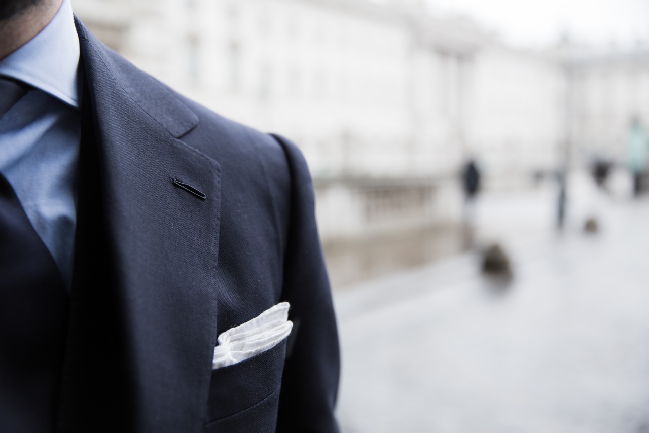
Navy is serious, professional and yet interesting enough in terms of colour combinations. Midnight blue looks smart with a white shirt and black shoes, but that’s about it. Navy, on the other hand, also looks good with those accessories, but brings out chocolate-brown shoes as well.
And a blue shirt under a navy suit provides a great background for experimentation with colour in the tie or handkerchief – strong colours against black just look cheap.
Building a professional wardrobe
Most of this applies to greys as well. Sometimes men wear grey that is very, very dark, almost black and with little texture.
Generally, there are really two good categories of grey that can be worn for business: charcoal and mid-grey. Charcoal is a sober and professional, and works particularly well in flannel, but (like navy) it cannot be mistaken for black.
Mid-grey, however, is kindest of all the suit colours on skin tones – it compliments a good tan, but it doesn’t wash out the pasty. It is for that reason that I would recommend creating a business wardrobe (or commissioning their your bespoke suits) in navy, charcoal and mid-grey.
Mid-grey might feel a little adventurous. It is a touch lighter than the grey suit you would instinctively buy for business.
Don’t be afraid – it will look perfectly serious with a blue shirt, dark tie and deep-brown Oxfords. But it will also work wonderfully in a casual summer setting, with a white shirt, mid-brown shoes and perhaps a white linen handkerchief.
Further reading
Reader question: Building a wardrobe
An exercise in wardrobe building
Jackets and casual colours
The most useful jacket for business is likely to be a navy blazer, but how acceptable this is will vary considerably between offices. Nice options beyond that for jackets will largely be muted ones such as a pale oatmeal colour or greys.
Going beyond business attire – or for more casual offices – will take you into the areas of brown, green and various shades of tan. These can seem rather daring until you look at tweed – the casual attire of traditional English dress and most commonly in shades of green or brown.
Both can work in suits or jackets in any material, but remember that lighter colours and stronger colours are more casual. So in a suit, both brown and green should have a touch of the grey about them, and they should be dark enough to look designed for work, not play.
Further reading
Should I pick a pattern?
If you’re commissioning your first suit, make it plain. There’s enough to worry about with fit, style and colour, without chucking pattern into the mix as well.
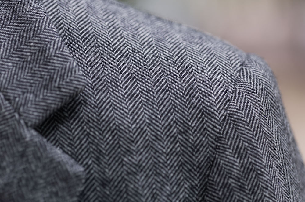
But, plain is rarely plain with worsted wool (the material most business suits are made of). There are nailhead and pick-and-pick, both of which most men would just describe as plain, and even some herringbone patterns go unnoticed.
In general, a little surface detail is a good thing. Unless the desired look is ultra-smooth and sleek, texture adds to the interest of a suit and contrasts nicely with the shine of a tie. So consider those little patterns to be nothing more than texture.
Herringbone is often a good option for a second or third suit; essentially a broken twill, it adds a touch of interest without sacrificing seriousness.
Simple, long stripes
If you do want a pattern, I’d also suggest starting conservative.
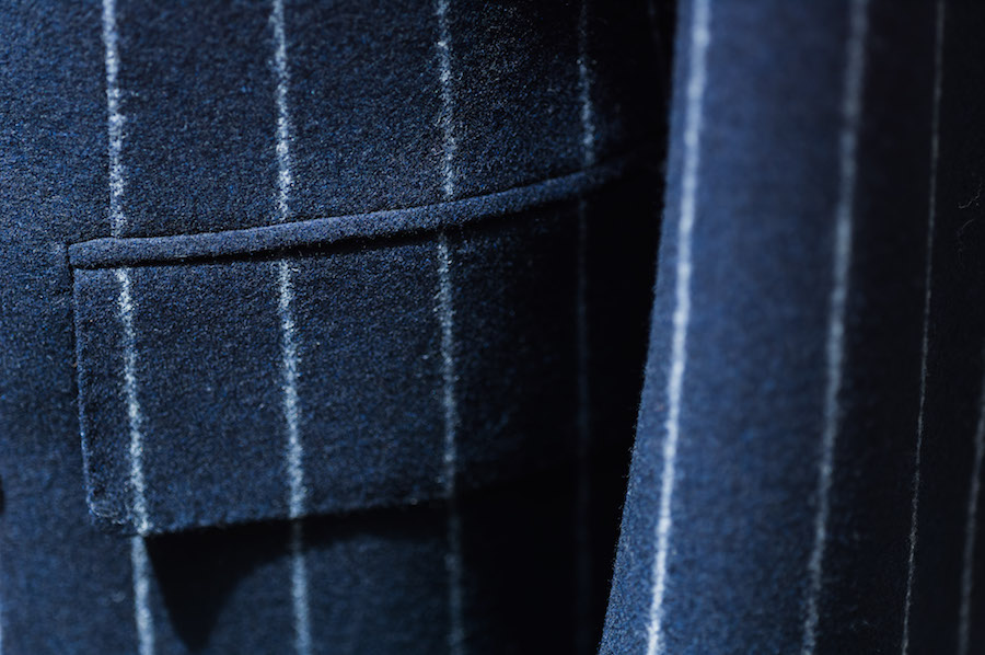
With stripes, most you see are pinstripe: a thin line of white or a similarly pale colour that contrasts with the background. It’s easy to see how to go wrong here – a stripe that is strong, wide or widely spaced will be tempting, but threaten to look unprofessional, verging on Wall Street caricature.
Equally, though, the stripe should not be so dense as to be nothing more than texture. It’s such a waste.
The nice thing about stripes is they give an impression of height and therefore flatter shorter men. Unless you are freakishly tall, though, they will not look bad on a big man. The lengthening effect is far greater than the slimming one.
Another popular option is chalk stripe. This is wider and usually used on flannel, creating a fuzziness to the line that is both classic and flattering. Try it on a blue suit and team it with sober accessories. Not rakish, but still full of personality.
Types of check
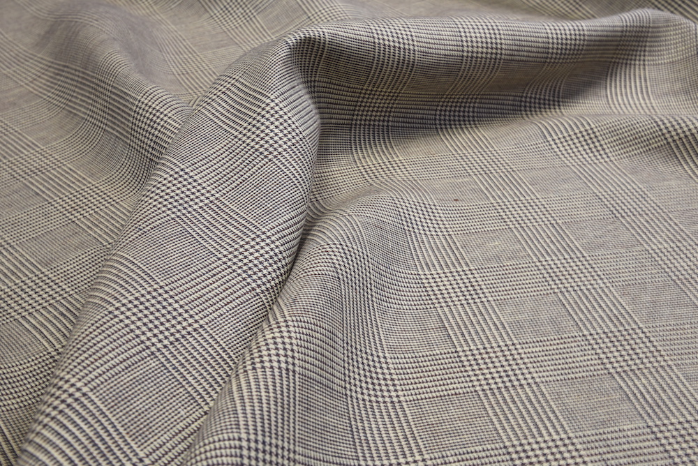
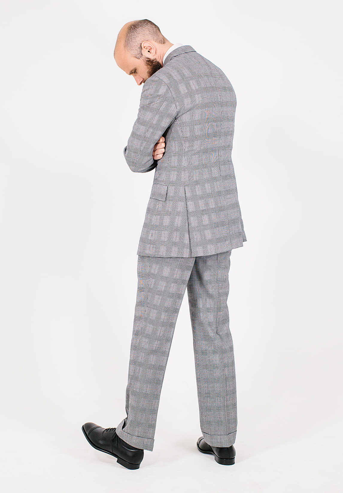
The king of the check is the Glenurquhart plaid, often reduced to simply glen plaid. This is a check of several overlapping lines that was made famous by Edward VII, who created his own version when Prince of Wales (a glen check with an overcheck is often referred to as a Prince of Wales check). The Duke of Windsor popularized the pattern during his travels to the US.
At its faintest, this check is mere surface interest; at its strongest, it is old-fashioned sportswear and unsuitable for business. The difference is both in the size of the check and the tone of the grey (or occasionally blue) that it is set against. Start with a mid-grey and then experiment.
The real fun though, is the overchecks. This is a simple, single line that follows the undercheck but outlines it, adding a subtle touch of colour to the pattern. Blue is standard and safe, lime green is surprisingly popular, and pink also pops up now and again. But the king is a rusty orange. Try it on your fifth suit.
Last are windowpane checks. A simple pattern created by single lines, this plaid can again vary enormously in its effect from anonymity to recklessness. A good idea would be to start with a large but faint windowpane on a charcoal ground.
Further reading
The guide to weaves and designs
Camps de Luca pick-and-pick suit


I was hoping this article would touch on a question I raised a few years ago that you said you’d address in a post… without going full blown black tie how do you differentiate between a business suit and something you’d wear for a fairly formal evening event?
Since raising this question last time I’ve added a dark navy (but def navy not midnight blue) twill suit to my small wardrobe which I hoped would fit the bill but it still feels to me that I’m the guy thats just come from the office.
Interesting question (the highest praise!). In my experience it’s less down to the suit and more what you wear with it. So a formal event will tend to have black shoes (even patent or slippers), a white shirt (spread collar, maybe covered placket, probably double cuff), more like a white pocket square, and a dark or muted tie with perhaps a subtle pattern like a pin dot
It’s very much down to the suit too. In the UK at least, there is an accepted convention for formal events where the dress code stops short of morning dress or black tie. Think Remembrance Sunday, or any state function.
Odd jackets are out, as are chalk stripes or checks, and light colours. Essentially, it leaves just plain navy or charcoal grey. Shirts should be white or blue. A subtle stripe is acceptable, but bold patterns like Bengal stripe are not.
Thanks Robert – exactly, dark plain colours are always more formal in the suit, white shirt is most formal, and then similarly dark, subtle accessories
Doesn’t this depend entirely on the event in question ?
Over the years, I’ve ran the gambit of just about everything and there is no uniformity. It depends entirely on where you are going , why you are going there and who you are.
Yes it does a lot David, but there are still useful things to say about what is more formal, and less office-like, so you can try to pick from those options, I think.
I also think the style of suit matters. Peak lapels vs notch, with the former being more formal. And accessories would lift it from an office look because they add layers to the over all outfit. Tie pin, boutonniere, lap pin, pocket square, cufflinks, etc.
Good point on peak lapel.
But who would wear a SB with a peak lapel to the office…………….?
If the suit was subtle otherwise, I would
Your article “Peak Lapel Single Breated” dated 11 July 2012 suggests otherwise Simon.
Nice recall!
I still don’t like peak lapel suits generally, I was saying here rather that I would have no problem doing so from a formality and propriety point of view. I would think it perfectly acceptable in most offices.
@anonymous
Harvey Specter would 😉
Material can be a point of difference too, maybe flannel for the office and a wool/mohair mix for a more formal suit.
I am in the (mental) process of ordering a grey jacket for fall/winter, but I am struggling to choose between houndstooth, pow and herringbone. I am moving in the direction of a houndstooth, but I worry that this may be to informal and difficult to pair with other stuff. My office is business casual (I can wear more or less what I like, except navy suit), and I will wear this jacket once a week. I would be grateful to have your thoughts on this matter.
If you don’t have something similar, Anders, I would go with herringbone. You will likely find it the most versatile, and given your uncertainly here there is a decent risk you spend a lot of money on something you’re not entirely happy with – so I would play it safe.
I hope that’s helpful.
I think that to work well on a single breasted coat, a peak lapel has to be quite strong. This, for me, is why it sits better on a dinner jacket, which calls for a bit of drama, than does on a lounge suit.
Thanks, Simon. Much appreciated.
I have found that, If you have to go straight from office to party, changing your “work” tie with a bowtie gives you a “festive” look quite different from the office one.
Excellent article Simon! One dilemma I constantly deal with is the issue of model, two or three button. For a while I’ve been primarily a three button man, but now am considering going back to the two button model. Do you have a preference and if so, why?
Maybe have a read of the single breasted chapter of the guide? It’s mostly in there – leave a comment if you have a follow-up question
Forgive my slightly un PC comment, but how can this be a dilemma with which you are struggling?
Asking for advice on two or three button fastening is a bit like asking if you should favour sauvignon blanc over pinot grigio.
Are you 6′ 3″ and 16 stone, or 5′ 10″ and 10 stone? An accountant or architect? 25 years old or 60? Living in a big city or the countryside?
Do you wear a 60 year old Timex or a Swatch?
Simon, try and give a helpful answer to a helpless question.
I think the comment is a little unfair. A three and a two-button suit can look very different and yes, it’s a question of taste and personal preference, but if you don’t discuss what makes them different you can’t find and establish your taste. I’d want to talk to someone similarly about wine
I have a Crispaire navy suit and a Fresco III 14/15ozs 430g navy suit. Which navy cloth do you recommend next? I was thinking of trying a VBC high-twist if it’s substantial enough.
It’s a wardrobe of uniforms — single breasted navy suits.
Weather concerns: I live in New York.
Secondly, what do you think of discreet action backs on otherwise formal suits? With a fitted garment, I don’t get a full range of motion like a t-shirt. On the other hand, the Fresco III does give me a full range of motion but is unflatteringly boxy. Or does a formal fitted jacket always restrict some motion? I get my suits from Whitcomb, if that helps.
It sounds like you could do with some variation in the material – how about trying a flannel or a worsted with some texture in it like a herringbone or birdseye?
I would avoid an action back, it will look too out of place on a formal suit
Simon,
I can’t go with your descriptor of blue chalk stripe flannel as ‘not rakish’.
The aforementioned teamed with a blue, washed out and slightly frayed open necked vintage denim shirt together with dark brown suede boots is the epitome of louche rakishness and represents, in the ‘ right hands’ , sartorial black belt excellence.
My traveling companion and ‘Permanent Style’ sensei, Jason King, is a leading proponent of this look.
Of course, it’s way to sophisticated for the ‘Pitti’ me gang.
Salutations,
David
Jason King wouldn’t be seen dead in denim.
Although I confess to often disagreeing, I will confess that at least part of my checking of PS.com has become a quick scan for any new developments from a David and his friend and sartorial guru &c… good stuff
In the video work you’ve done for PS, have you noticed any issues with moiré on pattern suit materials? Whenever I have done video material for work, the advice given has always been to avoid finely-spaced patterns because of the distracting “moving” effect they can cause on playback.
For striped suits this isn’t an issue as the spacing is suitably wide (unlike a pinstriped shirt, for example). But I would have thought that the glen check or herringbone pictured here, beautiful as they are, would be likely to cause problems. I am curious to know whether that has proved to be the case or not?
I’ve never done video work with moire or such patterns
Perhaps I didn’t express myself very clearly, I meant the effect described below, not the material after which it is named.
https://en.wikipedia.org/wiki/Moiré_pattern#Television_screens_and_photographs
The moire effect on video can be an issue although modern cameras seem to be able to resolve this. I do a lot of Bloomberg and CNBC video interviews and their cameras are able to resolve most fine patterns. Herringbone tends to be sufficiently fine that the moire effect doesn’t happen. Unless the herringbone is too coarse. The same can be said of glenchecks where the check is subtle enough. I think where it can arise is if you’re wearing a coarse and heavy twill.
For TV I just play it safe and wear plains or stripes.
Hi Simon, do you think grey trousers would look good in cavalry twill (as an alternative to flannel)?
I completely agree with your comment regarding black. It always looks cheap. Think bouncer, driver, hired help. I made the mistake of buying a black silk suit from Richard James some years ago and wore it once.
When Trunk Clothiers first opened I remember one of the staff commenting that the owner Mats would not stock black suits, jackets or trousers.
I’m sure that Mr. Tom Ford, a big proponent of black, would disagree strongly with you in this regard. Are you suggesting that men wearing black tuxedos look like bouncers or drivers?
Black can work OK on fashion types looking for high contrast, and work OK in photos. But it is not flattering on most men.
It’s generally better in black tie than other areas, but it tends to look a little dusty and faded under artificial lights – one reason a lot of men go for midnight blue instead.
Black is a very polarizing color it seems, people either love it or hate it. Would you recommend midnight blue for a tuxedo rather than black? If a man has a black suit and/or a black blazer in his wardrobe should they be purged in favor of grey or navy?
Either is fine for a tux – on the suit and blazer, if they fit and you like the style, then might as well keep them and wear occasionally with, for example, grey or olive. But by navy next time
Grey or olive shirt to tone down the contrast?
Contrast isn’t the problem really – you’ll get that with strong navy as well. And if anything grey might make the whole thing look quite washed out.
Thank you for this interesting article.
What’s your opinion of slanted pockets or a ticket pocket on a formal/business suit?
Both are a little racier or Rake-ish, but still subtle compared to colour or pattern. I would generally avoid them on a business suit, but it’s not a big deal if you really like them as a detail and everything else is quite subtle
A ticket pocket would have been a standard feature on a very classic DB, or SB three piece in the 60’s-late 80’s, but a bit anachronistic nowadays, only really only to be found on a sports/hacking jacket.
Slanted pockets can actually elongate but the flaps have to be out otherwise they look a bit odd, unlike a straight flap which can be tucked in for a bit of difference.
Nice points Nick
If grey trousers looks good with a navy jacket, why not wear navy trousers with a light grey jacket? Seems to me that if one works, the other should work as well.
By the way, I’m flirting with getting a MTM cashmere jacket from here: https://www.articlesofstyle.com/shop/product/pure-cashmere-herringbone/jacket/heather?id=1944
It’s light grey herringbone, and I quite like the look. Is the fact that it’s relatively light weight at 8.5 oz a red flag? Would such a lightweight cashmere still drape fine in the back, and do you think it would be wrinkle resistant at all (one thing I like about good quality worsted wool is that it’s naturally fairly wrinkle resistant).
Finally, do you think this would be pretty versatile? I’m an attorney and I would describe my work environment as relatively informal–we still wear traditional suit and tie when meeting clients, but otherwise separates with or without tie. Since I do like wearing suits, my solution has been to “dress down” my suits with by pairing them with more casual ties, or to wear suits that are inherently less formal (like hopsack or wool/linen blend in the summer). But I’m on the lookout for a versatile sports jacket besides a navy blazer that I already own, and a greenish tweed that’s better suited for weekend attire.
It’s not that simple unfortunately. Trousers generally work better in simpler, plain colours. You don’t wear a plain jacket with windowpane trousers, for example, and in general dark jackets are always easier to pair with lighter trousers than the other way around.
The jacket is a nice colour, and I think you would find it quite versatile though. Nicest with grey or charcoal trousers, possibly other warmer colours like dark brown or dark green too. Similar to my Hitchcock jacket. I’d avoid the look pictured – bright blue trousers with mid-brown shoes is not a great look (though a very popular one at the moment).
I would also steer clear of such a light cashmere, yes. It will wrinkle, and cashmere is delicate at the best of times – even worse in a very light material
Thanks so much for your reply. What weight range would you recommend for cashmere? What would be your minimum? Bottom line seems to be that cashmere is not a realistic proposition for lighter jackets but is very nice for winter or fall.
What do you think of this material as an alternative? https://luxire.com/products/wool_herringbone_grey_white-lux_78370#/. It’s also on the lighter side but made of wool. Obviously the feel would be quite different. Probably suitable for jackets but not suits?
Finally, on a different note, I’ve read that for lighter unstructured jackets, it’s better to go half canvassed rather than full canvassed. Would you agree? But in the real world, does a fully canvassed jacket really feel “hotter” than half canvassed? And would there be any other reason why half canvassed might be preferable in some circumstances?
I’d be looking at 9oz and up for any jacket really, and I’d worry that this one (though a nice colour) might not wear very well. For cashmere, perhaps 11oz and up.
And yes, you wouldn’t want that weight for a suit – far more problems with keeping shape and wearing through.
No, half canvassed won’t really feel any hotter. I would always go for full canvassed, unless you deliberately want something that doesn’t keep the same line or drape.
My understanding is also that a half-canvased jacket still has some light fusable so that there’s some structure to the lower part of the jacket, so a half-canvas jacket is probably less breathable at the top given the fusable (in addition to the canvas). And the bottom with fusable will probably also be less breathable than a full canvas where more breathable canvas is at the bottom. I agree with Simon that full canvas is the way to go.
There may be benefit to going half-lined or quarter-lined if you want to lighten the jacket and have fewer layers in the bottom half. Not sure how well that works with full canvas as I’ve never had a jacket with that combination.
Yes, if you want greater breathability much better to reduce the lining inside by going half lined
Thanks for the clarification. So if I understand you correctly, when someone says a jacket is “unstructured,” they’re primarily referring to the use of padding or roping at the shoulders, or perhaps to the amount of lining, but not to canvassing.
By the way, I thought the canvassing is done between the wool and the lining. So how is it possible to have a half lined fully canvassed jacket? Wouldn’t the absence of lining in part of the jacket expose the canvassing?
Hi Roger.
No, when someone refers to ‘unstructured’ they normally mean shoulder padding, roping etc, and the weight or layers of the canvas – not how far it stretches down the jacket. It can also be used for jackets with no padding or canvas whatever though.
And yes you’re right, there is always some lining covering the canvas at the front – half lined means the back is unlined (where there is no canvas). The front is still lined
Thanks for all your replies. How is canvassing done on a good top coat or trench? Should that go all the way down to the bottom?
Usually yes
Would you define an anthracite grey, prince of wales blazer versatile?
The pattern would be a good change for my wardrobe, but I wonder how well you can dress it down (jeans? chinos?) ?
Could be versatile, but whether it would go with jeans and chinos would depend on the texture, structure and cut more than anything else. Ie more texture and softer structure
I just went to wwchan to start my first bespoke business suit this afternoon , I pick Holland and sherry crispaire collection with charcoal plain weave worsted wool, it that a safe choice? Or shouldn’t be plain worsted wool?
Sounds like a very safe choice Stanley – don’t worry
Thanks Simon, the reason I ask because it is either not pick and pick or nailhead, I hope the final result not being old man suit. Btw I useing their house cut, little shoulder pad, 2 button, notched lapel, open collar, double vent. And I requested unlined too, I will share you the final outcome in wwchan if you don’t mind
Sure. It sounds like it will be nice, even without a little surface detail
Simon, I am a devotee of Anderson and Sheppard, but they are an infrequent treat due to my limited budget. Can you recommend or offer any suggestions regarding UK made-to-measure tailors that have a similar style?
Hi James. The Anderson & Sheppard style is quite driven by bespoke make, as it requires hand-padding and cut to get that nice drape. I don’t know anyone that does a good MTM option. How ever, if budget is the issue it might be worth trying Whitcomb & Shaftesbury. Have you seen my coverage of them?
Thanks Simon. I did read your Whitcomb & Shaftesbury post, I confess at the time it didn’t seem to register with me. Re-reading it now, it makes a lot of sense and I will follow this up, thank you. Incidentally and further to one of your articles, I tried Brian Smith who made me an excellent suit. I pick a third commission up from him tomorrow. Perhaps W&S will be next.
I would like to know your opinion on a „steel blue“ suit similar to that of prince harry. Also for example Vincent Bollore seems to wear a similar color frequently. I like that color tone a lot but I am unsure if it is really business appropriate because people in such positions as they are actually can wear whatever suit color they want. What do you think of that color?
Also would you say that the royal blue of your A&S flannel suit is a business color?
I’d say neither of them is really a business suit, no. You see a lot of these brighter blue colours around now, and I understand their popularity. But it’s because they don’t look like a normal business suit.
They’re better for people not wearing suits for business – for evening or events, for example
And if one wears such a brighter suit when just having an office day (without any client contact/important meetings etc.) and on such days no one wears a tie in the office?
Then it might be ok, but it will also depend on the particular office. Have a look what others where in yours and how similar colours are considered
A navy mini-birdseye woven with dark and lighter blue yarns should be very similar to a navy sharkskin suit?
Can a navy birdseye have the same iridescent look of a navy sharkskin suit?Depending on lighting, the suit can look anywhere from dark navy to medium blue.
Do all sharkskin suits have this shiny look? I don’t mean it in a negative way, I find this quite appealing.
They don’t all necessarily, no. It depends on the yarn too.
I can see why you’d like the effect, but be cautious that it can make the suit a little less smart and business-like
Interesting topic. What about a light grey suit for business?
Generally, not a great idea. It’s likely to stand out and not be that corporate. Best to stick to mid or dark grey
Is there a rule of thumb how one can see if a charcoal grey is too dark (almost black as you described it above)?
Just use your eye – does it look black to you?
What is your opinion on brighter blue sport coats for leisure time instead of the standard navy one? I have something in mind like your A&S royal blue. Seems for me like a nice alternative which is still very versatile.
A jacket in that kind of colour would be nice, and more useful than the suit in it that everyone seems to have these days. Just be aware that it wouldn’t be very business-like, if that’s a concern. And that it’s better in a more casual material like linen, rather than a smooth suit material
Dear Simon, I disagree with your point of a brown suit not being smart. While a brown suit isn’t necessarily as attractive (as grey suit or blue/navy suit), I do think it can work in many ways. As lets say you go to the country side where its more green and natural. A brown suit would go good in that situation, also the color brown gives a feeling of trust and comfort. And the right pattern with a brown suit would work, like checks, houndstooth, and herringbone.
A brown suit can certainly be smart, and I love it as a colour, in linen in the summer or wool in the winter – see my donegal one here
But I’m referring mostly to business here, and brown just isn’t quite as smart and professional as navy or grey. Both objectively and as a matter of propriety in an office world
Would a green suit work with a outfit?
Yes, green suits can be great – see my cotton one here, and a great flannel one here
I like blues that are a shade lighter than navy, more than grey in summer. Would you consider colours like “blue contrast nailhead” (H&S Crispaire 337041), “french blue nailhead” (H&S Crispaire 337040) or “blue contrast solid” (H&S Crispaire 337056) business appropriate? They are quite similar to the blue tone of your W&S suit (H&S Classic Worsted).
Those look like they would probably be OK, yes. You just want to avoid the blue being too saturated – that’s a bigger danger than being bright probably. And it creates the wedding/prom look that unfortunately you see a look these days.
I would like to see those made up, or at least in person rather than online, though
Hi Simon
I am having my engagement in a week, there will be approx 20 participants, close family members. The location of the engagement will be at a historical Palace.
In order to be safe side, I commissioned 2 peak lapel single button bespoke suits one with navy pinstripe (Loro Piana N713022 ) and Ash blue ( Loro Piana N713044)
I was looking to get a different look rather than a navy suit.
On the other hand, currently having a difficulty to pick the right one. May I ask your opinion which one would be more appropriate for this kind of event.
Any recommendation for tie aswell.
Many thanks in advance!
All the best
Hi Gohan,
I would go with the ash blue, just because pinstripes are a little too business-like.
The classic combination would be a white shirt and grey tie, as seen here. With that suit, though, a dark navy tie – either plain or with a simple pattern – would also look nice, or a white or pale-blue shirt.
There is a section on wedding attire here.
Thanks
Hi Simon, just to say I really appreciate this series – I find myself come back to it again and again.
I also had a question on your comment below, ‘Mid-grey, however, is kindest of all the suit colours on skin tones – it compliments a good tan, but it doesn’t wash out the pasty.’
Is the implication that a navy might wash out paler skin?
Navy can do, but not to a great extent. It’s just that grey is often the kindest.
Also, a lot depends on what you wear it with. Eg a blue shirt with a navy suit will be kinder than white usually.
In search of a medium-large sized check, starker black and white, glen plaid pattern fabric for a jacket…I would have thought this would be fairly simple to find, but I haven’t been able to locate it…something like what I attached…HELP?!?!
Perhaps something like this William?
That’s made by Prologue in the Marling & Evans undyed wool range
Looks great, thanks, although that M&E seems a bit more “cream/ivory”, whereas I’d prefer more of a stark contrast…am I accurate?
Yes you’re right. It’s dark brown rather than black in places too
Hi Simon. Wanted to get your thoughts on pinstripe suits. Must the stripes on the jacket line up with the stripes on the trousers? How realistic is it to achieve this?
No Adwyn, don’t worry about that at all. The two things are going to be moving around far too much
Hello, Simon.
Is it possible to get a herringbone-patterned navy suit as a first suit or would you stick to a plain navy suit with all costs?
I was thinking about something similar to this one: https://hespokestyle.com/product/navy-blue-herringbone-suit/
Do you think the pattern is too.. striped and not recommendable for business-events etc.?
No, I think that would be fine
Not about the article (great!), but I would be interested to see a take on Johnny Depp’s suits at his civil case, Windsor knots and all, as it is nice tailoring in the world’s eye at this moment
Hi Simon, I was wondering whether you would wear a mid-grey mini herringbone worsted wool suit for your closest family member’s wedding?
I have attached below a photo of the cloth for your reference.
Many thanks,
Jack
Yes Jack, that sounds lovely. I presume you’ve seen the section we have on weddings? Under Style in the menu
Yes, I have indeed. It looked wonderful.
I just wanted to ask whether that cloth would also look suitable for an indoor evening wedding?
Also, have you been wearing the suit for business? Personally, as there are some unusual things going on at the same time, such as the mid-grey colour and the mini herringbone pattern, I am a bit hesitant since it is quite difficult for me to imagine the end product and me wearing the suit.
I think it would like fine for business too, it’s very subtle.
For an indoor evening wedding you might want something darker, though this grey would still be nice. I’d just be less likely to wear a bright tie or other accessory
I’m wondering about your thoughts on purely monochrome cloth versus ones with a little colour variation (e.g. a pick and pick or birdseye)? I’ve generally leaned towards cloth with subtle colour variation, worrying that a completely flat colour might be too boring or uniform when on a full body canvas of a suit. However, am I overly worrying about something that will be rarely noticed?
For an upcoming suit, I’m debating between a uniform dark brown twill and a dark brown pick and pick which has a little lighter brown in it.
I would err towards the plainer fabrics to be honest. Think of clothing in the whole – your shirt, tie etc is a better place for pattern and colour probably. Certainly I would get a plain suit first before one with more pattern. A patterned one is also less versatile – you can’t wear the same one that often
Hi Simon. I was wondering if you would be willing to offer an opinion on the best shade of navy for an “all-purpose” business suit? Specifically, I am looking at Minnis Crown Classic Navy and Dark Navy. Picture attached.
Always the darker navy, J
Thank you Simon. I appreciate you taking the time to respond.
No problem
I have or will soon have worsted business suits in the following colours without pattern: navy, charcoal gray, medium gray, light gray, and dark brown.
Are there any other colours suitable for business that I should consider for my next suit? Or is it time to look at the same colours but in different patterns (e.g. pinstripes), cuts (e.g. double-breasted), and materials (e.g. flannels)? As evidenced by the dark brown suit in my wardrobe, my office doesn’t need me to stick to extremely conservative colours, but I do want serious business suits and not a casual suit.
I think you’re pretty covered, but have a look at what’s recommended in this article on five business suits. Plus comments of course
Hi Simon,
I’m currently commissioning a suit with W&S in a H&S worsted navy twill and am trying to decide on the shade of navy – currently between Classic Worsted Navy 6519067 and Classic Worsted Dark Navy 6519066 in a 13 ounce weight. I believe the suit you had commissioned from them in c. 2016 was the 6519067 (new code for the 654060 per your H&S cloths I have known post). Would you have any guidance as to which would be more suitable? I’d be wearing this in the office predominantly.
Kind regards
Fred
I’d go for the darker one Fred, particularly in an office environment
Thanks for the quick response, Simon.
The third colour I was considering was the H&S Intercity Midnight Solid 6021067 in 12 Oz. It’s certainly darker than the Classic Worsted Navy, but isn’t a true midnight in the way that the H&S Classic Worsted midnight shows (6519065). Would you have a view on that one vs the Classic Worsted Dark Navy?
Many thanks
Fred
Not without remembering to look at them both in a tailor’s at some point Fred, sorry.
No problem at all. Thanks for your help, Simon. Much appreciated.
Hi Simon. In your opinion, would glen check shirt + houndstooth trousers and no jacket?
If the trousers were let’s say a navy/charcoal and the shirt was a slightly lighter shade of navy/charcoal, would that look ok, or would this combo of pattern be too overwhelming? Thank you so much!
Regards,
David
Too much I’m afraid David. I wouldn’t mix patterns like that, especially without something controlling it or getting in between
Thank you so much!