Interwar art, posters and menswear – with Fab Gorjian
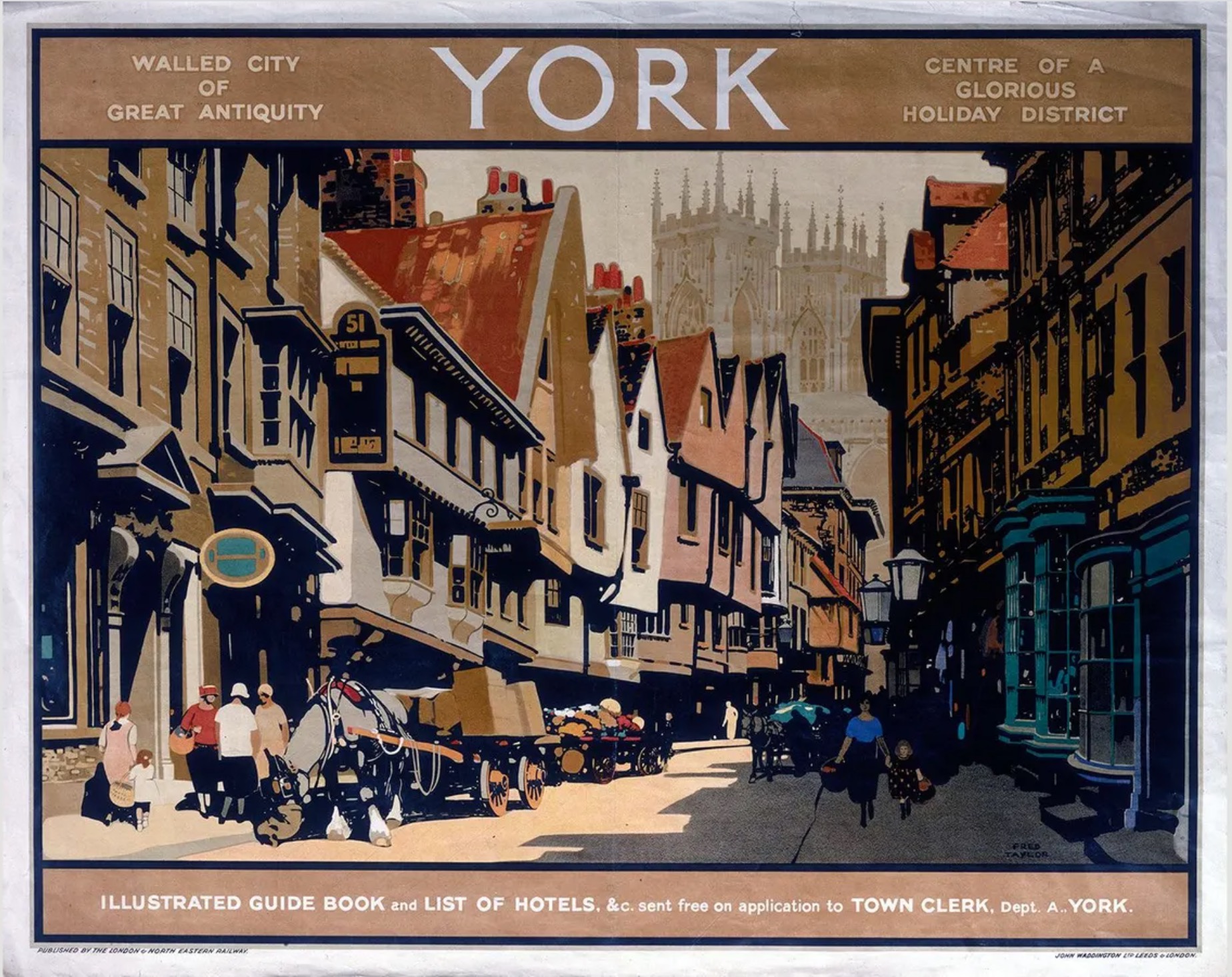
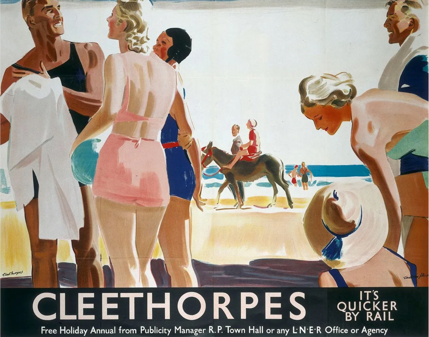
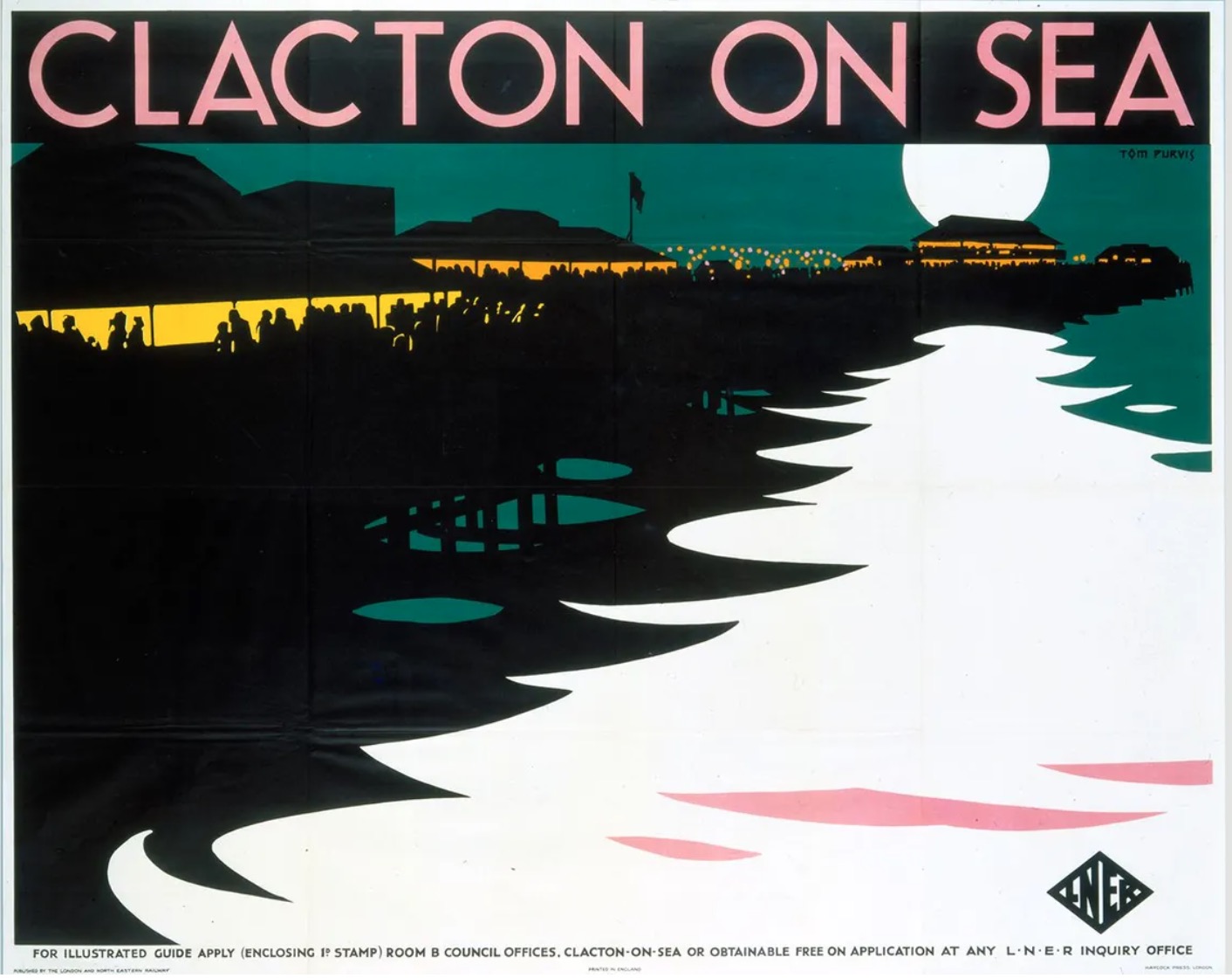
The most elegant advertising of the past was produced in the 1920s and 1930s by lithograph - often carved onto stone rather than metal, before being printed.
They were incredibly over-resourced. Train companies like LNER hired commercial artists to produce original paintings, which were carved by a different craftsman onto stone tablets, and then printed by hand. A simple poster on the wall of a station was a work of art in itself.
The trajectory of the style was interesting too. Having begun as information posters - with intricate paintings and rows of text - they became increasingly simple and stylised.
This was influenced by the art of the time, but also by a realisation that posters needed a simple, evocative message to drive interest. You can see that trend in the four images below.
I’ve always found this period of graphic art inspiring.
My parents had framed posters for local attractions like Kew Gardens on our walls at home, and of course the menswear illustrations from Esquire and Apparel Arts are very much in the same mould.
That was what drew me to the work of Fab Gorjian (below), and I bought an original artwork of his last week, as a 40th birthday present for myself.
I didn't realise until I spoke to Fab, though, how involved his process is - how far he goes to create works as close as possible to those interwar tourism posters. I had assumed, just looking at the textures, that they were watercolours.
"I tried so many different techniques to recreate that lithograph look," he says.
"It's hard because the surface is matte, and uniform, but still with this subtle texture from the paint and little imperfections in the printing."
Eventually, Fab came up with his own, original process. He draws the original image, scans it, and then uses the scan to create a stencil for each colour.
The colours are then applied with a roller onto the stencil, one at a time. The roller creates the desired texture (imagine the effect you get when you roll paint onto a wall) but the edges are clean and sharp.
White areas are left unpainted, as was the case with the originals.
It's not easy to get the precision, because every time you use a stencil to roll on a new colour, you're hiding 90% of the image beneath it.
Fab has got pretty good at this now though, to the extent that he deliberately overlaps some areas to create slight imperfections - again, as the originals had.
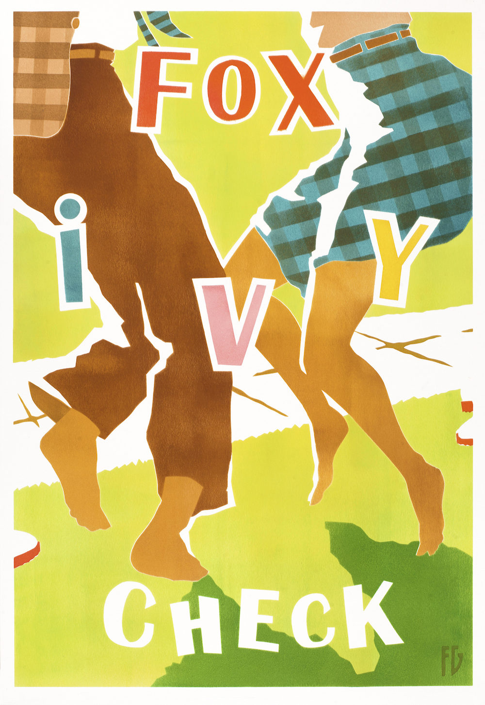
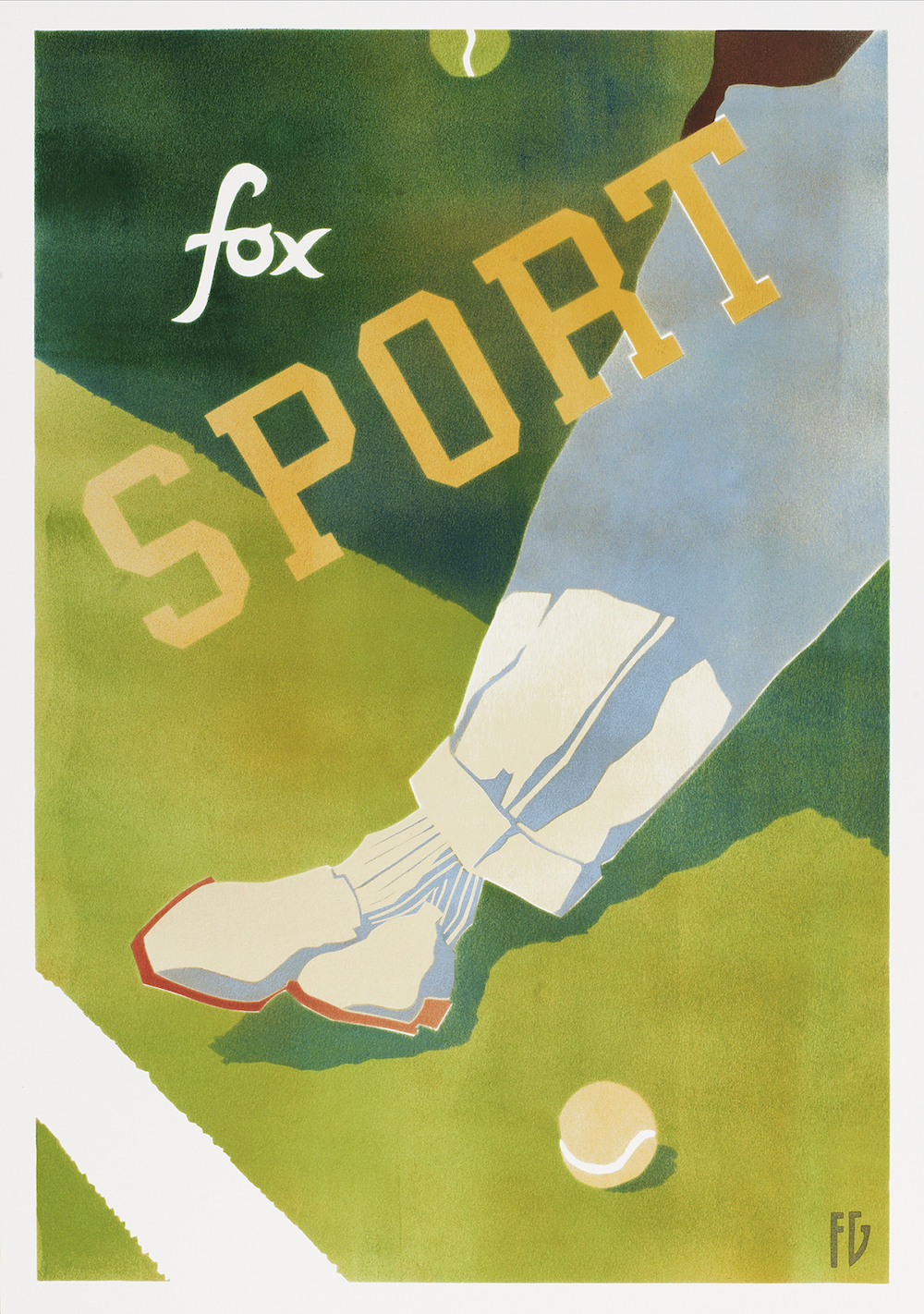
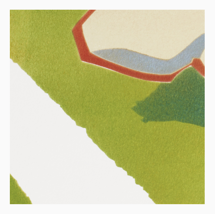
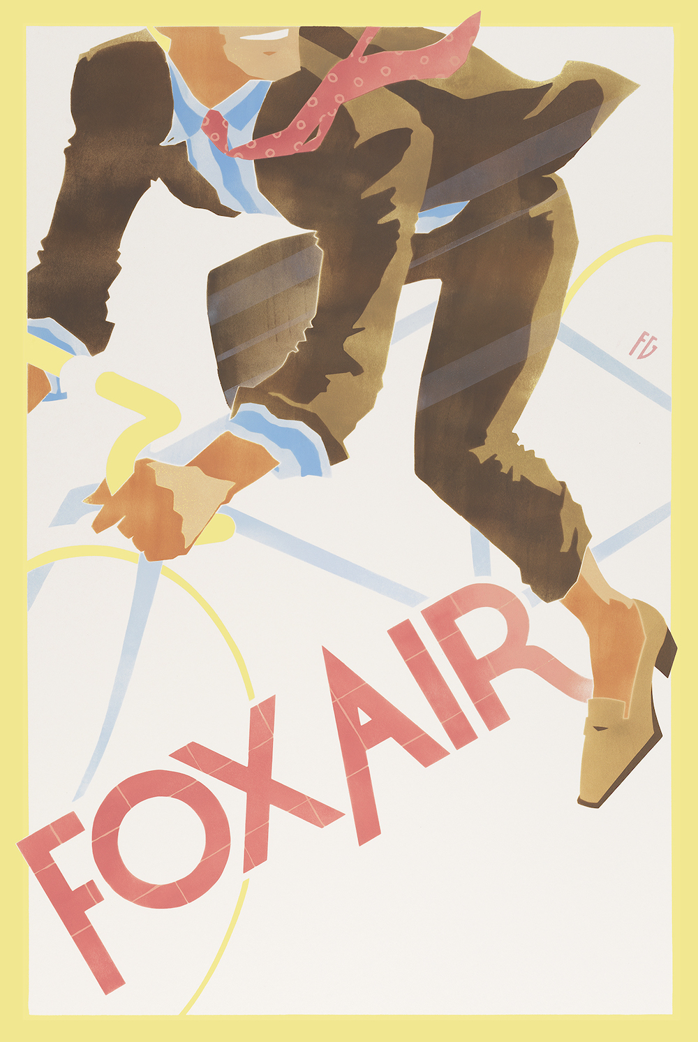
In the image above for example - commissioned by Fox Brothers - you can see the slight gaps and overlaps intended to create that effect.
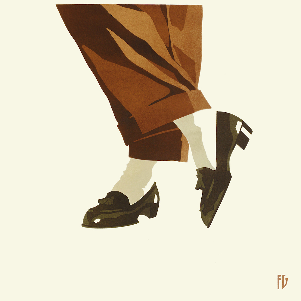
Above is the painting I bought.
To create it, Fab had his girlfriend stand in this pose, wearing a pair of his own tobacco-brown trousers. Which was great, in that it created a natural-feeling pose and some beautiful folds in the fabric.
The only issue was she is rather smaller than Fab, so the trousers looked even wider-legged than reality. “I had to make that up a little, filling out the trouser with a slightly bigger calf for example,” he says.
There’s a lovely tradition of this with the original railway posters, where artists often modelled characters on their wives or other family members. That’s why all the women in one poster sometimes have the same face.
I chose that image from among Fab’s work because it has real style and flair. But also because the tobacco/cream/black combination is one I particularly love.
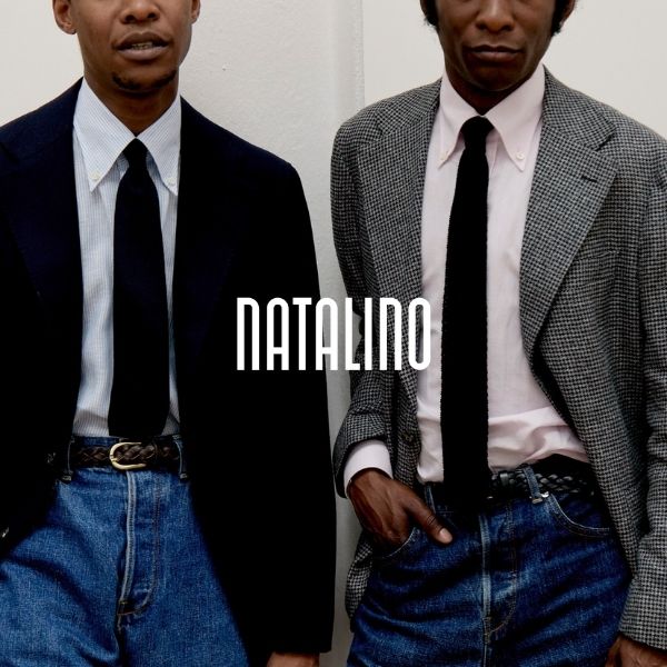
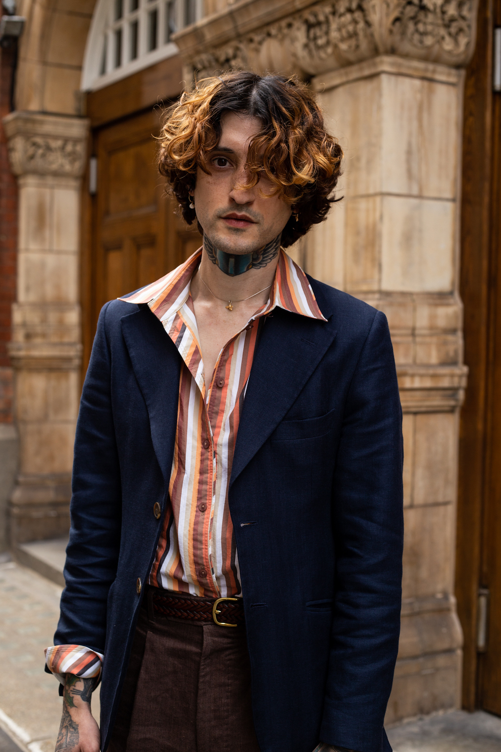
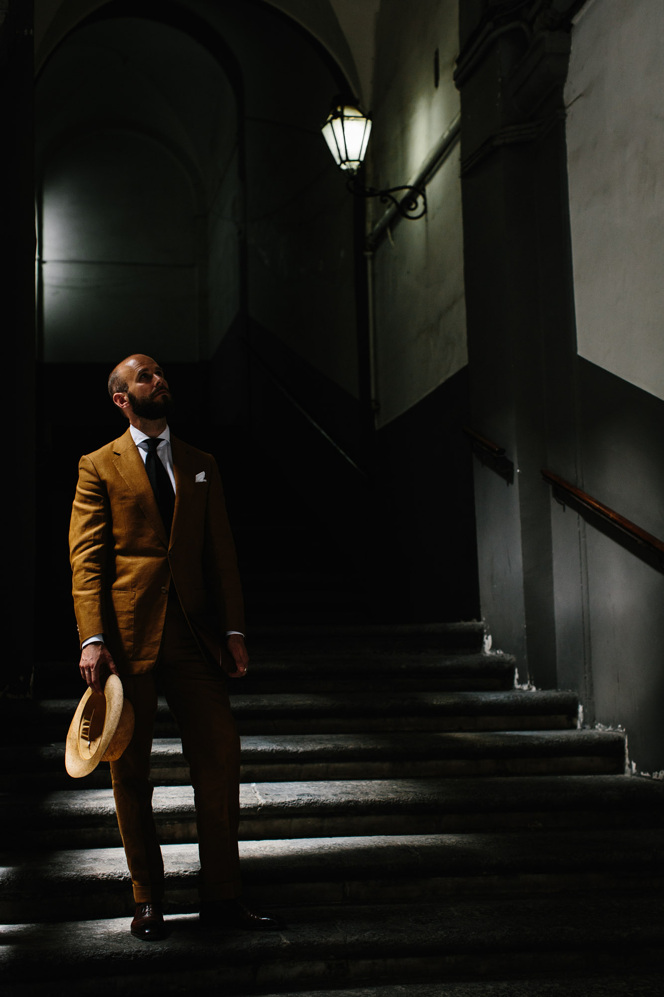
I don’t wear it in the way he draws it much, but I do in a suit/shirt/tie (shown above, in Naples) as well as shirt/trouser/shoe.
I think images like this also illustrate what elegance there can be in menswear without the need for neckwear, handkerchiefs or double breasteds. The elegance is in the lines, the proportions and the colours.
It doesn't matter whether you’re wearing a suit or not.
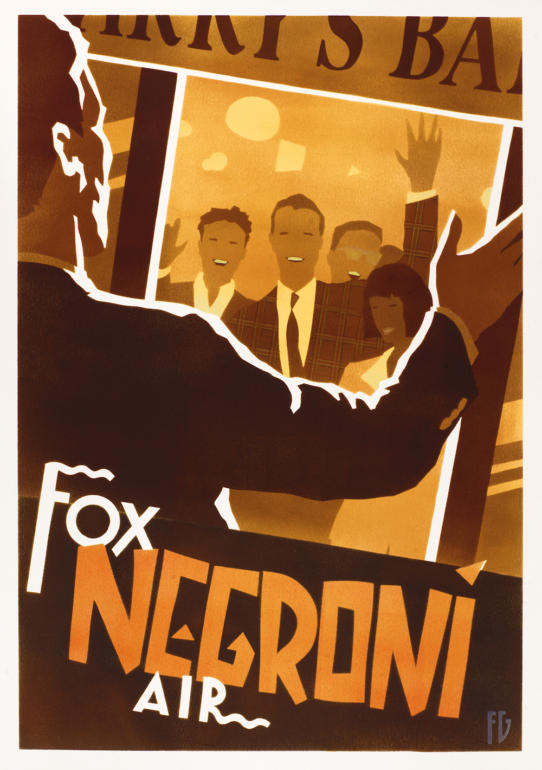
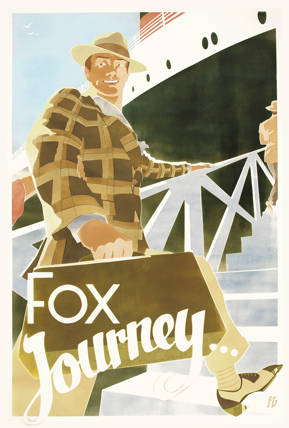
Fab has done wonderful work for Fox, which I've included above and below. But I don't find many of the clothing combinations reflect my view on style.
They are, of course, deliberately period, but outfits with hats and spectator shoes feel less representative of what I love in menswear. Simple elegance below the waist - or more practical, energetic images, like the cycling one below - are more me.
I wanted to buy the original work from Fab, rather than a print, because I’m at an age where I want to hang original art - in a house where I’ve brought up my family, and have no plan of moving from.
My wife and I bought a painting from local artist Mark Pearson last year for the same reason. It helped that doing so supported our local gallery, and that many of the images are of local places that have significance for us.
We do still have a couple of posters, but they’re kept for sentimental reasons: a special gig, a visit to the Italian National Cinema Museum on our honeymoon. In fact, it hadn’t occurred to me before but both have a lot in common with those interwar tourism posters, and Fab’s work.
The gig poster in particular, from The White Stripes’ 2005 tour, could easily have come from Fab’s portfolio. Even if it wasn’t made in the same original or exacting manner. Perhaps someday I'll track down the original of that too.

Fab's prints sell out quickly and none are currently available. However, more are apparently being put up soon. You can find them here, and they cost around £300 each.
Fab is also always available for commissions, which start around £1500. My original painting was £1200.
His work is also currently on display at Fortnum & Mason.