
A pocket handkerchief should harmonise with a man’s shirt and general ensemble. But not many men understand what harmony means.
Let me put it like this. It is a similar conundrum to which colour of tie you should wear, but is also a little like the choice of sock colour and of shirt. It encompasses all of these choices, and is broader than all of them as a result. This is the wonder and the joy of selecting a pocket handkerchief. There is such a broad range available; yet it is still possible to get it wrong.
Once you pick the suit you are going to wear for the day, I presume you select a complementary shirt, suitable socks and a pleasing tie. The shirt is probably the most constrictive in terms of colour: there may be many patterns on offer, but the vast majority will be blue, white or pink. Your socks for the day present a greater range of possible colours: beyond the choice of matching with your trouser, maroon or green are staples with a grey suit, purple or red can work well with navy. Your tie is presumably last, and presents the greatest number of options; to an extent this makes it the hardest choice, though, as fewer things are actually wrong.
The handkerchief can be any of these colours. Each of them is harmonious. Say, for example, that we start with a grey suit, grey socks and pink, open-necked shirt. Both shirt colours that you turned down are options for the handkerchief: white and blue. Equally, the potential sock colours of grey, maroon and perhaps green can work. And then the ties you could have worn – navy, for example, or a pale grey.
Indeed, the handkerchief options are broader even than that. I have always felt that a red or purple tie with a pink shirt look a little forced, a little easy and commonplace. It looks as if the best you could think of was a vaguely similar colour – reddish tones with more or less blue or white. Gold ties on yellow shirts have always elicited a similar response. It feels like a cop-out.
These colours are, however, still harmonious. A purple handkerchief with a pink shirt works well, as does gold with a yellow shirt. Where a tie is sometimes forced to play a dark, background role, the handkerchief has no such restrictions. Imagine a dark grey or black tie in the ensemble described above, set off by a purple paisley handkerchief.
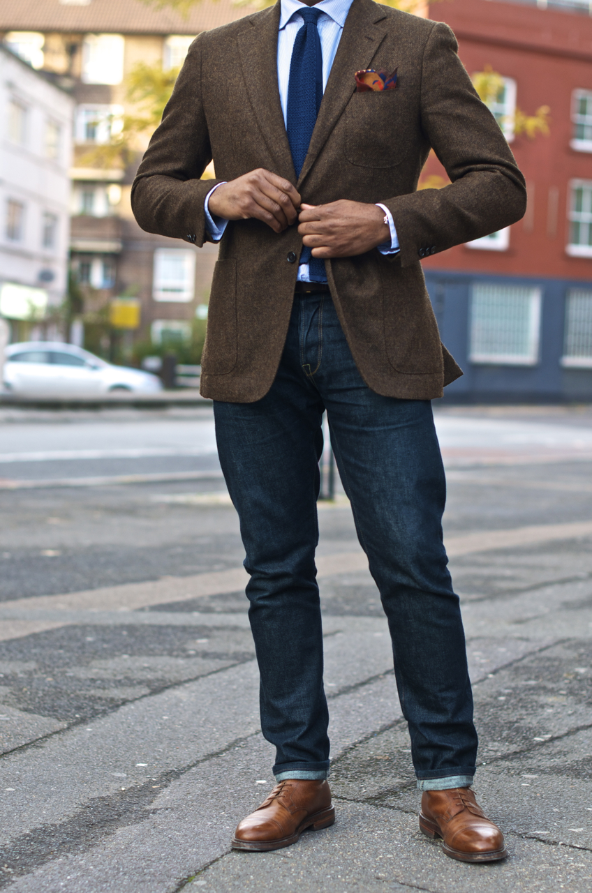
In the image at the top of the post, the handkerchief would have worked well as a tie as well – but the plain tie gives the hank more room for colour.
Harmony is broad, but you can still get it wrong. I find it hard to picture a yellow handkerchief working well with our example, for example, and orange would be horrible. But then, you would never have worn orange in any other part of that ensemble either.


Guest Comments »
1.
That was really informative. I’m learning more and more about how handkerchiefs can help my wardrobe. Thanks for the post.
Comment by DAPP3R CW — September 29, 2008 #
I find that the most versatile pocket square I have, which might be a cop-out (but I’ve always been one for a simple, classic combination instead of the daring sort that might get me on the Sartorialist) is a simple white cotton pocket square which has a nice cross-weave texture. It works either folded nicely and just peeking out for the dark-suit, white/pink/blue shirt days with a darker tie, or puffed out when I’m feeling like using a more colorful tie… simply arranging a pocket square differently can transform its effect in an ensemble.
From here on out, though, I think I’ll just be collecting the nice striped kinds that Paul Smith does so well.
What material is the jacket in this photo? Tweed?
You’d have to ask Drake’s I’m afraid, I can’t remember
Simon,
I think this jacket shows how the jacket cuff size should be in relation to the shirt cuff. Elegant.
S