
by Philipp Fröhlich
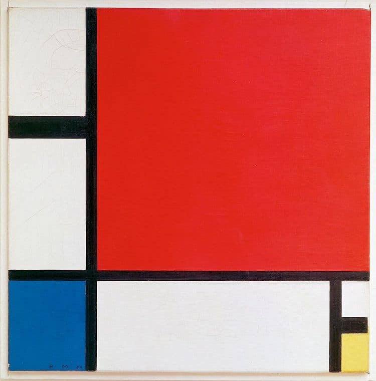
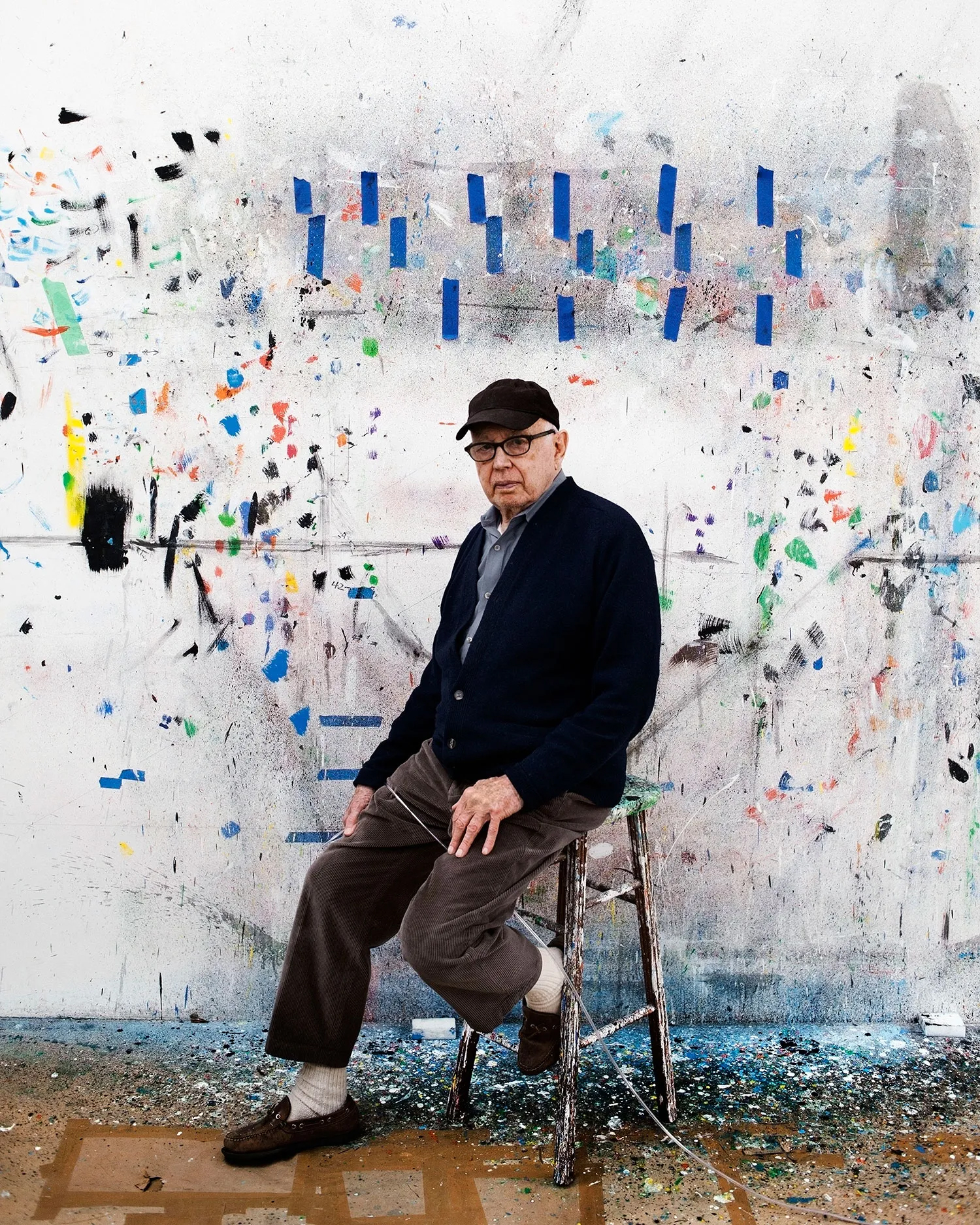
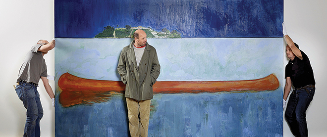
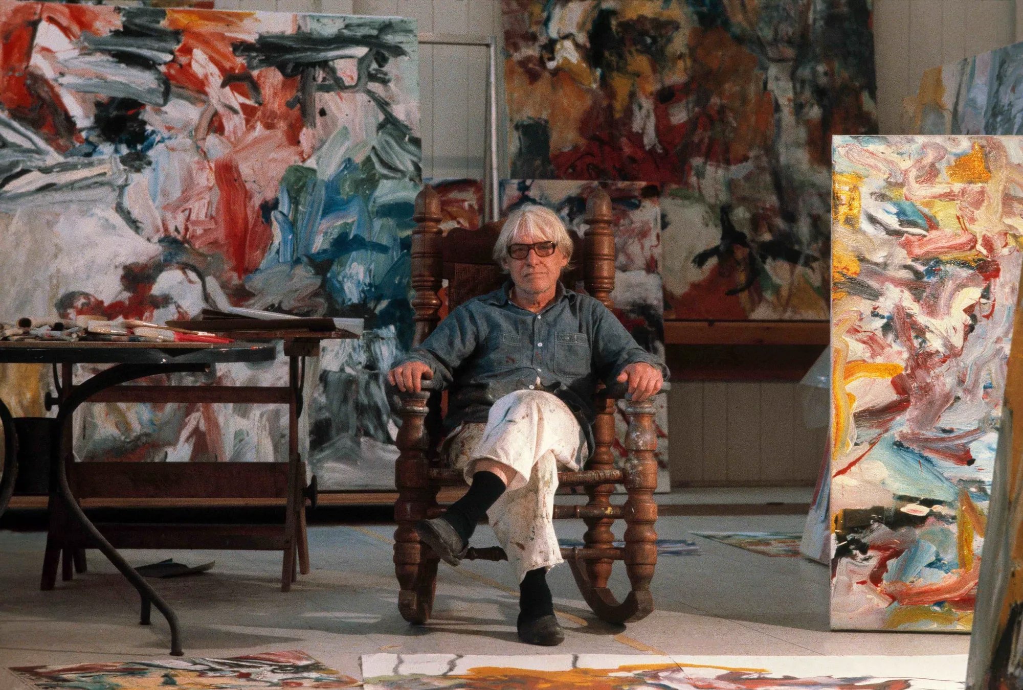
Between 1966 and 1970, Barnett Newman, a prominent figure in abstract expressionism, painted four versions of a painting he called ‘Who's Afraid of Red, Yellow and Blue’ (above). I assume Newman foresaw the intimidating effect that the large-scale combination of the three primary colours as colour fields could have, as two of the paintings have since been attacked and partially destroyed by vandals.
Recently, I've come across discussions on Permanent Style mentioning the colour wheel and its potential applications in clothing. As a painter myself, I thought I could share some insights based on my experience.
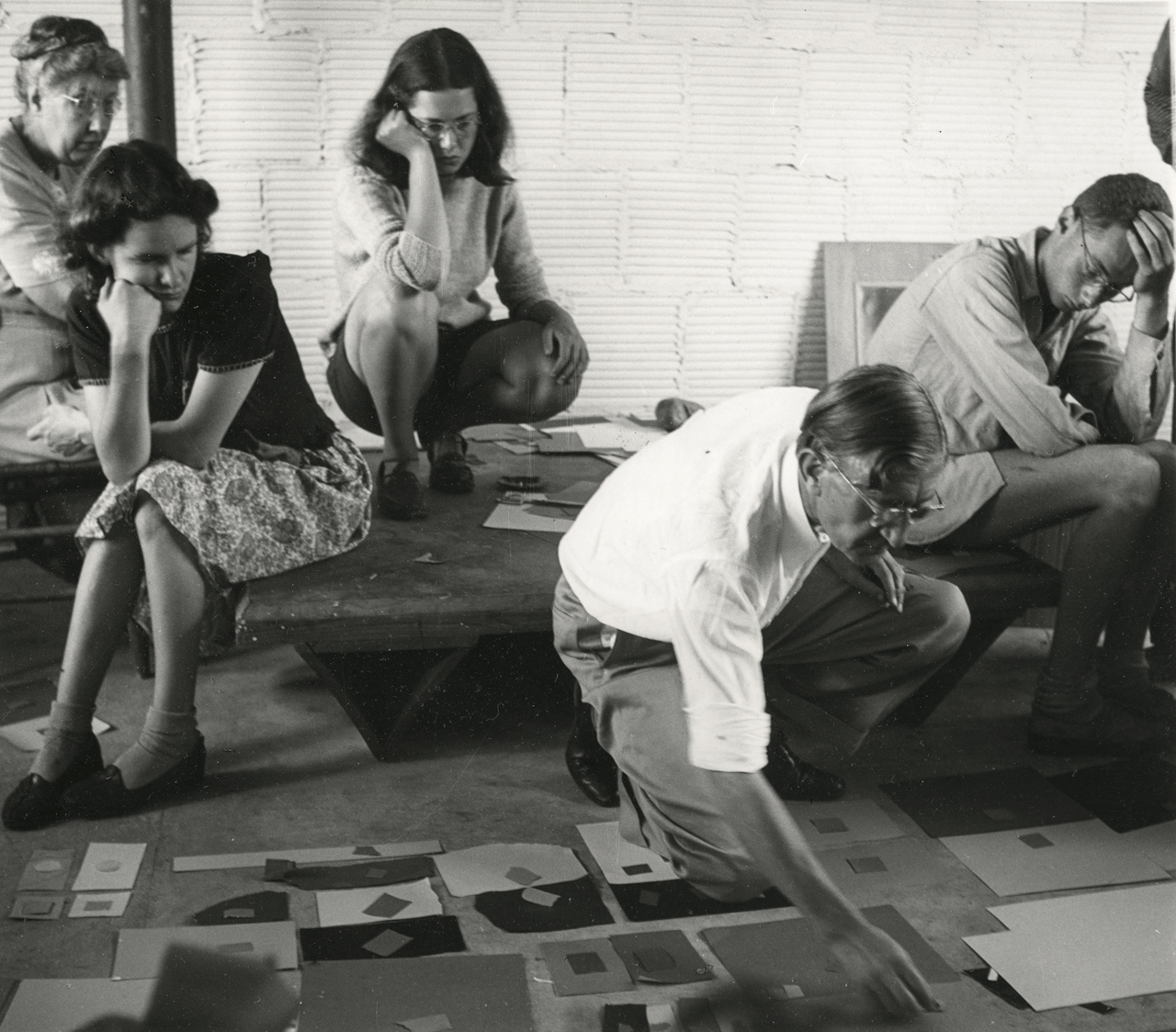
Joseph Albers, a painter and educator at the renowned Bauhaus academy, published an exceptional book at Yale University Press in 1963, featuring 150 colour experiments. He asserted that: “In visual perception a colour is almost never seen as it really is – as it physically is. This fact makes colour the most relative medium in art. In order to use colour effectively, it is necessary to recognise that colour deceives continually.”
Albers distinguished factual colour (colour in isolation) from actual colour (colour in context). Similarly, I believe we should emphasise contrast rather than isolated colour in regards to clothing. Of course, discussing factual colour in clothing is impossible anyway given things like skin tone, hair colour, eye colour and surroundings always come into play. I suppose the traditional division between country and city clothes has its roots here, too.
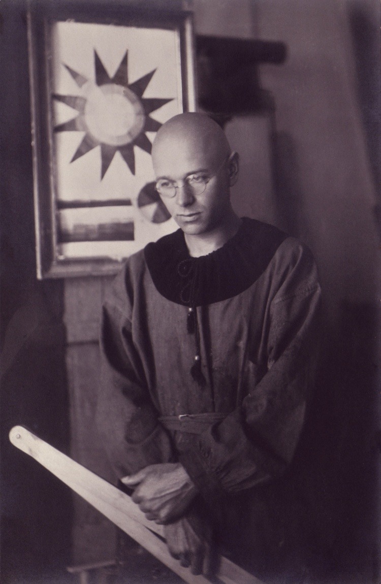
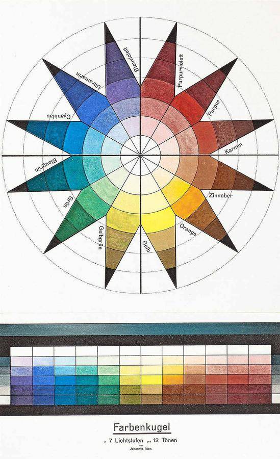
Johannes Itten, a Swiss painter and theorist, also a professor at the Bauhaus school, defined seven different colour contrasts. Let’s look at some of them - several have useful applications to how we dress.
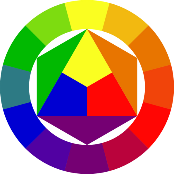
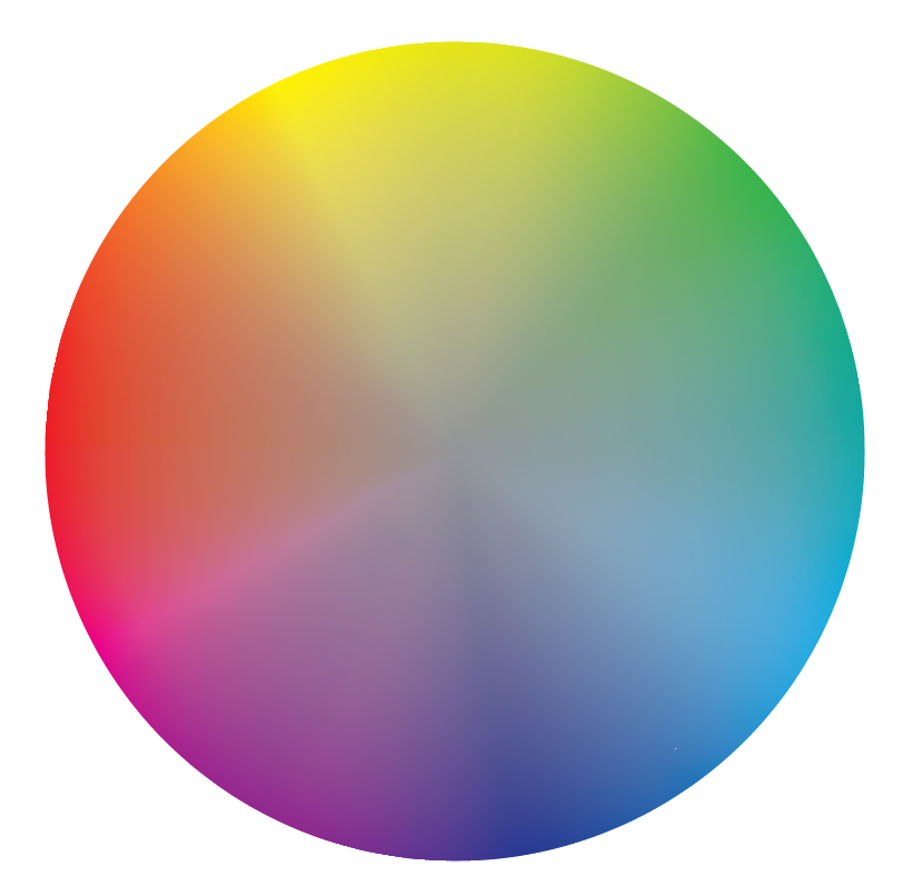
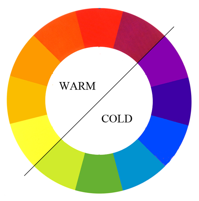
The colour wheel, likely familiar from physics or arts classes, comprises the three basic colours: red, yellow, and blue, arranged in a triangle with their respective mixtures in between, resulting in orange, purple, and green (at the most basic level).
The contrast between opposite colours in the circle, such as red and green, is called complementary and is regarded as particularly strong. Each of these tones heightens the effect of the other: green makes red look even more vibrant and vice versa.
Strong colours are always hard to wear
In a recent post and comment, there was a suggestion that this contrast might not be as suitable for menswear as the contrast of neighbouring colours on the wheel. However, I disagree.
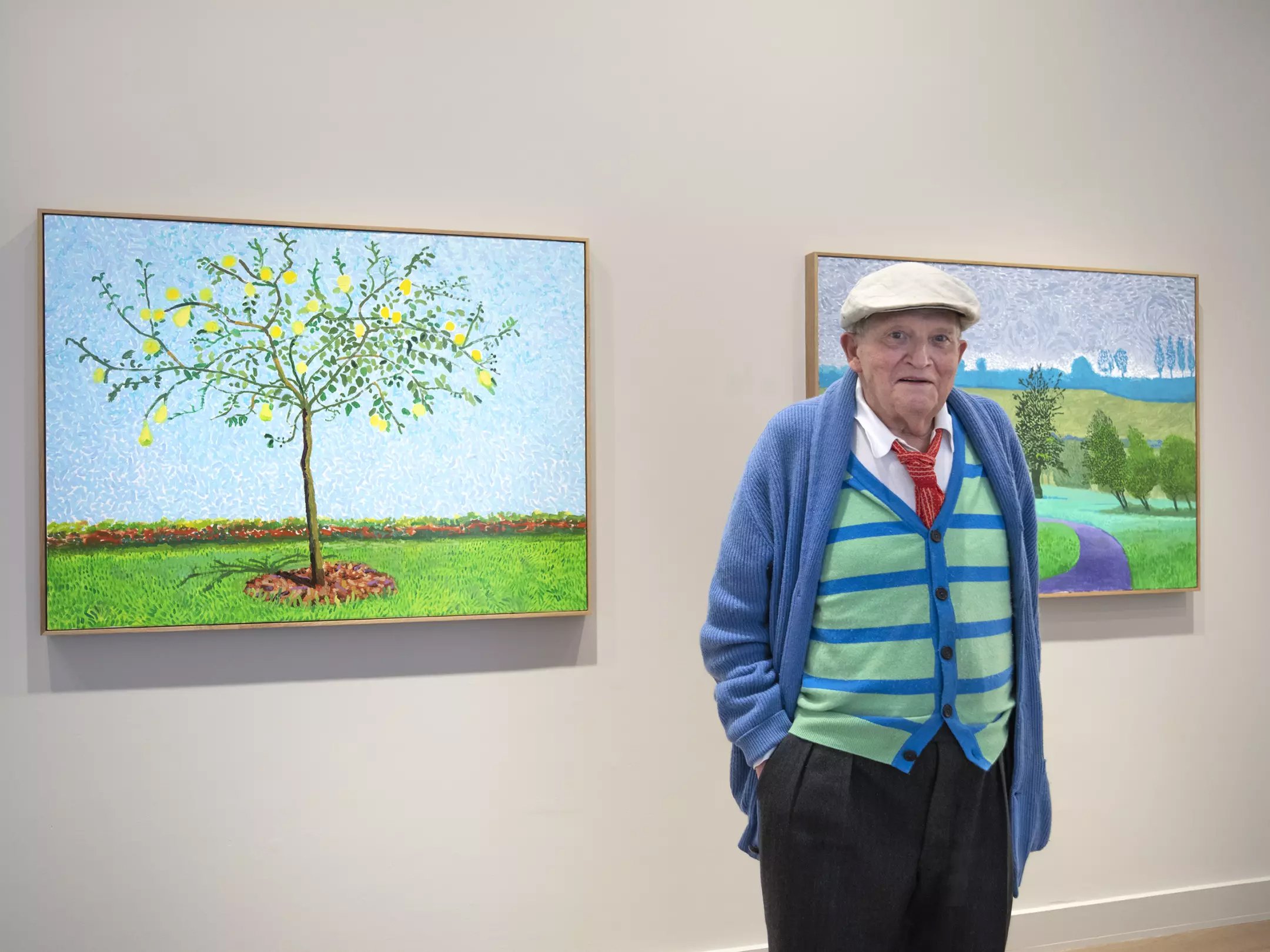
Any two equally strong colours placed next to each other create a contrast that is only for the bold. David Hockney effectively employs neighbouring colours in his paintings and clothing, achieving an effective, but highly stylised and slightly aggressive pop-art aesthetic.
But this applies equally to complementary colours as it does to those that sit next to each other on the colour wheel, as long as they are all equally strong.
Grey conjures up the complementary colour
That’s complementary contrast. The second type is simultaneous contrast.
Here, placing a strong red near a grey causes the red to conjure up its contrasting green tone in the grey, within our retina. You often see this in menswear, when for example a grey flannel suit is worn with a denim workwear shirt or green polo shirt. In these combinations, the neutral grey assumes the role of the contrasting colour, albeit in a very slight way that balances out the harmony.

Black and white can separate colours
You might think that black and white could perform this function in the same way as grey, but this is only true to a certain extent.
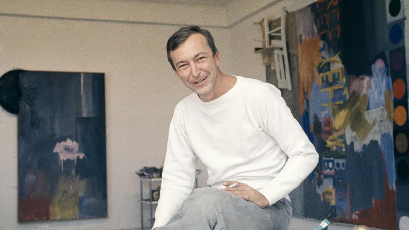
Black and white often work more as a separator. While artist Piet Mondrian used the three basic colours in his colour field arrangements, just like Newman, the grid-like black and white structures change the effect in a fundamental way. They are nowhere near as aggressive as ‘Who's Afraid of Red, Yellow, and Blue’. The black lines and white fields separate the colours and stop them from clashing, in the same way as a belt or white shirt can do.
As discussed often on Permanent Style, the white collar of a shirt or even just the white line of a T-shirt collar separate head and neck in a most effective way, and can make even difficult tones wearable next to the skin.

Different levels of brightness can make colours easier
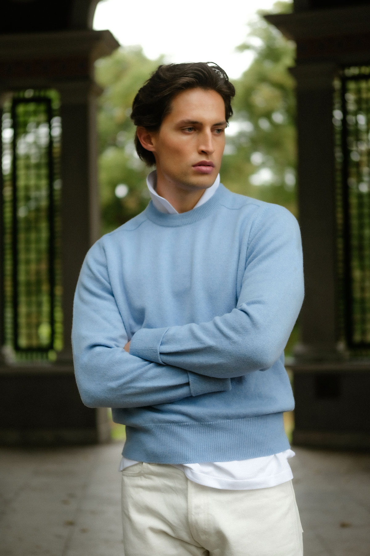
Colours start to vibrate together when on a similar level of brightness - the effect popularly referred to as clashing. They are much easier to combine when on different levels of brightness. For instance, Colour 8 cordovan loafers, jeans, and a light beige Shetland sweater complement each other well, but they are the same basic colour scheme as Superman’s red, blue and yellow.
The different values of light and darkness remove some of the hue’s ability to clash. Navy instead of mid-blue plays well with other colours, as we all know, and a pink or blue shirt is far easier to wear and combine when it is light in shade.
Desaturated colours are easier too
Another way to achieve greater harmony while maintaining contrasting colours is to move them closer in terms of quality – desaturating them.
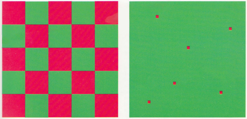
To visualise this, let’s substitute the colour wheel with a colour disc. The outside ring is the same, but as you go towards the centre the colours get mixed until they reach a neutral grey in the middle.
The strength of the basic colours lies in the absence of the others. When you mix two together, you still get a strong colour (green, orange or purple), but as soon as you add the third basic colour, the hue gets toned down.
Most of the colours we use in men’s clothing combine well because they are not on the outer ring of the disc. Olive is green with a hint of red; khaki is yellow with some purple mixed in. A chambray shirt looks great with chinos because they both move a little towards the centre. Brown shoes can be worn with many colours because brown contains some parts of all colours.
By meeting on the inner spheres of the disc, we get colours that do contrast, but since they contain a part of all the others, the difference is nowhere near as strong as on the outside circle.
How much colour is there?
Another of the seven contrasts defined by Itten that can be useful is the one of quantity or proportion.
Two colour blocks provide a very different contrast when one is expanded or shrunken in size. In this way, you can usually get away with stronger hues. An olive-green Barbour jacket with Nantucket reds will be too much for most of us, but the same jacket with a bright red scarf or cap might still work. The infamous power tie is a good example for a contrast of proportion, too. Ties, socks, scarves, and caps are great ways to add colour contrast to an outfit.
Warm and cold enhance each other
Warm/cold contrast is the last of the seven that I’d like to mention. When placed next to a colour, again of a similar lightness, a cold colour enhances a warm colour and vice versa. In painting, this is used quite frequently and, of course, it can be used in regards to clothing, too.
Sometimes this effect can enhance our personal appearance and skin tone. Being very pale-skinned myself, I look a lot healthier in a light blue shirt than a yellow one: the cold blue enhances what warmth I have in my skin tone.
Texture and depth
"Every colour can be described in terms of having three main attributes: hue, saturation, and brightness," states the Pantone website, and being the developer of the first colour matching system that revolutionised designing and printing, they should probably know.
Of course, this is a rather abstract way of speaking about colours. Science defines hue as light of a particular wavelength, a part of the visible spectrum. To the artist, colour is the substance of a pigment or paint. Colour in clothing is more akin to artists' tones.
When applied as a dye to fabric, the effect differs from the theoretical due to factors such as texture, lustre, transparency and depth. A worsted navy suit looks distinct from even a very dark denim due to weaving, materials, and how these accept the dye. Although not emphasised by Itten, keeping these factors in mind is essential.
The associations of colour
An different level of colours worth remembering is the primarily psychological or sociological one. I'd call it the associative level of colours.
Pure red, for example, holds a special place as a less common colour in nature, and one often associated with attention-grabbing elements like flowers, fruit, meat, or dangers such as fire and blood. Such a highly signaling colour can be impactful but must be used with caution.
Clothes bring their own set of associations – think of red Louboutin soles, transforming a part of a shoe that has long been ignored into something exciting and commercially useful, when marketed to make women feel confident, passionate and empowered.
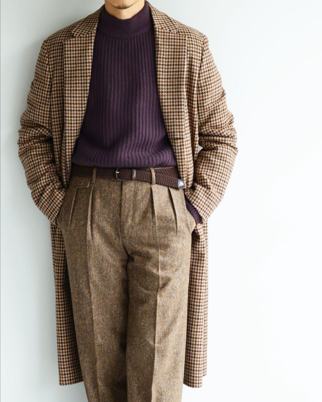
In a similar vein, I’ve always found purple challenging to use, being somewhat associated with the clerical, spiritual, or esoteric. Blue, suggesting distance as seen in the sky and deep water, is more versatile, though only when used in those shades of dark navy or light blue. Combining a true and strong mid-blue can still be a daunting task, as I've discovered while attempting to make my mid-blue Ebbets Field cap work.
Use patterns and texture
Another way to combine colours is through patterns. In the same way as pointillist paintings, patterns mix strong colours together to create a different effect when looked at from afar. It can be astonishing to see the vivid colours that make up a tweed cloth, while largely appearing as greenish or brown from a distance.
Effectively using and combining patterns can be challenging but also fun, depending on the specifics. Drake's, with its sometimes anarchic mix of tweed, colourful rugby shirts and scarves, comes to mind. Instead of large colour blocks clashing, patterns create a blurry, overall more colourful image that is difficult to define, resulting in surprising combinations.
Sticking with neutrals
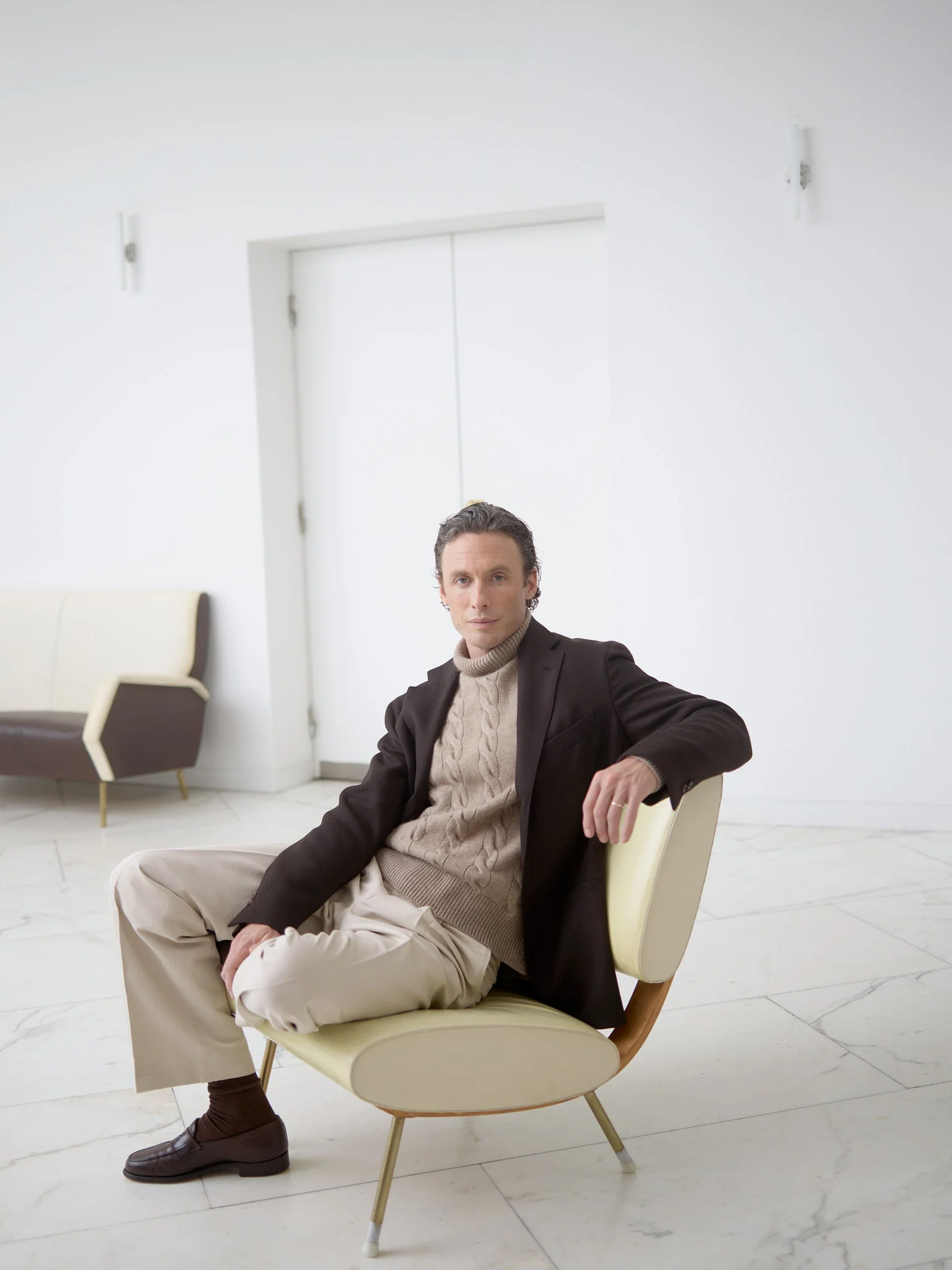
So, is there a recipe for success? One straightforward approach is to use mainly use neutrals – white, black, and grey – or adjacent neutrals such as taupe or brown shades. This is often referred to as tonal dressing, and you can find excellent examples in the lookbooks of Stoffa or Saman Amel.
Adding just one colour to this is easy and can be striking, especially when combined with texture. Rubato above provides a good example: light, neutral trousers paired with a blue or yellow sweater, with a subtle repetition of white added as a collar, creates a purposeful and elegant combination (above).
In the end, it all comes down to attitude. How do you want to present yourself?
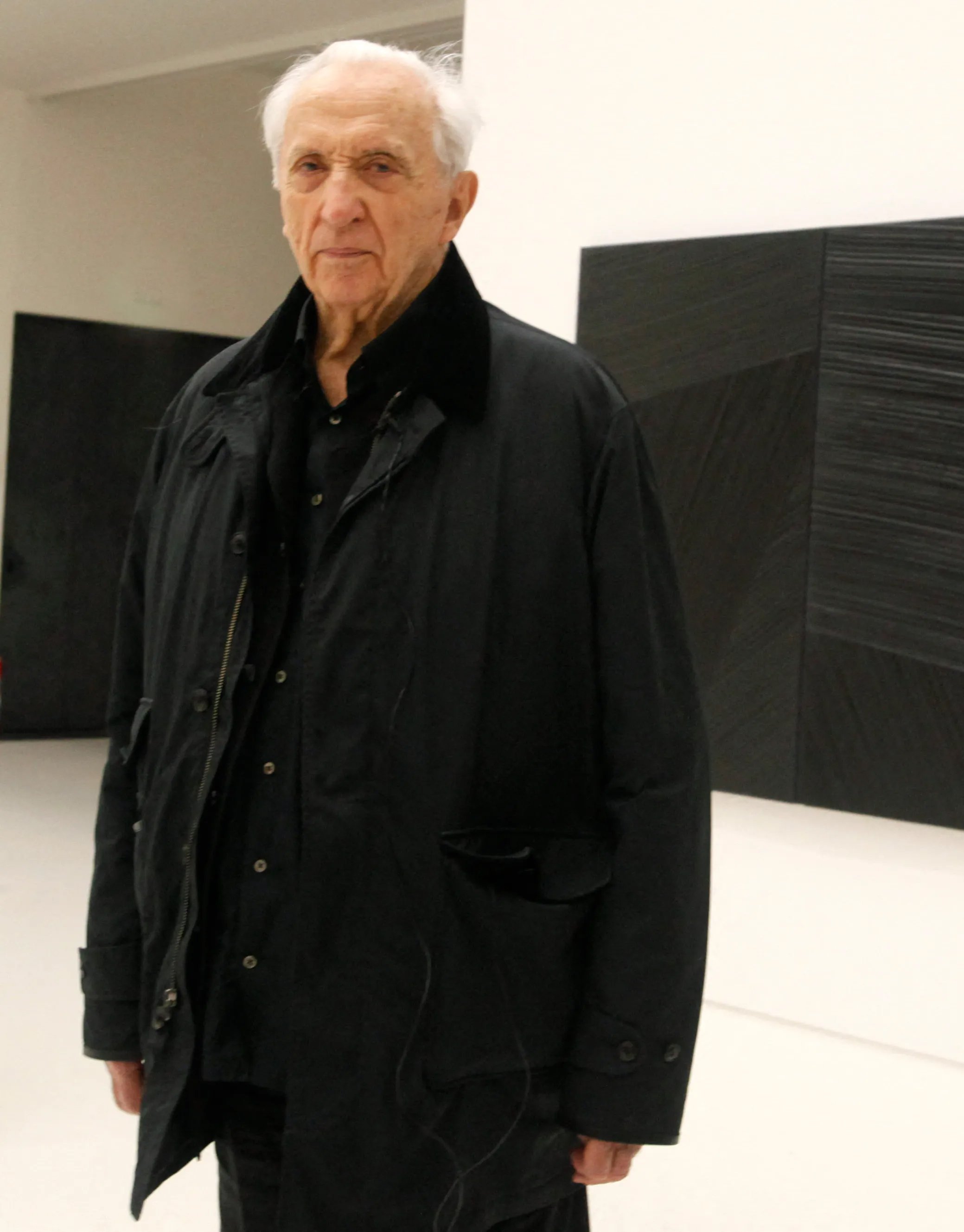
For an artist Hockney dresses in an individualistic way, standing out among the black-clad artists at gallery openings. Black, often considered rebellious and artistic from a traditional menswear perspective, has been prominently featured in lookbooks this year. It's crucial to note that there are no inherently good or bad colour contrasts; there are only different effects and associations that may reflect upon the wearer.


I actually have a few more extreme colours in my apparel including a dark purple pullover and a pair of yellow corduroy trousers!
What colour of trouser, shirts, polo etc. would work well with a purple pullover and again with a pair of yellow corduroy trousers?
I’d start with something like a pale blue shirt, maybe a light denim- something that softens the contrast rather than increases it (as a white shirt would do)
Interesting indeed.
Many thanks
Lindsay
My rule is akin to the doctors’ oath to “first do no harm”. In other words, with an outfit, avoid major blunders and you have done 90% of what’s needed. If a tie is dramatic in pattern, the shirt and jacket must be subdued. If a sweater is dramatic in pattern, the rest of the outfit should be subdued. Beyond that, in the winter, I wear mainly warmer colors — even my navy blue or grey sweaters are on the warmer side of the spectrum somehow.
Narrowing in on the point of your article here, I think it’s dangerous to mix warm and cold colors. I think that’s why, in your travel-wear piece, that warm beige cardigan clashes with the white t shirt beneath, the t shirt of course being in the cold spectrum…
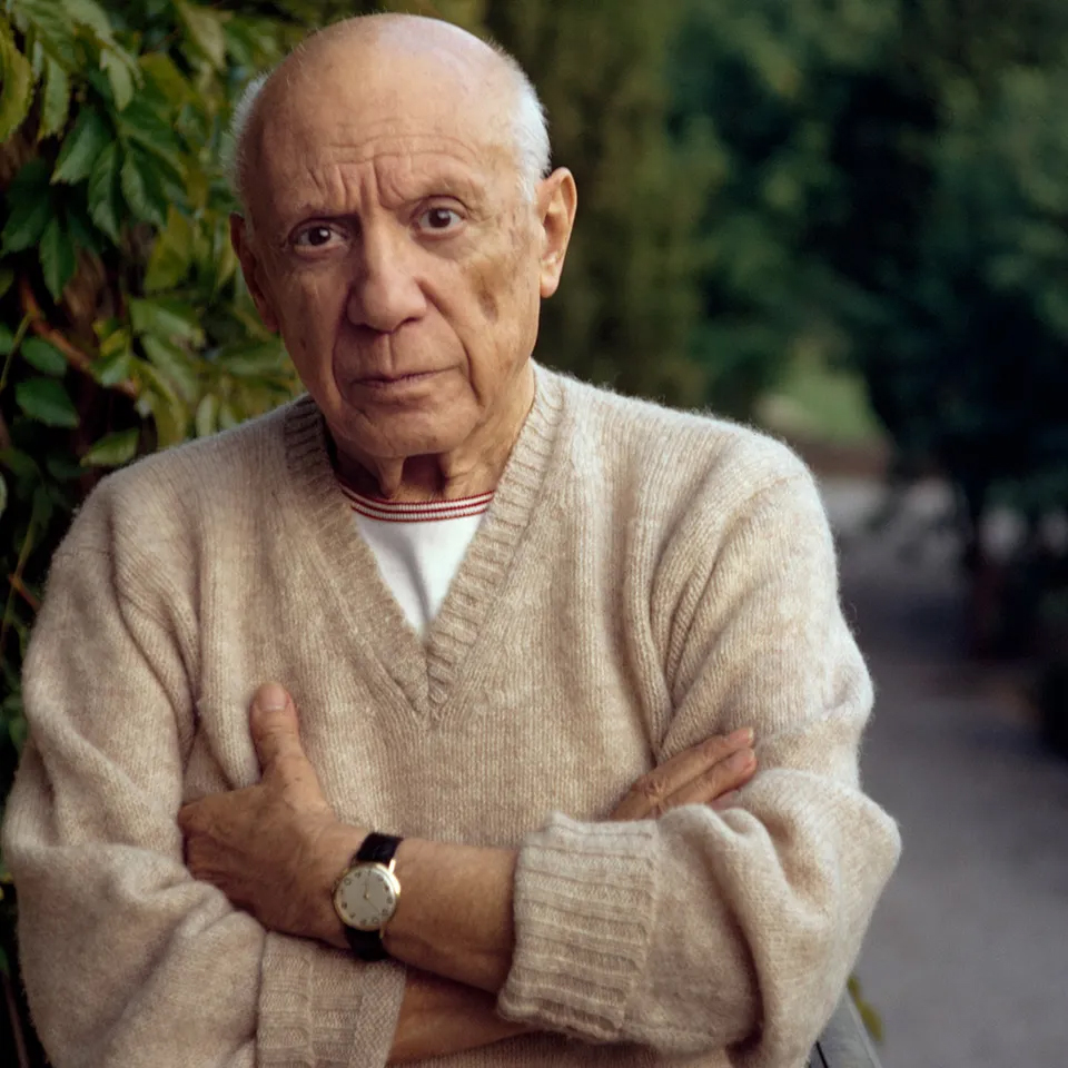
although, Picasso, plays the same game here with a warm beige v neck and white t shirt and it’s fine… maybe because his white shirt barely shows, or maybe it’s because he’s Picasso and he can do as he dang well pleases… or could do.
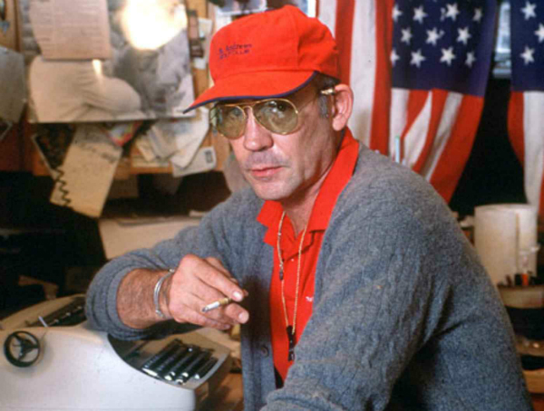
Hunter S Thompson, meanwhile, looks terrible, red “athleisure” mixed with a somber, traditional cardigan (my general bias against him aside).
I’ve got some orange flannel trousers and a turquoise cashmere sweater and my solution is to mostly keep them below everything else in my wardrobe, so that I don’t get tempted to ever use them.
Maybe try making everything else more colorful, like Drake’s would do. A single strong contrast between two or three pieces is often too much, I think, but add a brownish tweed sports coat to your purple sweater, some denim and a good scarf or cap and just maybe you can get away with it?
Whoah !
Probably the toughest PS article I’ve ever read (and in 10 years I’ve read a lot)!
There’s a lot to take in but it’s extremely useful for men to break out into colour .
The ‘colour wheel’ that mixes into the centre as a grey is fascinating .
I think I need to read this again . Better still I need to copy and paste it into ChatGPT and diffuse some key points .
Great article .
P.S.
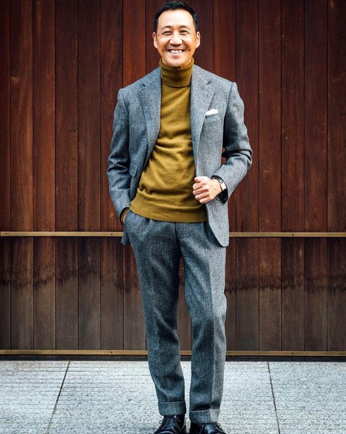
interesting seeing Kamoshita in the flannel suit with the polo neck . It occurred to me that we often dress with the outer layer of clothing providing much of the warmth and thus , I particularly , avoiding jackets that expose our chest .
Kamoshita’s just made me realise the outer piece should be more for dressing then ‘fighting’ the weather and the warmth pieces can lie under it !
Sorry if this is obvious to some but I think it’s misses most men’s attention.
It’s a tricky point to balance I find, your last one.
If you follow that idea to the letter you will find yourself in a wool sweater with a linen or light cotton jacket on top, which looks weird and out of season. And it probably won’t even fit that well over a sweater warm enough for the combination to work in winter.
If you go for season appropriate jacket and sweater then you might overheat inside any heated building, forcing you to lose the jacket and then you aren’t wearing the exterior “dress up” layer anymore.
Though trial and error, which largely depends on your office (especially if you cannot control the heating), I’ve found that for me a flannel shirt (+ undershirt) +
F/W jacket works best. Alternatively, a less warm shirt + knitted vest + jacket.
On the coldest days of the office (e.g. mondays during winter), a thin wool or cachemire mockneck can replace the shirt under the jacket.
According to this, I found I have little use for any other kind of sweaters, except heavy turtlenecks which I wear ironically mostly at home, obviously without a jacket.
Very interesting article and very much appropriate as a sort of new year resolution since I find PS absolutely perfect for inspiration and suggestions apart from the low attitude to colours.
Come on Simon surprise us with some purple or bordeaux !
I am wearing a purple watch cap at Pitti today. Does that count?
It’s a very good start but Pitti is an easy ground for colours.
Many thanks, Philipp, for a wonderful Wednesday morning read… looking forward to the addition of the image featuring Nam June Paik and his fun shirt!
Great! Thank you for this post 🙂
What an interesting article! Made me really think about why I like certain combinations. Hopefully it will help me in being more thoughtful and find me more of what I like!
Thanks and good luck!
Hi Philipp, wow there’s a lot here, just going though it,
Is this you at https://philippfrohlich.com/
I’m not into art to any extent, but if it is you, not or, it’s amazing
Hi David,
yes, that’s me. Glad that you like it.
Just looked at the site
Not sure how much that means, coming from someone who doesn’t get art, but I enjoyed looking at your paintings and found many of them beautiful
I’ll second David’s enthusiam! Really enjoyed discovering your works and spent a lot of time wondering about things like “does this fox have two heads?” and “are those leaves or insects?”
In your bio, it mentions that you live partially in Brussels (I live in Antwerp). Do you know if any of your work is visible in Belgium? The public collections section of your website seems to only list places in Spain.
Hi Mwanji, that’s right, I mostly live in Brussels now, but since I was living in Madrid for about fifteen years before, I still work with a gallery and have most of my contacts there. Maybe some time in the future.
Fun and useful, thank you. Quality and intensity of light also affects our perception of all these elements. Ever shifting. One note – Poor Jasper Johns is credited as “Jones.”
You are totally right about the quality and intensity of light. Curiously the highest intensity of colour is usually appreciated in half-shade, as direct sunlight levels intensity. I’ve often wondered, whether this is the reason for stronger colours looking more appropriate in summer.
My bad about poor Jasper Johns
Congratulations to this article. Incredibly well written and clear on a difficult topic.
Cheers Markus, I’m glad that you found it clear.
Wow! One of the better descriptions of color in menswear that I’ve read in a while … I almost wish the article kept going…
I still feel retarded when it comes to color. What is fucsia?!? And why do women just get this, and most men just revert to “purple-ish?”
Who comes up with terms like “mauve?”
Playing with the kids, I learned that mixing colors always makes shit brown for me, while the six year old is fricking Picasso already. Humbling…
Makes sense why offices have always been grey and navy suits … years ago… most people looked half decent. Now with casual work wear, I feel a “chairman Mao retro” look has emerged, no?
I just wish I was a bit better with color… I get like 20% of what the author writes on first reading…
Hey CG, I’ve never set foot in an office so office wear is something from legends for me, but that “chairman Mao retro” look, I’d love to see for myself. Anyway, let me know if I can make anything clearer.
Please don’t feel daunted by colour, Initials CG! (‘Journey of a thousand miles’ etc.). It is a fascinating and complex field. I don’t think that women just get it tbh, more that we are more exposed to colourful clothing, fashion trends and articles. Also, colour analysis is very back in fashion (assessing underlying skin tone as warm or cool; Colour Design Studio in Melbourne on YouTube is good for those interested in such things, as I am.) Whether one accepts it or not, it can start one on a ‘colour journey’ – and it has been around, particularly for women, since the ’80s with the publication of ‘Color Me Beautiful’.
Many thanks for bringing this all together in one piece. Most if not all of the points raised have been discussed on this website at some point in time but it’s extremely helpful to have it presented in this way. Thank you
Yes, these things have certainly popped up individually before.
A very interesting read. In terms of the rule on “quality and proportion” I agree that the real usefulness of a tie (or pocket square) is to inject more color or pattern in a small, concentrated dose. With neckwear and other accessories feeling less “wearable” in today’s landscape, I’m increasingly relying on socks to deliver color, a move I’ve entirely pilfered from Drake’s lookbooks and the personal style of the two Michaels behind it. In particular, I love how they’ve used a scarlet or purple sock to add a slightly ecclesiastical air to what might otherwise be a workwear look with denim or corduroy.
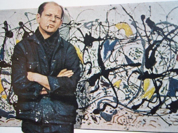
Got stopped in the street earlier by someone who asked “is that a Pollock you’re wearing?”
What do you mean by an ecclesiastical air?
Bishops traditionally wear purple. Hence ecclesiastical.
Except that it is not purple, but magenta.
Maybe because those colours of socks were long associated with Gammarelli’s socks for the Vatican? https://www.gammarelli.com/en/homepage-international/#history
You could try the Gammarelli socks, you can get them at Mes Chaussettes Rouges in Paris. They make the purple socks for bishops, black ones for priests and the whites for the pope.
I think I would be uncomfortable wearing magenta socks personally, since (as per the discussion regarding military wear a few months ago) I am not a Bishop, and to do so would be to imply a status I don’t possess!
I also wore somewhat colourful socks (purple, violet, etc) in the past.
I dropped them because I feel they are too showy for me. Interestingly, I do not see the same showiness in a moderately colourful tie or cap.
I find problematic almost every point made in this article.
It’s unclear what the author means by “strong.” First it seems to describe the contrast between complementary colors. Then it is used to describe individual colors. Typically, strong colors refer simply to colors high in saturation. If this is how the author uses the term, he repeats himself by arguing that “strong colours are always hard to wear” and then, later, that “denatured colours are easier too.”
I don’t see any practical application of the fact that grey conjures up complementary colors. The effect is very subtle and applies primarily to pairings with saturated colors that the author doubly acknowledges rarely work in menswear, much less classic menswear.
Mondrian uses black and white to separate primary colors, but human complexion is never of a primary color, and I don’t consider a “difficult tone” either the pale gray or oatmeal of the sweaters in the two illustrating photos.
Clashing occurs just as often if not more frequently between two colors of different brightness than between those of similar brightness. Consider the popular sin of tan shoes with dark suits. That light pink or blue shirts are easier to wear does not so much illustrate a preference for contrasting brightness as that for light shirts full stop. If contrast is the primary consideration then dark shirts with light suits should theoretically work—but alas. Also contrary to the author’s claim, mid-blue shirts (e.g. denim) are much more versatile than dark navy shirts.
I largely dismiss the practical value of the concept of warm/cold skin tone, but the consensus among those who do care is that a warm complexion should be complemented by warm colors and vice-versa—exactly opposite what the author suggests.
Hi Ben,
I’m sorry that you find most points in the article problematic. When I refer to a “strong color” in the article, I mean a saturated color of medium lightness, with a strong contrast being the difference between two saturated colors of medium lightness.
I understand if you dismiss the effect of simultaneous contrast on grey, and it’s not necessary to be aware of its existence. However, now that you are, perhaps you can observe it in your surroundings. For me, it’s one of those subtleties that enrich my life.
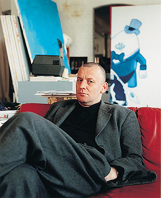
White and black work well as separators, irrespective of the tones of color themselves. A dark belt can work wonders, for sure. However, I find that tones close in value to skin colour are often the most challenging. Try covering Picasso’s shirt in the image with your finger and notice how much is gained by just this small white triangle.
Regarding tan shoes, it’s not necessarily about clashing to me. I just don’t think it’s a good idea to have the contrasting action at your feet; it makes the eye wander where it shouldn’t and stick there.
As for mid-blue shirts, I personally find them almost impossible to wear if they are intense in color. Of course, if you’re talking about chambray, then things change because we go back to the contrast of quality. A shirt can be intense if very light, like most traditional shirts, or dark, like raw denim. You are right about the light suit and dark shirt; you can’t apply a concept universally. Sometimes, when two colors don’t seem to work together, it’s as easy as choosing one piece in a lighter or darker shade. For example, I have this rust-toned knitted t-shirt from the Anthology that looks off with mid-blue washed denim but works great with a dark blue tone because the colors swing on a different level of lightness.
About warm and cold tones, that’s exactly what you should try. My skin tone is really cold, so a cold blue makes it seem less so. The colder color makes my skin tone appear warmer. The same goes the other way around. If you have a reddish complexion, then dressing in warm tones cools that down.
Oh and regarding “I just don’t think it’s a good idea to have contrasting action at your feet,” white sneakers with suits says otherwise.
I think the point about grey is very useful. Grey is often very slightly green, blue or brown and therefore knowing that can help pair specific greys with other garments. I have a grey jacket which is actually very slighty green, I now understand why I don’t enjoy it at all with yellow shirts.
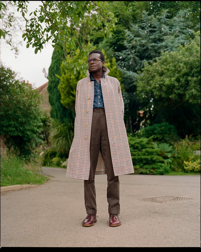
This is very interesting. It’s an important topic. I have been experimenting wearing a very textured orange tie with my blue jackets/shirts. Opposite sides of the wheel resulting in an effect I often like. Interesting that Philipp talks of Hockney using neighbouring colours, but in the photo above he is wearing an orange tie with his predominantly blue top half, and I think it is that pop of orange that lifts it.
Well spotted! I was thinking about his green and blue cardigan.
I have found this classic book quite useful:
A Dictionary Of Color Combinations Vol 1
https://www.amazon.com/Dictionary-Color-Combinations-Various/dp/4861522471/ref=sr_1_2?qid=1704893277&refinements=p_27%3ASanzo+Wada&s=books&sr=1-2&text=Sanzo+Wada
That looks very interesting!
Very interesting article. Brings me back to my time at art college. I find a more systemic approach to colour can be greatly enriching for a wardrobe without too much further acquisitions. Often one only needs to combine pieces in new and interesting ways to get completely new results.
This article brings up quite a few fun ways and concepts with which one can play around.
But I disagree on a quite fundamental point. I am probably going to open a can of worms with this, but here we go:
Itten’s color wheel is long outdated and should never serve as a basis for any modern literature on colour.
It does not use any true primary colours except for his yellow. If you try to mix it yourself, you will find it does not work at all. He just picked colours he liked and had not any real foundation in science. Thus the complementary colours etc are skewed. Green has magenta as a contrast not red as indicated by his colour wheel! Red has cyan etc.
I would never use it for any educational article such as this. As soon as you start to get a bit more in depth it falls apart more and more. Two out of three of his primary colours are not actual primary colours. It is not used anymore in any kind of serious professional setting for a reason, and has not for a long time. Infurriatingly enough, nothing about his colour wheel was not brought up before, so why it still persists as a “objective and true” representation of how colour works is beyond me. It is a collective hodgepodge of 200 year old ideas that have no basis.
I know it is still taught in schools in Germany and my native Switzerland, but it truly is quite a bit rubbish and was never that well thought trough to begin with.
Other better, more objective systems would be a RGB wheel based on light mixing or the CMYK System.
Hi Elio,
You are absolutely right about Itten’s color wheel being long outdated, and probably a cyan, magenta, yellow system offers a better approach to mixing correct colors as close as possible, at least on a theoretical level. From a practical point of view, using these three and black still doesn’t result in mixtures of every visible color, but only 60 – 70%. I frequently despair when seeing an ultramarine tone from one of my paintings reproduced as blue-violet in a catalog. Furthermore, you could argue that if, in theory, the mixture of those three results in black, why do we have to add black ink in the first place?
As artists, we are stuck with color as material anyway; our paints are pigments, either organic or inorganic, and behave far from how they should in an abstract world. The same goes for the dyes used on our clothes; they are limited to what can be produced as a chemical, is lightfast, and cost-effective. Sometimes you can even feel the difference between two cloths dyed in different colors when touching them. Probably, we’ll have to get used to the idea that color theory is a lot more complex than starting with three colors anyway. But for a broader audience, the Itten scheme is still great because it is visual, plays with the parts we have all known since kids, and expands them in an easy-to-follow system. To my own daughter, I’m teaching Itten’s wheel, too, because red is just so much more fun than magenta, and practical use is pretty limited by her box of paints anyway.
Hi Philipp
Oh the despairs of having to reproduce a colour over different mediums 😉
I fully agree that even a CMYK has big limitations and when used in its totallity is probably to advanced for this article. My point was more towards Itten’s colour wheel beeing flawed on fundamental levels. His ideas of black and white beeing non colours (taking the concept from Newton, without understanding how vital they are to our perception of colour), yet completely reverting to his “feelings” in other aspects is just the beginning. Most annoying for me the complementary colours are plain wrong in it.
I fully agree with your sentiment about colours being something deeply practical, that has to be experienced and hard to translate into theory. That the perception of colour is very very hard to try to organise and catalog in a neat theory. Take for example Küpper’s colour hexagon, that albeit created out of criticism of Itten, still struggles with gradations as we perceive them ( red tones vs yellow etc.) and has other deep flaws.
My argument is not about a CMYK or RGB giving more colours etc., but a more fundamental cirtique of Itten’s wheel. As soon as we go more a tad more in depth, such a wheel, where 1 is actually 1.5 and 1 + 1 equals 2.8 i.e., does more to confuse than help. In a lot of literature Itten’s wheel is still plopped there as fact without any disclaimers, which then in the public results in deep misconceptions about colour.
I really enjoyed your article, but found the presentation of Itten without any disclaimer to be detrimental, especially with later examples that would not work under Itten’s wheel. Exactly because I really enjoyed your article a lot, is also probably why this inclusion, creating inconsistent information irked me so much.
In your example about contrast and proportion, you show a picture with a red that is much closer to a true magenta, that Itten’s wheel could ever produce, due to not using true primary colours. There the green with the near-magenta instead of red is a true complimentary colour combination.
I get that I probably am nitpicking, but for me this perpetrates the myth and misconceptions arising from the use of Itten’s wheel. And although very cute, the argument about red being so much more fun, does not hold when we want to build a language to talk about those things. Especially since later you introduce such advanced and nuanced concepts (i mean advanced in the concept of dressing) about grey conjuring up a colours complementary one. For me such concepts are already quite advanced for a normal person, that does not work with colour everyday and thus necessitate a better “base language” than Itten’s wheel.
I think maybe, since we are talking about colour perception more than creating it, the NCS together with all your additional explanations would be a much more solid base to build upon? The NCS would also be an interesting inclusion, since it actually accomodates the fact, that we do not perceive all colour gradations the same, even when the step is equal?
Last but not least, I really do not mean to just slam you with this. I genuinely enjoyed the article and think overall it is such a nice summary about how colour works for an interested reader that wants to incorporate a more deliberate approach to it into their wardrobe. And exactly because it goes so much further than the average GQ and the like fluff piece towards colour it should also use a more well thought out colour system as it’s base.
Thanks, Elio. I understand your point, but concerning the public address, we may be delving into a discussion that’s too complex. I’d be happy to discuss it in person sometime.
I’ve never considered Itten’s color system to be exact in any way. In fact, I’m quite sure that any three-color-based system is flawed from the start. However, for basic understanding, it’s still the best and easiest to follow. I think we shouldn’t see the base colors Itten proposes as actual colors but rather as families. My usual painting palette consists of three yellows, four reds, three blues, two greens, one orange, two browns, as well as sienna and ochre, one black, and two whites. That’s a fairly standard palette and allows me to mix most of the tones I want. Starting out with three basic colors, black, and white, I wouldn’t be able to achieve half of them, regardless of the basic colors I’d use. Even with my 21 colors, some tones are still hard to achieve, such as an extremely light blue, because of the slightly yellowish tone of the titanium white. Many tones can be achieved in various ways, but the characteristics of the pigment, whether transparent or opaque, play a big part too.
My suggestion for what I’m discussing in the article and regarding clothing would be: think of green as a mixture of yellow and blue, but not in a pure way, but in a general and wide sense. Many saturated green tones can be achieved, and it doesn’t matter whether they are the exact green lying between a certain blue (or cyan) and a certain yellow. For dressing, this would make no difference at all. Think of red as a family of colors we can all call red. Maybe there’s magenta too, as well as carmine and scarlet, and many others. They contrast with green. In the world of clothes, it won’t matter if the contrast is exactly complementary; they still do something to each other that is different from what a neighboring color would do.
I really understand your critique of Itten, but I’d still defend his system because it’s artistic, broad, and simple.
To be honest, this is the kind of discussion I expected to see when I saw the term “colour theory” in the article title! Itten’s colour wheel is a useful tool, but it doesn’t really have a theoretical basis. Arguably no colour system really has, although RGB colour space, being additive rather than subtractive, makes a better claim than CMY.
I would view Itten’s wheel rather like the infamous “exposure” triangle used in photography to explain the relationship between medium sensitivity, aperture, and shutter speed – it’s useful to explain the concept, but it cannot be used empirically.
That’s the point. Well put, Michael.
Just fascinating, thanks for bringing these insights forward. It’s nice to understand the science behind some of the color combinations I’ve been drawn to and incorporated over time. I’ve been deliberating over the light blue Rubato knit for months now and finally know how to use, once I decide between crew and vee!
Crew is safe and classic but their v is just so special, isn’t it?
I think I am leaning crew with the well styled photo above perhaps serving as the dealbreaker, though when dry January passes. Separately, I was able to visit your website and what wonderful work! I hope to be able to view in person at some point. Honored to be in the same content and comment universe.
This was wonderful. My favorite PS article, by far! Not only well articulated, but the examples are great, and really clarify each point.
I loved seeing echos in each of the artist pics, all dressing well, and very much in keeping with their artistic personality. I’m a bit weary of seeing the same faces and brands in menswear pics, and love having such great examples from other disciplines.
Wonderful work, Mr. Fröhlich!
Thank you so much, James!
Hi Simon, this is a really helpful article for me as I am recently trying to improve on colour sense.
I have a question about the use of shirt colour to create and reduce contrast. For instance, if I wear a warm mid-brown jacket with dark and cold olive sweater underneath, would wearing a white shirt create some contrast? And if I switch the sweater to the dark navy, would the pale blue/denim shirt neutralise the contrast?
Many thanks,
Jack
Yes in both cases, but as ever, try those combinations, think about whether you like the contrast or how you feel about it
This is so much more in depth compared to many guides just talking about how to use the colour wheel. I’ll definitely come back to this article again and again, whenever I think about experimenting with something new.
Cheers!
Fascinating subject, I need to research more on it, I’ve always wondered why I’m drawn to Donegal tweed effects in various pieces of clothing, yes much more to understand why we have ”go to” items in our wardrobes. Thanks for this article.
Donegal is just amazing, isn’t it?
This is a really great and technically dense article. I will probably need to read it three times to understand it completely (OK, maybe not even then). However, there are a lot of points which you recognize from first reading that you understand intuitively from wearing clothes over a period of time – but you can’t articulate why certain colors play well together and others don’t.
For example, the section “Desaturated colors are easier too” states: “Another way to achieve greater harmony while maintaining contrasting colors is to move them closer in terms of quality – desaturating them…Most of the colors we use in men’s clothing combine well because they are not on the outer ring of the disc… A chambray shirt looks great with chinos because they both move a little towards the centre”. This is helpful if you want to have a smaller wardrobe where items can be easily combined – a useful shortcut to understanding which items to focus on and why to focus on them rather than fumbling and relying on instinct.
Another point: “The different values of light and darkness remove some of the hue’s ability to clash. Navy instead of mid-blue plays well with other colors, as we all know”. This is something you recognize over time but can’t say why (until now), but this is rather counterintuitive as you might reasonably assume that mid-blue (lying between navy and light blue) would also pair broadly but it just ain’t so.
I guess that even armed with this knowledge of how to combine colors there is always a spectrum of appeal of possible combinations from good to best and moving towards best involves understanding what works best for you personally at each point of your life. Style can’t be satisfactorily reduced to mathematical formulae or “I’ll copy that look” and often defies exhaustive analysis. I guess that searching for that je ne sais quoi is part of the eternal style journey and part of the eternal appeal of clothing and dressing.
Trying to reason about colors is useful up to a certain point, for sure. But, to some extent, it can provide solutions when intuition lacks. Material, silhouette, and color probably constitute what clothing is all about, and among these three, arguably, color is the one rationalized the easiest. Sometimes, a little dose of theory can take you a long way, but I agree that, in the end, it probably all comes down to something else.
What an incredible read! Thanks for the very interesting and informative post.
It has really resonated with me as my father is also a painter. He is in no way a menswear enthusiast but I find he is generally impeccably dressed. I’ve always admired that in him and even tried to copy it. However, being well dressed and eccentric at the same time is not something I have managed to replicate.
Now I understand where his intrinsic knowledge comes from.
Vielen, vielen Dank!
It’s my pleasure. Thank you.
Thankyou for this article on colors. I’m constantly confused about clothes and color. The suitable and unsuitable colors to pair, mix and match, etc etc is so very baffling. The differences in fabric seem so much more straightforward. so thanks for this article, it will be a reference point for me, I’m sure, as I try to navigate my way through the labyrinth of men’s clothing and colors.
best Regards,
leo
Glad if it can help.
Years ago I acquired a book “Color for Men” by Carole Jackson. It is basically seasonal color analysis theory. The four seasons color approach relates to the color tones of the human face and skin. I am a spring in this system. I too have a light complexion but not a very light summer type. Therefore; I can kind of wear pastels but they need to be saturated with some “punch” to them as I like to say. Very light pink, as seen in men’s shirts is too light for me. I can wear coral, which has more color and is a bit deeper. I can wear navy blue but give it to me where I can see the blue and not the typical blue/black that is common in suits and blazers. The system has helped me tremendously to understanding what looks good on me, especially at the face level. An Ecru shirt and not bright white, for example.
I’ve heard about that one but never got around to have a look. Maybe I should.
Many years ago I had a session with a consultant using what sounds like the same system. Like you I have found it a very helpful guide to what suits me, and my wardrobe is based on it. As the colours within a particular “season” are basically compatible with each other it’s easy to put together a harmonious outfit.
Thanks for this great article. For me a developing a sophisticated understanding of the interaction of color has been a long and slow process. I’ve been so thankful to learn many of the concepts and principles you’ve outlined here from my wife (a classically trained artist). If there are any readers who want to go a little further, I can strongly recommend learning about the Natural Color System (NCS), which organizes color in a three dimensional space (hue, chromaticness, and b/w balance). I find the organization makes some of the more complex color relationships a little more intuitive.
Elio suggested the same. I’ll make sure to have a look.
Hi Simon, may i ask something irrelevant with the article ? How do you compare rubato and brycelands jeans ? Im on the look for a cream one and a mid blue one. Could you also suggest some good mid blue options ? It seems every brand has white and indigo but mid blue is difficult to find.
Yes, most don’t do mid-blue because then you’re looking at washes, which is a whole different technical area. For that colour I’d suggest Orslow or Full Count.
I like both Rubato and Bryceland’s jeans, they’re great. The difference is really mostly fit, with the Brycelands being a touch higher and a tough wider in the hips
Thanx for the suggestions, by the way i have an orslow loopwheeled crewneck that i bought this year since the rmc ballpark is not available anymore( rmc answered my question and its not going to be produced anymore). When i tried it i thought it was huge and sloppy. I washed it at 30c and it came out big but smaller than before. So i took tha risk and washed it at 40c and it came out exactly as i wanted it to be. If someone is looking for a loopheeled sweatshirt that doent have a v on the back and isnt made short to be mostly worn with high waist trousers id surely suggest it.
Thanks Georgios
Plenty of food for thought Philipp, and a great feature for dry January. From reading PS over the years, two things have struck a chord: Wearing a white t shirt as a backdrop opens up knitwear and sweatshirt colours I previously would have avoided, and a neutral base with dashes of colour from a hat, socks, scarf or even a bag is a great and simple way to lift an outfit. This, particularly, has helped in my progress towards capsule / uniform dressing.
Simon – really enjoying these Dry January pieces!
Oh good, lovely to hear Daniel!
Today’s email was absolutely full to the brim with thought provoking and compelling articles. A tour de force.
Thank you Joseph, great to hear
Simon, just wanted to express my gratitude for maintaining such a high quality online publication, especially with such educational and useful information presented in posts such as this one. And on top of it, the comments section is filled with intellectual contributions and questions. Not an easy task to moderate at such a high level. Hats off!
So lovely to hear it’s appreciated James, thank you. Looking forward to all your thoughts and contributions in the comments going forward too