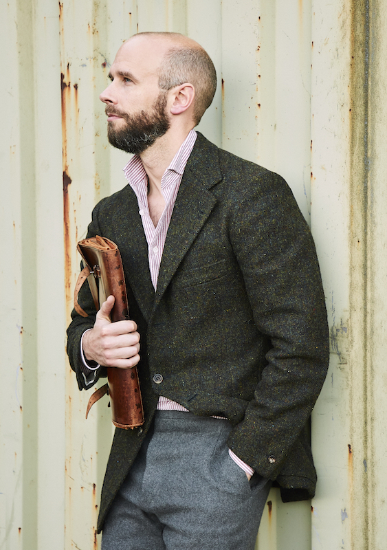
With men wearing fewer ties with their jackets these days, shirts carry more of the burden in creating style and interest.
Of course, there is another way to look at it, which is that we have more freedom. Suddenly those bold patterns that were too strong for almost any tie are easier to wear.
Probably the safest way to do this is with stripes. Checks are hard to get right, and prints harder still. But you can easily dial up the size and strength of striped shirts, until you find a range that works for you.
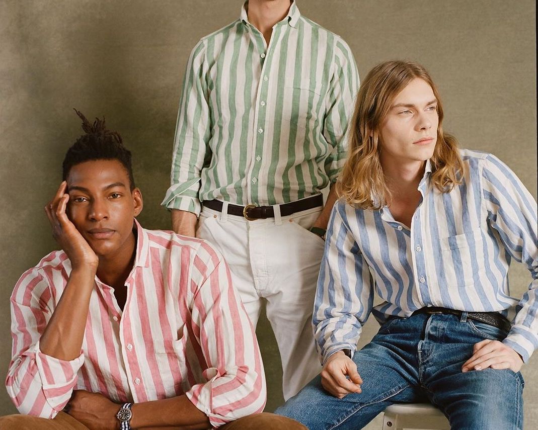
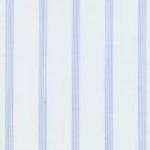
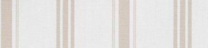
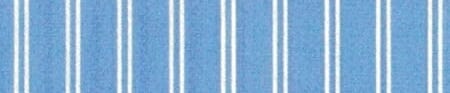
The guidance as to which stripes are more or less formal shouldn’t surprise anyone by now. The thinner, more muted, and more conservative the colour of the stripe, the more formal it is. Pale-blue bengal stripes are great for both work and leisure. Grass-green awning stripes (below) are really only for the latter.
One thing I’ve found in talking about shirt patterns in recent months, is that not everyone knows what the names of the different stripes are – or indeed agrees on their nomenclature. There are different associations in different countries, and sometimes inconsistent use across the industry.
As part of the recent guides we’ve been doing on shirts, therefore (so far including collars and cuffs), this article will define and illustrate the shirt stripes, and hopefully provide a useful reference as a result- similar to the one on shirt weaves and designs we wrote last year.
We’ll start with the most popular stripe patterns. The ones you’re actually likely to use when asking your shirtmaker to show you something; or maybe to describe to a friend on the phone what you/they are/should be wearing.
And we’ll generally run from thin to thick stripes, which as noted, generally means from smart to casual.
Hairline stripe
A design with a very thin stripe, running close together, meant to be similar to a hair’s width. Usually alternating between white and a colour, but sometimes colour and colour. More a texture than a noticeable pattern, and best thought of in that context.

Pinstripe
Familiar from the world of tailoring, this is a design with slightly thicker lines – more a pin’s width than a hair’s – but also further apart. We will find, in general, that stripes can be divided into those where the spacing is uniform, and ones where it is not. The hairline is an example of the former, the pinstripe the latter.
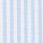
Pencil stripe
A small step up in thickness: usually two or three threads in the fabric rather than one. And usually the same as a pinstripe, in that the coloured stripes and background are not even. Personally, I find this is the thinnest of stripes that can look good on its own. The others are best with a tie.
This is also the point at which we introduce variations, or perhaps sub-groups. For example a ‘music stripe’ is basically the same as a pencil stripe (same thickness, same spacing) but is found in two colours more often. It is so named because it resembles the staves of music notation.
And a ticking stripe can be in many patterns, but is most usually similar to a pencil or bengal stripe. It is defined by the texture of the stripe, caused by the fabric’s weave, which resembles mattress ticking.
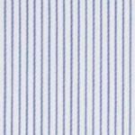
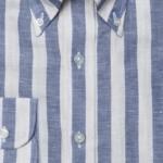
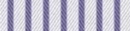
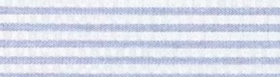
Bengal stripe
Taking another step up in thickness, we get the bengal stripe. This is defined by its width, by its even spacing, and by being always alternating colour and white. However, the first point – the width of the stripes – does sometimes vary while maintaining the other two aspects. Thinner versions can be called fine bengals, and thicker ones double bengals.
Another sub-category is the ladder stripe, which is a bengal stripe in end-on-end fabric.
Like many things in menswear, the origin of the name is British, but stolen from elsewhere. It was a pattern worn by the Bengal Lancers, a division of the British Indian Army, and inspired by stripes used on local cloths. It is probably the most versatile of all shirt stripes – in a pale blue or pink it can be worn with most ties, but also has enough interest to stand on its own.
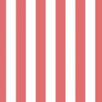
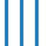
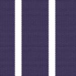
Candy stripe
One more step up in size takes us to the candy stripe, which references the bold stripes you might find going through sweets such as a rock. The spacing here is still usually even, but the stripes are larger, and the colours often bolder and brighter. It is one stripe with quite a lot of inconsistency in use though, and the stripes are not always evenly spaced, or indeed bold in colour.
Most of the time, though, this is the start of casual-shirt territory: not necessarily to be worn with shorts, but unlikely to sit well with a navy suit.
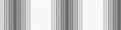
Awning stripe
The largest stripe, and one that has become popular in recent years – probably specifically because of the lack of neckwear for it to compete with. The name references awnings used over shops, and it is the biggest stripe usually found on shirtings.
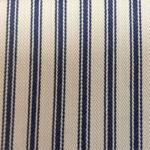
Butcher’s stripe
Now we return to stripes with uneven spacing, just at a larger scale. The big name here is the butcher’s stripe, which is defined by its coloured element being larger than its white. The name comes from the traditional pattern used on butchers’ aprons, and that coloured element is often strong and bold.
It doesn’t have to be, though, and in paler variations the butcher’s stripe can be attractive and versatile. The coloured element makes it more similar to a coloured shirt, such as pale blue, often making it easier to wear on its own. A variation is the reverse stripe, which is a general term for any stripe where the coloured element is larger than the white; the actual size of that coloured stripe can vary considerably.
A second group of stripes is less likely to be used by consumers, and perhaps more by those in the industry, who are more in need of categorisation.
They also tend to be more complicated or idiosyncratic patterns, and for that reason I would advise readers to treat them with caution. Such stripes risk being showy, gimmicky, or simply looking old-fashioned very quickly.
 Track stripe
Any stripe mixing various different widths and spacing. Usually one or two colours.
 Shadow stripe
A main stripe that is surrounded by one or more other, thinner stripes, creating the effect of a shadow.
 Halo stripe
Thick and thin stripes, with the thinner surrounded by a paler colour, or white, resembling a halo.
 Baiadera stripe
A particular design with varying widths of stripe, in multiple colours.
 Self stripe
A stripe where the pattern is created by the structure of the weave, for example a herringbone. Satin stripes are created by the same variation in the weave.
 Barre stripe
A name for a horizontal stripe in the fabric, though this is little more than a descriptive term, really.
 Regimental stripe
Any stripe that resembles a striped English regimental tie.
There are more names than this, but they either become very niche, or purely descriptions – such as ‘irregular’ stripe or ‘double’ stripe. We don’t need any help understanding those.
And there are more variations that don’t have names. What do you call a bengal stripe whose white stripe is very slightly thicker than the coloured? It has no name, sitting somewhere between a pencil stripe and a bengal, yet I see it all the time. Same goes for pencil stripes with very large white stripes in between.
In the end, this is just language, and language is use. We are trying to pin down a moving target, which is impossible. However, if we can just slow it down a little, that might be helpful.