Bright colours often need reining in. Or perhaps anchoring is the right metaphor.
Left on its own, a bright jacket (for example) can dominate an outfit and seem to float above it, rather than harmonising. It strikes the viewer as an individual item rather than part of an intelligently worked ensemble. Equally, if the jacket is dark and the rest of the outfit bright, something needs to link that jacket to the brightness elsewhere.
The most effective tool for this is the pocket handkerchief.
Pick out a colour from the shirt or tie and echo it in the handkerchief – suddenly there is a connection across the lapel and everything hangs together. In the top image, for example, this navy jacket could look a little out of place with the yellow, green and pink, not to mention the shorts. It could look like he’d put on his suit jacket on by mistake. But by echoing the pink panel of the shirt in the pink handkerchief, the jacket is anchored.
The second image demonstrates this the other way around. Here a bright yellow jacket threatens to lift right off the model and float unaided. The contrast would be particularly stark were I (or someone equally undaring) to wear this jacket – as I would certainly not pair it with such bright socks, shirt or tie. I would have plainer accompaniments and need something to anchor that jacket to them. The white of the collar would do, or a blue pattern if that were in the tie or trousers.
In this image, the handkerchief is linked to the tie by its similar tone – though to be fair that job is also performed by the horse emblazoned on the breast pocket.
Lastly, the white suit is given some kind of foundation by linking a blue handkerchief to the blues in the shirt and tie. Note, though, that the blues are slightly different in each of these items – it is harmonising, not matching.
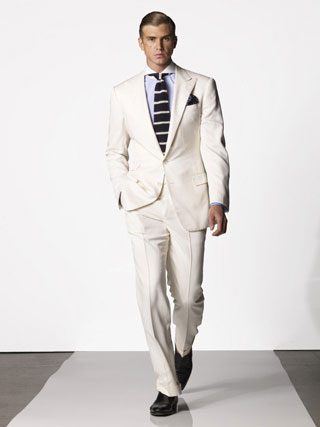
Anchoring a bright item, like a jacket, is particularly important as the warm weather strikes (particularly in recent weeks in the UK). Suddenly you’re considering linen jackets, tan jackets, white trousers or even trousers in other brights. Go with it, but every time consider how to link that summery item back to everything else.
At a simple level, when I wear my bright green jacket I always add either a blue or white handkerchief, whichever best fits the rest of the outfit. Try it.















3 Guest Comments »
1.
Handkerchief or not, nothing could save ensemble 1 or 2…except some bigger tweaks.
I love the idea of shorts with a sport coat. But even if the color is darker than everything else, the material and cut should reflect a more casual feel. In these pictures it’s hard to tell, but the jacket in #1 looks wool as opposed to linen or cotton. (Can’t what kind of shoes is he wearing?) My other problem with #1 is that it has a dual personality and seems impractical for both. Is this chap going to a business meeting? Not exactly. Vacationing? His top half is overdressed. Going to hang out at a country club? This would fit best. And how many of us actually belong to a country club? Not many.
So the picture serves better as inspiration. I’d loose the tie, unbutton the shirt, add an ascot, and chose a sport coat in a pastel. (And maybe unstructured? Or does that take us into Miami Vice territory?)
#3? Love it. Sometimes, simpler just feels better.
Overall, this piece got me thinking and I appreciate it.
Peace,
– Joher
Comment by Joher Coleman — June 27, 2009 #
2.
I agree: the contradiction in the first image is dizzying: a formal upper half countermanded by a casual lower: perhaps he’s a television presenter with an imposing desk ?! I think I also might struggle to find somewhere suitable to wear this ensemble. I lost my heart instead to the final image: a classic.
Although I might opt for a tie without the widening effect of horizontal stripes, and a different collar with a more suitable tie-knot. But in each case, the whole is underpinned by the handkerchief, as you say.
Comment by Dan D — June 28, 2009 #
3.
Great examples of achoring an outfit with a hankerchief, but not so great looks.
Even the last one looks a little mismatched. The suit has a more relaxed feel to it, and so it looks like his tight, over-spread collar and boardroom hair were cut and paste from a different body.
Comment by Patrick — June 28, 2009 #
Great post Simon…I was also drawn to the extremely smart looking bag in the first picture.
Picture 1: Ghastly.
Picture 2: Hideous (I particularly dislike the bib-as-necktie look).
However. (*ahem*) They both illustrate Simon’s point exceedingly well. These are clearly fashion photos, not style shots, and so should be taken, as another commenter put it, as inspiration–which our gracious host did nicely.
Picture 3: The only sour note in this otherwise perfect ensemble is the hyperspread collar: it’s too formal for the suit and tie it’s worn with. Of course, the peak lapel is perhaps too formal for a white suit, but I don’t think that’s a fatal flaw–unlike the collar.
The White suit works the rest no