
I am proud to say that at the end of this week we will be launching a brand new Permanent Style website.
The content will be the same, but it will be more expansive, modern and easier to browse.
It’s been a long time in the works, but I’m excited to finally have it going live.
Last year I began a process of talking to readers about what they liked and disliked about Permanent Style. In one-on-one conversations, often at book launches, we discussed navigation, layout and search functions. They told me how, when and why they used the site.
I am very grateful to everyone that helped. As regulars will know, I am a product manager for a publishing company and so I spend a lot of time with analytics. But there are many things you can only learn from talking to users individually.
Apart from an updated design, the major changes you will notice are:
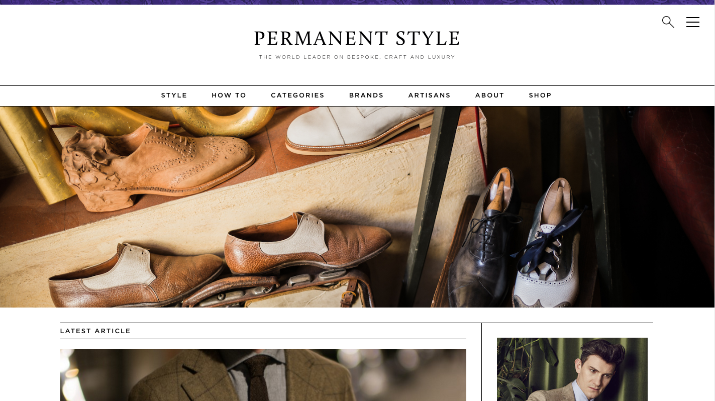
- A large landscape image that changes every time you visit the homepage, to show off our great photography and suggest old, image-led articles
- Article previews on the homepage, rather than full pieces, to make it easier to browse all recent content (and give posts more room)
- Bigger layouts for those posts, with more room for photography
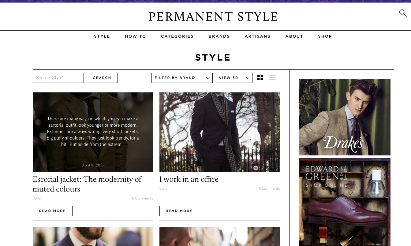
- An ‘Artisans’ menu to go alongside our existing Brands list, allowing you to find all our coverage of different bespoke craftsmen
- And a ‘How to’ section, giving a home to all our practical pieces about maintaining your clothes, buying a pen or finding a perfume
Permanent Style has been publishing for nine years this year, and there are over 1500 posts – not to mention thousands of comments, where readers have added their experiences and recommendations.
So it was important for us to make it easier for people to browse that content. The new sections should help, but there is also a powerful search, a ‘hamburger’ site map and a system of featured posts.
Please do let me know what you think. Hopefully the same objective, knowledgeable and stylish information will know be easier and more enjoyable to use.
Thank you for your support. You have made Permanent Style what it is today.


Good idea Simon, look forward to seeing it.
This was so needed! The preview looks fantastic.
Hi Simon,
This is a great idea! I look forward to seeing how this new design will eventually help me to ditch once for all Google search. Indeed, very often I have to rely on Google in order to retrieve information of interest to me that happen to be stuck in off topic comments or replies !
Be that as it may, I’m confident that the new design will be a big step forward!
John
Bravo
Hello Simon, the new website seems great.
I have a question: If I’m wearing white trousers, should I wear matching socks, to elongate the leg, as you’ve mentioned or do you think it would be better to go for another colour?
Personally I like white or cream socks with white trousers, but I can understand why some others don’t like that look. If you don’t, go for another pale colour like beige or tan – or something bright if it’s not too much with the outfit as a whole
See cream here: http://www.permanentstyle.com/2015/07/wearing-colour-tobacco-jacket-and-cream-trousers.html
Looks great Simon. I’d like the articles to be more centred. Currently on my computer I’m only using the left half of my screen to read the articles. and the wider photos are a plus. Can’t wait!
Can I make a suggestion for a dairy function, showing events of interest along with the when and where of traveling tailors, shirt and shoe makers etc.
thanks
Jamie
Absolutely… it’s actually already pretty much done! It will be ready in the next couple of weeks.
(I’m assuming you meant diary not dairy…)
I’ll put the typo down to an early morning run, lack of coffee and auto text.
That’s great, means I can time my trips to London with an Italian shirt maker
thanks
Jamie
Looks great and well overdue. At the moment it still looks like a blog, when really it has become more of a professional online magazine. Now it will look that way.
Exactly. Cheers Adam
Hey Simon, perhaps something interesting for you (and craftsmen / brands) to track is an ongoing survey whereby readers say who they went to after reading your blog. I think you certainly create significant value to the bespoke / craft industry by clarifying the value proposition to customers in an honest and objective way. In my case for example, after reading articles in your blog, I commissioned bespoke clothes from Graham Browne, Whitcomb & Shaftesbury, Steven Hitchcock, Cifonelli and (hopefully soon) Gaziano & Girling. Not to mention all accessories (Bresciani, Drake, Charvet, F. Maglia, Marinella among others).
On ‘my own’, I commissioned suits from Maurice Sedwell as you know (not covered in the blog) and intend to keep doing so as I think, from what I have seen so far, it is certainly on the top end of Savile Row in terms of make, fine detailing and style (very much comparable to Cifonelli on that end).
Just an idea to ponder about.
M
Thanks, and good call.
Oh, and I forgot to mention Luca Avitabile who I met recently in London! Lovely chap
On the issue of sock color raised earlier, I can never decide between blue or black for work. If I wear dark blue with a blue suit it looks fine, but not so good if worn with a grey suit. It leaves me feeling a bit uncertain Simon and I would appreciate your guidance.
If possible you should always try to match your trousers to the socks. So wear grey with grey suits, never black. It doesn’t take much effort
Hi Simon,
It dawned on me today that there is a big issue that has not been properly addressed by bloggers like yourself. Is there a readership beyond individuals like those who share your interests and usually post comments to be found in haberdasheries? What about those men or women in big stores in charge of the yearly menswear collections, say, at Harrod’s, Barney’s, etc.? I do have the impression that they resort to other – apparently traditional dubious – sources. Perhaps Mr Porter would be the exception, even though I’m not that sure. To be honest, I find the dismal discrepancy between our expectations and their taste really intriguing.
Isn’t there a way to explore the issue once and for all by launching, say, a Survey aimed at providing a good measure of the state of bloggers’ readership today?
It should be doable, I guess.
John
Dear Simon,
Firstly, may I congratulate you on your new website and the fantastic work you’ve done over the years since you started all this. I like the new website; very “clean”, fresh; if it can be described as that. I also love the refreshing banner at the top – gives the impression of your website being regularly updated, which you do. My wish however, was to see the link ‘bar’ listing all previous posts near the top of the home page as this is something that I frequently look through. Doubtless someone as meticulous as yourself has done that by design but that’s just my humble opinion. It needn’t be as big as the current ‘bar’ if it was at the top. Keep up the great work!
Thank you, that’s very helpful.
There is a ‘View all posts’ link at the bottom of the homepage. Did you mean that?
Simon
Hi Simon,
I did indeed mean the ‘View all posts’ link which is currently at the bottom to be moved up to the top. I realise that my previous post did not make that absolutely clear. Apologies for the confusion.
No problem at all, very useful feedback
Superb upgrade to a new website – well worth the effort – and like the closeness to the original style, as well as keeping the focus on superb photography. And of course, excellent work by Toby Egelnick’s studio!
The new design is great, clearly arranged and aesthetically appealing. One request, however: the coding appears to inhibit the “zoom” features found on mobile devices, such as the iPhone and iPad. Could this be changed to allow the standard “pinch to zoom” magnified view and “tap” to enlarger the font size? I so enjoy Permanent Style.
Thanks, yes good point. I’ll ask the dev team now.
Perhaps I’m the lone dissenter about the new website as I think it’s a in the wrong direction. It’s clear that a lot of energy was expended to make it new and different, but I feel it’s simply more cluttered and busy and turns me off a bit. There are so many images mixed into the very long homepage, at first glance, it’s hard to know what’s an ad versus the writing I seek. It almost seems to convey an impression like it’s trying too hard to impress and reminds me of gentlemansgazette.com. I’ve been reading this blog since the inception, and the content is second to none. I agree the photography is nice, but the writing is better and came first, and Simon’s content is why I come to this site. The quality of what Simon presents is inherent and doesn’t need to be dressed up any further. Too much flare and it starts to detract, I think. I’m also of the thinking, especially when it comes to luxury, that less is more. I can understand the need to give an update to the site, I’m just not convinced it’s a good one. The many tailors and craftsmen that are held in such esteem rarely change their look, hence the fitting label and interest of having a “permanent style.” But I wonder if the site is taking the all too common approach of modern marketing efforts and clichés to stay “clean and fresh,” only to succomb to the effects of things that come off as trendy and therefore, not so permanent.
Hi Tim,
Thank you very much for your thoughts, they are extremely useful.
Writing for me has always been the most important thing, and I’m very glad you appreciate that. I can certainly see how the quality of that would be less obvious when visiting the site, and how it could look very busy.
It’s an interesting point on ads vs content too. Perhaps I’ll look to something that will separate that more. (And I certainly don’t want to resemble Gentleman’s Gazette.)
The only thing I would say from the other side is that almost half of visitors to the site are first-time readers, and for them I think it was hard in the old site to know whether there was anything of interest to them. It was hard to demonstrate the range of content.
I hope this new design will help them become a loyal reader, and long-time readers such as yourself will continue to value the content. Please do let me know any other thoughts over the coming months as you use it more. Navigation in particular is tough to get right.
Thanks
Simon
I can understand the intent to present all the available content in a more clear manner for first-time readers. After I posted my comment I spent more time browsing the site from my laptop (which was how I came to the changed site first) and on my iPhone, so I feel I should clarify some of what I said. The top banner, main photo, and menu system on the home page is good and I wouldn’t change anything there. Then, the format and look of the page for any individual post is also nice with lots of white behind the text and photos. This makes the content easy and enjoyable to read. I also noticed the entire site (home page and all other pages) is noticeably more appealing on my iPhone when compared to the old site (the ads don’t even show).
So even though I wouldn’t change what I said earlier, I would limit those thoughts to the home page, when viewed from a desktop browser or tablet. And while this is only one page, its the most important one. Perhaps it’s because many of the post/article preview images are a similar pixel dimension when viewed next to the column of images for ads. With more review, Im sure I could go into more details but maybe it isn’t necessary.
There is one other suggestion I think would be nice: having a couple of simple buttons at the bottom of any individual post/article to go to the previous or next post by date would be nice so that you don’t have to go back to the home page and deal with scrolling through everything to try and figure out what’s next in line to read.
Also, I have one more bit of feedback on value. Clutter aside, part of the reason why I think your content is second to none is because of the quality and frequency with which you respond to comments such as mine. It’s unique in our fast-paced and often disconnected world and shows the integrity you carry and I hope as well that first-time readers see this as I have and enjoy all there is to gain from your efforts.
Lovely to hear, thanks Tim
Hi Simon,
Could you look to tweak your share button for twitter? It should be relatively simple and it would be more attractive if it could share tweet similar to this example, where you get the image appearing and a clear title
http://menstoptens.com/home/style/menswear-10-commandments/kevin-seah
Jon
Good call, thanks
As with Tim I am a long time reader (years) but have to agree with his many comments that, yes, the upgrade has delivered something near (but not quite as bad) as Gentleman’s Gazette. The excellent and authorative writing remains, the imagery still very good but the repetitive box style is a wrong direction (more mechanical Windows than organic Mac). Visually it is slightly confusing and disengaging. One of the reasons for this, I think, is that many now read on tablets/mobile, unless at work. Simplicity is therefore the key, hence my liking for the old site. Once into the article there is plain sailing, but to have an article in ‘latest’ then repeated in ‘how to’ or ‘style’ or ‘suits’ is unnecessary. I also question the need for the almost obligatory e-mail registration trawl. One of the joys of the old site was its democratic openess of comment. As with other sites wherein readers comments fall off following this barrier, I hope that this does not happen here. Lastly, and disappointingly, you have looked for feedback face to face at book signings but did not look for comments from regular, dedicated, readers on the site?
Thanks, interesting to hear. The mobile view should actually be better than before – and the comments should not require email registration, let me check that. On feedback, this was quite anecdotal rather than going out to the whole readership, and I do find it much easier face to face. But all comments gladly receive now as we will continue refining. Thanks
I’ve double-checked and the comments do not require any form of registration – as with the old site. But I will make this clearer going forward
Thanks Simon, gracious response as always. I didn’t mean to be too negative but as it is my favourite site comments are only meant to be constructive. It’s always hard to see change in the things you love but I guess without it things don’t progress…
Have to say that aesthetically I like the new layout compared to the old one but I do find that the site is now initially slow to load – I’m on a 1Tb connection and other sites arent impacted so seems to be something your end.
Secondly there have been a number of occasions when the site has loaded incorrectly but different issues each time – comments missing, all text missing, adverts occupying the content space etc. Refreshing the page doesnt fix the issue but coming back later and its functioning properly again.
Thanks Bob. Interesting on speed – the problem has largely been the size of the adverts but we are correcting this.
And on the pages not loading fully, we had an issue the past two days as we shifted to ‘.com’ with the style of posts. If this happens again please do give me a precise example – it would be tremendously helpful.
Thank you
Simon, glad to say there have been no more rendering issues but the site is still v slow to load initially (and a bit slow on page loads). Interesting the initial load takes about as long on a 3G dongle as it does on out 1Tb fibre connection at home but bringing up the high res photos is much quicker on the fibre as you’d expect.
Could be if your not used to have 1Tb speeds then its not that noticable but when you are then its slow when you download (legitimately) a HD movie in a few seconds
Thanks Bob. We are currently reducing the size of some advert images and archive images to improve the loading times.
Simon, I have to say I think its something more fundamental than that, unless your server is having some caching or database issues due to the sizes.
Your homepage today is reporting as 2.7MB whereas the BBC News is 2.9MB. Yours is taking over 20 seconds to load but the larger BBC News is “instant” even after the cache is cleared. Sticking a 100MB page up on the web it still loads quicker than your site (unless switching back to 3G in which case its then much slower)
Anyway, hope you get it sorted as whilst 20 seconds isnt a long time in life, and maybe those into craft are accepting of slower speeds, but in terms of the internet its an eternity.
Thanks Bob, I agree