
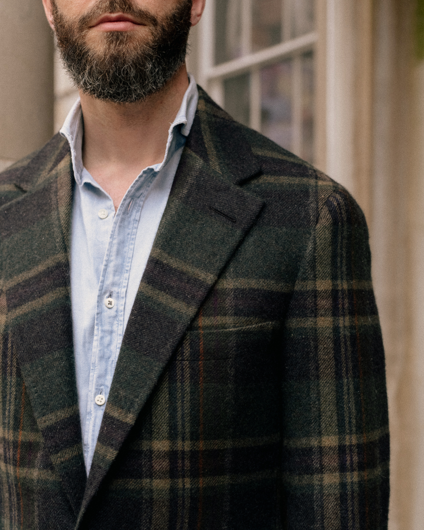
Checked jackets are always a lot of fun for tailoring discussions. Nothing makes you look harder at a fabric than working out the advantages and disadvantages of check arrangements.
The jacket above - first shown in our recent article on the new PS Plaid - is a great example.
Here’s the puzzle: given the scale of this particular check, and the scale of the gentleman wearing it, where should the checks be positioned?
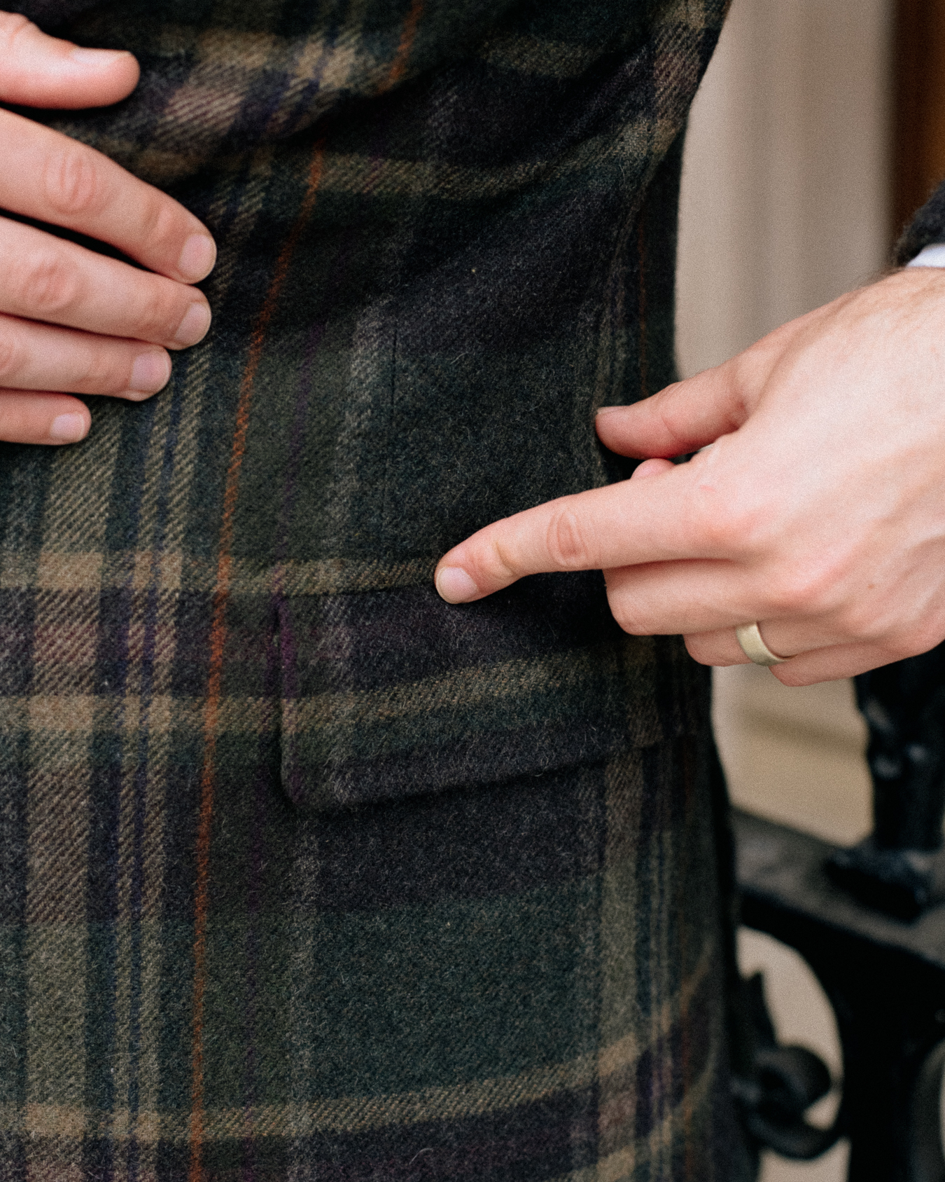
Below, you can see my jacket pattern - in white chalk - marked out on top of the cloth.
The vertical position of the pattern is not that difficult. You just generally want to avoid the main horizontal stripe of the check (a) from clashing with the hem of the jacket (b).
So you start from the bottom, and place the hem of the jacket somewhere in the middle of the check. (The only exception is if you find that this position somehow makes the check look odd as it sits across the chest and lapels - eg it runs into the gorge.)
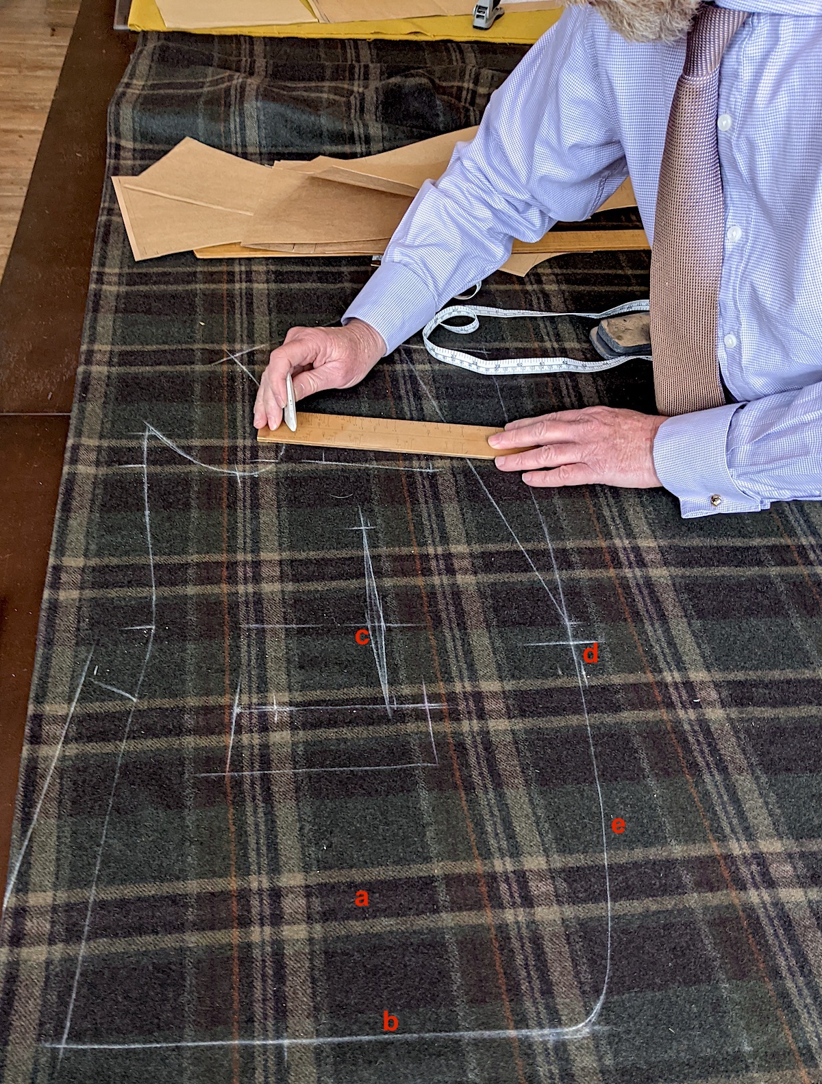
The horizontal position of the pattern is harder, and can involve some kind of compromise.
First principle: You want the dart in the waist (c) to be in between the checks, so there is minimal disruption to the pattern as it runs down the body.
That chevron on the pattern indicates where a dart will be, with the cloth being cut and pinched in, to give shape to the waist. This will necessarily distort the check, making it curve inwards. That will be less noticeable if the dart doesn’t touch any vertical lines of the check.
Second principle: You want the buttoning point of the jacket (d) to be in the middle of the checks, so they are evenly spaced across the whole front of the jacket.
When you wear the jacket, buttoned, and look front on at someone, it should ideally look as if the checks march evenly across the front, running from one side to the other. This requires the waist button to be in the middle of the check.
Third principle: Ideally the front edge of the jacket (e) below the waist button should not cut across a lines of the check. It just looks nicer that way.
You can see in the images that meeting these three principles involves a little bit of compromise.
The dart (c) isn’t in the middle of the check, but at least it doesn’t interrupt those vertical lines. The buttoning point (d) isn’t in the middle either, but not far off. Both could move a little to the left, except that you don’t want the front edge (e) to start clashing with the line just behind it.

I’m actually fairly lucky in terms of my proportions. A bigger compromise could easily have been required.
And if I was rounder or curvier - less up-and-down - more distortion would have been inevitable. You see that particularly on women’s jackets.
There are various other points of good practice as to how checks should be positioned. One, for example, is that you cut the sleeves so that they match one horizontal line of the check across the chest.
Others up and down the sleeve might not match, but you want one to, and that is the most prominent. (See top image.)
Another is that, on the back of the jacket, the checks should match the collar - so the vertical lines run up from the back onto the collar without interruption.
The two pieces of the back are therefore positioned so they are one-check-width apart at the top, where they meet the collar, and then that gap widens and narrows down the back, with the shape of the wearer.
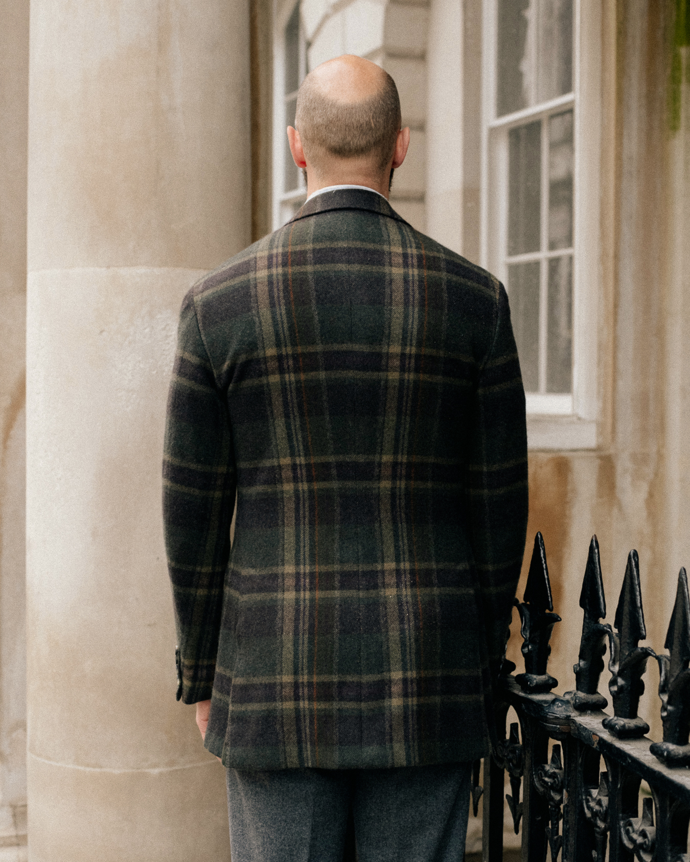
Interestingly, it is possible to reduce the distortion in the back by using lots of darts to create the required shape, rather than the centre and side seams.
This is called a Westfield back, after a company that used to operate in Bond Street many years ago, and was traditionally done more on shooting jackets (which often had prominent checks).
You can see an example below: there are seven darts in the waist and at the top of the back, with the result that the orange overcheck looks like it hardly narrows at all.
Personally, however, I quite like the hourglass-like shape of the checks on a jacket made the regular way. It’s flattering, accentuating the waist, and doesn’t look like a mistake in the way ignoring some of the other principles might do.
One last interesting, if geeky, point.
The run of the checks on the front can be interrupted by the jett on the top of the pocket. This little strip of material across the top of the flap is usually cut at a perpendicular angle to everything else, because the material is stronger in that direction.
Some tailors don’t do this on a checked jacket - keeping all the material running in the same direction - so the pattern isn’t interrupted. Anderson & Sheppard is one, and we showed an example in this previous article.
For Bob Bigg, the coatmaker that put my jacket together and works with Whitcomb & Shaftesbury, this is ‘bad tailoring’, because it makes the pocket weaker. It’s a debatable point, and in any case minor given how lightly most people use their jackets these days.
But as an alternative, Bob and cutter John McCabe (pictured top) suggested a pocket without a jett at all. This means that the cloth runs down from body into pocket flap with no interruption whatever - even from a pattern-matched jett. You can see this in the image below.
The only problem with this option is that the opening looks a little strange if you tuck the flap in, but I’m happy with that.
In fact either way, as I said, it’s a small thing with less effect than the points about the front or back. But it is a nice little detail.
There are more points to be made about the structure and cut of the jacket itself. The former is the new softer, inset-shoulder model from Whitcomb, and the latter something looser and lower than I’ve had in the past.
But both deserve more than a paragraph at the end of so technical a piece. So I’ll leave them for another day.
You can read all about the material, which is exclusive to Permanent Style - what we’re calling PS Plaid - on this previous piece. It has sold so well that Joshua Ellis have just started weaving another piece (60m) so there's plenty of stock.
That article also has all the detail on the clothes shown here.
Photography: Alex Natt @adnatt


It’s such a beautiful jacket. I thought this when I read the original PS Plaid article: the cloth looks like it really shouldn’t work but when you see the finished piece it all makes sense!
Interesting read Simon! Do the same principles apply to pattern matching on shirts with checks? Also, given the compromises involved, do you think checks for jackets (and/or shirts) should be absolutely avoided in case one’s body is far from the average proportions?
By way of suggestion, perhaps you can use capital letters when marking the photos? I had to squint to see whether it was a (c) or an (e) haha!
In general, checks on shirts are a lot easier because they’re so much smaller. With them, it’s more a case of how obsessive you want to be about the matching. Wil Whiting is a master at that, for example, but it is time consuming and so expensive.
On avoiding checks, no I think for most people the matching works OK. I think considerations like a big check making a big man look bigger, and it being potentially a showy style, are more important
Oh, and sorry, thanks for the suggestion on the lettering!
Simon
Asymmetrical checks are a minefield especially on the backs of jackets.
I have perfect example from Stephen Hitchcock and a less perfect version by another west end tailor.
Do you have any opinion on the Armoury Ring Jacket model 12 which does not have a centre back seam. Their website shows a plain fabric but they have used extreme checks in the past (I am sure there are images somewhere on Instagram) Model 12 is a more boxy design than the classic hour glass shape of your recent commission but it does solve the issue of matching checks on the back.
Interesting to hear Michael.
No, no particular view on the jacket without a centre back seam. There’s nothing wrong with them in general – and it can make checks easier. But as I said I like that effect on the back. It looks flattering but seemingly accidentally
Hi Simon, great article as almost always.
I have one irrelevant question. Can you suggest some shops for vintage leather bags, briefcases etc ? Im attending often some vintage sales and shops but from my experience you cant find so easy good quality leather stuff.
Thanx in advance
Hi Georgios,
The best I’ve found is Bentleys – covered here. They’re not cheap though.
There’s also a good stall in Grays Antiques next to Bond Street station.
S
The flapped pocket without a jett is an interesting detail. I have only seen that once before on an early 1950s American vintage suit that I own. It makes me wonder why you don’t see it more often on suits and jackets, as in many ways it looks cleaner than a jett above the flap. The only disadvantage is that you cannot tuck the flaps in as you say, which does not really matter if you are happy to have the flaps outside the pocket all the time.
I dont like the way larger checks like this create stripes on the lapel. I’ve always found it slightly jaring when the full check is not visible. For that reason this isnt a cloth i would purchase.
With you here John. My grandfather has a blanket in very similar colour/pattern on the parcel shelf of his Humber Supersnipe!!
Beautiful fabric, and a lovely jacket. I do have a question about the cut.
In the fourth photograph from the top, where there is a straight view of the back of your jacket, the checks (especially the large vertical lines with the lighter color) seem to be displaced somewhat more to the left relative to the center seam in the back. If we look at where the two major vertical lines meet at the collar, we find the left line almost outside the edge of the collar, while the right line goes right under the collar.
Is this simply an artifact of the angle at which the image was captured? Or was that a compromise that had to be made? I realize it is difficult to get things precisely aligned in every part of such a jacket.
Hi Dr Peter,
Yes, this is another check-arrangement point that we could have discussed in the article.
Basically, you have a choice as to what you consider to be the edge of the check. Here, the cutter has selected the cream line that runs vertically just to the left of the centre-back seam. You can see that this line and the start of the check on the right are equidistant from the seam.
However, because this is not a balanced check (where both left and right edges of it are the same) this means that the strongest vertical line – the wide cream line you indicate – is off centre.
There’s a compromise either way. If you put those strong vertical lines equidistant from the seam, then the thinner cream line I referred to would be almost on the seam itself. Indeed, it might well disappear in places, into the seam, which would not look great.
I think it looks better this way round, given what would happen to that thinner line, but as I said either way involves some compromise.
Excellent points. Thanks for the clarification. I agree entirely, there’s some level of compromise everywhere.
I recently picked up a large-check sports jacket (shades of grey, blue and cream) while thrifting. It was beautifully cut and the only label was a tailor’s name, so I think it was custom or semi-custom, perhaps. Every point of matching worked, but one. The only detail that was a bit off was the collar where it joined the lapel. Not only was the little bit of the check at that edge different on the left and right sides, the notch itself was slightly larger on one side! My gifted tailor recut and re-stitched one of the notches so that they were both now even, but there was nothing he could do about the mismatch in the check part. It is barely noticeable anyway since the checks, though large are a muted blue-gray. So now I have a supremely wearable tailored jacket, and all for a low purchase price of $10 plus another $10 for the tailor’s charge!
That sounds very nice Peter.
Bear in mind that with the collar, the priority is usually for the checks on the back of the neck to match those on the back of the jacket. That kind of determines where the checks will sit on the front of the collar too, as it’s all one piece obviously.
The facing could then be cut so the lapel pattern sits nicely with the collar, but with the lapel usually the priority is matching a line with the chest of the jacket. as on mine. I hope that makes sense
These technical pieces are fabulous. These guys are true artisans. The attention to detail is kind of amazing. Yes, bespoke is worth it. I remember a pithy comment posted to your Shibumi jacket review from a retired cutter who noted that the back pattern of your jacket was misaligned with the collar. “…I’m not impressed…”. That was classic.
I’ve switched to jetted pockets on all of my jackets (suit and sport coat). I know I’m supposed to like patch pockets on sport coats, but I just don’t. And the flap just seems like it gets in the way. I felt guilty the first time I ordered one in that configuration but have never looked back. One less thing to pattern match, too.
That jacket would look fantastic with cream trousers.
Cheers Craig. Presumably the jetts still have the choice of being matched or not, as covered in the piece?
Wonderful article Simon. Thanks!
Does a smaller size check make this easier or harder to do?
I suppose a patch pocket would alleviate some of the challenges matching checks at the pocket.
Usually easier, in terms of compromises. For example it means that lines such as that front edge always cut through the pattern – there’s nothing you can do about it
Does the facing check like up with the front? It seems to be a little higher than it should be, but I’m not sure. The jacket looks amazing though!
Good point. No, the facing is not lined up, so it’s not the same on the back and front of the lapel. Instead, the aim is to match up one line of the check on the front, where it runs from the lapel onto the chest. In this case, that line is the top cream line of the check that’s just above the chest pocket. That’s usually used because it’s there that the check is also made to line up with the sleeve
Ah okay, that makes sense! I suppose that depends on the shape of the lapel, so if you have more or less belly, the pattern may not line up? It’s always something I’ve wondered about, but knowing that, I like the layout!
Out of curiosity, do the fronts and backs of the lapel on a pinstripe jacket match? Only this time, on the horizontal, rather than vertical.
Thanks for doing the deep dive on the more technical points, I love seeing how the patterns are laid out and why! Please keep them up!
And the width of the lapel too, importantly. The idea is that you take that into account and position the stripe so that it does line up.
I’m not sure on pinstripe, but I would have thought so.
And no problem! Pleased you liked it
Hello. Can we match the check of the sleeve on both front chest & with back panel. As i can see in the picture it is matched. But is that accidentally or intentionally?
Good question, I’m not sure actually. I think that would be the starting point, the placement the tailor would start with. But it might not be possible, perhaps, if the customer was stooped, so the back had to be rather longer than the front.
I love how Anderson and Sheppard matches the pattern on the jettings of my pockets, as you’ve noted they do. A little detail that requires lots of extra work, but results in a more seamless look to the jacket. And a way, from across the room, to spot another A&S jacket, since almost no other tailor in the world does this.
I find that suit makers no matter what the price are often not careful on matching patterns or pinstripes. I have some rather expensive pinstripe suits made by Brioni and Kiton and the pinstripes do not line up at the top of the shoulders and the matching of the pinstripes on the lapels is hit or miss. You would think an off the rack suit which is advertised as cut by hand would have better pattern matching. Live and learn I guess.
Thank You, Nicely informative.
Love the way the back is done, with the hourglass pattern. Lovely work!
There doesn’t seem to be a perfect post to asks but you collabed with them as well… any views on PWVC X RÆBURN?
Not my cup of tea really. I have some old Rapha x Raeburn stuff, which I like, but that’s sportswear
I noticed that this jacket was cut in the more old-fashioned way without a sidebody or extended front dart. Was this done on purpose for pattern matching?
Yes it was Matt
Hi Simon,
How relevant are your considerations when it comes MTM or even RTW jackets? How much could or should one lower his expectations and standards?
John
Good question. I’m not sure to be honest, it’s a while since I’ve looked at RTW certainly. With MTM I would imagine it would be better the higher you went in quality. Where generally there’s more attention to detail
Hi Simon, so there is just one dart in the jacket? Amazing job.
Well, one on either side at the front, yes
Aren’t there two darts on each forepart, a chest dart and an underarm dart that ends at the pocket?
Sorry, yes Ian you’re right. I didn’t think through the comment above – I was just thinking about the dart we had illustrated here.
Thanks for the correction.
Very good read!
Just by curiosity, how wider is this lapel compared to your first two W&C suits?
Post on that coming soon Otavio
Any idea on how soon the post is coming, Simon? Thank you
Probably a couple of weeks. Sorry for the delay
I’m wondering about pattern matching when there are patch pockets in a Neapolitan jacket. In a Neapolitan jacket, the front dart runs all the way to the hem, going through the pocket. Therefore the pattern on a patch pocket would presumably not align with the body of cloth behind it. Do you know how this is typically addressed? I can think of a couple possible solutions: moving the dart forward so it aligns with the front edge of the pocket; or putting a dart in the pocket itself (seems unlikely to be done).
A patch pocket usually doesn’t match somewhere, because of the dart. With a Neapolitan that reaches the bottom it is a little bit harder, but usually it can be achieved OK. See my Ciardi for example