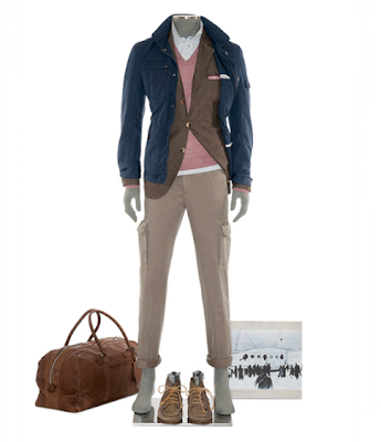
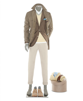
From the Brunello Cucinelli Spring/Summer 2012 catalogue: “The color palette features pastel shades with slightly grayish, faded, and mélange tones: Lily, Plum, Chamomile, Geranium, Lime, Mint, Quartz, Antarctic White, Coral, Orange, and Eucalyptus”
Permanent Style: Thank you for talking to us from Solomeo, Brunello.
I’d like to ask you about your use of colour in your collections, if I may, particularly for Spring and Summer. Your clothes frequently use pale colours for this season, and I think this is something English men are traditionally bad at wearing during the summer months, tending to extremes of pale linen and nothing else. What is the key to wearing pale colours well?
Brunello Cucinelli: I think the key is to always match a colour with something neutral. So you could wear a nice pale orange trouser, but with a mid-grey or navy jacket. Or, if the weather suits pale colours everywhere, make sure one of them is a neutral colour like a beige or a cream.
The collection is organised along these lines, and it’s not too much to say that it is the philosophy of the company to present things in this way.
PS: So these neutral colours can be both dark and light?
BC: Yes, I think the most useful and versatile ones are brown, grey and navy, but sandy colours or cream or white also work well, if the outfit can cope with such little contrast.
PS: Why do you think men have a problem with pale colours? Is it just an English thing, or do you get it in Italy as well?
BC: Men in Italy are more used to wearing colour, because of the weather. In Rome or Capri you see a lot of colour, although there is less of it in Milan, for example, or other more business-driven cities. I think the skill to wearing colour is acquired gradually in these circumstances, when you can learn from others.
PS: I suppose an alternative is looking at the various models and combinations you exhibit in your catalogues.
BC: Yes absolutely, this is a good place to start.
PS: Is there a difference between wearing strong colours and pale colours?
BC: The approach is the same, but again it depends on where you live. It is easier to wear strong colours when you live in a part of the world where the sun is bright all the time. English men, by contrast, will probably find it easier to wear pale colours.
Some colours look much better in pale variations as well, particularly orange and green.
PS: Does this philosophy regarding colour extend into any other aspects of the clothes, such as materials?
BC: You could say so, yes. Firstly, a lot of the pieces are cut so that they can go together easily. So the cargo pants are cut slim and straight, so they go well with even a tailored blazer, and the suits are a little more casual in their materials and style – we use very little structure and a narrow overlap for the double-breasted jackets, what we call a one-and-a-half jacket.
Secondly, we encourage the mixing of formal and casual materials in our outfits – a denim shirt, for example, can make a suit appear much younger and contemporary. The texture of a tie and a handkerchief is similar: we have very loose cashmere ties at the moment, and some softly patterned cotton handkerchiefs.
PS: Thank you for you advice, Brunello. I look forward to coming out to Solomeo.
















Hi, it is interesting indeed to see how the entire collection is thought through in terms of comibing various colours. Yet factoring the weather for the poor use of colours in summer outfits does not sound really convincing to me. There are very bold and fine colours in tweed fabrics for instance! Perhaps the challenge for, say, the British,would be to tame for summer dress in the city the colours of fabrics designed for the country.
John
What a beautiful palette. Fresh. Unusual. Nuanced. Not the sticky-sweet colors one usually thinks of as ‘pastel.’
(Okay…. ‘colours’ if you insist.)
Hi Simon, I think it woudn’t be a bad idea to consider writing a piece that would present in a systematic way the types of fabrics that someone who is looking for a smart jacket for Summer would need to consider. Unfortunately, we do have a poor knowledge of the available range of fabrics. I guess,there must be a rational for choosing one fabric rather than another especially in cases when fit, color and style are equaly fine with both. It would be very very helpful to many folks to sort out this issue, myself included of course!
Many thanks in advance.
John
That are some interesting ideas on colours and how to combine them. I had never thought about it that way. It is good to get it presented in words, thank you.
Great post. Indeed inspiring.
Anonymous, I think fabric is less of a problem than colour, but yes, good to know the difference between linen, hopsack, cottons etc. I have written about this before as well. Use the search function…
Simon, what’s your opinion on Brunello Cucinelli RTW blazers?
Not great value for money or cut unfortunately
Noted. Quality wise would you say Lardini and Brunello Cucinelli are same or?