
The fourth issue of L’Etiquette came out last week, and it remains the best menswear magazine in the world for me. (See previous article here for an explanation why.)
We’re honoured to be the only website permitted to translate and republish parts of it, with the aim of bringing the style to a wider, English-speaking audience.
Last time, the extract was an interview with French menswear stalwart Michel Barnes. Today, it is one of the photo shoots - focusing on the colour red.
The thing I love about L’Etiquette shoots is how practical they are. This is still fashion, and the models are still dancing around. But each outfit is shown for a reason – to make a practical point. Not just as a hanger for new-season collections.
And the philosophy is classic. Not always tailoring, but menswear classics nonetheless, often with heritage and always with a sense of everyday chic. Elegance is still the aim.
A shoot like this one demonstrates ways in which red classically works well, and prompts you to pick the ones that appeal. Whether it’s the fading of red sweats, the way white helps balance red’s strength, or how modern it can feel as an accent piece.
I don’t own a red Harrington-style jacket, a red sweatshirt, red shirt or red tennis shoes. But I do have a red cord jacket (from Connolly) and the Harrington shots make me think about how I could wear it.
The red Doeks show how good that colour can look if everything else is restrained (in that outfit, navy, white and grey). And the red sweat makes me think it might be a better choice for another sweatshirt, after navy and grey.
I’ll let the L’Etiquette team talk about the looks in their own words, though. Below they’re shown one by one, together with the commentary and listing of the clothes featured.
If you want the real thing, the magazine is available in a few newsagents, as well as online from their website here.

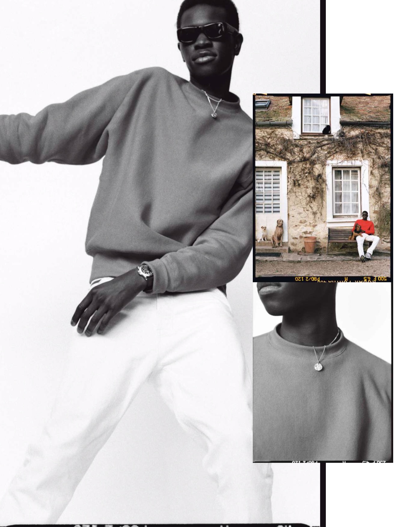
Red (the underused colour)
A red sweatshirt, a white five-pocket (let's say it one last time: we don't say ‘white jeans’, because jeans are necessarily in denim), a slightly protruding striped top and a pair of New Balance ... Simplicity is always rewarded. Especially when it’s well accessorized.
This sweatshirt is reverse weave. Specifically, the fleece is turned vertically, rather than horizontally, during production. This ensures that it doesn't lose length during washing.
Too technical? How about an anecdote instead: the reverse-weave technique was invented in the 1940s by Champion, at the request of coaches complaining about the shrinking of their athletes' sweatshirts.
Did you notice that the 990v5 are stripped of their logo? Pure playfulness.
Sweatshirt, CAMBER at BEIGE HABILLEUR. Marinière, LE MINOR. Trousers, DRAKE’S. Shoes, NEW BALANCE. Glasses, JACQUES MARIE MAGE at BEIGE HABILLEUR. Watch, ROLEX. Chain, TIFFANY & CO. Bracelet and chain with medallion, ALIGHIERI.
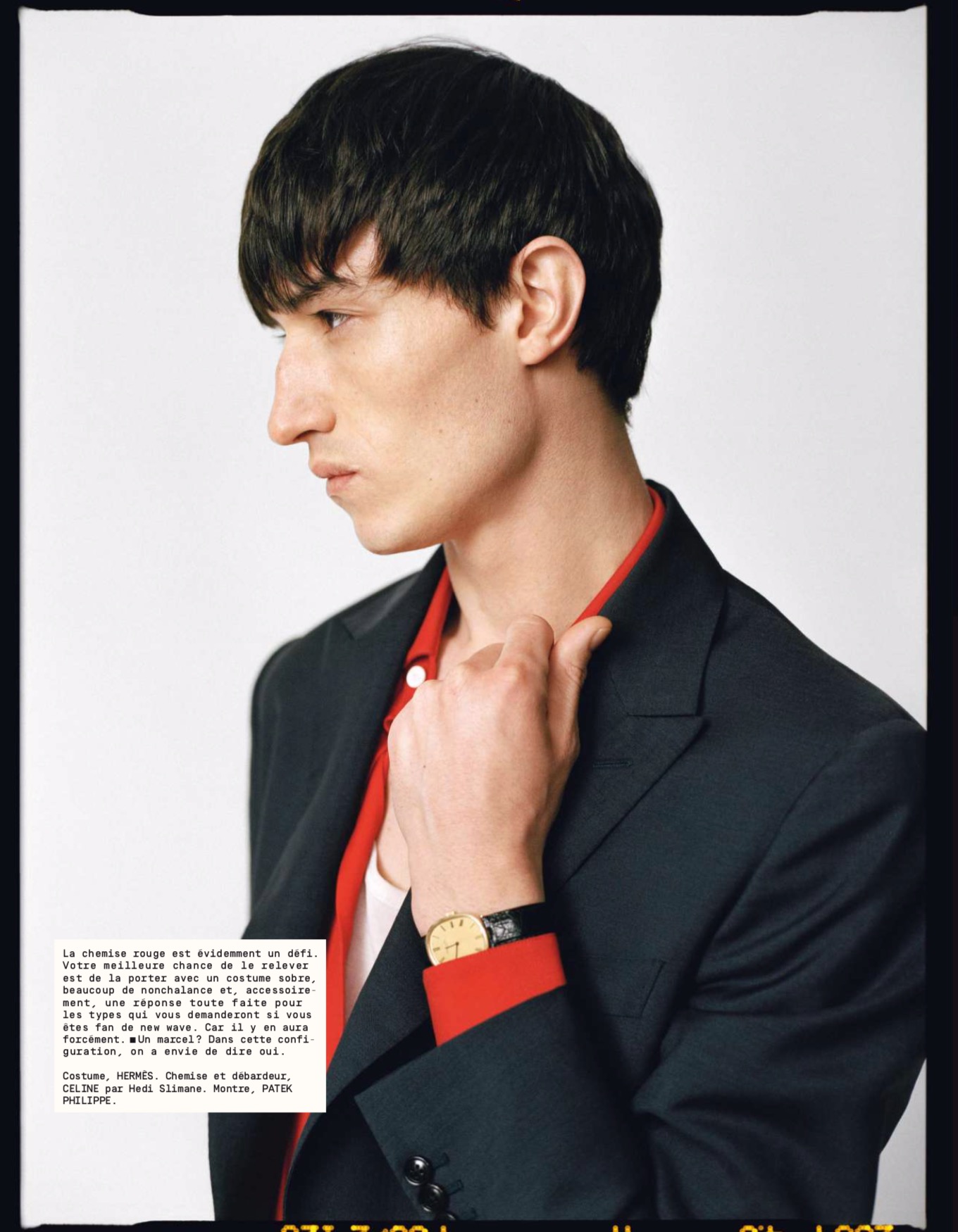
A red shirt is obviously a challenge. Your best chance to meet it is to wear it with a sober suit, a lot of nonchalance and, incidentally, a ready answer for the guys who will ask you if you are a fan of New Wave. Because they will.
And a vest? In this combination, we want to say yes.
Suit, HERMÈS. Shirt and vest, CELINE by Hedi Slimane. Watch, PATEK PHILIPPE.
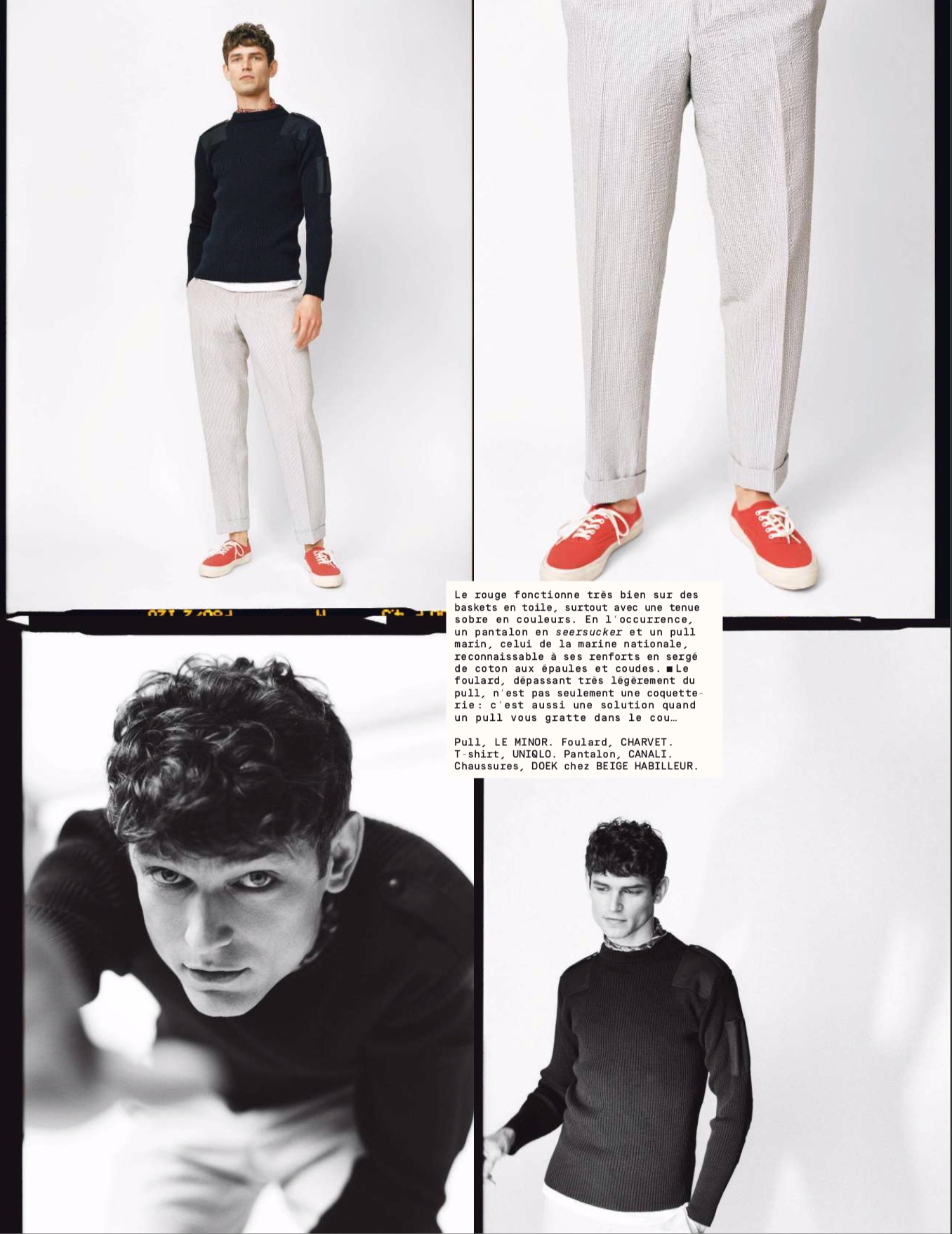
Red works very well on canvas trainers, especially with a sober outfit. In this case, seersucker pants and a navy sweater, that of the French Navy – recognisable by its cotton twill reinforcements on the shoulders and elbows.
The scarf, which protrudes slightly from the sweater, is not only playful: it is also a solution for the sweater scratching your neck...
Sweater, LE MINOR. Scarf, CHARVET. T-shirt, UNIQLO. Trousers, CANALI. Shoes, DOEK at BEIGE HABILLEUR.
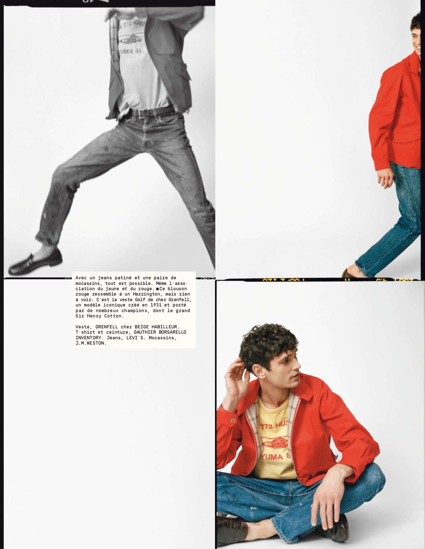
With patinated jeans and a pair of moccasins, anything is possible. Even the combination of yellow and red.
This red jacket looks like a Harrington, but has nothing to do with it. This is the Grenfell Golf jacket, an iconic model created in 1931 and worn by many champions, including the great Sir Henry Cotton.
Jacket, GRENFELL at BEIGE HABILLEUR. T-shirt and belt, GAUTHIER BORSARELLO INVENTORY. Jeans, LEVI’S. Moccasins, J.M.WESTON.
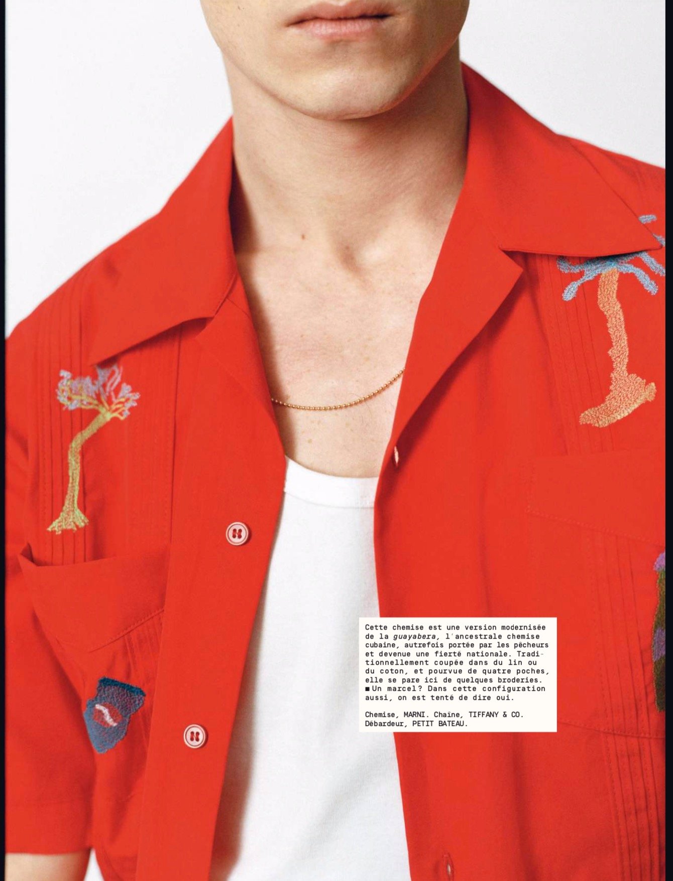
This shirt is a modernised version of the guayabera, the ancient Cuban shirt, once worn by fishermen and now a national icon. Traditionally made in flax or cotton, and with four pockets, it is adorned here with embroidery.
The vest? In this combination too, we are tempted to say yes. Shirt, MARNI. Chain, TIFFANY & CO. Tank top, PETIT BATEAU.
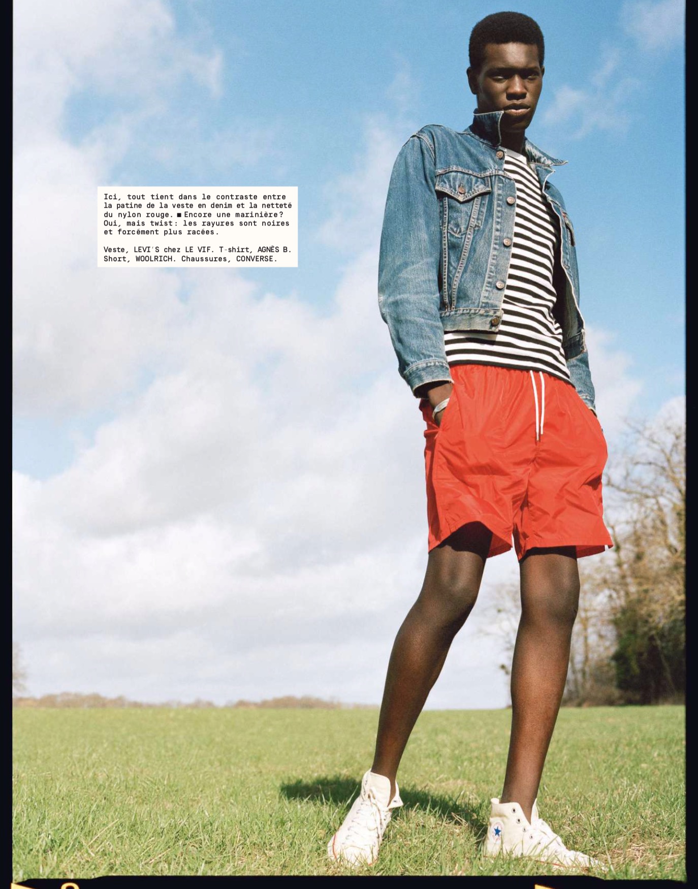
Here, it’s all about the contrast between the patina of the denim jacket and the sharpness of the red nylon. But with a twist: the stripes are black and therefore more elegant.
Jacket, LEVI’S at LE VIF. T-shirt, AGNÈS B. Short, WOOLRICH. Shoes, CONVERSE.
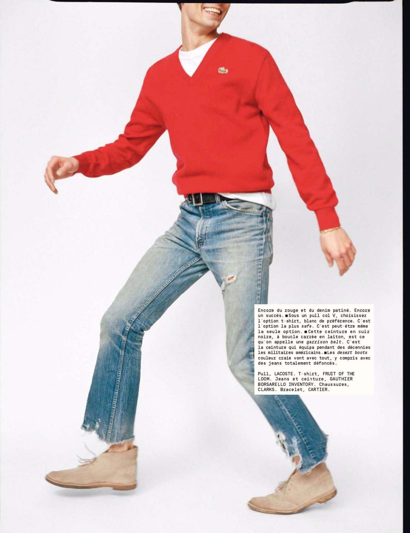
More red and vintage denim. Another success. Under a V-neck sweater, choose a T-shirt, preferably white. This is the safest option. It may be the only option.
The black leather belt, with its square brass buckle, is what’s known as a garrison belt. It’s the belt that has equipped the American military for decades. The chalk-coloured desert boots go with everything, including completely ripped jeans.
Sweater, LACOSTE. T-shirt, FRUIT OF THE LOOM. Jeans and belt, GAUTHIER BORSARELLO INVENTORY. Shoes, CLARKS. Bracelet, CARTIER.
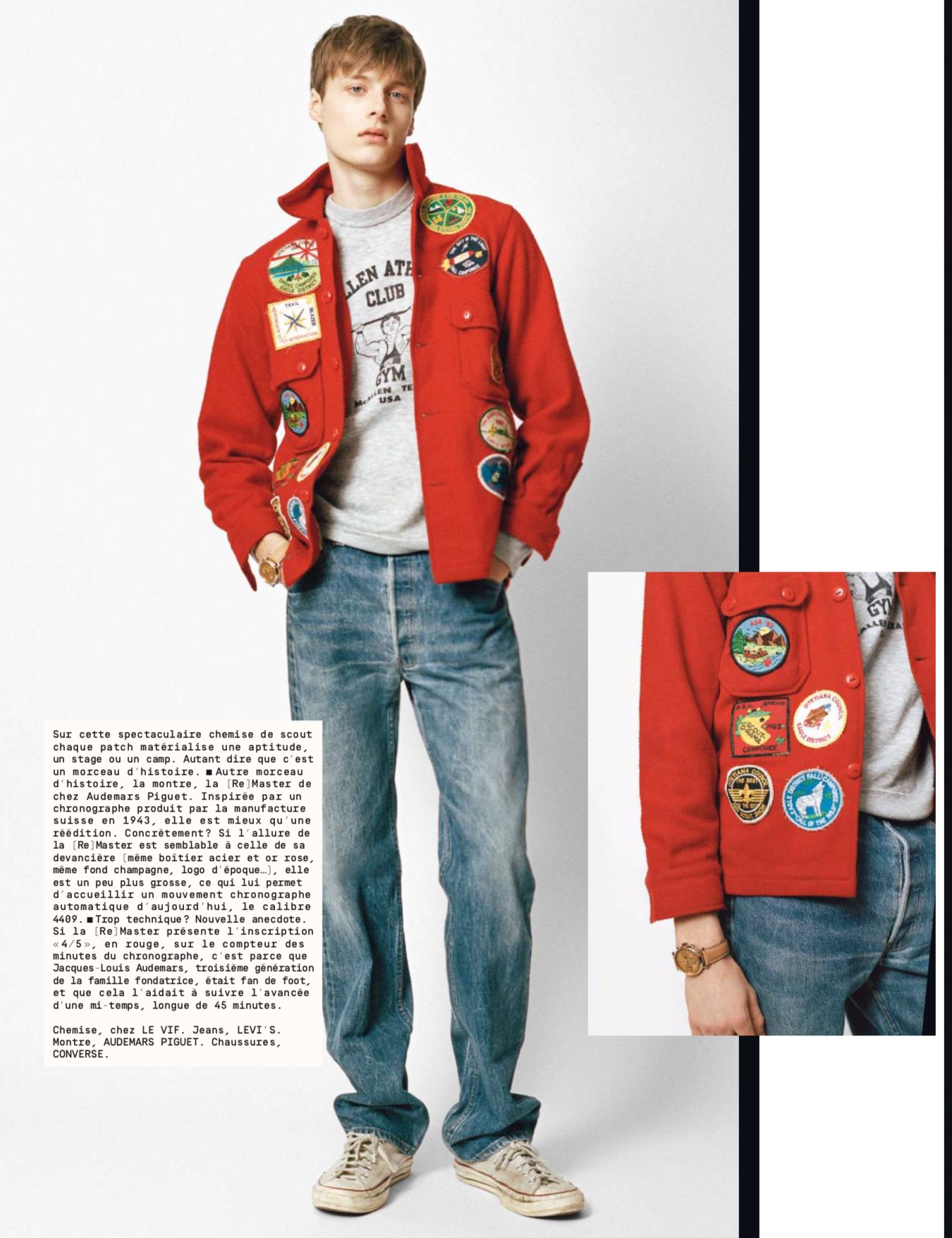
On this spectacular Scout shirt each patch represents a skill, an internship or a camp. Suffice it to say that this is a piece of history.
Another piece of history, the watch, is the [Re]Master from Audemars Piguet. Inspired by a chronograph produced by the Swiss manufacturer in 1943, it is better than a reissue.
To be specific, while the look of the [Re]Master is similar to that of its predecessor (same steel and pink gold case, same champagne background, vintage logo...), it is a little larger, which allows it to contain today’s automatic chronograph movement, caliber 4409.
Too technical again? New anecdote. If the [Re]Master has the inscription “4/5”, in red, on the chronograph minutes counter, it is because Jacques-Louis Audemars, third generation of the founding family, was a fan of football, and that helped him follow the advance of half-time, which is 45 minutes long.
Shirt, at LE VIF. Jeans, LEVI’S. Watch, AUDEMARS PIGUET. Shoes, CONVERSE.
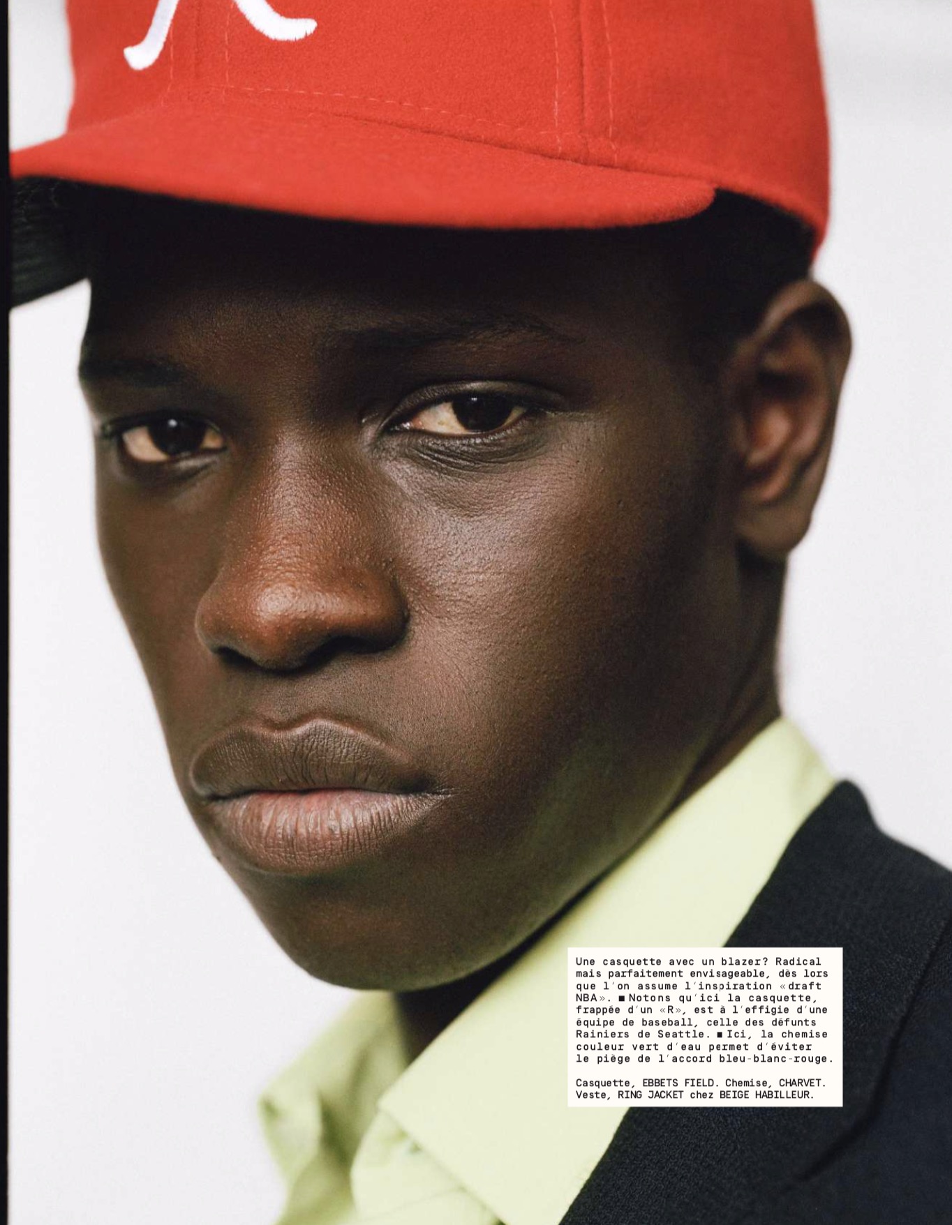
A cap with a blazer? Radical but perfectly possible, as soon as we have the inspiration of the NBA draft. Note that the cap, with its ‘R’, is in the image of a baseball team, the deceased Seattle Rainiers.
The water-green shirt avoids the trap of everything being blue, white and red.
Cap, EBBETS FIELD. Shirt, CHARVET. Jacket, RING JACKET at BEIGE HABILLEUR.


I don’t own a single item of clothing in red for one simple reason: whenever red works, orange works so much better. It pops a bit more, and it goes nicely with the kind of colours most men wear on a daily basis (navy, grey, olive green, beige and brown). Just my opinion, of course.
Nice point Andreas.
I find orange is nicer with warmer colours like browns, greens, beige. But red is better with grey, white, navy
I think orange is a visually better and more versatile color with tailored clothing – red doesn’t blend as well – but for casual outfits with streetwear and faded denim red is a better choice. None of the outfits in the magazine spread would be at all improved by orange; red in these contexts can be bold and soft at the same time, creating a vintage look that stands out without looking overworked.
Hey Simon,
I used to wear a red shirt with black pants back in the day. While I still think white and black “tames” a bright red, these days I think it should be worn only in accessories as an accent colour. At least for those of us living in the northern regions. In Southern Europe it would perhaps be different. I think also, with my complexion (similar to yours) too much red isnt flattering. Would you agree?
Yes I do. For me it either has to be a soft red (as the sweatshirt would be – very different to a shirt or the nylon shorts here) or it has to be an accent. Like the tennis shoes
Would you say this goes for burgundy and cherry red as well?
I think of cherry red as being this bright red, so yes. Let me know if that’s not what you meant.
Burgundy is much more versatile as it’s darker and deeper. It can be nice as socks or knitwear under a suit, as well as a tie or handkerchief. But I tend to find it nicer with navy that grey, and wear dark green more often.
After the standard grey and brown, burgundy and dark green are often presented as good secondary colours in formal menswear, yet I struggle far more with burgundy than green for some reason. Perhaps it’s because green is nicer with dark-brown shoes as well.
Hi Simon, it’s all in the shade I think. I have fair colouring so fire engine red is a little harsh but I have a v neck which is more of a winter red and is a favourite. Agree on the canvas sneakers. With a pair of Jeans and a white shirt it’s the bees knees. Just to add I’m to go back to work next week and your magazine together with some great style books including those by David Coggins and Jamie Ferguson have been a fabulous diversion over the last 2 or 3 months.
Daniel
Oh good. I’m sure David and Jamie would join me in saying what a pleasure that is
Thank you for your continued excellent posts.
Interesting article. In the Northeastern United States, Nantucket red is a commonly worn color for summer. It goes well with white and blue.
Simon, what are your thoughts on the brighter reds seen in this article versus more muted reds, such as Nantucket red or, perhaps maroon as a fall/winter equivalent?
I’m not a big fan of maroon personally, but softer more faded reds are great and definitely easier to wear. Like Nantucket reds or faded sweats. Basically, washed and worn cottons
That does look like a pretty good mag, especially comapred to the mass market fashion stuff which is frankly ludicrous.
Bright red rocks, like those available from Mes Chaussettes Rouge, are a personal favorite and provide a great bit of contrast.
Goodness, that Grenfell jacket almost made me start liking the shade it’s in. And the outfit with the red Doeks is just lusciously subtle.
From (fairly limited) experience, I find red hues work best as mixtures with other primary or secondary colours. My personal favorites are some of the many shades that occupy the gap between red and blue, such as wine and burgundy. Lovely pairings with navy and pale or mid-grey clothing, plus they usually work with both black and brown leather.
How has everyone else found these shades during their own experiments? Do they work for you, or not so much?
Hey Joseph.
My thoughts on burgundy, if you’re interested, in the comment thread above.
I think dark reds like burgundy are very different to the bright red being discussed in the piece. The former is a menswear staple, the latter rather hard to wear in smart clothes without looking cheap I find – and easier in more casual pieces like those pictured.
Ah, yes. Excellent point in that other comment, I do find myself picking green over burgundy perhaps 60% of the time and it’s nearly always because of shoes. It’s a marginal difference for me though, as I’m all too fond of wearing a pair of burgundy shorts with brown slip-ons and a navy or pale grey polo. (Sounds strange, I know, but the combination was a pleasant accidental discovery.)
And I had meant the phrase “mixtures with other primary or secondary colours” to refer to dark reds and other variants of the colour red, apologies for the confusing wording.
Thanks for clarifying Joseph
I agree with the comment on the Doek’s photo. It struck me immediately as inspired by Cary Grant’s costume in To Catch a Thief. I think he used espadrilles, though. This update kept the elegance yet modernized it well.
Menswear seems to be converging on red these days! Bryceland’s just released their sawtooth western shirt in a strong shade of red as well. Could fit nicely with some of the sentiments expressed in the article.
It is nice to finally read some what L’E has to say. Thank you for posting.
I think bright red might work well as a summer colour. White shorts with a red polo for example.
In my younger days I had a far bit of red in my beard and hair and wore red often. It worked with my colouring.
Now my (sparse) hair and beard are grey and I find bright shades of red make me look washed out. Darker shades, like burgundy, can look good but it’s hard to get the right shade.
Hi Simon, Thanks for translating this. Personally, I rarely wear any colors outside navy, and variations on, brown grey, and white. I like this rather spartan color structure and find that it inspires me to get creative with material, texture and subtle shifts in hue. The only real exception I make is red. As an example I have a red cashmere sweater that, because of the softness inherent in the material and weave, is not too loud or showy, just enough of a pop to go well with cream or soft grey trousers. Nice to see some more examples of red in elegant menswear.
Before I learned the importance of versatility, I bought a pair of red loafers. After I learned the importance of versatility, I had no idea what to do with them. Now I do. Thanks.
I bought a copy yesterday as this issue covers a very weighty topic; how you wear swimming trunks. Timely, given summer is around the corner.
This is just teenage fashion.
Nothing wrong with that – I’m a huge supporter of youth.
That said, it’s certainly not what I’d perceive as ‘PS’.
Anybody over 18 wearing this stuff would look ridiculous !
I respectfully disagree Jason. There are many ways these kinds of colours and proportions can be worn by older men. Just don’t copy wholesale. Pick and choose.
I’ll let you go first !
I already wear it Jason.
On Instagram recently you would have seen me wearing a red sweatshirt from Clutch Cafe. And I mentioned I have and wear a rather nifty red-cord summer jacket from Connolly
Red is not an underused colour for me as it’s my wife’s favourite. I have lots of red garments (in various shades) in my wardrobe and chests of drawers. They include five polo shirts, two t-shirts, a rugby shirt, cotton and wool jumpers, swim shorts and tailored shorts. They were purchased from the likes of John Smedley, Drake’s, Cordings, Oliver Brown, Sunspel, Ralph Lauren, Charles Tyrwhitt, Uniqlo and good old M&S. Bright red is only suitable for sunny days with clear blue skies but it can look spectacular.
Perhaps it’s because green is nicer with dark-brown shoes as well.
Hi Simon,
Just wondering, have you tried Grenfell outerwear and what’s your take on it? Given its heritage and manufacturing ethics I am surprised not having read anything about it on PS. Unless I missed something.
Thanks
No you’re right, we haven’t covered it much, but it’s also not available that widely in the UK.
I have tried the pieces, and they’re well made with an attractive mix of traditional styles with modern updates.
Hi Simon
I’ve been wearing a pair of red canvas Converse regularly throughout lockdown for my daily exercise in the park. Winter’s mud, rain, scuffs and nicks have really softened the colour so, although still unmistakably red, they are now muted and almost subtle.
Sounds lovely Daniel
What about a burgundy pant?
Not an easy one to wear well, Varun. Certainly different from the way red is done here