

On Monday my latest column for How to Spend It was published, in which I talked to Jean-Claude Colban (above) of Charvet in Paris about the state of the cotton and silk industries – and his project to create the perfect white shirting. Below is the full interview, which I’m sure readers will appreciate more than the HTSI audience.
What is changing at the moment in terms of the way you produce your materials?
Colours are an interesting subject. The world’s colours, particularly for silks, are becoming both more standardised and more ‘solid’. This is the technical term for colours that are more resistant to light, humidity, sweat and so on. It is judged by standardised tests, and certain dying techniques and shades are known to be more solid.
Dyers call it progress. Certainly it is in demand in certain markets. But it narrows the range of colours that are easily available. This season, for example, I used as a reference a colour from our records in 1939 – a bluish-green. I gave a swatch of it to a dyer, and he came back with four shades, none of which were close. Expressing my surprise and disappointment, I tried to push one of his buttons – his sense of pride. He came back with two more, one supposedly his best attempt but still a ‘solid’ colour, and the other closer but less solid. I had to push another button – calling his father. This time we got the exact right colour, with no more discussion about solidity.
Is it caused by cost-saving, ignorance or something else?
Often, it is just an excuse. It is easier to work with a small range of colours. There is a growing lack of knowledge, about colour in particular but textiles in general, that leads to people trying to get away with easy solutions. It is very concerning.
Do you think customers can tell the difference?
I think Catherine Deneuve, the actress, said ‘I can distinguish even between two green peas’. And this is true of more than just Catherine Deneuve. But you need to see the two peas alongside each other, otherwise many will not notice.
The colour difference is particularly important because many weaving techniques are based on subtly different shades. We are known for what some journalists call the use of a ‘hidden colour’, which is a decent approximation for something I never explained very clearly. The fact is we use shade differences between warp and weft to create certain effects, and having to choose from a standardised palette is a problem. Luxury is also a matter of choice of colour.
Does it matter how natural the colours are?
Absolutely: colours were produced until around 300 years ago entirely with natural dyes. In some parts of the world, such as India and Syria, it was done with natural dyes until maybe 20 years ago. There was a famous silk dyer in Aleppo, a blind man, who knew the perfect shades just by the smell. It’s true – it’s a documented story. Now this kind of knowledge has unfortunately gone.
I am myself very fond of natural dye because I think anything that is a shade from nature is pleasing to the eye. This is an idea that has been developed by people much more knowledgeable than I. They say, for instance, that the artificial colours of soccer players create a significant amount of aggression, whether willingly or unwillingly.
There is an endless capacity for nuance with natural dye. Over the course history, we have generally always begun with natural dyes and then reproduced them will artificial or chemical processes.
Are there any advantages to artificial, solid colours, other than the obvious resistance to sweat etc?
The colours are easier to reproduce. The process is more consistent, at least in theory.
Is consistency a big problem with dyers today?
Oh yes. In fact I would say that the item that has the highest degree of sophistication and luxury, particularly in shirting, is a plain, piece-dyed fabric. Because the plainer the fabric, the most noticeable every defect is.
If you want to weave a jacquard solid for a tie, it used to be very simple. Now, with dying the way it is, you often mix together six shuttles of supposedly the same colour, just to average out the differences.
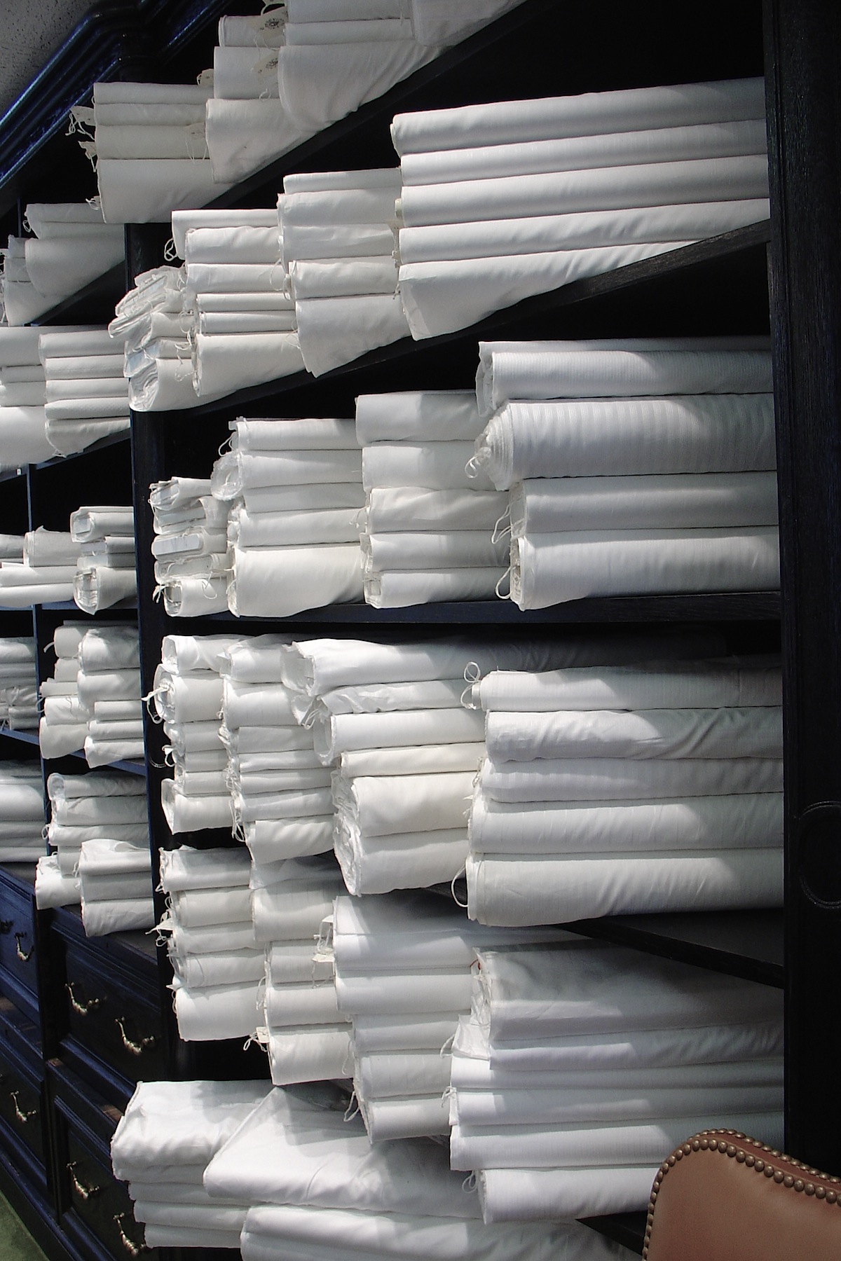
In fact, now that you understand that, you might understand that the thing we are most proud of, that we have developed recently, is our programme of solid white shirts. White shirts might be seen as an obvious thing, something plain that can be taken for granted. But that is precisely why they cannot be. The simplicity is revealing – it shows all defects.
White has aspects of candour, of honesty, and this is one thing we pay a lot of attention to.
When did the project begin?
It was two years ago. We first identified the first cotton to use – which was not obvious, because it’s not just a question of the length of the staple, but also the shine it will produce in the cotton. It also had to be consistent production that we could secure for ourselves.
Then we went into the best weave. This isn’t simple, particularly for poplin where people make lots of assumptions about warp and weft count, number of picks and so on. So we did a few things our own way – I hope you’ll excuse me for being a little reserved on what they were.
Then you get onto finishing, which is very important with cotton fabrics. As I’m sure you know, there is a tendency to use finer and finer yarn and weave it faster and faster, which produces a fabric which is extremely harsh. The solution, then, is to soften it – often with silicone. As the silicone-haters that we are, we developed our own natural finishing for it.
Which bit was the most fun?
Probably the next stage, selecting the colour. Bluish whites were in fashion for a long time; yellowish whites have a very limited Middle Eastern market; pink whites have been trending very strongly for the past five years; in the end, we went with a slightly purplish white.
And I wouldn’t notice the difference between any of them – unless they were alongside each other.
Indeed. If you notice the colour, there’s a problem.
The final fabric is available in poplin, oxford and panama, pinpoint and two twills. All at our entry-level price point for shirts. It’s a nice little collection and it was a very fun process. More than that, I think it proves something about what we can do. If you can’t produce a great white fabric, then what’s the point?
Do you think it’s important for people to understand a process like this?
Yes, because there is a shocking gap in the perception of cotton quality at the moment. People know that two-fold fabrics are better than single-fold, and they know to look for a higher thread count. But beyond that they know nothing. And the problem with high thread counts is that while the yarn will be extremely fine, it is not resistant, it is sheer and it can break. If you point to that man and say ‘The King has no clothes’, his response is, ‘But it’s a 300 two-ply’. That’s all. It’s the same as fine suitings or high gauges on knitwear.
In the end, people have to put their faith in us. And we have to strive to live up to that faith. I remember when we decided to test every single piece of cloth that was sent to us, for example. No one else was doing it and it was painful, but it was the only way we could guarantee consistency.
In the end, the value of a brand is nothing more than the trust you can put in it.


