

A few weeks a reader asked for a post on what makes a tie more or less formal, smart or not.
It’s a very relevant question. Few men today wear ties, but when they do, they rarely want them to be as smart as the traditional foulards and Macclesfield weaves. Understanding how to dress down a tie (or, for the right occasion, up) is important.
The four elements
The elements that make a tie more or less formal are very similar to those that affect suits, shoes or handkerchiefs. Brighter colours and bolder patterns are less smart; smooth texture and dark tones are more.
Just like a strongly patterned, woollen jacket is less formal than a plain suit in smooth worsted, so a cashmere tie with a big club stripe is less formal than a navy repp.
The four dominant elements here are: tone, colour, texture and pattern. Of these, texture is often the most important in a tie – partly because it is the most subtle and easy to miss.
In the image at the top of this post, I have shown five ties that have greater texture from left to right. They are: printed silk, woven silk, grenadine, tussah and knitted silk.
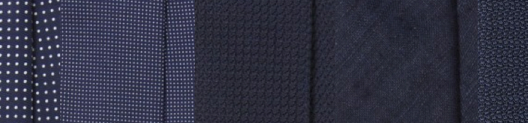
All things being even, they would therefore go from more to less formal, left to right.
The first two have a pattern, however, which sets them apart, and are slightly different shades of blue. The printed silk (left) has a slightly larger pattern (less formal) but is a darker shade of blue (more formal).
The difference between these two is tiny, but the important thing to realise is that all three things – texture, pattern, colour – make a difference as well as texture.
If there were to be an order to the different textures, it would look something like:
- Satin
- Printed silk
- Woven silk
- Grenadine
- Tussah
- Knitted silk
- Most wools and linens
- Shantung
[I am mixing up different terms for the sake of clarity and brevity. Some of these are also weaves, of course, and I’m omitting types of weave as well as types of grenadine.]
You could argue about the list, but it’s essentially an objective judgment of the same thing: how textured, how smooth or not, is the material? This is largely important because it affects the way light is absorbed or reflected.
Formality in diagrammatic form
Below is a diagram showing pattern together with the three other elements – tone, colour, texture and pattern – that should be considered.
Again, there are things we’re leaving out here, such as finishes on the silk or wool/cotton, but the same principles generally apply.
An important point on pattern is that it matters both how big it is, and how fancy. So a club stripe is a large, dominant pattern; but it’s simplicity makes it relatively formal. A paisley, on the other hand, is usually quite informal even at a lower scale.
Deciding whether two ties with widely different readings on these scales is largely pointless. Is a (muted) pink tie with a large (but simple) pattern smarter than a (strong) blue tie with a (small) fancy pattern? It doesn’t really matter.
The important thing is that if you want to know which tie to wear to a formal event and which informal, you have four elements to consider.
A satin tie is often great for an evening event because of its sheen (but is smarter in navy than in yellow). A grenadine, in navy or black, is perhaps the most versatile of all ties because its texture sits in the middle of the spectrum.
Reader (I think you were anonymous) I hope that helps.
All ties from Drakes


I think you’ve demonstrated quite well , by the many parameters, the difficulty choosing the right tie can be.
I find this particularly diffcult when most of us have for example a Tweed suit but a a collection of ties all brought to match against worsted suits.
What about brands like Boglioli , that try to bridge the gap between formal and informal. Is it a case of only a knitted tie ?
Knitted, or wools, or matte effects like madder…
Simon,
Which manufacturers do you recommend tie wise? And is there a big difference in quality between the “best” and the more common Duchamp type ones (as perennially seen on tv presenters)?
Thanks,
Ivor
Not a big difference no… You need a slip stitch and dye and discharge printing is nice but that’s it
Are these ties part of your collection? 🙂
No, though I do have most of them
I will definitely use that “chart” as a cheat sheet. I have been trying to pick a tie for my wedding recently and trying to find one it the right shade, but thathas some texture that’s not too informal for a groom, but not so smooth and formal that it is not really for me. (Or without trying to look like I have bought a wedding tie and pocket square set from the high street)
You have helped me shot list this:- http://www.drakes.com/online-shop/ties/classic/untipped-silk-tussah-8cm-tie-3413
Nice. I’d go further down the tone chart – paler, less colour – for a wedding but that’s just me
Unfortunately someone decided years ago that it is a good idea to let brides chose a colour and a theme which everyone else has to work with… !
Ah well. Never used to happen back in the day.
You should be sharp, serious and monotone. Colour in the boutonniere at most (but small!)
1. I assume tone refers to the shade e.g. light blue vs dark blue
2. What is the difference between a foulard tie and a Macclesfield or Spitalfields tie
Many thanks
1. Yep
2. A foulard is typically a printed silk. The other two are wovens
A nice guide.
I have a fairly simple tie collection and tend to wear sport coats most of the time at work.
I consider a suit a relatively formal garment and usually choose a relatively formal tie.
With sport coats my ties are more patterned (if the coat doesn’t feature a lot of pattern) or a single colour tie in a less formal texture (i.e. knitted) if the sport coat features a strong pattern.
Adam, not sure how formal your wedding is but the tussah silk option looks rather casual to me. Drakes make a lovely grenadine in that color, which I think will look a lot smarter without being too shiny: http://www.drakes.com/online-shop/ties/classic/handrolled-woven-large-knot-grenadine-solid-8cm-silk-tie
Thank you. I have also seen that one. It was originally first choice but when we looked at the colours in the shop it wasn’t quite right (brides eh?) but a bespoke option might actually be the solution. It’s not particularly formal.
Very good article; little to argue with.
Hi Simon, can you comment on the formality of various tipping styles (self-tipped, untipped, etc.)? I work in a formal business environment, and would assume that untipped ties are more casual.
They are, as generally are lightweight linings, but they’re relatively small things compared to what’s discussed above
What exactly do you mean by formal? Properly formal daywear – such as a morning suit – generally demands a light coloured tie. See e.g. http://www.thegentlemansjournal.com/the-best-dressed-royals-at-royal-ascot/. Formal evening wear of course demands a bow tie (textured white being the most formal). Plain black ties are worn by gangsters.
Formality is a scale, not an absolute. It is similar to smartness, but that’s a broader, vaguer term. Formality implies far more consideration of the place and occasion
Formal daywear is not what we are talking about here
Nice guide Simon, the four elements is a beautiful way to explain this. In terms of pattern for a necktie formal to informal; plain, spotted, foulard, striped, checked, paisley, large patterns etc. but I have a question; why is it that in many circumstances a foulard looks more compatible with a formal suit than say a plain tie? Is this purely a European taste (as Obama/US businessmen nearly always wears plain colours). Is it that plain ties often look ather dull against a formal worsted background. Would you add style as the fifth element – I ask as spotted ties were popular in the 80’s – less so now vs. plain & foulard- so though more formal less fashionable.
It’s a good point. Small, discrete spots or geometric patterns can sometimes look more formal than plains. But it’s often the fact that such small patterns are printed silks – the most formal end of my texture spectrum.
Style would eg far too vague a term for a fifth element. If I would add anything, it would be a sense of tradition – ie places or occasions where certainties are traditionally worn. But again, it’s a separate question as to how smart or formal a tie is, which is what we’re addressing here
Good article simon
I do wonder, though, where a man should look if he doesnt want to spend £100 on a tie? Drakes, Hermes and the such are lovely but where would you go if you wanted to spend less than that, but better than a natty CT number?
Have you tried online shops such as Viola Milano and Shibumi? I can recommend both
VM have added a number of “true” 7-folds over the last few days (the forest green one is particularly fine for formal business-wear). Shibumi also have a small number of formal “truel 7-folds, although also intriguingly at the other end of the spectrum, a 7-fold shantung grenadine…..
This post gave me the very satisfying sense that as a regular PS reader, somehow I have learned this already. I love these parameters of formality. Are they all equal? My sense is that colour and pattern are baseline parameters that directly respond to occasion and setting, whereas tone and texture are, in a way, secondary variations that allow for some dandification. The latter two are are less easily picked up by the uninitiated (knit ties apart perhaps, but they also have an unusual shape).
Good point Richard, yes I’d say those are slightly more important, but the others are easily ignored and shouldn’t be.
Pleased the PS academy is working…
PS academy! … There is the next books title!
Hi Simon,
Thank you so much for this very very useful post! I think I was among those who wished such a post. Expectedly, this will help me to overhaul my tiny collection of ties! I’ve already read this post three times, and it’s still not enough! I Wonder whether it’s not entirely premised on an understanding of occasion and time that has remained implicit in your explaination. Hence for all those, like myself, who still struggle to grasp the inner logic of this post, perhaps really worth considering would be then one, hopefully in the near future, dedicaded to that damn notion of occasion, whose sense according to Bruce Boyer has been indeed lost.
Last but not least, relying exclusively on their looks, how would you scale up the 5 ties displayed in The Merchant Fox’ ad?
Thanks again for this post, Simon! The journey continues!
John
Tom
Have a look at Michelsons website. Their ties are stupidly cheap for the quality.
Personally, I just open the wardrobe. Grab a tie. Put on. Swap for another if necessary. Charts are for trainspotters! X
Hi Simon,
Eventually, I do realize that one part of my previous comment or rather question (about scaling the ties in the ad) was squarely irrelevant, for “deciding whether two ties with widely different readings on these scales is largely pointless”!!!
While rereading your post it dawned on me that I happen to have a vintage woven silk tie (with a light blue as background and dark navy small geometric patterns) made by Pierre Cardin (Modèle deposé) , which surprisingly enough I have never ever worn with brown shoes, and yet with no rule or whatever other than merely esthetic reason in mind. Hence this new question: the case of satin ties aside, I guess, is there any relation between smartness of ties and shoes color? It’s a bit off topic, but I hope it could make sense in this context that sounds to me highly analytical!
John
Only in the way that they are all linked through formality John. And perhaps the colour and tone are particularly relevant when considering the colour of other things you are wearing.
Specific I know but what about a plain navy repp tie, with hand-rolled edges, with a grey herringbone tweed sportscoat?
Sounds fine. If anything the tie risks being too smart for the jacket, but it depends on the smartness of the jacket (affected by, as with the tie, similar things like colour, size of herringbone, finish on the wool etc)
For what it’s worth…
http://www.drakes.com/media/catalog/product/cache/1/image/1000x/9df78eab33525d08d6e5fb8d27136e95/f/r/freh.15335.001_m_1.jpg
http://www.drakes.com/media/catalog/product/cache/1/image/1000x/9df78eab33525d08d6e5fb8d27136e95/j/c/jckt.be257.001_m_1.jpg
Both current season Drake’s. I think I quite like the contrast.
Should be fine. The jacket is darker than it could be, which is nice, but the slightly rougher wool and patch pockets etc make it rather casual.
I would include width and shape as well.
A 7cm tie looks more informal than a 8.5cm tie.
And a straight shape 8cm tie looks more informal than a half bottle 8cm tie.
Though everything is related somehow. You would not make a foulard tie in 6cm width, or a knitted cotton tie in 9cm. Just as you would not wear a 9cm tie with a less formal slim suit.
Hi Simon
Another great article, anything with a diagram is a winner for me! I love ties they seem to be the one areas of menswear that allows the wearer to demonstrate some personality, without enduring office wide ridicule! The problem I find is that my tie collection is never big enough, plain and patterned/printed ties in several colours in 3 or 4 textures ends up as a pretty big number. While Drakes have done and continue to do some great business from me, I do wonder if you could do an article on the 5 or 10 most useful ties? I know you are a big fan of the navy grenadine and as the owner of a finca, a grossa and a donegal style grossa I agree, but how can I avoid owning 50+ ties?
Best
Rob
I’m somewhat surprised that you place most wool ties so low down on the list, particularly given your fairly recent outing of the green wool tie from Shibumi
What jacket fabrics can you actually wear shantung with? I have two Drakes shantung ties which both look great, i’d argue fairly summery, but never found anything to wear them with. I had thought they’d be a good match with my ill fated hopsack jacket but as per my previous comments that turned out more formal (smoother/slightly shiny) than I wanted so not a good match to the informality of the tie. I am not convinced the textures work with my 9oz linen and there are season/weight issues with my 16oz tweed
Hey Simon, as probably many guys I almost exclusively own printed Silk ties (mostly Hermes) and some woven silk (mostly Brioni, no “complex” weaves but rather larger woven in patterns). I wear those almost daily in the office. Now reading your site and browsing a bit through shops I didn’t know existed before I’d like to expand into different materials. I bought a woven brown wool/silk mix with a herringbone pattern as well as a simple navy grenadine tie, however I find it a bit difficult to make sense of the different weaves/materials against each other. For example woven wool and cashmere looks almost identical to me as does less irregular shantung silk. Tussah appears to be much more rustic and probably office-incompatible. Finally knitted-silk looks somewhat comparable to grenadine, but probably is not. The interesting thing is that for example Drake’s does *not* produce them in England, but instead explicitly mentions German and Suisse craftsmanship. Do you happen to know who does them from Drake’s?
Best rgds!
Good points, maybe worth a bigger piece at some point
Simon — Fantastic or too much?: https://www.drakes.com/gold-navy-and-orange-handrolled-shantung-block-stripe-tie
Could be lovely, but have to be styled carefully (what it’s worn with)
Could you give some pointers? Which combinations would you avoid? Which could go well?
(Work for me is quite traditional as in dark suit everybody. For the weekend I would describe my wardrobe as gravitating towards “country”, as in lots of knits, corduroy, unstructured sportscoats etc.)
It’s a very big question, but generally colours that you wear anyway (navy, grey) will be easiest to wear, followed by dark colours or monochrome (burgundy, dark green, cream)
What construction would you recommend for a plain navy grenadine tie Simon? Would a 6 fold lightly lined work?
It could do nicely, yes.
Personally, I tend to wear a simple three fold. I care less these days for the intricacies of the make behind the tie.
Hi Simon
I’m looking for a tie to go with a green Donegal jacket. I’ve seen a particularly nice one at Drakes, a burnt orange tussah. Do you think the texture of tussah is too similar to the Donegal tweed to work?
Thanks
No, that could be nice. Although when you try it if there is too much texture, try a plain wool in similar colours
Brilliant, thanks. Is grenadine too formal for a Donegal jacket?
No, I don’t think so. Particularly large knot
Hi Simon
I’m looking to build up my tie collection and have a number of questions. For heavier materials such as tweed, should I be going for a 6 or 7 fold tie as oppose to 3 fold? I’m guessing the tie will appear heavier and sturdier with more folds?? I think flimsiness with a tweed jacket will look silly. Also what’s the benefit of untipped ties?
Thanks in advance.
It’s a minor point, and I wouldn’t worry too much about it. Better to focus on colour and texture.
But in general no, you should be fine because a 3-fold will simply have more lining in it, and will often be just as thick as a 6 or 7 fold
Simon, lovely post, but I have a conundrum having thought it all through. In your view, would a simple smooth or smoothly woven (light pattern) matte cream silk tie be considered to be towards the formal end of the spectrum? Despite your comprehensive guide, with which I agree almost 100%, imagining this tie places it high on the formality spectrum for me (e. g. office with a fairly conservative suit-tie requirement. What are your thoughts?
Yes, that would be quite formal. Although wovens are generally less formal, the colour would make it quite smart – there are overlapping variables here which it is hard to account for in a single scale
Thanks!
Hey simon I currently own this jacket: https://thearmoury.com/products/ring-jacket-hopsack-amj07-travel-sport-coat?variant=12255047483463
One of my favourites to wear in humid singapore. I sometimes try to dress it up for formal events (wedding), with high waisted grey pants, but am struggling, particularly to match it with neckties I own, given the shade of blue the jacket is. Would a white shirt and black grenadine work? What other shirt/tie colour combination would also work?
Navy should be ok, still a decent contrast against the mid-blue, and also brown (as per the scarf in the picture).
If blue shirts seem too closer in colour to the jacket, try white or a blue/white stripe
Simon,
Can you please post a “how to” on how you tie your tie? It always looks great in photos, much better than my average execution. Thank you.
It’s coming…
Simon,
What about satin ties with stripes? Would you wear these with a sport coat/button-down collar, or do they go better with suits?
I took a photo of my striped ties ( ). 4 and 8 are the satin striped ties in question. I’m also not sure what I think of 5 or 6 either, if you don’t mind (formality level, sport coat vs suit).
Probably with suits, although smarten jackets might be ok. Hard to tell on 5 or 6 but they look they have quite a bit of shine to them – again I’d stick with suits or smart jackets
Were on the scale would you place a tie made in worsted wool? To me it feels smarter than say a woollen tie or one made in Donegal style. Would it still be a 6. or would it place higher?
I’d say it would be more like 4 or 5. It will be quite fine in appearance. From a personal point of view, though, I would generally recommend against them as they can seem a bit too much like part of a suit
Hi Simon. I hope you and your family are doing well and enjoying time together. Would grenadine ties (the large gauze ones in particular) work with corduroy suits? Or are knitted ties better?
Yes, large-knot grenadines are just about casual enough for cord
Hi Simon thanks for your reply. Are shantung ties also a good match for corduroy suits? I’m having one made by W&S and I was trying to pick out the right ties to go with it. A welcome distraction during these strange times.
Nice.
Shantung could be nice, yes, though I’d be inclined to go for something less unusual, like a plain cotton or wool. Mostly personal taste though.
Simon,
I’m not sure if this is the right post to ask the question, but you did finish this post by pointing out that a navy or grenadine tie is probably the most versatile because of its texture. I notice how you have talked about the levels of formality of shirts and suits in various posts over the years, but I can’t seem to find a post bringing them all together. For example, you say the navy grenadine is a versatile tie and I agree with that, as I may wear it with a smooth worsted navy suit and light blue cotton poplin (or twill) shirt, as well as something more casual like a grey sport coat an oxford shirt. I wonder how that versatility is applied to suiting and shirt fabrics. A navy smooth worsted suit is obviously a good first suit, but I don’t think it is as versatile as say a navy birdseye suit. I think a navy worsted suit with a poplin shirt would look weird with a wool tie, especially a chunky one. On the other hand you put a navy birdseye suit, with a pinpoint oxford shirt, and that combo would look better with a wool tie. So I guess my question is, what are your thoughts, or do you agree with me, that a navy or charcoal birdseye suit, and a blue pinpoint oxford, are very versatile items along the same lines as the navy grenadine tie is? They seem to me pieces that can be dressed up and down easier than items at the extremes of formality, for example a dark satin tie, or a chunky tweed jacket. I hope that makes sense.
I does make sense, yes.
I wouldn’t say they are quite as versatile as a navy grenadine, maybe, but basically they are more versatile because they are slightly less formal, and can therefore bridge more of the spectrum than something that is at the extreme end of the formality spectrum. I think most suits and shirts that are more in the middle of this spectrum will have that versatility
Are untipped handrolled ties considered more or less formal than tipped (self or otherwise)?
I recently bought some ties from drakes in plain dark navy an light blue both tipped and untipped and can’t quite decide which to keep for a conservative office setting.
They will be less formal, though in today’s environment it is quite a small point
Normally I don’t have any problems picking a tie (formality wise). However, I’ve just picked up a dark navy double breasted jacket in Super 120s wool, that is unconstructed and has brass buttons and patch pockets. I’m pairing it with flannels or smart chinos and smart shoes. But what kind of tie goes with it? What confuses me is that that the colour and cloth of the jacket is quite formal, but the make quite informal.
I guess the safe bet would be a grenadine? But would knitted silk, woollen or linen work as well? Any input would be much appreciated!
I think those would all work Martin, yes. If it’s that informal, I wouldn’t go with the smartest silks, but most casual ties would be nice
Thank you very much!
On the subject of cotton ties… were would you rank them on this scale? A 7, on par with wool and linen? Or perhaps lower given that cotton is (usually) a cheaper material and feels very casual.
Many thanks!
Probably a 7, yes, about the same.
Grenadines create a thicker knot, so is it better to stick to a 3-fold construction with no lining?
They do, but it’s really not that thick, I think it ties a nice knot.
A three fold with no lining will create a very small, tight knot. I would always want a lining, just varying its thickness with how thick the silk was
Hi Simon. For somewhat smart summer tailoring,, such as:
Hopsack jackets paired with Irish linen or high-twist wool trousers
Wool/silk/linen jackets paired with Irish linen trousers
Could I wear Garza grossa grenadine ties? Are they appropriate for summer outfits? Or would shantung ties be a better choice?
Yes, you certainly can CMW, they would look nice.
Shantung is more unusual – I would pick it more because you wanted a certain look, rather than because it seems appropriate for summer.
Simon I have just bought some cravats from Budd. Though tasteful and seemingly beautifully made they are much lighter in weight (construction or weight of silk?) than some older Turnbull and Asser cravats I own. In your experience does a heavier or lighter weight silk & or construction result in the cravat sitting in place better & achieving a more elegant look? Which retailers your are familair with (UK, Italian or French) produce the best quality cravats and indeed stock the best selction of same?
Thank you.
I’m afraid I’ve never worn a cravat, so I’m not best placed to advise here, sorry. I wouldn’t be surprised if older ones tended to be heavier though
Great post! I love how you break down the subtle elements that affect the formality of a tie. It’s easy to overlook things like texture, but it really does make all the difference. The way you’ve explained the hierarchy from satin to knitted silk is super helpful for anyone looking to refine their tie choices. Definitely a useful guide for understanding when to dress a tie up or down for the right occasion!
Perhaps cashmere?
Wool would be nice too, cashmere just might feel a little more luxurious
No worries.
The linen harrington will certainly be cool, and as wearable as anything is in that heat. (I used to travel there quite a lot)
Hi Simon. For flannel suits and also smart odd jackets, which I guess would include wool/cashmere blends and fabrics like moonbeam, could you pair with printed silk regimental stripe ties and grenadine ties? Could you also wear the same ties with hopsack jackets or high-twist wool suits?
Yes and yes. I’d also just make sure other things align too – shirts, shoes etc. There’s no point setting hard rules like ‘no silk regimental ties with odd jackets’ when it could look fine if the cut and material of the jacket, the shirt, the trousers, plus the shoes, are all relatively smart.
If you’re wearing, for example, a wool/cashmere jacket and are worried about whether a tie like that works, just try something else and see if you prefer it. Or try smartening up other things – like a poplin shirt rather than an oxford, or worsted trousers rather than flannel etc. It’s something to keep in mind – that the tie is a little smarter than the jacket – rather than any kind of hard rule to follow
Thanks for your reply. So for the wool/cashmere jacket, wear smart trousers and shirts along with a smart tie. If going to the more casual side, same jacket with flannel trousers and an Oxford button-down shirt, what kind of tie do you use for that outfit? Grenadine is versatile but maybe still too formal for that outfit? And maybe it’s not a good look to pair a wool/cashmere tie with a wool/cashmere jacket? Are the only options left wool challis or silk knit ties? Sorry for all the questions. It’s just that I like wearing neckties and have a nice collection of them, all different types, but sometimes I am not sure if I am pairing them correctly.
No problem. Happy to help, though over time I think it’s also important to develop your own judgment based on what you like and what you see elsewhere.
A silk knit tie is probably best with that second outfit, yes.