
Readers regularly ask about whether they should wear certain colours, and why certain clothes might appear to ‘wash them out’.
My opinion has always been that skin colour and complexion is less important than most think. There are many reasons for this, but the most important are that men’s colour options are so limited, and that they rarely wear the large expanses of strong colour that women do.
However, I’ve never written in depth on the subject, so this is a more detailed examination of the view.
What are the ‘rules’?
These are pretty consistent between different writers. Most refer to Alan Flusser’s breakdown of it in Dressing the Man, but the same ideas have been around for a while.
They state that men are largely one of three ‘contrasts’:
1 High contrast
- Dark hair and pale skin.
- Most Asians are high contrast, though not all, as skin colour varies.
- Includes men with dark-brown skin, because they’re so dark overall
- Contrast is increased by having light-coloured eyes
- (In general, hair colour is most important, then skin colour, then eye colour)
2 Low contrast
- Light to ruddy skin, mid-brown to pale hair
- Includes anyone with red or blond hair
- Light-coloured eyes generally decrease the contrast
3 Mid-contrast
- Everyone in between. Which in a European country, is probably the majority
There’s also a point about reflecting some aspect of your colouring in your clothes, but that’s more straightforward and intuitive.
The idea with contrast, then, is that you should wear clothes with a high level of contrast if you are in group 1, and a low level if in group 2.
Those in group 1 will be washed out if they wear clothes with low contrast (eg a mid-grey suit with a blue shirt). Those in group 2 will be washed out if they wear clothes with a high contrast (eg a navy suit with a white shirt).
What effect do they have?
This all seems fairly logical.
However, the images that are often used to demonstrate this are rarely that striking. And when you see people with different levels of contrast wearing the same thing, that difference seems to be further reduced.
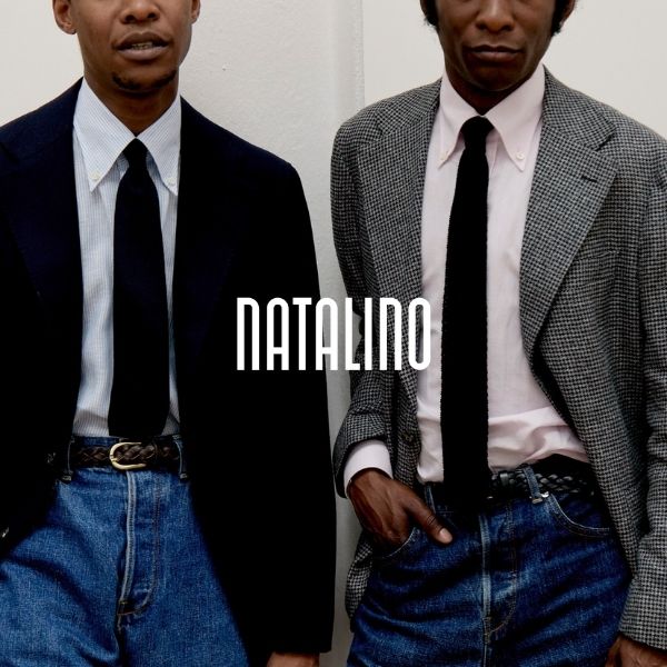
Fortunately in classic menswear, we are blessed with several ‘couples’ that have this difference in skin types, and can be used for illustration.
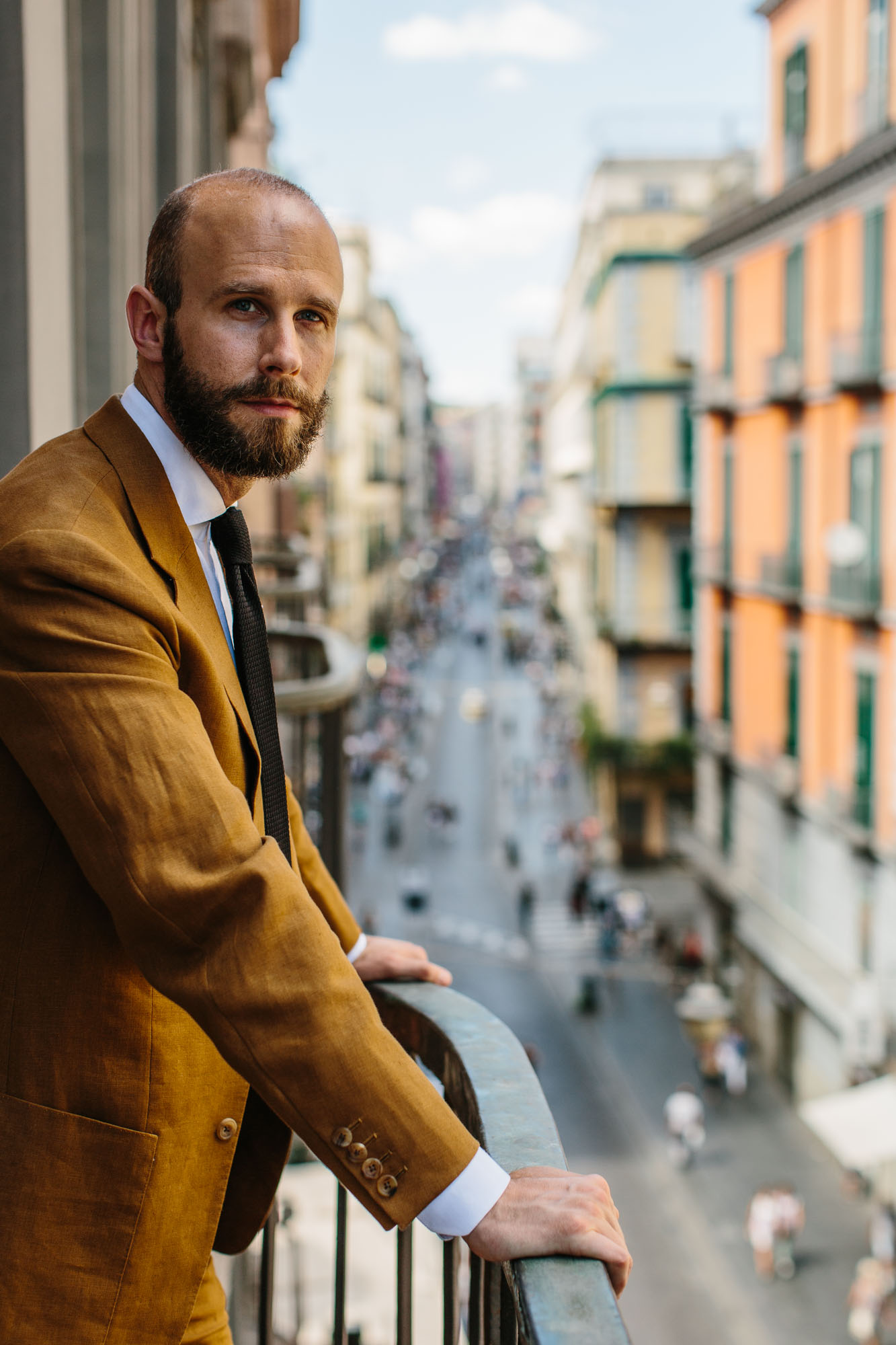
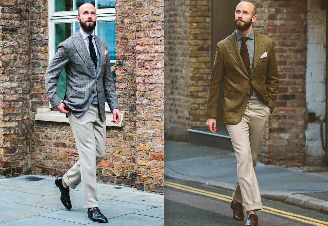
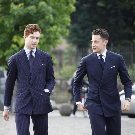
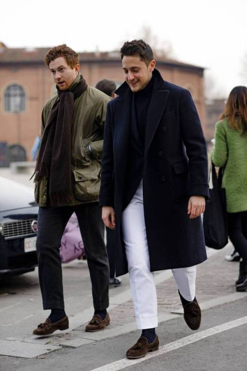
Take Jake and Alex from Anglo-Italian, for example. In the image above, both of them are wearing navy suits with pale shirts and dark ties.
Jake has red hair, and so is low contrast. Alex has dark-brown hair, and so is higher contrast.
Yet they both look great. Perhaps Jake might suit a mid-blue shirt in that combination a touch more than a light. But it’s marginal and - in my opinion - less important than the other effects of the colour, such as formality and style.
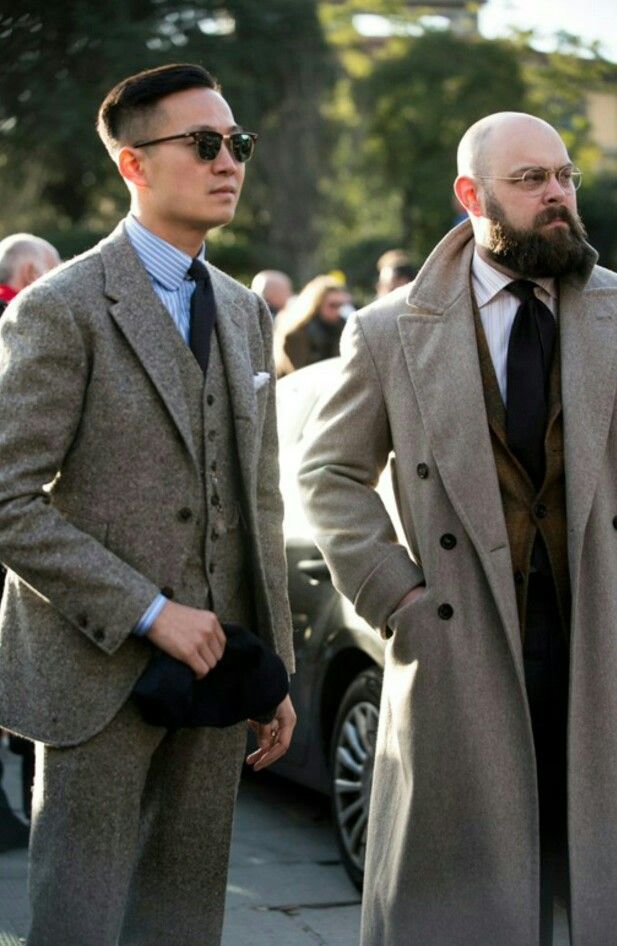
The same goes for the example below: both are wearing similar levels of contrast (in different ways) yet both look good.
There are several reasons I think this effect isn't that strong:
1 Most are middling
A large number of men - probably the majority in Europe, though not in Africa or Asia - are not sufficiently high or low contrast for their complexion to make a big difference. They are somewhere in the middle.
2 Men don’t wear strong colour
As far as classic menswear is concerned, colours are generally quite limited and muted. Navy and grey, with white or grey shirts - going into brown, tan and green with more casual clothing. Bold colour is usually limited to small things like knitwear, ties and other accessories.
3 Men don’t wear blocks of colour
Colour has most impact when there is a lot of it, and it’s against the face. In a classic combination, men have several things around the face, including a jacket, shirt and perhaps tie. Even in more casual combinations, they often have a shirt under a sweater. A blue shirt does much to soften the impact of a brightly coloured shetland.
4 Which means you can balance colours
As men wear different things together, they can control contrast by changing what one item is worn with. Like switching a white shirt for a blue one, or going for a charcoal tie rather than black, for instance. As a result, it makes no sense to say a navy suit doesn’t flatter someone. You can say that an outfit overall does compliment their skin type, but not just one item.
So that’s why I think complexion has limited importance. Certainly, it has less for men than for women.
A woman will wear a strong purple crewneck, or a bright yellow one, with no shirt or anything else between it and the face.
She will even wear strong colours like that for the entirety of an outfit - as a dress. Men never do that.
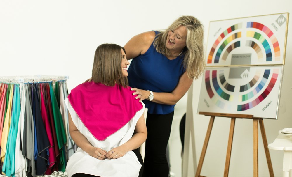
My aunt used to work for a company that analysed skin colours. You sit and have different shades of a colour placed against your face, to see which compliments it most. People are divided into Spring, Summer, Autumn and Winter, and then further sub-divided.
My siblings and I had it done at one point. It was very interesting. But not that useful.
First because what it did was allow you to pick between shades of a single colour, which rarely happens in a shop. And second, because the importance of the colours was largely dependent on them being worn over half or your entire body, and being next to the face.
How important is this effect?
If that’s why these colour rules have little effect, here’s why I think you shouldn’t give them too much importance, even if they had a big one.
1 Colour affects formality
More important than colour flattering you is the messages it sends about the person you are meeting, or the place you are going. Black tie is the highest-contrast clothing there is. But if you’re invited to a black-tie event, you respect the host and where it.
2 Colour affects personal expression
Just as important as whether colour flatters you, is whether you like it and feel it suits your lifestyle. I love muted muddy versions of classic menswear colours, like cream, dark brown and olive green. My only consideration of whether they flatter me might be what those colours are worn with, or in what proportions.
3 Other things are more flattering
In my opinion, fit makes more of a difference to whether clothes flatter you than colour. Proportion makes more of a difference (big double-breasted jackets on short, wide men). And style makes more of a difference (wearing something that seems awkward, anachronistic, or just not you).
4 Nothing is necessarily ‘bad’
Finally, none of these effects on your complexion are necessarily bad. They just have a certain effect. Observe that effect and see if you like it or not. In some cultures, looking paler is seen as a good thing; in others, looking darker is.
Perhaps the biggest thing to take away from points 1 and 2 is that skin colour shouldn’t rule anything out.
Wear a navy suit, white shirt and dark tie if you think it really suits the situation. Even if in general, you tend to wear more grey suits and blue shirts.
In general, Alex from Anglo-Italian wears more navy and cream, while Jake tends to soft browns and greens (above). But they both wear a similar suit too.
The same goes for someone like Michael Hill at Drake’s. He’s always wearing green cotton suits, brown-suede shoes, and warm-toned accessories. Which makes sense, given his colouring.
But he’ll still wear a high-contrast outfit like a navy jacket, white shirt and grey trouser as well.
Men have a tendency to take any ‘rules’ to extremes - to make them rules, in fact, rather than tendencies. And complexion is one of the easiest to take too far.

I don’t wish to suggest that complexion and skin colour are not important. Most men aren’t even aware of the effect certain colours have, and they should be.
Flusser makes the point that flattering colour and balanced proportions are what drive attention towards the face, and make it look good. I doubt most guys have even thought of clothing that way.
Being aware of the thinking around skin colour will definitely have beneficial effects. Some men might find it hard to wear certain colours, and this will help explain why. It might make them wear those colours with different things, as a result.
And thinking around colour can suggest things that work particularly well, rather than ruling things out: such as the way green compliments those with red hair.
But for me, skin colour is a long way down the list of why you should wear certain clothes. It comes somewhere near the bottom, below propriety, fit, style and personality.
For a good article on the many cultural messages that colour sends, read Derek’s piece on Die Workwear! here.
For anyone that wants to dive a lot deeper on colour, the best place to start is Carole Jackson's Color for Men.
Pictures: Jamie Ferguson, kerloaz/Tumblr, treviorum/Tumblr, Hein Fienbrot/Tumblr, Mark Cho, Style Forum, Hein Fienbrot/Tumblr


I think you may have downplayed skin tone a bit. In the first shot of the first photo, you look completely washed out. Also, in the first photo, do you not think the second outfit has more contrast??
Thanks. I certainly look a little paler in that first photo, but completely washed out I think is an exaggeration. Which I think speaks to the point about these effects being quite small.
The second outfit has high contrast only between the pocket square and the rest. Remove that and there’d be very little contrast
Apologies, a little harsh of me. I should have said, low contrast. Once again my apologies.
In the the second shot, to my eye, there’s quite a bit of contrast between the jacket and trousers. Do you not think this is the case?
Yes, good point there is more contrast there. Of course, any description of the contrast of an outfit is going to be a simplification, as it’s happening in various parts of the outfit. But in general it makes more of a difference what’s nearer the face.
Got you. Thanks for clarifying.
People should also be reminded that a photograph is not necessarily reliable, as it can be over- or underexposed, softened, etc. (for artistic effect hopefully).
This is a topic I always struggle with . I think alot of that has to do with the language that is used … contrast , warm colours, autumnal colours …. men aren’t as accustomed to this language as much as women .
Whilst I accept a lot of what you say when it comes to black people then complexion is a huge factor . Which is why strong bold colours work so well e.g. just think of Oswald Boateng .
The tricky areas are beige and browns against Indian skin or lighter African skin.
Also , rather like most makeup is made for lighter complexion is it a case that most cloth is coloured for lighter European complexions ?
Just one point that you need to clarify ….when you talk of contrast are you talking about hair colour or skin tone against the colour of the cloth worn.
Nice points. Yes it definitely makes more of a difference at the extremes, as with black skin.
Re contrast, I’m saying the contrast between skin and hair should reflected in similar contrast between the clothes, eg between suit and shirt
I’d take it a step further and say that a lot of suiting and shirting cloths are made for white, European markets.
So while I agree with most of your points, Simon, I think that’s because most of the mainstream cloths you’d find have been made with skin tones similar to yours in mind.
Speaking from personal experience, I generally push back on some recommendations regarding beige colours because I’d simply look naked at first glance.
The reality is that Asian and Black people sometimes need to look for style inspiration from people with similar complexions and hair type (haircuts being another difficult subject for some non-white people). No shortage of that on Insta these days.
Though important to bear in mind no ethnic group is homogenous. E.g. Asians can range from whiter than some Caucasians to darker than some Africans.
I couldn’t agree with you more in regards to how much more important contrast is with black people, especially being a lighter skinned African American. In the beginning of my menswear journey I found difficulty styling outfits because I was buying colors that were suited for Asian and white skin tones and always wondered why they never looked as good on me as they did others. I had to really understand my skin, learn what works best, and then learn how to add warmth to an outfit if I was hard set on owner a piece of clothing that was so cold in color.
And yes, there are plenty of black style influencers on Insta, but I’ve found none of them go into the depths of understanding that Simon does. Most are simply focused on stylization and not cloth, cut, makers, etc. I wish our community had someone who spoke Simon’s language with such fluidity.
Skin undertones- warm and cool, seem to affect color choices more than contrast
Interesting discussion, and I generally agree with many of your points about why colouring is of lesser importance.
I do think the “rules” around who is high v. low contrast you provided don’t really make sense to me. E.g. someone with pale skin and red hair, I’d argue, really has a medium level of contrast between skin and hair; light skin and blond hair, would be low contrast in my opinion.
Looking at the photos of Jake and Alex, I’d classify both as being medium contrast–Jake has maybe a touch less contrast between skin and hair than does Alex, but there’s still clear contrast. And hence, it doesn’t make a big difference when they both dress in white and navy. This may speak to your point of more people being of medium contrast than at the extremes.
I also think some of the optimization of colour and contrast occurs naturally as we see what we look good into. I’m often told I look good wearing purple. That makes sense based on colour wheels (I have brown skin) and the relative higher contrast it has against my skin and other colours I likely wear. But I came to wearing it long before I realized those two points, and I probably came to it because it just seemed to work so well without knowing why
Very interesting article, and somewhat reassuring as a red head that you shouldn’t necessarily be put off from wearing certain tones. By brother is also a red head but give him £10k and access to the finest tailors in the world and he would still look like he was wearing someone else’s cheap suit!
To complexion on black people, I am a black man and have been buying bespoke suits from an experienced cutter for over a decade. I have found his tips invaluable. (He is into art and colours and gardening and has an excellent eye). My skin tone is something like milk chocolate (depending on time of year, face or hands etc). I find that complexion is important. It is one of the factors I consider when choosing a fabric swatch (but I also consider weight and texture and sponginess etc).
I don’t think that the fabric available for suits, jackets, coats are necessarily tuned for Europeans. The standard colours of charcoal and navy for work, are great against my skin. I dare say that often these colours suit me better than against Northern European skin tones. I find that navy suits suit me better than charcoal, but both work. Light grey doesn’t work on me at all. Likewise, certain tones of blue are out for me, even if I like the cloth.
I chose something that works on me. What I think “works” is a no doubt a mix of many factors from classic tailoring to colour wheel theory (that I have considered or just found intuitively).
As to the language, I don’t get it either. I think that I am low contrast as the difference between my skin colour and hair colour is slight: dark brown skin and black hair. When my hair colour (if any is left!) turns white, then I will be high contrast… however, I admit I don’t really understand the terminology.
As to beige and browns, I just avoid them. I think a chocolate coloured man in a brown suit lacks contrast (between suit and wearer). I would wear a deep aubergine instead. Likewise, I looked at the olive fabrics Simon C. wear sometimes and they don’t work on me at all. I will chose deep blues or deep greens generally. Nature is a great inspiration for colour combinations: we see all around us that brown and green work well in nature and that blue suits with dark brown shoes work; well, I see my skin tone another expression of that principle.
In summary, I think people can wear any colour, but tone is important. Moreover, just because you can wear it doesn’t mean there is a better alternative. That is in itself subject to taste… I am just glad that men seem to care a lot more about their appearance than when I started my sartorial journey so many years ago. Thanks for adding to that experience Simon.
Unaccustomed as I am to commenting on sites, I would like to add an irreverent opinion. Which is that most of the stylish men I know, Mr. Flusser included (regardless of what he says), wear the colors they like rather than the colors others (psychologists and other experts included) may think are good for them. I merely make an observation.
An appreciated observation. Thank you Bruce.
Excellent observation Mr. Boyer and wise advice to heed, thank you! Stylish men intuitively have the good sense to know what colors look good on them.
Interesting…I was at an event recently, and met, and spoke with a woman of African ancestry, who was a stylist, and we spoke openly about her recommendations….
One thing I have noticed through the years (Alex, this goes to your comments on colour), is that a Black man can walk into a meeting wearing a canary – yellow, or vibrant purple suit, and be taken totally seriously, with no one making a comment. If a Caucasian man were so experimental in colour (or even half as much) they would laughed out of the room….
It probably is time for a little colour liberation…in business attire, etc…..
ANM you say:
“One thing I have noticed through the years (Alex, this goes to your comments on colour), is that a Black man can walk into a meeting wearing a canary – yellow, or vibrant purple suit, and be taken totally seriously, with no one making a comment. If a Caucasian man were so experimental in colour (or even half as much) they would laughed out of the room….”
Well, in my profession, law, I wouldn’t even get into the room with a purple suit, unless I were the client and I am a black man. This goes to Simon’s point on propriety.
However, in a non-work environment, things are different. I saw a Ghanaian man get married and he wore a burnt orange suit and it was fantastic. He wore it confidently too; he looked like the boss James Brown sang about. Not sure if a European man (confidence or not)- or a man without chocolate skin colour could have carried that well. Then I do feel other colour (I note the broadness of that term) suits better suit other complexions. Menswear is so complex because we have that interaction of the wearer, the suit, or odd trousers and jacket and shirt and tie. Textures play differently and then the lighting and environment , social occasion affects everything too.
Bend, I’m looking at your Styleforum articles. Very interesting.
Yes many darker skinned people generally can pull off wearing a red jacket or shirt! Something which as a pretty pale person myself is impossible to do without highlighting the many red tones in my face! Which is unflattering and against the whole point of tailoring!
I think darker greys and navy always go well in built up environments surrounded by bricks and concrete! Also in a serious environment such as a court regardless of skin colour.
Hi Simon,
Sorry to bother you with a non-related question, but this might be useful for some other readers. I will soon order a bespoke DB travel blazer. Would you have any Fabric suggestion ? I had thought of fox hopsack but you may havé better idéa. And also, what would be your wiew toWards gilt buttons ? Would you préfèr Brown horn ?
Thank you so much from France.
Nathan
Hi Nathan. Hopsack would be a great cloth for a navy travel blazer – I’d go with that. Personally I don’t like gilt buttons much, but it’s a cultural thing. It looks too old-fashioned, at least in the UK.
Nice analysis. I tend to agree that it’s not that important, though I have two points.
1. There are some uses of very bright colour which look great on darker skin but I’m not convinced would work on lighter skin — I’m thinking about the bright blue or yellow of les Sapeurs. They might not be to the taste of PS readers, of course, but I think often very effective in their own ways.
2. I wonder if this is such a well-worn topic not because it’s crucial to dressing well but because, like height and weight, skin tone can be something that people can feel / can be made to feel self-conscious about. Just like the endless “dressing for short guys” articles, this isn’t necessarily a good thing.
I think Simon’s “Nothing is necessarily ‘bad’” line bears repeating.
It’s a shame that writing on this subject is so dominated by Flusser’s contrast concept, which is simplistic at best and usually misleading. But the idea that one’s skin and hair colors come “below propriety, fit, style and personality” in terms of importance to dressing is also problematic.
I’ve written about this topic at length, using photoshopped versions of the same subject and outfit as evidence: https://www.styleforum.net/threads/color-theory-revisited.447796/
Thank you – I’ve read those pieces in the past, and they’re very useful for a deeper look at the subject and illustrations.
Personally I’d still argue those other aspects of dressing are more important, but there’s certainly more depth that can be gone into.
Thank you for bringing this up Simon, very interesting topic to discuss.
I tend to agree with the first anonymous comment here – you definitely look better in the second set of photos than the first. The first outfit takes attention away from your face, while the second set complements it. I would also argue that both photos in the second set are less contrasting compared to the one with the tobacco suit..
Most of your readers take pleasure discussing the smaller details of an outfit such as the fabric weight, weave, the placement of the patch pockets, etc (which is great as I love to do so too!). However, I would argue that choosing colours/contrast to match your skin tone is definitely a more important detail to consider. I have mid brown skin with black hair, and pale grey suit with a white shirt just would not cut it for me. When you say you prefer muddy colours – perhaps that’s because you subconsciously realise that you look better in less contrast?
Also, what trousers are you wearing in the second set of photos? Can you share the make/fabric? That drape looks amazing.
Thanks Zohair. The trousers are the cavalry twill that was part of the Drake’s collaboration that the second shot is taken from.
Long time fan of PS and I very much agree with most of your conclusions in this article. However, a weakness of this website, along with most resources about menswear, is its discussions of colors (perhaps this is just a pet-peeve of mine, though, as someone who was classically trained in painting). Color is a little more complicated than you often make it out to be. Speaking basically, there are three main aspects to consider when thinking about color (there are a number of synonyms for these words): hue (what color, e.g. blue or yellow, something is), value (how light or dark a color is, white being the lightest, black being the darkest), and saturation (how colorful, or grey something is, e.g. a bright green is more saturated and olive less). Things of very different hues (e.g. red and green) contrast a lot and so do things very different in value (e.g. cream and navy). If hues are different, contrast can be mitigated with less saturated colors. In menswear, there are also other factors of contrast to consider such as texture and thickness. There are a lot of practical implications to all of this such as–among other things–the appeal of a navy suit and white shirt, the usefulness of grey pants, why it is easier to get away with tan or snuff suede shoes as opposed to similar colors in calf, and why shetland sweaters are easy to wear in seemingly bold colors.
A lot of why certain combinations are so successful and others aren’t can be explained in these terms.
Many of the examples you cite don’t really take this into account. For examples, both pictures of the bryceland’s crew are pretty low in contrast (not much variation in value, save the white shirts; low saturation, not much variety in hue). The Michael Hill picture is higher contrast, due to the white shirt, but this is just a contrast in value. The side by side pictures of you are both pretty low contrast–the values are all pretty similar (except the shoes) and the colors are all less saturated.
Thank you, and particularly good to have such an experienced contribution.
Do you not think that some of these points are just less relevant – for the reasons I mention – because men don’t wear colours like that? They will rarely wear strong hues next to each other, for example, and rarely things with that high a saturation. As a result, it’s mostly about value.
Value is probably the most important, in classic menswear and in art (consider a charcoal drawing). I would agree with you there. In fact, many classic ensembles, such as evening wear or a navy suit and white shirt, rely almost entirely on value and do almost entirely without color. The simplicity and harmony is part of what makes these ensembles so attractive. When you introduce other elements things become more complicated which is why–ignoring elements of fit–more casual tailored outfits, especially ones with more interesting colors, can be more difficult to put together.
Men do wear other colors, though, which is why some of this is important to keep in mind. In the top picture you are wearing a tobacco suit, and you are wearing an olive jacket in another. These are colors of course, albeit not the most saturated ones. There is also the picture of Michael Hill with the yellow pocket square (a very informed choice according to color theory). The concepts I mention can help explain many of your wardrobe choices. For instance, you would probably never go with a wool suit in that color because it would be too saturated.
There is also the contrast between skin color and clothing to keep in mind which was the focus of the article. Skin color is a little darker and more colorful than people generally assume and this is something worth paying attention to at times. (Artists talk of a nine step value scale, with nine being the darkest; most Caucasian skin is a 3 or 4) But again, I would ultimately agree with you that men don’t have to worry much about their complexions. The one thing I would say here, is that the color of skin, both in terms of value and saturation, can make it very hard to wear a very light grey (think a light grey jacket) especially on the upper half of one’s body (small amounts of light grey are pretty trivial though).
I think people generally understand these things in practice. It is in theory that people can be led astray. I do still think there is some benefit to understanding these concepts, though, insofar as it can lead you to try more interesting combinations that you wouldn’t otherwise consider. It is also something I wish various shoe-makers would pay attention to and something I commend you for paying attention to with that special color of belgian loafers you did some time ago.
Nice points and detail EL, thank you.
EL can you suggest any books or articles to study?
There are not so many great sources unfortunately. I learned most of it orally and most painters aren’t great writers. I believe there is a book by Harold Speed on painting (not drawing) where he goes into some of this. It is a bit quaint, though. I also remember a text on color theory by Fletcher which is also a bit old-fashioned.
As I said above. I don’t think these are things most men need to worry about much in practice. I think most people are already pretty good at recognizing when something does or does not look good. Having some knowledge can help you think up more interesting outfits, but it will only help so much.
@EL fascinating viewpoint – you have thoroughly whet my appetite! Personally I have never found the Flusser concept of contrast system very helpful at all. I have blond hair, blue eyes and fair skin (i.e. pretty low contrast) but I’ve never noticed low contrast combinations to look especially better on me. That said, I do find certain shades work better than others; generally anything very bright or saturated seems to look pretty bad. Would love to hear more of your thoughts!
I’ll be frank here. I think the neutral term ‘complexion’ is played up in discussions on menswear in order to avoid the big taboo of physiognomy, which is related to race and genetics. I have certain features (big bulbous nose, misaligned dentition, short stature, horrible hairline) which make it next to impossible for me to look good, so I should know.
Thank you, Simon, for a most interesting article. Two points occur to me:
1. The colours we look good in may change over time. For example, thirty years ago when my hair was so black it was almost blue and my skin very pale, I looked awful in brown, even though it’s one of my favorite groups of colours. Now my hair is grey , and my skin pinker, I think brown suits me. Maybe this is no more than Simon’s contrast theory being applied?
2. If we like a colour, and assuming good make and fit, we’ll be happier and more relaxed wearing it; others may see that relaxed appearance and associate it with the colour (on us), then going on to think that the colour suits us.
Simon, not a great article as you haven’t really researched the subject beyond Flusser. There are many works on the subject that provide different theoretical approaches and whilst, within fashion/style based publications, the majority are aimed at women some, such as ‘Colour for Men’, are directly written for male consumption. Flusser’s contrast based approach actually reflects a very poor understanding of colour theory and is more to do with dynamic range (light/dark) rather than hue range or intensity. Nor, as Rabster points out, does it reflect an international view as to race and skin tone. Within the format of style colour reference can be argued as a background element – but that is when we are primarily considering the garment itself. If considered as something connected to the wearer (along with ease, comfort, the emotional response to the garment – how does it make you feel) then colour is almost a primary feature. Knowing the colours that serve us the best and the colours that are best to avoid is a key skill in dressing well and feeling comfortable about our choices.
I have – I’ve read Colour for Men in the past, read other sources, and spoken to those that analyse it for a living, like my aunt mentioned.
Personally I find the Flusser system the most effective in terms of the results I see, but only for some people and rarely to to extreme extents.
Systems like those used by colourists that I have gone through are also very international.
A great topic, and I mostly agree…with one twist. Contrast is also less important than the colour of two specific facial features – eye colour and hair colour (even eyebrow colour becomes important for men who are shaved or bald). Regardless of whether a person with blue eyes has high- or low-contrast features overall, blue clothes will always look good especially if their hue is close to the specific blue of the eyes. This is because the eyes alone have greater impact than almost everything else, including contrast. Hair is also important – regardless of contrast, a person with white or light grey hair will always look good with a light- or mid-grey suit and a white shirt.
Having read Flusser and reflected on the ideas he presents in Dressing the Man regarding what colours to wear based on one’s complexion, I’ve taken some of his advice to heart however I have found some exceptions at the same time.
I generally have a ruddy complexion with my face being slightly dark and having brown hair with increasing amounts of grey. From Flusser, I would gather that wearing highly saturated colors is not the best option for me. This is true in some circumstances however it isn’t universal.
For example, wearing a bright white shirt doesn’t suit my complexion at all. I feel it washes me out however I do look fine in a saturated red like with an underarmour baselayer that I wear.
Flusser may offer a good starting point on what choices to make however the advice is not infallible and it feels like one must find one’s own niche of colors and hues to wear.
Interesting. When I read Flusser some time ago, I got bewildered. I have always believed I looked my best in navy. But with blond hair and pinkish skin, maybe not? Happily, I have come to my senses and concluded that still navy is one of my best colours to wear. I had not, like one of the comments does, seen this in relation to my blue eyes.
This is a great article. Still I think one should take care about the colours one chooses.
I have slightly Mediterranean complexion and in my opinion violet/purple colours (like Simon’s Liverano jacket) or light greys don’t suit my skin colour well so I avoid them even though I like them.
The violet/purple jackets look great on the joker… but his face is painted in white. 😀
Although I’m a fan of both your work and Alan Flusser’s, I think the high-contrast, low-contrast thing is too vague to be of use to most men. On the other hand, in 1988 I received a copy of Carole Jackson’s Color for Men, and it quickly became my guide. True, it’s not perfect — I’m an autumn but look just fine in a black tuxedo (my son, a winter, looks spectacular) — still, her ideas do hold up and are simple to understand and put into practice. In my opinion, that book is obligatory reading.
Thanks a lot, Simon.
Where are men with grey or white hair in your rules?
It depends what the skin is like – it’s the contrast between the skin and hair that Flusser was referring to
Great article – and something I have asked about in the past.
Typo here though: “But if you’re invited to a black-tie event, you respect the host and where it.” *wear
I do think all these rules, conventions, guides and conventions are meaningless to anybody with a modicum of confidence.
If you live your life basing your dress on them, you will likely end up confused, insecure, anxious and generally lacking in confidence.
Stand in front of a mirror and try things; this with that, matched with something else.
If you end up liking the way you look, then great. Over time you will develop a flair and look you feel at home with.
Thanks Simon for a thoughtful article as ever. I entirely agree with your reservation that menswear (at least the sort considered on this website) rarely involves whole body blocks of colour like a dress. It is worth noting that the Colour for Men taxonomy involving 4 seasons seems to have been refined subsequently into subdivisions (eg soft summer). I’m a bit dubious about how far it can be taken but equally feel there is something in it. (get off the fence man!)
Here is a thought which I thought I would toss in.
Perhaps there is a distinction which can be drawn between whether an outfit looks good and whether the outfit makes the wearer look handsome. The basis of the colour theory seems to be more aimed at the latter concept than the former. Obviously there is a considerable overlap and it is doubtful that one could choose clothes guranteed to make one look like a poorly-dressed Adonis, but I would suggest that the distinction might be worth making. It may be that some colours do suit someone’s complexion better than others without the effect being so strong (especially at a distance) as to make the viewer think- “he looks all wrong because he’s too pasty for that shirt and tie combination.”
Either way I feel that most menswear nerds are more intersted in the internal balance of the clothes, not their relation with the wearer (hence the popularity of those headless shots.). Really there’s no need to refuse to wear the colour combinations you like (within limits).
One final point: perhaps an interesting comparison can be made of European statesmen wearing navy suit, white shirt, navy tie. I have noticed recently that Donald Tusk, Macron and Mark Rutte all seem to wear this uniform. I’m inclined to think it suits Macron the most, Tusk the least.
Colour for Men changed my whole approach to dressing. I have medium brown hair (now going to gray) and medium olive skin, and I would look simply cadaverous in a tan suit with an olive green tie. I find that most men, regardless of complexion or ethnicity, look good in high contrast outfits, by which I mean grey suit/white shirt/ burgundy or navy tie or navy suit/pale blue shirt/burgundy or french blue tie. Very few men, on the other hand, look their best in tans and olives. I actually think Simon looks healthier and ruddier in the high contrast outfit at the top of the article. As a college professor I wear a lot of brown tweeds, but I try to gravitate towards the cooler shades of brown and use burgundy or blue ties in order to have cool, high contrast colors next to my face.
Just got back from a great spring skiing trip myself.
I wonder if the bright sunlight and high contrast environment of white snow and green trees make those bright skiing outfits “work”.
Plus, sunglasses (or goggles) and helmet cover so much of our faces that skin tone seems almost irrelevant.
I think many followers of this blog site underestimate how constrained as to colour matches we are by our everyday work and social environments. As I type this comment on an iPhone (with difficulty -still needs a fix Simon) I am returning from a skiing trip enjoying my black and canary yellow ski gear. My son next to me looks good in bright red and white. Would I or we even contemplate wearing those colours when not skiing?
Russ, would you mind dropping me an email with details of the issue with commenting on the iPhone? Thanks a lot
Interesting points Simon. One aspect that is overlooked is light source. Colors can appear quite different as to time of day as well as variance in artificial lighting. This is known as metamerism.
Great article, but…
“She will even wear strong colours like that for the entirety of an outfit – as a dress. Men never do that.”
Eddie Izzard is quite known for that, however. 😉
I think the two models you use have pretty similar skin tone, and the hair isn’t really that different: red versus medium brown. (I.e., I don’t think red hair is necessarily that “light”–in my view it’s closer to brown than to blond).
I agree with you about the differences being exaggerated, but there are some exceptions. The biggest I can think of is that men with very dark skin are better able to pull off really bright colors (like a burgundy or purple suit) than caucasian men; on the former, really bright colors look “bold”; on the louder, they look “loud” and weird.
As a black man who has slightly darker skin than Mr Boateng I fully concur with your point about bright colours – that being said, I also agree largely with Darren who points out that whilst people can wear (almost) any colour, tone is very important.
Personally my choices have largely been based on ‘feel’, I’ve never really been able to quantify how it works, I just kind of know! For me suiting isn’t a office staple, it’s purely an indulgence so I like to play with various colours and cloths in a way that the corporate/office types wouldn’t.
I think some more reading, based on the recommended references by others in this thread is certainly in order for me though…
Hi Simon,
Slightly of topics, but a black blazer by a “prestigious” fashion brand caught my eye recently. I looked at the fabric, only to find it was a blend of wool and “viscose”.
What is your take on that combination? I haven’t knowingly encountered it so far and I’m wondering if you could give me your thoughts, or point me to any writing you’ve already done on the matter. Is it come, much less for a high end brand to be using?
Thanks.
Hi Andy. While it’s generally worth avoiding things like viscose, it can be used to help give interesting materials better performance. For example to give a lightweight, loose linen more stiffness. If it’s only a small proportion, and a top-end brand, I wouldn’t worry about it.
I’ve never paid to much attention to these colour “rules”. I have found what colours I prefer and look best in. I find a pink shirt (in the right shade) really suits me. It’s a colour I think to many men overlook. I think it really compliments my pale skin and grey hair.
Conversely I know I look awful in yellow and just to pale in black.
Like Simon’s aunt, I analyse people’s colours as part of my styling service for men. I find on some guys it doesn’t make that much difference but on others it really does…..I’ve seen guys age about 20 years in certain colours (!) whereas others make them come alive. I find it easier to explain in line with E L’s description of how to grade colours, rather than Alan Flusser’s.
Most people tend towards colours that suit them but other things get in the way and sometimes people lose confidence. I find it opens up lots of options for them if they’ve seen various colours compared on them and can see which shade looks best.
A lot of the readers here, are likely to be more interested than many men in appearance and so might be getting it right anyway, but I find it’s a good starting point for people who don’t know that much. That said, it’s not a matter of life or death, so I tell people to use it as a guide and of course adhere to the other rules of menswear such as propriety etc
I know this will sound frivolous, but reading Colour for Men many years ago completely changed the way I look at clothes; it was like the proverbial light bulb going off in my head! I have brown hair and olive skin with a moderately heavy beard, and now I know why I look cadaverous in most greens and khakis. On the other hand, I look younger and healthier in high contrast outfits like a french blue crewneck sweater with a crisp white shirt under it or a navy blazer or a black and white herringbone Harris Tweed with a burgundy tie.
Hi Simon,
What are the deciding factors on choosing high / low gorge for a suit?
Cheers
Mostly fashion. There is a small physical effect that a higher gorge may throw the eye upwards and make you look taller, and a lower gorge through it across and make your chest look wider. But mostly it’s a style, and people tend to like it higher or lower depending on what they’ve seen others wearing. It was high for a long time; now it’s getting lower.
As with many things, like lapel width, just keep it within moderation. Not too high, not too low. Then there’s a good chance it won’t look silly in five year’s time.
Hi,
Wonderful Mr. Boyer and wise advice to heed, thank you. Stylish men intuitively have the good sense to know what colors look good on them. Thanks for Sharing.
Simon,
This topic came up again in your post on the cream shirt, I personally just started reading Flusser’s Dressing the Man, and have been reading several other blogs on the topic. I have a few observations and questions I’d like to get your thoughts on if you have the time.
1. The contrast theory, as applied to men’s business wear, works better for high contrast men. The most common suit colors are navy and dark grey, which naturally frame the face with a dark crop of hair on it. Even wearing a medium grey suit, throw on the most popular ties, as you point out a navy grenadine or navy stripe and now you have “framed the face.”
2. Throw in the most common shirts, white and light blue, and you have a high contrast outfit. Even with a lighter navy and medium blue there is still a significant mount of contrast there.
3. When you get down to the level of contrast that is appropriate for mid to low contrast guys like myself, you aren’t left with a lot of options.
4. Even with no contrast in an outfit, for example an all black outfit, that would still “frame the face” of a high contrast individual with dark hair. So I’m not sure it is even necessary to have contrast in the outfit itself.
5. It is more important to avoid things that look bad on you, rather than things that may slightly improve your appearance. The women in my life have always pushed me away from yellow as they say it washes me out. I’ve never had anyone tell me a high contrast navy suit and white shirt wash me out.
6. In all my research, which although I’m not an expert I have done a significant amount, I have never found how a beard like you and I have affects contrast theory. I mean my face is already framed ha. It would seem to me to make me higher contrast, although that may just show I don’t fully understand all of this which I readily admit is true. What are your thoughts on the effects of a beard on contrast?
7. Ultimately it is good, as Flusser says, to have a rudimentary understanding of color theory, which is probably what I have. It certainly makes me think about what I wear more, and has converted me from the white shirt as my most common business shirt to the blue shirt, which both lessens the contrast of the suit/shirt/tie combo and works well with my blue eyes. I allow it to influence, but not dictate my style.
Thank you.
One thing I would say is that I find there is significant different in the amount of contrast between, for example, a white shirt with a dark tie (eg navy) and a blue shirt with a more muted one (say, mid-grey).
I think a beard increases contrast, but only to the extent it is prominent hair. If you also have a lot of hair on your head, it makes no difference. Also, it depends on the beard colour as with the other hair.
On the general role of this theory, and contrast within it, you are certainly right. Both are helpful to understand, but both are also only parts of the story.
https://insideoutstyleblog.com/2018/05/ideal-value.html
Hi Simon,
My sister love reading articles on fashion and yesterday she made me read this article.
Do you think it applies to men as well?
Not so much, no, for the reasons mentioned in this article
I have a warm undertone and I have read quite a lot of articles describing white and light blue as cool colors and not an ideal fit for warm undertone.
1) If someone is to go by this notion what do you think could be the choice of shirts for people with warm undertone?
2) Is off white a good option?
1) I don’t think this is that relevant, no. Although shirts are next to the face, they are simple backgrounds and much depends on what else is worn – if you wore that blue shirt with a dark navy it would be very different to if you wore it with a warm green.
2) It’s fine, but I would wear it for style not complexion.
So do you think I should not be concerned about it even if I am only wearing a shirt and no jacket to accompany it?
I don’t think you should be, no. You’re probably also going to wear a jacket or a jumper or something over the shirt sometimes too
Thanks!
I was just reading an article of yours about cream shirt and I am finding it very difficult to ascertain as to what would be the right shade of cream and I don’t think the store sales people would have much knowledge of it either. I have thought of commissioning a ‘cream linen shirt with light blue stripes.’
Do I need to take into account the right shade of cream or is it much easier wearing not the perfect shade of cream when it has some form of stripes or check?
When there’s a stripe the cream will be much less noticed, yes. I wouldn’t worry about the shade then. I’m not sure if the difference would even be that noticeable that it would be a good way for you to experiment with cream, myself.
I’d say it’s worth you eperimenting with a plain cream shirt at some point. And if in doubt, choose the one that’s closest to white.
Hello Mr. Crompton,
I have a question regarding colour matching. I’ve always had trouble pairing colors (shirt to pants to shoes), and I’ve been wondering whether there is any rule to this? In other words, which sets of colours match well together? And are there any colours that are easily interchangeable in a wardrobe?
Thank you.
Hi there,
The short answer is that there are lots of rules, or guidance, but they’re extensive. We cover them all the time on PS on articles like ‘brown in town‘ or warm v cold colours, or on the capsule building series where we talk about the most versatile colours.
Could I suggest you read articles like that, and let me know if you have any more specific questions? Also if you want more recommendations of articles.
Thanks
Is the connection between complexion and colour altered by artificial light? Is it relevant there, too? Thank you!
It can definitely make a difference, but it’s not something you can account for really, given we don’t change clothes when we go from one type of light to another.
The only context where that does happen is with black tie, where we assume that’s all indoors, and so midnight blue can look better than black, for example
I was asking with all indoors events in mind. If I usually wear autumn colours because they flatter me more, is there still an argument for wearing a brown suit instead a midnight blue one if I only wear it at night under artificial light?
Well, in that case I’d say the event and propriety is the more important factor, as brown is less likely to be so
It’s interesting how useful and useless color theory with skin tone is. On one end, I love British navy for how dark and deep the blue tone is, but when comparing two navy sweaters on my skin (warm), one British navy the other a navy with a warmer undertone, I found that British navy washed my skin out and made it look high yellow, much the way black does, while the warmer navy complimented me.
However, I own several British navy jackets and they always look great when I pair them with a warmer toned shirt because the shirt is what’s closest to my face. In contrast, a crisp white shirt looks lovely on me, as it does with most men, but stark white t shirts wash me out so I always opt for a cream or ivory.
Like you stated, in the end it really boils down to how you mix those colors in your entire outfit. I used to pair warm tones with warm tones, but quickly got bored with that so now I challenge myself seeing where I can add tension and interest with the two. I’d also say that things like value and chroma are just as important to consider as overtones and undertones as well.
Thanks Christopher, nicely described
Hi Simon,
In my experience, color becomes slightly less relevant in fall and winter, where you have multiple layers you can work with; however, during the spring or summer, when you may only be wearing one item on top, it seems to be a little more important. I fall into the high or medium contrast and find wearing a heather grey top does make me appear washed out.
To gain a granular understanding, how are these “rules” applied during the warmer months? If you fall into the high or medium contrast category such as myself, is it the contrast of the garment (i.e. navy) against your skin (pale or fair) that would constitute the high contrast that Alan Flusser writes about? Conversely, with the example I outlined above with heather grey, is the lack of contrast between the heather grey and fair skin the explanation for a resultant washed-out appearance?
Hi there,
Good point, yes it makes more of a difference when you’re not layering. And often stronger colours are worn in the summer too.
On the second point, yes it is the contrast between the garment and your skin which is the important one.
Interesting article. I love the Flusser books and, even after 15 or 20 years, refer to them on occasion. I can’t say I disagree about the relative importance of skin tone, though I do think the expanse of a plain shirt or jacket (I rarely wear patterns, and almost always stripes when I do) can be a substantial block of color. For me, at least, I can mitigate that block by selecting analogous colors or looking to the Soukan guides when considering those that require more care and caution. And of course, some colors just don’t work for me. I avoid those entirely.
Hello Simon, I recently read a book called Color for Men which I assume you’ve already read it. The book quite firmly advises avoiding certain colors. For example I am assumed to be an Autumn type, and it specifically says that I should avoid gray and black. To what extent do you think it is necessary to follow this advice/guideline? Thank you.
Hi Josh – Yes I am aware of all that colour theory, and your question is kind of the point of the article. Do you have any more specific questions having read it?