
Being able to judge the relative formality of an outfit is a key component of dressing well in modern, variable working environments.
Many things contribute to this formality:
- Most obviously, formal items of clothing such as a suit, tie, or handkerchief
- Next, perhaps, colour and pattern (a brightly coloured checked jacket compared to a plain navy one)
- Third, shape and line (sharp, clean suit trousers compared to bulky jeans)
- And fourth, texture (tweed v cashmere).
This is something we’ve covered fairly consistently in recent years, in posts including:
- Which office are you? (Or, a sliding scale of formality)
- Seven levels of formality, and
- The Valstarino jacket three ways
However, a useful parameter that we rarely discuss is the relative warmth or coldness of an outfit.
This is similar to the consideration of colour, but also brings in relative tone or shade (how strong, dark or muted they are).
It is also something you can communicate easily to someone, and judge instantly - making it a useful rule of thumb.
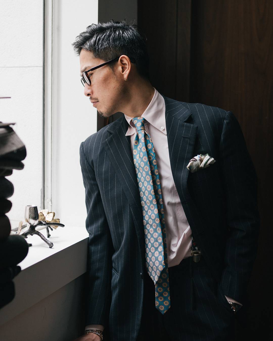
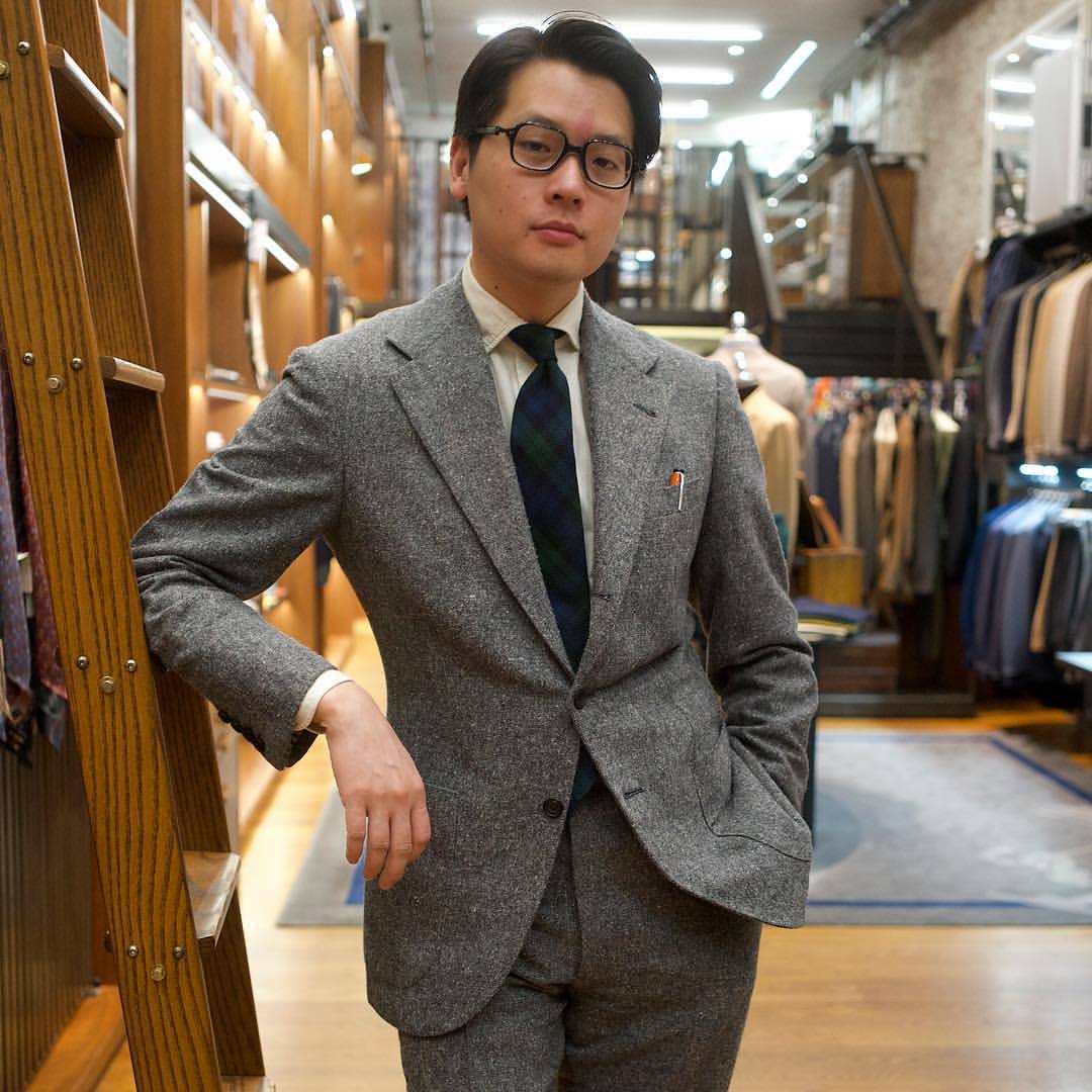
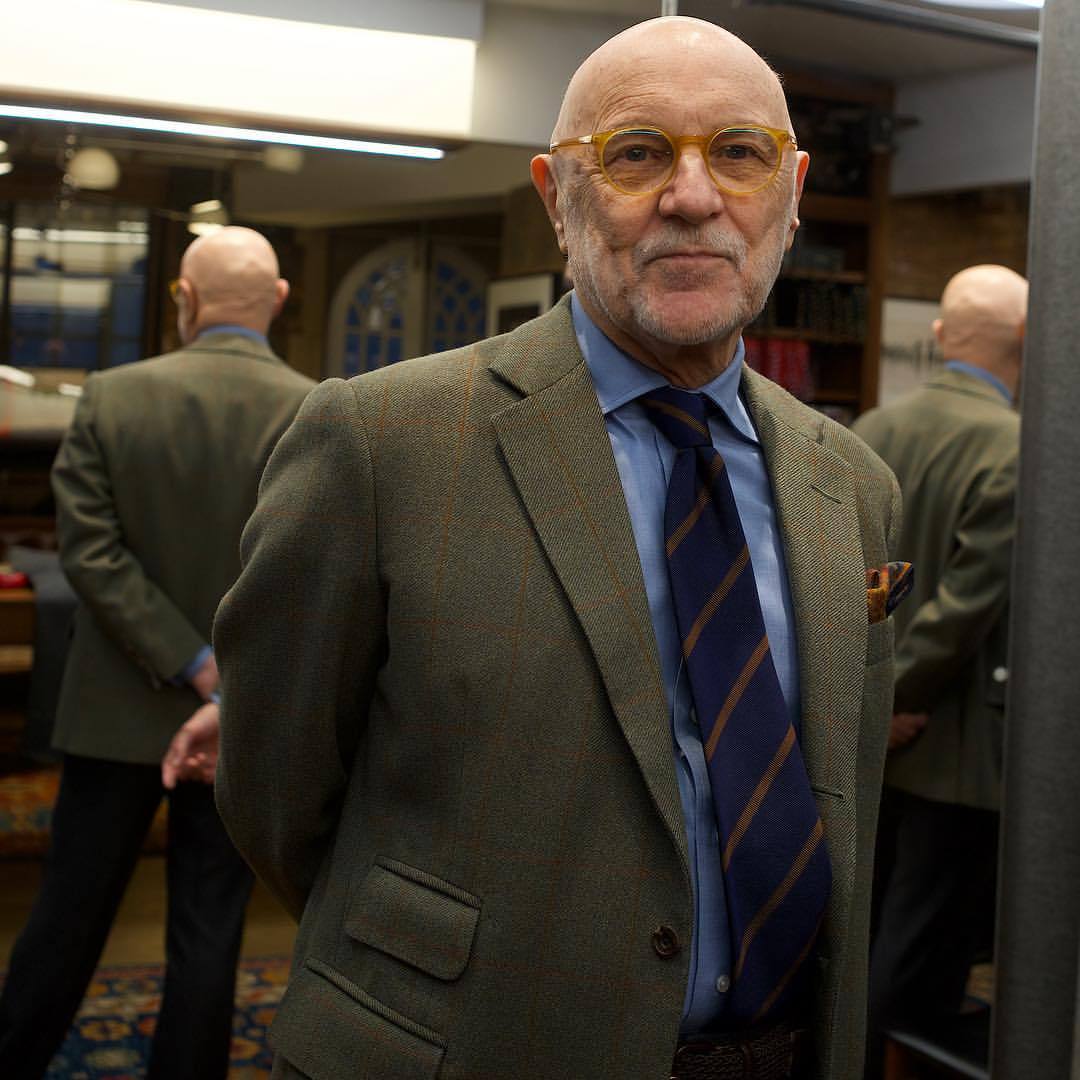
To take an example, Alan in the image above is very cold and formal. There is nothing warm to grab onto here.
Traditionally, formal daywear and evening wear was limited to these kinds of greys, creams and blacks.
Obviously that outfit also had little colour, pattern or texture.
The next image, above, has more: brown, blue and green, as well as some pattern.
Those colours are muted, however, and the whole, again, feels cold.
This doesn’t mean it’s immediately a formal combination, but it does mean it's smarter than a similar outfit in warmer tones.
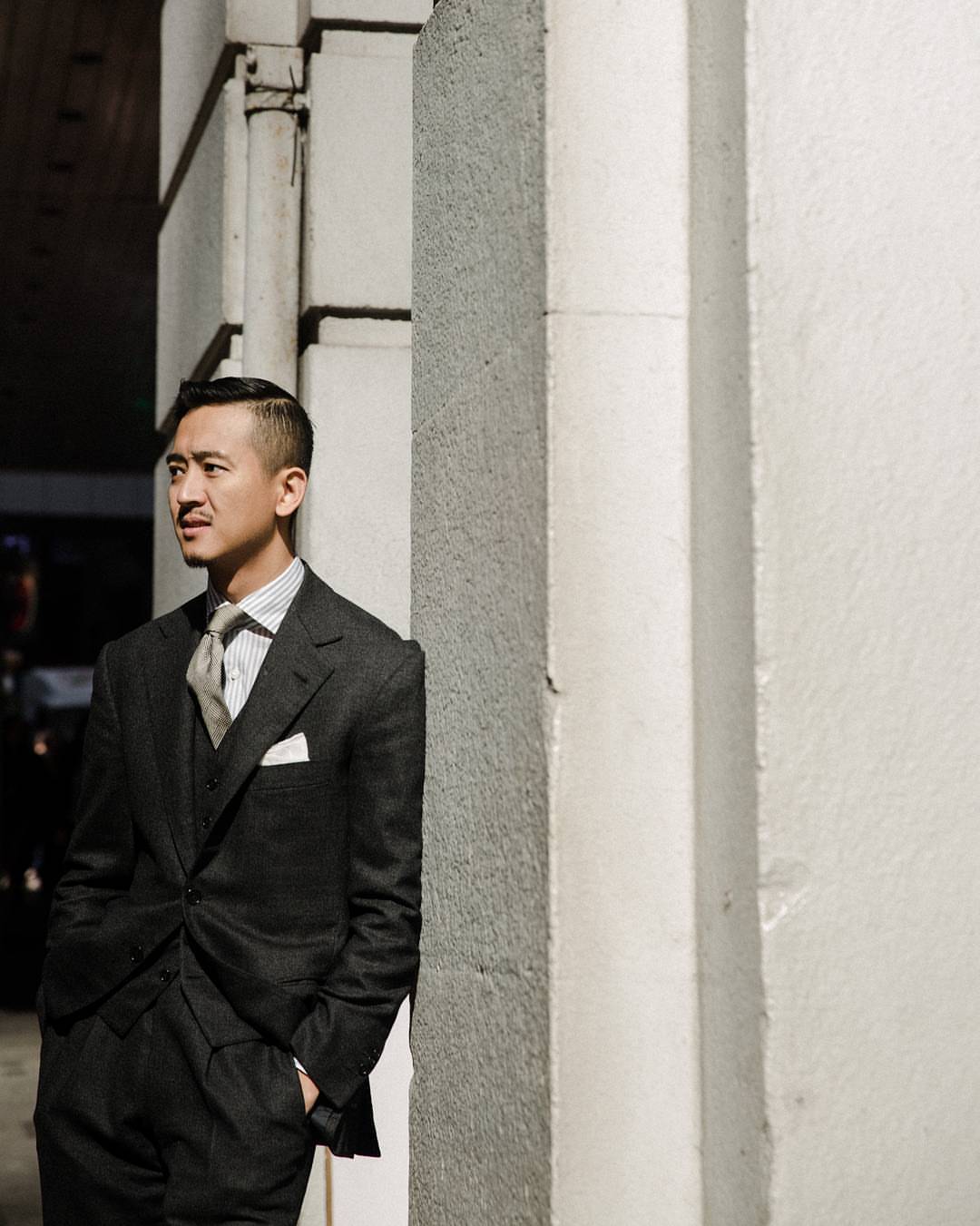
This next has a lot of pattern and texture going on - particularly the knitted tie and houndstooth check - but again its relative coldness make it seem relatively smart.
Mark’s outfit, above, is a little warmer but not much.
Replace that grey donegal with a brown in the same texture, and the pale-yellow shirt with a blue one, and the combination would be a lot warmer and more casual.
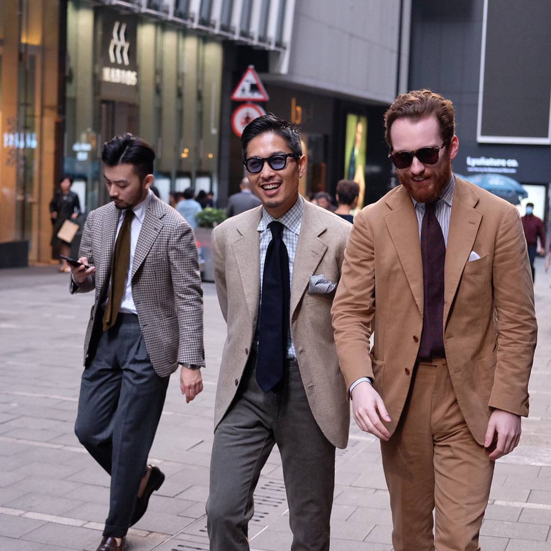
Next, compare Jim on the right in the above above with Taka in the centre.
Jim is wearing a suit and Taka a sports jacket; both have a tie and handkerchief; and if anything, Taka has more pattern going on. But the coldness of the colours make him appear smarter, Jim more casual.
(Equally, imagine swapping Jan’s tie, on the left, with a navy one and consider the effect.)
Warm colours often come in more casual materials, like corduroys or other cottons. And they are far more common in casual clothing like knitwear and chinos.
But you do still see them in tailoring, and the relative warmth is an easy thing to judge at first glance.
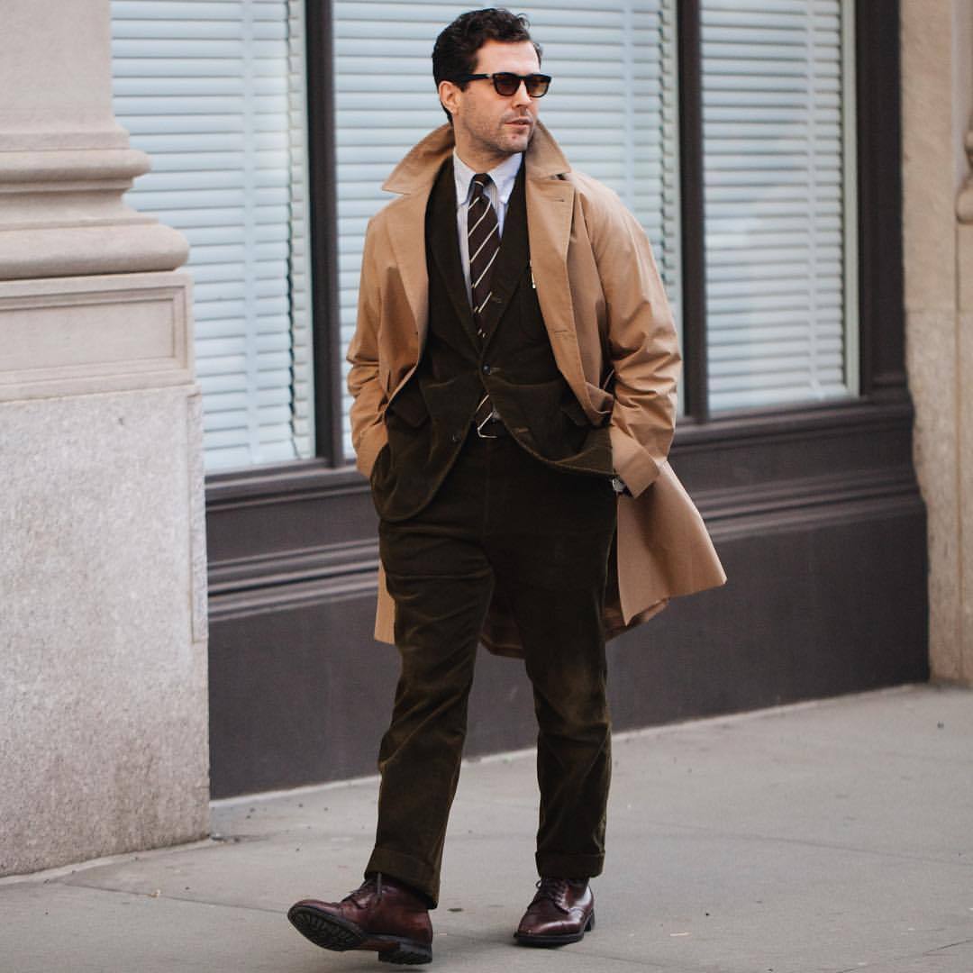
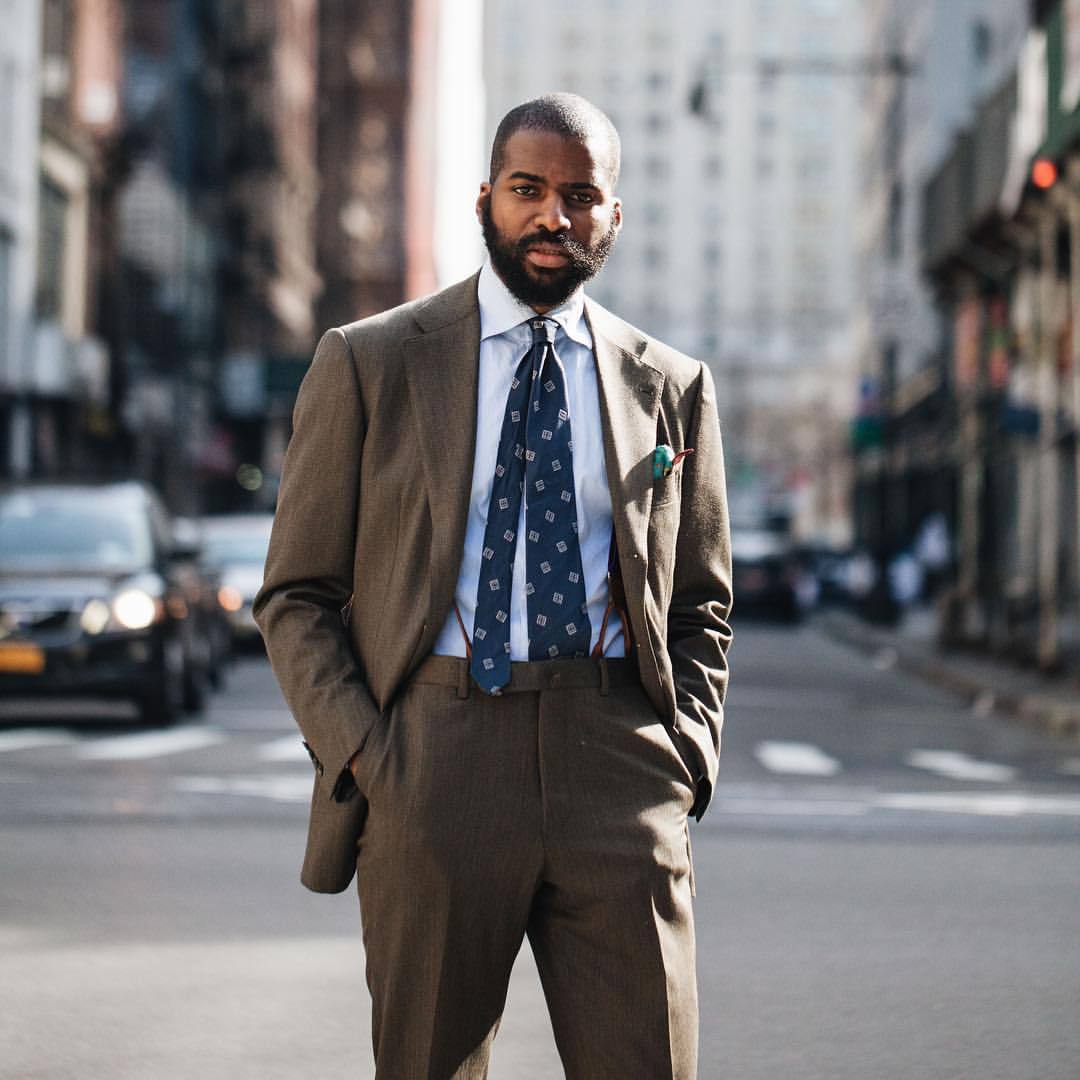
So with Rick, shown above, his brown suit and tan overcoat feel very warm (although, a blue shirt rather than white would make the whole even warmer).
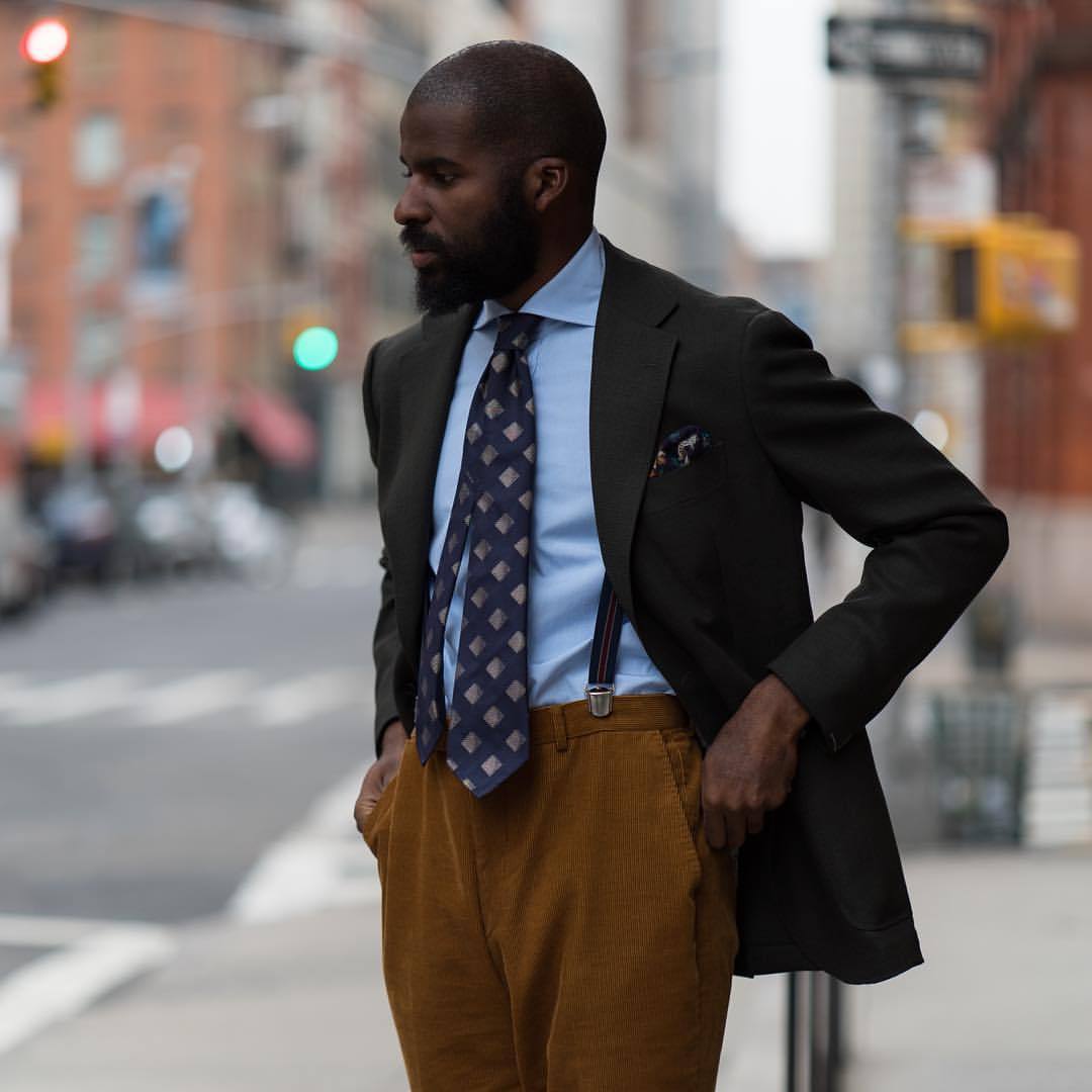
And as a sports jacket combination, Amechi's above is very warm: rich tan trousers, blue shirt, mid-blue tie and green jacket.
The warmest combinations often feel very autumnal.
And as a last example, writer Bruce Boyer is invariably in warm colours - again here, with blue shirt and mid-blue tie, and a burst of orange handkerchief.
(Although the reflection reveals charcoal trousers on the bottom half, which cool it down at touch.)
Most outfits, of course, are neither of these extremes, but somewhere in the middle.
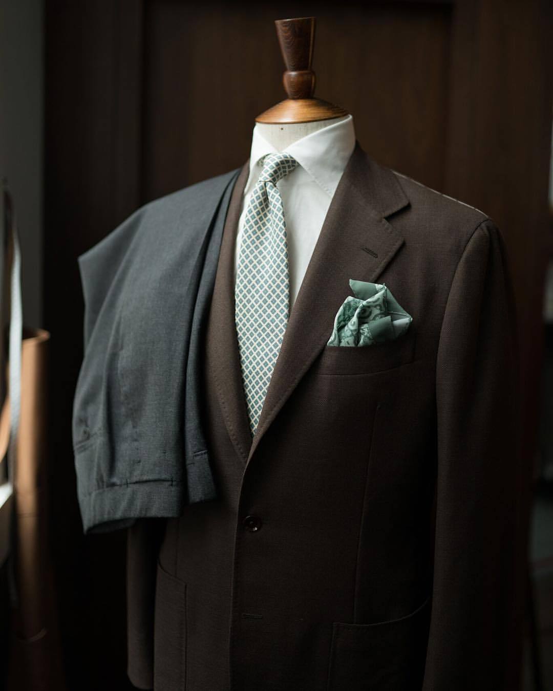
Amechi, above, is an interesting example. His tie is a mid-blue, which is warmer than navy, and he is wearing a brown-covert suit, which is warmer than navy or grey. But the white shirt and lack of really strong colours make the whole relatively muted.
-
Relative warmth or coldness is by no means the most important factor in judging the formality of an outfit.
Removing the tie from any of these combinations, or swapping the trousers for jeans, would make a far bigger difference.
But it is useful, and I find myself using it more and more in considering jacket-and-tie combinations.
(All images of Armoury staff unless otherwise noted - and taken from their Tumblr.)


Interesting, I’ve never really given much thought to this. Though blue does feel a bit colder to me than say white or pale yellow.
Yes, I too thought/think blue looks colder… yet I suppose a lighter colour makes the outfit more… formal.
Don’t know, really…
Just to be clear guys, I’m contrasting a mid-blue with navy – navy normally seems colder
Lol! Now that’s clear…
Thanks!
Hi Simon,
Blue being warmer than navy makes sense, but in discussing both Mark’s and Rick’s outfits, you mention swapping their yellow/white shirts for blue to make them warmer. In particular, yellow really does incontrovertibly warmer to me than blue.
Aha. Yes, I see that point, perhaps yellow is better taken out of that equation. I do find it often looks a little cold in formal outfits, though certainly warmer than blue
I suppose it does matter the tone of yellow–lemon yellow is cool as compared to a mustard yellow or gold.
It seems you would still consider mid-blue to be cooler than white. That doesn’t feel right to me (though I think they are close), but perhaps again it is a question of the tone of the mid-blue.
Thanks, but no I’d always consider a blue to be warmer than white.
White definitely colder (dressier, more formal) than light blue. For me.
I agree white is dressier and more formal. But blue feels cooler to me (perhaps because blue is the conventional colour for “cold” while red for “hot”–on faucets, for example).
I know what you mean, but don’t take the colour in isolation. Consider it in an outfit, as in examples above, and see the effect then.
The point of this way of assessing outfits is that it is quite quick and simple
Thanks Simon. I appreciate you going through all these responses so I could explore your perspective.
No worries. I know others find it useful
The “temperature ” of one’s wardrobe is something I’ve never considered. This article adds another dimension on how to dress. Brilliant.
This is just an advertisement for Armoury products dressed up as ‘guidance’. If the goal of this blog is to truly educate, there are plenty of ways you could have conveyed this information with the long list of makers stocked by The Armoury, nice as they are.
Hi Sebastian.
I’m sure you’ll agree that the important thing is that The Armoury in no way paid for this post or was in any way connected to it. Unlike some other blogs. I simply like the imagery.
Second, I could certainly have written this without mentioning the products that are shown, but then readers always ask what they were and where they can get them. It can’t be both ways unfortunately. I get enough grief when I feature a cloth that is no longer available.
Lastly, I could have selected pictures from a range of shops purely to avoid any suggestion of commerciality. But that would have been rather artificial don’t you think?
I appreciate your healthy scepticism, but there seems to be little basis for it here.
Thanks
Simon
Hi Simon
Interesting article thank you. Quick question – to what extent do you think skin tone should play a role in the selection of clothing colour ? Being rather pale I would tend to shy away from the Pecora Nera Houndstooth jacket. Looking at the photo of Jan, Taka and Jim – Jim who appears quite pale skinned in the photo is wearing what I would assume is quite a flattering colour but could he say equally wear Jan’s jacket or is there a danger he could look a little washed out ? Alan Flusser deals with skin tone in his book ‘Dressing the Man’ but I was wondering what your thoughts were?
Kindest regards
Paul
Hi Paul,
Thanks for the reminder that a piece on this is long overdue. I will turn to it in the next few weeks.
Best
Simon
Hi Simon, nice post and very interesting observations.
On a different note – why are tailors often dressed rather sloppily? The first image above really struck me – pin stripe suit and button down shirt with tie; brown shirt with grey suit; tie too long, odd color and large pattern….really? Is that an embodiment of Liverano’s style…and a god-damn expensive Florentine tailor?
Well, tailors in general often don’t dress well because they don’t see themselves as models for their clothes. They see themselves as craftsmen.
It’s only when there are salesmen or front-of-house that they generally dress well, though this is changing.
Taka actually dresses pretty well, and I don’t mind these points myself. A button-down shirt and pin-stripe suit mix formal with informal, but that is barely bending the rules, let alone breaking them; I like the shirt is actually pink and the suit navy, but I might be wrong; the tie is deliberately worn so that the front blade hits the waistband and the back blade hangs wherever it must; and the tie colour and pattern aren’t necessarily bad, definitely a question of individual taste and style.
I agree with Jan; Taka’s outfit looks like a bad attempt at sprezzatura (why anyone would attempt sprezzatura to begin with is a mistery to me, but that is a discussion for another day). The problem with the too-long back blade could have been solved by tying a Prince Albert knot, or, at a minimum, by tucking it into the trouser waistband. I don’t terribly mind the button down shirt with the pinstriped suit, but what I do mind is the sloppy shirt collar that almost seems to fold over the right lapel. I am sure Taka’s clothes cost a king’s ransom, and wearing them so sloppily, feels like a slight to those of us who try to cultivate style and good taste on a limited budget. In one word, far from being patrician, Taka’s outfit seems decadent. On a different note, the Pecora Nera houndstooth is beautiful, but it needs a darker tie to provide more contrast.
Thanks Dan. Thoughts appreciated as always, though I disagree with most of them – in particular that budget has anything to do with the style points.
Perhaps you misunderstood my last point – it is definitely possible to dress well on a budget, more so than ever now that we have access to eBay, but someone on a budget simply cannot afford some very high-end items. Seeing those same high-end items worn in a sloppy and mismatched fashion can therefore prove somewhat annoying, given human nature.
Thanks Dan. I understand that, but you’re disagreeing with Taka’s personal style, not his seriousness of approach. He cares about clothes just as much as you do.
Perhaps worth leaving out those more emotional assumptions in future.
Thanks
Isn’t the problem more that nobody likes ‘sprezzatura’ unless it is they that are practising it ?
Of course it can go horribly wrong. We’ve all seen the n’er – do – well with his open monk strap, unbuttoned button down, irregular tie blade and open cuff – all in the one outfit – and thought, boy isn’t he trying too hard.
But this isn’t the case here with poor old Taka. The boy done good !
In any event, shouldn’t the lesson be, moderation in all things, including the much maligned ‘sprezzatura’.
Yes, I think that’s a good point.
I like sprezz though – if, as I say repeatedly, the term is used correctly, for something that doesn’t look deliberate. The example you’re talking about is of someone trying and failing to do sprezz
That drapey Liverano chalk stripe suit in the first picture is fantastic.
Doubt I’ll ever afford one, unfortunately.
What do you think of these Coherence coats? They are beautifully made undoubtedly, and I keep trying them on at Isetan. But I can’t make up my mind about the look.
I like the overall look (vintage, large cuts) but find I really like some styles, less others.
One I do like, here.
Colours certainly have meaning. It’s a great point that cooler colours are more formal and warmer colours are less formal. That goes with cool colours being traditionally formal city clothes and warm colours being sporty country clothes, each reflecting their respective cool and warm surroundings. But how do you think these purposes of dressing cool or warm should relate to one’s skin tone. I saw you mentioned above that you’re going to write about skin tone, but I’m curious as to how you feel about what is most important (formality, location, time of day, time of year, skin tone, etc).
Thanks Matt. It has to be a mix of all of them of course, but on balance I’d say formality is the most important, then weather rather than time of year (eg bright or dull)
Hi Simon,
Many thanks for this post: a very instructive one! Honestly, I had never seen dressing that way.
From a broader view on this topic, I think the best way to benefit from your insight is to keep in mind the previous post you mentioned above: “the seven levels of formality”, a must read. From there on, one can easily move on to the two others.
Most importantly, for all those who see dressing as something that should or could be playful, they now have useful guides in their hands!
John
Thanks John, and good point – that’s the best way to start
Simon, thank you for a thought-provoking piece. I confess I’m still confused! I’m more familiar with other writers describing blue as a cold colour with the opposite side of the colour wheel, the autumnal hues, being labelled warmer.
I’m also looking forward to reading your thoughts on the influence of skin tone on colour choice. Many years ago, on a presentation skills training, the advice was to select shirt colours in muted pastels according to skin and eye colours. Which meant for me, avoiding white and coordinating with my brown eyes by choosing cream (a look which now feels very dated!). My hunch is that context (what peers are likely to be wearing in any setting) remains the dominant factor.
Indeed Ralph, I agree. Apply the skin considerations if you can, given other factors, but only then.
The point about blue is that it is warmer in these examples than navy. I should say mid-blue perhaps. It’s not just a question of certain colours being cold or warm, but their tints and shades as well.
Interesting article but I don’t think I get it .
I think I get it but can’t explain it which means I don’t get it!
Is it about muted and loud colours ?
Is it about toning up or down the formality of an outfit ?
How does one wear a suit , considered formal attire , but blend into both formal and informal environments ?
That aside my congrats for taking on such an obtuse topic.
I’ll try to break it down simply:
– The point is that the ‘temperature’ of an outfit affects its formality, and this is a nice rule of thumb
– Some colours are pretty much always warmer than others (eg brown is warmer than blue)
– But, variations of the same colour can also be warmer (eg mid-blue is warmer than navy)
– Paler colours tend to be colder, as do darker colours. But really, it should be something you can instinctively feel when you look at an outfit
You can use this to make an outfit more or less formal, yes. So for example, a blue shirt and orange tie will be warmer than a white shirt and grey tie.
And you can make a suit less formal, as you suggest, by using these kinds of elements. But, as mentioned at the beginning of the article, warmth is only thing that affects formality. Others are pattern, cut, texture and so on.
A huge subject tackled very well. I personally think skin tone does come into it a lot but then I would say that as I do colour consultations for men! The colours definitely influence formality too though and it’s always trickier if someone suits warm colours (like Jim) advising them on what to wear for formal / business wear. I find having a warm coloured overlay or fleck in a traditional coloured suit ie: navy or grey helps.
I also find if you have a higher contrast in the colours it looks more formal eg: white shirt and dark navy jacket, rather than pale blue shirt and mid blue jacket.
Look forward to reading your piece on colours and skin tones!
Very interesting ideas raised in this article and comments particularly those around tone and contrast which to me affect formality, or lack of it as much as the actual colour itself.
Is there a limit to how dark a navy suit can be and still look good with a black grenadine tie and black oxfords?
For some reason I have it in my head that there should be some contrast between the two colors. I’m specifically referring to SuitSupply’s navy: https://us.suitsupply.com/en_US/suits/lazio-navy-plain/P5403I.html?cgid=Suits&prefn1=colorID&prefv1=blue&prefn2=fit&prefv2=Lazio
Also, is there a common perception that black and navy shouldn’t be worn together?
No and no, for me.
Black and navy is the classic business combination, at least in shoes. Maybe worth not wearing the black tie though, to keep some variation in the whole look
Thought provoking article – thank you. Respectfully it seems to have caused some confusion – no bad thing but I see the article as a door opener to be followed up with 2/3 deeper articles. The missing element causing confusion is why things are as they are. Why is the white cool (monochrome colours reflect no single hues), why are autumnal colours warm (they contain richer hues – i.e. higher intensity or saturation). Bright colours (i.e. orange) are threrefore high energy whilst greys are low (so warm vs cool). Essentially there is a mix in the descriptions between formal v casual, warm v cold, muted v bold (against the usual background of cut, colour, cloth, contrast etc.). It might be clearer to look at some basic colour theory (hue = colour, value = light to dark, chroma = saturation of colour i.e. navy blue vs sky blue). Tint (the amount of white in a colour), can produce pastels, tone (amount of grey in colour) produces muted colours, shade (the amount of black in a colour) produces more sombre, darker hues. Colour is a complex area with varying theoretical approaches but a grasp of the basics helps to understand the key elements outlined in the article. Importantly, colour variation changes with time and fashion (50s muted, 80s bright pastels). Articles such as these help to identify the underlying contemporary pallettes and allow for better composition of colour within an oufit.
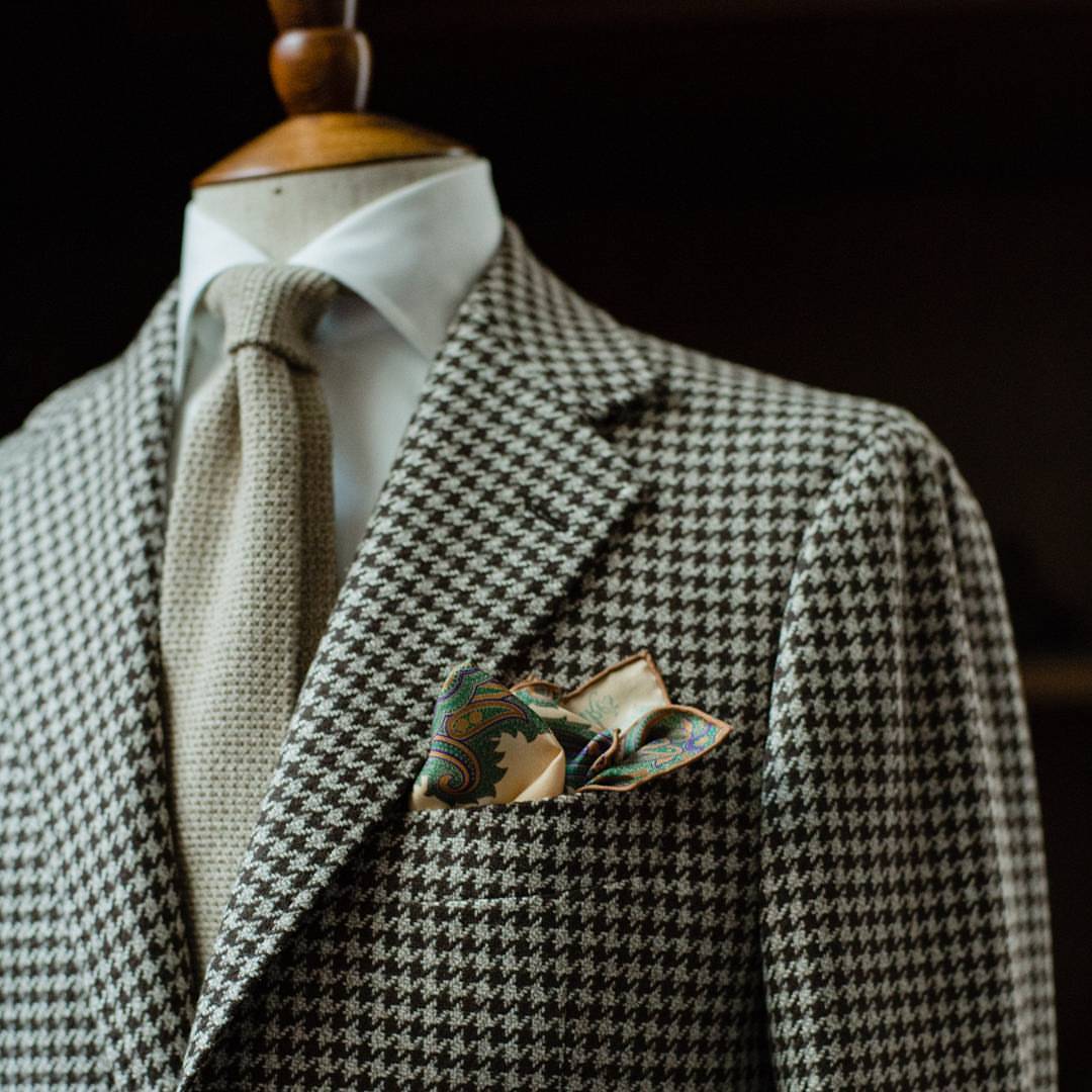
Which range is the houndstooth cloth from Simon. I like the definition and also the departure from classic black and white.
It’s the Pecora Nera range from Loro Piana
I think it should be Dick (Carroll), not Rick?
Do you think of undertones (warm or cool) while choosing the color of shirt and jacket?
Do you feel it is important to consider it especially what you are wearing near your face?
Not really a shirt, but with a jacket I do. It’s really just a matter of thinking what else (trousers, knits) it will go with, but you could think of it in terms of warm and cool.
I don’t really think about what’s near to my face, beyond wanting a collar that frames it and hides a fairly long neck, and often something at the top of a crewneck collar like this.
Simon,
This was really helpful. I have these mid brown trousers that I love and can now see that even though not dark in shade the color wears warm due to an almost reddish undertone. Does that prevent it from working well with a navy jacket?
Not necessarily, but it might mean it would look better with brown shoes than black, for instance
Is that because black is a cool color? As mentioned this is clearly something I should focus on as I thought black shoes essentially go with everything and it was brown shoes that one needed to be careful with
You’re right, generally, and no black isn’t really a colour at all, let alone a cold one. But it’s lack of colour does mean it goes well with cold/muted colours, as does a white shirt
As always thank you!
Simon,
The general thrust is of this helpful article is how the color temperature affects clothing formality. In some other reading I’ve since done I’ve seen color temperature used as the primary gauge for compiling outfits – particularly jacket / trouser combinations and that warm color jackets should be worn with warm color trousers and the same for cool colors. What are your thoughts on this approach? I’ve seen some excellent combinations of warm brown jackets with cool charcoal trousers. Can that be reversed equally well such that the cool jacket is paired with a warm color trouser?
I think it’s about balance, Ben. It’s something that’s definitely worth thinking about and bearing in mind, but it’s not an absolute. For example, if a brown jacket of yours doesn’t seem to work with fairly yellowish beige trousers, it might be because one is too warm, the other too cold. But some warmed brown jackets might be fine with charcoal trousers (which are quite neutral really) if you also wear a white shirt, rather than say a warm yellow one.
I’ve thought about this a lot, especially when you’re at a point when you’re slowly building a wardrobe from scratch. Do you ever find yourself mixing warm and cool colors together? Such as, a cream jacket with pale cold brown trousers or dark green as opposed to the warmer dark olive?
I certainly would mix them together, yes, it can be an interesting combination.
Hi Simon,
I’m a first-time commenter but a longtime reader, and Permanent Style is easily my favorite menswear resource and a big influence in my style journey, so thank you for that! I do have some constructive criticism, which I’m sure you will take well, as you always do, even if you do not ultimately agree.
I would like to add my voice to those of multiple other readers who say that your specific use of the terms “cold” and “warm” in this article (and others) is not the best choice for what you’re trying to describe. As far as I can tell, what you are outlining involves four distinct dimensions:
Color temperature: the established convention of reds/oranges/yellows being warm, and blues/greens/purples being cool. This is consistent across design, art, and photography. Yes, there is nuance in undertones, but that builds on this convention rather than overturning it.Saturation: how vivid or muted a color is. You can reduce saturation in different ways — adding white (tint), black (shade), or gray (tone). Each of these affects how a garment feels, with all moving toward quieter expression.Luminance/lightness: how light or dark a garment is. This is one important way to create contrast in clothing (e.g., a white shirt against a dark suit), alongside other kinds of contrast such as between textures, levels of formality, or complementary colors.Context of the garment: the same color means different things depending on the item. Navy is a staple for tailoring but unusual in shoes. Black shoes are conventional and formal, but a black suit might feel out of place in an office even though it is standard for funerals or evening wear.I’d argue the interaction of these factors — temperature, saturation, luminance, and context — does a more accurate job of explaining what makes your palette harmonious than just calling it “cold.”
To illustrate why “cold” feels problematic: it’s a bit like describing a plate of food as “spicy” or “mild” based on how it looks rather than how it tastes. A curry or mole can be extremely spicy in flavor while looking muted and earthy in color. Diners might grasp the metaphor, but “spicy” already has an exact meaning in food. In the same way, “warm” and “cool” are fixed terms in color theory, and re-using them in a different sense muddies the language.
As for alternatives, there are several words that would capture your meaning more clearly: “understated” and “restrained” suggest elegance without excess. Another option could be “refined,” though it risks sounding more about polish than color. “Soft” could work, but it risks confusion since it often describes fabric texture. “Low-key” conveys the idea well but feels a bit slangy. For me, two of the strongest candidates are “quiet” and “subtle.” “Quiet” communicates understatement in a very intuitive way, though it can imply silence, while “subtle” emphasizes sophistication but can sound more technical.
I’d argue any of these alternatives would be a better fit than “cold” for the kind of wardrobe you are suggesting here, as they would avoid confusion with the well-established warm/cool framework.
But perhaps the most evocative, and my personal favorite, would be to use “whisper.” A whisper is quiet, yes, but it also communicates. It suggests restraint and control, but also mystery and power — the idea that what is said softly can carry more weight than what is shouted. A whisper draws people in: the listener leans closer, intrigued by why the voice is lowered. It doesn’t shout, but it communicates with impact. People may not understand it immediately, but once they tune in, they’re compelled by it. To me, this captures the spirit of exactly the kind of wardrobe Permanent Style advocates.
Thanks for reading and for what you do!