Reader profile: Adrian
Adrian Hogan is a PS reader and an illustrator living in Tokyo. We met at Midori So, a charming Ivy-covered building that’s used as a shared workspace, set on top of a hill in a largely residential area but just a couple of blocks from the Nakameguro shopping district.
We got a tour of the building, which was built in the 1960s and seems largely unchanged. Little offices and communal areas run into each other, a whitewashed concrete room is used as a studio, and a flat roof affords wide views of the city - plus a disused swimming pool below.
Adrian spoke about his work for the likes of Nike, Starbucks and Uniqlo, and striking the right balance of clothing as an artist.
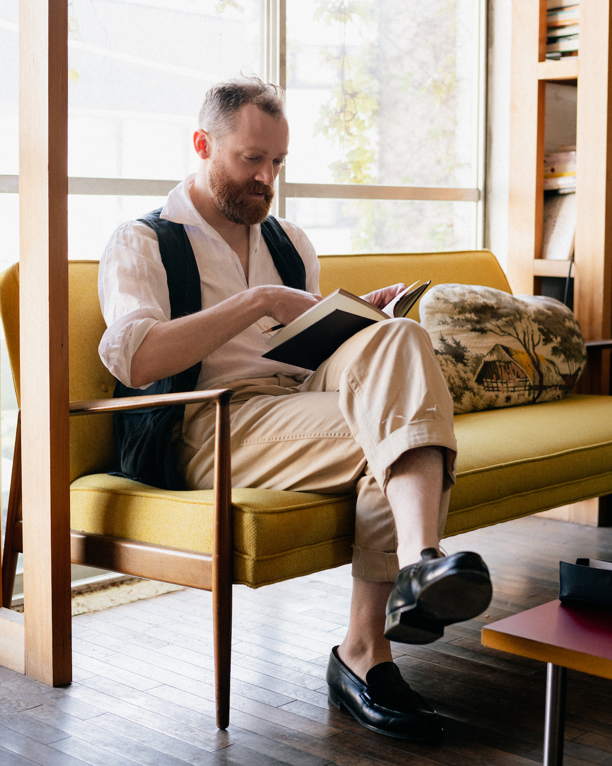
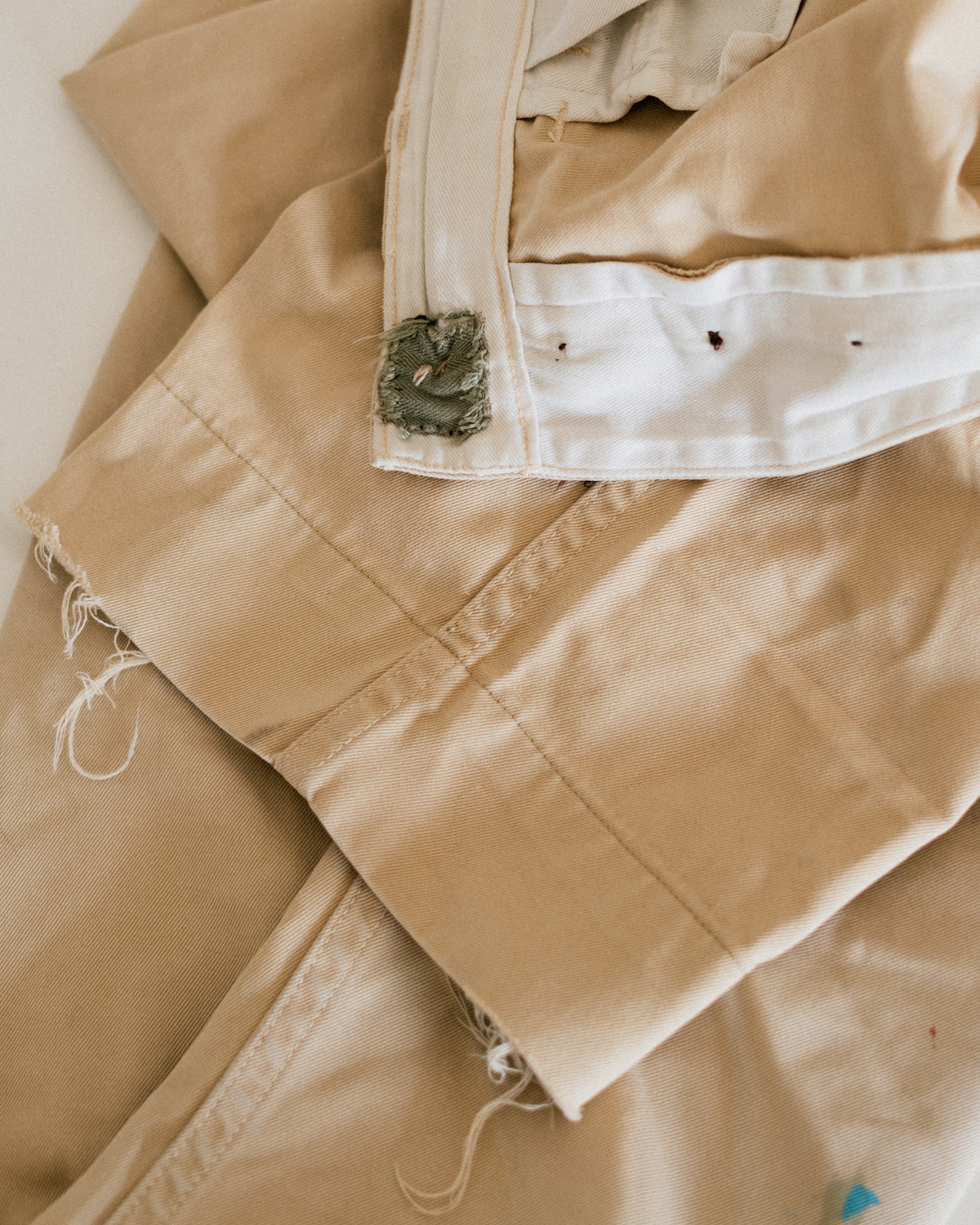
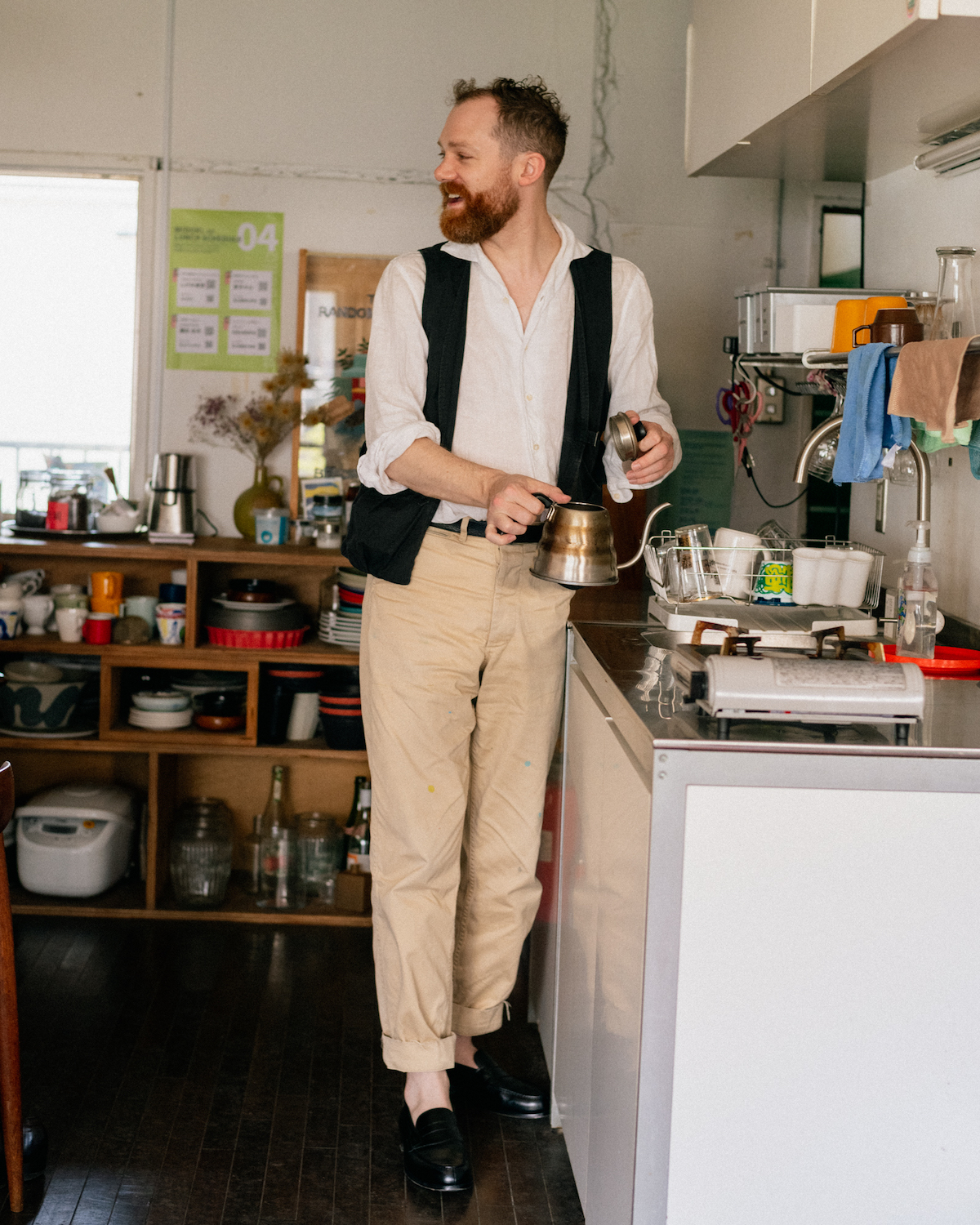
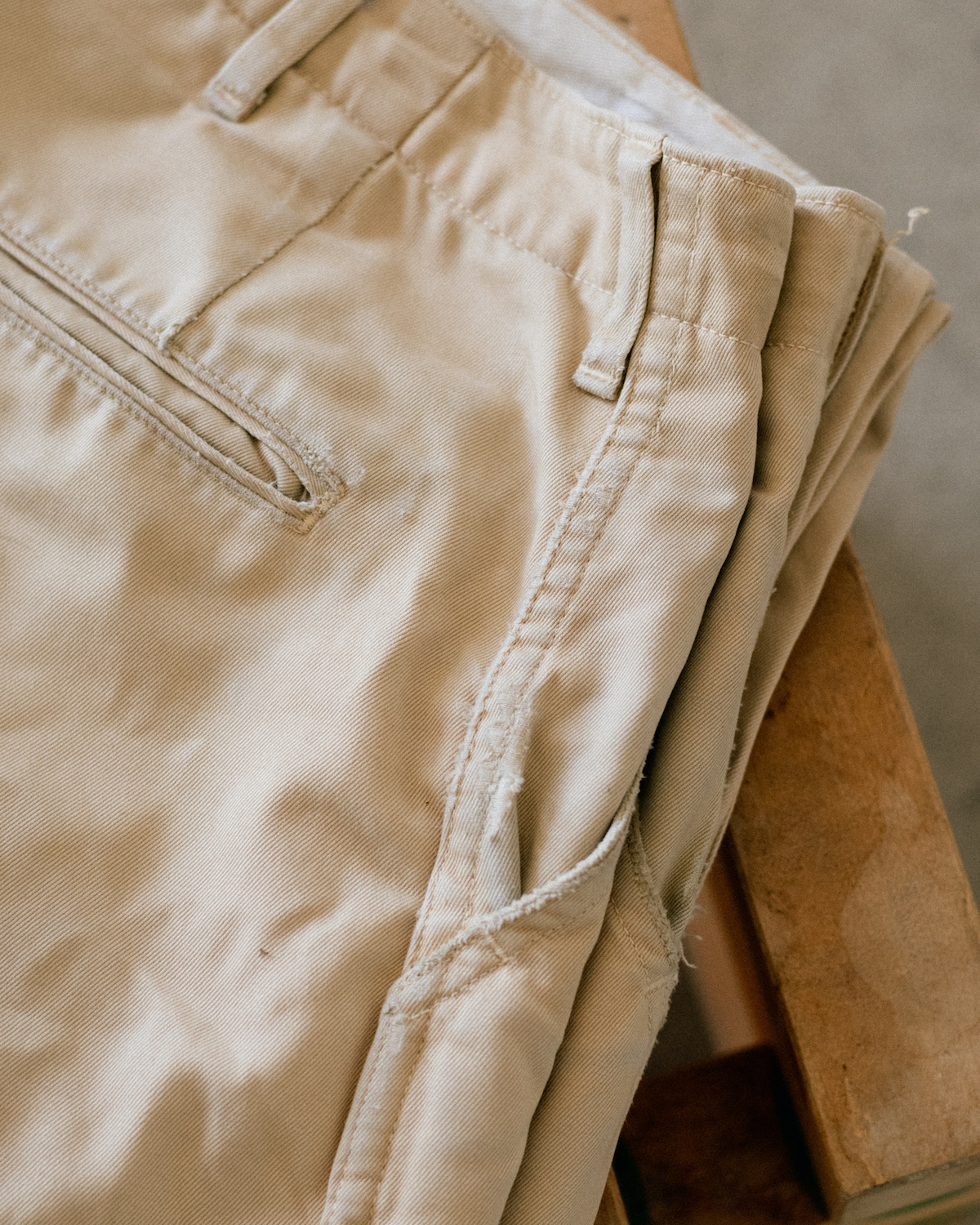
Outfit 1
- Linen shirt: Bryceland’s
- Vest: Phigvel
- Belt: Vintage
- Chinos: Bryceland’s
- Loafers: JM Weston
What are you working on at the moment?
An illustrated city guide for Uniqlo’s in-house magazine, Lifewear. It’s something they bring out twice a year and I usually do it each time in a different style. A lot of the editorial team at Uniqlo used to work for Popeye magazine, which is the magazine I’ve worked for the longest, so they use the same freelancers.
How do you get work as an illustrator - is it all word of mouth, or do you have to pitch?
One good job usually leads to another. The Japanese are quite relationship based, once they trust someone they tend to stick with you. Popeye has been pretty much doing the same style of magazine, the same 12 topics every year, since they started in the 1970s.
Clients also tend to throw everything at you once they trust you, which can be challenging. You’ll start with illustration, then it’s art direction, then a whole branding assignment for a store. It’s good, it pushes you.
How did you first get started in Japan?
I moved here from Australia in my twenties. I’d studied graphic design but it was really the drawing aspect I liked the most - not the fiddling around with fonts. The start was very fortuitous though - I thought I told you this story? Maybe not.
I was sketching people at a train station and there was this guy wearing a hat at an angle, looking very mysterious. So I drew him, and I thought I was doing it from quite far away, but when I got on the train he had clearly seen me because he approached and said excitedly, “Can I see the drawing, can I see it?”
Fortunately it was a good one, he took an interest and gave me his business card. He worked for Comptoir des Cotonniers - it’s actually a company of Uniqlo now, but was French then. That led to a job drawing portraits for Vogue’s Fashion Night Out over here.
From there I started working for magazines - I think I’ve drawn for most in Tokyo at this point - and for the store Tomorrowland. Aside from Popeye my biggest clients now are Starbucks and Uniqlo; I did some work for the Tokyo Olympics as well which got me a lot of attention.
I remember doing interviews on the radio about the Olympics and my mother back in Australia recording them - she’d send each one back to me and I hated the sound of my voice! But I guess everyone does.
Have many clients are menswear?
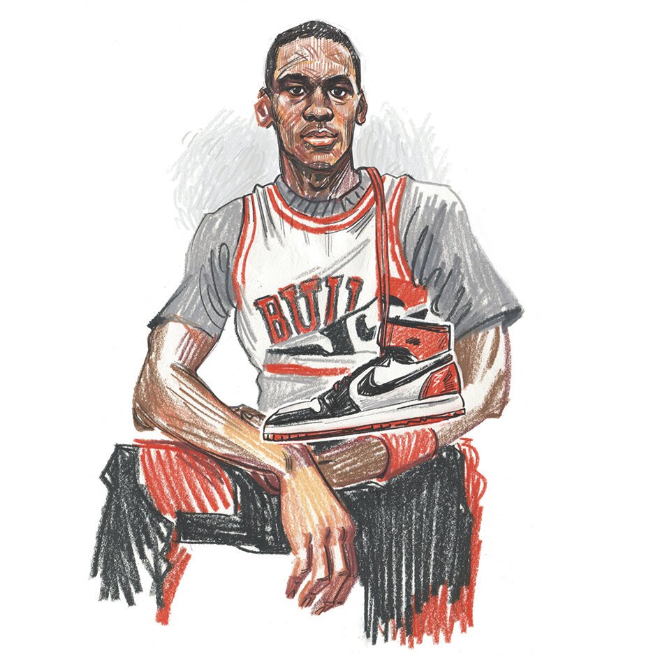
A few, though none at the start. I remember I had this one project for Nike where I had to draw Air Force Max sneakers, and I had to focus so closely on the lines, the proportions. Everyone knew the product but I didn’t. It was the same with drawing a herringbone jacket or other clothing for the first time - it’s such an education.
Is the outfit above typical for you? Thank you for the coffee by the way!
You’re welcome, it’s such a nice little kitchen. Yes this is the kind of thing I wear a lot in the summer, lightweight because it’s so hot in Tokyo. Unlike Melbourne where you can have four seasons in a day, Japan is quite consistent.
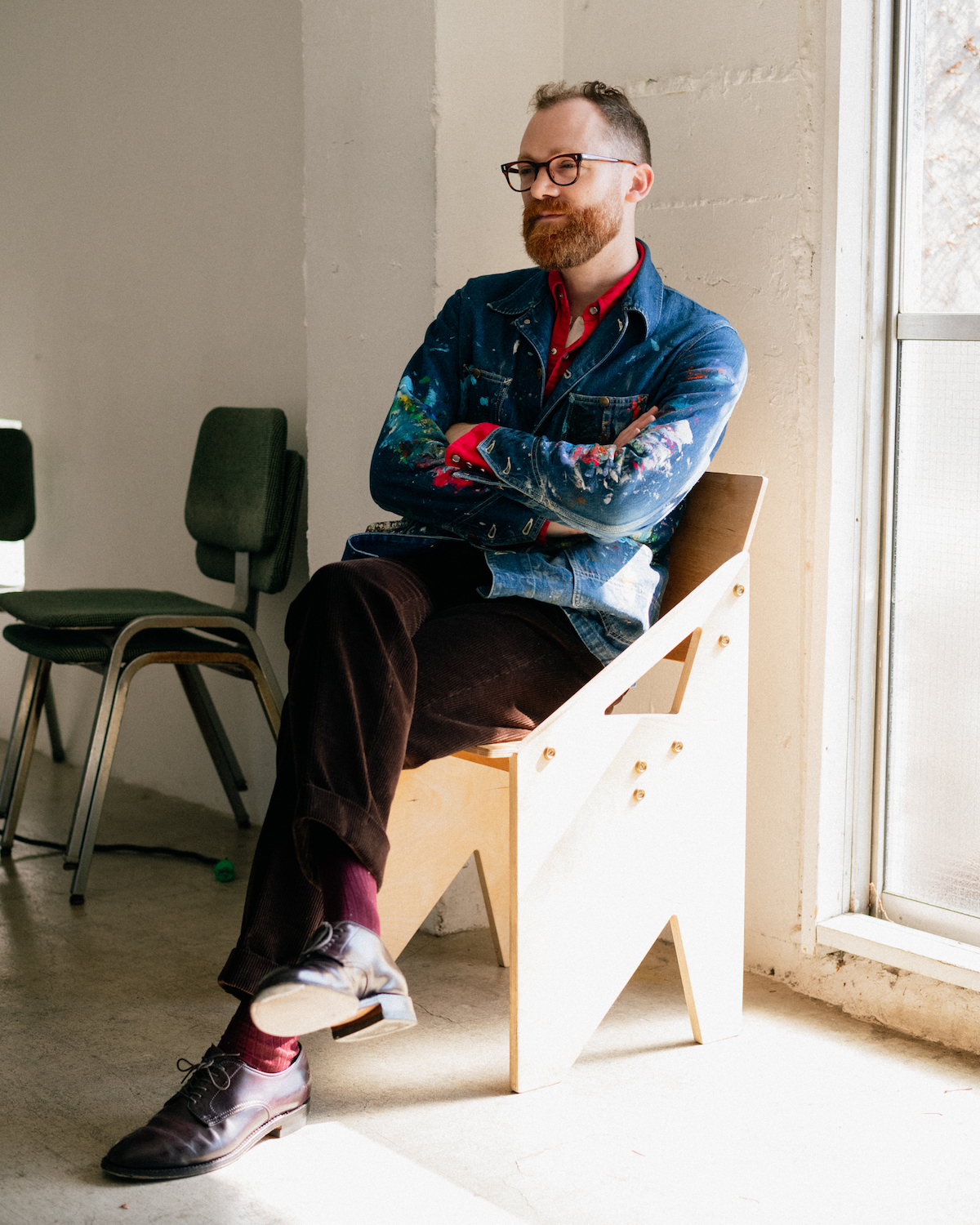
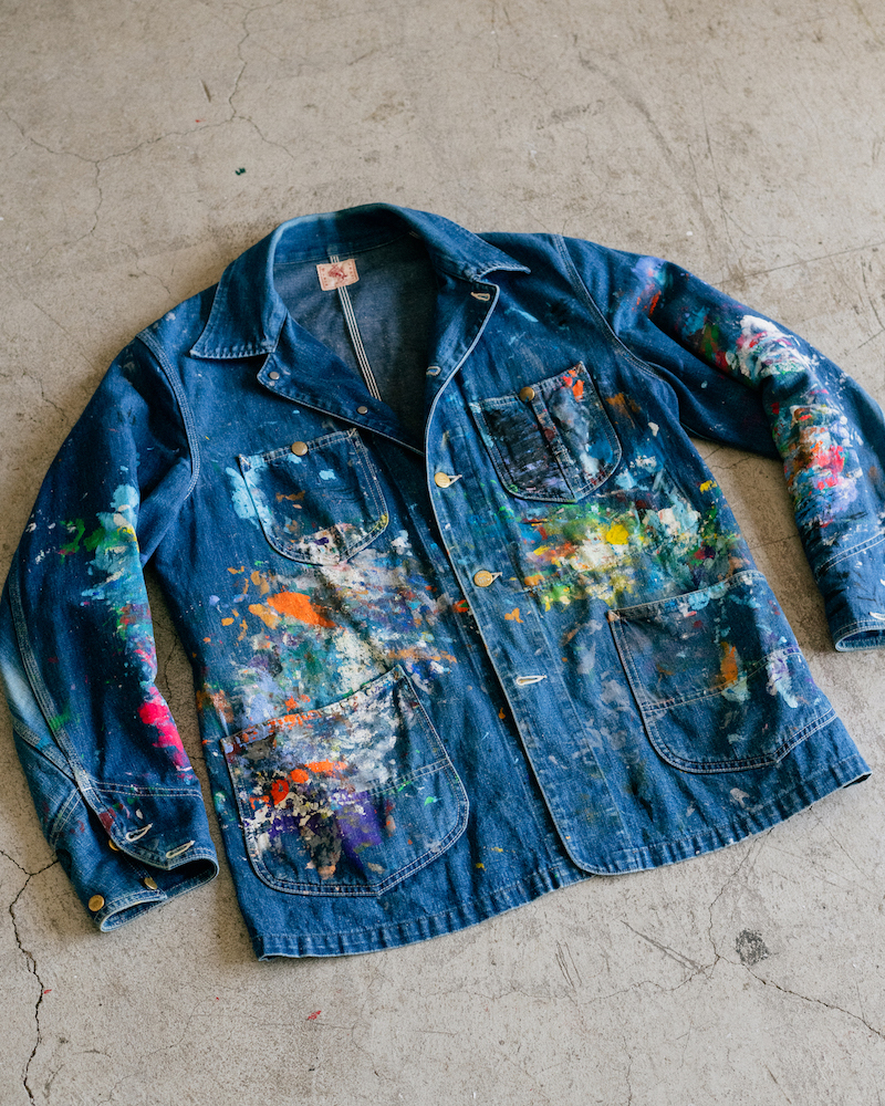
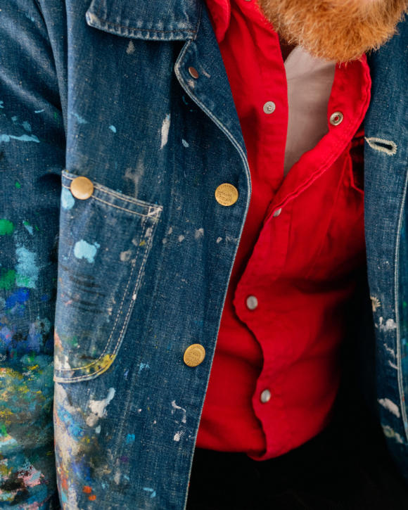
Outfit 2
- Chore coat: Bryceland’s
- Red sawtooth western shirt: Bryceland’s
- Cord trousers: Ambrosi
- Socks: Crockett & Jones
- Loafers: Alden
Have you always been into clothes?
Not really. I used to dress OK, probably because I had a good eye for colour, but I didn’t think about them much. It didn’t help I was a starving artist with zero budget, and being tall and thin meant not much fitted me in Japan. I actually had quite a lot of hand-me-downs from expats that had left.
But when I turned 30 - six years ago - I started to think about it more. I wanted to be taken a bit more seriously at work, but I also didn’t want to dress like a salaryman, so I needed to find a balance. The Japanese also focus on clothing a lot, it’s part of the language. They’re quite object-oriented and there’s a presumed knowledge of a lot of the culture of clothing. So there was catching up to do.
How did you start?
Bit by bit, talking to friends who were designers or finding store staff that were good. I’d do that poor-boy thing of talking to the staff in the expensive store about everything, getting all their advice, and then finding the same thing cheaper. The outfit above is a lot from Bryceland’s and other makers, but a few years ago I was wearing the same kind of clothes just from Uniqlo.
I also got into more traditional garments, like a Jin Bei, basically a Japanese cardigan. That was from a brand run by a friend called Hi Hi Hi. They do an ‘exhibition’ every season, like a lot of Japanese brands, which is basically an opportunity to do pre-order and even alter the fit. That was the first time I realised things could be custom made.
I also like a brand called Semoh, though they’re a bit more fashion and the clothes don’t work as well if you start to get a bit pudgier around the waist! And Phigvel for workwear, where that vest in the first outfit is from.
Sometimes I get clothes as part of work too - Tomorrowland paid me partly in credit in the early days, which allowed me to get my first suit.
How did you first get to know Bryceland’s?
A magazine asked me to do a portrait of these various guys around Tokyo, and Ethan was one of them. I was kind of intrigued too - here’s this Australian, big guy and with a beard.
Ethan was really good at giving advice. It was so relaxed, you could just rock up there, have a coffee and a chat. He was particularly good on navigating that high/low aesthetic: it works really well for me as someone that wants to look like an artist but also professional, but it can be tricky to get right.
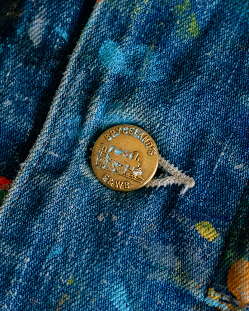
You clearly enjoy the Bryceland’s range now - those chinos look amazing and the chore looks like it’s been used for work a lot.
Yes, I’ve worn both so much. And it’s nice having a piece like that chore coat - I have a white one too. They get paint on when I’m doing mural work - I’m doing one for a hotel at the moment. But I’m also very aware of the impression they give, and that it’s the kind of look some clients want in an artist.
There’s always something a little performative in what we wear, perhaps particularly so in Japan.
Bryceland’s was why I first started reading your blog too, in 2018 maybe. Ethan had a copy of the book you did with Kamoshita on the cover and he told me about it.
Oh that’s nice, The Style Guide.
Yes. Although actually, in the past few years a lot of friends in Japan that have no interest in menswear have suddenly been asking me about it - I think because of Derek Guy, now he’s blown up on Twitter. So I send all of them to your site.
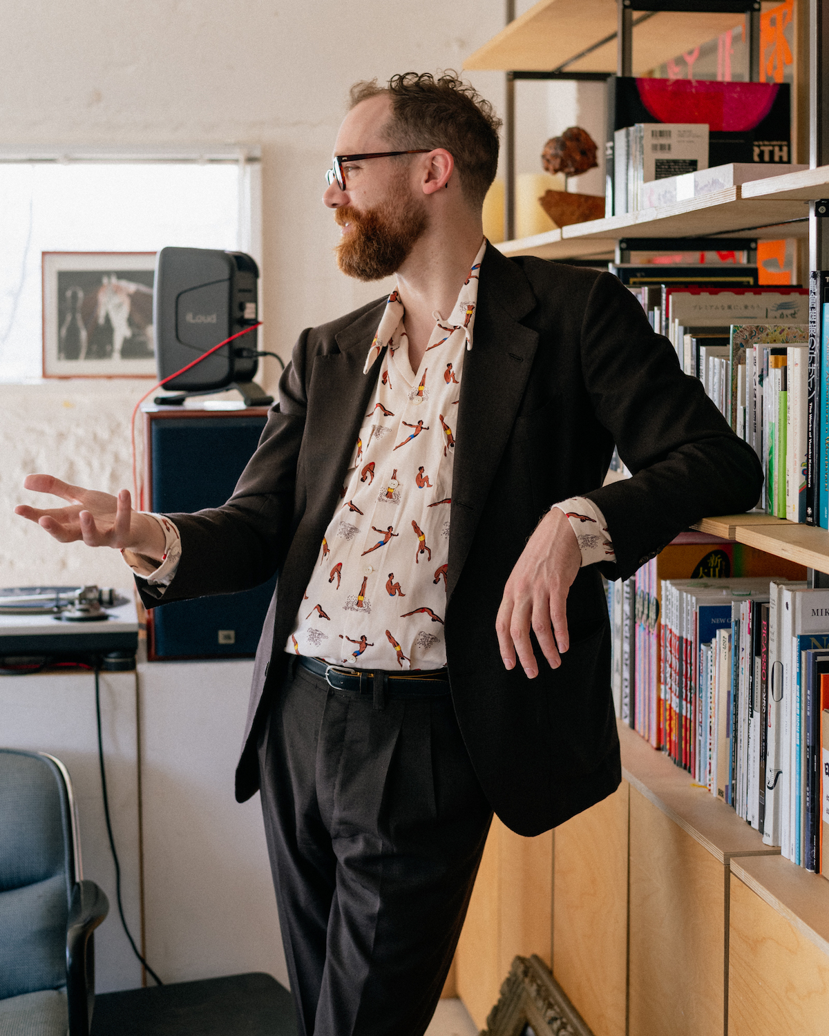
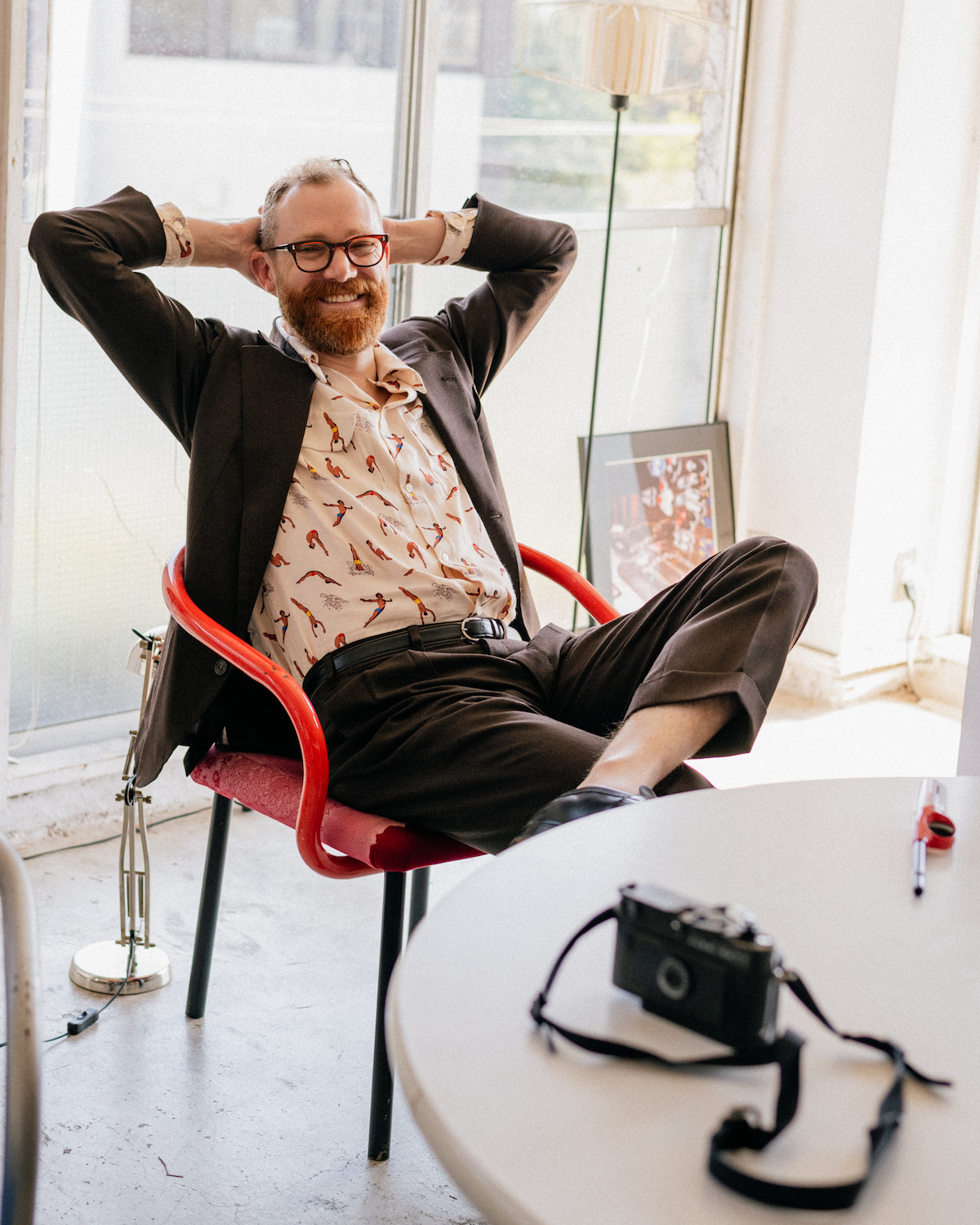
Outfit 3
- Glasses: Vintage
- Suit: Dalcuore
- Shirt: Bryceland’s
- Belt: Vintage
- Loafers: JM Weston
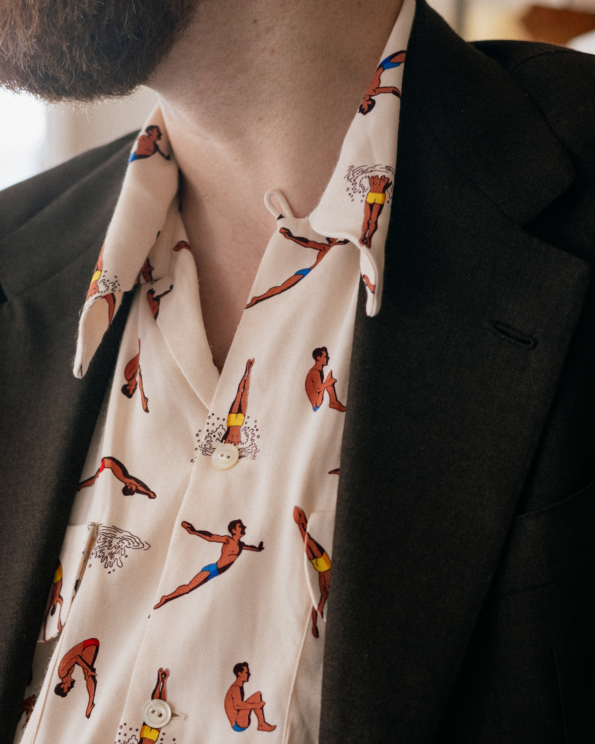
I know you designed the motif on this shirt - is it typical of your drawing style?
My drawing style actually varies quite a bit. Maybe it’s my background in graphic design - we were always taught there to adapt to what the client wants, to fit their branding.
Even when I moved to Japan and was doing more drawing, I’d have different styles. One quite realist, one simplistic, one more cartoony. Drawing is like a language really, and different types of language are better at expressing different things.
As a freelance artist is it helpful to have an identifiable style as well? To give yourself a form of branding?
Yes there’s always a balance there, and it’s easier to do it as you get more established. When I first came to Japan I did everything, even anime or manga, which I didn’t particularly like but it’s what you do when you’re trying to get started.
One thing that’s nice about Japan is that they appreciate things that are handmade, so they like illustration that is clearly done by hand, even if the colouring is done on computer, perhaps for speed.
One other thing I had to get used to in Japan is how much colour and tone of illustrating depends on the season. People are very aware of the weather: it will be a topic of regular conversation that we’re going into June and July, so it’s rainy season, so everyone had better look after their health.
That affects the tone of my work - it has to feel quite specific to the season. If I’m working on something now for Autumn/Winter, I have to think ahead and plan accordingly.
Was there a change in palette coming from Australia as well?
Yes, Tokyo is much greyer, but the country as a whole is much greener. That was a revelation to me; if you’re drawing a city or a background you have to be very aware of these things.
I was over in London during the Platinum Jubilee actually, and it was so foggy it felt like a Turner painting the whole time. I was thinking - he wasn’t original at all, he was just painting what it was actually like!
Thanks Adrian. That was fascinating but we’ll have to call it a day there. Hopefully see you again next time I’m in Japan.
That would be great, and pleased you managed to get out to Cow Books as well. See you then.
The Style Guide book is currently out of stock, but a second printing in coming later this year.