The colour fallacy

Monday, December 27th 2021
Share
||- Begin Content -||

By Tony Sylvester

This Autumn past, I took my first trip since before Covid. A short flight to Copenhagen, a city I know well. A very brief holiday, it served as a primer of sorts; a way to ease back into the idea of travel. 

Everything was familiar - the streets, the shops, the restaurants, and especially the museums. The one necessity of any trip to Copenhagen (besides hot dogs from Steff's Place) is for me a visit to the Glyptoteket. 

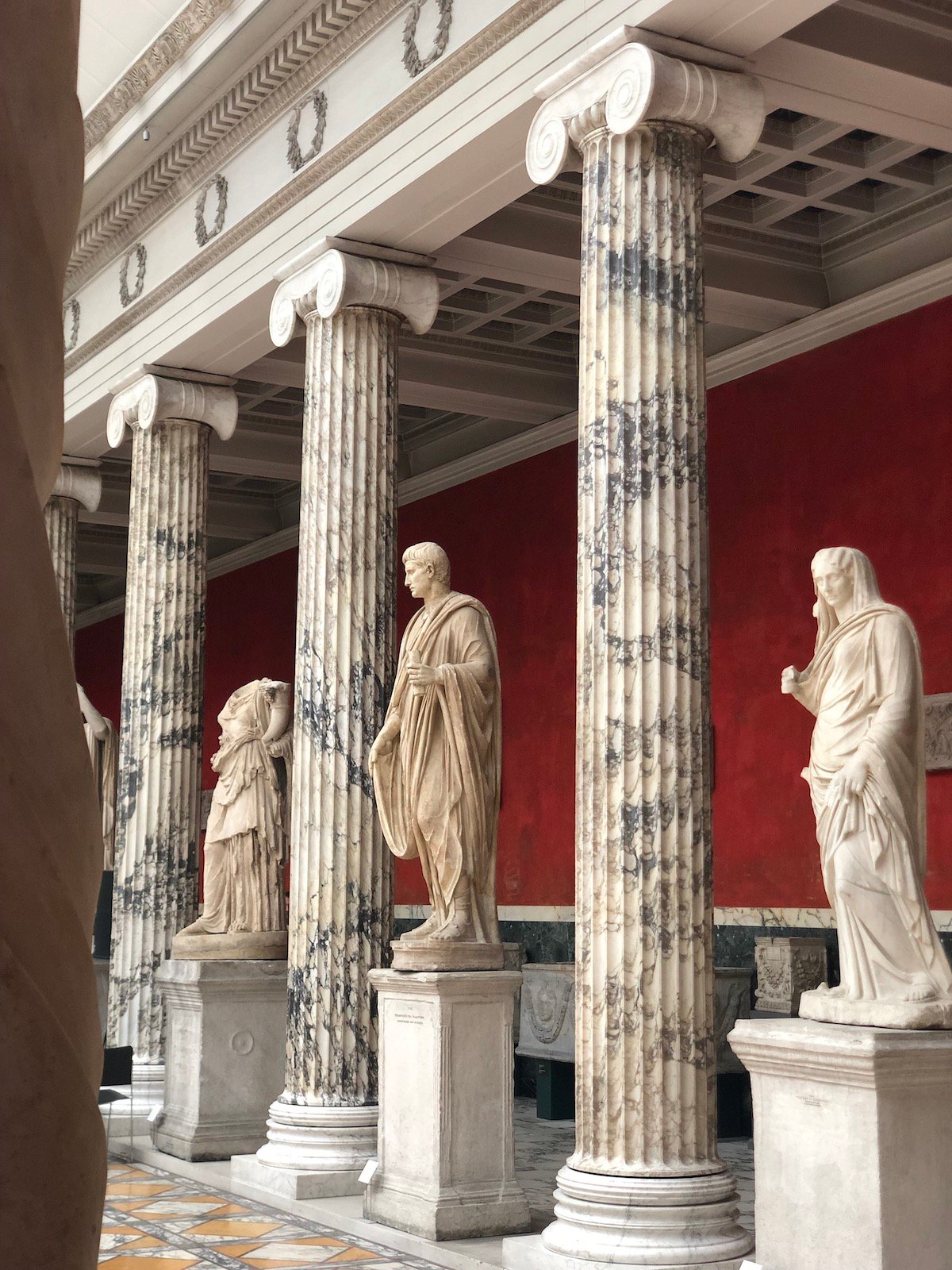
The Glyptoteket (literally 'Carving Place') is a sculpture museum built on the old city's fortifications in 1897. It houses the exhaustive collection of art, predominantly statues, collected by Carl Jacobsen, the son of the founder of Carlsberg beer. 

Split between French works from the 19th century and marble pieces from antiquity, there are endless rooms of glowing white figures offset against coloured walls of various Farrow & Ball-esque hues. It is incredibly beautiful and calming in its austerity: somber yet lovely. One could argue this is Western Classicism at its most fundamental: cool, minimal, stoic, tasteful. 

Unfortunately, scientific development in recent years has somewhat burst this bubble, undermining any belief in the inherent legitimacy of these plain white figures. Upstairs, a research room shows the statues as they really were. 

Analysis of the statues' surface reveals microscopic paint fragments in an incredibly diverse palette. Eons in the soil and waters, coupled with the wire brushes of the early archeologists, had washed and scrubbed away their true appearance. 

In contrast to ones in the main halls, these restored figures that once stood in the Greek and Roman private villas and municipal squares, radiate with multi-coloured togas, glowing eyes and golden locks. The whole thing is a little… well gaudy, to be honest. 

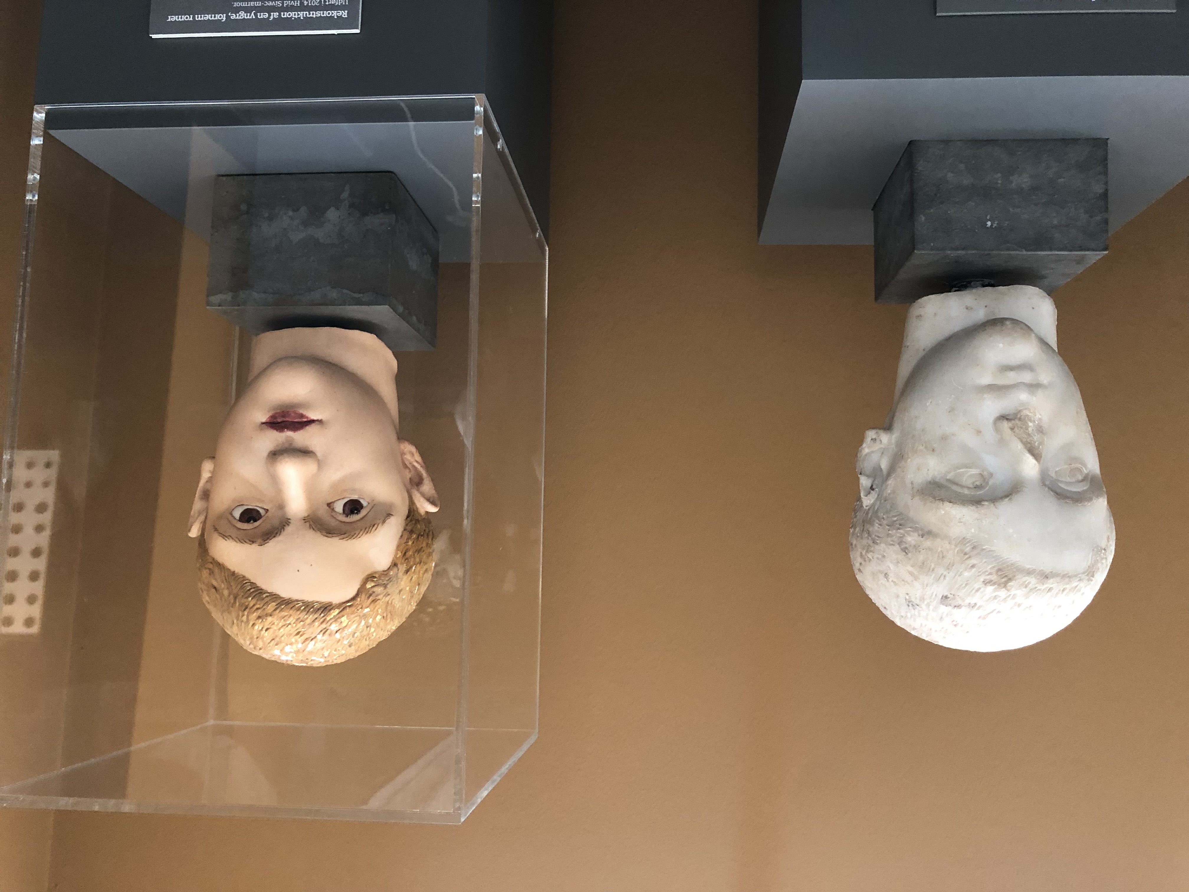
As archeologist Jan Stubbe Ostergaard points out, this goes directly to the European sense of self. Our white marble was what set us apart from the ‘barbarians’ with their childish paintboxes.

"European high culture was not characterised by respect for other cultures," he points out. "In our own imagination, we Europeans have regarded ourselves as different and superior throughout history. The Europeans have regarded the white marble figures as the ideal for sculptures because they were different from all the others." 

Turns out we were as gauche as the next man after all. 

This made me chuckle because it reminded me of the often blinkered world of 'traditional' menswear. With its dogmatic adherence to rules and regulations laid down in the last century, it can involve a very specific, monolithic view of our forebears. 

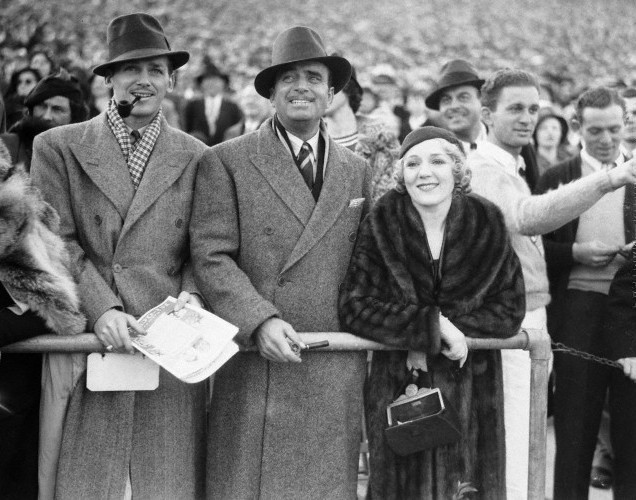
One of the most commonly held myths about stylish men of the past, is the sober colour palette they employed in their outfits. The monochrome world of Pathé newsreels, faded newspaper clippings and Golden-Age Hollywood celluloid has created a sense that our forefathers were a conservative lot; well dressed, but dowdy and tame in their choices. 

You see echoes of this in the collections of many modern brands, Ralph Lauren’s Purple Label (below) being the most obvious example. The tailoring on the chiselled models is almost unfailingly tonal, whether it’s grey surrounding the palest of lilac, or cream set against the darkest of browns. The whole thing will usually be shot in a white room with high contrast and strong shadows. Ralph’s love of old Hollywood is common knowledge, and often the look and feel of the collections screams of the monotone movies he devoured as a child.

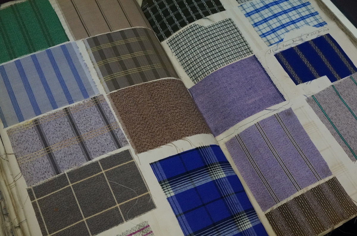
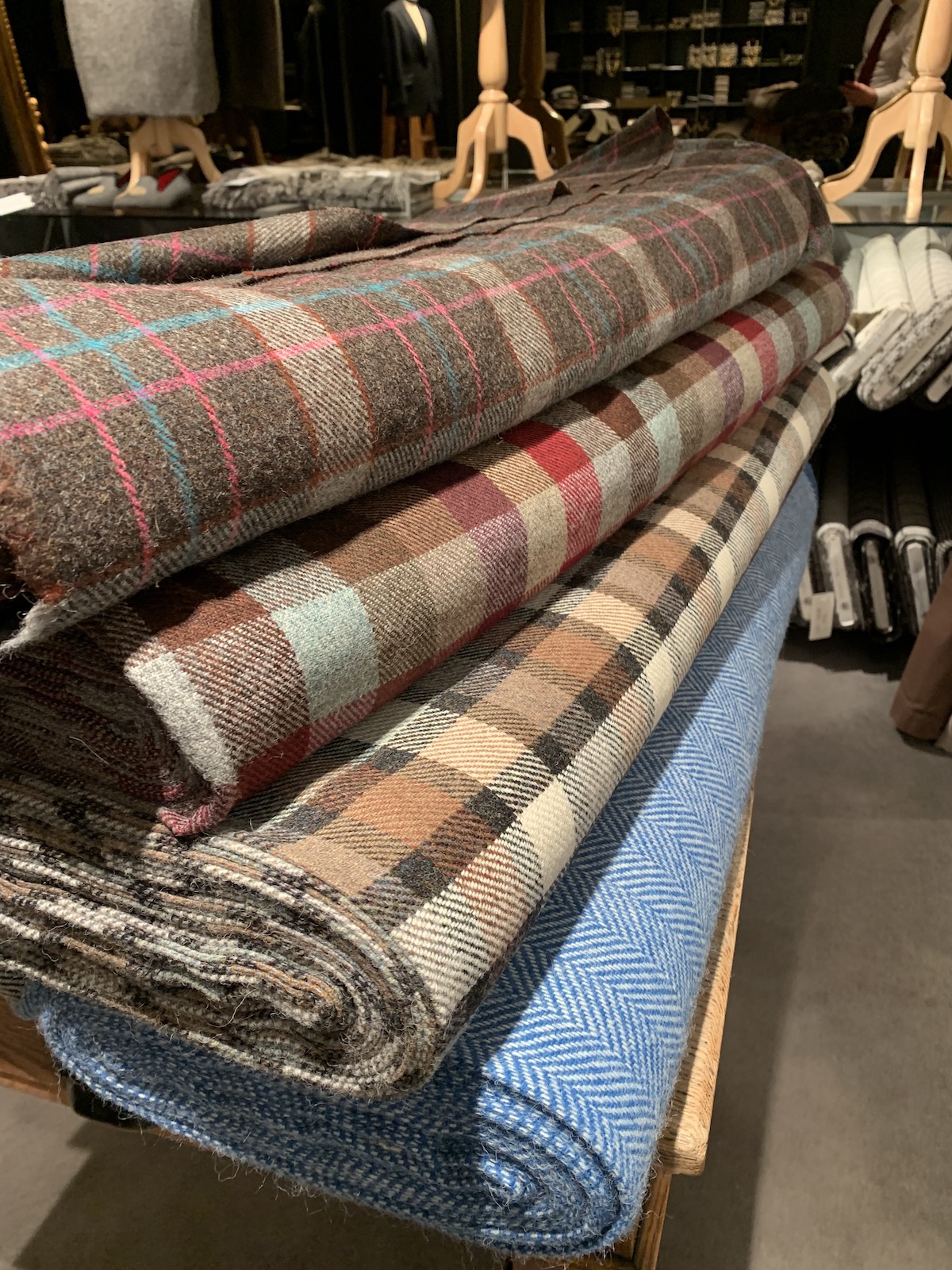
The reality of the period this aspires to was illustrated to me when I recently visited the archives of Jermyn Street stalwart Turnbull & Asser (above). 

The sheer scope of their kaleidoscopic checks and stripes from the turn of the century is breathtaking. Silks, voiles and cottons in every conceivable shade, still bursting with unfaded pigment, hidden away as they are in thick leather bound binders. Certainly contemporary portrait photography of the time failed to capture this ebullience. 

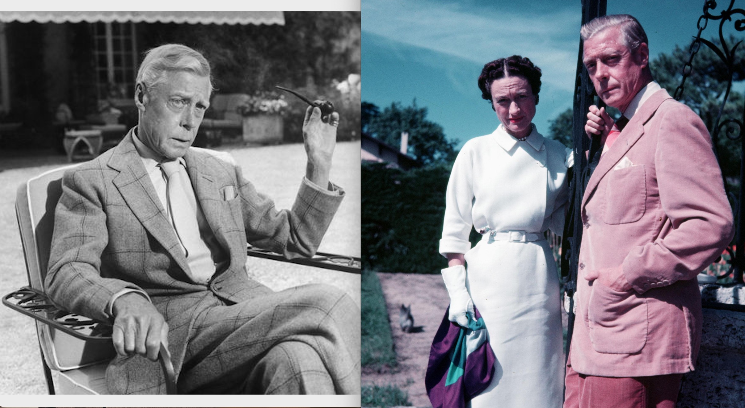
Die, Workwear!'s ever-insightful Derek Guy once pointed out the dissonant disparity between seeing one of the Duke of Windsor's outfits in black and white, and viewing the same ensemble in colour. All that expert pattern mixing of scale and tone is blown out of the water by the full drama of the colours. 

The infamous Sotheby's collection of Herr Windsor's personal belongings highlights some, shall we say, eccentric choices when it comes to cloth. Outfits in old Time Life issues show Eddie rocking what one assumes to be a country tweed in a suitably muted palette. Cracking open the Sotheby's catalogue however, we discover that the diminutive Duke had swathed himself in parakeet green with a navy windowpane. 

It evokes peals of laughter, shock or a begrudging respect, depending on where you sit on the scale sartorially. 

These are issues I often ruminate on at this time of year when thinking about commissioning tweed jackets. 

While no fanboy of the wayward king, I often wish modern cloth mills would cater more to those of us with similarly gutsy opinions on colour and pattern. There's a boggy murk on the heart of most books of winter cloths that puts one in mind of a particularly drab and rainy day on the moors. 

For me Tweed, with its roots in the tartans of the great Scottish houses, offers so much potential for working colour into an outfit that I am always on the hunt for brighter checks with greater contrast. 

The first sports coat Fred Nieddu cut for me almost a decade ago (above) was from a long discontinued Cacciopoli bunch. The olive base was to the mustard end of the scale, with bisecting lines of paprika and teal: perfect foils for bolder ties or socks. 

Later, my favorite Teba from Justo Gimeno used a deadstock cloth I discovered which used a biscuit-coloured base to build a grid of rainbow abstraction. Despite the myriad colours, it still maintained its utility with an overall harmony. 

More recently, I ordered a grey tweed three piece with gold overcheck from Porter & Harding's Hartwist bunch, after seeing Fred use it for one of Prince Philips' highland looks in The Crown. 

This year I'd been stuck for something that would compliment my recent wardrobe of black, tan and brown. Black is the colour I find least harmonious with tweeds, as there's very little echo in most cloths I've seen. 

As luck would have it, Dugdale's had placed some old bolts and end-of-lines in Savile Row Valet, and there amongst the worsteds and high twists was the ideal candidate. At once loud and bold without resorting to colours you could call flamboyant, it was labelled ‘Carnaby’ and' was a mid-sized check of tan, seafoam, brown, cream, and yes, black. It went straight over to Fred at Taillour to be made into a patch-pocketed sports coat (shown above). 

It turns out that this Carnaby cloth was part of a series called ‘Tweed In Town' that Dugdale's promoted at the tail end of the 1960s to achieve exactly what I had been aiming for: a tweed that shed its country complexion in search of more urban pursuits. 

They still have stock on the wonderfully monikered ‘King’s Road’ (a bright blue and cream herringbone), ‘Golden Square’ (a large scale check of pale brown, raspberry and wine) and ‘The Pimlico’ (with sorbet pinks and blues over a mid-brown base, all shown below). 

Come on, let's wreck the temple of neoclassical good taste together!

Subscribe
Notify of
guest

40 Comments
Oldest
Newest
Inline Feedbacks
View all comments
Jack

Great article, thankyou for the insights Tony. I like you’re last outfit with the tan trousers and black Chelsea boots…may I ask are they RM Williams Craftsmans? They’re very popular here in Australia as they may a good hard wearing daily dress boot that seems to go with everything!

A W Sylvester

Yes indeed, Good spot Jack. These Calvary twill trousers were cut a little higher on the ankle to accommodate Chelsea and jodhpur boots. The craftsmans (craftsmen?) are my go-to’s

Jack

Craftsman are the classic chisel toe boot in the RMW range

Patrick Hanrahan

Time for a spot of Mink Oil on the RMs. Very satisfying to see them come up with a good creme polish.

jose carlos

I agree completely about the ensemble, beautiful clothes, beautiful boots indeed, perhaps they could do with a bit of polishing before going online. That put me off, and I am sorry for that.

Kenneth

Excellent article!!!!! Sir your writing is very impressive….happy new year 2022…..peace

Johnny Foreigner

The bit about Europeans, barbarians, and white marble is nothing but fake history, of a dangerous sort too.

Peter Hall

I’m reading this as I travel to Schipol wearing green desert boots, green chinos with a burgundy blazer!
Fascinating stuff, I’ve been following the project ‘Tracking Colour’ and it is quickly apparent how gaudy antiquity was coloured.
Post lockdown I’m sure colour will bloom…

Peter Harding

Great article Simon.

Stephen

Hi Tony,
Fascinating article. I always enjoy finding out something new.
Similarly, I personally find the ‘colourised’ black and white films lose some of their style and you article resonates with that view.
The cloth in the Fred Nieddu sports coat looks amazing. The only issue I find with these patterns is the way horizontal element sometimes stands out too much for me, but now I’m inspired to look again at brighter checks.
As for Herr Windsor- thanks for helping to explode the myth. I have always thought his style was extremely overrated. Simon and I have corresponded on separating on what someone wears with how they behave – which I generally (but not always) agree should be the case. The quiet reprehensible behaviour by Herr Windsor, in the lead up to the Second World War seems to now be reflected in his clothing choices. Which also demonstrate poor judgment. Certainly at best shallow attention seeking.

If we are looking for a true style icon amongst royalty then there is no need to look further than the late HRH Prince Philip. Style comes from within, which in his case is enhanced by his moral fibre and his sustainable approach to his wardrobe was ahead of its time.

Thanks again for some a bit different to blow away the post Christmas cobwebs!

FS

Here here! Couldn’t agree more with regard to the overrated Duke of Windsor and the (relatively) underrated style of Prince Phillip. Cheers.

William

It sounds like a conservative and muted color palette, then, is almost a novel development that belongs to our era, not the Greeks’ or the Romans’ or Humphrey Bogart’s. And it’s based on a misinterpretation of “neoclassical good taste,” rather than on a correct appropriation of a stylistic inheritance. For example, modern people are probably much more fond of bleached marble than the Greeks and Romans of antiquity who wanted the statues they commissioned painted. To use another of your examples, Ralph Lauren’s Purple Label might actually be much more tonal and minimal than the 20th century black-and-white films that inspired the brand. The Purple Label reflects more of our interpretation of the technological medium than the era ‘s fashion. New technology and research are revealing that maybe we’ve gotten the whole classical paradigm wrong. Though, in doing so, I’d argue that some very “cool, minimal, stoic, [and] tasteful” stuff has been made, to use your words again.

I agree with you that the painted statues look a little bit wacky. They jostle my (apparently very) modern sensibilities. I too prefer the blanched marble. Thank you for writing such an interesting article!

A W Sylvester

Thank you William. I agree. What I always found fascinating about Purple Label was how it appeared to be exactly that: a misread (probably deliberate) of what the movie stars were *actually* wearing – a more muted or monochrome take.

Jim

It’s interesting that you don’t mention illustrations from this era e.g. Apparel Arts. It seems most of the colours in those illustrations are quite muted and tonal, similar to the Purple label palette – would you not agree?

Jesse

This resonates with my feeling on the subject, as well. It seems that, in the case of the marble statues, time and nature revealed the true nature of the thing – the underlying beauty of the shaped stone, freed from the color palette that would otherwise have been slightly offensive to modern sensibilities.

Perhaps a similar effect has been achieved with the fading of the photographs of icons of the past. Digging deeply, and restoring true color, adds another dimension to consider alongside the more muted tones.. Although one does wonder about the connection between vibrancy of color and patina. It seems patina is much more celebrated than brand new and box fresh. All color fades, so if it starts more muted, perhaps it feels newer, longer?

Regardless, the exhortation towards more color is an apt one, even if it’s for richer tones and not necessarily bolder ones. Bravo, Tony.

Ben

A bit of a straw man assault this one. Look anywhere beyond classical menswear and there’s plenty of color to be found—and in much more saturated shades than what’s shown here. The latest Bond stepped out in fusia velvet. And classical menswear is an increasingly vacant sector of contemporary dress.
The conservatism of this subculture is declared in its very name: classical menswear. Its preference for the muted is a feature, not a shibboleth. If you don’t like it, there’re plenty of other flags to salute.

Tim Barker

Why make a point based on the clothing choice of an actor, and then spell the colour you make the point about wrong? And what is a straw man assault?
Simon why do you publish such ***** comments?

Tim Barker

Thanks for the admonishment. I know what a straw man argument is, but I was asking what a straw man assault was.

Yosef777

Don’t think the duke has ever been referenced as ‘Herr’ before, at least not in public ; )

Kenneth

Tony was making a point about the duke..we know what he was talking about..let us just say that the duke was always well dressed..smile..happy new year!!!2022.

Tom

Thanks for a most interesting and valuable article. It may be worth noting that color photos change over time, and in some ways may be as misleading as the black and white variety. The photo of the Duke of Windsor is an example. As with many old images, the blue sky has turned cyan, and red has intensified, making skin tones lobster-like and changing the color of the Duke’s clothing. His jacket was likely not pink but more of a dark sand. The revised image that is attached shows what I mean.

Screenshot-2021-12-12-at-14 rev.jpg
PC

The Duke’s outfit (colors) doesn’t look out of place in a Drakes catalog.

AK

Great article, and I think particularly relevant as traditional orders of dressing become even less restrictive post-COVID. Could use more photos though!

Something I’d be interested in reading about, which I’m sure has been done, is a discussion of the color choices in set and wardrobe that they made back when they were filming movies in black and white, in order to achieve the desired final effect. I’m thinking of things like the invention of TV yellow for guitars (a paint that would appear white when filmed in black and white under bright stage lights, where actual white would cause harsh glare).

Anton

First off, I will be avoiding the whole political argument that is trying to equate belief in white marble statues as a reflection of a person’s questionable racial beliefs. I don’t think it is by accident that when you google “Painted Roman Statues” all of the articles seem to focus on racial issues over any actual interest in the objective archeology themselves. When did one’s appreciation for ancient Roman statues (painted or not) become a factor in determining one’s racial beliefs? What next, someone on TikTok claiming Rome did not exist at all?

Since my interest is less on the politics and more on the archeology and art, it is what I want to address. I will be frank. Rome had a lot of statues. Some painted, some not painted. Out of those that were painted, you most likely had some brilliant works of art, true masterpieces. You probably had some gaudily painted ones too. All the science really knows so far is we have found traces of paint flakes on many statues at the microscopic level suggesting that Romans and Greeks did paint statues at some point in their history. A quick look at the Pompeiian frescos could tell you that. However, an archeologist who may or may not be an artist slapping some paint onto a mockup to get an idea of what they are studying is not indicative of their actual appearance. To claim that Rome was a “Gaudy” based on those mockups alone is intellectually dishonest, and when tied with the politics being pushed with that hot take, it suggests that the entire art history of the west is rooted in racism and tastelessness.

Rome was vibrant. Not gaudy. Even the choice of words used are poorly chosen. We only have to look at plenty of well preserved Roman era frescos to see the artistic style and colors preferred by the Romans. Google them. Even better, go see them in person in Italy. I promise you will see plenty of wall frescos with representations of statues and marble work on them, painted by those same Romans! If you need some actual examples, look up these two. A roman era fresco decorated the dining room of the Villa of the Farnesina in Rome has unpainted statues. The house of Venus in Pompeii has a wall Fresco with a clear representation of Mars as a statue. Look them up and then decide for yourselves on why some people have made a politically fueled mountain of race theory out of the molehill of Roman art that should have never had anything to do with that in the first place.

I will conclude with this. Celebrate the diversity of art. There is an entire world of it, and every culture and era has their Trump Tower to go along with their Taj Mahal.

A W Sylvester

Anton – very good points well made. I wholeheartedly agree that we should celebrate the diversity of art.

SamS

Really enjoyed this post! Well written, and some really nice fabrics to boot.

I can’t help wonder, though: are the famous people who wore more colourful tailoring representative wearers of historical “classic menswear”? Or are they the equivalent of the pitti peacocks of our days; outliers that wear a more extreme style of tailoring. Windsor might have worn pink jackets (or he may not), but I think the more interesting question is what the contempory professionals who were inspired by Windsor wore.

The rich and famous have always been able to afford a more extravagant style, where as the people inspired by them tend to wear less extreme versions of those styles.

Yes yes, Brunel being the exception.

Alan

My interest in classic menswear started with vintage menswear from the 1930s-50s. When you collect vintage pieces and look at clothing catalogues from that era (particularly American ones) you see just how varied the colours and patterns were. Even conservative suits from that era often had interesting colours woven into the fabrics. The idea is that it was all conservative colours is a myth.

In fact looking at vintage clothing dispels a lot of modern misconceptions about classic menswear. A few days ago someone showed me pictures of a 1921 dated British solaro jacket with a 3 roll 2 button front and spalla camicia shoulders – showing that the Neapolitans did not invent this style or at least were not the only ones that used it.

BenK

The behavior of antiquity was also … Loud, at times. The results were sometimes grand and sometimes tragic, and causality can be tricky to explain. But fashion reflects the inner life… through a kaleidoscope.

There were good (and bad) reasons to embrace the various styles that appeared in medieval Europe and Byzantium; but the Renaissance had its own odd logic. So, do we find the ‘mod’ black and white of Dominicans preferable to the ‘drab’ earth tones of Franciscans or the jewel tones of ordinary Bishops? What is splendor, modesty, purity, loyalty, …?

FS

On Christmas Eve, my wife and I undertook our bi-annual viewing of the 1954 film ‘White Christmas.’ I have always admired the style of the film, but something that struck me on this viewing was the vibrant–even flamboyant–colors of Bing Crosby’s accessories. Compare this to the staid palate of Dean Jagger’s wardrobe. Both look excellent and, I believe, are well-within the realm of classic menswear, although I personally favor Jagger’s more conservative choices. My point—and I believe the point of Tony’s essay—is that “classic menswear” is a bigger tent than some adherents would have us believe. 

Vincent

Love the combination with the Edward Sexton tie in the picture with the Fred Nieddu suit.

Kathan Hanley

Hey, Tony! 
Sorry I’m late to the party w/ this comment:
I think you made an interesting comparison between Neoclassical sculptors’ making white marble sculptures in an attempt to imitate the style of antiquity and people’s wearing muted colors in an attempt to imitate Old Hollywood stars in black & white photos. Thanks for the great read!
To anyone interested in Neoclassical sculpture & reception studies: look up J.J. Winckelmann. He’s the guy who’s mostly responsible for modern Europe’s idealization of classical Greece. 
Coincidentally, I’m writing this comment to you from Trieste, the city where Winckelmann was murdered. (In 1768—it wasn’t me!)
If you ever visit Trieste, I recommend checking out the Museo d’Antichità J.J. Winckelmann. (JJW Antiquities Museum.)
—Kathan

Ronald

This is so helpful. Thank you!

SVT

Good article on how to understand yourself. Something in harmony with your article about the tattoo. A kind of catharsis.