Coloured summer jackets: Final Anderson & Sheppard commission
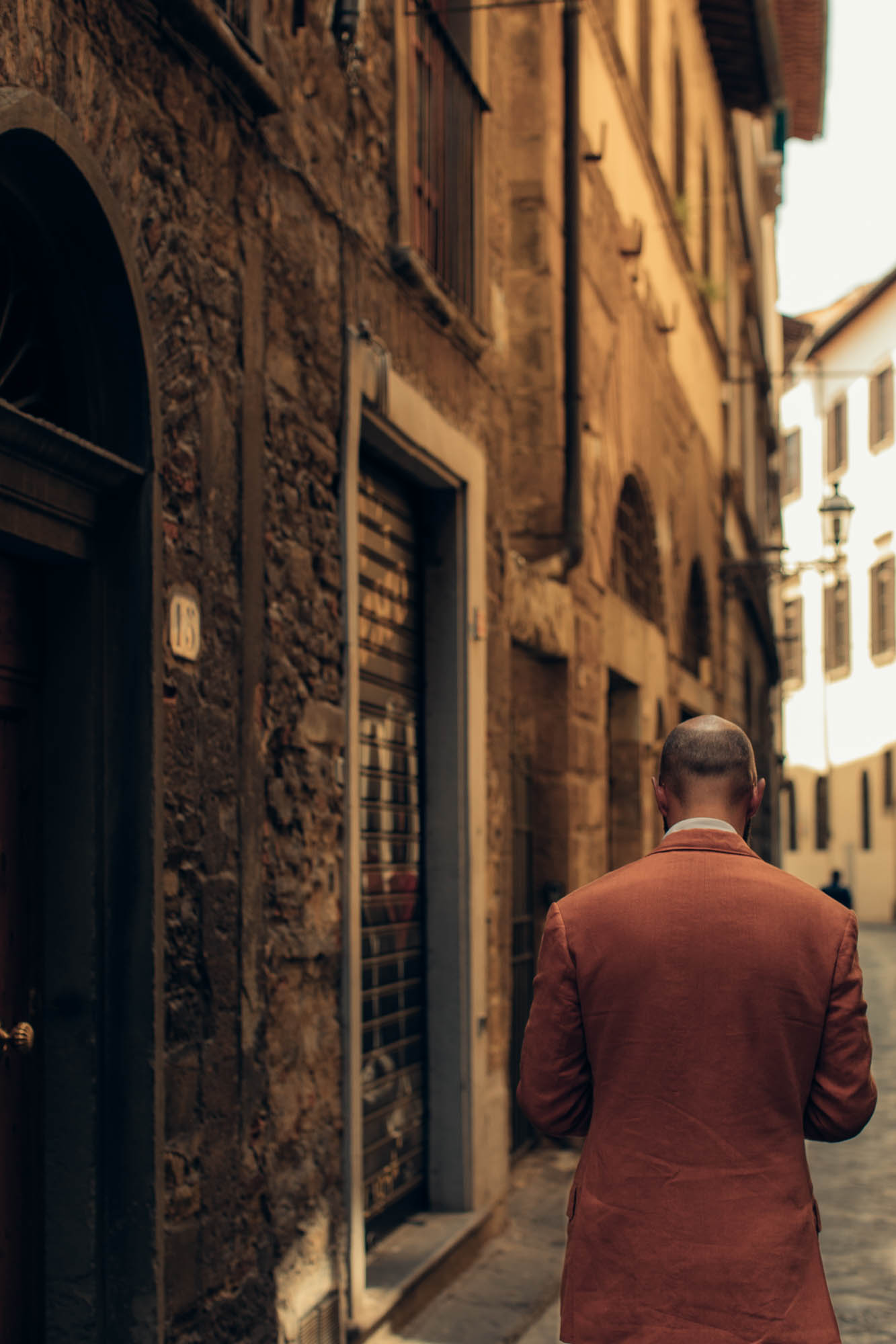
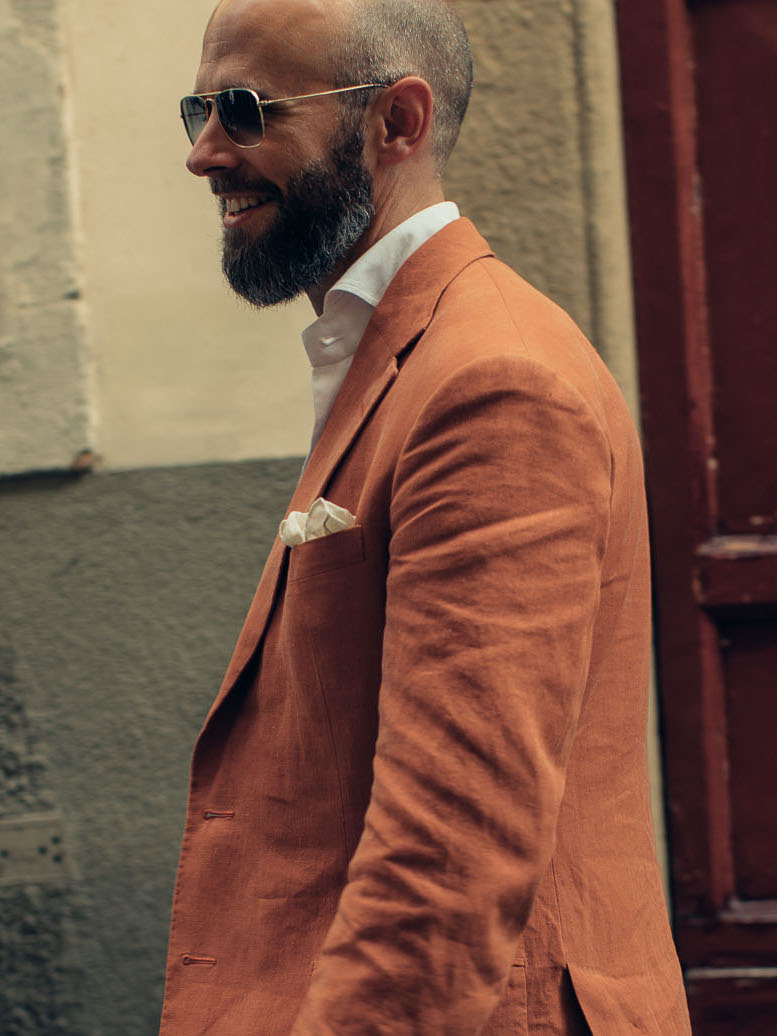
How do I feel about orange? This linen looked more like a terracotta red when it was a swatch, but let’s face it, it’s orange.
Fortunately I rather like it. Strong colour isn’t normally my thing, but when I do wear it, I prefer the colour to be softened somehow.
That comes over time with some materials – my Dege & Skinner tobacco suit, for example, was more orange than I had anticipated, but after wearing and cleaning and pressing a few times, really started to soften. And my other Anderson & Sheppard linen jacket, in a rather azure blue, was a soft colour by virtue of the white in the weave.
The linen shown here was unusual for being stonewashed, thanks to de Le Cuona, the interiors company that supplied it. More on them, and which of their materials could potentially also be used for tailoring, here.
Bright colours always look more at home in brighter weather – summer, sun, and in this case the baking heat of Florence.
I feel that cities which see a lot of sunlight build their cities accordingly, certainly old ones. There are more buildings in washes of pastel, or in simple white. Terracotta tiles are complimentary too.
Of course it must be heavily dependent on local materials, but you feel there was some guiding aesthetic at work in all this. (Anyone with knowledge to add here, rather than just impressions, do chip in.)
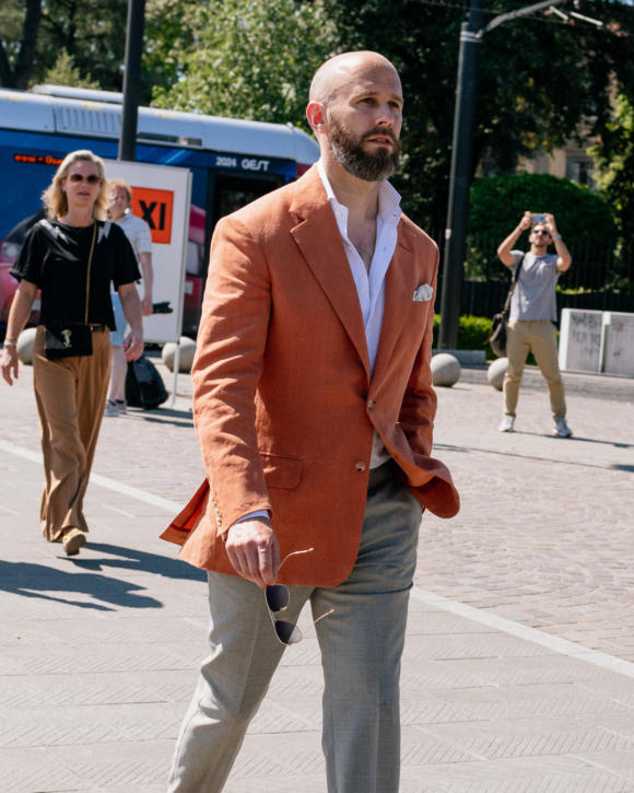
In this kind of environment orange linen seems at home. It certainly felt it as I went around appointments in town. In the fair of Pitti Uomo the colour was almost too subtle, like a washed-out version of what the peacocks were wearing. But around the city it almost blended with the brickwork.
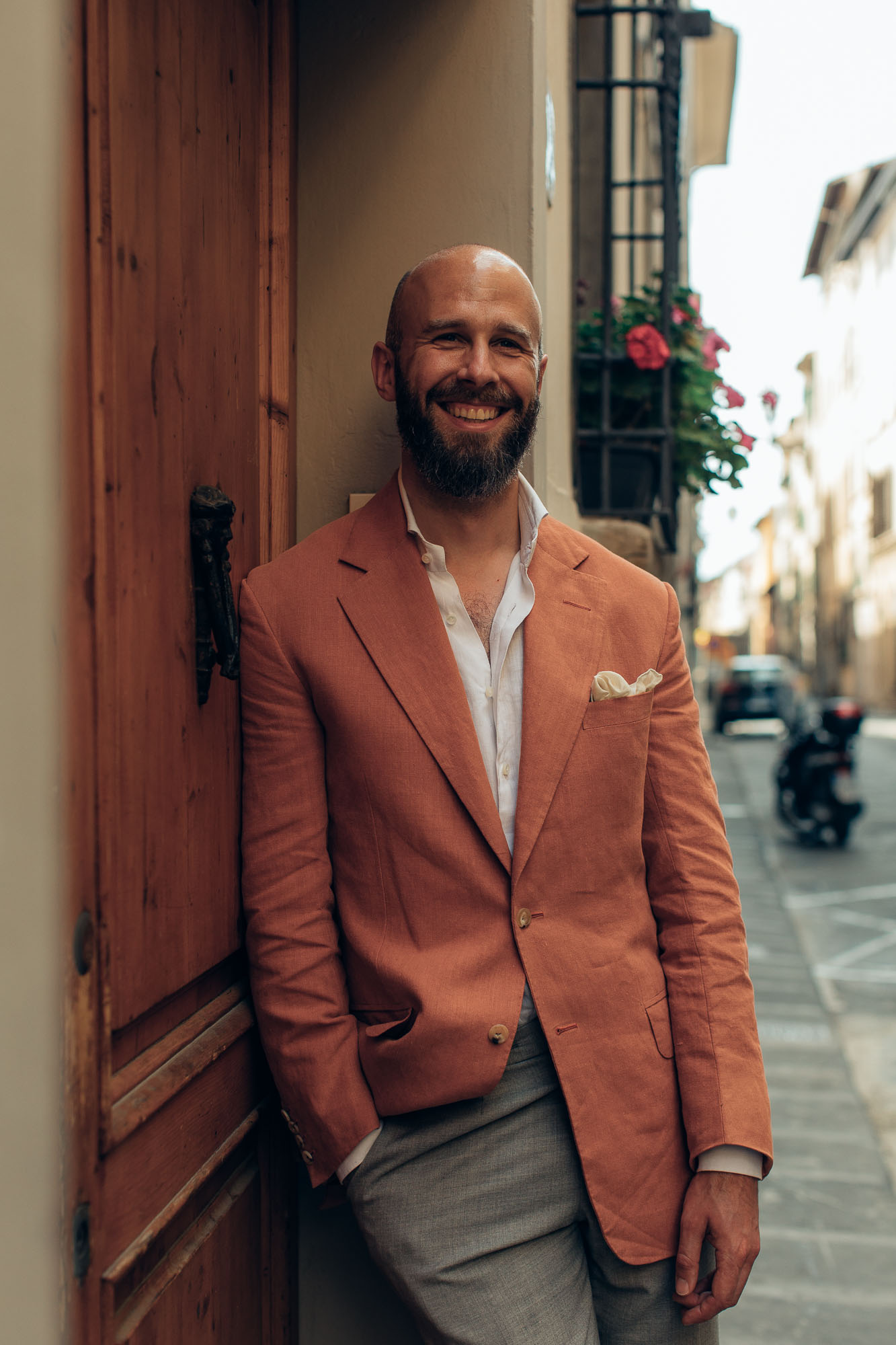
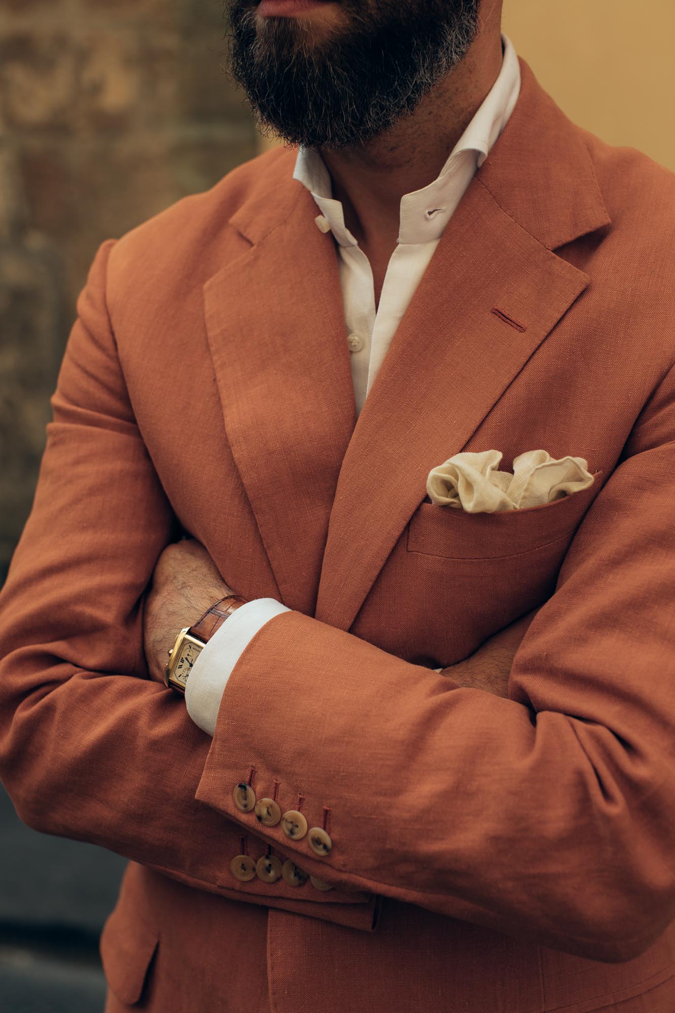
One thing I wasn’t entirely happy about with the jacket was the lining and buttonhole colour. I wanted something that toned down the colour if I could, but this proved impossible.
There were no pale oranges, and no shades of warm brown or grey really worked. I haven’t given up looking, and may end up replacing it at some point in the future. (This is possible with button holes, though they’re usually not as neat afterwards.)
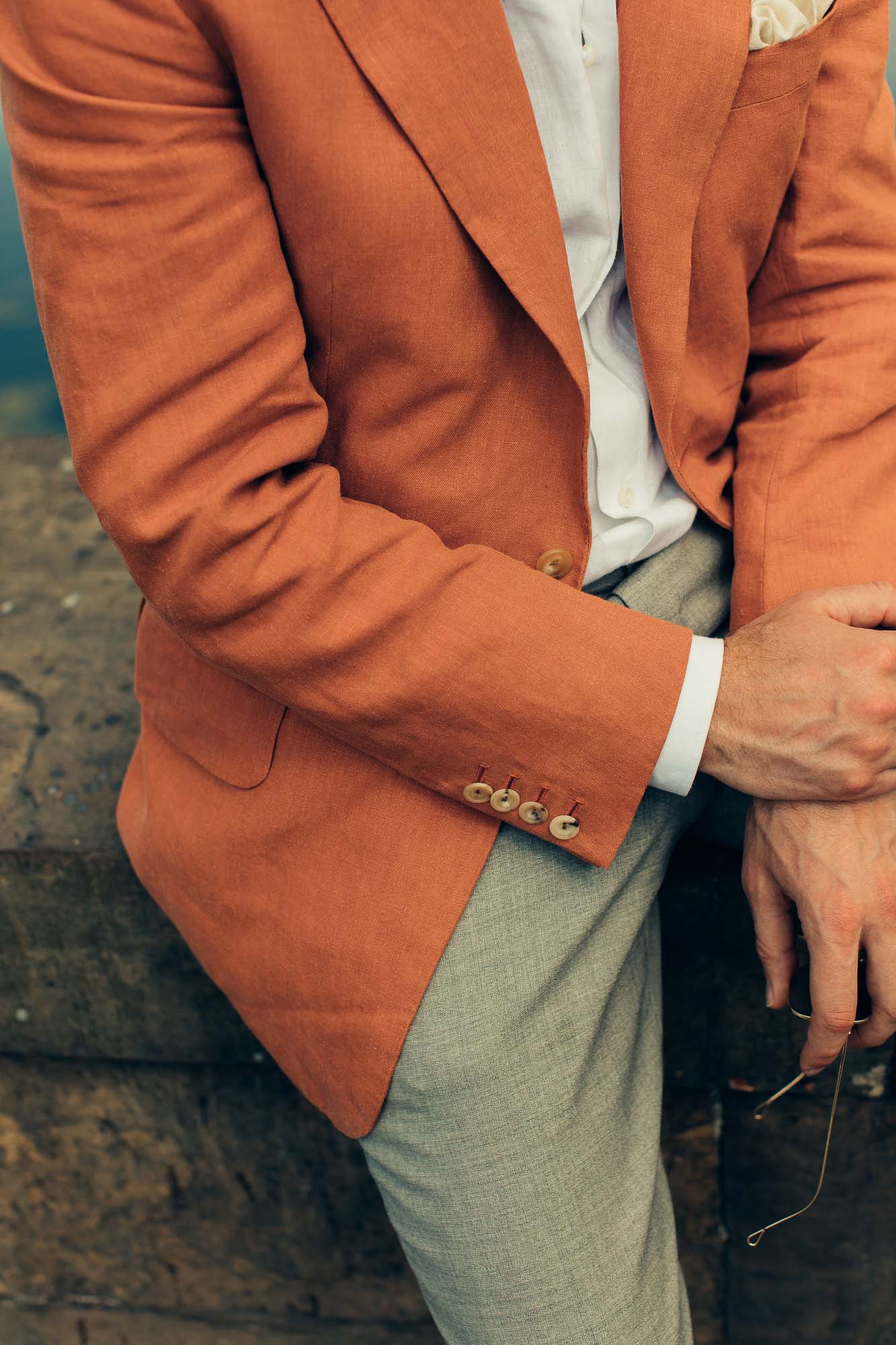
I ummed and erred similarly with the choice of buttons. If I want subtlety, does a brighter button achieve that because there is less contrast? Or is a darker button always better? In the end I went with the former, and that seems to have been right.
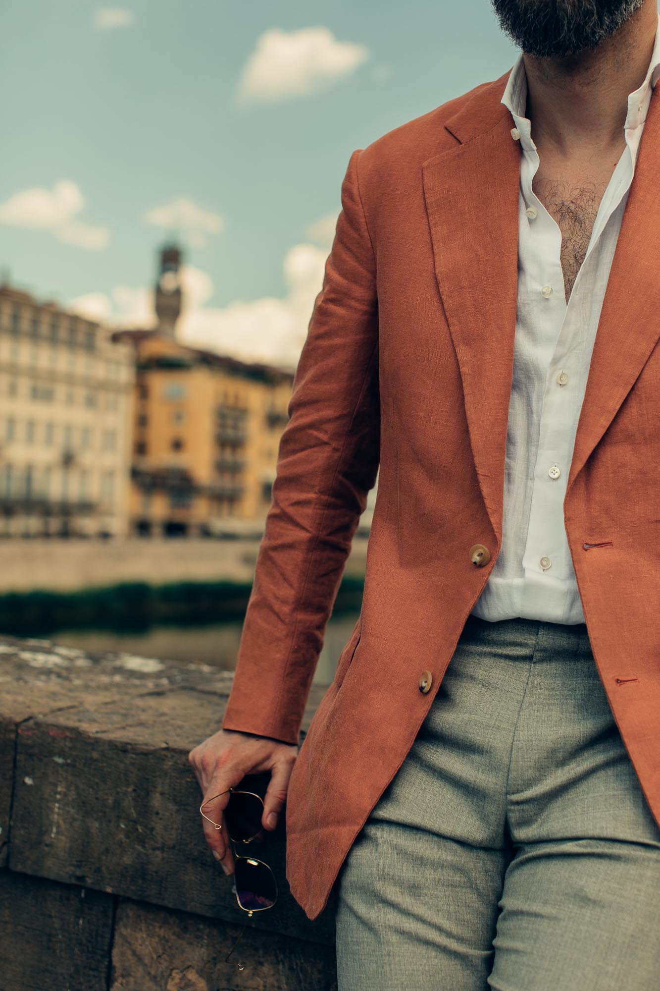
The other unusual thing about the material is the weight – it’s a 15oz linen, compared to the 11oz of normal Irish linens, or 9oz for most Italians. Interiors fabrics are rarely lightweight, as they need to be so abrasion-resistant, and de Le Cuona does even heavier ones too.
Interestingly I didn’t notice much difference in Florence though, even in 37-degree heat. I don’t sweat that much generally, but while I did notice a difference compared to the less structured Dege & Skinner jacket worn the day before, I didn’t notice one compared to that tobacco Dege suit, which is 11oz linen.
So my lesson is that while structure of a jacket – more canvas in the body, more padding in the shoulder – makes a noticeable difference, 4oz of extra linen does not.
That also applies to the benefits of those factors. Although this heavier linen flows beautifully, it’s a small difference compared to the slightly lighter Irish linen. The structure of a jacket, however, does makes a big difference to the overall look.
I had a couple of comments from friends as to how much they liked the way this jacket fit and flattered me. They preferred it to the less structured Dege jacket. Obviously the Dege was a lot easier to wear - but there are rewards for the suffering.
The padding in the shoulders of the A&S allows them to be pushed wider than my natural shape, while the canvas in the chest creates a sharp and elegant line, supporting that roll of the lapels and keeping the fronts sharp.
As we detailed in the first of these articles (it is the fifth of five, see article footer for the others), these design points were all deliberate, built off my experience with previous A&S cuts. But they wouldn’t have looked as good without that structure.
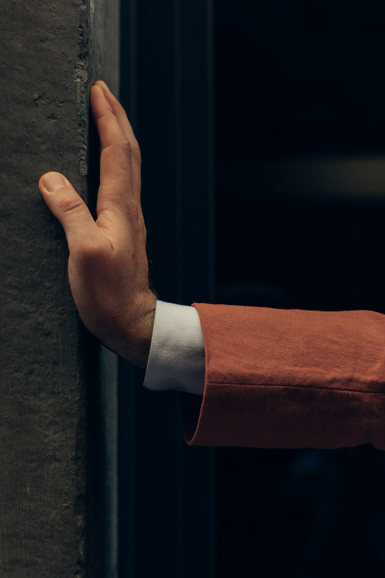
There’s also something to be said for having structure in linen in particular. Because while some elements will crease as soon as you bend your arms, or sit down, the front and in particular the chest and collar will retain their shape.
I think you can see that in the images here. It is 4pm on a very hot day, with the jacket having been worn and used since 9am that morning. The sleeves are rumpled to hell, but the chest and collar are still sharp.
This structure means there is a trade off with coolness of course, but I’d argue that it’s one worth making for any jacket designed to be smart.
If you want a linen layer that’s a lot cooler, it might be better going for something like an overshirt or shirt-jacket – an obviously more relaxed style.
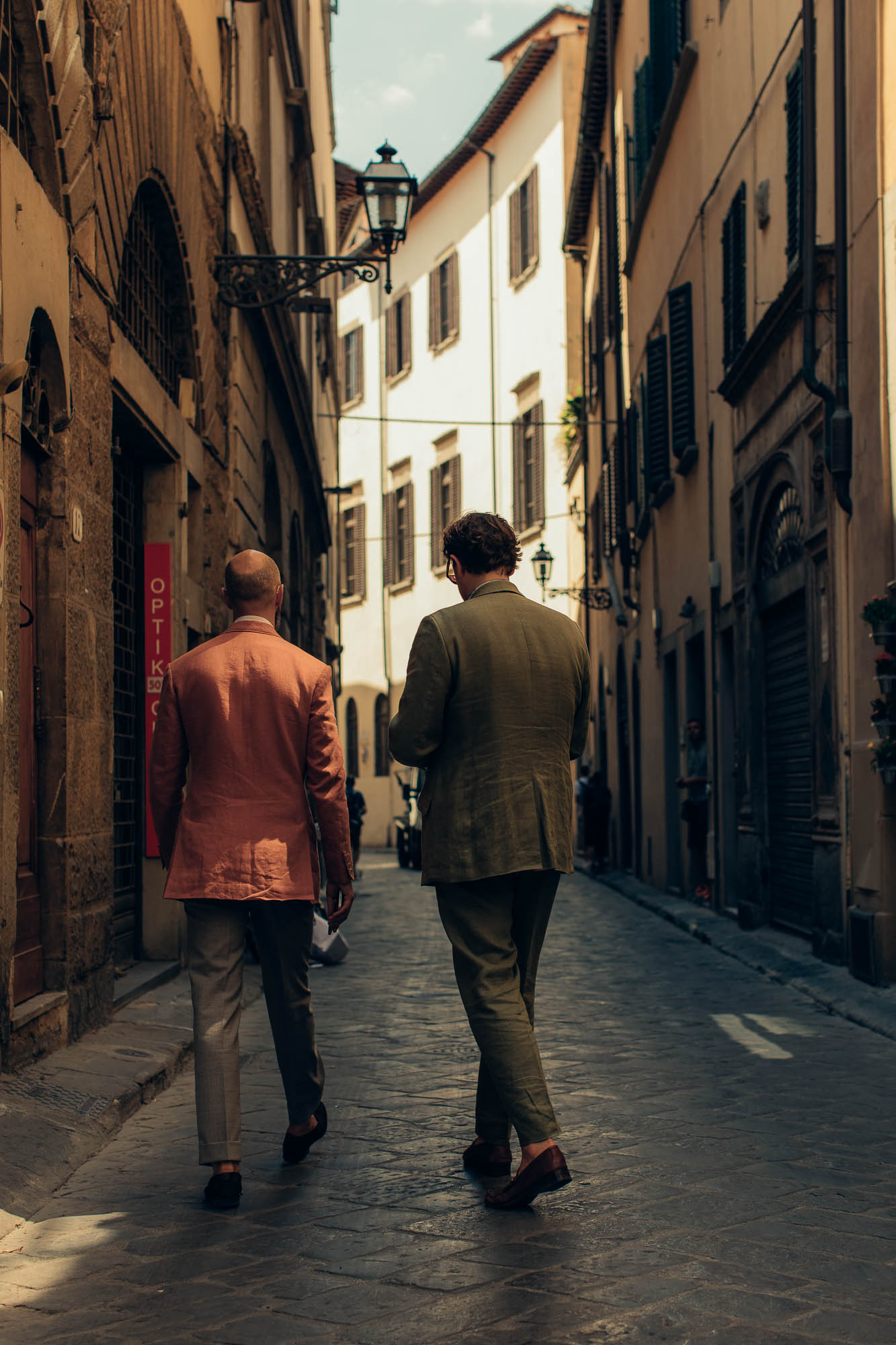
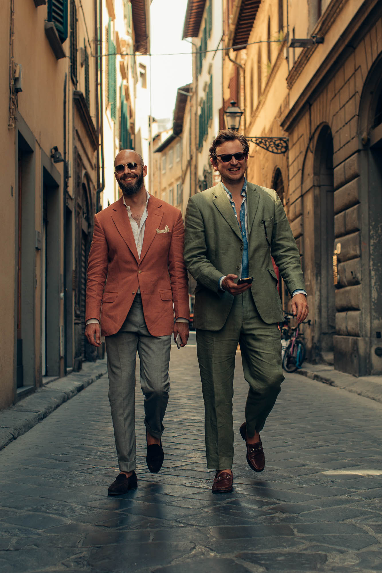
The orange is not the easiest to combine with other colours, as you might expect. But so far I’ve found a couple I like.
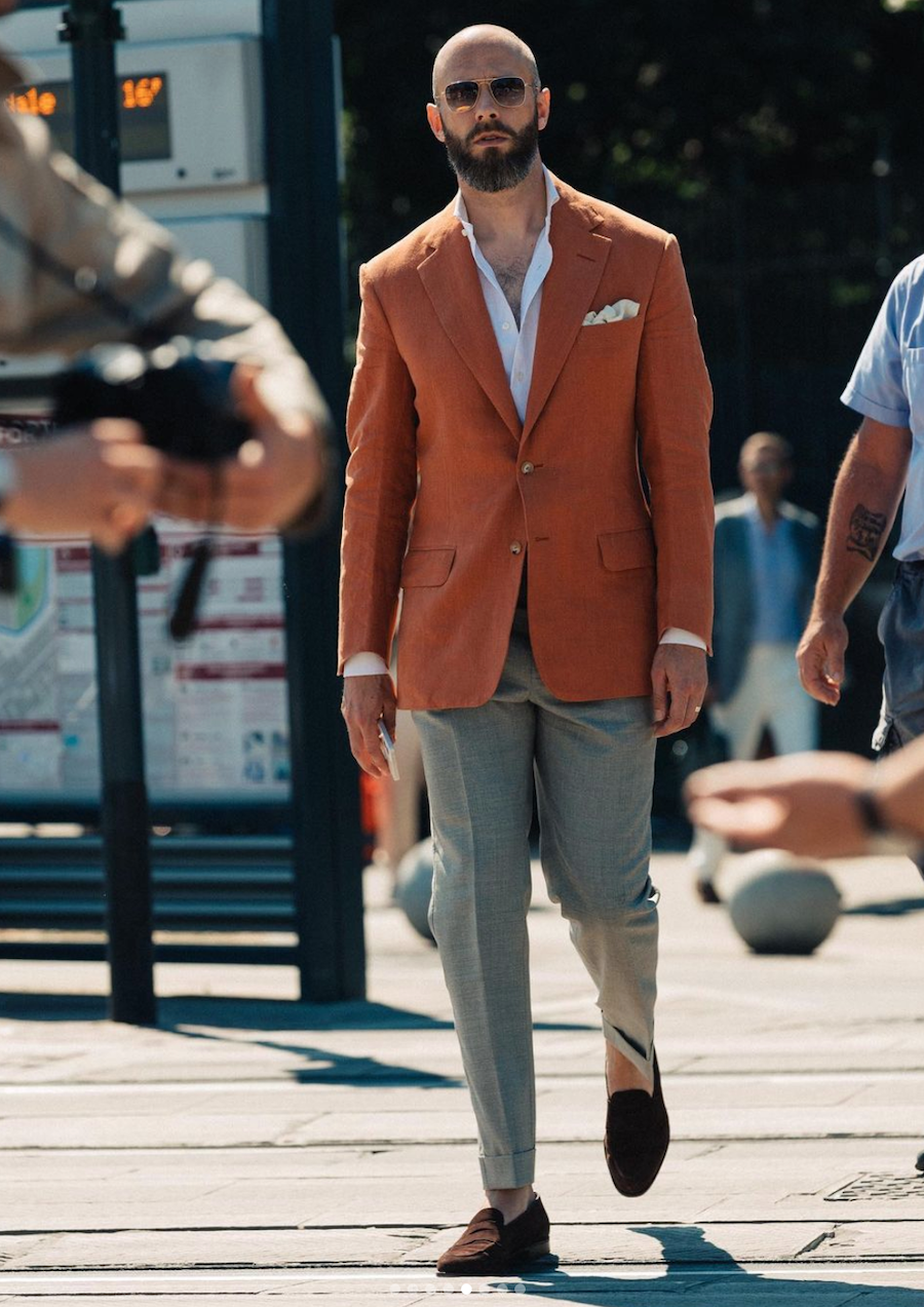
The jacket is easiest to wear with white or cream either on the top or the bottom. So here it’s worn with a white linen shirt and grey Drapers 2-ply trousers. I particularly like this shade of grey as it has the tiniest touch of brown in it, which stops the trousers looking too much like a suiting.
And the other option is white or cream trousers, with a blue shirt on top. Denim is especially nice – something about the faded appearance of both the denim and the linen means they compliment each other. I’ll take a picture of that some other time.
The jacket could work with other bright colours – a brightly striped shirt, or certainly a tie or handkerchief. But as I increasingly realise (and feel at home with) this is not my style.
Also worn here are a cream linen handkerchief, which seems to set the white of the shirt off nicely, and dark-brown unlined Piccadilly loafers from Edward Green. You notice the lack of lining even more in the heat.
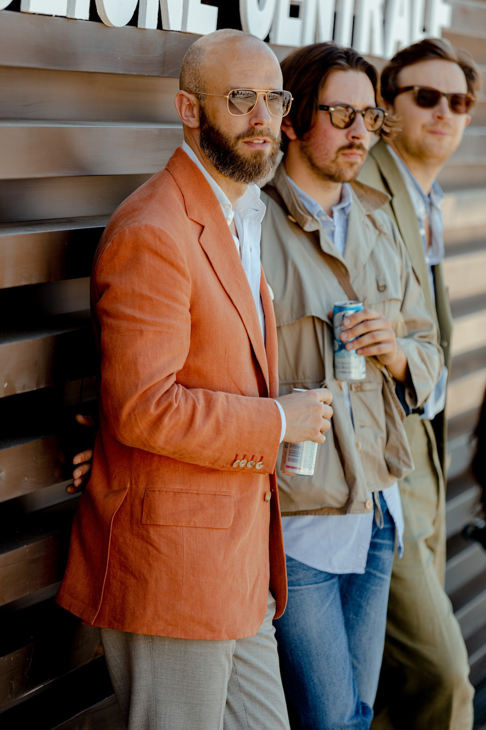
Pictured above, the PS team at Pitti - myself, Alex Natt and Lucas Nicholson
Photography: Jamie Ferguson except image above, Pontus Jonsén for Baltzar; and top and bottom images, Alex Natt.
The previous four articles in this series are:
- All the tailoring I’ve had from Anderson & Sheppard
- The cutting and patterns at Anderson & Sheppard
- The fitting of a jacket at Anderson & Sheppard
- The hand-padding of an A&S jacket