Men in Style: The Golden Age of Fashion

This book, which I mentioned in a recent post, is rather an inspiration.

You know how you flick through men’s magazines, hoping against hope that there will be an inspiring fashion shoot of suits, ties and shirts, demonstrating bold colour combinations you hadn’t considered, illustrating textbook use of pattern density and pushing the boundaries for contrast in texture? Styling that encompasses the rich past of menswear yet energising it with effective modern interpretations?

Well I do. And outside an occasional spread in the Esquire Big Black Book, and slightly more frequent line-ups in The Rake, they are hard to find. Inspiration for me more often comes from runways, blogs like The Sartorialist and men I just see around on the street.

Which is ironic. Because the illustrations from Esquire that are collected in Men in Style are a composite of those inspirations: what men are wearing, slightly idealised, and slightly styled. No one sits quite that nonchalantly assembling his fishing rod, perched on the edge of the desk. But men are wearing wide peaked collars with single-breasted suits. And the pattern combination among check, herringbone, stripe and crocodile is certainly inspirational.

Esquire was some magazine, containing articles and stories by writers like Ernest Hemingway, Dashiell Hammett and John dos Passos. It was progressive, boldly printing a tale by a black author about a romantic multi-racial triangle – at readers’ request. And most importantly, it employed some great illustrators – particularly Laurence Fellows, Leslie Saalburg and Robert Goodman. Each had their strengths, but all could paint texture, cloth and drape extremely well. This was their primary skill – where modern fashion shoots focus on atmosphere at the expense of detail, these illustrations showed the shine of every button and the subtlety of every pattern.

Those were the good old days, you may say. No one would produce that kind of thing now. But when Esquire launched it was entirely unique on the newsstand. As Woody Hochswender says in his introduction, “the conventional wisdom was that men were not interested in fashion, at least not interested enough to be caught dead looking at it in a magazine.” So Arnold Gingrich, the founding editor, sought articles “substantial enough to deodorise the lavender whiff coming from the mere presence of fashion pages.”

Men’s fashion magazines today feature many articles. But you wouldn’t call many of them substantial. If I see another grooming piece telling me how to shave I’ll kill someone. Hemingway it ain’t.

The original Esquire was brave and different. And it launched as the world clambered out of global recession. Coincidence?

The Cary Collection: Manhattan treasure trove

New Yorkers have mastered the art of living luxuriously in small spaces. Visiting Leonard Logsdail and Stephen Kempson in midtown last week was a good example: you step straight from the elevator into a compact yet very well-appointed tailoring studio, complete with armchairs, drink and racks of cloth. Alan Flusser’s small boutique is similar.

But the “bachelor flat/cum showrooms” of Thomas Cary (as he himself described it to me by email) are something else. As the pictures here amply demonstrate, the four small rooms on the upper-east side are stuffed from floor to ceiling with gentlemen’s collectibles and accoutrements.

From an old Dunhill walking stick with concealed blade to an Asprey catalogue featuring beautiful painted boards; from Christmas cards drawn by Cecil Beaton to vintage velvet slippers. And of course books, mountains and mountains of books. Regular customers include Ralph Lauren and Tommy Hilfiger, who have bought items both for display and design inspiration.

I had discovered Thomas while searching for a copy of Men in Style: The Golden Age of Fashion from Esquire by Woody Hochswender. Although only published in 1993 it is now out of print, and is the only collected edition of illustrations from Esquire or Apparel Arts as far as I know. Outside of this volume there are the original editions of both magazines, but they usually only contain a few plates and are much more expensive.

As I was to be in New York, and one seller on AbeBooks.com (Thomas) lived in the city, I thought it would be a good opportunity to check out the book. Little did I know the treasure trove I was discovering.

Thomas also owns several hardback editions of the original Apparel Arts, which are truly beautiful things. The adverts are just as attractive as the features – as those that have seen scanned copies on various style fora can attest. But I didn’t realise that they also include swatches of cloth tacked to the pages. Not big ones, but enough to give a prospective buyer a sense of the weight and handle. If only my pockets were deeper (the set of six is on for $4500).

I did end up with Men in Style though, which I was very happy with. Fans of classic style will be familiar with many of the illustrations, but it is lovely to have them collected and in one’s hands. And doubtless they will provide inspiration for many blog posts in the future.

[Pictures from Tina Barney’s portraits of the showrooms for Nest Magazine in Spring 2000.]

A glass of red with Kempson and Logsdail

There aren’t many bespoke tailors in New York. Even fewer that are younger than 70. Old names like Tony Maurizio, Bill Fioravanti and Nino Corvato have been around for long time and still hold their own, but they are getting on a bit. Leonard Logsdail is a little younger and started working a few years ago with Stephen Kempson, who adds some design and lifestyle expertise as well as a range of shirts and shoes.

I was fortunate enough to spend a happy afternoon with both of them yesterday here in New York, alongside English tailor Kenneth Austin of Benson & Clegg, well-known writer Gary Walthers and Stephen’s brand manager, Rob Solis. For a lively debate on style fora, judging customers and making suits only using ‘rock of eye’, I highly recommend it. Ask for the bottle of red and pick one of the high-backed armchairs.

Logsdail makes a full-bespoke suit out the back of the rooms he shares with Stephen at 53rd Street Manhattan. Just four people are involved, including one lady for basting, finishing and buttonholes. Although Logsdail has been in the US for almost 20 years, he trained with a fair few names on Savile Row, including Bernard Wetherill and Welsh & Jeffries. He was kicked out of the former when Kilgour turned towards ready-to-wear – a decision that it is ironically now reversing.

Kempson’s strength is design and colour. A former Brioni man, I could tell he liked his cloths and combinations from the off. He was wearing a grey-flannel double breasted, with alternating thin and thick chalk stripes. Buttons in high-contrast yellow horn, four working buttons positioned close and tall, elongating the shape. Big roped shoulders too.

Clients that use Stephen are often those that want an entire wardrobe picked out and shipped, or designed for a particular itinerary or trip. He famously told Financial Times editor Lionel Barber that he dressed appallingly during an interview for an FT piece on bespoke (when Barber was US editor). Fortunately, Barber took it on the chin and asked Stephen to re-work his entire wardrobe. An interesting sales technique, though obviously effective.

Logsdail, for his sins, once made a bet with a friend that he could make a suit for a customer based entirely on rock of eye, so without taking any measurements. He won the bet, backing up his assertion that tailoring is 90% about sizing up the client – both physically and psychologically.
So a nice place to be and a good bottle of wine. US terminology does drive me up the wall though. If you think it’s hard in the UK, with every tailor and his dog misusing the term ‘bespoke’, count yourself lucky that at least some people agree on the terms and their meaning. Custom tailoring has a legitimately wide range of meanings, there are grades of made to measure and bespoke is more often called bench-made. Which just makes me think of leather suits being lasted over a wooden mannequin.

Leffot: A sign of US shoe trends

In New York this week, and I popped in to see my good friend Steven Taffel, founder of Leffot – far and away the best shoe store in the city. In fact probably anywhere in the US outside Hawaii (the competition there being Leather Soul).

Since Steven and I first met, it’s been interesting to see the growth of both our blogs. While they have very different natures (Steven’s being a commercial venture to create interest in the store), the aim of celebrating classic men’s shoes is the same. And I still find it astonishing that we are unique, two years down the road. There are so few good men’s style blogs outside the US, and so few good commercial blogs by shoe retailers anywhere.

In fact I always say that if I want to browse high-end shoes, the Leffot blog is the first place I go. There will always be more images of shoes from Aubercy, Corthay or Edward Green there than on the companies’ own sites.

One definite trend over the past two years has been the popularity of locally made products in the US, and how that has benefited American shoemakers. Leffot now carries Alden, Rider Boot, Sebago and Wolverine, and the US brands have become the most popular in the store. The Wolverine 1,000 mile shoe is incredibly popular and the first two shipments of the Exclusive JC Indy Boots (below) from Alden sold out before they could reach the store.

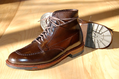
The Wolverine isn’t exactly my style and I’ve never been a big fan of untextured brown cordovan, as the Indy Boots are made from; personally I’d go for the Rider Boot shown below – a made-to-order version in black with a red lining and sole. But you can’t argue with the sales figures.

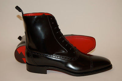
The Indy Boot is an example of another trend too – of Leffot growing from a simple retailer to a creator of its own products. Long a popular route for made-to-order shoes from Rider, Gaziano & Girling and the like, the Exclusive JC Indy was a special commission for the store named after a customer, Mr JC. The blue Greenwich boot from Alden with ‘water lock’ waxed soles (below) was also an exclusive.

In the future, look out for Leffot commissioning its own exclusive designs, working with some US shoemakers and hopefully going on sale later this year.

(Pictured top: a made-to-order Wilfrid shoe from Corthay.)

The rules and how to break them 7: Handkerchief texture

Rule 7: Handkerchiefs should compliment the texture of jackets

Of all the colours and materials available for a pocket handkerchief, white linen is probably considered the smartest and most formal.

Why? Well it’s a question of two factors – compliment and contrast.

A silk tie is intuitively smarter than a wool or linen one. The shiny lustre of the silk and the way it contrasts with the matte texture of the suit creates a pleasing contrast. So why isn’t the same true for handkerchiefs? Why isn’t silk smarter than linen?

Probably because the contrast between silk and wool has already been done with the tie selection. More silk would be too much. Instead, white linen echoes the sharpness and matte texture of the suit, complimenting rather then contrasting.

This is also the reason a wool handkerchief would be too casual. Yes, it is matte and rough in texture like the suit, but it is not sharp like the suit. It only shares some of the same characteristics.

So this is the rule. Or rather, this the reason that men of taste have generally worn a white-linen handkerchief with their wool suit and silk tie. There was a period where cream silk was dominant, but linen has generally been more common, and certainly looks more appropriate today.

So how to break the rule? Well, most men don’t wear a tie every day. If you don’t, there’s no silk to contrast with your suit – which is a pity. So you could a coloured silk handkerchief instead of a linen one when you are tie-less.

Generally I go between linen, silk and wool depending on how smart I want to be. 

Another way that the rule is broken: tweed jackets. Men of style will often say they like silk handkerchiefs with their tweed jackets because of the contrast in texture. But they weren’t saying that about their suit were they? Then it was all about compliment.

One reason is that woollen or casual ties are often worn with tweed. Another may be that the sheer roughness of tweed needs greater silk to balance it. Certainly, a silk handkerchief is often worn when tie-less with tweed.

Having understood the principles behind this behaviour, it is easy to find creative ways to make use of its wisdom without necessarily following it.

In this case, be aware that all decisions with accessories are about complement and contrast.

That’s why a white-silk handkerchief with a tie often looks a little cheap and feminine. And it is a good argument for wearing woollen ties or handkerchiefs with modern, shiny worsteds. Just not both, probably.

Consider compliment and contrast.

First fitting with Toby Luper

hemingway-tailors

Having met Toby Luper of Hemingway Tailors, I was invited recently to try his bespoke service. Toby is rather cynical about the number of fittings Savile Row tailors insist on, and bet me he could get the fit right in one (forward) fitting.

As I mentioned in a recent post, I was impressed by the attention to detail Toby showed in analysing my body shape. That impression continued with the fitting this week.

The trousers were a good fit across the waist and shaped beautifully down my lower back, falling in one nice straight line from my bum to the floor. I have a rather pronounced seat, despite being slim, and this can be a hard thing for tailors to get right.

The seat itself was a little tight, as shown by the trouser pockets gaping about an inch. But that was the only alteration needed to the trousers – everything else was perfect.

On the jacket, Toby had discussed previously throwing the balance a little further back, so that there was room to cover by prominent shoulder blades and fall cleanly over my bum. The suit I had been wearing at our first session (an old one of Edward Tam’s) hollowed out a little between the blades and in the small of my back, meaning that the skirt kicked out.

After he had raised the back by around an inch and a half all the way across – from one armhole to the other – he did achieve that clean finish on the back.

There was no sleeve roll at this stage, which meant the sleevehead folded in under the shoulder pad. While this is a little off-putting, the finished effect could be seen by tautening the sleeve. The shoulders were also taken in an eighth of an inch.

The right sleeve appeared a little shorter than the left, so it was lengthened an inch and the left sleeve just half an inch. The waist fit perfectly.

Elsewhere the fronts were fine except for one small detail – it had been made up as a single breasted when I asked for a double. I say small detail because while this will necessitate replacing the fronts entirely, I have confidence in Toby’s attention to figuration and I’m sure the final product will be a very good fit.

It does mean we will require a second fitting; so Toby lost that bet, though on different grounds to those we were really exploring. The truth of Toby’s skill will be seen when the suit is complete and has been worn several times.

In the meantime his passion for hang and drape is undoubted. I’ve tried a few visiting tailors over the years and too many saw the fitting as a time for me to tell them what I disliked, rather than for them to analyse the minutiae of fit.

For those that are interested, I had a nice discussion with Holland & Sherry about their upcoming remnant sale – big reductions on a range of cloths, April 22-23 10am-4pm in the fitting rooms at 9/10 Savile Row. All welcome.

Be a rogue like the Big Bad Wolf

My two-year-old daughter has a book called Cinderella and Other Stories, by Stephen Tucker and Nick Sharratt. Reading it to her yesterday, I noticed that Sharratt (the illustrator) dresses the Big Bad Wolf in a purple suit with yellow windowpane check, yellow bowtie and tan-and-cream spectator shoes. The implication, whether conscious or not on Sharratt’s part, is that this is a figure of ill repute. Only the roguish dress in such an ostentatious way.

That feeling about loud clothes can be seen throughout the development of menswear. The Duke of Windsor, when Prince of Wales, favoured checks more than his contemporaries (hence his popularisation of a variation on the glen plaid) and took to wearing spectator shoes. The latter were deemed by his father, George V, to be the footwear of a bounder and a cad.

His father, Edward VII, also pioneered clothing that was stronger as well as more comfortable. He favoured tweed suits for the races, rather than formal daywear, and took to wearing velvet jackets as well. Interestingly, though, Edward VII quickly dropped the latter when they were popularised by Oscar Wilde and became associated with homosexuality. The Duke of Windsor, by contrast, continued to wear suede shoes despite their associations with homosexuality.

Bounders, cads, rakes and rogues are often those that have stepped outside society’s ideas on respectability. This is communicated through clothes as much as through their actions or the company they keep. Indeed the nickname for suede shoes used to be brothel creepers, suggesting one place these men liked to hang out. And spectators are also known as co-respondents, after a figure in an infamous divorce case.

So there has always been this association between loud clothes and roguish characters. (Golf clothes and the ‘go-to-hell’ leisure wear of American upper castes might be seen as a deliberate casting off of respectability for a certain period.)

One thing I find interesting is that throughout this history of innovation, the trend towards comfort has always been accompanied by one of personal expression. Colours, patterns and contrast are a deliberate step outside the norm in order to become more individual.

What’s depressing about menswear today is that the two trends have become divorced. Comfort has lost its twin, expression. Jeans, chinos and trainers are not the result of any individuality. A suit is more individual in most parts of the US or UK.

Perhaps not a purple checked suit. But men need to be a little more rakish now and again.

Gloves at Bill Amberg

In my last post celebrating Bill Amberg I concentrated on craft – his use of bridle leather throughout the bags and the structure that gives them, as well as the most recent innovation of using oak bark-tanned leather that grows colour-rich and characterful almost as you watch it.

This post, rather than craft and bags, will discuss design and gloves.

It will not surprise readers that I consider my hands to be unsuited to ready-to-wear gloves, and have never found any that truly fit. Such are the excuses that a bespoke devotee of makes about his feet, shoulders and much else.

My hands are relatively broad with long fingers, but the wrist is small. Artistic hands, in the eyes of my mother; feminine hands in the taunts of everyone else.

The problem with slim wrists is that gloves are not tight enough there and so slide forward on the hand, making them feel loose all over. Even elasticated gloves aren’t tight enough. For someone that gets itchy when his collar is too big or his cuffs just a touch too short, this is an irritation.

By blind luck, I stumbled upon a solution at Bill Amberg. All his gloves are inspired by models, either modern or historical, being used out there in the world. The pair I liked are those worn by the cavalry officers that guard London’s royal palaces – you know, the ones that aren’t allowed to smile.

In unlined calf skin they are very soft and supple, yet thick enough to be warm. And they’re not just copies of the officers’ – they are produced by the same company but commissioned exclusively for Bill.

Gleefully for me, they also button snugly around the wrist. I discovered that the model is part of the reason (Bill’s driving glove, a copy of an old British model, is short and loose at the wrist, designed to be easy to put on and not constricting) but the leather is also important. The soft calf stretches more, so as long as the fingers are long enough, you can try one size smaller than normal. I downsized from an nine to an eight.

While I highly recommend Bill’s gloves – others are copies of those worn by air force pilots and fishermen – this is obviously not the season for gloves any more. There is one pair of the cavalry officer gloves on the site, if you happen to be a size 10. But they also have some left in the store in the Burlington Arcade. And if you’re lucky enough to find some you like, they’re on sale.

Otherwise, just have to wait until Autumn/Winter 2010.

Fishy and polo: A photo update

I haven’t been good at posting pictures recently, so here’s an attempt to make up for it. Here we have images of the polo coat that has been documented in detail over the past few months, but of which I never posted a final image, and of the ‘fishy’ suit I commissioned most recently from Graham Browne. This was my first suit with braces (so with a fish-tail back) as well as featuring a fish-mouth lapel.

The fish-mouth lapel has a narrower gorge (the gap between lapel and collar), with the lapel angling upwards like a peak model but at neither the same angle nor to the same length. It is seen as a nice compromise between a notch and peak, though glancing around the various off-the-peg suits out there you will notice there are many variations on the notch, both in size and angle.

There are essentially two variables – the angle of the seam between lapel and collar, and the size of the gorge. If the seam is more horizontal, the lapel is flatter and sticks out more, achieving some of the broadening effects of a peak. Many modern suits give the impression of a higher gorge simply by changing the angle of the seam. If the size of the gorge is bigger, both collar and lapel are pushed apart. This dates a suit from the 1980s as much as the height of the gorge.

Of course, the notch lapel is defined by the angle of the seam continuing in a straight line along the lapel. A peak and fish-mouth lapel both angle upwards, to a greater or lesser extent.

I like the braces – the trousers certainly hang better at the front and the waist is larger and more comfortable. However, I’m not sure I’ll ever get used to having something around my shoulders. The next commission (Minnis mid-grey flannel with patch pockets) will switch back to normal trousers. And this may even be altered to that style eventually.

I couldn’t be happier with the polo coat, though I am reconsidering the choice not to have turn-back cuffs. The style probably suits it better, but the camelhair is so heavy that I feel tired just at the thought of it.

The back of the coat, which featured so heavily in the pieces on its design and construction, is shown here in two different settings – mid and tight. As I am wearing a suit and cardigan underneath, the tight setting (close-up shot) is a little too tight for easy movement here. It would be used if I were just wearing a sweater.

Thanks to Dan ‘the trews’ for photography

Jewel in Vienna: Wilhelm Jungmann Und Neffe

A recent trip to Vienna for a Central & Eastern Europe Finance Forum (don’t ask) was enlivened by the discovery of Wilhelm Jungmann und Neffe. A men’s outfitter of the first order, it has been supplying accessories, cloth and tailoring services to central European gentlemen for over 125 years.

I didn’t hold out much hope when I strode out from the Hilton Vienna into the clear, crisp sunshine. A break from lawyers, some nice architecture and perhaps a quick coffee in a square-side café. Any retail interest would likely be restricted to small shops stocking Zegna suits, Falke socks and re-branded Drake’s ties.

The problem with living in London is that there’s precious little you can’t buy there. Paris is good, there’s always discoveries to be made in Milan, Naples or Rome; but that’s about it in Europe. Vienna, at first, seemed to be living up to my expectations – one shop with nothing of any quality, another with some Pantherella socks on sale.

Then, in the grand setting of Albertina platz, I saw the windows of Wilhelm Jungmann und Neffe. Good window displays are always a welcome sign. Someone inside clearly has a sense of colour, as well as taste. Among my favourites are Bergdorf Goodman, Turnbull & Asser and – surprisingly the most consistent for colour – Hackett. Now I’ll add WJN to the list.

Yellow umbrellas with tan wooden handles. Camel-coloured jackets and cashmere ties in subtle brown checks. Suitings in pale grey with delicately placed gold paisley handkerchiefs. A themed and inspiring window – and there were three more.

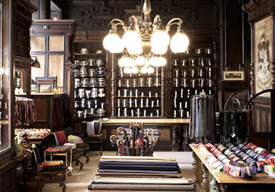
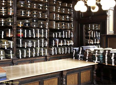
WJN is best known locally for its fabrics, which are imported from England, Italy and locally in Austria. Several bespoke tailors operating in Prague, Bratislava and Budapest visit the shop in order to cater to clients, rather than there being a dedicated tailor on site.

But I was most taken with the accessories. The cashmere scarves and shawls came in 15-20 colours and a similar number of patterns, from the basic to the funky. The staff were particularly proud of two recent acquisitions – one Italian double-sided scarf picked up in Pitti and another design commissioned from some locally in Austria.

Most of all, this is a personally edited and locally sourced collection, which is what makes it worth visiting for someone from London, Milan or Paris. The madder ties, for example, are made by a company just outside Vienna. The store manager said it was the only one still making madder outside England.

I didn’t buy one of those ties and I regret it now. Perhaps I’ll find another CEE Finance Forum.

Bill Amberg: Oak tanning, for bags

Fans of sartoria will be well aware of the benefits of oak bark-tanned leather. Its denseness of fibre and yet ability to be moulded make it perfect for the soles of men’s shoes. But because it is hidden beneath the shoe, and because it is often painted, few appreciate how the leather changes colour over time.


This quality of tanned leather was highlighted by a collection of bags from Bill Amberg, and it’s one I discovered recently. Serendipitously, as a new collection is slowly arriving in store, that oak bark line currently has 30% off.


In its natural state, the oak-tanned leather is pale and creamy. Over time, it turns a rich, deep brown. This is not as a result of contact with your hands or other contaminants, just photosensitivity. It’s a lovely process to witness in a natural product – the neck leather, selected for its texture and stretch lines, slowly acquiring character and depth over three months or so.


It can, however, be a hard thing to explain to customers. You’re not buying a bag in that colour, but in a very different one. Bill admits it’s not easy to communicate, “which is why we’re polishing up and preparing a bag that can sit in the shop, to show people the final colour,” he says.


Bill also has a strip of the leather around his wrist, in case you happen to bump into him. (Among its many characteristics, the leather is one of the most benign against the skin and is hypoallergenic, which means it is often employed in prosthetics.)


Each tanning process produces a different colour – chestnut is more yellow in its natural state and turns orange, mimosa is almost white and goes very yellow. Oak, for Bill, produces the most natural, wood-like tone.


But little of any tanned leather is used for bags. This is because its hardiness makes it difficult to work with. Fortunately, Bill has a lot of experience here. Most of his products are made with bridle leather: skins that are treated with oil to give them strength and water resistance. They are also harder to work with, but Bill prefers them because they retain the structure of a bag.


“It means you can make a bag with no internal structure, no metal frame or cardboard – just leather on the outside and a coloured suede on the inside. It’s beautiful and simple and strong,” he says. That also makes the bags surprisingly light – particularly briefcases or similar designs, which conventionally have a wooden or metal frame.


The size of leather required, particularly in the neck, is not usually produced by tanneries. So it takes a fair amount of planning to produce a collection like this – up to a year to commission the skins and plan production, then nine months for the (pit) tanning before anyone can start making bags.


So probably worth checking out the remaining ones in this collection.

Where the brace buttons should be

I recently received my first braced suit. That is, one designed to be worn with braces, featuring a high waist and fish-tail back.
When I first wore the suit it seemed that the front two pairs of buttons were a little too far round to the side. They were more on my hip than under my stomach, with the consequence that the braces felt like they would fall off my shoulder constantly. But then I’ve never worn braces before, so I didn’t know whether that was normal.

After a day viewing collections, and so trying on quite a few suits, I decided something had to be wrong. Every time I took off my jacket one or the other of the braces would slip off and have to be re-hung. Not exactly elegant.

Returning to my tailor, he explained that there were two standard settings for the buttons position. One, most often used in the military, is to have the rear of the two buttons sitting on the side seam of the trousers. This ensures that seam, often decorated on military dress trousers and so a point of focus, stays taut and straight.

The second is to have the foremost of the two buttons sitting on the crease in the front of the trousers, keeping that taut at the slight expense of the side seam. This is required on pleated trousers, where the way that the pleats hang is key. On flat-fronted trousers it matters less, especially as few men these days bother to maintain the crease.

On both options the distance between the buttons in a pair is the same. And as it is the rear button that sits on the side seam in one option and the front button that secures the pleat in the other, the difference between the two positions is not great. But it is noticeable.

The other advantage of the first position is that the braces cannot be seen when a man’s jacket is open. Unless he has his hands in his pockets and pushes the foreparts way back, the braces remain hidden. It was for this reason that my tailor went with the first position, as I had never worn braces before and seemed a little self-conscious about it.

He forgot to ask me what I preferred, though, or to take into account my sloping shoulders. The latter means my braces need a little more purchase than the average man.

So the buttons were moved. And now I know the next time I order a braced suit.

[Pictured, the braces in question, from Drake’s.]

Bespoke shoes at Cleverley: Part 2


In the first part of this series, I described the measuring process for having a first pair of bespoke shoes made at GJ Cleverley. The second step, though of course it takes place in the same session, is deciding which material and model of shoe you would like.
 
Unless a client wants something very extraordinary, the design options are presented around the racks of Cleverley’s ready-to-wear and semi-bespoke shoes. Everything from a whole cut to a toe cap to a wing tip (not to mention casual, monk or derby), with every fraction of brogue in between. Here a quarter brogue is a toe cap with brogueing on almost every seam, but no medallion on the toe. A medallion makes it a half brogue and a wing-tip into a full brogue.
 
Clients of George Glasgow’s at Cleverley have even requested one or two thistles to be brogued onto the heel of the shoe in the past, in order to make it more individual. But that’s a lot of holes in one shoe.
 
Most important in designing a brogue is to keep the patterns balanced. Don’t insist on broguing on the vamp and the counters, perhaps with a thistle, yet nothing across the toe.
 
I already knew I was going with a deep-brown shoe, as I wear that colour more than black and I want these shoes to be as adaptable as possible. My other pair of dark-brown shoes are half brogues, so this design will be cleaner.
 
I asked Mr Glasgow if he could think of any combination of lines, medallions and brogued seams that have never been commissioned before. (These are bespoke shoes after all.) He looked through the window briefly, as if running each permutation through his head. Then said no.
 
In the end I went for a clean toe and one brogued seam, running below the laces and finishing at the welt just in the middle of the waist. As you would have on a brogue, but without any decoration at toe or heel. It was the same design as a Cleverley balmoral on display, except with the seam pulled down half way. I’ve never been a fan of balmoral shoes (boots are a different story) – the horizontal line lacks movement to my eye.
 
 
Next, the choice of leather. Two bunches “of the brown family” were brought out, including kudu (as a general terrm for deer), hogskin and crocodile, as well as calf in a variety of grains. There were two dark browns, one of them cordovan. While I’ve never had cordovan shoes, Mr Glasgow was against the choice, suggesting that ungrained cordovan can look a little plastic and believing its thickness was more suited to country shoes.
 
On to soles. How thick do I want the sole? I have no idea – just like I had no idea how long the rise was on my trousers until I had bespoke suits made. Here having models on display is crucial. I pointed and George nodded.
 
The size of the welt? It can be cut very tight against the upper, leave a little room or be wide enough that it is invisible from a top-view, visible elsewhere. I went for the latter. Apparently people also vary the size of the welt around the shoe, with some preferring it to jut out slightly more at the toe – perhaps to give an impression of length. I skipped that.
 
 
Then finally there is the lining. Cleverley has quite a selection of different colours and this strikes me as a nice way to make a bespoke shoe your own, while keeping the outside conservative. I’ve never been a fan of bright suit linings, but then no one will see the inside of your shoes. Except your wife and the airport security guard.
 
The most popular lining options are red on a black shoe and racing green on a brown. The book was elsewhere so I’ll decide at a later stage. But bright yellow looks good in my head…
 
Next: the making of the last