
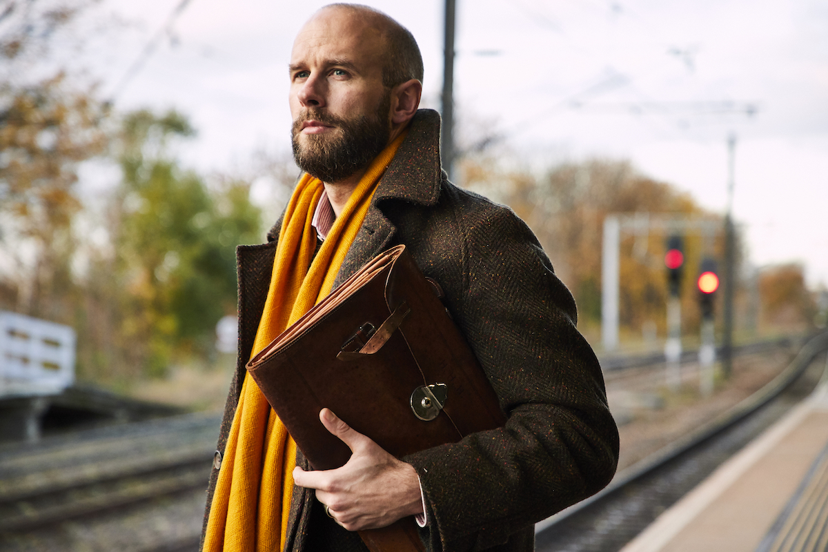
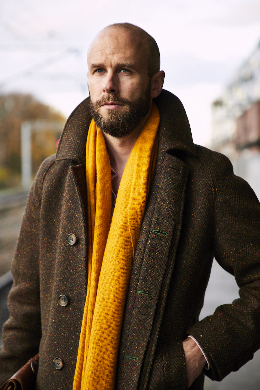
Strong colour in accessories
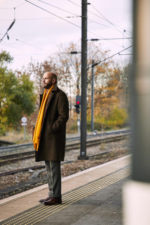
The tangerine orange looks nice against the brown tweed, doesn’t it?
This combination, worn up to see Joshua Ellis recently, spurred a few thoughts on colour. Here they are.
First, I don’t wear many strong colours just because I find that smarter, tailored clothing is more likely to fit in when it’s subtle.
Most of us start our love of suits with a passion for Prince-of-Wales checks, tan shoes and bright linings. I certainly did: my favourite suit at one point was an Etro two-piece with a green overcheck and rampant floral lining.
But over time we settle into the subtler - perhaps deeper - pleasures of weighty flannels, tweed flecks and shoe waists.
Strong colour can be showy, unprofessional and even boring: everyone notices that you’re wearing ‘that’ jacket again.
It’s easier to wear such colours in accessories.
But even there, I find young guys start with quite showy pieces: red ties, yellow handkerchiefs or spotty socks.
These aren’t much subtler than the tailoring they’re worn with, given how prominent they are in an outfit. And the colours are often loud, primary.
Better, I think, is using colour in what might be called second-level accessories. Those that are often hidden, or not worn all day. So scarves, gloves, even cardigans.
They’re not in the face of everyone you meet, all day, like a tie. And they’re so tangential to the outfit that they can easily be swapped for something more conservative.
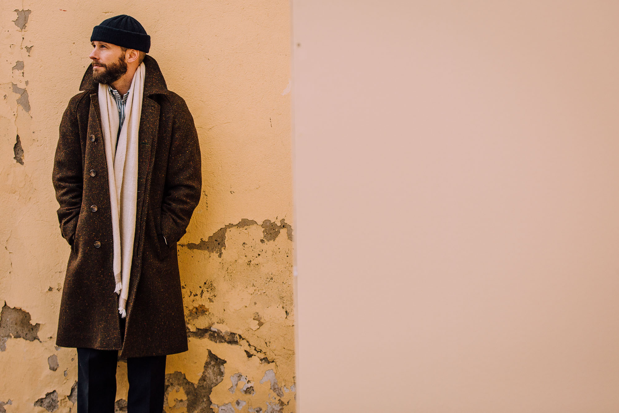
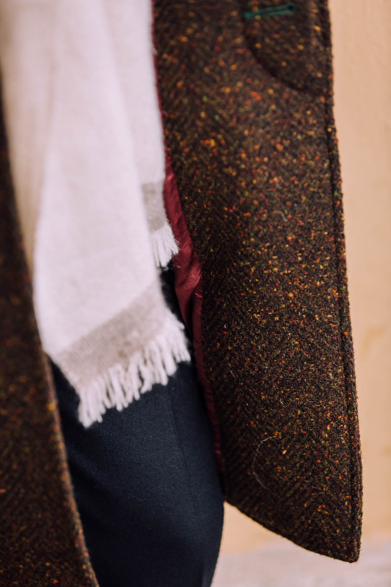
So for example while I love this bright-orange scarf from Anderson & Sheppard, it could be swapped for something quieter, such as a cream shawl (below, also A&S).
A grey or dark-green scarf would be even subtler, particularly in a smaller size.
Second thought (perhaps an obvious one, but worth spelling out): such bright accessories are much easier to combine with clothing in warmer, rural colours than colder, professional ones.
Country shades like green and brown are much more amenable to bright orange, yellow or red. Their warmth means there is less contrast than against a cold colour like navy, where bright accessories can often look cheap.
It's one reason bright colours are so much more common in rural clothing - whether red cords or a yellow overcheck.
Strong colours can work with a navy business suit, but they tend to be darker and deeper, like purple or maroon.
Finally, the easiest thing of all is if the accessory picks up a colour in something else you’re wearing.
This is what makes this orange scarf so easy: there are already orange flecks in the tweed coat, so you know the colour works.
It’s one of the reasons tweed in general is such a pleasure.
There are far greater depths than this to colour theory, which could explain why a certain shade of orange works with a coat, but another doesn’t. Small changes in saturation or acidity.
But they’re hardly relevant, because as a customer you’re not picking scarves from a Pantone book. Rather, your decision is whether the particular yellow in front of you works.
There, the best thing is always to try it against something you’re wearing, or go home and do so.
It’s what I did with this scarf. I saw it, was unsure, and wore my coat in the next day to check. The coral pink also worked, but nowhere near as well.
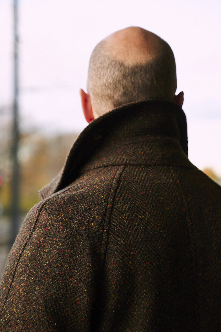
The coat, by the way, is from Cordings Autumn/Winter 2017/18. It's not available anymore, though there is a duffle coat in the same material in the sale (Medium only).
As with most things from Cordings, that material is great - a 20oz donegal. And the functional elements like the collar are well thought through.
But other style points are too loud - here the bright purple lining and green buttonholes. Fortunately both things could be changed relatively easily, as could the length.
Then again, I thought that a year ago and I haven't got round to changing them yet.
Photography: Jamie Ferguson @jkf_man


Simon,
Great article again. I have that exact same coat (wearing it today coincidentally) and agree it is such a versatile piece, and great value as well considering.
On a side note, I really enjoy the way you use words. Tangential, what a great word. All this reading is certainly helping me build my repertoire of vocabulary.
Thanks,
Stephen
Thank you Stephen, that’s lovely to hear. Particularly in an age with so little writing.
I really must echo Stephen on this point. Of course it is the sartorial knowledge and views that many years from now got me hooked to your blog, Simon, but what has kept me still reading all your articles is how you write. Countless are the occasions I find myself contemplating over a well put together sentence that sometimes even give me more pleasure than the actual theme you are dealing with.
Keep that up!
Per Håvik
Further endorsement from me on your writing style. It’s excellent – clear crisp and not overwrought. The avoidance of execrable(!) words often found in style/fashion writing (such as “drop” to describe product launch, or “kicks” to describe shoes) is especially appreciated.
Anyway, on the substance of the piece, I fully agree. Donegal tweed is the perfect winter fabric for this approach, since the colours in the flecking usually span a very wide palette. That orange scarf looks great.
I like these posts on colour theory.
On the A&S cashmere scarves (and other brands for that matter such as Begg), I have found that the cashmere tends to fluff/shed considerably. This is in stark contrast to my cashmere scarves which were purchased more than 5 years ago. Has the quality of cashmere changed? Grateful for your thoughts.
I don’t know Gus, to be honest, though it’s certainly become more expensive.
It might be due to differences in the weave of the scarves though (looser, denser) or the finish (more finishing, ie bashing or scraping, making it fluffier)
Hi Simon,
Thoughtfull consideration about an important topic.
To me the coat is already enough short.
John
I find that some strong colours also work best on a sunshiny day 🙂
E.g. a coral or sky blue tie on a hot summer’s day.
Josef Albers’s excellent ‘Interaction of Color’ is pertinent to this post (https://yalebooks.yale.edu/book/9780300179354/interaction-color). He was the husband of the great textile artist Anni Albers.
Seeing your vintage folio made me wonder when you are going to release your folio?
It’ll be 2 or 3 months probably
That would be a great news!
Would you reveal any design details?
I can’t really yet no, sorry
That coat is outstanding, love that tweed!
It looks similar to Magee’s “Corrib” raglan overcoats which are also available in Donegal tweeds. Magee is one of Cordings’ suppliers.
Thanks Kenny
Cordings’ AW18/19 was very disappointing. Your raglan Donegal coat was not replaced and the use of polyamide in the classic Lodens is alarming. The range of paddock coats was limited to a couple with microfibre fabric rather than the excellent moleskin. I fear that the quality of Cordings’ collections is in decline.
This discussion, and others like it, are helpful to women as well as men. Thank you.
Nice to hear, thanks Valentine.
Understand your point of view and your thoughts are accurate. Some things though, such as your Etro suit, exist, thematically, in a particular time and place. Some things, floral ties are an example, are out of fashion now but when paired with their original contemporaries – they look good, make sense and invoke the mood (which may have been bolder or more outrageous) and music of that time. Though we may sometimes look back and think ‘what was I thinking’! I think it also worth mentioning that as we age we become more discreet about attracting attention, to do otherwise might reflect a lack of judgement. Conversely, younger males and females both wear brighter colours. Later, we may chalk it up to lack of taste but bold fashion colours (i.e. the pastels of the 80’s vs. the earth tones of the 70’s), which often rebel against what came before, always favour the young. I think your color composition looks strong, bold and well judged. Where were you off to (there is always something exciting about railway journeys)?
Yes, big fan of rail – did a lot of inter-railing in my youth (not wearing many hyper-fashionable clothes though I’m afraid).
I was off to the Joshua Ellis mill
Half the women in London seem to be wearing big yellow scarves right now.
Simon, I very much enjoy your articles. At Pitti I noticed that shearling coats are de rigeur. Could you teach us about its characteristics and how to recognise quality. Thank you, Patrick
Not a small subject, but yes Patrick I’ll plan something
Great educational article, as always. The coat from Cordings, its colors and cut/shape are gorgeous. I have a couple of questions though, and I don’t mean to insult you at all. Actually, I read this blog at least once a week and I do so because I find it very interesting and enjoy your knowledge and writing (I need to improve my English). I have noticed that many internet experts are essentially advertising watches, car makers and their own tailoring (or else -i.e. glasses, shoes, etc.) businesses. It seems to me that you for the most part write about and wear bespoke suits, jackets, coats and shoes. My two questions are: 1) Do you wear this coat from Cordings and, for instance, the bridge coat designed and sold by you on a regular basis or more often than the wonderful bespoke coats that you own? 2) Are this article and the photo-links on the right column of this blog paid adds? I may regret having asked these questions, yet I am going to click on the “post it” button anyway in a few seconds. Best regards, Fabrizio
Hi Fabrizio,
Happy to answer. I never take money for writing articles on the website – never have and never will. For me it’s what undermines the credibility of both fashion magazines and of most social media.
That’s why we have the adverts on the right hand side, which are paid for, and sell some of our own products. Both seem to me to be more transparent ways of funding the site. And even there, advertisers have no guarantee of coverage, and I try to always make clear when I’m writing about a product I’m selling on the shop rather than someone else’s.
I hope that’s clear.
On point 1, I’m not so sure what you mean, but yes I wear all those coats regularly – the bespoke ones perhaps with tailoring on smarter days, something like the bridge coat with tailoring too but also at the weekend with knitwear.
Let me know if that didn’t answer your question
Thanks
Thank for your answer. I don’t want to sound condescending, but your explanation above and the way you conduct your business, along with your knowledge, makes you the best and, certainly, the most honest internet style expert. I just needed, as, I am sure, many of your followers and customers, confirmation of what I already suspected. Two more question that you did not answer in the page on how to take care of your sweaters: do you regularly drink your coffees and espressi with the left hand, as many Italians and I do in public places, in order to avoid catching a disease (this is what seems to me from the presentation of the corresponding video)? And is that an A&S sweater that you are wearing? Thank you again
Thanks Fabrizio, that’s nice to know.
Nope, I drink my coffee with whatever hand feels natural at the time; and yes it’s an A&S sweater
Hello Simon,
Quick question. Steven Hitchcock made you a beautiful grey W Bill jacket in lamlana. Could you comment on how heavy it is and its usefulness year round or seasonally? Ideally if you were to identify a similar cloth in similar tone that could be worn in warmer climes what would you recommend?
Thanks,
M
In the UK it’s fine to wear 9 months of the year. If you wanted something for warmer weather I’d look to the wool/silk mixes of caccioppoli or loro piana – but I haven’t searched for something like that recently I’m afraid
I cannot recall you touching on this point before but I think it’s worth mentioning.Simply that when comparing weights of cloth in grams and ounces one should not divide the figure in grams by 28.5 to obtain the oz. equivalent.This is because grams should be expressed in regard to a square metre of cloth and ounces are expressed per square yard.So,for example 600g is not 21oz but 17.7 oz.I have simply divided 600 by 33.906 to convert cloth in g.per metre to oz. per square yard.
People can be significantly misled about the weight of cloth.Caveat emptor.
Hi. Actually most people don’t use yards. However, it does vary between measuring per linear metre (of the cloth) and square metre. Which can be frustrating.
Yes,I understand your frustration but I also wonder when Cordings or anybody else for that matter quote 20oz do they mean per sq.yard /sq.metre?If they mix imperial with metric it is even more confusing and misleading.
Also,I added my initial comment because sometimes I like to convert metric weights back to imperial because some people discuss cloth in imperial terms and it’s more accurate to use 33.906 than 28.5 in conversion questions to get a true understanding of their comment.
Hmm. However, British cloth merchant Dugdale simply divides grams to obtain oz, e.g. this twill:
http://www.dugdalebros.com/the-white-rose-caldonaire/product/4221-mid-fawn-cavalry-twill/colour/mid_fawn_cavalry_twill/page/145/
Yes, because one mill will always use the same area, linear or square metre. It’s only a problem between mills
No,I’m sorry, if its just a problem for the mills it’s also a problem for people like me who have over 40 years experience with tailors and take care when choosing a cloth for a suit or overcoat.In the end I trust my gut instinct about a chosen cloth and the word of my tailor in regard to it’s merits.I simply do not rely on the given weight since it may not compare reliably to weights that I scrutinized years ago when looking at bunches.
Dear Simon,
This is a great read and helpful read as usual!
Speaking of colours: is there any book regarding the theory of colours that you can recommend as an in-depth-view to this article? Either on clothes in specific, or a more general approach, which then could be adapted to clothing.
I know that a book could never cover all the fine nuances which can be found here, and I can imagine that a lot of it is trial and error and dependent on such things as texture too. But the theory of colours and how to combine them is one of the things I still know very little about – thinking about it, I hardly ever leave my comfort zone of the classic browns, greens, beiges, and blues.
There are quite a few, but I’ve never seen a specific one on menswear, which it really should be to be that useful. Menswear works well within a fairly narrow range of colours – cold business ones, warmer casual ones – and then things that go well with them. When you get into womenswear, where any colour can be worn in any proportion, it’s much broader and not necessarily that helpful
For Felix: try ‘Color for Men’, 1987, by Carole Jackson (Amazon/eBay). It is old but the ideas, suggestions and work on developing an individual colour palette remain true.
Thanks
Simon,
Great article and great coat – I wanted to get the same but I was out of the country, when I returned it was sold out. Hopefully they will re-stock it again.
Instead I bought Cordings Norfolk Jacket (Byron Jacket). Although the jacket is beautiful and heavy 22oz, it has an odd composition (44% Wool, 44% Nylon, 12% Other). If you don’t mind me asking, what is your take on such blends? I am hoping to use it casually (almost like a sport coat) but, because of composition, I am torn between keeping or returning (and later get a 100% wool jacket)…
Thanks,
Simon,
Some time ago, I asked you about high – contrast colours for buttonholes, etc., and I believe you said something like it was in fashion for a brief time some years ago, and has now turned into a cliche that denotes, not high quality/fashion, but in fact the opposite.
In reading this article, what are your “rules” overall? I understand that in fact “you just know” may be as good answer as possible, but are their any guiding principles you adhere to?
As I see it, if you can catch a flourish – the lining of a jacket, or the inside of a billfold, or it is an accessory garment – scarf/tie, that is where you can “go wild”…any other advice?
I think it’s something I address in this piece to a certain extent. It’s much easier to add colour in second-level accessories, so gloves and scarves, rather than ties or handkerchiefs. And in permanent parts of a jacket, like buttonholes or linings, unfortunately it usually looks quite cheap or gimmicky
Like the Balmacaan coat from Cordings. They are hard to find these days and tend to be cut a little short and missing the bits of decoration like the collar and cuff tabs. I have a lot of top coats but am always looking for a nice off the peg Balmacaan. New and Lingwood had a nice one a few years ago. Fairly large pattern tweed in muted colors (breaking your rules somewhat) but voluminous (the full bell tent effect a bit like those 20’s and 30’s illustrations) and with the fiddly bits. Unfortunately now dropped.
Simon,
That is great looking coat. I sorry now that I didn’t buy one when I had the chance.
But out of curiosity are you wearing yours over a sport coat or over knitwear?
Also do you know of any other RTW alternatives? I’m looking for a wool overcoat to wear over knitwear but already own a Pea-coat.
Sports coat – this one in fact.
The Anglo-Italian ones are nice, and the Armoury does some good ones under its own label and from Coherence. I’d look to Ralph Lauren too.
Thanks, I’ll check them out.
Hi Simon,
I absolutely love the brown leather folio you showed here. I’ve been looking for a similar one for a long time but have only seen one similar to yours when I travelled to Tokyo couple years ago. It was at a store that sells pre-owned clothes. The price was around US$2,500 and I regret that I did not purchase it as at the time I thought it was pretty expensive for the condition of the folio. Do you have any idea where I can possibly purchase similar folios in the US or online?
Hi Joseph,
Not really I’m afraid, no, you just need to browse vintage shops, some of which will be online. This is the pleasure and pain of vintage shopping!
It’s always worth asking Bentleys too, I guess, which is where I got this one from in London. They will certainly tell you how easy it is to get another one.
S
Simon what is the construction of that Cordings coat? Is there a fused canvas inside like with a tailored jacket?
Yes, pretty much any RTW coat like this, unless at a much higher price point, will have some fusing down the front
doesn’t that make the coat flat Simon?
Only in comparison to a bespoke coat with a hand-padded chest and shoulder. But for that you will always be paying a lot more.
If there were no fusing, the coat would be a lot less clean and would lose its shape more easily. Unless it were in a very heavy, stiff cloth.
I had a look at Stoffa coats and I believe they have no interlining at all. Does this mean they would give a completely different look to a traditional overcoat?
It might be hard to tell Rups. There may well be something down the placket, for example. You can’t feel it like on a suit often.
And no, that look will depend much more on the cloth and style
Hello Simon,
I found this exact coat second-hand. Please can I ask you (if you remember) what size you were wearing in the Donegal?
Many thanks for replying.
Detlef
Simon, i have read somewhere that if you are wearing colours in your outfit it is very important to repeat the colour somewhere else in your outfit so that it coordinates and it is especially important with shoes otherwise the eye would be drawn more towards that part where the colour is. What would be your opinion?
So if i am wearing a burgundy shoe and do not repeat that colour anywhere in the outfit then would the eye be drawn towards my shoe?
I can see why people might say that, but it’s not something you have to do all the time, definitely. Just keep it in mind as something that might look good. Try it with, and without, and see what you think.
Hi Simon,
Love the colourful scarf shown here. I was searching through the A&S website to find:
https://shop.anderson-sheppard.co.uk/cashmere-knitted-scarf-5828-orange
Your scarf looks like a between colour of the Orange and their Gold colour. Do you know if your scarf is the same once shown here?
Thanks Daniel.
Mine was more of a shawl-scarf, and I don’t think they do it anymore I’m afraid.