Wearing black (in a sports jacket)
I recently remembered these shots we took last year in Japan - it was September, but Tokyo was hot and humid, as Europe has been in recent weeks.
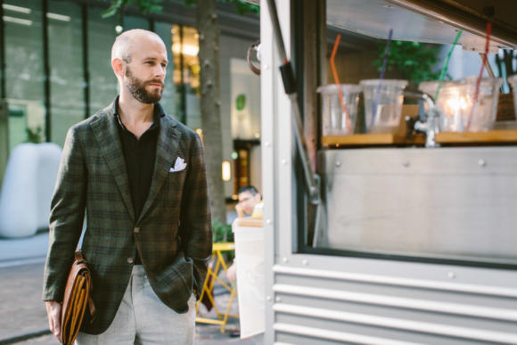
Although wool, the checked jacket is 9 ounces and half lined, wearing pretty cool.
It was a useful piece, therefore, but also extremely versatile in its colour and pattern - which never fails to surprise me.
It is helpful if a sports jacket - that is, a jacket worn on its own rather than part of a suit - has texture or pattern to clearly distinguish it from the trousers.
Hence why so many sports jackets are checked.
However, if that check is large or bold, the jacket can become dandyish, striking and - perhaps worst of all - limited in how you can wear it.
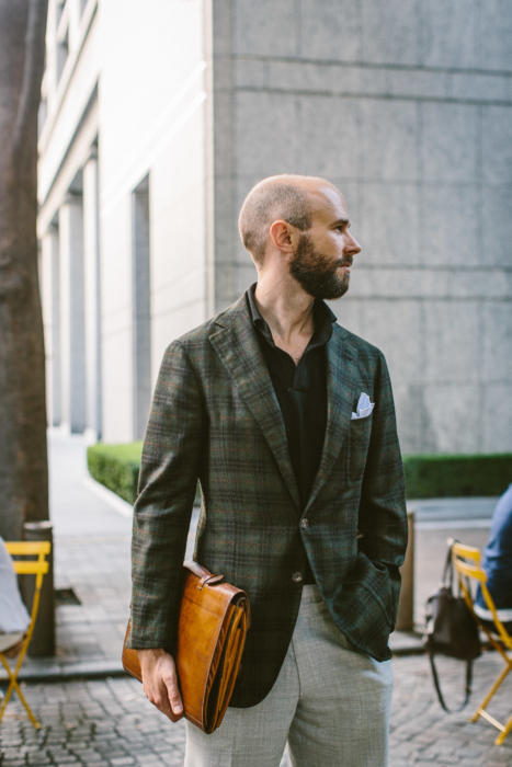
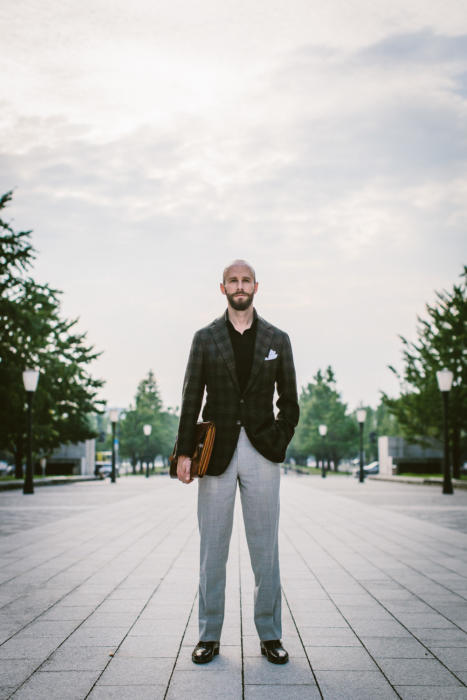
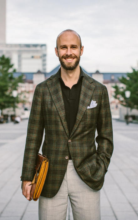
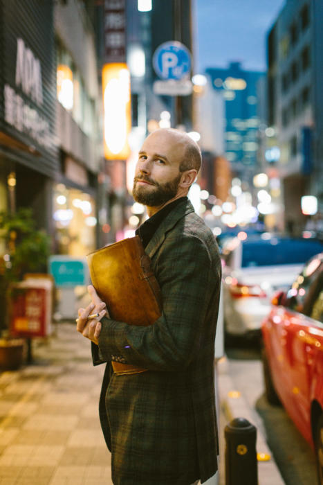
Better a definite but subtle check, as we have here in black on green - with a faint overcheck of orange.
I still clearly remember the afternoon I selected this cloth, from the Caccioppoli jacketings bunch, in the Solito atelier in Naples.
Gennaro was watching over my shoulder; it was a baking day; I was sweating hard.
Having found out that the cloth I wanted - a much more standard blue-and-brown check - was sold out, I opted for the next one in the bunch without thinking it through.
I was convinced the green/black/orange combination would be unwearable, but it turned out to be one of the most useful things I own.
Much of that is down to the subtlety of the check, and general subdued tone of the jacket.
But black as a secondary colour has also proved to be surprisingly useful.
Black is generally a colour we avoid in tailoring, unless for evening wear, given navy is so close yet richer and smarter.
But in an accessory or secondary colour it can be nice. Generally black works best with shades of grey (eg black knitwear with pale-grey flannels), but it is also nice with dark greens. I have a black shawl-collar cotton sweater from Paul Stuart that always pairs best with dark-green linen or flannel trousers.
Green tartans or tweeds can be equally effective.
In these images, the black in my jacket is picked up by a black long-sleeved polo shirt.
Again, there are few things I would naturally wear such a colour of polo shirt with, other than greys and greens (and perhaps the right shade of tan).
The polo is from Testoria Korea. I continue to try and wear polo shirts other than the Friday Polos we sell - both for market research and because each has its own idiosyncrasies that can be nice to play with.
This model does use a great pique, but the lack of any buttons on the placket does give it a pleasingly unusual, clean look.
Elsewhere in the images, my grey-linen handkerchief with white border is a nice change from the normal white (and not as formal).
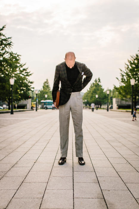
The pale-grey fresco trousers are my pair from Ambrosi (which were reviewed here).
And the vintage folio is from Bentley’s Antiques. A beautiful piece, if not always the most practical thing in the world.
Photography: Jamie Ferguson @jkf_man












Hi Simon,
Who makes the gray pocket square you’re wearing?
Anderson & Sheppard
simon, been musing a green tweed jacket as I love the colour green for its country associations and more informal look, however Im lost as to how to wear it. I could pair with flannels or jeans on the bottom half but I have a neurosis about pairing a blue shirt with a green jacket. Is this nuts or a well founded issue for a clothing obsessive? should I veer into buying tattersal designed shirts to wear with such a jacket to fit with its more country associations? blue seems … well a bit formal, also not sure if the colours clash in themselves (although not sure why jeans would go with green tweed although I guess they kind of do perhaps because of the texture at work). HELP!
Don’t worry at all about wearing a blue shirt with a green jacket. It will be easier with a relatively pale blue, and a relatively dark green, but you shouldn’t have any problems there at all. Mixing blue and green usually refers to much stronger, mid-blues
Hi Simon,
This is interesting! Yes, one of the rare cases I’ve seen where a black shirt seems to be useful.
I’ve never bought a black shirt, and don’t think I will ever buy one. Black in my wardrobe is confined to few items: oxfords, socks and ties for very special occasions.
Strangely enough, I’ve already seen guys in France wearing black monochrome suits – from ties down to shoes, while not heading to funerals though! And each time, I’m utterly flabbergasted at their choice, always wondering how they have come to see such outfits as stylish in the first place. Anything goes would be the motto!
John
Black and forest green is an excellent combination. In addition to tan and grey, black works well with dark red and violet, which are of course colors off limits on this Classic blog. Also appreciate the fact that you stray from those who avoid darker colors in warmer climates.
I disagree with your trouser choice here—and more generally with the widely shared claim regarding the versatility of light grey. Against such dark shades up top, the color gives your trousers too much visual heft, leaving you bottom-heavy. A darker shade of grey would work better in my opinion.
Thanks for this post!
Thanks Ben, interesting point.
Ben’s comment is interesting but I don’t necessarily agree with his assessment the combination here; a darker grey whilst having contrast in colour may have made the outfit too monotone i.e. too little difference in the tones between top and bottom.
I am intrigued though by your admission, Simon that you chose the cloth for the jacket believing it was ‘unwearable’ (though the result proved your doubt misplaced – the cloth and cut in that jacket are wonderful). Why did you pick it then given a bespoke jacket is not a cheap item? Your rationale in previous posts on choosing cloth have always been informative and appear to have a need behind them -gap in your wardrobe, lighter weight suit etc.
It was more the pressure of the situation, as I tried to relate.
I really wanted a lightweight jacketing, and went for this thinking it would be good. The dark green would certainly have been useful and did fill a gap in the wardrobe. But stressing about the black and orange afterwards, I convinced myself it would be unwearable.
It’s a lesson in how hard it is to pick on the spur of the moment, and how hard it is to assess the versatility of colour and pattern.
I would add, however, that this was five years ago. I would have much more confidence in making a selection today.
I find that black is so difficult to get right. Partly, for me, it’s a complexion thing, pale skin somehow rendering the black too flat and cold. Darker skin tones can have the opposite effect giving it a deep warm richness that can work so much better. (Heavy textures can help also).
Interesting comment about ‘deep red and violet being off limits on this Classic blog’. It strikes me that this is a bit of a shame, red, particularly in its more restrained maroon, burgundy, oxblood and purple shades does seem to be generally somewhat under used, given that aesthetically it pairs beautifully with a wide variety of blues, a gamut of greys and a varied range of tans and greens. Is this a cultural hangover of some kind? -from reds flash historical military associations perhaps. Are we missing out on something as ‘useful’ as navy blue?
It’s a good point, but I don’t think we are, no. I think it’s fairly objective and constant.
Cold colours like navy, grey, white and pale blue are smart and formal because they are so lacking in colour, unsaturated and muted.
Warmer colours like brown, green and tan are less formal, more country colours, but still seem natural and can be quite muted too.
Richer, stronger colours like reds and purple are simply too strong to be useful for jackets, trousers, shirts etc. They are best kept to accessories, to elements of a pattern and so on.
That said I do rather like you purple Liverano & Liverano jacket. Granted it can’t be the easiest item in your wardrobe to wear but as a statement piece for a celebratory event it seems spot on.
No. I don’t like this.
Black is a very restrictive colour.
Always looks cheap. Better reserved for funerals and gangsters.
I don’t think you look like you are going to the former and you don’t look like you want to be the latter.
Too contrived. Always a mistake.
Regards,
David
Thanks David. On cheap, interesting and I think I know what you mean – the lack of richness to black often creates that problem.
If you could expand on why you think it is contrived, though, I’d be interested to know why you think that.
I agree with Ben on the trouser colour but this is a v.cool look – the black works so well – the check is bold enough but not flashy and the collar of the polo sits up properly under the jacket – I have sometimes been tempted to wear polos under jackets but often the collar is swamped by the jacket.
In case you’re not aware of it Michael, that is precisely the problem we attempted to solve with our Friday Polos – which went on sale again today as a special order opportunity.
It’s a smart outfit; but for me the jacket would be better paired with darker trousers perhaps even your bespoke Levis (though I understand that for business this would not have been suitable). In shade it is a country green overlaid with a plaid (more correctly a tartan), placing it further in a country mode – to mix it with light grey is slightly incongruous. Rather than trying to urbanise it I would like to see it with brown tones – I think it would bring out the truer nature of the garment. Converesely dark grey jeans and a mid blue shirt might pull the orange out more. You also mention red (trousers, shirts etc.) – I think it a matter of place – a good quality red shirt with jeans makes for a good weekend look especially in summer. The bright colour declares casual wear and sits perfectly within the brighter summer colour range. Red trousers also have their place – it would be a narrow wardrobe if only in greys and blues.
Thanks
Simon, is it my eye sight or are you wearing your jackets slightly shorter this year? Could also be the photographs too but this jacket particularly looks shorter than your usual look. Could I also ask how wool, even unlined 9 ounce wool wears in hot climates – with less structure don’t you get more creases?
I don’t think this looks contrived but I do think it looks Italian. Not surprising as the jacket and trousers were made by Italians but, and I may be alone in this thought, I do miss your more structured British style clothing. To me some of your Italian designed and inspired clothing looks slightly too unstructured and just a tad louche though less appealing than the word signifies. I guess its what I grew up with but following you from the days when you were experimenting with G&B through to today your style has certainly altered. Again nothing wrong with that, taste is a journey not a destination but your journey is taking me to some places I am not sure I would want to visit again!
Hi John,
This is about usual for my Neapolitan jackets, but I do wear a mixture of English, French, Milanese and Neapolitan. I’d say Neapolitan probably makes up about 40% of my wardrobe now.
You don’t generally get more creases in wools like these if they are unlined. Or at least, its 90% down to the cloth and how its woven, rather than the lining.
And interesting on the journey, thanks. I do still wear structured tailoring, including some Graham Brown! But you’re right, I have had more Italian recently – largely because I’ve just had more access to it, travelled more etc, where in the first few years it was just Savile Row, being so accessible.
S
Excellent practical suggestions for incorporating black. I will take this a step further and say that one of my favorite Fall/Winter jackets was a soft constructed, 1/4 lined, patch pocket in heavy flannel black cashmere. It was ideal for casual wear with grey flannels or jeans and a white shirt. The cozy soft construction fit a bit like a sweater jacket and was ideal for travel or grabbing it to wear in leu of outerwear.
Hey SImon, would you consider this pattern/colour of jacketing to be equally versatile if done with a heavier weight wool as a winter version?
Absolutely
Simon, in some of your more recent articles, you’ve had some rather negative comments about fresco used in trousers, saying that either the texture’s too rough or the lining defeats the purpose of it. Do you stand by those remarks? Does that mean you would not commission pants such as these ones again?
I would generally go for Crispaire over fresco given those issues, but I wouldn’t strongly recommend against it. If you like the hang and don’t mind the texture, go for it.
Lovely piece, Simon, thanks. You gave me the idea to use black not in a polo, but in a shirt. At an event I was hosting in December, I wore a brown Donegal tweed SB suit (RTW, not worsted, but not as thick or “bushy” as Drake’s current Harris tweed sports jacket, for example), brown brogues and a black Paul Smith shirt (French cuffs) that I’ve owned for ages (as a result, the black is fading slightly, but it didn’t matter and maybe added to the informality). I threw in a dark orange paisley tie by Amanda Christensen (Sweden). The tie’s warmth was a good touch, I thought, and toned down the black’s severity. Unusual perhaps, but fun. Even though less than 50% were in sports jackets, as the host a casual suit seemed warranted.
hi simon , i want to ask how can wear a black sport jacket with three bottons , i know that the black colour is diffilcult to combine with other colours,please give me your opinion.thank you
Try grey trousers and a white or pale blue shirt?
Hi Simon,
Which brand would you recommend for polo shirts with a good collar that would look great under Blazers.
Kind regards
Rupesh
Hi Rupesh,
Well, the Friday Polo that I designed most obviously, as that was what it was cut and made for. I presume you know those?
Then The Armoury ones are also good in that respect – not cut long in the body, like a shirt, but the collar is very nice.
I thought this might be about a sports jacket in black colour.
Simon, if i may ask, how do you feel about just that? I do not have a black suit, but it seems to me that having at least a black jacket is somewhat essential and has at least some utility. Personally I like bold colours and patterns on shirts and black could possibly help neutralise the loudness?
It was about black in the pattern, rather than being completely black.
To be honest I’d avoid a black jacket. It will make bold colours and patterns look stronger if anything. Grey is best at neutralising those. And navy is always richer and sharper than black