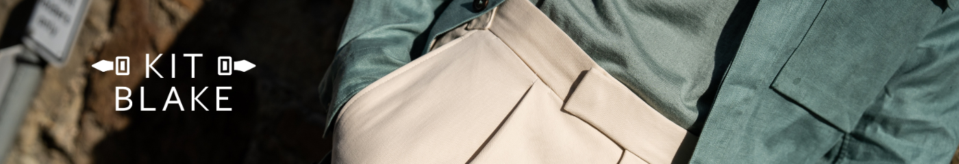
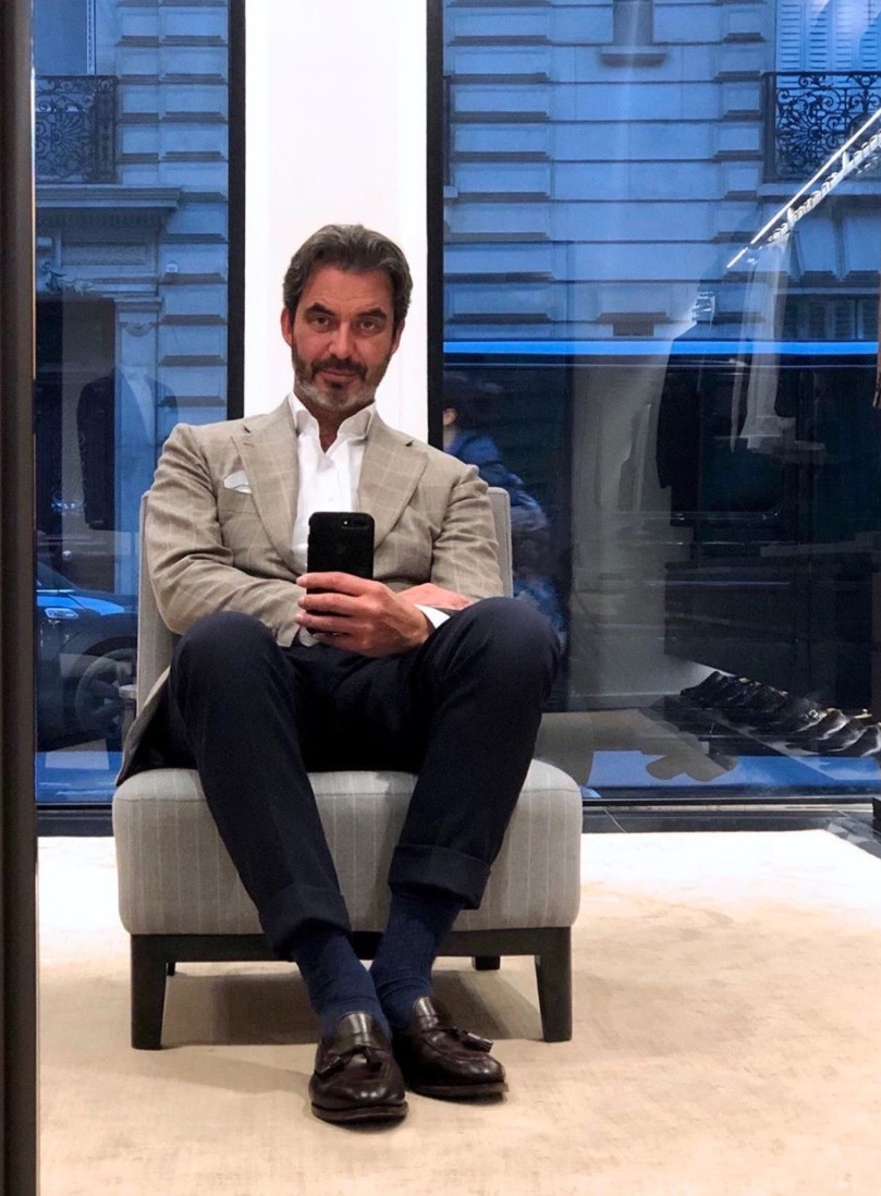
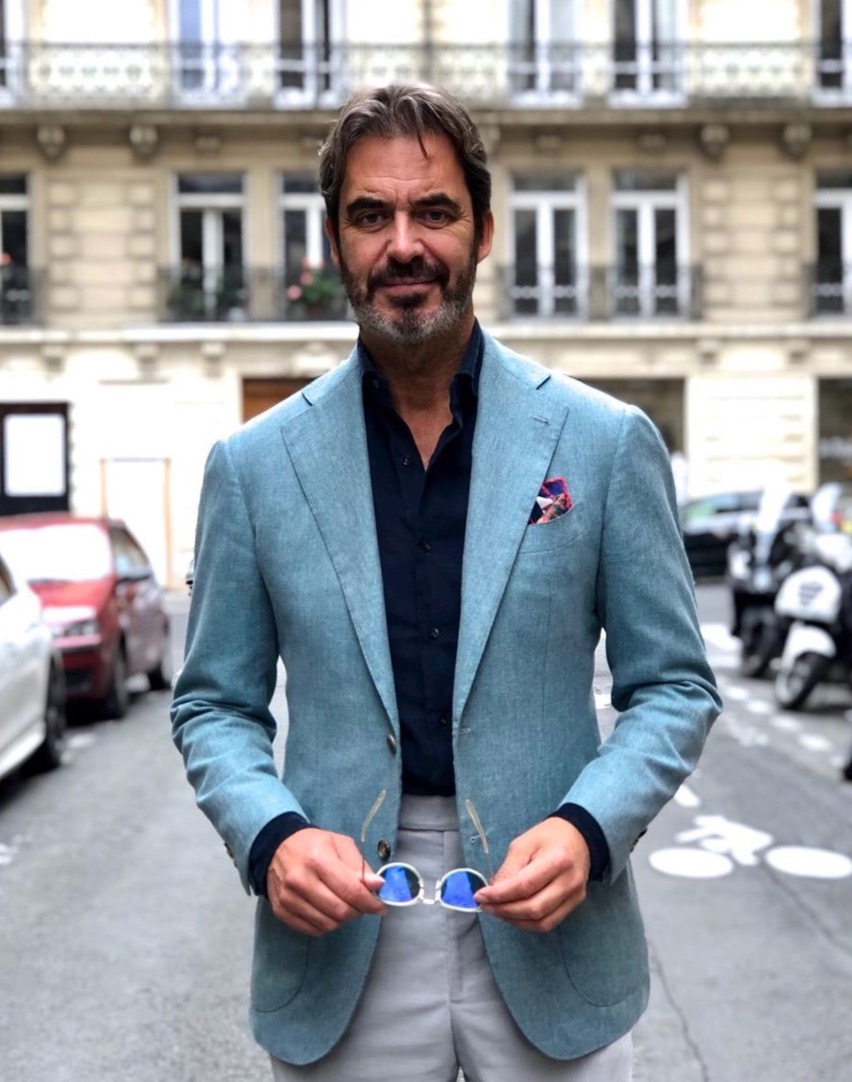
I asked Jean-Manuel Moreau to be the next chapter in our ‘How to dress like’ series specifically because of the way he wears colour.
Creating jacket/trouser/shirt/shoe combinations that feel new and interesting, yet remain modern and relevant, is one of the greatest challenges for a modern dresser. And JM wears many combinations I don’t.
So I asked him to describe briefly how he dresses – with what aims and principles – and then to break down how he put six interesting combinations together.
“I am a very instinctive and intuitive person in the way I dress. And at the same time very classic: I know the limits I have to stay within and the frontiers I may not pass.
For example regarding colour, I usually dislike combinations that are too loud. I don’t particularly like green and grey together (except perhaps light grey), and I dislike wearing black, except occasionally in a rollneck or polo.
Yet I also take pleasure in trying unusual colours, and trying to find ways to wear them that are pleasing, and harmonious.
I think the most interesting challenge in one’s style is to remain consistent, recognisable, whatever you wear – yet to also explore, fill, this whole but quite small space which is finally devoted to yourself.
I think I’m quite an ‘urban’ guy when it comes to what I wear. While I love nature and the countryside, I’m not a fan of what I call the ‘gentleman farmer’ look. So I generally avoid this kind of style.
I’m also not a fan of the 100% vintage look we’ve seen a lot in recent years. I’ve no doubt that all of us want to achieve a balance between historical handmade craftsmanship, and modernity in how we look. But one of my firm personal rules is to stay within the times in which I’m living.
Usually, I start building an outfit with one of the three principal pieces: jacket, trousers or shirt (or rollneck). They just all have to work together in a harmonious way, however obvious or unexpected each may be.
OUTFIT 1.
Jacket: Blue/green fabric by Holland & Sherry (Oceania bunch)
Shirt: Navy mini-corduroy by Canclini
Trousers: Corduroy by Holland & Sherry
Here I started with the jacket, obviously.
This very specific, tender green goes well with the putty colour of the pants, in particular because, in the texture of the jacket, there are some touches of grey and beige that pick up the putty.
The added interest of the outfit comes from the navy shirt. This deep navy is like a developer, an enhancer, of the both the jacket and trousers. I think the combination is also helped by the pocket square, which adds some warmness, thanks to its reddish touch, to quite a cold whole.
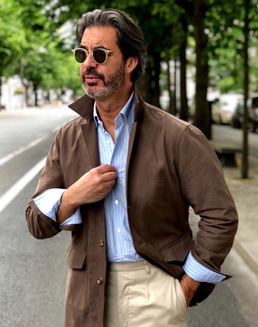
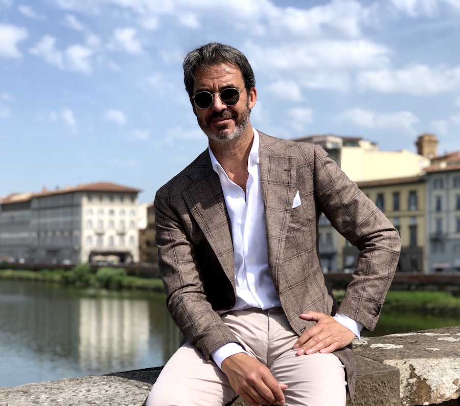
OUTFIT 2.
Sahariana: Light-brown winter cotton by Caccioppoli
Shirt: Striped-blue linen/cotton zephir by DJ Anderson
Trousers: Beige cotton by Holland & Sherry
I started with the sahariana. The trousers were an easy match. But I then wanted to stay in an ‘urban’ register, which explains the choice of the shirt.
First it is a yellowish blue, which matches well with both the jacket and trouser colours. But at the same time, it creates real contrast. Like a wake up. And the sophisticated striping (if you look up close) brings the total look back to the urban universe I’m working in.
The choice of the picture background is perhaps not an accident: the head in the trees, the outfit in the asphalt.
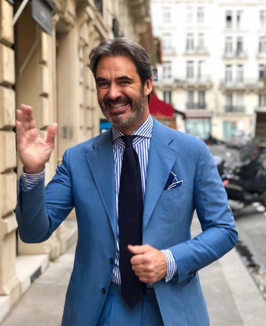
OUTFIT 3.
Suit: Intense-blue wool cloth by Caccioppoli
Shirt: Navy stripes by Grandi & Rubinelli
Tie: Seven-fold navy silk.
Of course, I started from the suit.
This blue is very intense. All the more so as it is a suit, not just a jacket. My challenge that day was to take this colour and make it as corporate as possible. A white shirt would have been too formal: navy bold stripes for the shirt, and a basic solid navy tie were the solution.
The pocket square, in my opinion, mixes the styles: making it classical, in a solid navy, is a confirmation of the neutral corporate look, but its shaping in the pocket is loose and wilful.
OUTFIT 4.
Jacket: Dark-green piquet by Loro Piana
Trousers: Beige cotton by Scabal
Shirt: Pink stripes by Canclini
I started from the green jacket – as ever with the bolder colours.
Green is not a colour I’m that comfortable with, so it was a real challenge. Always this fear that it’s too connected to that ‘gentleman farmer’ look. But I do like this deep green. A white or a light blue shirt were too easy in my opinion. I found the pink very interesting, taking into account that the pink I like always has white too, in a striped pattern.
The beige pants with a touch of red looked ideal to match both the green and the pink. The white pocket square had to be as neutral as possible.
OUTFIT 5.
Shorts: Navy cotton by Caccioppoli
Shirt: Peach linen by Carlo Riva
I think this is the only time in my life I went to the shop in shorts. It was 40 degrees in Paris that day. So definitely, the shorts were the start of this ‘Parisian beach’ outfit.
The challenge was to stay ‘urban’ as much as possibl. The peach colour of the linen shirt, from such a unique fabric by Carlo Riva was nice. It gave some yellow and orange sparkle to the whole.
I am a big fan of tassel loafers. They are in the same color as the braided nubuck belt, building a valuable third colour I could not get otherwise, because of the lack of a jacket.
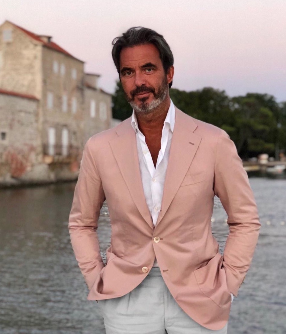
OUTFIT 6.
Jacket: Pink cotton by Holland & Sherry
Shirt: White cotton/linen by Canclini
Trousers: Irish linen by W Bill
I love this pink cotton jacket. In French we call it ‘old pink’.
Of course, it drove the rest of the outfit. The shirt had to be white – better than off-white in my opinion so that it ‘wakes up’ the ‘old’ feel of the pink.
I kept the off-white, with a touch of grey, for the trousers to allow some contrast with the shirt. The overall idea being to enliven the pink of the jacket and leave it as the focus, for the upcoming evening event.
Background on Jean-Manuel and his shop here.
Review of my made-to-measure suit from him here.


Playing tennis? An article on tennis kit (whites) please please! In fact a historical / modern sportswear series could be cool
Already working on the latter…
V cool. From my perspective – there is endless writing on the American sportswear influence & don’t feel like I will know anything more. U.K. & European though!
Fascinating post Simon. The Sahariana is interesting. Is it possible to have some more details of this ? Paul
I’ve never tried one on, so you’d have to go through the JMM team for more info. It’s pretty similar to a safari jacket or overshirt in that style though
It’s remarkable how he combines colour.
Outfit 1 … that’s a really unique colour and therefore very difficult to match but he does it .
Outfit 2 …. browns (or brown and beige) is a difficult one to combine and one can easily looked washed out . But again he pull sit off brilliantly .
Outfit 4 ….. absolutely mind-blowing ! The dark green and pink is hard enough but to combine that with a beige trouser is brilliantly done.
I think in each case skin complexion and hair colour have played a part …. for example the brown and beige could never work on brown , Indian complexion . Or would it ?
But more importantly , I think for the first time it’s hits me , how this gentlemen’s personality comes through on the ‘still’ medium of photography which allows him to pull difficult outfit off effortlessly.
Generally , Simon, should one work dark colours out or dark colours into a outfit (i.e. dark shirt , light jacket or light shirt , dark coloured jacket .) Also how would it then go with trousers … dark top , lighter bottom half or vice versa.
P.S. Also I would encourage your readers to click on that “How to Dress like” link .
I think they’ll have forgotten the richness of the collection of articles in this series.
Keep it up !
On skin colour, I think most of these could work on most caucasian skin colours, from pale to darker tanned, but I can’t really say on an Indian complexion – you’d probably know better than me there.
Generally, combinations are much easier when the shirt is light, the jacket dark. And the jacket dark, the trousers light. The latter is more for versatility, but the former (light shirt) is a lot easier. It takes more thought and time to do the dark-shirt look effectively. (My thoughts here)
I am of Indian descent and I regularly wear brown and think it works quite well. However, I usually wear cooler and darker browns–dark brown shows, jackets, even a dark brown suit are all staples of my wardrobe. I think the darker colours work given the darker complexion and black hair. I think I could wear JMM’s brown Sahariana without problem.
The trousers I wouldn’t wear. Warmer and lighter browns–tans, khakis–I avoid. But I’m not sure if this is about my skin complexion as oppose to I generally don’t like those colours most of the time on anyone. I do wonder a little if that general dislike may nonetheless be heavily informed by how those colours work on me (my favourite colours seem to be the colours that generate the most complements for me when I wear them, so there is like some interaction there).
Thanks, very helpful
I am very dark skinned and would happily wear every single outfit Jean-Manuel shows in these pictures. The man is a genius at combining colour and a real inspiration for my own wardrobe choices in future!
I actually don’t believe there is any single colour out there I couldn’t wear well but understand that for those with lighter skin tones may feel this isn’t the case.
Great article and maybe I can say my request has been granted. Must be a mix of the job he does and the environment he lives but to me Moreau is by far the most elegant man I know. And, just as stated in the article, he is the most modern take of what classic style is.
While I wouldn’t be comfortable with every combination presented here (my favourite being the first two which I very much like), one thing is clear – Mr. Moreau has a keen sense of what can work well together. Could see myself asking his advice in this regard.
Great article – lots to consider. I really like the look of the Sahariana in Outfit 2 and might research something similar!
Thanks to you and Jean-Manuel.
I found this insightful and it gave me some useful ideas for combining colours more effectively, something we Brits can shy away from or get horribly wrong. As much as I love beige tailored trousers I find then a little impractical and have tended to avoid them when travelling in central London in rush hour (when that was a problem!) and in the rain, wearing them more on the weekend, when going out for dinner etc.
Really great read. Mr Moreau has a superb dress sense. Does his style inspire you to be bolder with colour whilst still remaining elegant? For all the benefits of keeping things simple and basic, sometimes being able to bring in stronger pieces and actually making it work and not too ‘shouty’ I think is the ultimate sartorial skill.
It certainly inspires me to try more, yes. I think I’ll always remain more conservative at heart, and take greatest pleasure in more subtle textures, or tonal combinations. But like my pink or purple jackets, you don’t want to lose the variety that colour can give you as well.
An excellent piece. Very chic. Very French. I found it interesting that J-M deliberately limits himself to a particular end of the classic spectrum – urban and contemporary – which gives him a consistent look over time. He clearly has a natural feel for colour and style. He can “see”, and the thinking is very much secondary I think. A good choice of subject, Simon, because as you say he wears colour differently from you, no doubt due to his higher contrast colouring.
Hi Simon,
Very interesting and inspiring post, as always! It would be nice if you could add a few more words for the outfit in the first photo, as you often stress that you dislike blue odd trousers (except for certain cases in which trousers deviate much from shades/textures of suit ones). Thank you in advance!
I wondered who would be the first to pick that up!
I still wouldn’t say I dislike blue odd trousers, just that they only work in certain fairly narrow combinations – as set out in this post. That doesn’t mean they can’t look really, really good, just that they are less versatile – so they shouldn’t be among the first few dress trousers you get. (Which is very different to chinos or denim)
JM does it well here, along the lines I described in that article. With a grey jacket, cold colours overall, and so on
I apologise for having used ‘dislike’, I meant that it is not one of your favourite choices. Indeed, blue odd trousers can sometimes work really well. Another example is Nicolas in the photo of Outfit 4, isn’t it? The odd jacket has enough texture and makes a nice match with the blue trousers.
No worries. Just wanted to be clear for anyone else reading.
They do work on Nicolas in outfit 4, yes, though I think only in that very specific outfit of all blues, which I’m not sure about personally
It’s interesting how certain styles suit certain people because of the wider facets of their physical appearance. Jean-Manuel’s choices don’t appeal to me personally, and I wouldn’t recommend them to most guys (the bold colours, slightly tight/short fit), but they work v well on him, I guess because of his rather louche, handsome, rakish, kind of ‘rich’, look! Being attentive to, and honest about, the innate characteristics of one’s appearance is an important element of choosing clothing that perhaps gets a little overlooked in a journalistic landscape of absolutes – “the ‘best’ tailor in Naples” / “the three pairs of trousers you NEED”. You often refer to lifestyle context as a key factor in making clothing choices Simon, (eg not everyone needs five business suits), but maybe pre-existing physical attributes is another area, albeit a much more nebulous one, that also warrants thought?
Yes, true, and true it’s a hard one to analyse. Easy with suit proportions of course – flattering the tall, short, wide and thin – but harder with other things like boldness of look or general proportions, to give much consistently helpful advice.
One missing piece of advice evident from the pictures: it’s a lot easier to play with color if you skip the tie. I don’t say this as a negative, just as an objective piece of advice. If you want to wear interesting colors, seriously consider skipping the tie.
I like the silhouettes JMM’s putting together. Soft, lightly-padded jackets with trimming lines. When it comes to color, his more successful outfits are still those that deviate least from classic principles: if you’re going to wear an unusual color, make it a light one that doesn’t call attention to itself. Accordingly, outfits 1, 3 and 4 don’t convince me that wearing unusual colors is better than not. The suit/jackets are too bold and pull all the attention away from the face, the avoidance of which is one of my core principles for good dress.
Great post Simon- as usual. It would have been nice to see his shoes as well as that would have given sartorial philistines like myself a more comprehensive picture. .
I don’t know, don’t want this to come across aggressive and I guess he’s consciously experimenting with the extremes of “classic” style to inspire his customers. But to me these pseudo youthful color combinations have a rather paradox effect – you would think they make you look young or “contemporary”, while in reality they make painfully clear you’re old. In fact, too old to care so obviously about your clothes (again, he sells them so it’s fine, but anyone else at that age should have more important stuff going on in their lives). Also, the overall style feels a bit passé to me, looks like a 2014 Pitti street style collection. And shorts with the shirt tucked in and a belt… I think that look should be left to US frat guys. But the jackets of course fit great and, as was noticed before, wonderful shirt collars.
PS: Yes, please write something about sportswear (especially for tennis), would be very interested in such a piece.
I’ve never been a fan of Mr Moreau’s carefully thought silhouette. I don’t understand why this knowledegable gentleman with solid hips thinks tapered pants give him the best appearance. I know this cut is a sartorial marker but to flatter one’s own body type is more important to me than fitting the current fad.
Yeah, I follow JMM on instagram and he knows how to dress well and pull off color. Sometimes, I think, “ok, that’s how you wear these colors” and start wearing something similar. For example, I started wearing sky/pale blue cotton trousers because of him. However, I do think some of the outfits he wears are too strong and “out there.” And some of his outfits I do not feel that one who does not work in the menswear industry could pull off. Those of us who work in a professional office are limited.
I also like the polo shirts he wears. Simon, do you know who makes those?
Also, I find it interesting comparing his style to Simon’s style. Cleary opposite as JMM tends to wear more color than Simon who is conservative. Not a negative, just an observation.
I agree Dan, some of the combinations are harder to wear outside of fashion. I think that’s often the case with those that run shops etc – they can do it, but also they want to do it sometimes, to give their customers plenty of ideas, to take or leave.
I guess my style is a bit more everyday – I think often influenced by writing this site, where I want to give readers lots of very wearable options.
I don’t know who makes the polos no, sorry.
Great series, thank you Simon. Do you share J-MM’s concern regarding pairing green and grey? Assuming the green is a dark green, I don’t see why that might be considered loud. For example, olive chinos with a grey jacket works, no? Many thanks.
I don’t have so much of a concern there, but the green has have to be dark, yes.
Very dark olive chinos and a grey jacket might be ok, though much easier is the other way round – eg dark-green tweed jacket and grey flannels
I guess I belong to the ‘gentleman farmer’ category. I wear mostly brown and green tweed jackets, brown coats, waxed jackets, quilted vests and brown shoes. Living and working in a more rural environment I’d say that I’m kind of overdressed most of the time. Compared to others at least. When I go to a bigger city I feel mostly underdressed though. As JM indicates a more urban look feels much more at home there. I’d say would I live in another environment I’d dress in completely different colors. I’d even drive another car! It’s funny how we humans adapt ourselves almost like chameleons.
Very interesting article, Simon
Two things stood out to me:
The first was the green jacket in picquet. Am I correct in assuming it’s a heavier version of picquet used for shirts/polos? If so it’s fascinating, a great way to dress down whilst dressed up!
Secondly, the trousers referred to as “putty”. I sometimes refer to it as stone, and use this colour whenever I can find it. It’s less ‘corporate’ than grey but sharper than cream/beige. Also unlike traditional greys it works well in cotton or linen
Enjoy the W/e
Philip
Thanks.
Yes, I believe picquet is a weave, you can use in lots of different weights or materials.
Yes, I call that stone as well, and it is really versatile, particularly in chinos
Thanks again
Is there a difference between stone and light grey? And do you find mid and darker greys less versatile as a colour for chinos (and cotton trousers in general)?
Yes, stone is a little warmer, still has a little cream in it.
And yes, greys are harder to get right in cotton trousers. Though it can be done – see grey cords I have from Anderson & Sheppard and grey cottons that were shown in the Shibumi jacket post
An observation: in the 5 of 6 outfits with a jacket, JMM’s starting point is the jacket.
Simon: I remember that you once did an article about how you dress in the morning, deciding what to wear. I’m wondering if that article might fit in this series, recognizing it is a little different in format and you are perhaps trying to make this series about others.
Thanks, nice suggestion. So an article looking at a few outfits of mine, which article I started with and what else was chosen as a result? Basically a more compressed version of this piece.
I was actually thinking more of this article. And that it wouldn’t even necessarily need to be a new article–you could maybe add this one as well as the one you reference as parts of this series as-is.
OK, thanks
Why so many (any) photos with hands in pockets?
Why does it matter?
Because it’s not casual or comfortable, just sloppy (in my view).
Hi Simon,
Indeed, JMM has a great sense of combining colors! What strikes me besides what you said is the fact that he can easily factor in the surrounding environment into the process of putting together the various items of the outfit he intends to wear. Whereas I – at least – am happy when I manage to avoid a clash of colors from two items when considering an outfit worth of interest.
I guess French readers haven’t missed his remark about the quite ubiquitous gentleman farmer look that obviously spooks him. He’s right on that score too!
John
Not enough drape on the jackets for me, they look ready to wear as a result even if well made. There is no better advertisement against the wearing of shorts than that last photo.
This is a great article. I love the photo’s and the ideas and combinations are very inspiring. Thanks for sharing it.
Personally, no. 6 works the best in my opinion. Pink and light grey is one of my favourite combinations and it works really well here with the white shirt to set it off. As it is, not a jacket for work or the coming seasons but in the summer at the weekend or on holiday, why not?
Definitely a more inspiring “How to dress like” release for me than recent Mr. Wang’s. Calves more apt to wear shorts too.
JM’s tieless tailored outfits work because he is tanned, has thick hair, wears REAL colour and looks fit. Clues for many to take in this day and age.
A bit on the frenchy side but does not cross the line (given his environment) and pulls it off.
I absolutely enjoy this “How to Dress Like Series” of postings. Hope to see more coming along soon Simon!
Lindsay
Good to hear Lindsay.