
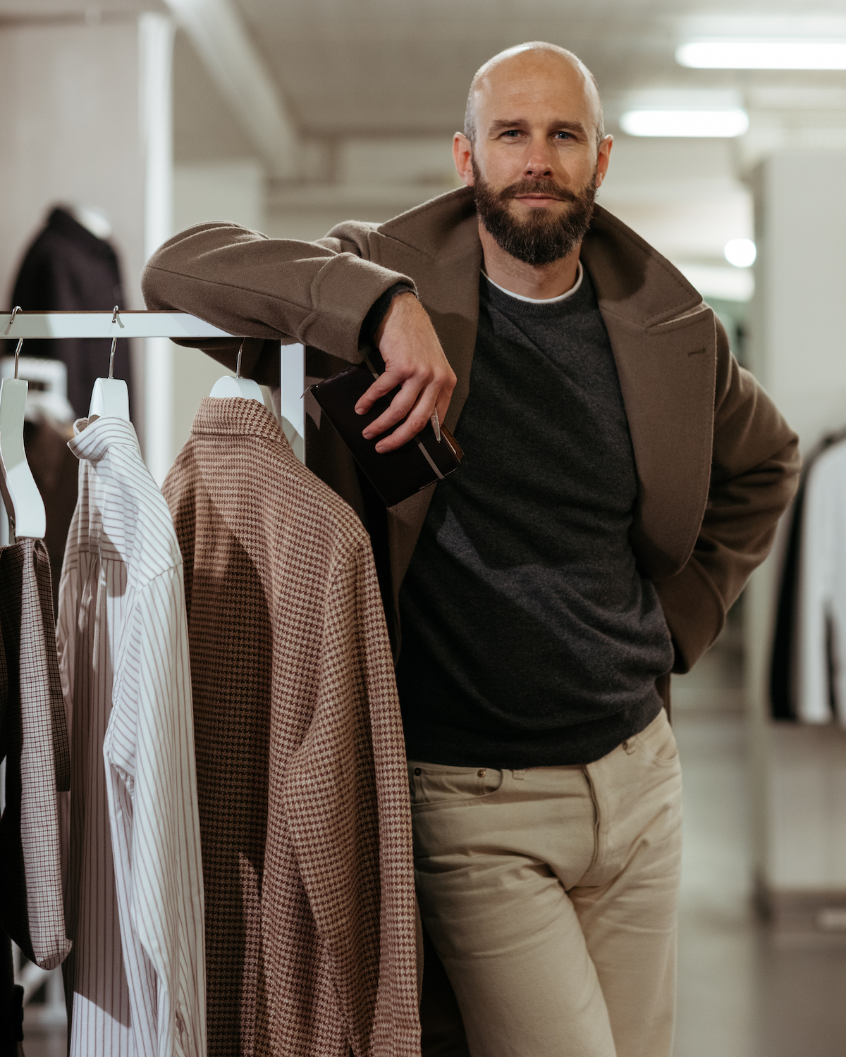
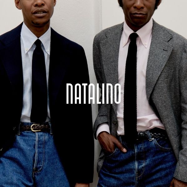
I realised recently that an increasing number of my casual clothes fall into a narrow colour range.
A good proportion of my favourite things - and certainly combinations - are a mix of brown, cream, black and grey. With some secondary colours at the edges.
This might not be unusual in tailoring, but with casual clothing it’s more striking. And I think I like the palette for similar reasons - it feels smart despite the lack of a suit, its darkness and simplicity make it subtle, and yet its rarity means it has personality.
In this post I thought I’d try to break down this cold-colour collection - for my own purposes as much as anything else.
Knowing what you wear most often, in what combinations and why, is great when you need to put together a small capsule collection, for example when travelling. Even if I’m just going to my parents for the weekend, with my family, it means I can chuck things quickly in a bag with the confidence that it all works together.
This kind of analysis helps that a lot.
So, the four primary colours in this scheme are:
- Brown. Must be dark and cold - see post here for more on what I mean by that.
- Grey. All shades of grey, which sometimes means charcoal and light grey in one outfit.
- Cream. Not white, though that can be a useful secondary colour.
- Black. As mentioned previously, something I wear more often these days.
These four can then all be swapped around, between knitwear, trousers, shoes and outerwear.
Any colour can apply to any of them. You’re less likely to have cream outerwear (except in a knit, as below) or cream shoes (except as a leather trainer/tennis shoe) but otherwise any category can be any colour.
Below I've picked out five different permutations to demonstrate:
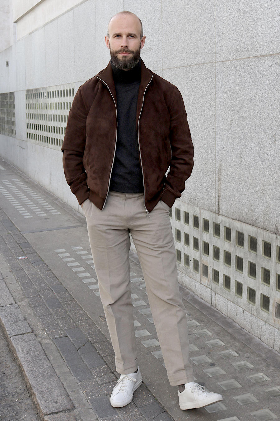
- Brown/black/grey
- Charcoal/grey/brown
- Grey/white/charcoal
- Cream/black/brown
- Brown/charcoal/cream
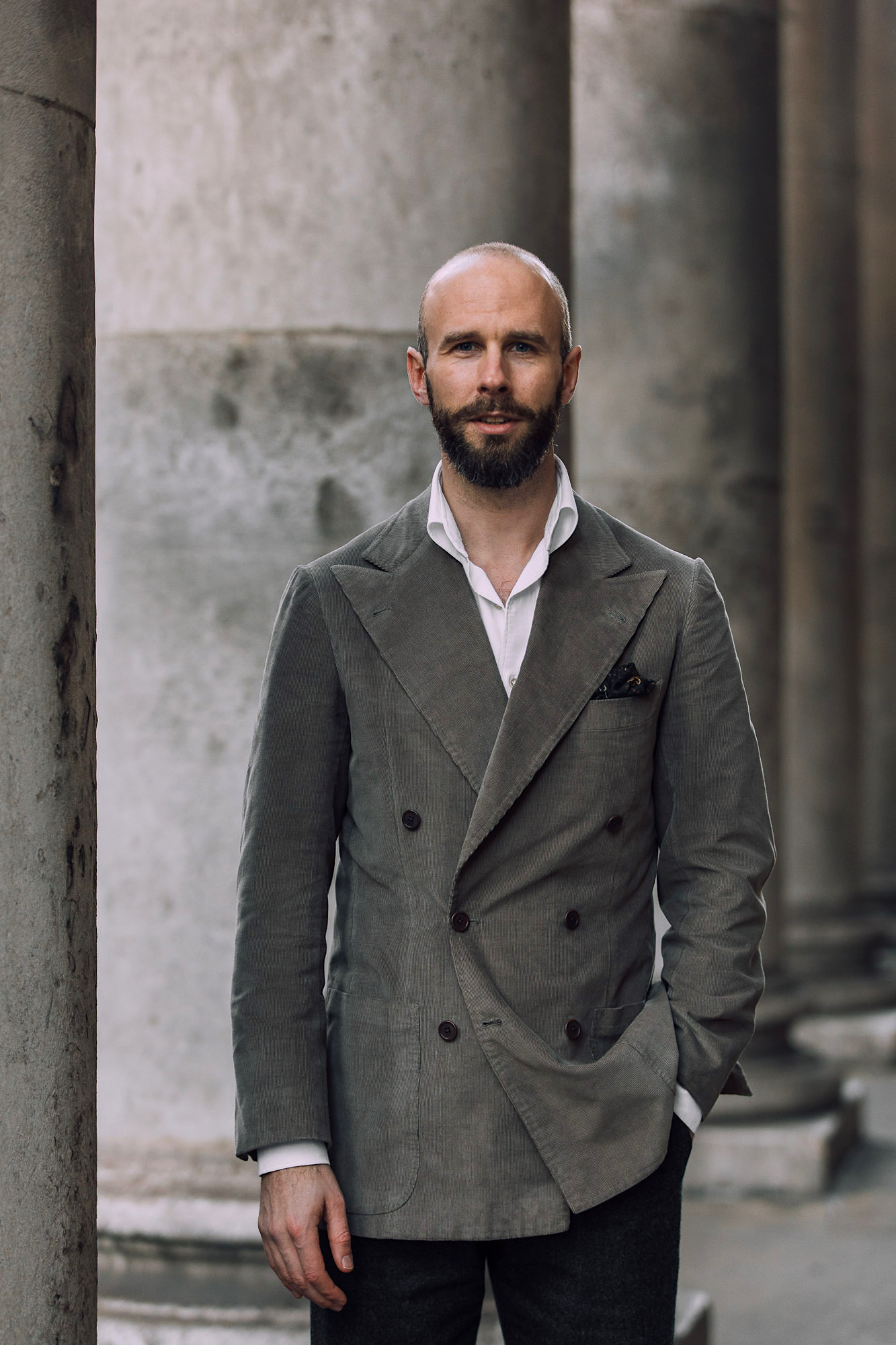
These all work, and are consistent as well as characterful (I think). But if they get a little boring or too tonal, there are secondary options.
Apart from the occasional bright, accent colour, these are all quite cold as well. They are:
- Taupe, beige or stone. Basically, muted and greyed versions of these classic colours. Particularly useful as a trouser option.
- Navy. Useful in this colour scheme as a minor piece - a scarf, a beanie, sometimes a trouser. If a major piece, such as a jacket, the look becomes something different.
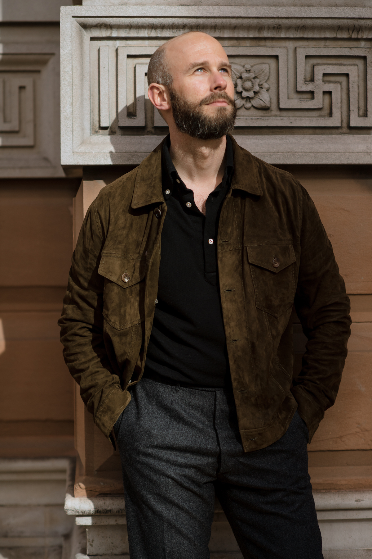
- Olive. Basically the green equivalent of the dark brown. I find this a harder shade, and not quite as good with black and cream as the dark brown. But a nice alternative if the shade is right.
- Bright red, yellow, indigo. A nice way to add colour, with a bright accessory like a hat, scarf, umbrella etc. This also means it can be removed easily. Red and indigo seem to work best.
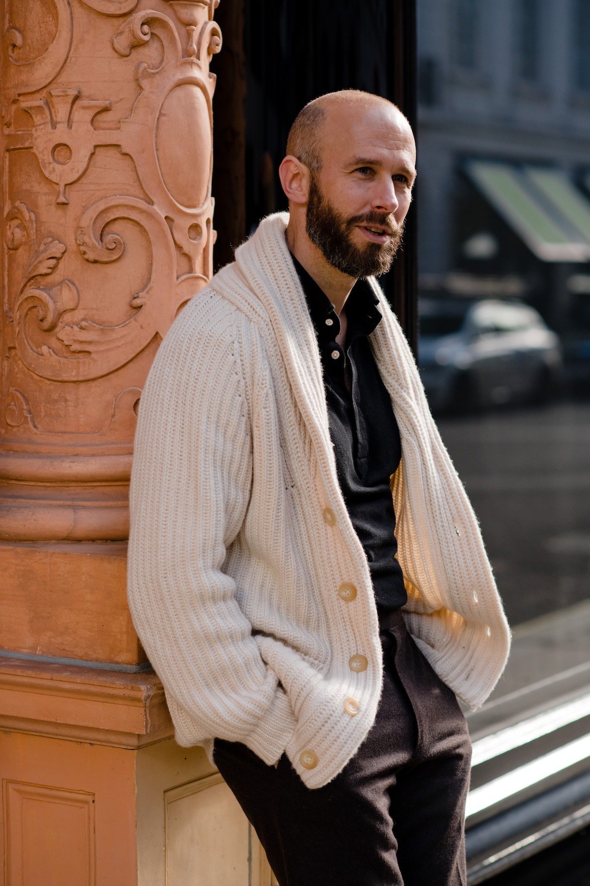
Some examples (the more I look for them, the more there are from my outfits this year):
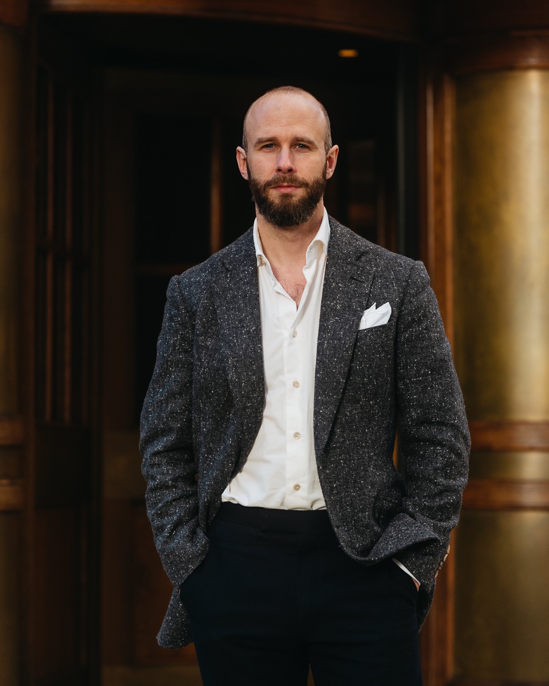
Each of those has the same basic combination of brown, black, grey and cream, but adds secondary colours.
Other things to note with this collection are that matte textures work particularly well (suede, flannel, nubuck).
But contrast in texture also adds useful variation without the need for another colour. For example, black calf shoes add some shine, and thus variation, from wool and suede elsewhere. Jewellery can do something similar, and is usually best in silver with this palette.
In the image below, the brown calf shoes add that variation. Although having thought through the combinations in this way, perhaps black calf shoes might have been better: they would have provided both another colour and another texture.
Another thing this analysis has suggested to me, is that I should look to expand the colour/category combinations where I don't have them. For example, I don't have any black knitwear, but it would work with a lot of these outfits.
So I've just ordered a black crewneck from Luca Faloni to try that out.
One way to look at this capsule collection is that it’s just like a range offered by a brand.
Most small brands naturally have a narrow range of colours, or at least types of colour, so that everything works together. That’s the case whether you’re looking at the dulled colours of Anglo-Italian, the organic ones of Adret or hyper-tonal Saman Amel.
And I should also make clear that there is nothing original about this cold-colour look. Others do it well, often better than me, and have been for a while. I just like systematising, explaining and communicating.
Most of those people are friends, so I’m sure they'll take it as a compliment. I’ve included a few images below, with their own takes and tweaks.
Enjoy playing with my collection, their variations, and if you feel inclined, even analysing your own.


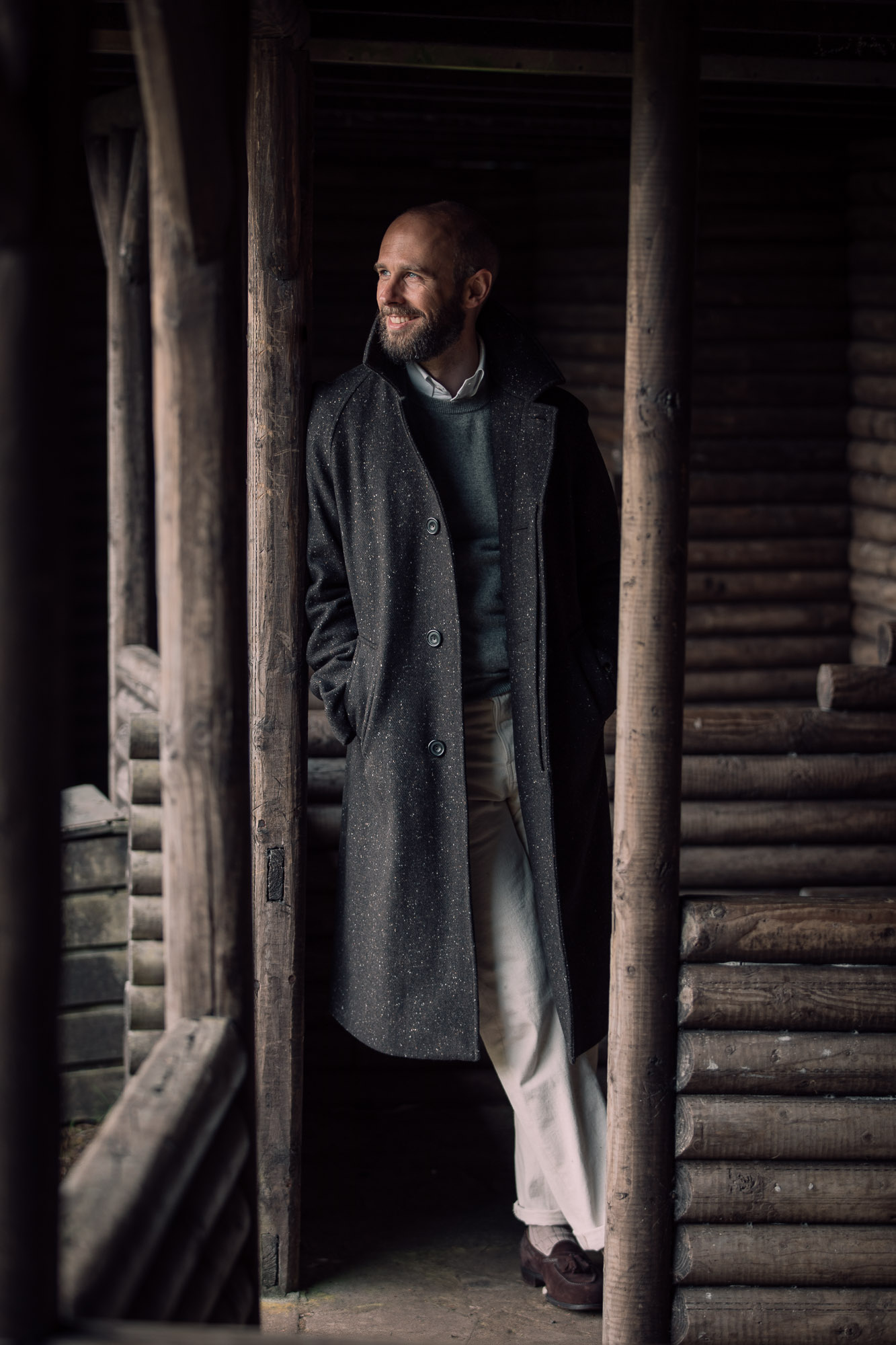
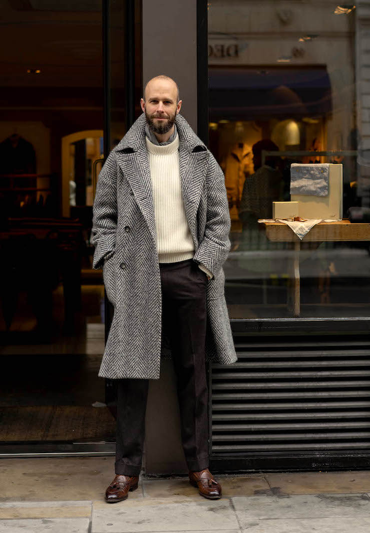
All great advice, Simon. Some may find the cold equations-style logic somewhat off-putting, but I appreciate the skill it takes to distill color pairing into something that can be easily digested. // Who is the maker of that large pattterned, herringbone DB coat? It makes quite an impact. I have actually seen that image used on Yahoo Auctions Japan a number of times, but this is the first time I have recognized it on the blog.
Thanks, nice to hear.
It’s from Connolly – see post here and also here. Where have you seen the image used?
I am based in Japan, and use Yahoo Auctions Japan, an eBay competitor here. Sellers will use pictures from Pitti Uomo to taut their items. I have seen that image or one captured by a Japanese magazine at Pitti, more than a few times.
I see. A compliment I guess
Unfortunately, having searched high and low, Connolly no longer sell this coat Simon – I wonder if there is anything available elsewhere that is similar or, failing that, might it be worth getting something similar to it tailor made? If so, where would you recommend for something like this?
I really like this coat, so much so that I even tried to find one secondhand but to no avail.
No I’m afraid they don’t. They have the same style in other colours, such as dark brown, but not in this herringbone.
To be honest, I wouldn’t recommend a tailor make it. Both because it’s too soft and unstructured for any tailor to really make, and because it’s very design driven, and that’s not usually a tailor’s strength.
Hi Simon,
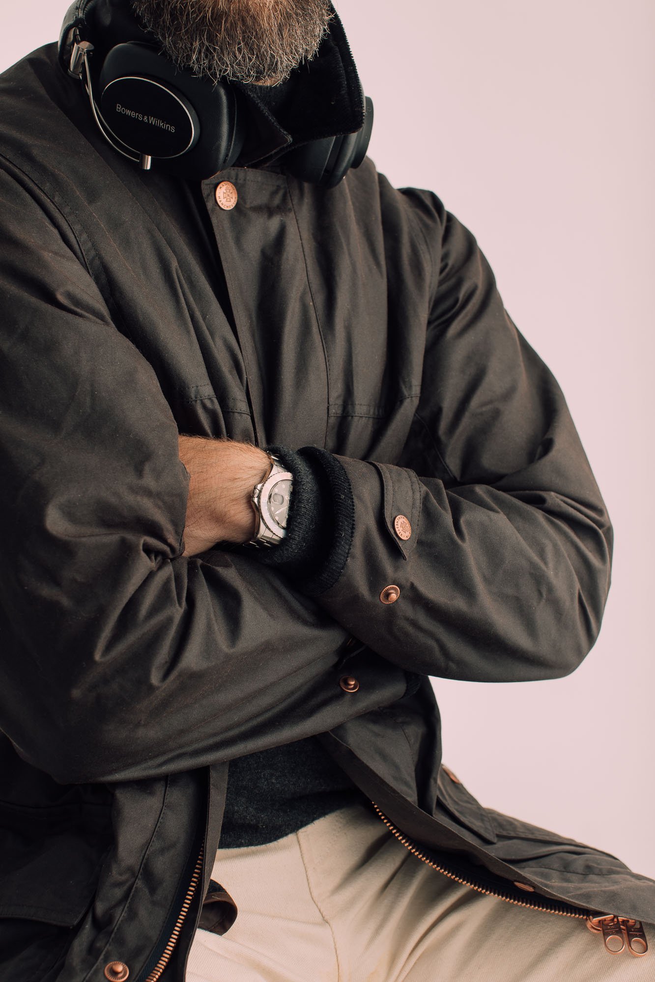
what’s the watch on the wax jacket picture? Also, do you plan another posting about watches in the future? Thanks,
Simon
It’s my old GMT. I wasn’t planning one, no – I’ve covered all my watches here as well as writing pieces on my views on what to buy – was there anything specific you were interested in?
Hi Simon,
little different question. Will your trench coat be back or is it still available at Private White?
Best
Josua
It will be back next year, yes, but no it’s not currently available with us or PWVC
Thanks, is there any possibility to buy the finest knitwear merino v-neck again from PS or from your manufacturer?
No, sorry, the minimums are too large.
Hi Simon, what size did you take for the black crewneck from Luca Faloni please?
I’ve sized up now, as I like them a little more roomy – from Small to Medium.
Thanks Simon!
Well, that’s very similiar to what I wear most of a time. I wish it could be all the time, but sadly, summer exists. Quite a lot unusual pieces – grey cord jacket, navy trousers, dark brown trousers… Not what I would call basics. But that’s great, menswear is pretty stale, so I’m all up for it!
I think most of this could work in a summer wardrobe as well – it just doesn’t happen to be how it’s illustrated here.
So you can have cream or dark brown or beige shorts, black or white or dark brown polos, canvas tennis shoes or brown or black Belgians, and so on. Same with overshirt colours. The palette might look a little more stark in bright summer weather, but no less stylish for being so.
I think they can all be versatile basics within this wardrobe as well – just not in the better-known classic menswear palette
Following on from the above, I think this would be great as a regular series (i.e. a series of discussions of different palettes and some examples of who does this well, both from manufacturers and inspirations). It’s nice to highlight your favourite items from each look (like the coat).
Perhaps more on topic, I seem to remember you did a good interview with the chaps from Saman Amel and they spoke about the importance of having a cohesive style from, for example, cold colours when you want to have a flexible wardrobe. I recommend it to anyone else who enjoyed this article!
Nice idea, yes. The traditional English rural palette is much warmer, for example, and someone like Anglo-Italian does a colder and subtler version of a lot of that. Whereas Drake’s keeps the colour and warmth, and makes it more contemporary in the way it’s worn.
And yes, good point on Saman – that was in our video here
Summers seem to be hard in general. There seem to be two typical summer styles. The colors are either bright and striking or very light. The first is too bold for me, and I look very poorly in the other. To be fair, I thought about something similiar to what you proposed, but I always thought that those aren’t “summer colors”. Perhaps I’ll finally try it next year.
Very nice, I find myself attracted to similar colors these days.
Do you have any tips for identifying warm versus cold colors? I find I have trouble with this, especially when it comes to colors in the beige/tan/cream family
Have you read this piece on it? There are some good examples in there
Hi Simon,
nice article. Over the last years I have found myself also gravitating more and more towards cold colors, recently even having my chestnut or snuff coloured shoes being re-dyed as I didn’t like them any longer.
Would you say this is just a matter of personal taste or fashion, or do cold colors generally look more sharp and elegant (maybe even more masculine). Do you have good examples of own outfits or other people that prefer warm colours and still nail it? E.g., regarding your comment on Drake’s and Anglo-Italian, I wouldn’t hesitate a second to say I unambiguously prefer the latter, looking much more contemporary.
Have a nice day!
Thanks Ferdinand.
I think this palette looks more subtle, perhaps more sophisticated, and more elegant. A more colourful one could look more fun, playful, irreverent. And the colder will tend to look more urban, the latter more rural. I think these things are largely outside the fashion of them.
There’s also an argument that the colder is more suited to countries or seasons with less warm sun, and the surroundings that come with that.
Drake’s is the best example in our area of a brand that nails the coloured side. Related might be Aime Leon Dore, perhaps Fred Castleberry too.
Interesting – I think I have gone through a similar evolution of colour. Particularly when it comes to ties I find that I now prefer dark, matte and restrained (cue A-I), whereas previously I would buy more colour. This is also the main reason why I haven’t purchased any Drake’s ties lately, even though I love the quality and feel of them.
Sorry, and another question: Do you have a recommendation for cold-coloured (brown or maybe even black) contemporary-looking RTW boots robust and warm enough for winter? I like the design of something like the CJ Snowdon (https://www.crockettandjones.com/collections/mens/boots/snowdon-oak-wax-hide/), but they are quite reddish. I couldn’t find a configuration of EG Galways as well (which I find a little too dressy anyways), and was surprised that the market is apparently quite thin here.
Thanks!
Yes, those are more reddish.
I’d go for a mink-suede Galway, or a dark brown calf. Also Color 8 cordovan, plus black of course as you mention
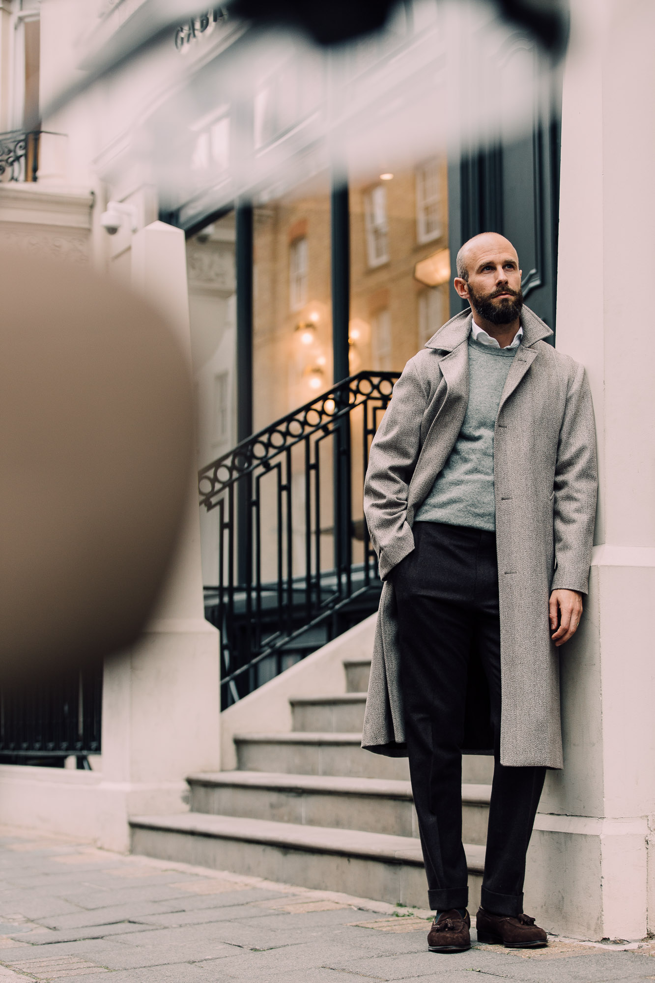
I know you’ve previously discussed how you think shoes should be darker than trousers. I notice in the photo with the Connelly coat that your trousers are darker than your shoes. Is this because it is a casual outfit, so you are willing to compromise on that rule? Or is it because the shoes are relatively dark and there contrast between shoes and trousers isn’t too great, so it still works?
The last one – it’s not a big contrast, plus the shoes are lighter in parts, darker in others. The polish has some variation and some parts are actually pretty dark.
Hi Simon. I think you look very good indeed in these photos. I think that this is because the mixing of light and dark colours harmonises with the contrast provided by your relatively light complexion and dark beard. I am not sure this would work as well with individuals with a lower contrast complexion. This includes me, regrettably.
Thanks Hugh.
I can see why you’d think that, though I think Andreas from Berg & Berg (shown lower down the post) is a good example of how it can still look good on someone fair without much contrast. More on his thoughts on that here.
Indeed, those last three shots are a decent illustration on how it can work on different contrast levels. The Rubato model is between myself and Andreas, with fairer hair, and Willy has higher contrast than me.
As with many guidelines in classic menswear, I think that contrast point is one worth bearing in mind, but it’s always only one factor.
Thanks for your thoughts Simon. Respectfully, I disagree about Andreas. Whilst he does look stylish and well put together, I think the strong, contrasting combination pulls one’s attention away from his face and to his torso and trousers. This may be intentional of course but if the intention is for clothes to complement the face, the most important part when it comes to human interaction, I think it fails.
Thanks Hugh, good point and well made. Discussions like that about contrast often focus on whether someone looks ‘washed out’ for example, rather than where the attention of the viewer goes
Yes, I agree with you Hugh. I think that for lower contrast people it is generally good to avoid large blocks of colour. Black is always going to be extremely difficult for such people, IMHO, but especially in large blocks and especially near the face.
Useful and interesting discussion here. I’ve always thought black goes very well on Asian people because they tend to have high contrast features, while dark skinned people tend to look very good with bright colors. For instance, black man can pull off bright reds particularly well, and although a lot of women look good in red, black women look particularly good in a bright red dress.
I like the concept of the post and the combinations displayed. Those colours work with fair complexions but for Asians I’d say that you’ll need to be more choosy about which brown tones to use. Cream does work but other off white tones to my eye don’t.
Another neutral colour might be more appropriate as one of the base four.
Interesting, given the commenter above doesn’t think it works on fairer hair and less contrast!
See my reply to him, and also bear in mind you can just tweak the combinations to change the contrast. So if cream isn’t great, then wear a white shirt underneath it to increase the contrast, for example, rather than the grey scarf I’m wearing.
Hi simon, talking about black shirts – I’m thinking of getting the black westerner shirt from Bryceland (instead of their denim one which you own). I can imagine it is quite versatile in a cold weather type outfit? In my mind it looks to play well with navy and dark brown sports coat with khakis army chinos and denim jeans at the bottom. Am I right to say so and are there potential areas which I need to think of? The one area I can think of are shoes which I think looks best in black itself but I guess brown can work too?
Yes, and I think the black can work in all those combinations. I’d only add that with a black western shirt, there’s probably a greater chance of it looking a little costume-y. So play that down if you can – no other western elements at least!
Today, on a snowy day in Montreal, I’m wearing raw denim that’s barely faded, black winter boots, a dark navy turtleneck from Drake’s, a white t-shirt coming out of the sweater a bit, creating an uneven white strip, the Bridge Coat, and a light grey lambswool bonnet from Drake’s. I always feel more confident when I wear these combinations. It’s elegant and masculine. I also picked up the tip from you to wear cream (trousers) on a sunny day (unlike today). Maybe you should write about what to wear on the rarer sunny day vs. the more numerous overcast days.
Nice Frederic. And OK, yes, good point
I certainly tend to go for the browner,rural look. I live in the countryside, so it’s a good fit. As I become older, I’m more relaxed about colour, my knitwear is becoming warmer, also finding yellow and pink in my regular shirting.
However, I agree, the white,black, grey combo tends to be default when travelling into the city.
I love this time of year….the classic styles ,the layering.
I loved this post and all the photos, great outfits that look so elegant even at their most casual. I do have one question: I have a very dark brown sport coat that I love, but I sometimes worry it’s so dark that I can’t really pair it with light trousers because the contrast is too stark. But I see in several of the photos posted here that that sort of contrast is embraced (lots of cream on top and dark brown/gray on bottom). Is my concern about the stark contrast exaggerated? Maybe cream trousers work with a very dark brown jacket because cream is sort of like the lightest shade of brown, and shades of brown look coherent together even if they go from darkest to lightest. Thanks for any guidance on this issue.
I think your instinct is right that the contrast would be quite large, but that isn’t necessarily a problem. If you don’t like the look, perhaps try softening the contrast by wearing a blue shirt instead of a paler one or darker one, if that makes sense. Or indeed other things – brown suede shoes rather than black for instance.
There’s an article on WW Chan coming next week that I think will be useful for you in that regard
A particularly enjoyable post. As it reflects about 80% of my wardrobe, I’m aware that a proportion of that enjoyment might come from having my own preferences reinforced! But, matters of ego apart, it seems to me to be quite a mature capsule, by which I mean the product of experience and reflection.
My own version of this capsule is certainly the product of evolution (I wouldn’t go as far as to say mature reflection) over the years, having made many mistakes along the way. Of course, I’m not immune to simply replacing the mistakes of youth with the mistakes of middle age, but hopefully not entirely in this case.
I’m still not quite there with wearing black and brown together, but I have found that black can be quite useful in knitwear, trousers (though only in corduroy) and shoes – though not together, of course! I haven’t yet started channeling Johnny Cash, Lou Reed or Albert Camus (much as I might admire each of them). I’ve found black suede derbies and chukka boots work well for me (sadly I have yet to find loafers I can actually keep on my feet).
I’d also strongly endorse taupe as a useful colour for trousers. I’m considering a pullover from Stoffa in taupe, but I’m not yet quite sure. Thankfully, Connolly aren’t offering the driving sweater in cream or I might be tempted to throw caution to the winds and buy it. It looks fabulous.
I think the colours you’ve omitted are interesting. Navy is the foundation of many casual wardrobes (navy knitwear and indigo denim) so I wondered if you might elaborate on your comment about navy “If a major piece, such as a jacket, the look becomes something different.”
Navy is very useful, but I was presenting this capsule as an alternative to the more normal classic-menswear wardrobe, which would be mostly navy jackets, grey and beige trousers, blue shirts, brown leather shoes and knitwear colours like bottle green and burgundy.
The role of navy is taken in this wardrobe by the other dark colours – black, brown or charcoal. And so if you wear a navy jacket, the palette is different – its immediately richer and very slightly warmer. The collection as a whole doesn’t work as well together.
That doesn’t mean you can’t wear navy with these other pieces, not at all, but this specific collection and the advantages I spell out don’t work so well with major navy pieces like a jacket. I hope that makes sense.
Very helpful. Many thanks
I think I’ve made this point before, but you are referring to more neutral colors, not cool colors. Warm=red/orange family. Cool=blue family. This is what anything on color theory will tell you. Wikipedia has an entry on color theory, but there are better sources for this information out there. Browns are always warm, though some are more warm (red) than others. Tan is always warm, though never very warm (think of what color paints you would use to mix tan). Greys can be warmer or cooler but they are never particularly warm or cool.
I think using different terms than everyone else is problematic because (1) it is confusing, (2) you don’t have a term to use to describe colors that are actually cool, and (3) it suggests that you don’t have the fullest understanding of color, which is fine, but if you are writing about color, it would be helpful to understand the basics of color theory. Sorry if I sound like a broken record, or if this comes off as obnoxious. I don’t care if you publish this comment, but I would appreciate it if you could bone up some on this stuff. I just think this is a potential area of improvement for PS. This may also be a pet-peeve of mine given my artistic training.
Thanks EL.
You have mentioned the points before, and it’s useful to bring them up. I do think that you’re wrong that these precise definitions are the ways everyone else uses them though. They come from colour theory, which is one system that has been created to describe things to a certain set of people, but which the vast majority do not use and are not familiar with. The way I am using the terms is very similar, but also perfectly comprehensible and intuitive. Evidenced mostly by the fact readers are not confused by what I’m saying.
Thanks again for the comment, I genuinely mean it’s interesting and useful to bring up. Even if I disagree that it’s a problem here.
Cheers
First of all, I really like these combinations and the thesis about how they match. I have for a long time been using cream more than white (although not being a 60 yrs+ man). I also think the colors and clothes in the pictures are very wearable (I live in Scandinavia).
But I also struggle with understaning the warm/cold references. As an example, to me, a crisp white is always colder than cream. Basically everything in the 70’s was warm. A young claret is cold, while an aged ditto is warm.
I think that my preconception is sullied by the traditional way of referring to warm/cold colours. Is it about the intensity of the color and the contrasts between the combinations rather than the color itself?
Nice to hear Daniel.
No, it’s more that this wardrobe has several things that describe it, and cold is only one of them. It is also more muted (less strong colour), uses more neutrals like black and white/cream (not really colours at all) and has various other attributes that don’t admit to a single adjective, like the use of matte textures (eg suede).
You can’t get all of those into a headline, or a single sentence when referencing the look.
I use the cold point primarily because I think it’s the most important: it applies to things like the browns and greens, which have more blue in them. And it is this that people are usually choosing between – between different browns, for example. It’s harder to communicate that than just to say, wear more black and white.
The point about white v cream is not that cream is colder – it’s not, it’s a warmer colour. That’s more about formality.
Is there anything you might add about mixing black and brown? It seems like the convention has been to go with one or the other, for good reason, but I occasionally seem them mixed well. Do you have some guiding wisdom?
To be honest, I think they usually work well – but they’re not such a conventional combination, and I think therefore don’t fit in with social situations where such conventions would be paramount, most obviously in business. This is fading fast now, but in business you would never traditionally wear much other than grey or navy in your suit, and the shoes would be be black or sometimes dark brown. As soon as you start wearing brown tailoring, that goes out of the window.
The reason black is not normally recommended as a shoe colour for brown tailoring, is because black is such a smart colour. But in a casual shoe (eg loafer or boot) and perhaps casual material (suede) it is a lot less smart. As with all menswear ‘rules’, not wearing black shoes in such a situation is a useful tip, but only one part of the story
Hi, very nice article. Really enjoyed since I normally wear casual clothes, even more in my startup work environment.
I would like to ask 2 questions: Is that olive suede jacket (trucker jacket?) from A&S? What is you rational to buying it in terms of style and you opinion on what details such jacket should have for you.
The immediate other question is: if you were to rebuild your wardrobe of suede/leather jacket, what would be your first 3 and why? I find suede and leather jackets very “chic” specially since I don’t need to wear tayloring but I’m never very sure about which style to pick (ex: I don’t like how boxy some of them look) and would like to get the very best (so a large investment)
Thank you! Wish you a nice day
Tamaki
Hi Tamaki,
Thank you, I’m pleased to hear you found it so useful.
The jacket is from A&S, yes, and it is in a trucker-jacket style. It is to be worn as a light outer layer in temperate months, rather than anything else, like a mid-layer. This trucker style is more unusual for a suede jacket/overshirt like this and I would normally go for a simpler bomber style.
Which three suede/leather jackets you should have depends a lot on your style. A black horsehide jacket may not be your style, for instance, but a field jacket/safari jacket in suede might be equally off.
It also depends on whether you’re trying to cover different temperatures (eg a light one like this, a heavy autumn one, and a blanket-lined or down-filled one for winter) or trying to cover different styles (smarter with flannels, casual with jeans, maybe even one very casual/street one).
But in any case, I would always go for dark-brown suede first, followed by navy, tobacco or olive suede, depending on which best suited the rest of your wardrobe.
Hi Simon, thank you for the reply.
On the style, what would you get? I belive the first is a bomber jacket, but what would be the other 2? And would you consider those asymmetric jacket from Stoffa as too unusual?
Yes, probably, but again it depends what range you are trying to cover. If you get three different styles, you are covering those options but not different colours or seasons
Got, thanks for the answer Simon
It’s all a little morose, if you ask me. A spot of blue and pink might go down well. Your Neapolitan chums need to brighten you up a little more. More Campari, less tea and coffee.
The point about matte finish footwear resonates. I’m in casual clothing most of the time, and gravitate much more towards nubuck, rough out or suede. I find these just go better together for a relaxed yet refined casual look. Smooth-grained shoes always seem like the odd man out especially when I’m wearing heavier pants (9 oz chinos, mid / heavy denim, BDU pants).
I would only add aubergine/eggplant to your list. The winter palette needs a bit of warmth, and a deep warm violet is a wonderful addition to the collection you have created.
Nice idea David, yes
Hi Simon- the color capsule to augment packing for travel is most valuable. Thank you. My wife also thanks you!
No worries Jay (and wife). Pleased to hear it takes some of the stress out of that!
Nice article, although I must agree, that your use of the term ‘cold colours’ is rather confusing. Someone wearing a strong cobalt blue suit would be dressed in a cold colour, whereas your beautiful brown suede jacket has a nice warm tone and so has the cream colours knitwear. What you refer to seems to be less saturated or broken colours.
Thanks Philipp, good to have the feedback, and you’re right I am packaging in an element of desaturation as well
Really appreciate your posts, but as someone who studied art and design I find the usage of warm and cool colors somewhat antithetical to what I know of color theory, and a bit confusing. Cool colors tend to blue (hue) and warm colors tend to red (hue). Perhaps rather than color you mean the attitude –formality or informality– that is portrayed. In your examples of both formal and informal outfits both cool colors and warm colors are used.
Happy Holidays (even if somewhat muted this year).
Hi Robert
Thanks. No, formality is not relevant here – both formal and informal outfits can be of either type.
The colours that there are here do tend to be bluer as well, such as the browns and greens. But the element that’s missing is that they are also muted, weaker colours. That could be stated more often
Regarding wearing black clothing, I always thought it is better to match with black shoes or at least dark brown shoes, even wearing casual black knitted tie. Do yo think it is reasonable or necessary? Thanks.
I wouldn’t say it’s that firm a rule, but usually yes, if you’re wearing something black like that, then black or dark-brown shoes will be best
Hello Simon,
a great and inspiring article! I hesitate from including black as a knitwear, because it could look stark.
You mentioned, if you include a major piece in navy, the look changes.
Which colors would then be suitable?
I suppose cream, shades of grey and shades of tan could be?
Black, dark brown could be difficult beside as color for shoes and leather?
Cheers,
Stephan
Hi Stephan
I don’t think black has to look stark – it’s a question of what you wear it with. For example, it will look stark with a white shirt, but less so with a blue one.
Please see comment above on the navy point, to make sure you understand what I mean there.
And as to other colours, yes dark, muted browns and olives will be best. But keep in mind this is just one, narrow and versatile wardrobe of clothes that happens to work well together. It doesn’t mean you can’t incorporate other things, like navy, and make it slightly different
Thanks
Hi Simon, thank you for sharing this capsule. Deeply inspired and hope to incorporate more neutrals into my wardrobe.
Curious where the white sneakers/trainers are from? They appear to be Common Projects but unsure if that’s true.
Best,
Victor
Hey Victor – yes, they’re Common Projects. If you look up ‘trainers’ on the site you’ll find a few posts on why I like them above other trainers
Fantastic, thank you Simon. I’ve owned a pair but for some reason they were never comfortable. I’m normally a size 12 in other trainers, but was unfortunately in between sizes (45-46). Wish they would come out with half sizing.
I’d be interested to hear your comments on adding a blue denim shirt to this palette. As an example, how the Rubato outfit might be better or worse with a shirt swap.
It would work with everything here – as would a blue oxford. The look would be different, as noted with the navy blazer, but it would still look good
Hi Simon. Long time reader, first time poster here.
Many readers have commented that their style has evolved into this direction and probably feel good after reading this article and comments as their personal wardrobe evolution has been backed up by similar thoughts. But for someone who recently got into menswear to get rid of changing trends, this kind of fast evolution feels quite frustrating.
Based on your recent articles and reader comments in this post, it feels that a majority of people have now moved on from blue OCBDs and mid-rise mid-blue jeans to high rise trousers and muted colors endorsed by few brands, who for some reason happen to be mostly Swedish. Also now black is suddenly in, even though a couple of years ago most people into classic menswear would have suggested to avoid it.
It feels almost like a fashion trend. As someone who has spent a quite a lot of time and money to move on from streetwear to a classic more permanent personal style, this article makes me worry that classic casual menswear is just as susceptible to trends as fashion. If I now again start overhauling my wardrobe for something that’s supposed to be more elegant, subtle and flexible, isn’t there a risk that the classic menswear community has moved on to some other color palette or style when I have enough items to wear this kind of capsule collection from Monday to Friday?
What’s your take on this? Do you think that cold-colored style is something where the casual menswear will gradually move on to permanently or is it just a trend? Is there a possibility to combine cold color palette with a more classic casual palette? Are there even more alternatives to these two styles? Is it possible that classic menswear scene is more susceptible to trends than anyone would like to admit?
Hey Dale,
I think you’re worrying a little bit too much. Hopefully I can put your mind at ease.
This cold-colour wardrobe I’m suggesting, and indeed wearing more black, is not a trend as you would get in fashion, in that it doesn’t make anything else unstylish, or stop it looking good. Those oxford button-downs and mid-rise trousers are still fine – I still wear both, and more importantly, you can still wear both and ignore everything in this post, and not have a problem.
I think you need to separate little trends like this – which are just a little touch of interest, which you can ignore if you wish – from more fundamental ones such as trouser widths, lapel widths, dress becoming more casual etc. Those do happen in classic menswear, and they do make older clothing seem less relevant. But they take place over periods of 20 years, sometimes more. So not something to worry about day to day.
I hope that makes sense
Simon
Thanks for a great article, Simon. My recent experience of diving into Shetland sweaters with your help has made me realize that I seem to have locked myself into mainly primary colors, particularly as knitwear is concerned, and your blog has been a prime motivator in breaking out of that rut. While I don’t regret getting my sought after bright scarlet red Shetland (anathema to you, I know) from Jameison’s, your influence has led me to also put in an order with Boise for January delivery of a Harley in mushroom that I am greatly anticipating.
As always, great blog and many thanks for helping me become just a bit more stylish and expansive in my color palette. Cheers from Chicago.
Hi Simon,
I loved the article as it introduced a new way to structure and compile outfits.
I have a question regarding the cardigan, though.
Is it normal for rib knits like that to lose shape over time while wearing it, or is it a matter of the overall quality of the material/knitting? I have a cardigan and sweater that tend to get slightly saggy after a while. However, they are nowhere near the quality olymp you live on.
Best,
Patrick
It’s hard to say Patrick – it largely happens because the knit is quite open and loose, but that doesn’t necessarily mean bad quality, if you see what I mean. The brand might have meant it that way
Per your Valstarino look, it’s ok to pair a brown suede jacket with brown suede shoes? I’ve never been sure about this as I feared it might be too “matchy-matchy.” But it looks good here.
I can see the concern, but I think it’s OK, yes.
Hi,
Very interesting article! I live in Sweden and are pretty pale myself most of the year, so the information above really helped me to understand why some things I buy does not look as good as expected. I would appreciate if you could tell me where you bought the pale taupe trousers above or what fabric they are made of.
Nice to hear, thanks Andre.
The pale taupe trousers were made to measure by Stoffa – see article here.
I notice you said you were purchasing a black Faloni crewneck. I can understand how that would be nice, but it just seems like charcoal can do almost everything black can, and it works with more colors. What color trouser could you wear with that black crewneck besides grey? With cream, the contrast is probably too stark. With dark brown, there may not be enough contrast (and I’m still unsure about the black/dark brown combo in any event). I suppose you could use something like taupe or beige with the black, but I still think both of those work better with charcoal. Thanks for any guidance here.
Well, I already have charcoal! And yes, I agree that would be more versatile.
Black I want particularly to wear with shades of grey trouser. I also really like it with dark browns. And it is a different look, not necessarily a better one, with taupe or beige.
Hello Simon, thanks for your writing! If you had only 1 shawl collar cardigan would you choose navy or cream and why?
And do you think wearing a cream shawl cardigan in a casual office where guys tend to wear baggy dress shirts/ polos would be appropriate?
Navy. That or grey are usually the most versatile colours of knitwear, and navy usually edges it. Cream is a little more unusual, and also gets dirty quicker, requiring more cleaning.
And it really depends on your office – it’s hard to say without any personal experience of it I’m afraid. But navy would certainly be safer
Have you tried the Luca Faloni chunky knit cashmere cardigan? I have something like that in navy but was thinking of the grey or beige.
I haven’t, no
I love this concept, but one weakness is that none of these colors seem to work well for shirts (as opposed to knitwear or polos). Shirts in dark brown, grey, black, or cream are rare and, in any event, probably won’t look as good as their knitwear/polo counterparts. It looks like you’ve generally solved this problem by using a white oxford, which would fit the bill in most cases. I suppose one exception might be with black knitwear, as a black sweater over a white shirt might seem a bit too stark, striking, and perhaps formal. So what color shirt have you used under black knitwear (e.g., the black Luca Faloni crewneck you mention in the article) to keep with the cold-color theme? Thanks.
You’re right, I wear a white shirt, oxford or poplin, pretty much all the time with this kind of outfit.
I have worn a white shirt with black knitwear, but you’re right it is quite stark – it’s one reason charcoal is often more useful there. If it does look too dark, I wear a pale blue poplin instead. Not quite as neutral as the white, but still close with the black crewneck
I’ve since also gotten a black crewneck and, in keeping with the cold-color framework, my favorite shirt to pair it with is a white/grey university-stripe OCBD. Not as stark as black and white, but colder and more muted than blue. Plus adds a bit of pattern. As I recall, you tried a PS oxford with white/grey stripe but decided against it. I think it’s highly useful for the cold-color capsule wardrobe when you want a shirt but don’t want a plain white one.
Thanks, that does sound nice.
Hi Simon,
I feel similar in that my wardrobe is composed mostly of cold colors. I know other readers have raised a similar question, but I’m hoping you could expand on the use of a cold color scheme during the summer. Aside from cream trousers (which seem to be your trouser color of choice during the summer), how do you feel about darker, colder trousers during the warmer months? Do you wear dark/mid-grey or chocolate trousers during the summer?
Yes I do. It is easier to wear warmer or brighter colours in the Summer, but there’s no reason you can’t wear these as well.
See for example my Sexton linen suit here, and the combination with the Finest Polo here too, using those same trousers.
Hi Simon, how much do you think your preference for a cold color wardrobe is based on your living in London, where there is rarely bright or intense sunlight either in summer or winter?
In my opinion, a wardrobe built around cold shades of brown, grey, creme and black could make sense if one wanted to build a small wardrobe where everything goes with everything, or if one lives in a place like London, or maybe Scandinavia, where there is rarely much intense sunlight. [In the photos in the article, for example, there are only 1 or 2 where it appears to be sunny. The weather appears to be grey or overcast in all the rest.]
Apart from these two cases, a wardrobe built around cold shades of those four colors seems to me to be quite safe and a little bit sad. Especially if one lives farther south in Europe, in much of North America, or in Asia, where there is more sunlight.
While I am certainly not advocating the colors that one sees in photos of Pitti, if I look in my own wardrobe, the clothes that I most enjoy wearing and for which I receive the most compliments are all in warm, rich colors: for example, my solaro, burnt sienna linen, and air force blue flannel suits; my russell check jacket. They are in colors that have a richness and depth that I find cold shades lack. They may be harder to wear for that reason, but I find when worn well they are more interesting and more elegant than cold colors.
Hey Andrew,
I think personally that that’s a factor, but only a small one. For example, while Naples might see a lot of colours of tailoring, you don’t see that in all countries with more Sun.
I think being urban, and perhaps not by the sea, is a bigger factor. The colours of Naples would look a little strong even in New York on a bright day.
And I think the biggest factor is simply one of personal style. Nothing gives me more pleasure than small, complimentary combinations of textures and colour shades. And of course also of fit. It is more of a chic style, that’s all.
I completely understand how for others, colour is more exciting. And of course it’s not surprising it draws more comments, as it’s more obvious.
Hi Simon
Thanks for your reply. I would generally agree on your comment about the urban environment.
I am not sure I agree about your final comment on cold colors being more chic. In my opinion, they are safer and easier, but not more chic. They are safer because they are not likely to polarise: nobody is going to strongly dislike them but similarly they probably don’t wow anybody. They are easier in my opinion because they can be worn by most people without much risk of looking ridiculous.
I would imagine that this is why many brands today like those colors: the combination of both reasons means they sell better.
You have a number of garments that fall into the types of colors that I personally like, and that you don’t seem to wear as much or at least don’t feature in the cold colour wardrobe: your AS Lapis blue jacket, your tabacco linen suit, the Caraceni yellow DB jacket. In my opinion all of these are more interesting, and chic, than cold colors because they take a confidence and a nonchalance to wear well that cold shades don’t.
Thanks Andrew.
I agree that most of the time, darker and colder colours are easier to wear. But that doesn’t mean they have to be safe, or lack personality, which is the important thing for me. It’s still very possible to mix unusual textures or materials in there. It’s just personality that you only notice a little closer to the garments.
On brands, actually I don’t think many do sell in these kind of colour ranges really. It’s not easy to find good dark olives, or dark matte browns. Brands tend to offer warmer and more obvious versions of those.
I think it’s also worth digging more into the idea of being chic. Today it usually suggests an understated elegance. I think all the clothes you mention of mine can have that, but it’s more normally seen in darker, simpler and more subtle combinations.
Hi Simon,
I really appreciate the informative post. I am in the process of ordering a pair of Edward Green MDM loafers (the unlined harrow, which in my opinion is a great addition for the casual chic wardrobe).
My wardrobe consists almost entirely of cold colors, and therefore, I’m ordering the unlined harrow as a complementary shoe in a darker shade of brown. I was hoping to get your advice on the shade of brown. There is a handful of options: mink, mocha, espresso, brown kid suede and brown pepper. It almost looks like the mink suede has a hue of red, but it’s fairly subtle. Do you have any advice on which shade of brown that would be most complimentary to other cold colors?
I think the mink or the espresso. Either would work well
Simon,
Thanks for getting back. Would you mind explaining your rationale for the color selections and perhaps why you wouldn’t select the mocha?
Thanks for offering time and assistance
Really just because I find the slightly darker suedes to be more versatile. But there isn’t a big difference between mocha and mink either
Got it, thank you, Simon. Are the tassle loafers in the pictures above Edward Green? If so, is that the mink?
yes and yes
Hi Simon,
In terms of versatility, which Edward Green color do you think is more versatile, the mink or espresso? I would primarily use this as a casual shoe in the category of “casual chic”.
I’d go for Mink in that case
Simon,
Can you explain the logic in pairing cream with black but not with the grey?
Hey,
Which part of the article are you referring to specifically?
Thank you
In the above outfits, you paired white with the charcoal and grey as opposed to cream. In the other outfit, you used cream with the black and brown as opposed to the white. What was the reasoning for these choices?
I’m wondering how you chose to use cream vs white. Additionally, isn’t cream more of a warm color than white?
Cream is usually a little warmer, yes, but not much compared to other shirt colours, or rather not as coloured compared to others – still very muted.
Generally the choices are driven by white being the default for a shirt, cream the default for knitwear, and cream the default for trousers. Those are good places to start from, with cream as a shirt alternative when you want a different look. Also, it’s safest when there’s more contrast, so white with mid-grey rather than cream.
Hi Simon,
Most of my clothes are of the cold colour scheme so exactly the same colour palette as you’ve listed above.
I was wondering then, which version of the cromford shearling will work better for a cold colour capsule wardrobe?
Thanks
The current colour, the dark brown, I would have said
Hi Simon, what Brand are the suede Jacket and the double-breasted grey Jacket from
The suede jacket is a collaboration of ours with Valstar – see article here
The grey jacket was made for me by Sartoria Ciardi – it was featured in this article
Another great article. I recently realized that blue is too dominant in my wardrobe. Even my tuxedo is midnight blue!!! I’m starting to change that.
Question: Would a midnight blue piece be able to replace black? For example, in tour charcoal pants, black polo and brown jacket outfit?
Not for this wardrobe, no I don’t find it does usually. But then this is a very narrow set of colours, and only one option.
Thanks Simon. To further the question, I’ve heard conflicting advice on wearing chocolate brown with navy blue. I actually think it looks smart, and somewhat Italian. I often pair a navy blue sport jacket (cashmere blend) with a dark chocolate flannel pant, but I often time pause and ask if it works, even though I like it. Thoughts?
I think that can look nice, and I do it myself. Just helps if the navy and the brown are dark and the brown not too rich.
Keep in mind that this cold-colour wardrobe is, as I said, just one very narrow set of clothes that can work well together, and that most people don’t think of. It’s not a versatile capsule that I’d recommend to everyone.
Thanks again Simon. One thing I’ve come to conclude is that I built a very narrow cold-color wardrobe. Back to the drawing board! Well, at least I’m having a lot of fun with it. Can you recommend a post where you discuss building a more versatile wardrobe?
Hi Bruno,
Yes – look at all the Wardrobe Building articles, they are in a section of the menu under Style
Will you consider your Olive Cromford Shearling cold coloured?
Just about, yes, although I’d say the brown would be a more natural fit for a cold-colour wardrobe
Would you consider this brown jacket to be “cold brown?” Or does it have too much red, not enough grey? How would this jacket work with other cold colors? Thanks.
https://www.beige-habilleur.com/en/sport-jackets/1998-summer-wool-balloon-jacket-brown-.html
I wouldn’t say it’s an especially cold brown, but it looks like from the pictures it would work with grey and cream etc like another cold colour. If you’re concerned though I might look for something darker and less red. Always a little hard to tell online
Simon, do you think the below jacket works with this capsule? Or is too warm and yellow?
https://www.thearmoury.com/collections/new-arrivals/wool-silk-linen-model-3-sport-coat?variant=39811097624647
No I think that could be nice
I think this is really helpful and I have also realized that I tend to wear mostly cold-coloured clothing. But, I do not really understand why
cream” is a part of the cold-color capsule? To me, cream is a warm/yellowish color, could you perhaps elaborate on why it works particulary well with cold colors? Would not stone be a more natural companion to cold colors? Thanks!It’s important to remember that I’m only using ‘cold’ a shorthand, Anton. There are a few things that define the wardrobe other than that, most obviously the colours being muted and the combinations quite tonal. I use ‘cold’ as the most obvious one because I think that’s what helps people understand the differences in colours that often sit in between, such as browns, greens, beiges.
Cream as compared to white, would probably have more red in it, and so be warmer, yes. But it’s usefulness here is more in stopping other parts of the wardrobe from being two stark and high-contrast. Or indeed, from everything being too cold.
Really interesting. I love that capsule article. I am now wearing black knits with quite warm brown trousers and white sneakers. A dash of warm amidst the cold works great
Hi Simon,
I’ve been eyeing some Rubato knit and I know you have a few. Most of my clothes are of the cold colour capsule so I was wondering whether their dark brown or their ‘fawn’ colour is more suitable for the cold colour capsule?
Thanks
Both are great actually Andy, I’d say either would fit in nicely. Their colour palette fits it well – one reason why they nearly always show their things with white shirts, and wear both black and brown shoes with them too
Hi Simon,
I want to make sure that the cream is really a cool shade?
Because the color of cream should be very light and close to white lemon yellow, so it should be closer to warm colors.
Shouldn’t the cool colors similar to it be ivory and stone?
Big Thanks
Being cold or warm is only one part of the definition Kuo, and I should perhaps be clearer about this. The wardrobe/capsule is also defined by being muted, desaturated, tonal – cold rather than warm is a better way to describe the kinds of browns and greens that work best. I only use ‘cold’ in the general description because it’s the one people usually understand least.
As to the point about cream v ivory, it doesn’t really matter that much, what’s important is there isn’t too much other colour in there
Hi Simon, I am considering investing in a pair of black calf Chelsea boots as I found a last that works really well with my feet which is pretty rare.
My only concern is how useful they would be in terms of going well with what’s in my wardrobe. Most of my jackets, trousers and knitwear are cold colours (dark brown, greys, black beige and so on), but some are warm colours, e.g. jackets in PS Harris tweed or Shetland. Would the black calf be quite restrictive to match those jackets? As I remember, you mentioned that you mostly wear black suede shoes with cold colour outfits, so I wonder whether it would be the same for calf if in black.
Many thanks,
Jack
Yes I’d say it would be the same for black calf, Jack. I probably wouldn’t wear them with those jackets
Hello Simon! Is this jacket’s olive cold enough for the CCC?
https://shop.anderson-sheppard.co.uk/wale-cord-travel-jacket-dkolive
Perhaps just about, yes. It is a slightly strong colour having seen it in person, but should be OK. Might struggle with things like black
Hi Simon, could you suggest some cold colours which would be nice for summer jackets other than dark brown and cold beige?
Many thanks,
Jack
Well, the point about this wardrobe is that the ones that are actual colours (brown, green, beige) are colder and more muted variations. So it’s not a warm (more red) or stronger (more saturation) brown, for example.
You could apply that principle to anything, but obvious ones would be a light brown and a green, outside of the ones you mention. Then also neutrals like cream, black, grey
Thanks, Simon.
I can see why dark green/olive colours like your olive suede jacket above or Zizolfi jacket are ‘cold and muted’ greens which could even work with black, but would lighter shades of green work similarly? For instance, I am not sure if you have seen it yet but Rubato recently released a new colour called Frejus for their polos, which looks pale and cold to me – would you say this kind of shade could also work to the dark green/olive?
Yes, absolutely, it’s still cold and muted
Simon, I reckon your knack for analysing and explaining colours is seriously impressive—definitely one of your strongest suits. The way you put it all into words is proper brilliant. Reading it got me inspired, and now I’ve got an outfit in mind I’d love your take on. Here’s what I’m thinking: black jeans, a dark brown Rubato V-neck sweater, a cream shirt, a dark grey raglan coat, dark brown cordovan/suede loafers and a mid brown and charcoal cashmere scarf. What do you reckon?
Yeah, sounds really nice George. It would look clearly thought out – very deliberate – but without being shiny or loud or anything
Hello Simon,
I hope you’re doing well.
I just wanted to ask for your thoughts on this outfit. While I understand it may be a bit difficult to determine the exact colours of the jacket and trousers from the photo, I am wearing a db jacket in dark taupe which I recently commissioned (I’d describe it as roughly 60% brown, 40% charcoal). Although I expected it to an extent before the commission, it has proven to be even trickier to wear.
I’m also wearing mid-grey flannel trousers and a cream knitted polo, but I’m unsure whether the mid-grey provides enough contrast against the jacket, and whether the overall look appears too monochromatic as well.
I’d really appreciate your opinion and what other things I could potentially wear with the jacket.
Many thanks,
Jack
I think it does look a little samey Jack, yes. You might be better with black trousers, dark brown, or beige?
Thanks, Simon.
I never though dark brown can work since the jacket has some shade of a dark brown itself.
Would you consider your Richard James Cavarly twill trousers to falll into the the shade of beige you recommend with the jacket?
https://www.permanentstyle.com/2017/03/cavalry-twill-for-trousers.html
Yes I would think so.
Sorry on the jacket shades Jack, it is hard to see these things with home photos – I thought the trousers were dark green until you told me otherwise!
No worries at all, Simon, I completely understand! I’m sure it’ll be much clearer when I can show you in person. Thank you
Any particularly good combinations using camel? I have thought about camel and monocrome, but lavk inspiration outside of this. Can you give recommendations outside of this that works well? I have a wardobe of mostly blue tones, white, gray and some green and blue, soon adding some black. Considering a camel rollneck, but I would like some inspiration on good combinations
Did you see the Tonne Goodman piece we did Emil? Some good camel/beige in there.
I’d say err towards neutrals – so very dark navy, olives too
Thanks. I did, great piece! I really enjoy those kind of articles. The white and navy combinations from Tonne Goodman are great, but I’m not fond of her combinations with black/dark navy shirts with camel jackets. I don’t really know why, but I guess it comes down to the tones. I really enjoyed the particular article on the green, navy and white combination as well that you did sometime.
Yes I presume you mean this one
Try a grey knit instead of the dark navy or black shirt perhaps
I also enjoy wearing cool colours, especially in winter. Unfortunately, I only have a navy overcoat. If I wear all my other pieces in cool tones and layer the dark navy coat on top, would that throw off the look you’re talking about?
No I don’t think so, particularly if it’s a dark navy
Simon, I want to ask your advice on wearing black shoes. Would wearing a black grained leather derby with a slightly warm blue shirt clash? To explain more clearly for understanding: I’m thinking of wearing a PS/Rubato chambray shirt, a PS cashmere vest, dark brown corduroy trousers, and a dark navy flannel chore jacket. Would you tweak anything in this combination?
No I think that sounds fine Flavio. I thought you said suit at first, and then I could see the concern. But if it’s the shirt, it’s a long way from the shoes and the other things seem to tie in nicely.
Simon, as you’ve started to wear trousers with a higher rise, what do you do about the knits that have a length suitable to lower rise trousers. For instance, the cable knit cream you’re wearing in this article. Do you continue to wear them with the higher rise trousers or no? I find that my knits with a longer length tend to break down the illusion high rise trousers give of elongated the legs.
I do, though these trousers are the mid-rise I usually wear, I haven’t changed there much. Maybe let me know where I talked about wearing trousers with a higher rise, so I can be clear.
With knits, the ribbing should always sit snugly around the waistband of the trousers, with a little then spilling over the top
I’ll see if I can’t find the article, but the advice you gave about where the sweater should land relative to the trousers is very helpful. Cheers!
Oh good
Hi Simon,
Permanent Style is easily my favorite menswear resource and a big influence in my style journey, so thank you for that! I do have some constructive criticism.
I would like to add my voice to those of multiple other readers who say that your specific use of the terms “cold” and “warm” in this article (and others) is not the best choice for what you’re trying to describe. As far as I can tell, what you are outlining involves four distinct dimensions:
Color temperature: the established convention of reds/oranges/yellows being warm, and blues/greens/purples being cool. This is consistent across design, art, and photography. Yes, there is nuance in undertones, but that builds on this convention rather than overturning it.Saturation: how vivid or muted a color is. You can reduce saturation in different ways — adding white (tint), black (shade), or gray (tone). Each of these affects how a garment feels, with all moving toward quieter expression.Luminance/lightness: how light or dark a garment is. This is one important way to create contrast in clothing (e.g., a white shirt against a dark suit), alongside other kinds of contrast such as between textures, levels of formality, or complementary colors.Context of the garment: the same color means different things depending on the item. Navy is a staple for tailoring but unusual in shoes. Black shoes are conventional and formal, but a black suit might feel out of place in an office even though it is standard for funerals or evening wear.I’d argue the interaction of these factors — temperature, saturation, luminance, and context — does a more accurate job of explaining what makes your palette harmonious than just calling it “cold.”
To illustrate why “cold” feels problematic: it’s a bit like describing a plate of food as “spicy” or “mild” based on how it looks rather than how it tastes. A curry or mole can be extremely spicy in flavor while looking muted and earthy in color. Diners might grasp the metaphor, but “spicy” already has an exact meaning in food. In the same way, “warm” and “cool” are fixed terms in color theory, and re-using them in a different sense muddies the language.
As for alternatives, there are several words that would capture your meaning more clearly: “understated” and “restrained” suggest elegance without excess. Another option could be “refined,” though it risks sounding more about polish than color. “Soft” could work, but it risks confusion since it often describes fabric texture. “Low-key” conveys the idea well but feels a bit slangy. For me, two of the strongest candidates are “quiet” and “subtle.” “Quiet” communicates understatement in a very intuitive way, though it can imply silence, while “subtle” emphasizes sophistication but can sound more technical.
I’d argue any of these alternatives would be a better fit than “cold” for the kind of wardrobe you are suggesting here, as they would avoid confusion with the well-established warm/cool framework.
But perhaps the most evocative, and my personal favorite, would be to use “whisper.” A whisper is quiet, yes, but it also communicates. It suggests restraint and control, but also mystery and power — the idea that what is said softly can carry more weight than what is shouted. A whisper draws people in: the listener leans closer, intrigued by why the voice is lowered. It doesn’t shout, but it communicates with impact. People may not understand it immediately, but once they tune in, they’re compelled by it. To me, this captures the spirit of exactly the kind of wardrobe Permanent Style advocates.
Thank you for reading!