The rules and how to break them #10: Suits without ties 

This is a new installment in the series ‘The rules and how to break them’, which has been a little neglected in recent years. 

It’s a great little guide, exposing myths of menswear and calmly explaining the rationale behind advice that is normally just shouted (with a surprising amount of consternation and no nuance).

The guide – which you can see here – explains conventions such as ‘no brown in town, ‘no white after Labor Day, and others. As I write this I can think of several more we should add. 

Today, we’re going to talk about wearing suits without ties. Why some say you should never do it, the reasons behind the opinion, and as a result the ways it can be done intelligently.

Three years ago, when I still worked at a financial magazine in the City, the tieless look was in full swing. On a Friday night after work, bankers and lawyers would be standing outside the pubs, pints in hand, wearing dark suits, white shirts and no tie. 

It was a terrible look. They were all the same and they were all boring. Without a tie, they had lost the one thing that forced them to make a choice in the morning, and express some personality. 

Suits and shirts had to be conservative, but the tie was a shiny, patterned and even brightly coloured decoration. And now it was gone. 

This is one good reason people dislike suits without ties: the tie is a beautiful thing, and its demise is a loss to culture. When will so many men wear such delicate, decorative pieces of clothing again? 

The bigger argument, however, is that a suit is simply incomplete without a tie.

This is also part of the reason those office workers looked so dismal: they gave the impression of having just left off one piece of clothing out of laziness. 

The suit is a big dark block of colour, tailored to lead the eye pleasingly towards the face. As we go up there is a pale shirt, and then usually a necktie as the triumphant end of the journey. 

Without a tie, it can genuinely feel like something’s missing from the top of the outfit. 

I don’t think this is just a question of convention – of what we’re used to. There is something about the architecture of a suit that looks best with a neat tie at the collar. Separate jackets and trousers don’t have that problem, as the outfit is broken up.

For that reason, they’re often a better choice if you’re not going to wear a tie. 

A suit is also, usually, a sharp and finely made garment, kept pressed and buttoned. An open-necked shirt can seem out of place with that aesthetic, in the same way as a suit that is misshapen, badly fitted, or never done up. 

These are all good and valid reasons for wearing a tie with a suit. I think they should make any well-dressed man think twice about not doing so, and take every opportunity to add one. 

But, as with all these rules, that’s all there is to it: there are no absolutes. A suit can happily be worn without a tie, and the key to doing so is to consider these same reasons of why a tie looks good. 

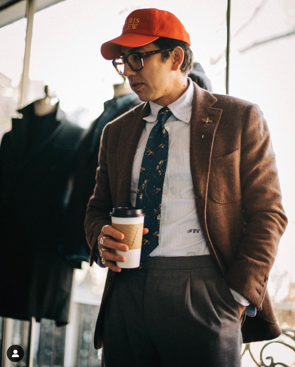
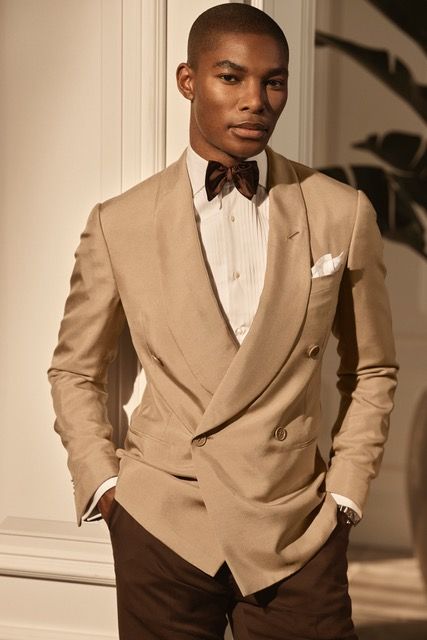
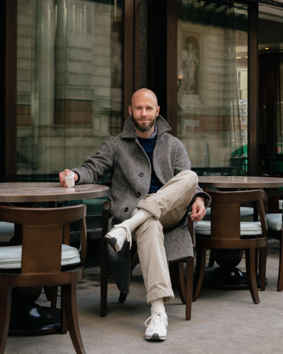
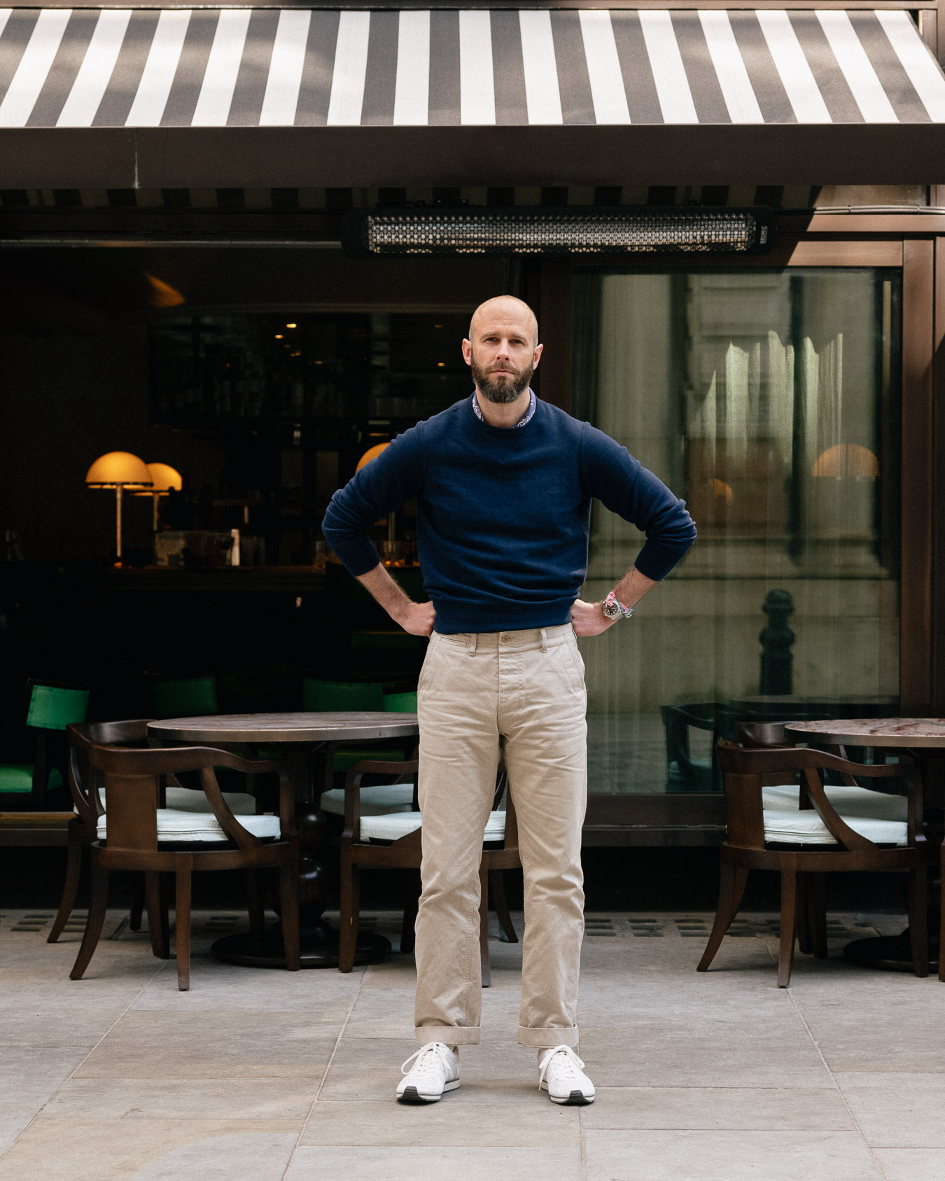
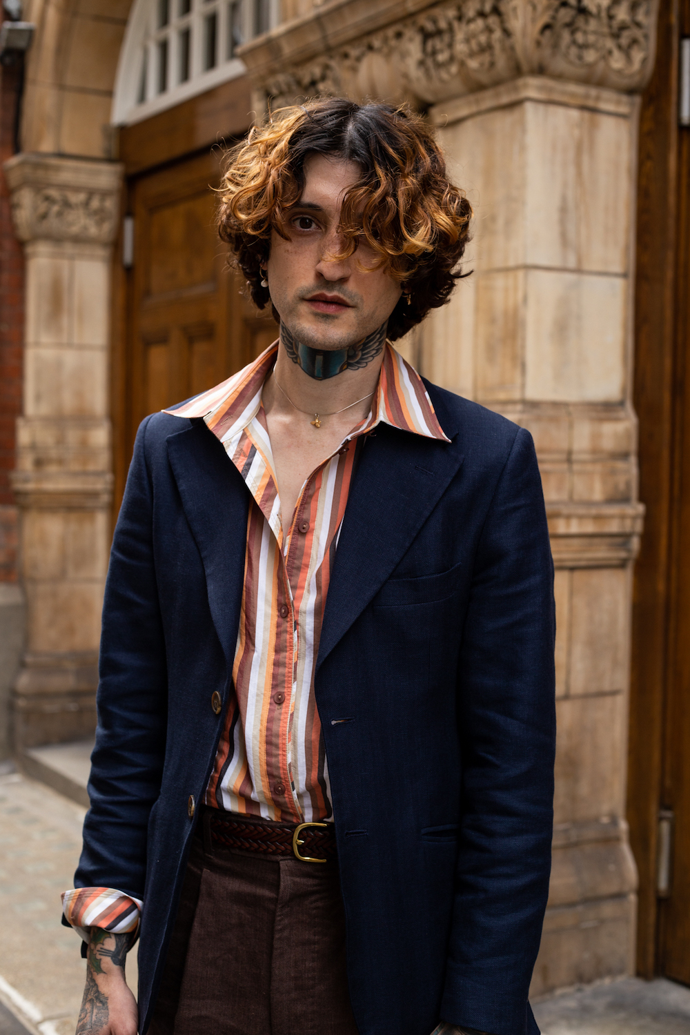
First, a tie accentuates and finishes off the sharp, smart look of a suit. So if the suit in question is more casual, the reasoning loses power. 

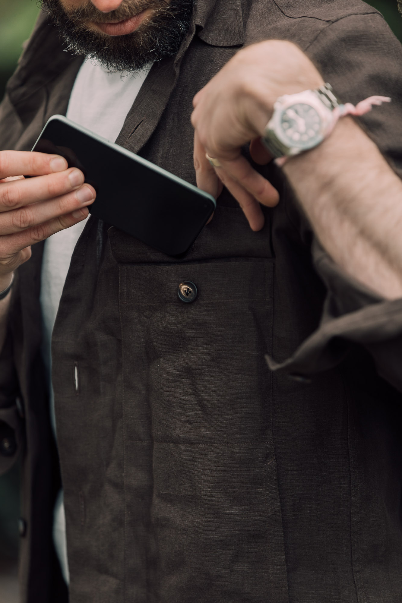
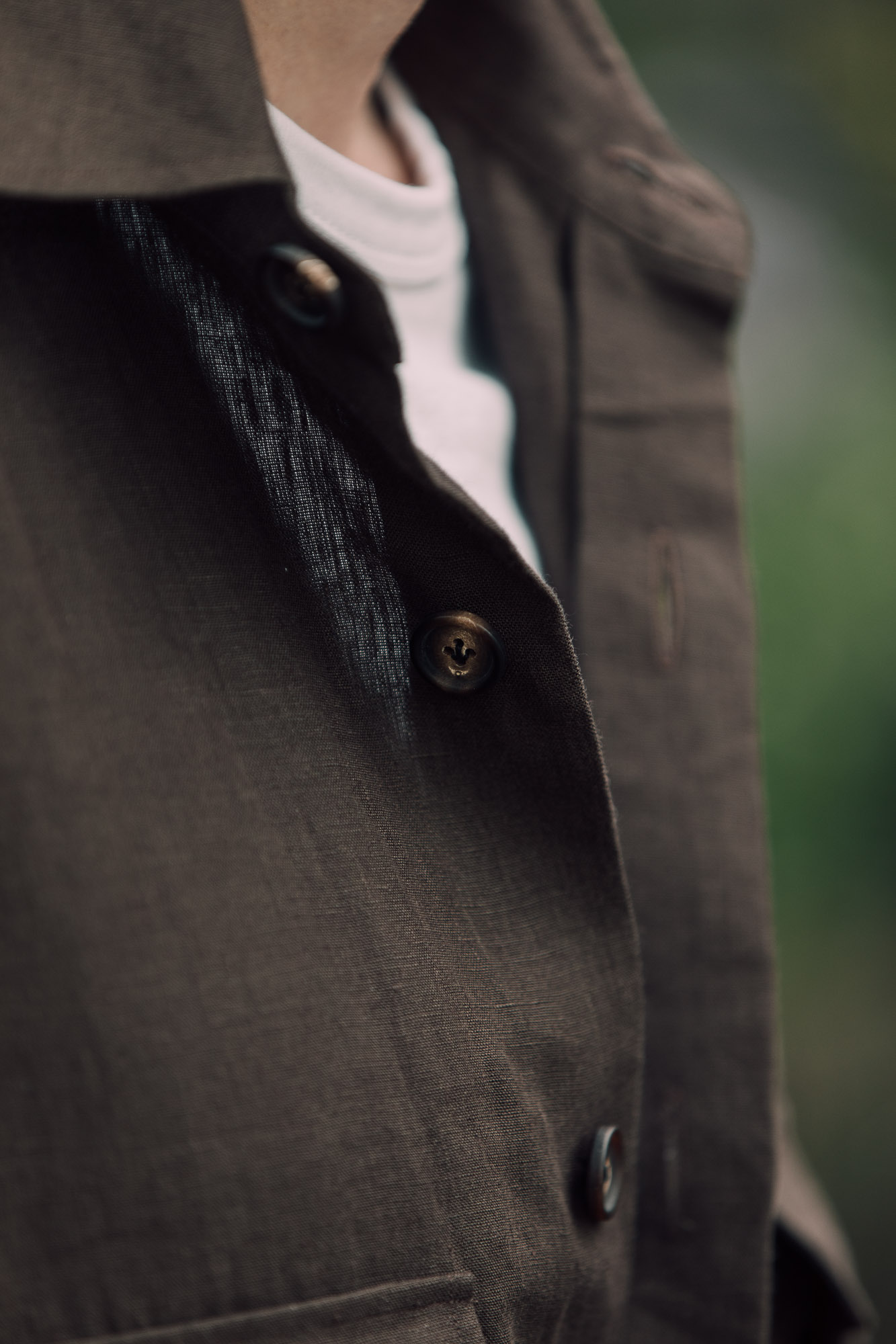
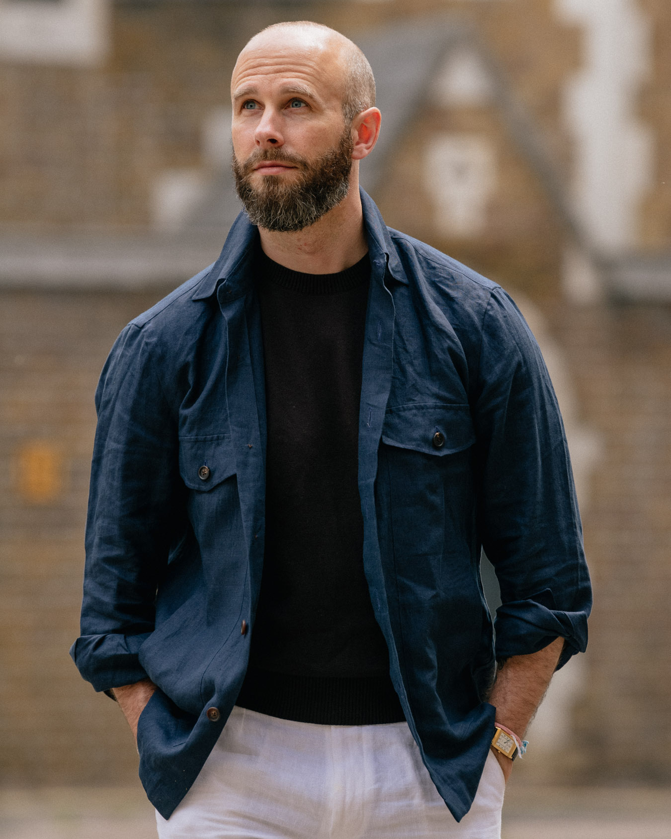
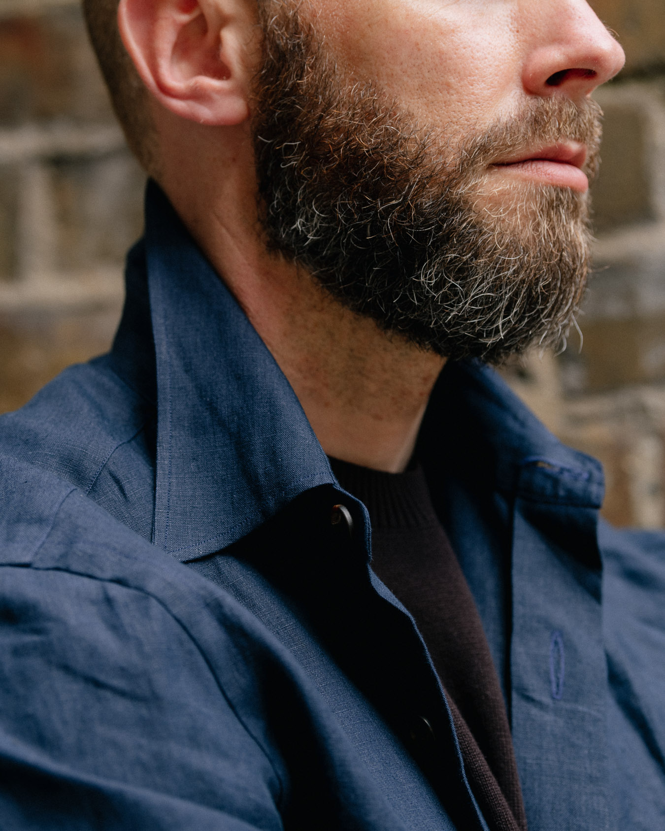
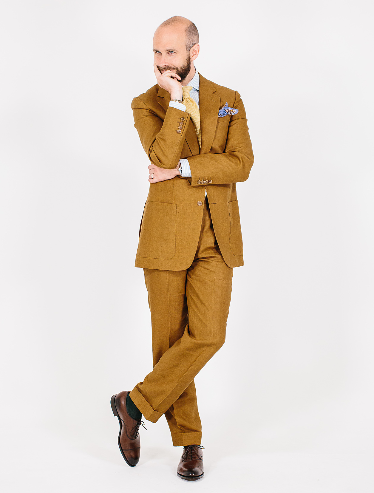
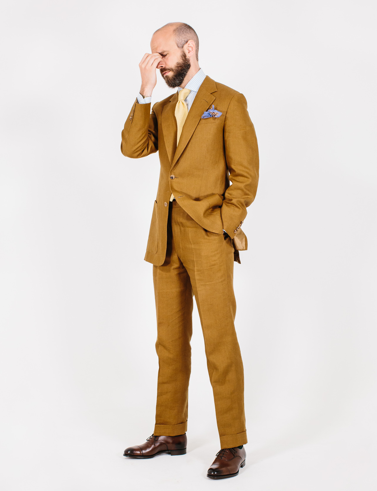
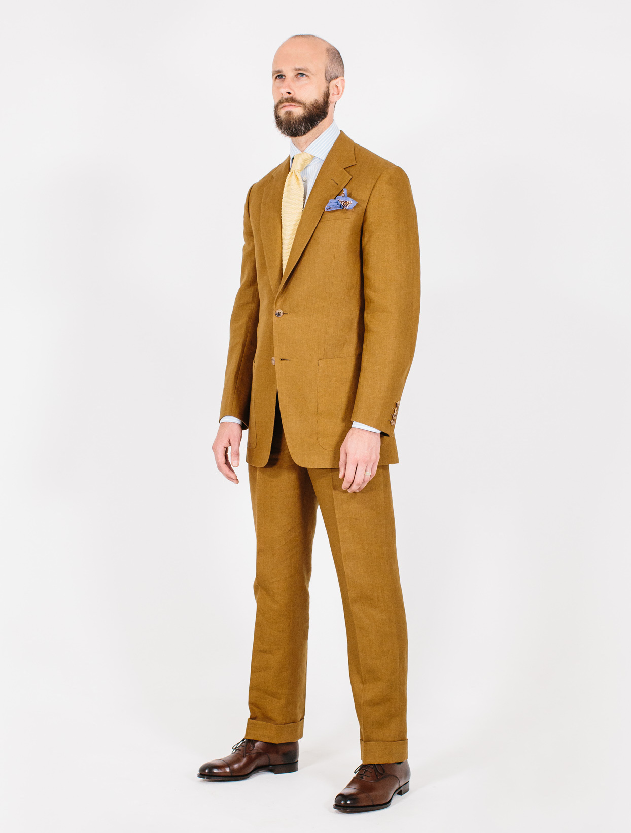
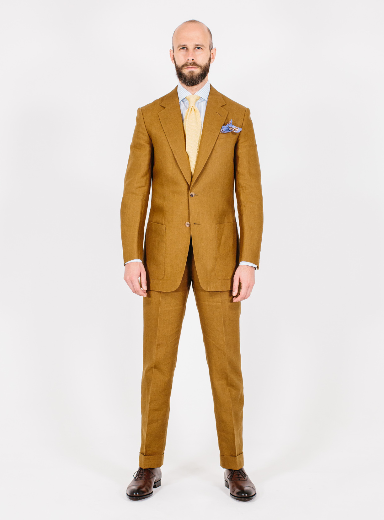
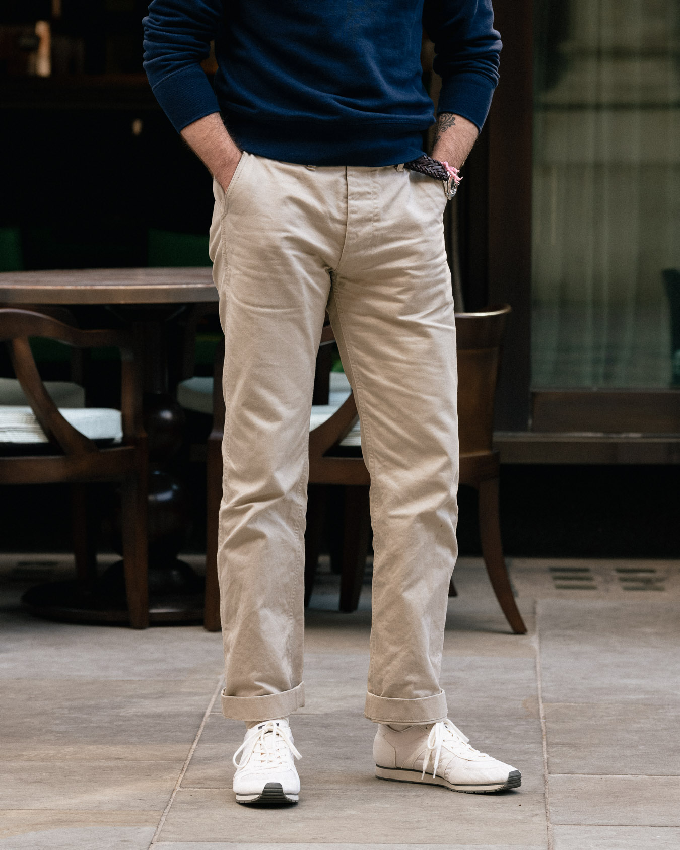
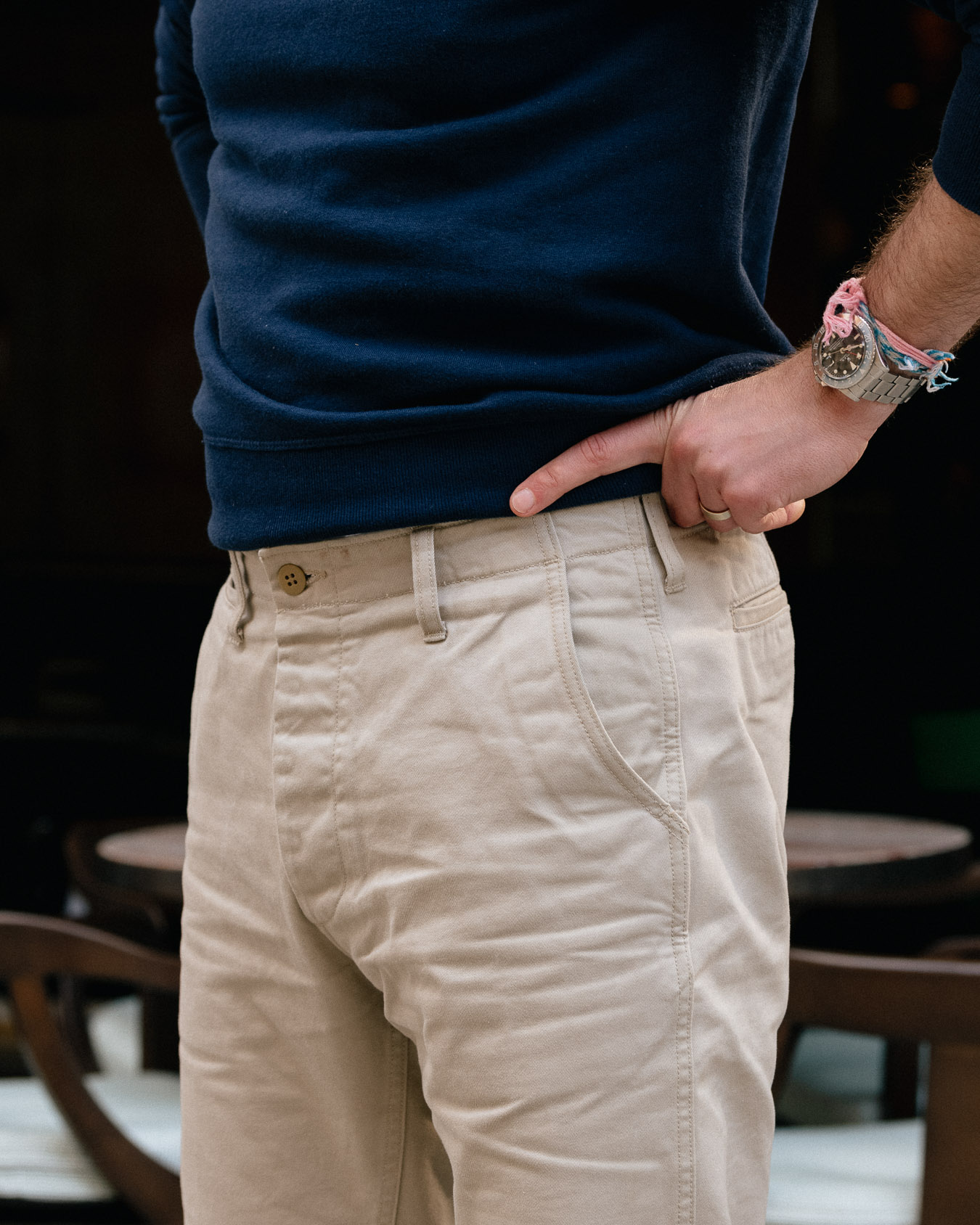
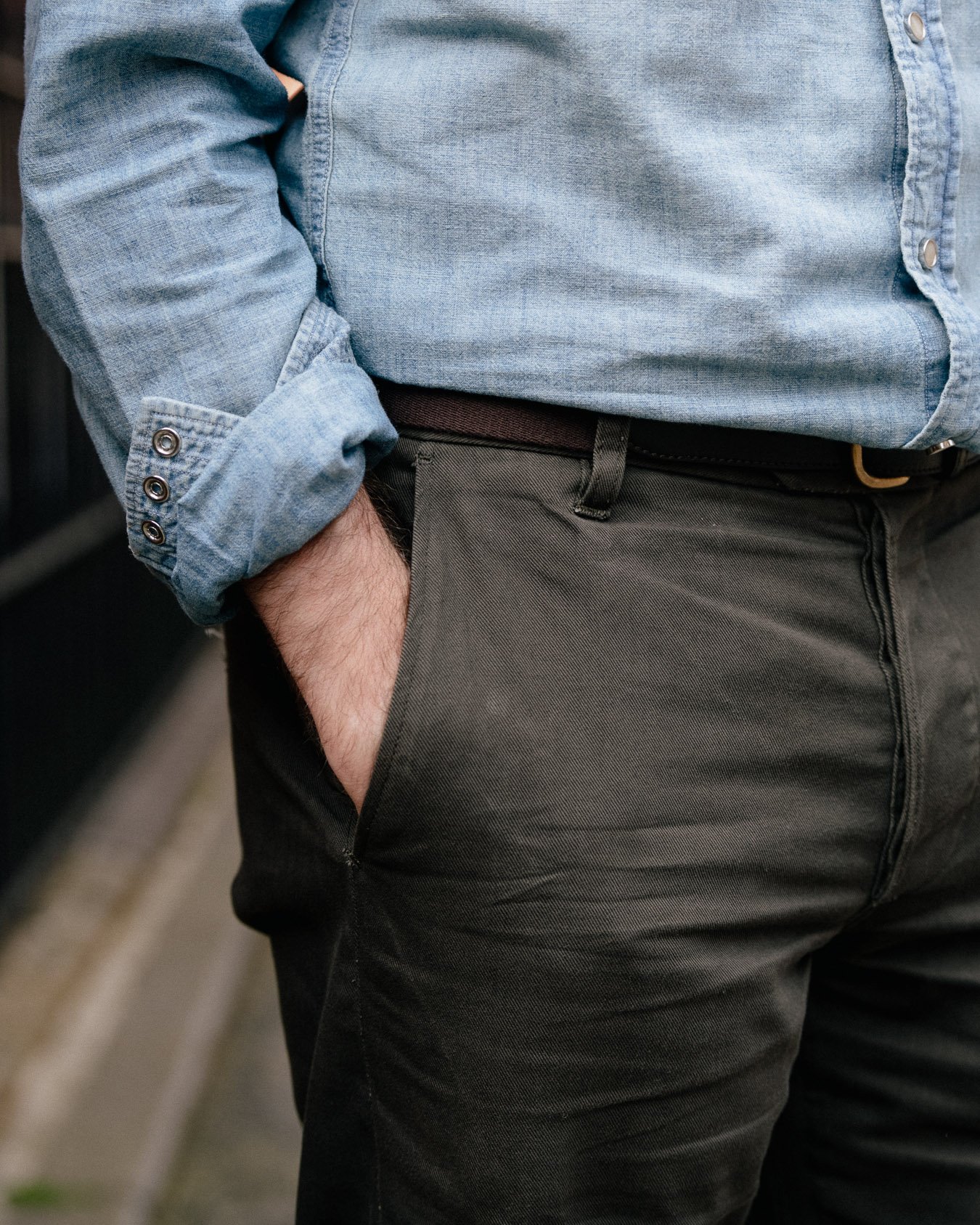
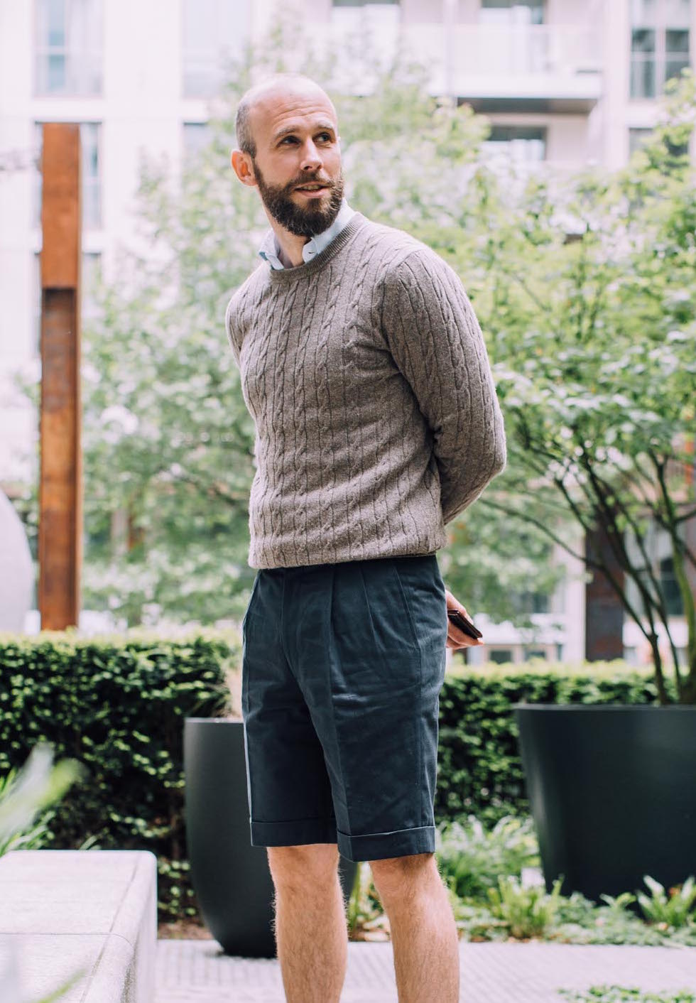
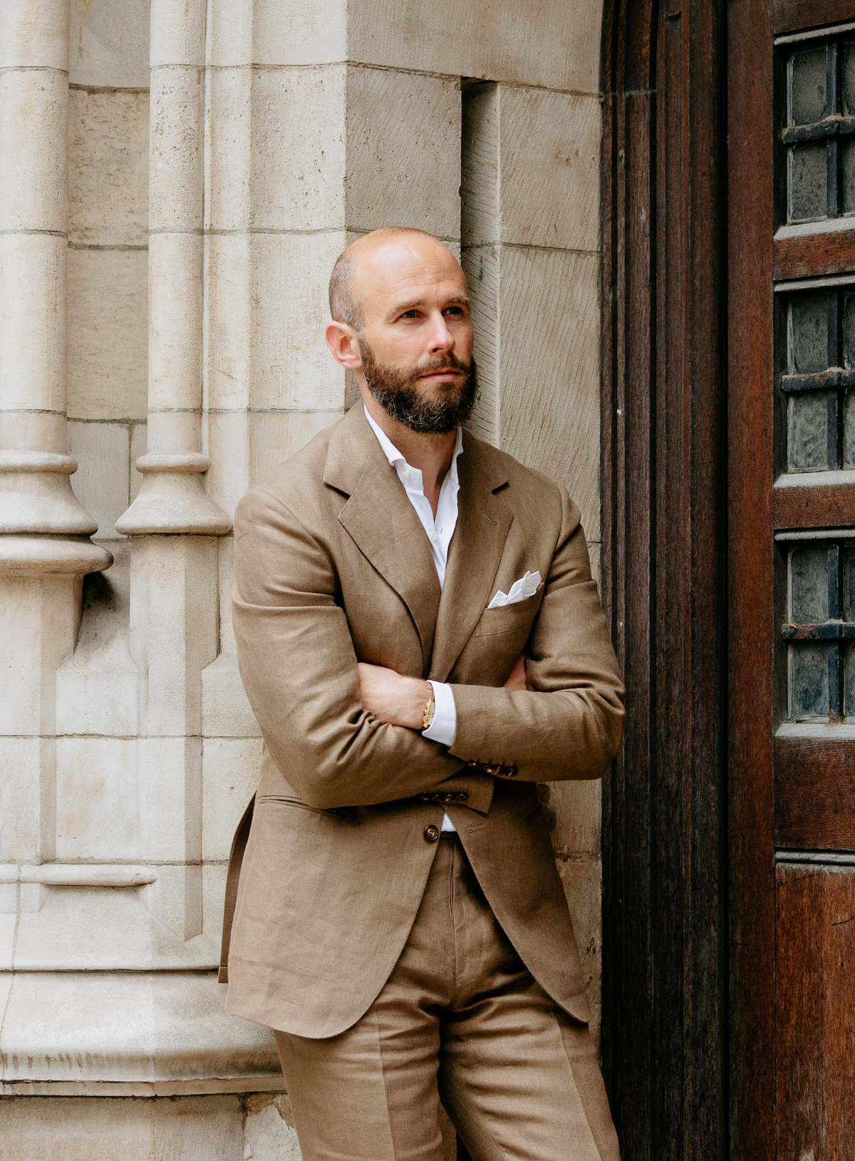
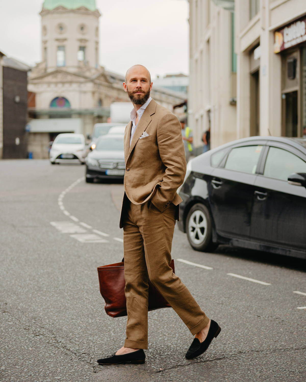
A cotton, linen or woollen suit looks much more comfortable without a tie than a worsted one. The same goes for a suit in a more casual colour – basically, not navy or grey. 

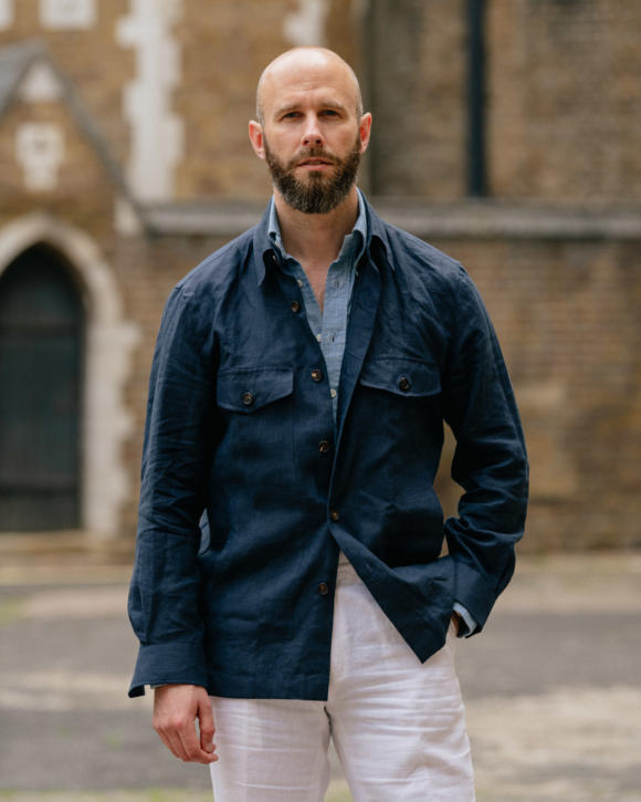
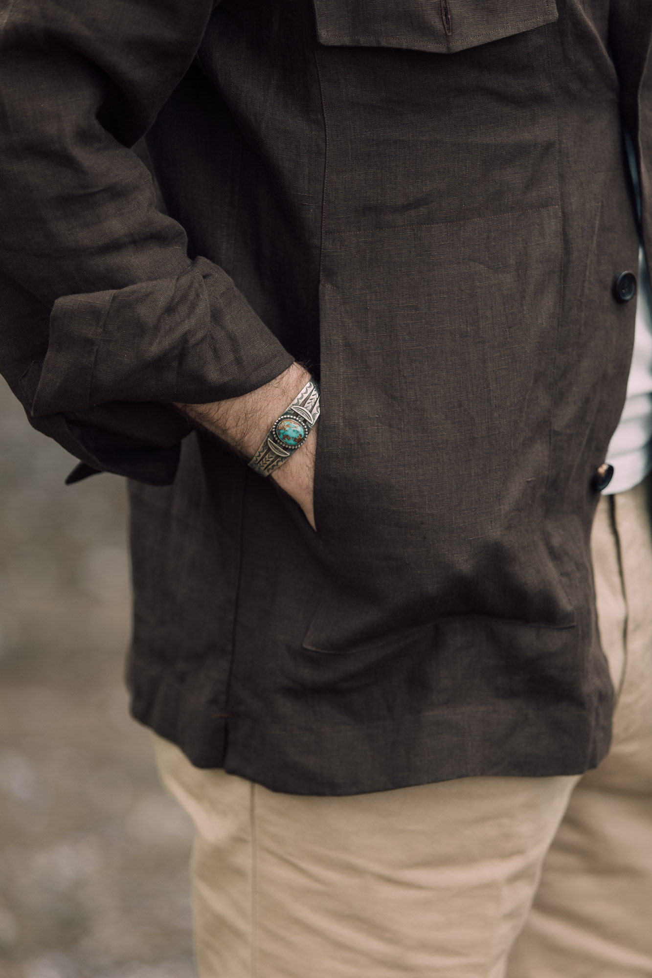
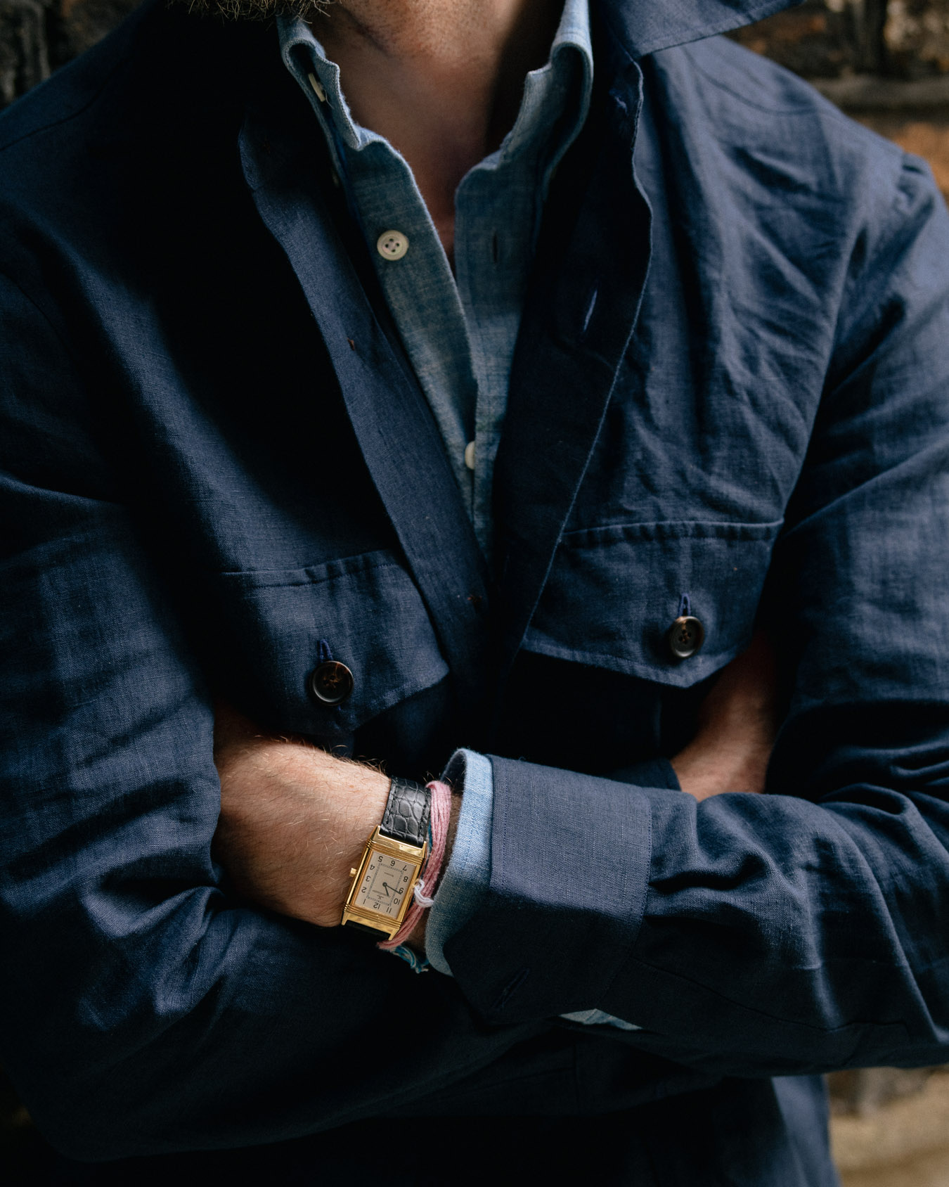
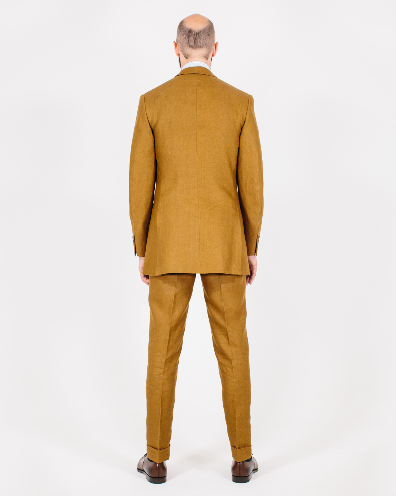
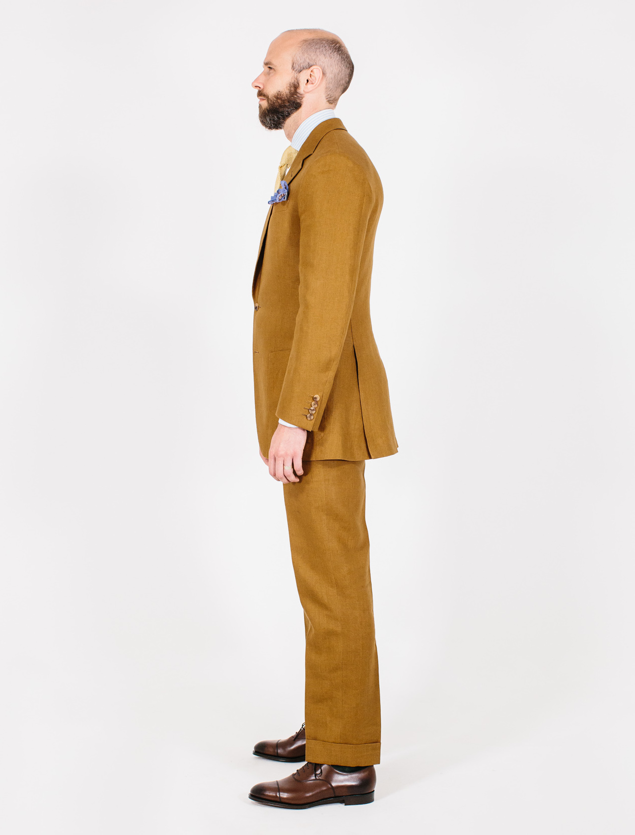
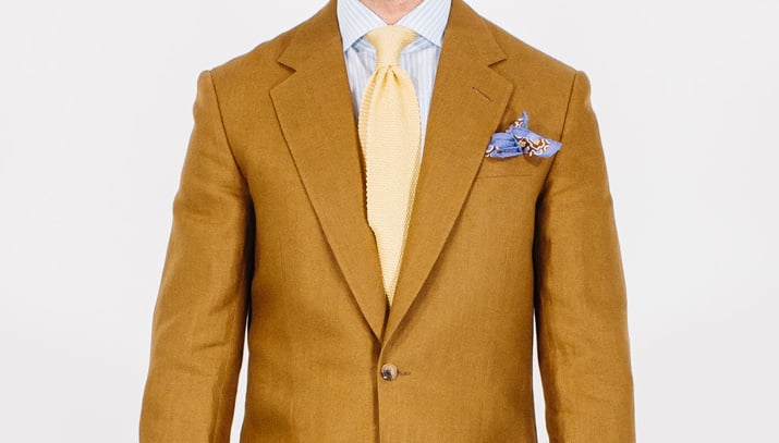
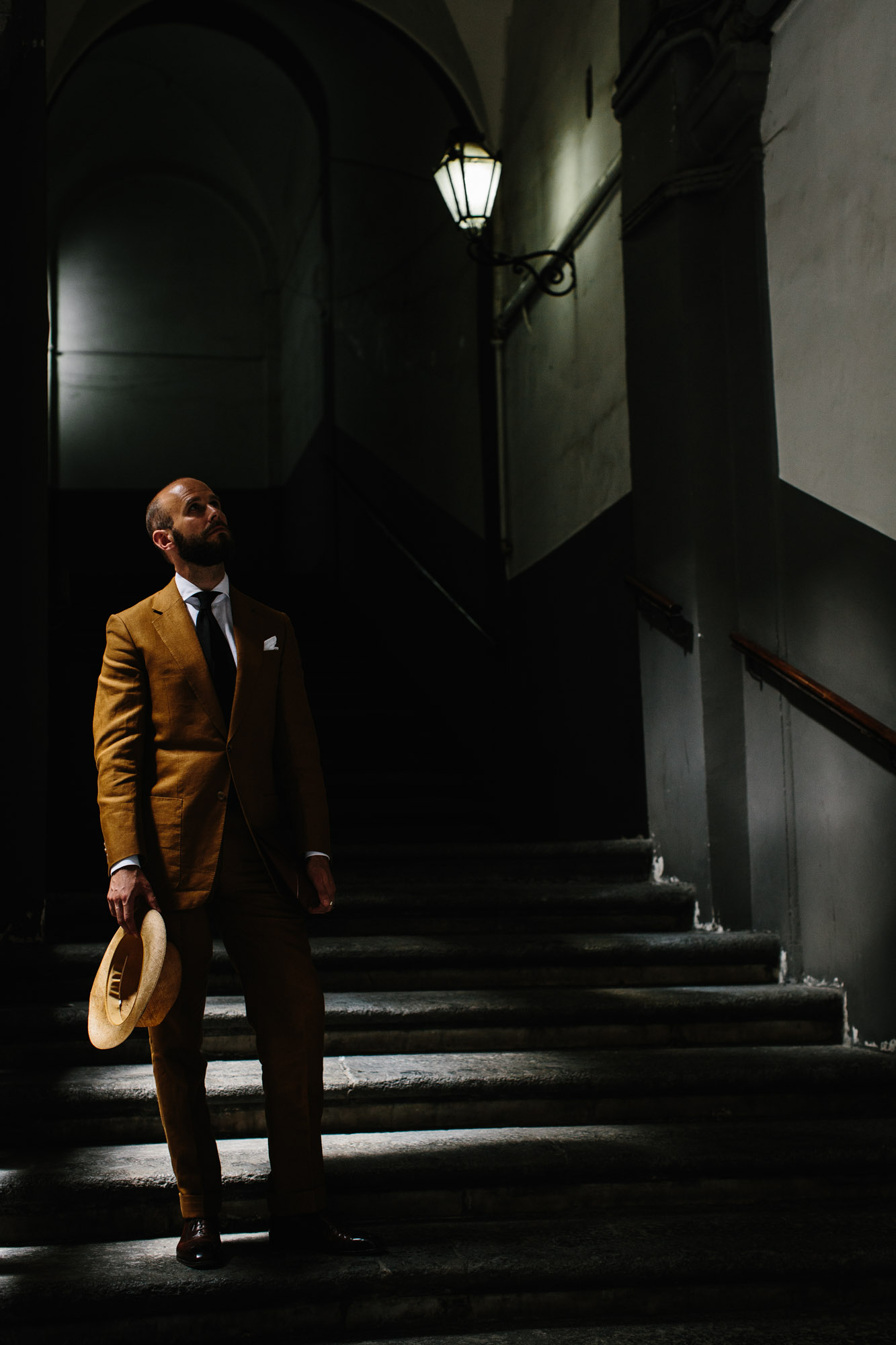
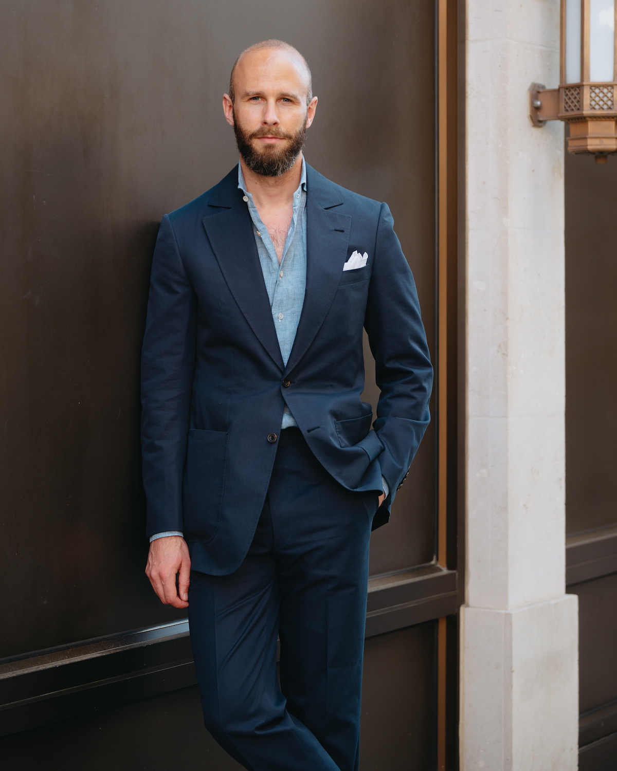
With my linen from The Armoury above, for instance, the suit looks great with a tie, but also very natural without one, given its material and colour. 

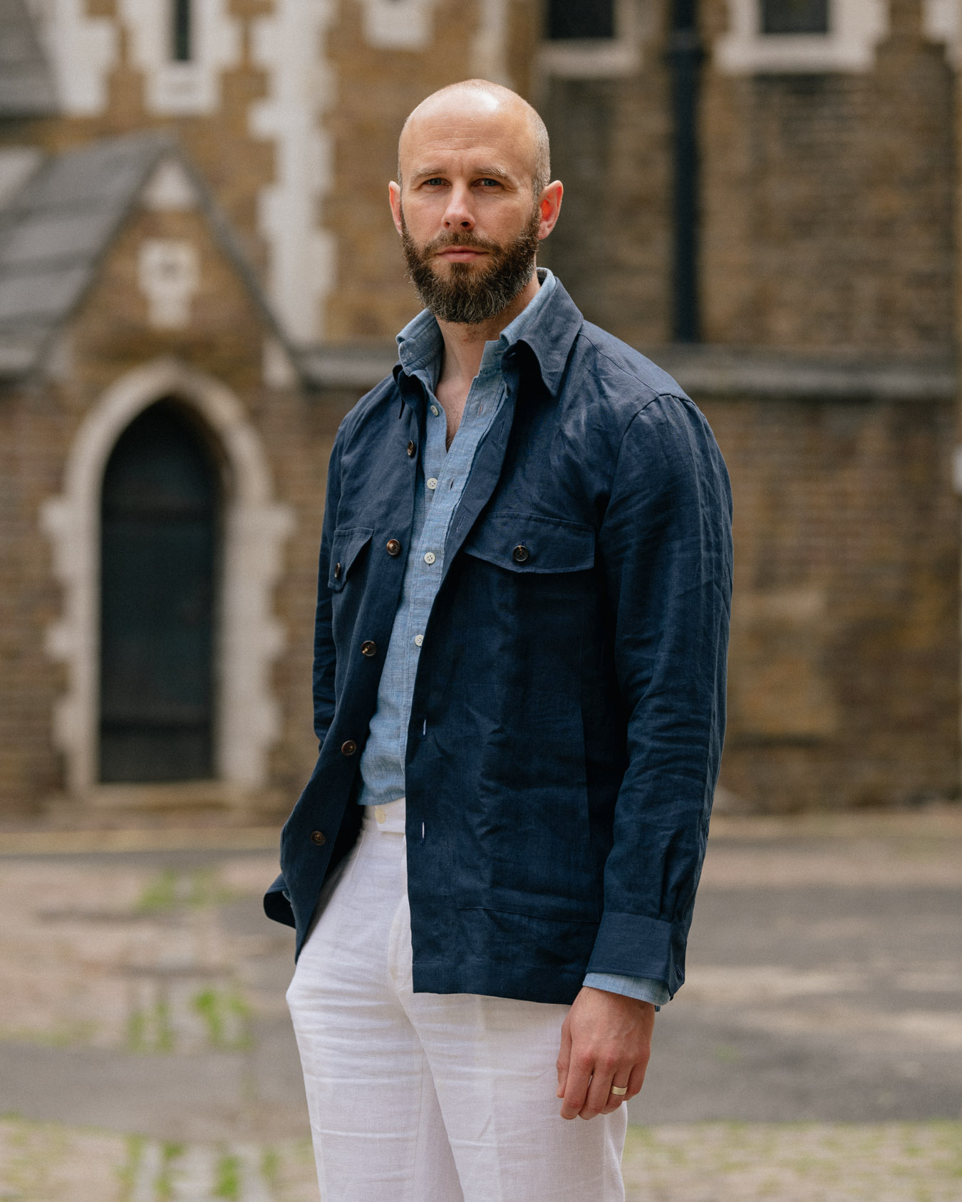
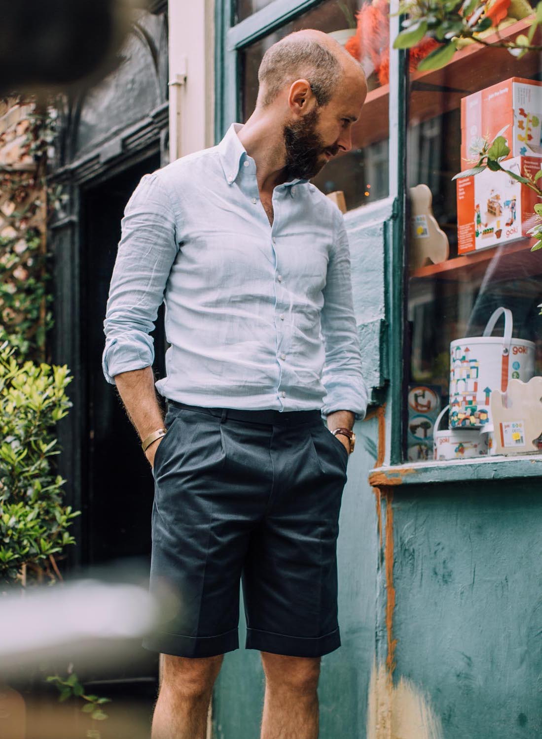
The suit below from Kenjiro Suzuki in Paris is more borderline: it’s cotton, a casual material, but dark navy in colour. I was fine wearing it here without a tie, but I was conscious that it would have been very plain without a pocket square or some other decoration. 

These two examples also point to another good reason for wearing suits without ties, which is temperature. 

Exposing your throat to the air is very cooling, given the veins that pass close to the surface, and a bigger factor in the Summer than an unlined jacket. So it looks and feels far more natural to be tieless in the heat. 

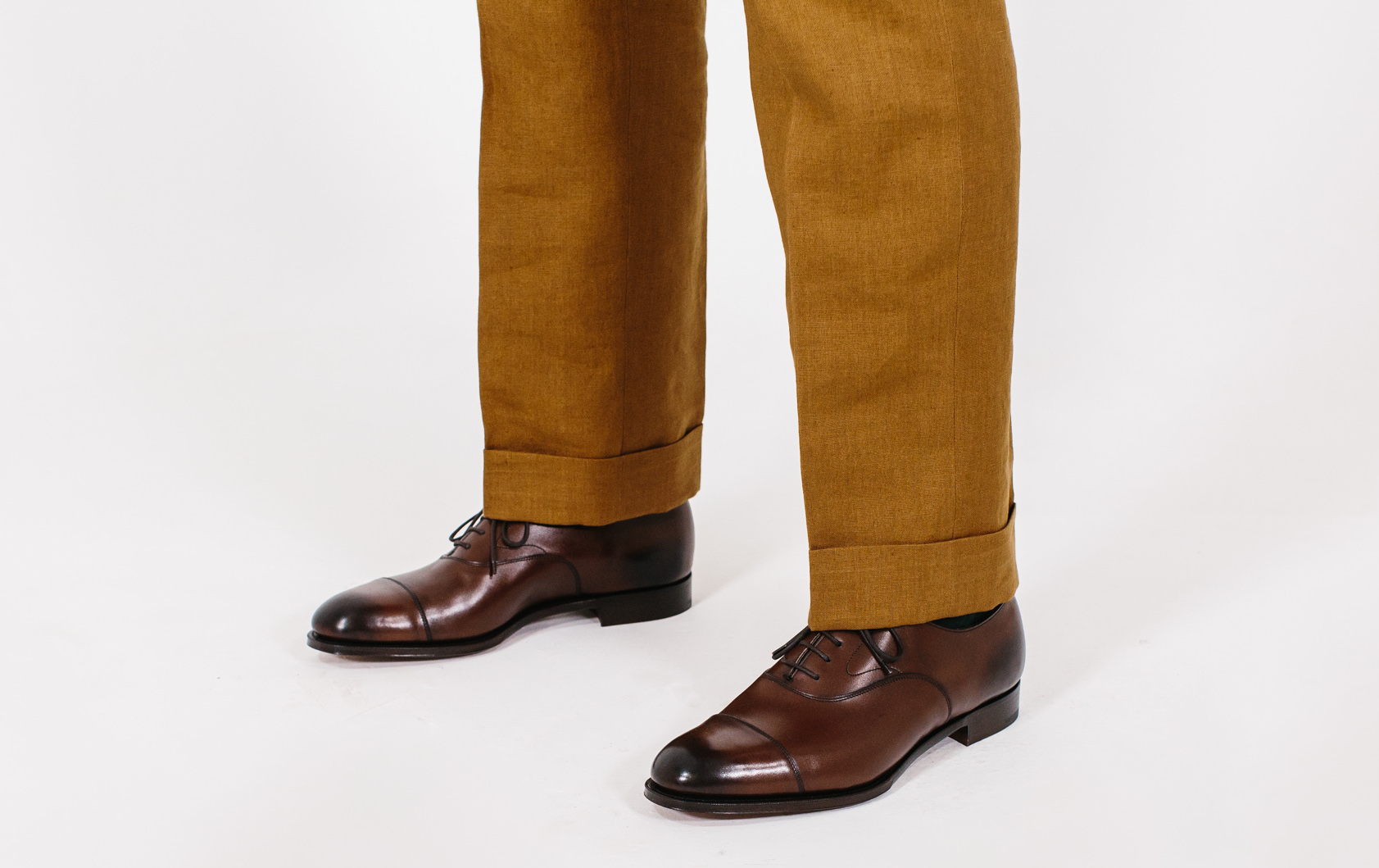
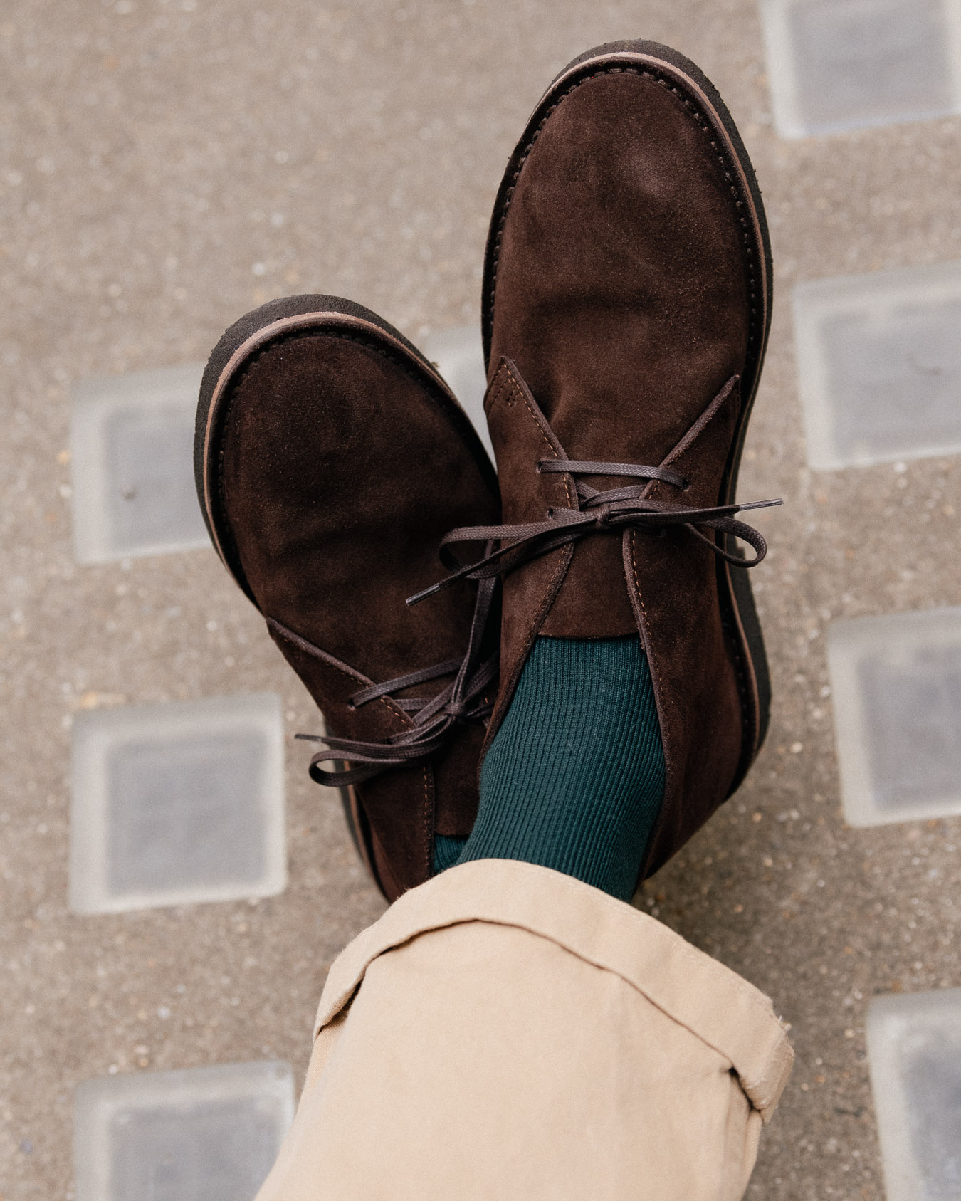
The same goes for your ankles, actually, which is why being sockless is so practical as well. And in fact a suit and tie with bare ankles is often an odd look (a mistake I’ve personally made in the past). 

Good reasons for going tieless with a suit, therefore, include trying to being casual and trying to keep cool. I do so much more in the Summer, as demonstrated by the fact that most of these PS images are of Summer suits. 

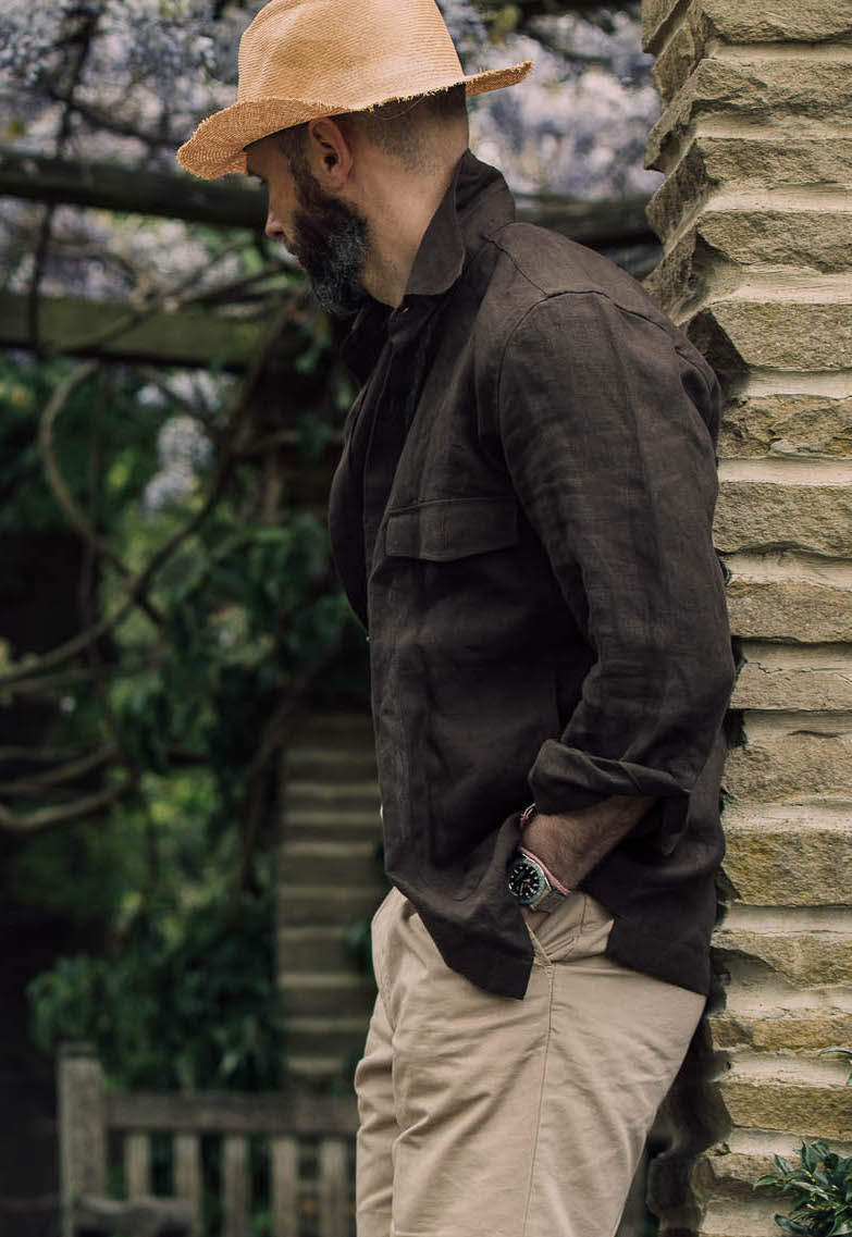
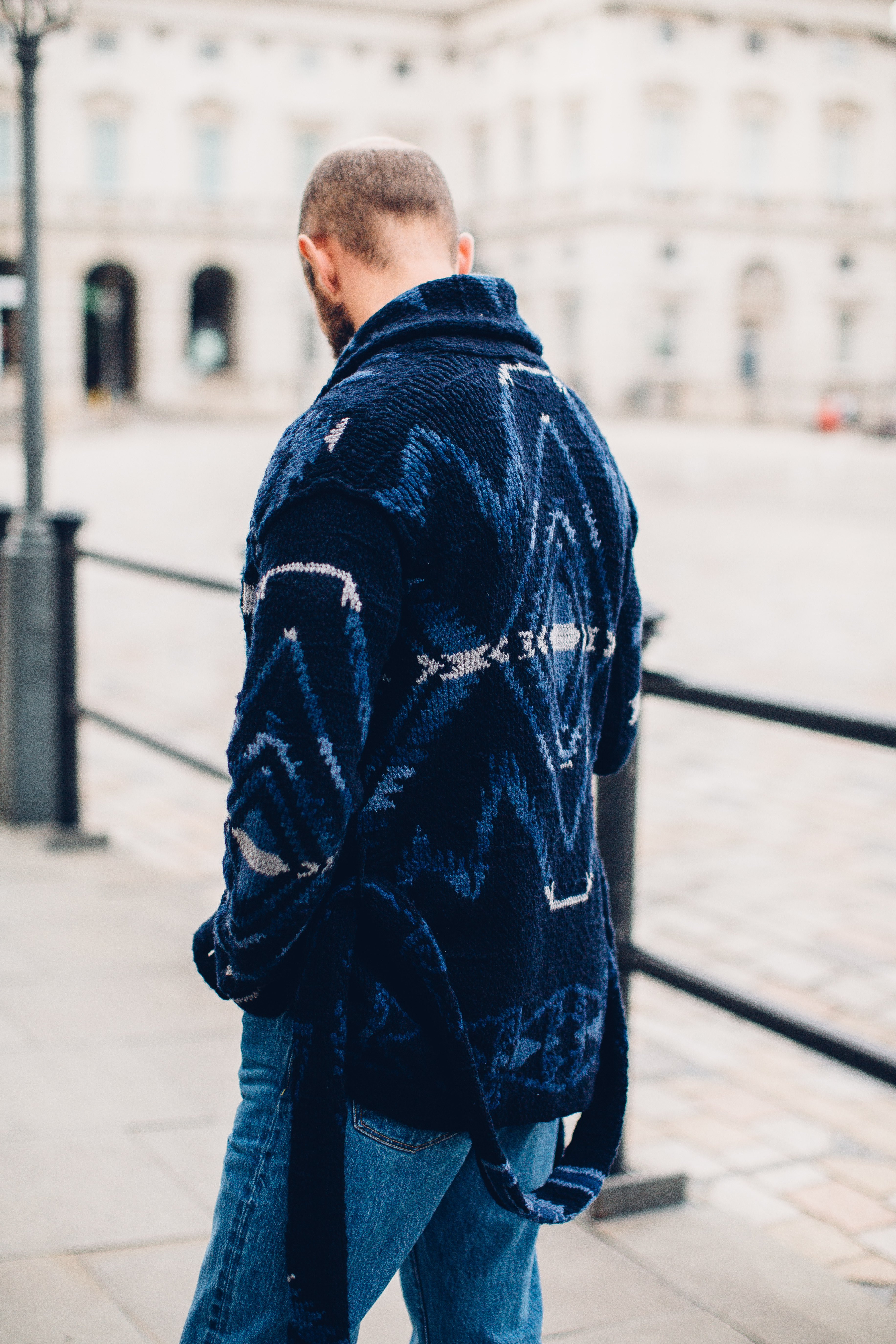
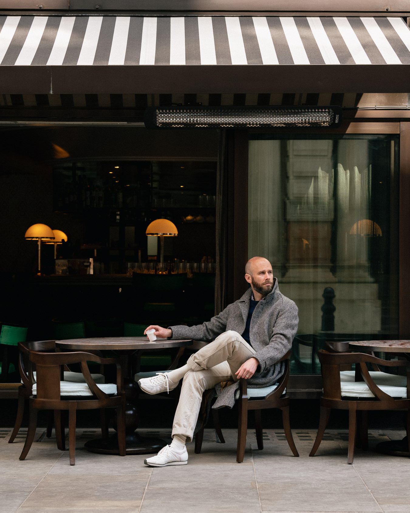
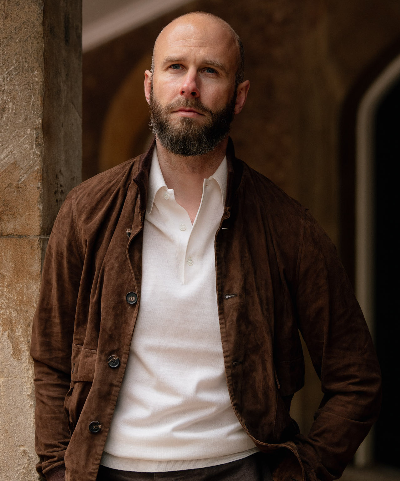
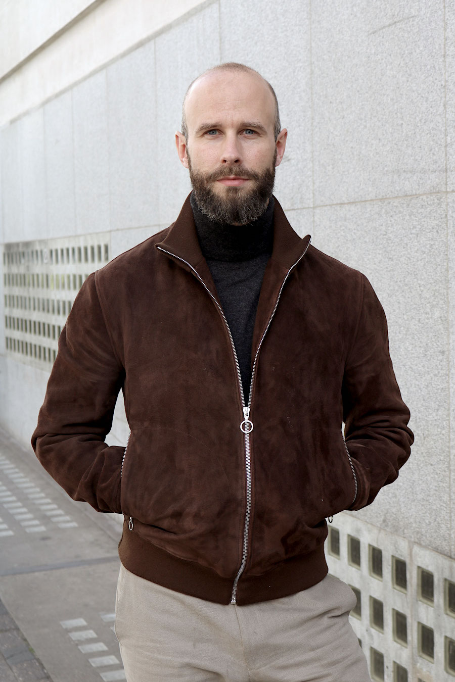
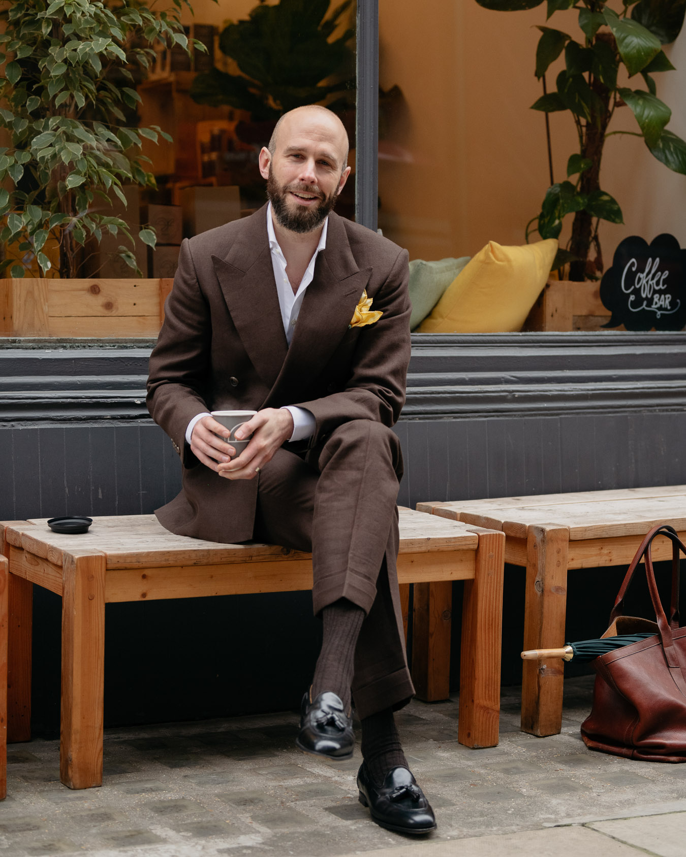
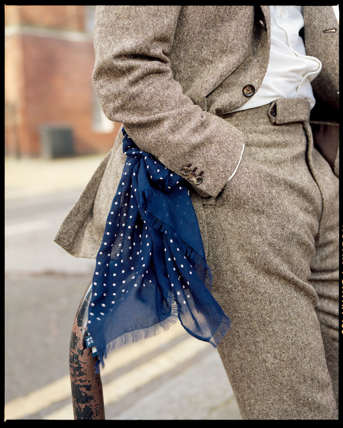
I do wear Winter suits without ties as well, however, as with the example below – my brown donegal-tweed suit from Dalcuore

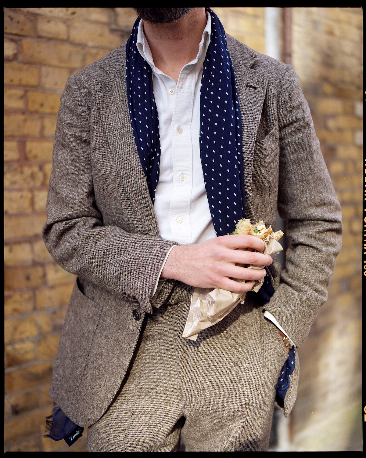
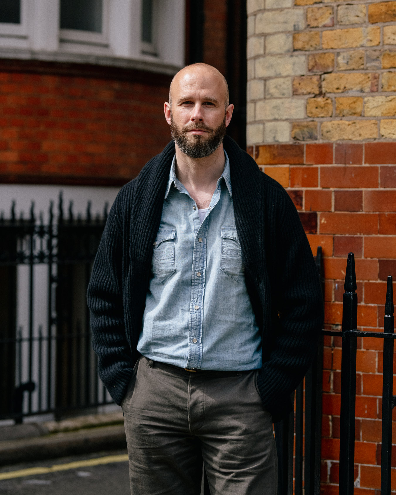
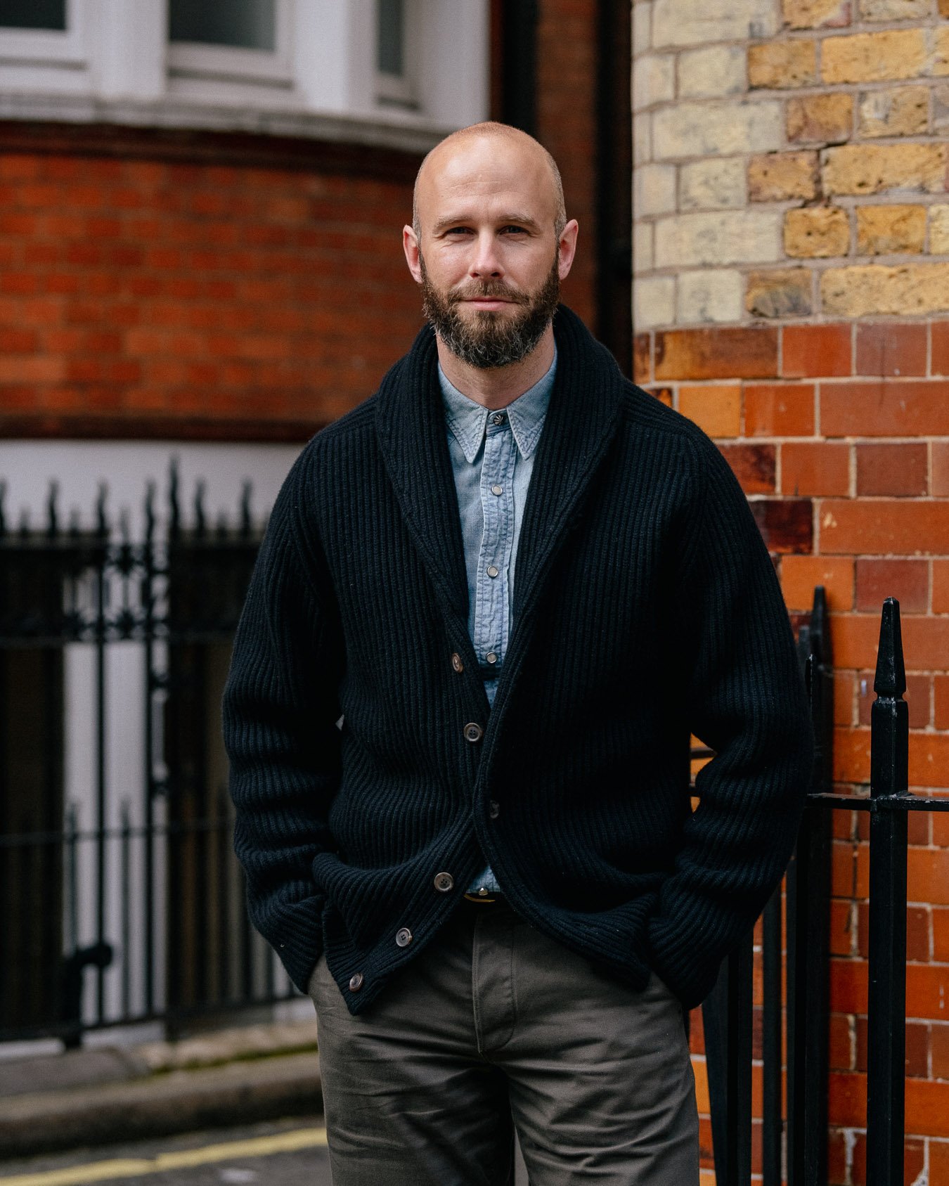
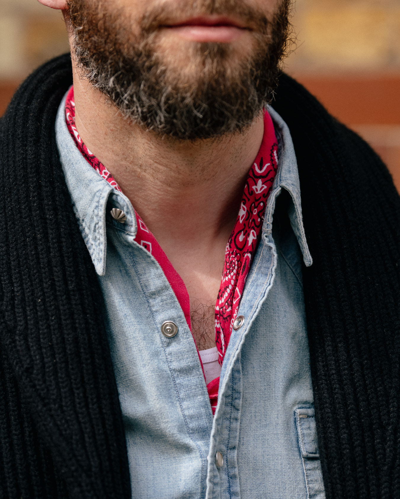
This outfit illustrates a last aspect of suits without ties, which is that it helps to replace the tie with something else.

Those City men looked drab without their ties, but they could have compensated by wearing more interesting shirts, a piece of knitwear, or another accessory like a scarf or handkerchief. 

This might have been tricky given their dress code, of course, but where permitted an alternative accessory can make a big difference. That Suzuki suit of mine might have suited a more colourful pocket square, and it helped that the shirt was indigo linen. 

The donegal Dalcuore suit is much improved by the navy spotted scarf (modal/cashmere from Drake’s). 

The particular advantage of a scarf, of course, is that is not as flamboyant as a pocket square, nor as smart. The suit can remain much more casual and everyday. 

Indeed, the scarf can look purely practical, though I’d encourage men to explore scarves that aren’t only required to keep their necks warm. 

Other accessories that can help include pins, sunglasses in the breast pocket, and a sleeveless cardigan. 

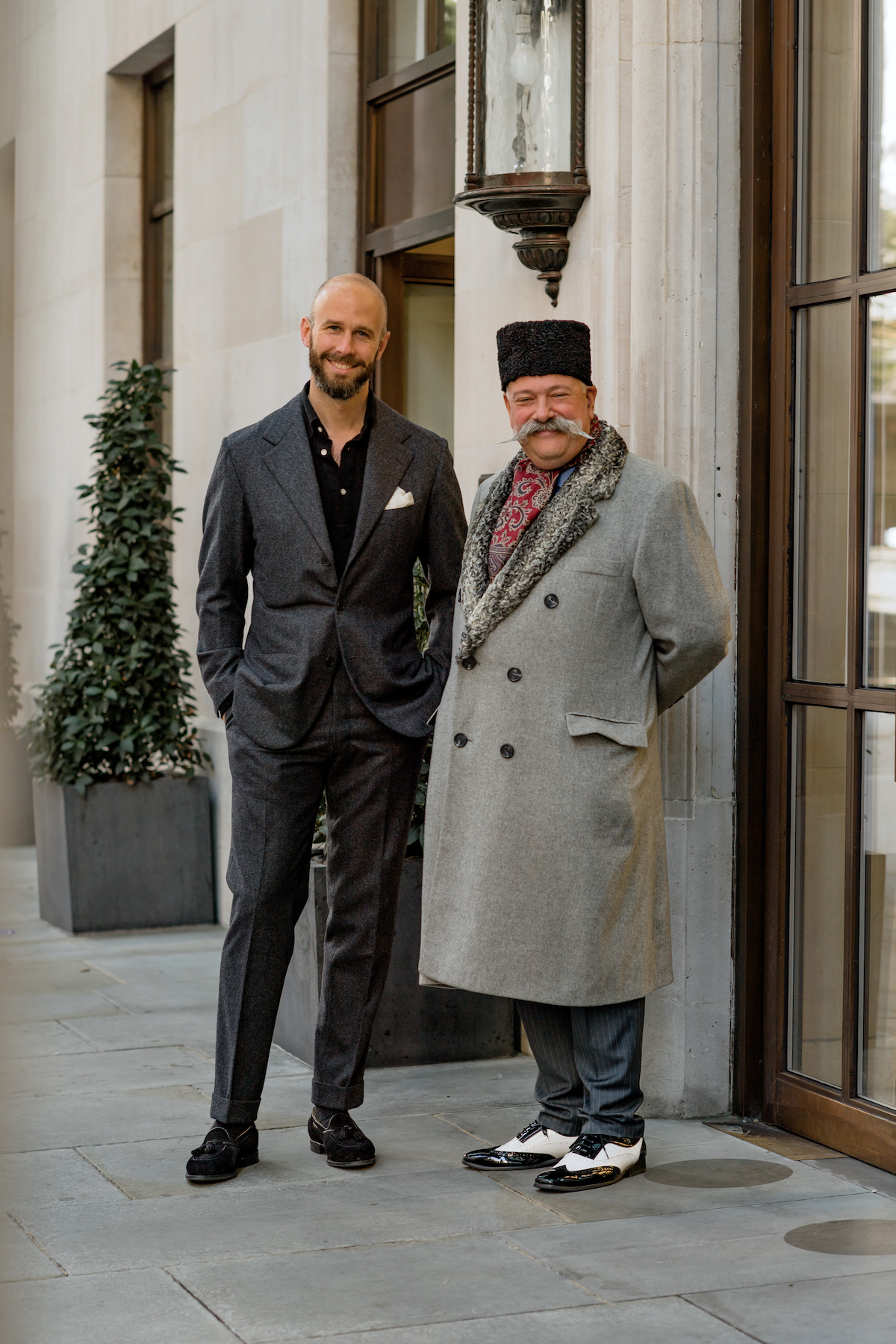
Casual shirts help too, like the black Friday Polo worn below with my Vestrucci flannel suit below, or a denim Western shirt

Patterned shirts can also be good, though personally I find they work best with Summer suits. Somehow with a Winter or smarter suit they don’t quite dispel the impression that something’s missing. 

I’ll close with the mantra that began this series of articles, back in 2008: “Rules are there for a reason, but there is nothing wrong with breaking them. It’s often only when you understand the rules that you can break them effectively.”

I’ve paraphrased slightly (I think my grammar might be improving), but still it’s nice to know that 13 years later, the mantra still holds. 

Revisiting Thom Sweeney casualwear

Revisiting Thom Sweeney casualwear

Monday, June 28th 2021
||- Begin Content -||

I’ve been spending more time in Mayfair in recent weeks, as restrictions have eased here in the UK and businesses have opened. 

It was on such a visit that I went into Thom Sweeney recently, really out of a desire to see everyone I could. Having not been into any stores for several months, it was good to see everything first hand. 

I was struck by how much the current collection fits into our recent discussions of ‘casual chic’: that art of appearing refined and elegant without wearing a jacket or suit.

The Thom Sweeny colour palette has always been narrow. It’s navy, white and grey, with only the occasional olive or beige, and brown in footwear more than anywhere else. 

It’s very classic, even corporate: transposing business colours direct from suits and ties into knits and chinos.  

This works well for the simplicity of casual chic. There aren’t the subtle, earthy shades of brands like Stoffa or Rubato, but it all works together smoothly and intuitively. 

It’s not unusual to look along a rail in the Thom Sweeney store, and see just navy, white and grey. But that does mean it’s all very familiar and easy.

The quality of the product is also consistently high. I think I’d forgotten this, as I’d looked mostly at tailoring and shirts in the past and not bought ready-made for a while. 

A good example - sticking with a recent theme - is their knitted tees and polos. 

Both use a high-twist cotton that has a dry handle similar to the ones we offered recently from Umbria Verde. While I particularly like merino, this is the nicest fine cotton I’ve seen, and the twist helps both to keep their shape. Unlike, for example, John Smedley Sea-Island models.

The polos have an effective collar that, although not made with a stand, does a decent job of staying up under a jacket or cardigan. And that helps them frame the face too. 

The T-shirt’s collar is made with a tubular section below its interlock stitch, which helps it retain its shape. It’s also cut that little bit higher than most mainstream T-shirts. 

These all make the tee a good candidate for wearing under tailoring - if that’s your style. 

Thom [Whiddett, co-founder] does this often, and on the day we met to discuss the collection, he was wearing a navy version under a dark brown DB jacket, and charcoal wool trousers. He was the epitome of casual chic. 

That’s also him on the right, above, with the same tee under a cream jacket. 

“My favourite part is the little split in the side seams, at the bottom,” he says. “That little detail makes the T-shirt look so much more considered when you wear it untucked.”

The way the Thom Sweeney collection is put together, Thom says he’d wear that tee with almost everything in the shop - from high-twist trousers to shorts: “The only thing I probably wouldn’t put it with is the finest worsted trousers, like our Weighhouse suits.”

There are many things in the collection I wouldn’t wear. The trousers have always been too slim for me, and I’m not going to wear the track pants, zipped hoodies or caps. 

But don't be put off by these things. As Thom and I discussed, it would be easy for someone to wander into the store and think this was a fairly standard, fairly mainstream brand. All the expected colours and the categories are there. 

But there’s usually more to the product when you look closely. For example, the merino cardigan (above) has a placket that's wider than most, giving it a subtle collegiate feel. And the tension on the ribbing is less than most, so it doesn’t gape open. 

It’s little things like this, and the quality of the materials, that elevate the casual clothing above anything mainstream. 

This is, of course, reflected in the cost. The cardigan is £295 and the T-shirt £195. (Although if one more person tells me that’s ludicrous for a T-shirt, I will scream. It’s a sweater, just with short sleeves. Not a big-panel cut-and-sewn mass-manufactured tee.)

It’s a long time since I’ve had something made bespoke by Thom Sweeney. Eithen and the  team are now all on the basement level of the new store (above). 

But talking to Thom did remind me that their taste level and modernity extends to tailoring, and this still separates them from most English tailors. 

They were the first house to offer something as adventurous as Caccioppoli, a decade ago. And Thom was enthusiastic about the best current examples from Loro Piana and Solbiati, including the latter's Aloe Vera-infused linen shirting. 

The ready-to-wear tailoring has also got progressively softer, and there are now two lines: one with only a thin pad in the shoulder and the other with nothing at all. 

Thom Sweeney have always had a celebrity following, many of whom really are friends, and regularly turn up unannounced - or gather for the Thursday drinks in the top-floor bar. 

When I visited this time it was Michael Keaton, who sheepishly finished a bespoke appointment and left with a casual goodbye. 

Sometimes this exposure - and the team’s relative lack of social media - makes me forget how good some of the product is. I recommend looking at it with fresh eyes next time you're making that still occasional visit to Mayfair. 

Introducing: The PS linen overshirt

Introducing: The PS linen overshirt

Friday, June 25th 2021
||- Begin Content -||

For a long time, my favourite linen overshirt has been an old model from Drake’s - readers will have seen it previously here, and it’s been worn continuously and lovingly since. 

One of the reasons I liked that model was that it had just two chest pockets, with no hip pockets.

The inclusion of hip pockets - as well as other design details, like epaulettes or bellows - always pushes designs towards the Safari jacket for me, which is not the subtle or modern look I want.

After Drake’s discontinued the design, I tried the ‘Valerio’ overshirt from shirtmaker Luca Avitabile. This actually improved on my old favourite, because while there were only two visible pockets on the chest, two side-entry pockets were hidden in the same piece of material, just below. 

This seemed to be the best of both worlds. The design was outwardly simple, but there was a pocket at the waist if you ever did need more. 

Still, there were a couple of points that I wanted to change on Luca’s design, and so I asked him to make me a bespoke one with these tweaks. 

As has often happened in the past, this led to us collaborating on a ready-to-wear version, which is what is on sale on the PS Shop today

The main design change I made was to enlarge the size of those breast pockets. Because nice as they were, the shape was rather shallow and wide. It wasn’t big enough to accommodate a mobile phone, and even with a small wallet the horizontal shape was rather counter-intuitive. 

It took us a few iterations to get this right. The pocket couldn’t be too deep, or it would start interfering with the side-entry pocket below; but it needed to be large enough to hold most mobiles. 

In the end we settled on 13cm wide and 17.5cm tall, which seems to fit all but the biggest phones. 

The other change was fabrics. 

I’ve found it difficult in the past to find the right linen in ready-to-wear overshirts. Even the bespoke one I made with Budd back in 2014 proved to be too soft and not have enough body. 

The issue I had with some of Luca’s ones was colours in the Summer and finish in the Winter. 

The wool ones, for Winter or at least Autumn, use a worsted that is too shiny and smooth for my tastes. The linen Summer ones, on the other hand, come in two shades that are too strong - a mid-blue and a bright tobacco - while the navy and olive use a heavier, hopsack linen. 

These might seem like small differences, but I find material is absolutely crucial in an overshirt, given that’s all there is. It’s even more important than with a shirt, as it has to hang and drape nicely too. 

For our overshirts, therefore, I used the same Irish linen as the two bright colours, but in a classic dark navy and deep dusty brown. 

These two are the easiest, most useful colours of Summer overshirt for me. 

It’s easy to be attracted by lighter or brighter colours, but as you’re unlikely to have a whole wardrobe of these (unlike sports jackets) they do need to be versatile. And dark layers on top are more useful Summer trousers are more likely to be pale.  

One reader already asked which of the two I consider to be the most useful. 

To be honest, I think they’re just different. I find I wear navy the most, but it has the limitation of not being good with navy chinos or shorts. Brown is definitely better in that regard, but still I find I like and wear navy more.

The image above is taken from our recent shorts article, and shows the brown overshirt effectively. That dark, dusty shade is particularly nice with khaki, white, grey and cream. 

And then below, the navy is pictured with a slightly smarter combination: a chambray shirt and white-linen trousers. 

White trousers with navy is immediately quite smart, showy, perhaps even redolent of the Riviera. But it’s toned down by the texture and softer colour of the chambray. 

A navy overshirt can of course go with any colour of trouser apart from navy, just like a blazer, from pale green to biscuity brown. I quite like it with the pale green of these linen trousers, for example. 

The other outfit I’ve shown the overshirt with, is the same trousers with a dark-brown knitted T-shirt (from The Anthology). This is useful to demonstrate a halfway house between shirt and tee: something casual, but knitted so more refined. 

Like the shorts outfit above, it also shows how someone that doesn’t normally wear T-shirts (perhaps because they’re less flattering) can put an overshirt over the top to give them that collar at the neck. 

Plus of course, the shirt gives you a better place to put your wallet and phone.

The best geometry for a collar is something Luca and I definitely agree on. 

It must lie cleanly on the neck, but stay standing at the back when you put it up (as I often do with a T-shirt underneath). Once popped, the points of the collar should fold gracefully downwards, touching the body of the shirt. 

It’s not an easy combination, but generally it comes having more structure in the collar stand, and less in the collar itself. 

The sleeves, by the way, have a decent length placket, which makes it easy to roll them up if desired. It’s probably the most effective way to make the overshirt look more relaxed. 

Elsewhere, the overshirt is cut a touch longer than most - 78cm on this size Medium - but as it’s just linen, could be easily shortened - perhaps around 3cm before the hem gets too close to the waist pockets. 

The body is cut fairly straight, but it’s also a little slimmer than some, perhaps vintage-inspired chores and overshirts. Check the measurements below against a shirt you already have to get an idea. It could be slimmed further if required. 

Oh, and I forgot to mention there’s also another, internal pocket, on the left hip. Also mobile-phone sized. 

Product details:

  • The PS Overshirt is made in 100% washed Irish linen, 290gm
  • The buttons are dark-brown horn
  • It is made in the Luca Avitabile atelier, Naples
  • It is a clean machine make: no handwork other than handsewn buttons, unlike PS shirts
  • The shirt has two breast pockets, two hidden waist pockets, and one internal hip pocket
  • It can be washed cool (30 degrees) and hung to dry, as with a fine linen shirt
  • It is available in dark navy and dark brown

Sizing: 

  • In the pictures, Simon is wearing a size Medium
  • The body is cut straight but slightly slim compared to other chores and overshirts
  • It is relatively long. Generally, an overshirt should reach somewhere between the bottom and halfway point of your seat
  • Alterations, as on a shirt, are easy. The only limitations are the waist pockets, if shortening the body, and reducing the length of the placket, if shortening the sleeve. 

Size chart:

Neck Chest Waist Shoulders Back length Sleeve Cuff
Small (44-46) 38.5cm 112 102 48 76 60 24
Medium (48-50) 40.5 118 110 50 78 62 25
Large (52-54) 42 124 116 52 79 64 26
Extra large (56-58) 44 130 124 54 81 66 27

Behind the scenes: The design work at Ralph Lauren

Behind the scenes: The design work at Ralph Lauren

Wednesday, June 23rd 2021
||- Begin Content -||

I don’t think consumers value design that much any more. They concentrate on price and (more justifiable) quality, but design often gets swamped by hype. What is fashionable rather than what’s well-designed.

A large part of the reason is that good design is hard to quantify. You can’t put a number on it, or make a straight comparison with a similar product. It’s aesthetics, a matter of judgment. 

One way to quantify design is the amount of time, and therefore money, a brand invests in it. And the menswear brand that does that more than any other is Ralph Lauren. 

Unfortunately, they don’t talk about it. Over the years, I’ve been repeatedly frustrated by the lack of product and design information Ralph Lauren supplies - to either customers or journalists. To the extent that, when I covered a hand-knit cardigan back in 2017, it took a member of the design team to anonymously comment on the article, for us to understand quite how much work went into it. 

In order to try and correct this in my small way, I spoke to three ex-Ralph Lauren designers recently, to get their inside view on the product development process. They were Sean Crowley, Fred Castleberry and Peter Middleton.

Sean (right) in 2008, during his time at Ralph Lauren

“Ralph Lauren is a design-driven company, and it might be the last one standing,” says Sean, who worked at RL for 11 years and now runs his own vintage store in New York, Crowley Vintage

“Certainly on the evidence of the companies I worked for after Ralph, and friends that work elsewhere. Usually they have a block for their suits, shirts etc, and the decision each season is just, what colours shall we do it in? Last time it was navy, green and yellow. The navy sold best, so this year let’s try navy, brown and cream.”

These companies are often described as ‘merchant-driven’ rather than design-driven. As in, it’s the merchandising and commercial side of the business that controls the decision-making.

“At one subsequent employer I was the head of design, and every time I asked to make a tiny change - to try a different material that would add just 5c to the product cost - I was told no. Eventually I told them there was no point having a designer at all.”

Sean's wall of proposals for ties at Rugby. Other labels were much bigger, often taking up whole rooms of just ties

“The reason it’s easy to be design-driven at Ralph Lauren is that it all starts with concepts,” says Fred Castleberry, who ran conceptual design at Rugby, before it closed down, and now runs his own brand F.E. Castleberry.

“It sounds silly, but you actually were asking yourself every season, ‘where does the Ralph Lauren story go here?’ What’s the next room you walk into?’”

The concept was important, because it meant many of the design and product decisions were already made before the merchandising team got involved. 

“I would spend weeks researching, buying vintage, drafting ideas, and then we would mock up a room for Ralph to approve,” says Fred. “He always wanted it to be set out like a store, so he could see how the customer would experience it.”

Fred Castleberry

Once Ralph gave his approval, the concept team would present to all the heads of design - one for knitwear, one for tailoring, one for leather goods etc. They would spend a few weeks fleshing out the ideas, before merchandising joined in. 

“There was always a tension there with merchandising, and a necessary one,” says Fred. “If it wasn’t for them, the designers would just go wild.”

But because the designs were largely in place already, the role was to control costs, or perhaps the volumes of more expensive items. 

“If we had seven really complex, eye-grabbing pieces, that might be whittled down to five,” says Fred. “And maybe there would be fewer of them, used in the front of the stores rather than lots of stock. But the design concept would hang around them.”

Personally, it’s often these more unusual pieces that I buy from RL - a suede trench coat or a hand-knitted ranch cardigan - because I can feel the design work more. 

One of my two much-loved cardigans. The patterns always match across the front, which makes me smile.

The detail on these designs would be a combination of vintage research and then innovation with the makers. 

“For example, after visiting a dozen vintage dealers, we might find this old cardigan with a knit pattern that we’d never seen before,” says Fred. “We’d work it into the concept, and then when the knitwear designer became involved, we’d talk to the factory together, to see if they could reproduce it.”

The problem with old knitwear is that it tends to be both heavy and coarse. Both knitting and spinning have come on a long way. 

“So the interesting thing was trying to recreate that hand feel, without the same weight or roughness,” says Fred. “For example, you might use a linen/cotton yarn, because the linen would give it the crispiness, and cotton would add a little more weight than wool. That would also produce more of a Summer knit.”

The more I work in menswear, the more I appreciate work like this that goes into materials. People like Stoffa or Anglo-Italian who develop their own, rather than just offering their customers the same books as everyone else. 

And even among mills, ones like Loro Piana that innovate with their materials as well as producing tasteful designs. Unlike some merchants that are basically just holding rooms for other peoples’ cloth. 

Peter Middleton, courtesy of Zeph Colombatto

Peter Middleton worked on the textiles team for Ralph Lauren Runway - the women’s equivalent of Purple Label - before setting up his own brand, Wythe. “The amazing thing about the range at Ralph is that almost every single fabric you see in the store, no matter what sub-label, is a custom fabric. 

“When we saw the mills, we’d always look through their seasonal collections, but never pick anything. Sometimes you’d even have to push back a bit, if they kept saying ‘we have this new finish, it’s been very popular’. You’d have to remind them that that’s not what we’re after. Nothing standard is going to go into the collection.”

I’ve been tempted several times to have a MTM suit from Ralph Lauren, just based on the materials. They’ve always done particularly nice open-weave Summer jacketings in brown and straw that you can’t find anywhere else. 

Peter is the same. “Those Purple Label suits start around five grand, which is really expensive for a suit. You can get bespoke for less. But the kicker is the fabrics - you won’t find them elsewhere. And that’s where a lot of the value is, because so much work has gone into them.”

An anniversary patchwork jacket using many of those exclusive, open-weave cloths

When a company is that particular about cloth and product, it has to be design-driven. It’s impossible to be the other way around. 

“I remember someone once said to Ralph, ‘these other designers are doing X, which is interesting’. And he looked at them like, ‘why on earth would I care what other brands are doing?’,” says Peter. 

“He just works with the same themes he loves and always has - Safari, Southwest, English countryside, blue and white - but every time there’s something new he’s excited about. 

“At that big meeting of the design specialists, there might be a thousand ideas on the table, but he’ll focus on a particular leather colour. He’ll say that shade of leather is fantastic with the brown and cream here, and we’ve never done that combination’; or ‘we normally do that leather with sliver hardware, but with these knits it would look great with brass. That’s so interesting.”

Personally, I love hearing behind-the-scenes stories like this about the design process. About why I walk into a newly dressed room in the Bond Street store, and it all feels so familiar yet exciting. 

“I think he’s the best at making each season different, yet the same,” says Peter. “But while others do that to try and stay current, he never is. It’s just about what he and the conceptual designers are excited about.”

'Admiral' inspiration board
One of the last Purple-Label presentation rooms Sean worked on. Again, smaller than usual

Ralph Lauren is not the only company that works this way. Many we cover do (Adret is another example). 

Although, according to Peter, other companies he’s worked at function that way because the staff are ex-Ralph. He highlights Faherty, whose boss was at RRL. I’d add Antonio Ciongoli, who used to run Eidos and then founded 18 East. And of course Adam from Adret was at RL too. 

None of this, of course, means that every Ralph Lauren product is unique, or good value. They spend a vast amount on shoots and advertising. 

But one part of the value - design - is always there, and it’s distinctly lacking at many modern brands. Start-ups often focus on cost, delivering ‘basics’. Street brands are particularly guilty of just selling T-shirts and hoodies in lots of colours. 

“I talked to friends at [X and Y] recently, and asked ‘what does a design meeting look like for you? Their response was ‘what’s a design meeting’?” says Peter. “There are ideas, but they’re just simple and delivered on the fly. Even at big designers, they’re run by young guys who throw out an idea and wait for someone to make it.”

All three - Peter, Fred and Sean - talk fondly of those big design meetings at Ralph Lauren. Where the season’s concept had spawned a hundred ideas, a thousand products, and Ralph was cutting a clean line through all of them - picking out the outfits he would wear. 

“It’s very expensive, which is the biggest reason no one does it today,” says Sean. “And times are tough. I really hope they carry on doing it for a long time. You can see the results everywhere.”

Thank you so much to Sean, Fred and Peter for their help with this article. They are:

@crowley_vintage

fecastleberry.com

wythenewyork.com

Dege & Skinner tobacco-linen suit: Style breakdown

**This article is an extract from our book ‘Bespoke Style’, which sold out in less than a month last year. A new print is ready and will be on sale soon. If you would like early access, or are interested in stocking the book, please email [email protected]. Thank you**

This suit from Dege & Skinner is perhaps the best example in this series of the archetypal English structured suit.

The shoulders are padded, but not to any extreme (less than Chittleborough & Morgan, for example). The lapels have a little belly, before straightening out (unlike any species of Italian). And the jacket is fairly long, more than covering my seat.

It is broadly fair to say that the style is the most common among English tailors today, and has been for some time.

There may be subtle differences in padding or drape, but most conform to these rough principles and proportions, historically derived from nineteenth century dress uniforms.

House: Dege & Skinner

Address: 10 Savile Row, London

Sitedege-skinner.co.uk

Cutter: Nicholas De’ath

Price (at time of writing): £4925 (incl VAT)

Suit starting price: £4925 (incl VAT)

I had the suit made by Dege in 2016.

The tobacco linen was driven by the fact I loved a similar suit made by Sastreria Langa in Spain in 2014, but not the make or weight.

The linen that time had been light at 9oz and not very starched, both aspects of linen not woven in Ireland. This time I went for 11oz from W Bill instead, which I have found I prefer for the way it rumples rather than wrinkles.

Tobacco linen still seems to be a trend, though it’s a long-running one at this point. I was copying someone else when I had mine made in 2014 – though I can’t remember who. And readers still today talk about it like a fashion.

I imagine that the overall look of this suit will go down well with quite a few readers.

Its shoulders, structure and length are elegant. The closed quarters mean less shirt is exposed. That and the length at the back make the legs look longer – because you cannot see where they end.

I fundamentally agree these things are flattering, and it’s why I don’t think I’ll ever stop liking or wearing English structured tailoring.

I wore this suit during a trip to Naples last year, complete with panama hat, and I felt like the very image of an English gentleman.

The only issue is that it is so formal in its smartness.

White tie is also incredibly flattering, with its high trousers, cutaway fronts and sweeping tails. But that’s not enough reason to wear it. To be stylish, it needs to be socially and culturally appropriate too.

The key advantage that softer, usually Italian cuts have is that they can look casual and informal, yet retain many of the flattering aspects of good tailoring. Like an emphasised shoulder, nipped waist and ‘V’ on the chest.

But to return to this Dege & Skinner.

The shoulder is not that wide, at 5⅞ inches. However, we’re measuring the shoulder seam, and the neck is not as high as some other suits (eg Richard Anderson); so it is shortened at the neck end and looks wider than the measurement suggests.

There appears to be a little roping at the top of the sleevehead, but there is no sleevehead roll in there: this is merely the shoulder pad and its canvas running out into the top of the sleeve.

The lapel is typically English, curving out slightly from the waist button, before straightening as it approaches the notch.

Most other things are moderate and typical too. The buttoning point (19¼ inches from the shoulder seam), the sleeve, the suppression of waist and back: all sit in the middle of a range among other English suits in this series.

The only things that are different are minor ones: the outbreast pocket is rather higher, at 9¼ inches rather than 10 inches (bottom of the pocket to the shoulder seam); and the vent is longer, at 10¾ inches.

A last point is the finishing, which includes more handwork than the suits in this series from Richard Anderson or Henry Poole.

The in-breast pockets are cut into the cloth rather than the lining, which takes rather more time but should be stronger. And little points like the piping there are also done, nicely and neatly, by hand.

In terms of overall style, this suit always makes me feel very summery and I picked deliberately bright accessories for it.

The blue-and-white striped cotton/linen shirt (from Luca Avitabile) is worn with a lemon-yellow knitted-wool tie and blue/brown cotton handkerchief (both from Anderson & Sheppard).

The suit looks rather more chic with a simple blue shirt and navy tie. But this feels celebratory.

The socks are green cotton. The shoes are the Chelsea from Edward Green: dark-oak antique on the 82 last.

Style breakdown

  • Shoulder width: 5⅞ inches
  • Shoulder padding: Moderate
  • Sleevehead: Slight roping, caused by pad and canvas, no sleehead roll
  • Sleeve: Moderate
  • Cuff: 10¾ inches
  • Lapel: 3⅝ inches, slight belly then straight
  • Gorge height: 4 inches
  • Drape: Small
  • Outbreast pocket height: 9¼ inches
  • Buttoning point: 19¼ inches
  • Waist suppression: Moderate
  • Quarters: Small, straight
  • Length: 32¼ inches
  • Back seam: Moderate suppression
  • Vent height: 10¾ inches
  • Trouser width at knee: 20¼ inches
  • Trouser width at cuff: 16½ inches

Photography: Jamie Ferguson @jkf_man

Flash vs fuddy

Flash vs fuddy

Friday, June 18th 2021
||- Begin Content -||

Here's an idea.

I reckon men face two, polarised dangers in their style that we haven't discussed before, or at least not formalised.

One is being too flash or showy; the other is appearing too old-fashioned - a ‘fuddy duddy’. 

When guys wear shoes that are too pointy, trousers that are too tight, or shirts unbuttoned just a bit too far, they risk looking flash. 

But equally when they favour high-waisted trousers, fedoras and braces, they can risk looking too ‘fuddy’. (It’s a word now - I like the alliteration too much.)

In many ways these are two extremes of a spectrum. Like formal vs informal, or urban vs rural. 

This crystallised for me recently in a conversation about loafers. 

My interlocutor expressed a dislike of my Belgravia tassel loafers because they were a little ‘flash’. Tassels, for them, were associated with toffs and playboys. 

However, they also weren’t a fan of my Alden LHS loafers. For them, the Alden loafer was too wide, too chunky, too reminiscent of an old man’s slipper. 

The perfect loafer for them - we discovered, after a bit of internet show-and-tell - was the Edward Green Piccadilly. All the slimness of the Belgravia, but without the tassels. The perfect mid-point between flash and fuddy. 

(Below, top to bottom: Belgravia, Piccadily, Alden LHS)

Of course the two extremes have their attractions as well. That’s why men tend towards them. 

The ‘flash’ end of the spectrum feels like it has more obvious style. It’s sexy, out there, saying something. It’s an easier look to sell, not least because it always looks good on a model, even if not on everyone else.

It feels young - and indeed to some extent this spectrum could be seen as between perceptions of young and old. 

The ‘fuddy’ end is more classic and elegant. It’s traditional, and so often seen as more authentic. Its charms are also often subtler, and therefore it can be seen as more sophisticated and intelligent. 

PS readers will tend towards this end of the spectrum. But our familiarity with it also means we know it can go too far. Whether it’s the classic menswear of pinstriped suits and tie pins, or the vintage dressing of flight jackets and cargo pants, it always has the potential to become period.

So how do you avoid getting too close to either extreme?

Mostly, by choosing moderate versions of a style, by not pushing anything too far. Wear higher waisted trousers, but not up under the ribs and not with braces. Wear tasselled loafers, but not too pointy or flimsy, and perhaps in brown suede rather than alligator. 

In fact that last example is a useful one to illustrate this balance. 

Brown suede is a pretty dowdy, dull material. There’s nothing shiny or exotic about it. In a double-soled derby, it can look pretty stodgy. Which makes it the ideal material to make some tassel loafers look less Eurotrash. 

This balance comes up a lot in PS articles, such as our recent one on white jeans. There I suggested as white jeans can risk looking flash, it’s good to have a slightly looser leg, a higher rise, and always a slightly off-white colour. 

Clothing also looks less extreme when it’s clearly practical. Unbuttoning another button of your shirt looks much less flashy when it’s actually hot. If the weather justifies it. Same goes for shoes without socks. 

One reason I think Western style has a perennial popularity - and is particularly strong at the moment - is that it’s a more rugged version of the ‘flash’ look. 

Boots are often pointy and jeans are often tight. There is a sexiness about it, but in a rugged, authentic way. At its root, it feels more masculine than the playboy equivalent. 

And at the other end of the spectrum, I think Ivy has a particular appeal because it is classic and traditional, but also sporty. 

The ethos of Ivy is casual and experimental, playfully mixing styles while understanding craft and traditions. And adding some actual sport, some genuine masculine athleticism, always helps.

I feel like this article might be most useful in the future. As a reference point, to link back to in upcoming discussions. 

Cultural associations are inescapable, and come up in almost every debate we have about style. I think flash v fuddy (do shout if you can think of a better name) will be useful in positioning those associations. 

And please don’t think any of this means you can’t wear what you want. Rock alligator tassel loafers if you can. Just do so with taste, intelligence, and a healthy amount of self-awareness. 

The Real McCoy’s chinos: Review

The Real McCoy’s chinos: Review

||- Begin Content -||

If the last chinos we reviewed in this series were a little more unusual (from Casatlantic) then today we’re back with a very good, very everyday pair. 

Similar in that respect to the first brand we covered - Rubato - just more on the workwear end of the spectrum. 

These are the Joe McCoy chino trousers from Japanese brand The Real McCoy’s. 

As regular readers will know, I’m a big fan of The Real McCoy’s because they generally have the same aim as I’ve always had with tailoring: the highest quality, with pretty subtle, classic style. 

Although they are essentially a repro brand - faithfully reproducing American clothing from the 1940s and 50s - the pieces they reproduce are mostly quite understated and wearable. 

They aren’t cheap. That focus on quality and precise reproduction means they have to order very small runs of material and hardware, often getting a mill to produce something entirely new. These chinos are £265.

I don’t really care whether the reproduction is precise or not, but I do care deeply about quality. And I’m usually prepared to pay a little more if those two have to come together. 

So what makes these chinos so useful, so everyday? 

The first is the colour. This pale beige is a standard American military shade, but it’s also an civilian classic. It's the one you wore from Gap when you were a kid, or perhaps from Ralph Lauren when you were a little older. 

It goes with everything: navy and black, brown and green, cold and warm. The only possible exception is mid- to light grey tops, like a grey sweatshirt. But even then it can work if there’s some contrast elsewhere, like a white T-shirt or a dark belt. 

When I was a teenager, and wearing baggy versions of these from Gap, I’d have a black, long-sleeved Pearl Jam T-shirt on top. (I still wear an old favourite now and again, though usually for housepainting or similar.) 

Today, my favourite accompaniments are a white-oxford button-down shirt, or a blue sweatshirt like the one from Merz b Schwanen (via Trunk) shown here. That’s a size 5, worn with an old blue cotton bandana. 

The other thing that makes the McCoy chinos so everyday is the cut.

These are not original military wide-legged or high-rise chinos. They have a hem measurement of 20.5cm and 29.5cm at the thigh (in this, a size 32). They are slim, though not skinny. 

Compare that to the more common shape of classic menswear chinos, like the Armoury Army style, which has a hem of 23.5cm and a thigh measurement of 31cm. 

McCoy’s does do a wider-leg chino too, the US Army 41. But this Joe McCoy pair is specifically inspired by the ones Steve McQueen used to wear. Often with a sweatshirt, and most famously in The Great Escape

Interestingly, The Real McCoy’s doesn’t have the licence to use the McQueen name, but another Japanese company called Toys McCoy does. The two used to be part of the same outfit, along with Freewheelers, but the three split into different labels years ago. 

Son of a Stag in London stocks Toys McCoy and I have tried their official version, but prefer this pair. 

The rise on these chinos is also quite mainstream: I measure the front rise as 28cm inches, although the size guide says they should be 29. They did lose at least a centimetre from the original raw state, as the guide predicted. 

That’s definitely a mid-rise, and lower than more Army-inspired pairs. It’s the same as the Rubato pair covered previously, though those are a little higher at the back. 

The biggest difference from that Rubato pair and any mainstream chino is the weight and strength of the cloth. It is dense and tough. More so than any other chino I’ve worn or covered. 

It’s still nothing compared to heavy denims, like my 21oz pair from Blackhorse Lane. And it has softened nicely after a few washes. But it's that toughness that makes it feel like a workwear chino.

One thing we haven’t talked about in our coverage of chinos is whether the material is a left or a right-hand twill. 

In general, most dress trousers are a right-hand twill and most mainstream, casual chinos are a left-hand twill. You can spot it from the direction the twill of the cloth runs down the trousers (top right to bottom left, or top left to bottom right).

What’s the difference? Well, in general a right-hand twill tends to be denser and sharper, while a left-hand twill is more open and softer. 

The reason is that the yarn gets twisted in a different direction as it’s woven - often referred to as an ‘S’ or a ‘Z’ twill, illustrating the direction as a letter. A right-hand or Z twill gets twisted more in the weave, and so produces a harder and smoother material. 

Below: Real McCoys on the left, with a right-hand twill; Incotex on the right with a left-hand.

As I said, dress cottons are right-hand, and so are chinos we’ve covered before like the Rubato pair, the original Armoury Army chinos, and this Real McCoy’s pair. 

By contrast, the newer Armoury Army chinos are left-hand weave, as are mainstream chinos like Incotex.

When The Real McCoy’s calls its cotton a ‘West Point’ cloth, this is what it’s referring to. Army officers - from West Point military academy - tended to have smarter chinos, with a right-hand twill. 

Neither is necessarily better, and as with all cloth, it's only one factor alongside weight, fibre, finish and so on.

In general left-hand tends to feel softer, but there’s also a particular softness about a dense cloth like right-hand cotton which has been worn and washed a lot. Right-hand also tends to look a little shiny before it’s washed a couple of times. 

Elsewhere, these Real McCoy’s chinos are finely made, with all reproduction points all picked up as you'd expect, including urea buttons on the fly and pockets. 

Often a good sign of a quality make on chinos is the way the back pockets - usually uncovered and unfastened, at least on one side - keep a straight line over time. They are sufficiently reinforced and closely stitched to keep their shape. These do that well, as do my old Armoury ones

Overall, I think these McCoys chinos are a great everyday option. They’d suit any guy that wants something to chuck on with a sweatshirt at the weekend, and perhaps spend half his day on the floor playing with the kids. They only get better the more they’re worn like that, then washed and worn, washed and worn. 

The only issues are inevitably the price, and perhaps the rise. Ideally I’d have that a couple of centimetres higher, at least on the back. 

But then, this is really comparing the trousers to bespoke, where you can everything you want. And that’s something I’m trying to get out of the habit with. It rarely happens with RTW. 

Other clothes:

  • Navy sweatshirt from Merz B Schwanen via Trunk (size 5)
  • Vintage blue cotton bandana from The Vintage Showroom
  • White trainers from Margaret Howell/Mizuno
  • Rolex watch, GMT Master Ref. 1675 with faded bezel
  • Donegal coat, Permanent Style sample

Feel free to ask about any of the clothes in the comments. Most have also been covered previously, but I'm happy to supply the link.

Joe McCoy chino trousers in beige, size 32 waist, cost £265. 

therealmccoys.com

Photography: Alex Natt @adnatt

The Western shirt four ways (with Begg & Co cardigan)

The Western shirt four ways (with Begg & Co cardigan)

||- Begin Content -||

One of the reasons Western and denim shirts have been so popular in recent years is their versatility. 

On the one hand, their conventional pale blue means they sit easily beneath all manner of jackets or suits, while adding an intentional, unexpected note. 

But on the other, they’re still a casual shirt, with all the texture and design add-ons to prove it. Which means they can be worn with the most casual of trousers, such as workwear chinos. 

Chambray shirts, if similarly pale, can be just as useful - but usually with more subtle style details like pockets and contrast stitching, rather than MOP snaps and pointed yokes. 

These, along with the oxford, must be the shirts of the years to come. They're all pieces that can just as easily sit under casual tailoring during the week as with beat-up favourites at the weekend. 

I find I wear Western shirts in different ways too - some more conventional and others less so, depending on how I feel and where I am. 

This article shows four of them. All of which are easy to switch between, whether for reasons of style, warmth, or variation for its own sake (for example when travelling). 

Above is the first, the standard. A pale-blue Western shirt from RRL worn with a black-cashmere shawl cardigan from Begg and dark-olive chinos from Blackhorse Lane

There is a dark-brown surcingle belt with abrass buckle, just visible underneath the fold of the shirt. Not shown, on the feet, are brown-suede boots. 

The combination is an example of the cold-colour wardrobe, given the dark, cold, muted shade of the trousers, black knit and pale shirt. There’s nothing bright, warm or strong. 

The only style choice that might stand out is the peek of a white vest. Which we’ll get to in a minute. 

The combination’s coldness and darkness mean it’s unlikely to draw attention, despite actually being fairly unusual in its colours and textures. 

That changes as soon as you do something quirky like button the shirt all the way up. 

This is probably smarter, certainly warmer, and is particularly nice with a Western shirt because its front is so decorative: mother-of-pearl snaps topped off by a shank button at the collar. 

I tried having a bespoke dress shirt made in this manner a few years ago, with a covered placket and then a domed button at the top. But it always looked a little odd.

It’s still unusual with a Western shirt, but with obvious roots. 

Of course, context is everything with clothes. Our feelings about them are almost entirely driven by experiences and associations.

(A point well made in our recent article with Ethan Wong, where in his milieu a bucket hat could be less unusual than a blazer.)

A buttoned-up Western shirt might be less unusual in parts of the US (though perhaps also have unwanted associations). In London it merely looks like a quirk, and one I like when it feels appropriate because of the weather or situation. 

Actually, it’s interesting to compare it to wearing knitwear similarly buttoned up, which we covered recently. I dislike that look for its associations with football pundits, but I doubt anyone in Texas would make the same connection. 

One reason I dislike the way those pundits wear this style is they do so without a jacket. This leaves a lot of bulk in the body, and is unflattering unless you’re in amazing shape. 

It’s the same with bow ties, with fine roll necks, and with this buttoned Western shirt. You’re giving up the open V of a collar, and the long line of a necktie, so you need the V of a jacket or cardigan more than ever.

It's even better if that jacket or cardigan is fastened. Which is why mine is.

Returning to the vest under the shirt, this is something people will love or hate (again, largely based on associations). 

On the positive side, it can look manly, workmanlike, redolent of manual workers and an older era. It can look sexy, a sneak peek of underwear, chest, the man beneath. Ethan and Jamie do it well, among others. 

On the negative side, it can remind one of an old man, a string vest, a singlet. Something that - let’s face it - very few men look good in without the shirt on top.

Those feelings can be substantially reduced by replacing the vest with a T-shirt, or a Henley-style vest. The T-shirt option looks American, more ranch, rather Ralph

Whichever you go for, the effect is understated if just the top two buttons are undone, as mine usually are and is shown at the top of this article.

The more buttons you undo, the more you’re pushing the look. One more is still pretty subtle and arguably flatters a T-shirt more, which is the only way I really wear it. With a vest (shown above) it makes me look a little pasty and a little skinny.  

A final option. A red bandana underneath the shirt collar. 

I’ll do a fuller piece on bandanas at a later date. For the moment, I just wanted to highlight that this is a nice way to add colour, and is rather fitting under a Western shirt. 

Interestingly, bright red is often the nicest colour with both Western and cold-colour combinations. Nothing else has quite the same pop, and it sits well with blues, blacks, and cold versions of both brown and green.

The watch cap shown here with the Wax Walker is a good example

The cardigan, by the way, is the Yacht model from Begg & Co - perhaps the nicest piece from their expansion into knitwear. 

It is in most respects the classic shawl collar we all know and love. But it’s been modernised a bit, with the hip pockets removed, no ribbing on the sleeves and a straighter cut. 

The cut is drapey, which some will prefer (and is probably more unisex). The sleeves are straighter too, though the downside of the lack of ribbing is you have to be quite precise with the length - otherwise there’s nothing to stop it falling over the hand.

It does come in some unusual colours, like pink, yellow and black. The availability of the latter is the reason I tried it. 

The shirt from RRL can be seen here. It’s a nice fit and wash, but I do wish the collar were longer. The belt is from Anderson & Sheppard, hereThe chinos will be reviewed separately soon. 

Photography: Alex Natt @adnatt

Remote, manufactured bespoke boots from Carreducker 

Remote, manufactured bespoke boots from Carreducker 

Friday, June 11th 2021
||- Begin Content -||

I've known Deborah Carré and James Ducker (below)for many years, having first covered their workshops when they were at Cockpit Arts (those pictures of me and Luke!), then the opening of their service at Gieves & Hawkes, and more recently tried the saddle stitching in their new space at Chocolate Studios. 

We also made a great film together last year, discussing the industry with some more unusual cordwainers. 

Throughout that time, Deborah and James have been among the most interesting and innovative people I've known in shoemaking. 

Their style has always been quirky - perhaps as James put it to me recently, a 'magpie' style, with little interesting bits and pieces always being pulled in. Anything, really, that catches their eye.

That style hasn't always appealed to my classical tastes. But their approach to making and to business always has. 

They ran workshops from an early stage as Carreducker, partly to smooth out what can be quite an erratic income from bespoke. James taught shoemaking at Cordwainers for several years, but now that’s closed - after the school became part of London College of Fashion - the  Carreducker course is the only one left in the UK. 

They also started an online store for shoemaking tools a few years ago, called The Toolshed (below). That made sense given how many shoemakers they were training, all of whom needed supplies. But it’s also a valuable service for the industry as a whole, and something few people have done successfully in other crafts. 

In 2015 they also started offering ready-made shoes, but not just RTW versions of their bespoke designs, as others would do. Instead, when they found shoemaking outfits around the UK that they wanted to support, they designed a shoe with them and used a kickstarter campaign to pay for the shoes. Which has led to slippers made in Sheffield, desert boots made in Suffolk, and walking boots made in Derbyshire. 

Those are the shoes you can see on the Shop page of the Carreducker site

All of which, as per usual, is a way of introducing the reason for this post: that a more recent innovation convinced me to make a first pair of boots with James. 

Last year, Carreducker introduced what they call Bespoke Manufactured. Basically, a shoe made in exactly the same way as their bespoke, except that the soles are sewn on by machine. 

The welts are still sewn by hand, but doing the sole by machine saves £845 on the normal bespoke price. In fact, they’ve just this month gone further than that, breaking down bespoke again to include Blake-stitched soles (no welt, so no hand welting), which saves another £355. 

This means they can cater to a much wider audience. For example, they recently made shoes for an older lady that had various issues with her feet. The Blake-stitched service meant that she received the same expert fitting and lastmaking, on a quality shoe, for under £2000. 

That’s still a lot of money, of course, but more affordable than the normal bespoke price (with Carreducker and others) of over £3500. 

James also recently made a pair using this service for a man who wanted something with so much space in the front of the shoes, that they weren’t even touching his feet. No constraint at all. 

“We did the consultation, all the measuring, and got the lasts back after a few weeks,” says James (below). “I thought they looked horrible, they were so big. But the customer was ecstatic - it was exactly what he wanted.”

I’ve long argued that high-end shoemaking needs more options between ready-made and bespoke. The high price, and sometimes unpredictable nature, of bespoke shoemaking puts a lot of people off and stops them making that jump. 

One option is to reduce the lastmaking work, by modifying a RTW last as Saint Crispin’s does. Another is to reduce the handwork, as Carreducker is doing here. 

When James and Deborah started out, their initial offering was actually bespoke-making on RTW lasts - a different option again, and one offered by several makers today, such as Yohei Fukuda, Stefano Bemer and (most recently) Gaziano & Girling. 

“I don’t think anyone really understood what we were offering back then,” says James. “It would probably have been better understood today.”

Part of the reason James and Deborah (above, teaching our class) started with that combination was that they were both trained shoemakers - rather than lastmakers and fitters. 

James had gone to work for John Lobb Ltd after doing a shoe course in Barcelona (where he was an English teacher) and Deborah had used the QEST scheme to do a similar course, while working in marketing. 

They both continued their day jobs for a few years while starting Carreducker - James made for Lobb for over 10 years - and again, I think the broader awareness of Deborah’s background, for example, informs a lot of what the pair offer today. 

I was very impressed, for example, by the thoroughness of the remote measuring and fitting system that James used for my boots. 

We had to make them remotely, because it was during lockdown and no one was allowed to visit anyone else. But of course, a successful remote system also opens up the whole world of customers potentially, if it can work. 

James not only sent detailed instructions, but he had created videos showing how the measuring should be done, and sent foam pads to imprint your feet (something others use, but I’ve only personally found at Texas Traditions in Austin). 

So, there was good reason to try Carreducker, because I’ve never done so before, because they’re doing something original, and because the remote service meant it had the potential to apply to all readers.

The only missing element was finding a style of shoe I liked, and fortunately I did that very easily. I hadn’t looked at the bespoke gallery for a while (it’s a little hidden - you can see it here) but when I did there was plenty to choose from. 

You can see, perusing that gallery, what I mean about the style - it’s very different from, for example, browsing Yohei Fukuda. The look is more playful, more rugged, with more colour and more natural-leather edges. 

But I liked the look of the Gilbert Hunting Boot (above). It would be something I didn’t have, that perhaps demonstrated the crossover between my style and Carreducker’s, and was something I would find it difficult to buy ready-made. Boots that high are never comfortable on my ankle bones or calves. 

The whole process took almost a year, with various delays resulting from Covid. But I’m pleased to say I’ll be able to show the results soon. 

The costs for bespoke (all including VAT) are:
- Lasts, a one-off cost of £660 for all bespoke
- Hand-sewn construction, £2,590 on top of that, sometimes with extras for different skins or styles
- Manufactured (machine-sewn sole), £1,745
- Manufactured (Blake-stitched or cemented, so no hand-sewn welt), £1,390
- Trees always £210 and optional
- My boots were £660, plus £1745, plus £200 extra for being boots, total £2,605

www.carreducker.com/bespoke

Photography: Carreducker. Below, the Gieves service on display. 

PS (shorter) shorts are back

PS (shorter) shorts are back

||- Begin Content -||

The PS Shorts go on sale again today, in the same colours as the past two years: khaki, olive and navy. Thank you to all readers for their patience waiting for the restock. 

There is only one major change, which is that the shorts are 1.5 inches shorter than the previous iteration. The inside-leg measurement has gone from 10 inches to 8.5. 

I made the tweak because I felt the shorter length would be more current, and so achieve the core aim of the shorts: to be classic, moderate and easy to wear. Almost anonymous. 

It’s not a big change - shorts these days are trending much shorter, like 6 inches. But I think it means they look average, and everyday. Whereas the old length might now stand out by looking long. 

Savile Row tailors always used to say that they never ignored trends, they just moderated them. 

So if lapels on mainstream suits went from 5 inches to 2 over the space of 20 years (perhaps, from the 80s to the 2000s) theirs would go from 4 to 3. And most of the time they would be somewhere in the middle, say 3¼ or 3½. 

I think the change to the PS shorts is doing something similar. 

When we launched them in 2018, I said I was tired of most shorts being extremes. On the high street, everything was tight to the thigh; in classic menswear circles, it was all repro-vintage, with big legs and gurkha tops. 

The aim was to be something in between: well-made, but easy for a normal guy to wear. The new design simply renews that aim. 

I’m sure some people will say this is a case of overanalysing. But I find the topic interesting, even just academically. 

Every year, brands tweak their styles, materials and colours based on trend reports or on what ‘feels right’ given everything else in the market. Forecasters earn a lot of money from predicting these things and telling those brands what to do. 

I have no plans to change anything else in the PS range for those reasons. It’s just as important to wear clothes that are distinct - particular styles which express one's personality. 

But where the aim of the item is to be distinctly average, it’s something to keep in mind. Tailors generally change their lapel widths because they don’t want the lapel to stand out. The fit can, and certainly the cloth - but they don’t want a statement lapel. 

Shorts, for men, are the same. For many guys it’s enough  just to be wearing them rather than trousers. And there’s plenty of room to be expressive elsewhere - with printed camp-collar shirts or old-fashioned sandals - if you want to. 

Or you can just be well-dressed, with a well-fitting linen shirt and espadrilles. As I try to be. 

In the photos here I’ve shown the PS shorts with a few more casual clothes than in the past - to mix together with those other, smarter shoots and demonstrate the versatility.

In the image above, the khaki pair are worn with a simple white T-shirt. I wear collared shirts and polos more, but when I do wear a T-shirt in Summer it tends to be something like this - white, simple and quality (usually a circular knit - here from The Flat Head).

They’re worn with black espadrilles, from Diego’s, which I find surprisingly versatile. You wouldn’t think black would be that useful in a casual shoe, but a reader commented last year that he wears nothing else in the Summer, and he’s right - they go with almost everything. 

It helps that a lot of my clothes are darker, colder colours like the dark-brown linen overshirt the outfit is also shown with above. That’s our upcoming collaboration with Luca Avitabile, about more soon.

Next I’ve shown the same outfit with a cotton sweatshirt, from Dunhill. 

There's been friendly mockery in the past about showing ‘Summer’ outfits that feature knitwear, but it’s something I regularly find I have with me, if only because you’re often met with air conditioning when you go indoors. 

And of course, in the evening there are few things more pleasant than putting on a jumper with shorts, as the sun dips gently below the horizon. 

Dunhill don’t do this sweatshirt anymore, which is a shame. It’s styled like a sweat, but uses a very light, fine cotton, which makes the hand wonderful, look a touch smarter, and feel pretty cool. 

I’m wearing my old Berkeley cap with that outfit - a gift from a friend years ago - which does well for Summer headwear with casual outfits. 

Summer hats aren't easy, unless you’re smart enough to wear a full panama. So I often switch between a baseball cap and a cheap, beaten-up straw hat - which is shown with the linen overshirt above. 

Stylish beach homes seem to be full of old hats like this, but it’s not an easy thing to actually buy. I recommend getting something you like the shape of, but can afford to mess up, and then treating it very badly. 

Sit on it, even stand on it, cut off any ribbon or edging, and pack it in anyhow with your other clothes. You can reshape it quite easily (use steam if needed) and the ill-treatment is the best thing for making the hat look suitably old and familiar. 

The last outfit shows the green shorts with our Madras-check linen

Apologies to those that wanted this shirt ready-made, rather than bespoke using our cloth. There seemed less point when it was available RTW from some other brands; but now it’s not, as far as I’m aware, we could make it for next year if enough people still want it. 

Wearing a shirt with shorts is a good way to retain some elegance in Summer. To avoid the look of shapeless, untucked polo and cargo shorts that often seems to be the default for men over 40.

Not a business shirt, of course, but something in linen or linen/cotton, whether classic white or blue, or a bolder check or awning stripe

I’m sure most readers will be familiar with the shorts and their basic design, but for those that aren’t, here’s a summary:

  • The shorts are 100% cotton
  • The green and khaki have belt loops and washed, ‘sport’ finish. The navy has side adjustors, so is smarter, and no washed finish
  • They have a coin section inside the right-hand pocket and one rear pocket on the right, fastened with a button
  • They are made by Italian factory Rota, who readers will probably be familiar with and make for several other high-end brands
  • The make is a good level for ready-to-wear, with great hardware, linings, buttons, and finishing. A machine make, but with a high level of precision
  • They are available in four sizes - small, medium, large and extra-large - equivalent to Italian sizes 46, 48, 50 and 52
  • They should be washed cool, at 30 degrees, and hung to dry before ironing.
  • Shipping is from the UK
  • Price (£175) does not not include VAT, as most PS customers live outside the EU. Taxes are added at checkout.
  • Available on the PS shop site here

In terms of alterations:

  • All the shorts can be taken in considerably at the waist, by 5cm (2 inches) at the most. It helps here that there is only one rear pocket, as large alterations won’t push two pockets oddly together. On the green and khaki shorts, such a reduction in the waist would also require the rear two belt loops to be taken off, and reduced to one, over the back seam.
  • The navy can also be taken out in the waist, by at least 3cm (1.25 inches) as there is considerable inlay there and running down the leg. However, the green and khaki cannot be taken out as this would leave lines around the old seam (as they are garment dyed and washed).
  • Both shorts can be shortened in length, at least by 5cm (2 inches). The bottom of the leg is obviously smaller than the thigh, but there isn’t much taper at the bottom. At the worst, the leg might need to be narrowed slightly as well. The green and khaki pairs, however, would require the turn-up to be cut off and machined on higher up, as again there are fade lines at the top and bottom of the turn-up.
  • The navy short can be lengthened, by at least 2cm (0.75 inches) by either reducing the size of the turn-up or changing the way the turn-up is made (currently it is folded over, making three layers of material. The folded layer can be reduced.) The other two cannot. 

Photography: Jamie Ferguson @jkf_man

Below are pictures from previous shoots - demonstrating other ways to wear them. Note, though, that these all have the old, longer length.

Blouson, chore, or leather jacket? An exercise in casual paradigms

Blouson, chore, or leather jacket? An exercise in casual paradigms

||- Begin Content -||

Three years ago, I wrote an article called ‘Five paradigms of casual clothing’, which attempted a rough division of informal men’s clothing into different styles.

It was an interesting exercise. The categories were necessarily very broad, and encompassed many niches and trends; there was also obviously a lot of overlap between them, and some pieces that were more universal than others; but still, it was possible to describe general categories, and allocate types of clothing to them. 

I thought of that division recently because a few readers were asking for advice on casual jackets. Should they buy a blouson or a chore jacket? Which was more formal, which more versatile? 

Usually, formality is the most important aspect of clothing we discuss. It’s crucial to tailoring, and I understood why readers were asking that question first. 

But with casual clothing, probably just as important is the style tradition the piece of clothing comes from. Its roots, its culture, and its resulting associations.

So I thought it would be useful to revisit those categories of clothing, and consider how they affect a particular purchase, such as a casual blouson/bomber/chore jacket. 

To recap, the five categories were:

  • British country. Think rural clothing in most parts of the Western world, given it largely has English origins. Tweed, cords and waxed cotton; flat caps and fisherman’s sweaters.
  • American prep/Ivy. Has many roots in the above, but America’s cultural influence means that it is now widespread and has many offshoots: French Ivy, Rugged Ivy in Japan, suedeheads in the UK.
  • Italian smooth. This needs a better name. But it is the Italian style, the continental look, that went international in the 1970s and ever since has dominated most upmarket menswear brands. Slim cuts, luxurious materials, simple colour palettes. 
  • Workwear. Clothes at least originally built for work, or service. Encompassing military styles after WW2, and Western clothing too. United by rugged materials in particular. 
  • Sportswear. Modern sportswear. Sneakers and synthetics. Not something we touch on much, but obviously mixes with the others, and hugely influential. 

Of the jackets the reader was considering - largely derivatives of the chore coat or blouson - a chore definitely falls under workwear in this categorisation. Originally for French workers, it's straight cut, and patch pockets make it simple and practical. 

The blouson or bomber jacket is trickier. Most of the styles have military origins, but they’ve been consistently repurposed ever since - whether it’s leather jackets being worn by bikers or field jackets by students. Indeed, some styles have more in common with Varsity jackets, which are definitely Ivy.

I think here the material and hardware are more significant. The reader was largely looking at dark-brown suede models, and this feels more luxurious, more Italian. In most iterations, that’s the category it belongs in - particularly I think when zipped (like the Connolly below) rather than buttoned (like the Valstarino above). 

So why is this categorisation useful to the reader? 

Because it tells him the chore coat will sit better with workwear chinos, with T-shirts and with sweatshirts. The suede blouson, on the other hand, will be more at home slim Incotex chinos, or indeed with tailored trousers, and cashmere sweaters. 

The difference between the two is about style, about different traditions of clothing, as much as anything else. So the reader should consider which of these two they wear more - which, perhaps, is more their style - when making the decision.

You might suggest this distinction is still about formality. The blouson is simply smarter than the chore coat. That’s true, but style is also important too (where it rarely is with tailoring). 

And often, formality has little to do with it. For example, which is smarter, a denim chore coat or a denim trucker jacket? A brown-horsehide motorcycle jacket or a brown-waxed Barbour jacket?

The bigger difference there is stylistic traditions, and associations. That’s the reason the Barbour would look silly with cowboy boots, and the horsehide wouldn’t look great with wellies. 

I think that when readers are considering how to build a small, quality wardrobe of clothes, they should keep these distinctions in mind. 

But there are several caveats. First, some items of clothing are so universal that they work with anything. Jeans are the obvious example. They’re not going to look out of place with a shooting jacket, a varsity jacket, a leather jacket or a Nike windbreaker. 

Still, the style of jean might vary. Zegna or Loro Piana outerwear usually works with rather different jeans than something from Bryceland’s or The Real McCoy’s. 

Second caveat: some of the most stylish people and stylish looks come from mixing traditions together. The unexpected pairing of a tweed jacket with a cowboy boot. A vintage black-leather jacket worn with pressed charcoal flannels. 

But that doesn't show that the categories don’t exist. Rather, it’s only because they exist that there’s contrast in the look, which makes it looks so unexpected and stylish. 

The other arguments against analysing clothing like this are usually that the points are obvious, that they are a care of overthinking, or that they’re too prescriptive. 

As to being prescriptive, I’m certainly not saying readers should dress purely within one of these traditions. Just like with the so-called ‘rules’ of menswear, it merely pays to understand traditions - certain ways people have dressed historically - before going off and breaking them. 

You may find it helpful, for example, to root yourself in the casual chic of Stoffa, Rubato or Saman Amel, before experimenting with the addition of a western piece into the wardrobe, like a cowboy shirt or an alligator belt. 

Or you might find you’re more of an Ivy guy, with a wardrobe of preppy chinos, oxford shirts and Alden loafers. At which point you might try mixing in something more workwear, like a vintage chore coat over the top of those chinos and a sweatshirt

As to whether these points are all obvious, they can’t be because readers ask about them. They may well be for you; they may well be for most people; but they certainly aren’t for everyone. 

And as we discussed in our post on creating your own style, people that find style easy have often just absorbed more of it subconsciously. They can just try combinations and think they ‘look wrong’. That doesn’t mean that what lies behind it can’t be spelled out - can’t be learned. 

I guess a final objection might be that fashion is so mixed now, so global and so rehashed and rehashed, that these categories no longer exist. Drake’s used to sell Valstar, then sold chore coats, and now sells trucker jackets. 

I think that has more to do with how Drake’s has evolved over time. Most menswear shops are actually still quite narrow and consistent. Trunk sells Valstar and Incotex. Clutch sells horsehide jackets and workwear chinos. Because customers want things that go together.

Actually chinos are another good example, similar to suede/leather jackets. We’ve talked a lot more about ‘chinos’ in recent months, but that word covers a huge range: from bespoke trousers in the finest cottons, through Italian chinos with a bit of elastane, to workwear models in coarse, heavy canvas. 

Asking for a ‘chino’ is like asking for a cotton shirt: it runs everything from a superfine Alumo to a Buffalo-check flannel. You need to be more precise. 

Casual clothing is a lot harder to navigate than tailoring: it’s bigger, less culturally consistent, and more subject to fashion.

There's also a tendency today to think that you can buy and wear any piece of clothing. That if you can't find a way for it to work with everything else, you just lack style.

Actually, most people dress more in one category/tradition/paradigm than another, and experiment with occasional pieces from elsewhere. It's less complicated and more coherent.

That's a particularly good lesson for younger guys, trying to build up a wardrobe of quality clothing. When you don’t have that many clothes, and you can’t afford to buy that many clothes, everything has to work with everything.

So even though there are lots of shades of grey here, and many traditions overlap, I think these style paradigms are always worth keeping in mind

The illustrations are nearly all of casual, short brown leather or suede jackets, to compare. Top to bottom:

Desert boots (and knitwear, and bespoke) at Anglo-Italian 

Desert boots (and knitwear, and bespoke) at Anglo-Italian 

Friday, June 4th 2021
||- Begin Content -||

Somehow, Jake and Anglo-Italian manage to keep relatively under the radar here in the UK, despite being one of the few classic-menswear shops keeping that spirit relevant. 

Perhaps it’s because they don’t actively seek out mainstream coverage, or because so much of the business is overseas - the shop has almost become a showroom for an online store, such are the international sales.

Whatever the reason, I think it means Jake’s consistent innovation often goes unheralded. 

Anglo-Italian is one of the few shops in London selling good flannels, good oxford shirts and good brogues. But there’s always an original point, an angle, that shows each piece is being considered fresh each time. Whether it’s travel flannel that wrinkles less, or vintage stubby lasts on the shoes, there’s always a viewpoint - albeit a very subtle one.

Some of these tweaks are my style, some are not.  

For example, in the current collection I love the Ice Cotton crewnecks (above). ‘Ice Cotton’ is not an Anglo term - it refers to a particular yarn - but Jake’s version is a touch shorter, with a smaller collar, such that it works on most people without a shirt underneath. (Or it does on me, which does happen that often.) 

On the flip side, I see what Jake is doing with the Sport Sweatshirt, which is made with cotton on the inside but merino on the outside. The idea is to replicate the feel of a cotton sweatshirt, but with a smarter outward appearance - one more in keeping with the Anglo look. 

He succeeds, but it’s not something I personally want. I prefer to have one or the other. With merino on the outside, there’s only part of the sweatshirt feeling, and I like full merino knits on their own too. For a different approach to sweatshirts, I probably prefer the Armoury’s Indoorsman Sweatshirt, with its waffle knit. 

But this is a personal preference; I know others would disagree. And far more important is that Jake is constantly doing these things, all the time. So there are always new things I love. 

One of those is the Anglo Desert Boot, which I picked up a couple of weeks ago. 

Most of the desert boots I’ve had in the past have been of lesser quality - the likes of Clarks and similar - or have been styled more like a regular dress shoe, with a more structured toe and so a smarter look. 

Jake’s thing with shoes generally is to give them a low profile. Which means a toe that slopes downwards when seen from the side, and less of a spring (so the toe is flatter to the ground). 

With the loafers that also means a lower vamp, further down the foot, and that’s replicated subtly by lower lacing on the desert boots. They also have a lower height at the back, which makes them look even more laidback, and stops them getting caught on a tailored trouser leg. 

It’s striking how different these things make the boot compared to my Shanklins from Edward Green, for example. I love them, but everything from the height to the toe to the thin welt to the makes them look like a smarter, luxury style. 

Jake designed the boot as something to wear with tailoring as well as T-shirts and chinos. 

I would wear it with tailoring, but only the most relaxed kind. Certainly, with flannel trousers and a crewneck. Not with something like my Sexton flannel suit. And only possibly with my Panico flannel suit

Just as interesting for me, though, is that the relaxed shape means they work with even more casual things than Anglo-Italian sells, such as the hoodie and workwear chinos shown on me above. 

Colour-wise, a tan boot might be a touch nicer with this outfit, but the softness and low profile of the desert boot work really well. 

And I think this is something men could get a lot of use out of. Because often the temptation with a casual outfit like this is to wear trainers, or perhaps chunky boots. There are few options in between. And if you’re an older guy who doesn’t want to wear trainers, or its too warm for big boots, these are a really nice alternative. 

The quality is good too. It’s a simple make, as with most desert boots - stitchdown construction, no lining. But the suede is thick and supple, and the crepe sole seems to wear well. 

Crepe soles can be pretty cheap, and when they are the edges quickly fray - that’s what happened with cheaper ones I had in the past. The bits can be cut off, but you don’t want to be doing it all the time.

The Anglo ones use a denser, harder crepe that suffers less from this problem. They’re also single, dark colours: almost as bad as the fraying on crepe is the natural-coloured soles that have the edges painted black. Given the texture of crepe, that always looks messy. 

I was a little concerned when trying on the Anglo boots, that the place where the two pieces of leather overlap on the inside of the shoe, seemed to move around and rub. But that settled down quickly, and now they’re very comfortable. 

I sized up slightly, taking a 9 when I’m normally an 8.5. 

Jake says he knew the best way to get a more refined version of the desert boot was to have them made in Italy, and that’s probably a good way to think about it. They’re an Italian version of a Clarks boot (and indeed the maker is an old Clarks supplier). 

Among other boots I have or have tried, the Edward Greens are beautiful but seem to have more in common with an English dress boot. Alden is similarly low in profile, but leather soled and rougher. Carmina is more similar to Edward Green, but not at the same quality. 

Lastly, Anglo just recently started offering an MTO service on the boots. For £300 (up from £245) you can pick your suede, size and sole - light crepe, dark crepe or Vibram (which I like less). 

Actually, one more thing. As readers have noticed and inquired about, Anglo-Italian are in the process of setting up their own bespoke tailoring

This will be housed in a new space around the corner from the current shop, and managed by a young cutter and coatmaker hired last year. In the intervening months Jake and the team have had great fun pulling apart all his old bespoke suits and learning little making details. 

The service will offer the Anglo-Italian style, with its soft shoulders and roomy fit, in a full bespoke service - full hand work, full fittings process etc. 

Prices will be good for anything using Anglo-Italian cloth. Jackets start at £2700 including VAT, suits at £3350. Anything using another bunch will be more expensive, with suits around £3500 for example. 

More on that service soon. 

Clothes on me: Real McCoy’s sweatshirt in ‘Milk’; old Army Chinos from The Armoury; black bandana from Clutch Cafe. 

Photography: Alex Natt @adnatt

Interwar art, posters and menswear – with Fab Gorjian

Interwar art, posters and menswear – with Fab Gorjian

Wednesday, June 2nd 2021
||- Begin Content -||

The most elegant advertising of the past was produced in the 1920s and 1930s by lithograph - often carved onto stone rather than metal, before being printed. 

They were incredibly over-resourced. Train companies like LNER hired commercial artists to produce original paintings, which were carved by a different craftsman onto stone tablets, and then printed by hand. A simple poster on the wall of a station was a work of art in itself. 

The trajectory of the style was interesting too. Having begun as information posters - with intricate paintings and rows of text - they became increasingly simple and stylised.

This was influenced by the art of the time, but also by a realisation that posters needed a simple, evocative message to drive interest. You can see that trend in the four images below. 

I’ve always found this period of graphic art inspiring. 

My parents had framed posters for local attractions like Kew Gardens on our walls at home, and of course the menswear illustrations from Esquire and Apparel Arts are very much in the same mould. 

That was what drew me to the work of Fab Gorjian (below), and I bought an original artwork of his last week, as a 40th birthday present for myself. 

I didn't realise until I spoke to Fab, though, how involved his process is - how far he goes to create works as close as possible to those interwar tourism posters. I had assumed, just looking at the textures, that they were watercolours. 

"I tried so many different techniques to recreate that lithograph look," he says. 

"It's hard because the surface is matte, and uniform, but still with this subtle texture from the paint and little imperfections in the printing."

Eventually, Fab came up with his own, original process. He draws the original image, scans it, and then uses the scan to create a stencil for each colour. 

The colours are then applied with a roller onto the stencil, one at a time. The roller creates the desired texture (imagine the effect you get when you roll paint onto a wall) but the edges are clean and sharp.

White areas are left unpainted, as was the case with the originals. 

It's not easy to get the precision, because every time you use a stencil to roll on a new colour, you're hiding 90% of the image beneath it. 

Fab has got pretty good at this now though, to the extent that he deliberately overlaps some areas to create slight imperfections - again, as the originals had. 

In the image above for example - commissioned by Fox Brothers - you can see the slight gaps and overlaps intended to create that effect. 

Above is the painting I bought.

To create it, Fab had his girlfriend stand in this pose, wearing a pair of his own tobacco-brown trousers. Which was great, in that it created a natural-feeling pose and some beautiful folds in the fabric. 

The only issue was she is rather smaller than Fab, so the trousers looked even wider-legged than reality. “I had to make that up a little, filling out the trouser with a slightly bigger calf for example,” he says. 

There’s a lovely tradition of this with the original railway posters, where artists often modelled characters on their wives or other family members. That’s why all the women in one poster sometimes have the same face. 

I chose that image from among Fab’s work because it has real style and flair. But also because the tobacco/cream/black combination is one I particularly love.

I don’t wear it in the way he draws it much, but I do in a suit/shirt/tie (shown above, in Naples) as well as shirt/trouser/shoe. 

I think images like this also illustrate what elegance there can be in menswear without the need for neckwear, handkerchiefs or double breasteds. The elegance is in the lines, the proportions and the colours.

It doesn't matter whether you’re wearing a suit or not. 

Fab has done wonderful work for Fox, which I've included above and below. But I don't find many of the clothing combinations reflect my view on style. 

They are, of course, deliberately period, but outfits with hats and spectator shoes feel less representative of what I love in menswear. Simple elegance below the waist - or more practical, energetic images, like the cycling one below - are more me. 

I wanted to buy the original work from Fab, rather than a print, because I’m at an age where I want to hang original art - in a house where I’ve brought up my family, and have no plan of moving from. 

My wife and I bought a painting from local artist Mark Pearson last year for the same reason. It helped that doing so supported our local gallery, and that many of the images are of local places that have significance for us.

We do still have a couple of posters, but they’re kept for sentimental reasons: a special gig, a visit to the Italian National Cinema Museum on our honeymoon. In fact, it hadn’t occurred to me before but both have a lot in common with those interwar tourism posters, and Fab’s work. 

The gig poster in particular, from The White Stripes’ 2005 tour, could easily have come from Fab’s portfolio. Even if it wasn’t made in the same original or exacting manner. Perhaps someday I'll track down the original of that too. 

Fab's prints sell out quickly and none are currently available. However, more are apparently being put up soon. You can find them here, and they cost around £300 each.

Fab is also always available for commissions, which start around £1500. My original painting was £1200.

His work is also currently on display at Fortnum & Mason.

www.fabgorjian.com