The jungle jacket: Summer’s M65
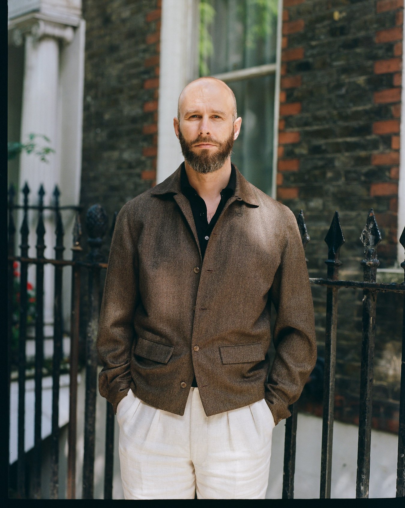
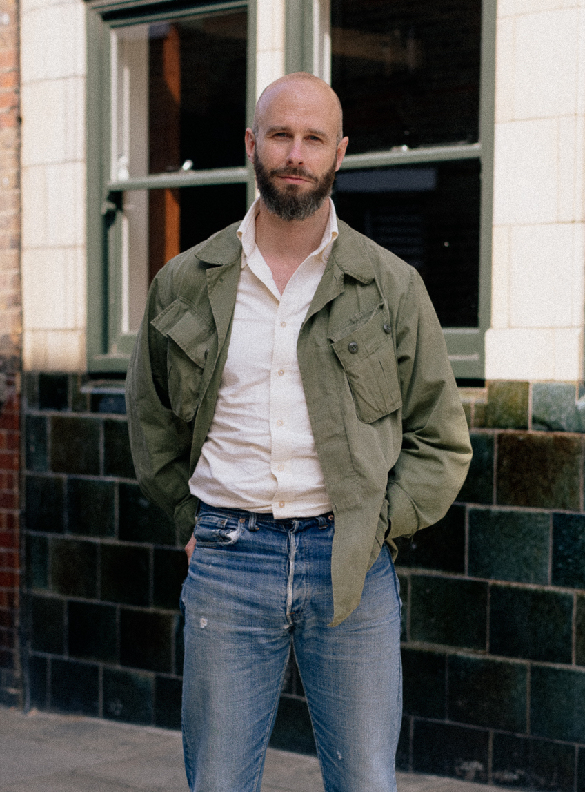
This might be our last piece on summer clothing this year, and I wanted to use it to talk about one of my most useful pieces of the last few months - this vintage ‘jungle jacket’.
I bought it two years ago, at the now sadly closed Vintage Showroom in London. They were popular then, and have only become more so since - Drake’s released its version earlier this year.
But something I find the new versions can't achieve is the lightness of the originals. That rip-stop cotton was made for tropical climates, and it’s as light as a linen overshirt, perhaps even more so.
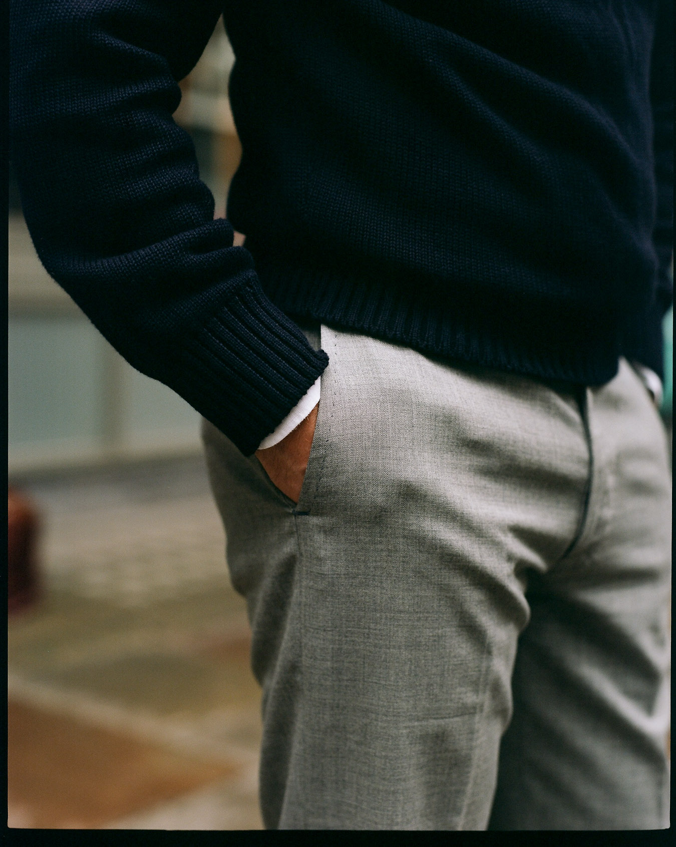
As a result, it became my default outer layer for casual combinations this summer, such as a T-shirt and workwear chinos at the weekend (example here). Or jeans. Or shorts.
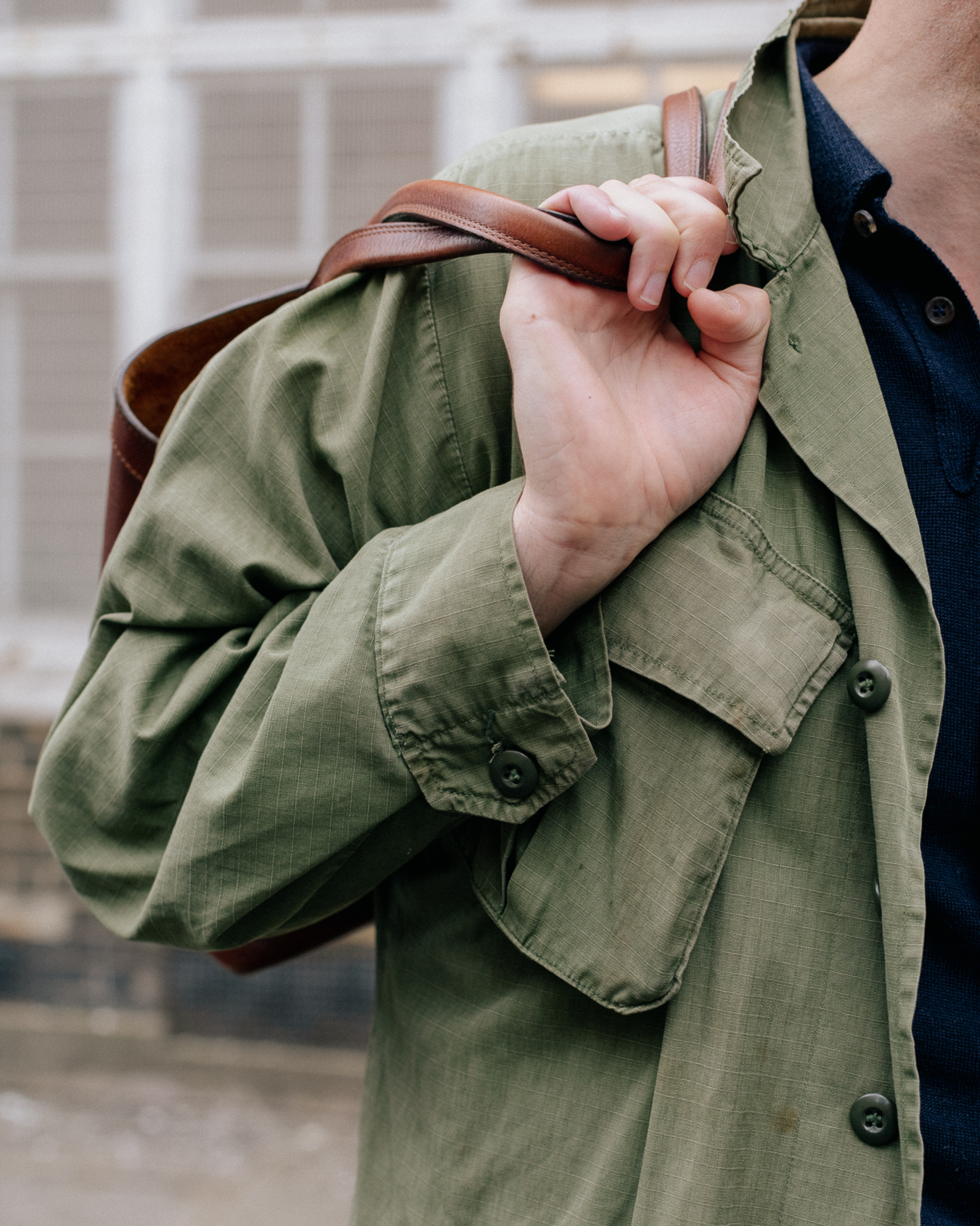
It has all the pockets you need - which is often the reason for wearing an extra layer in the summer - but is so light you almost don’t notice you’re wearing it.
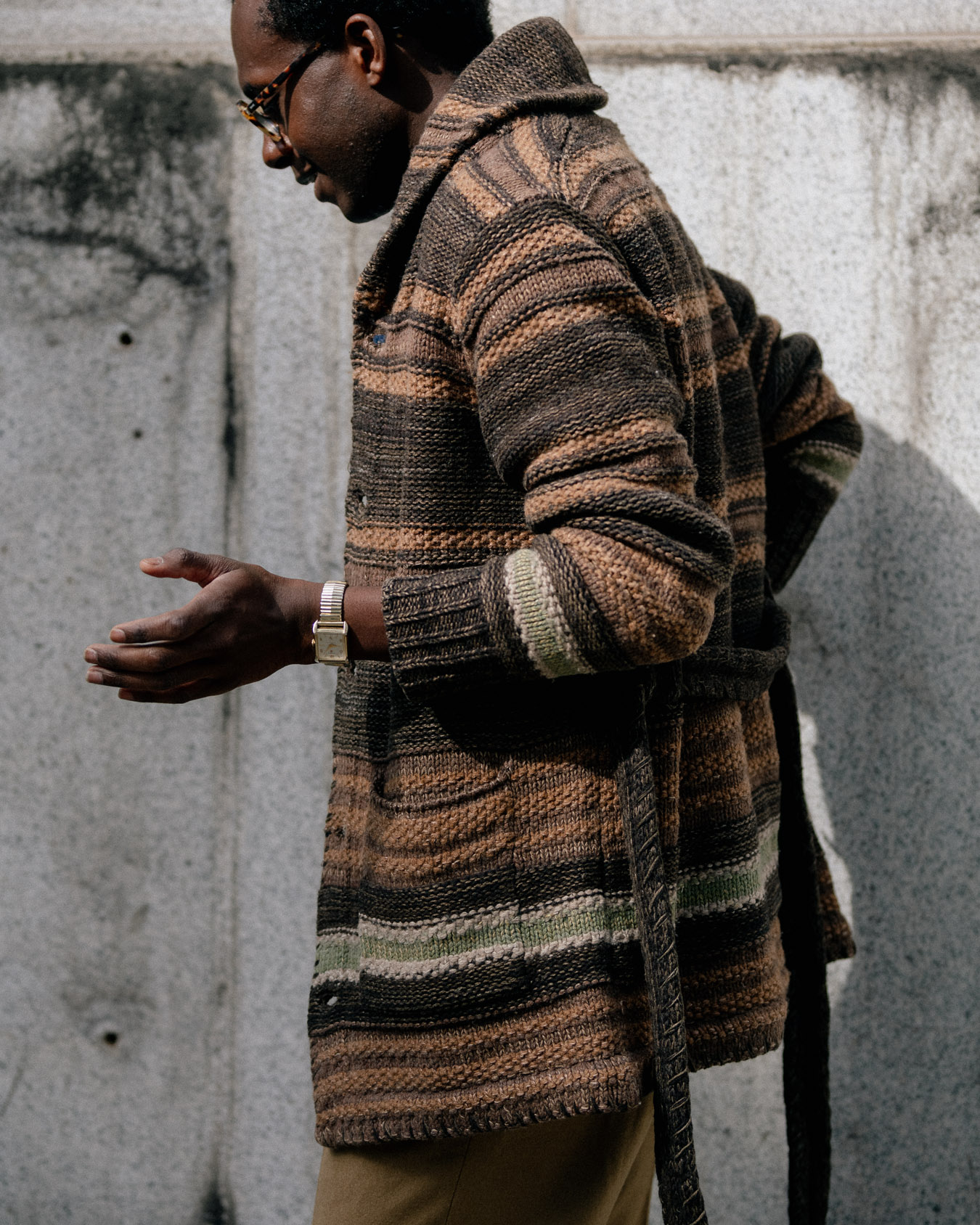
It helps that vintage versions have been washed and worn countless times, making them softer and perhaps even lighter too.
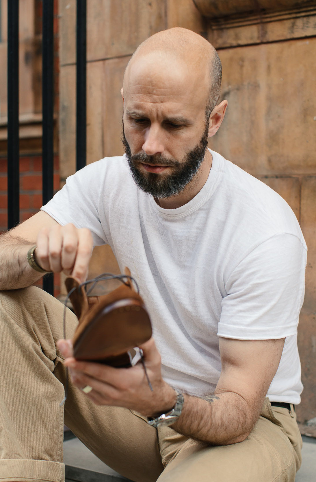
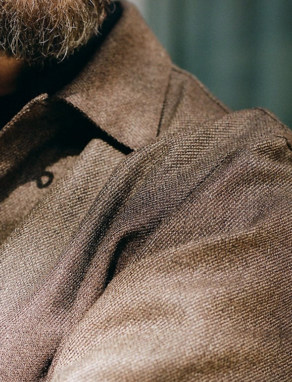
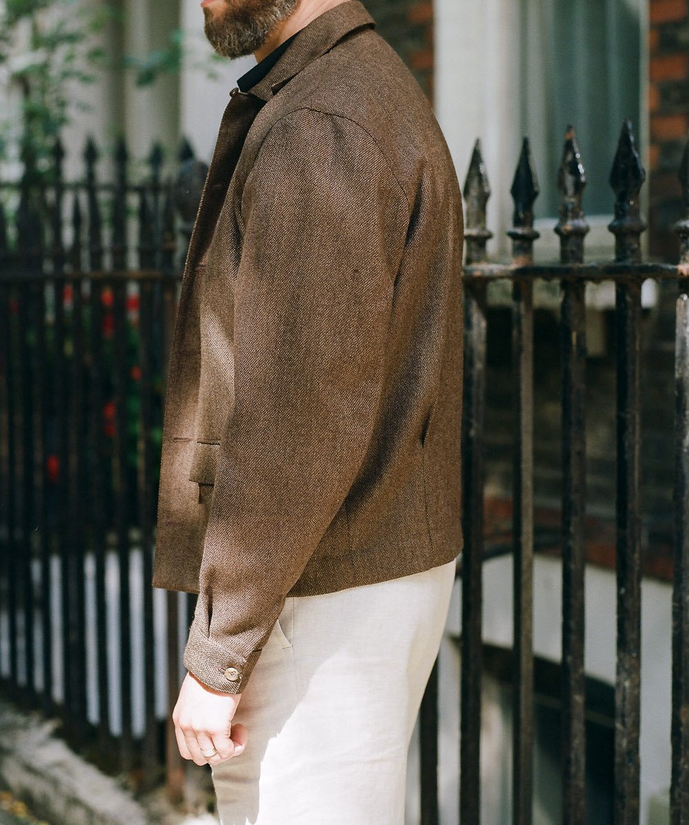
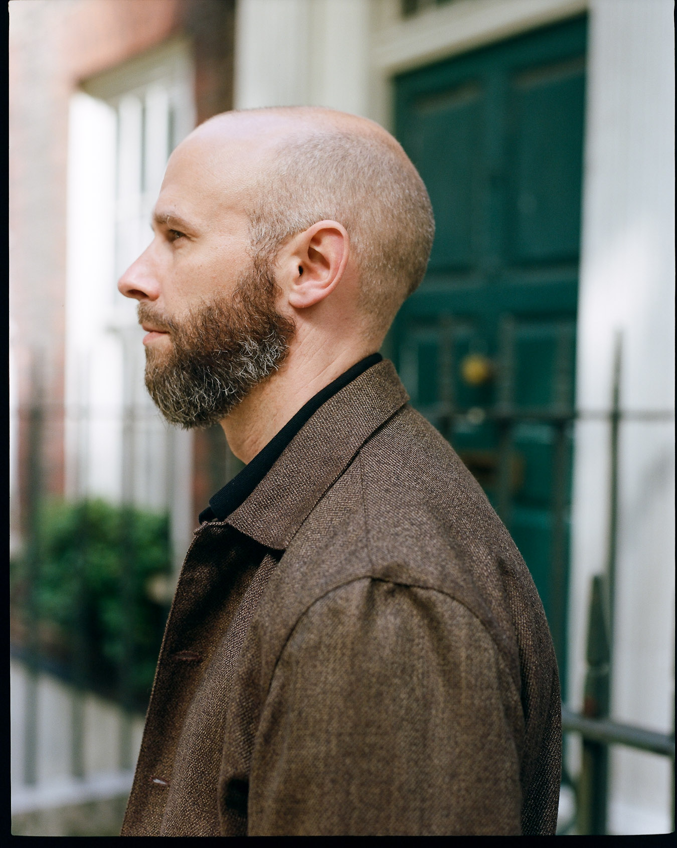
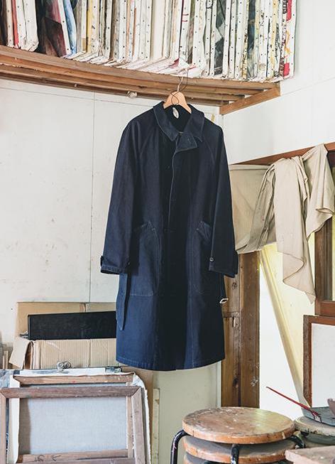
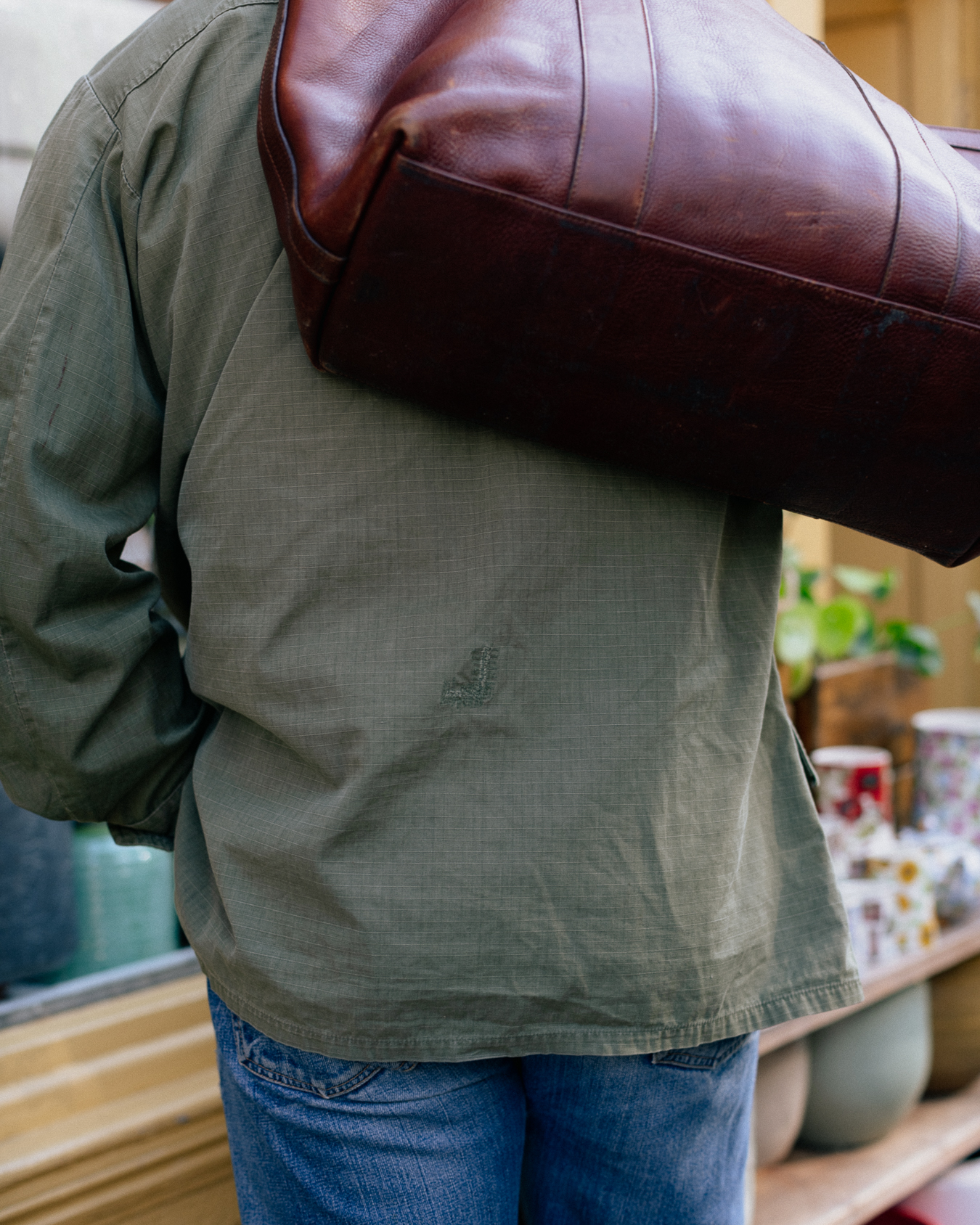
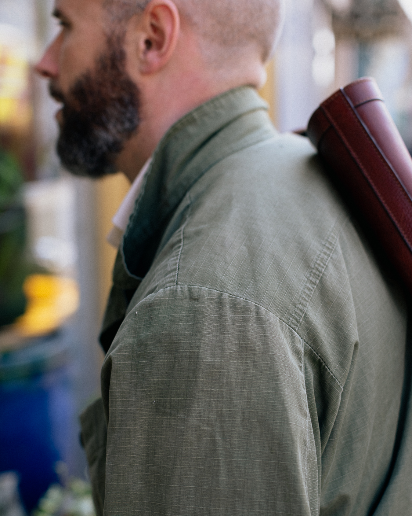
Then there’s the normal pleasures of a vintage piece, like the natural fading at the hems and seams, and the little repairs where the jacket has been caught or worn through. You can see one on the back of my jacket in the picture above.
In many ways, the jungle jacket is the summer equivalent of the M-65 field jacket, which has become so popular with menswear fans over the years. It is the same versatile pale-olive colour, and is just as effective at adding a touch of high/low dressing to an otherwise smart outfit.
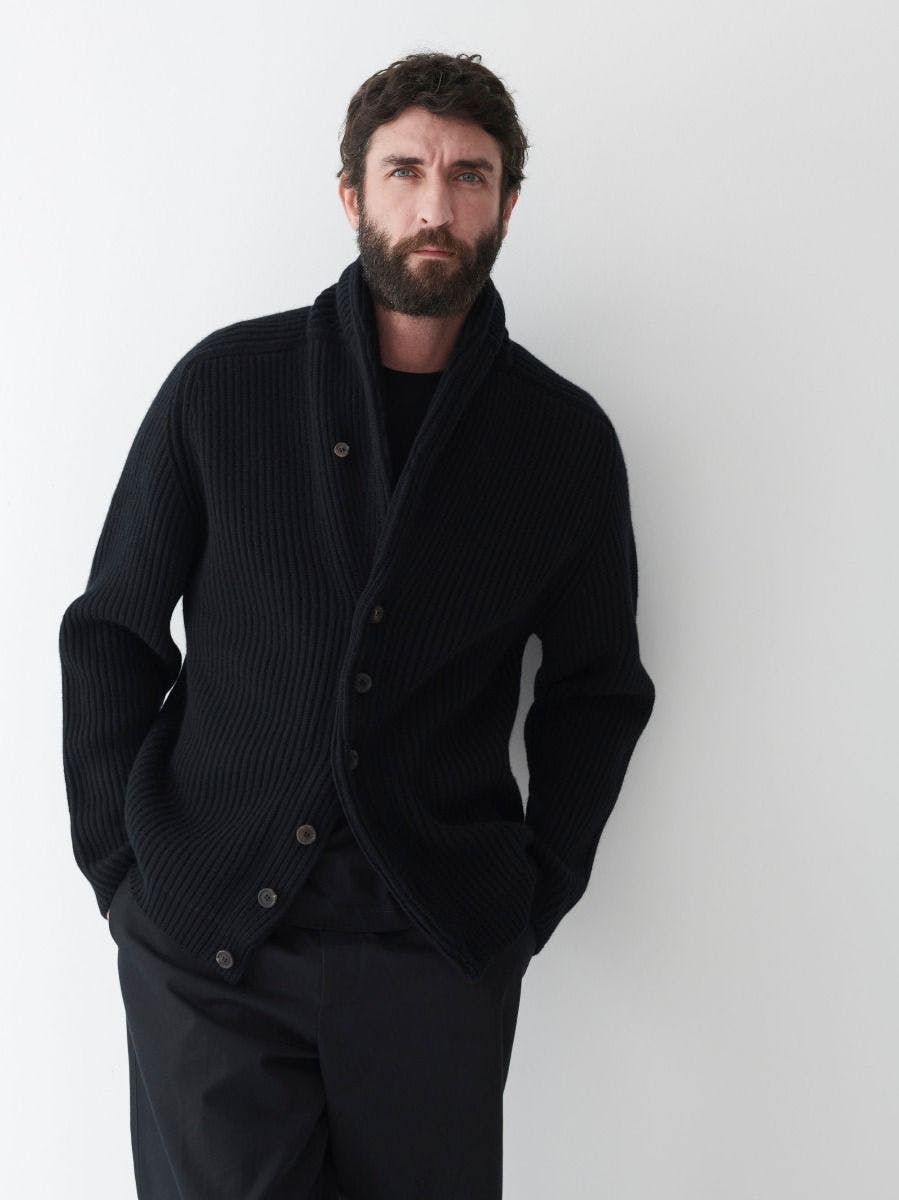
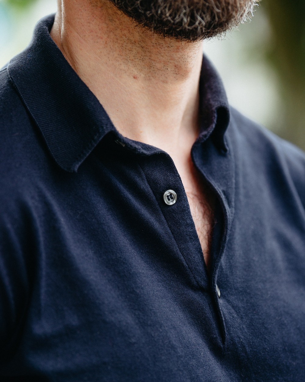
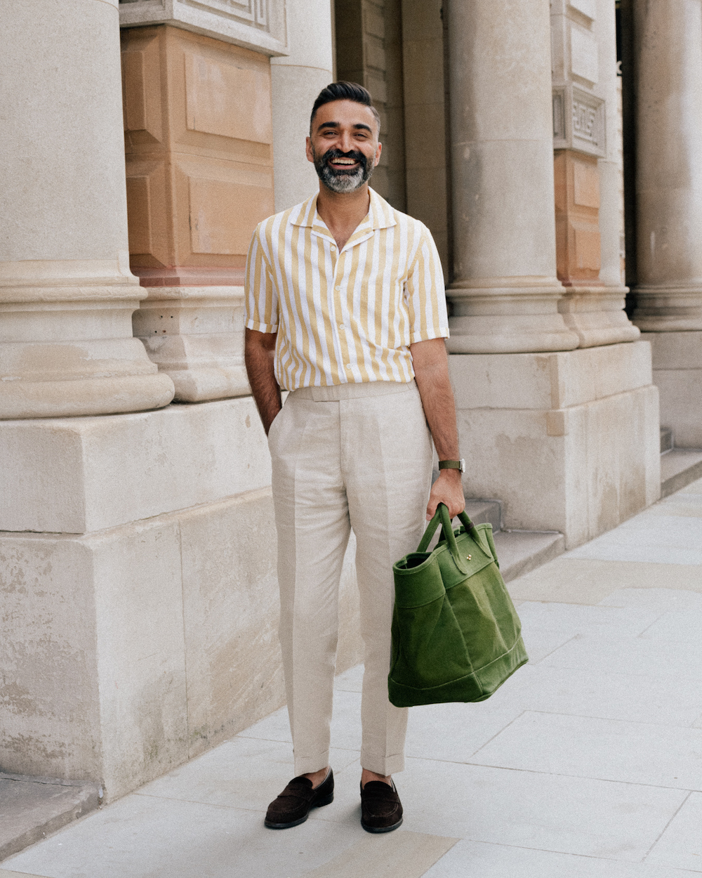
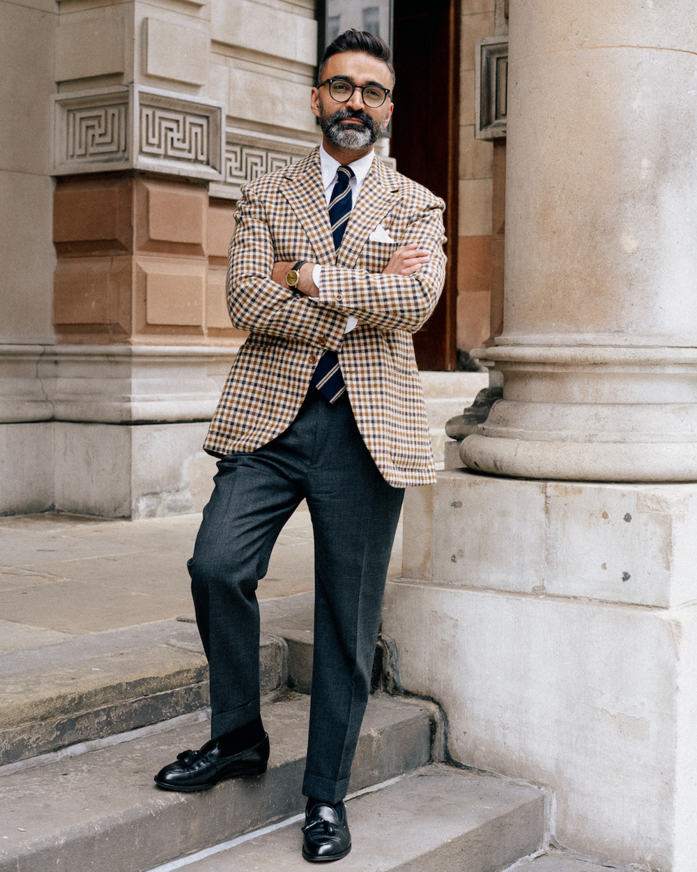
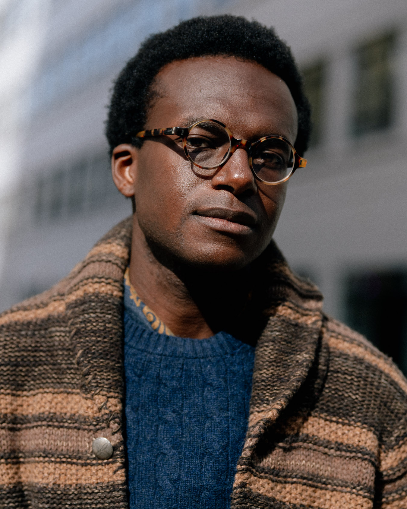
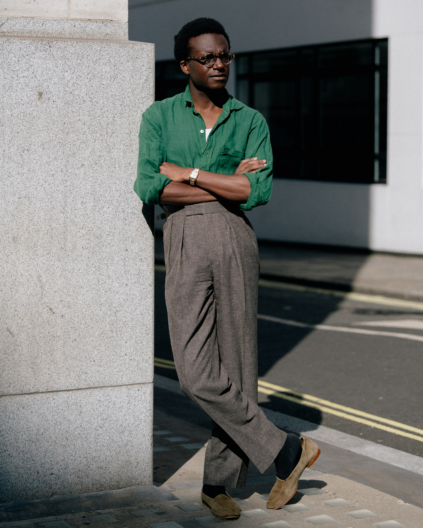
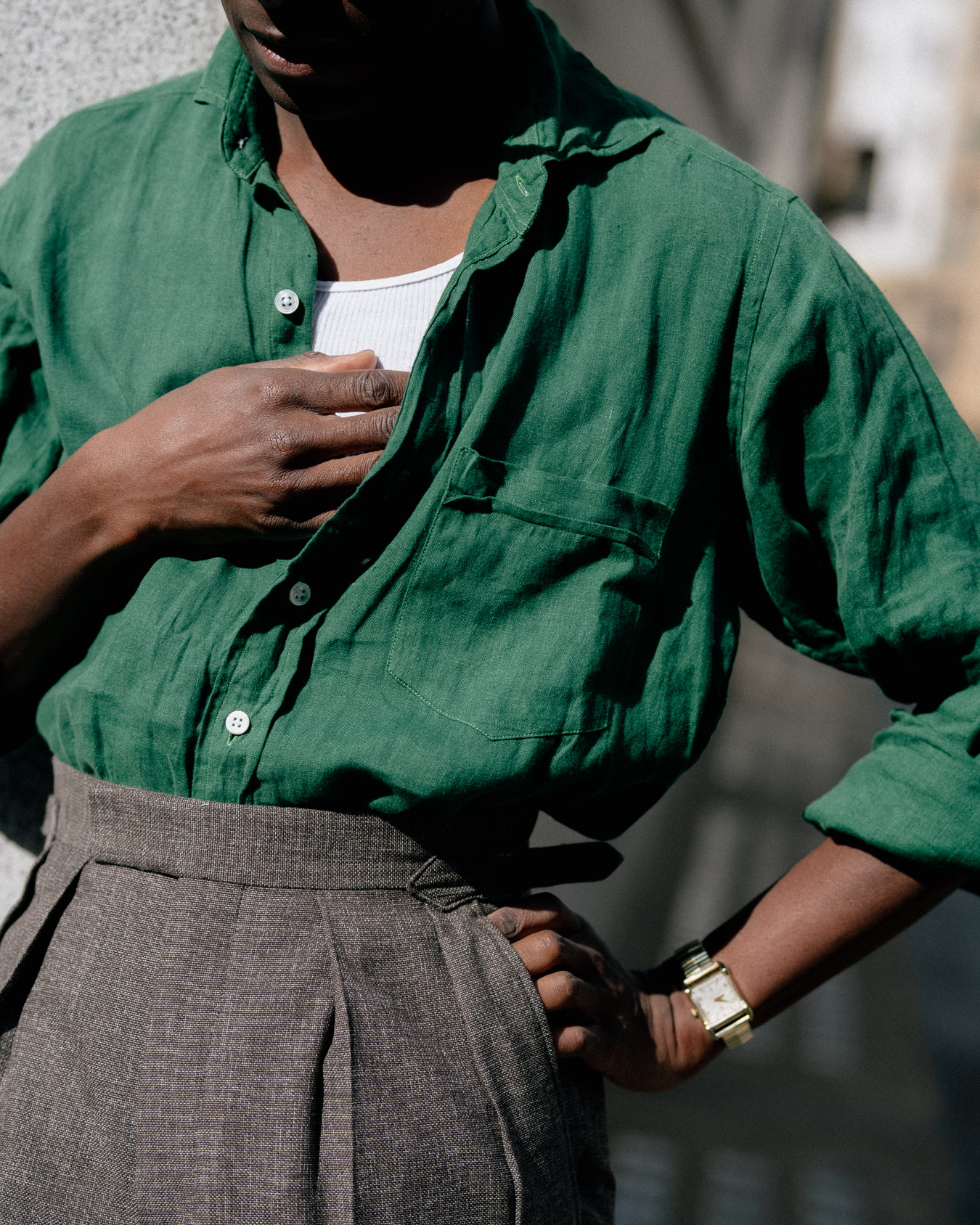
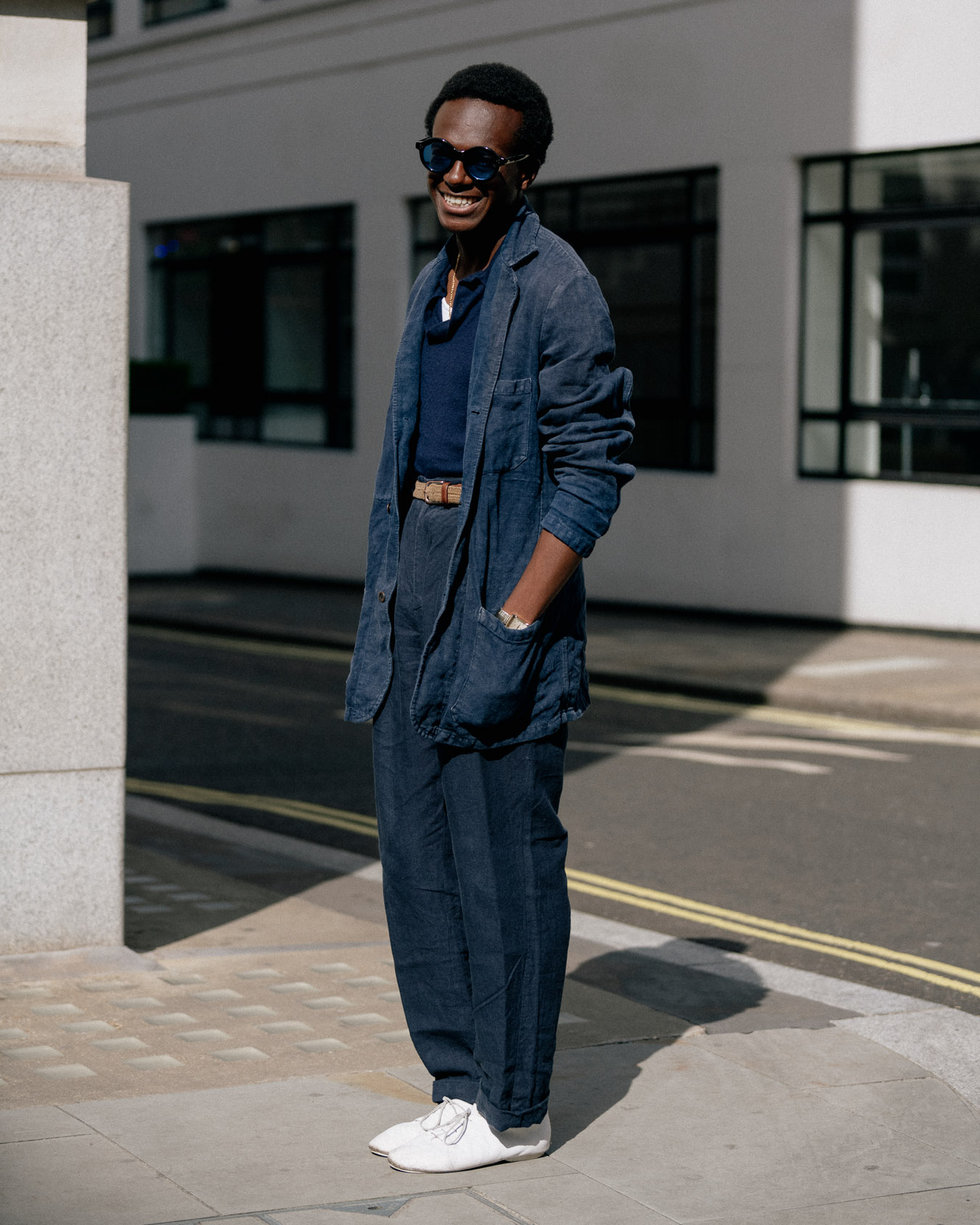
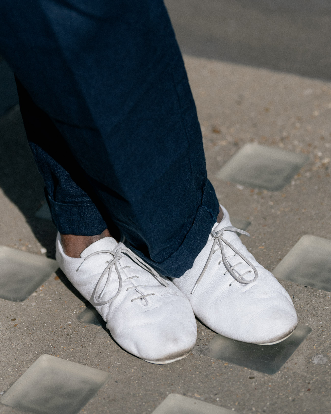
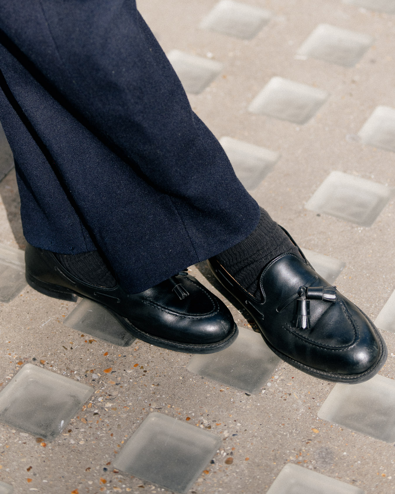
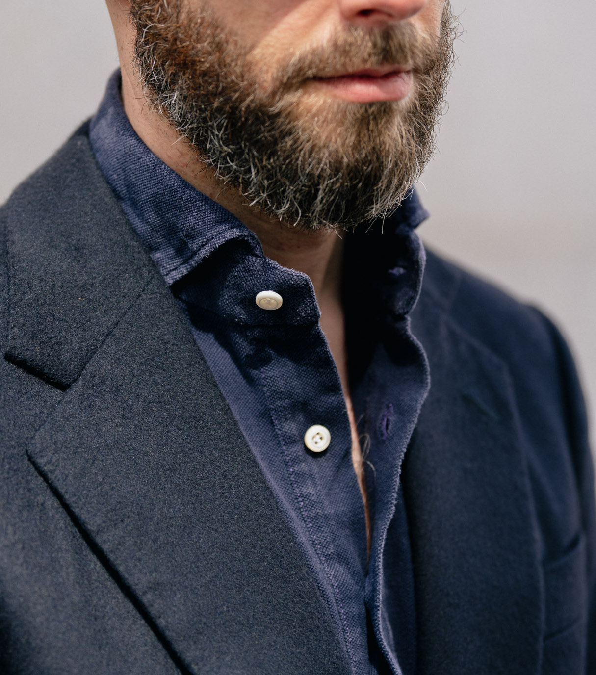
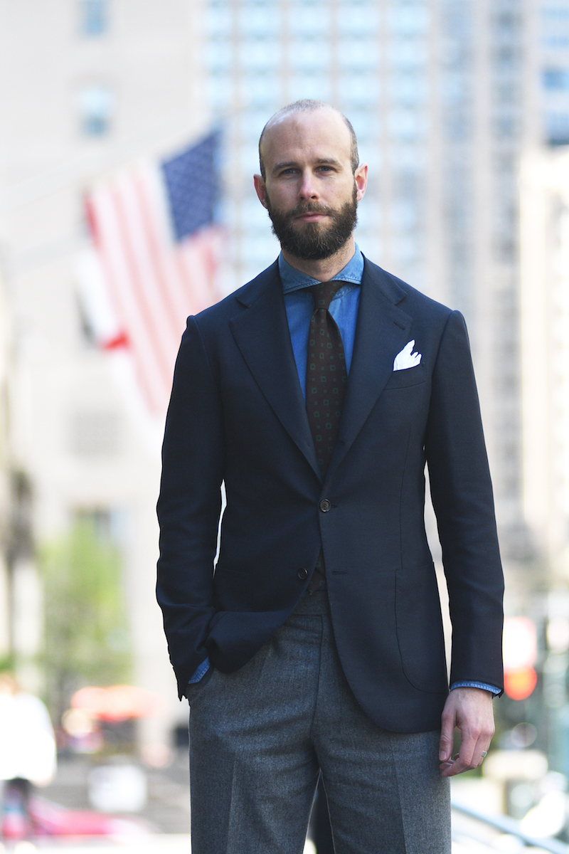
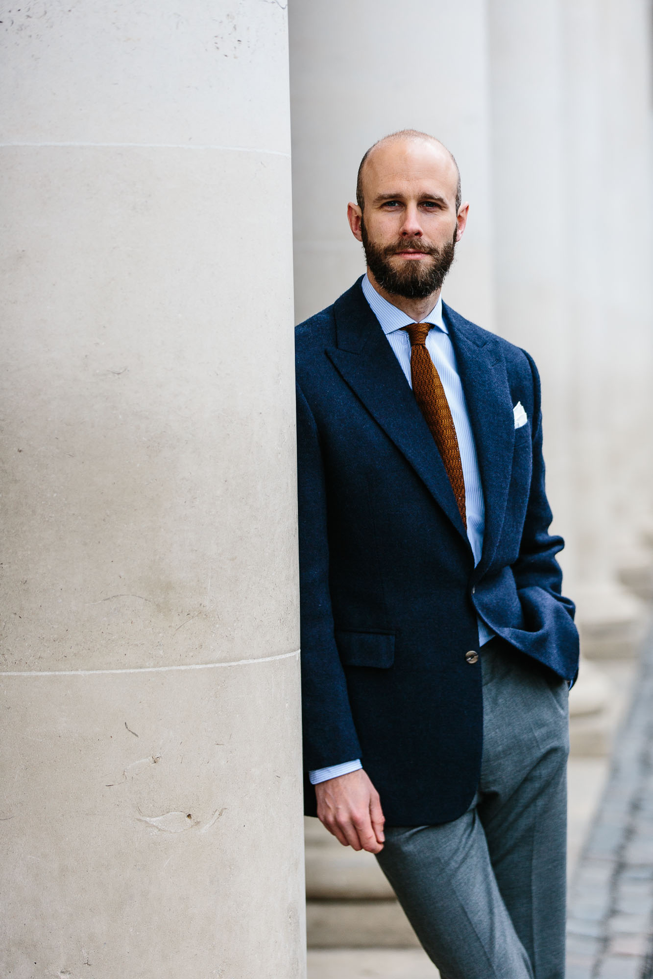
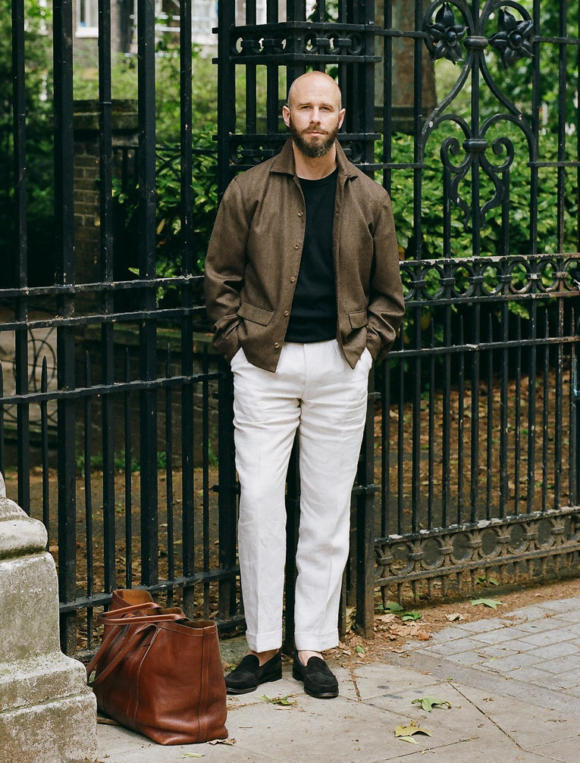
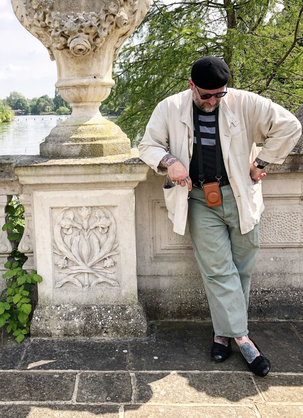
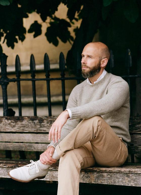
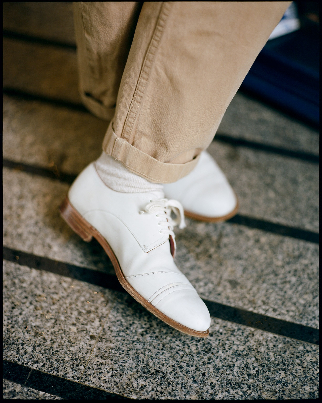
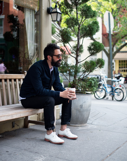
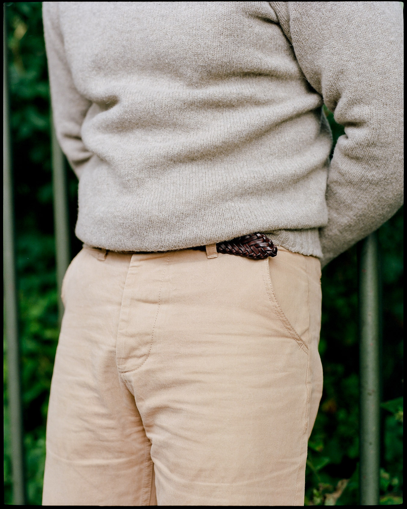
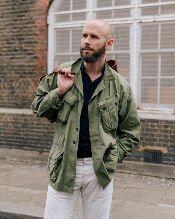
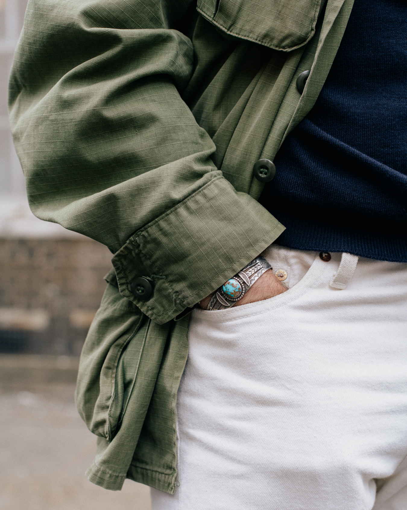
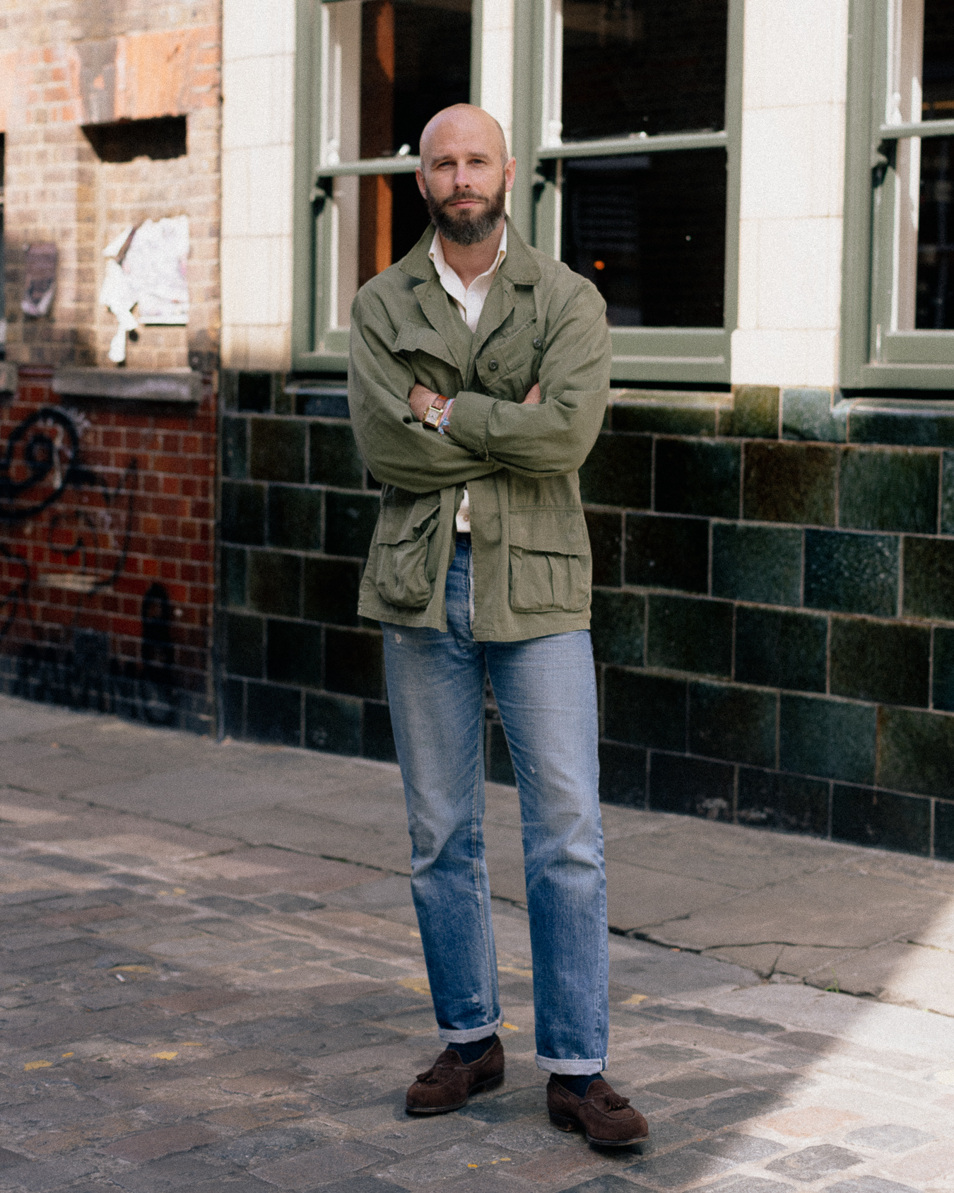
I’ve shot it with two outfits here, and the one shown at top is a deliberately smart colour combination: navy knitted polo, white jeans, brown-suede loafers. The same colours would work just as well with more formal materials too, such as cream flannels, a blue oxford shirt, and a navy cashmere knit.
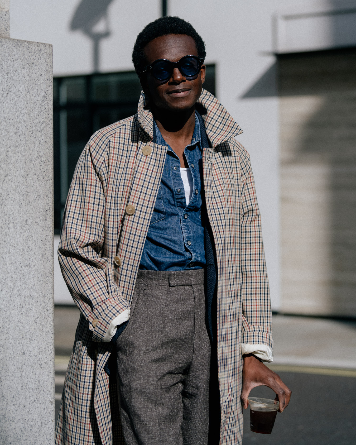
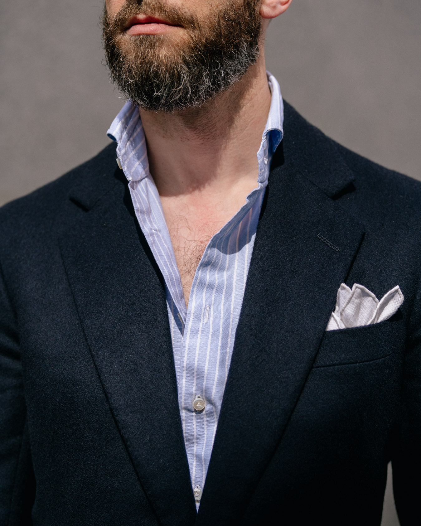
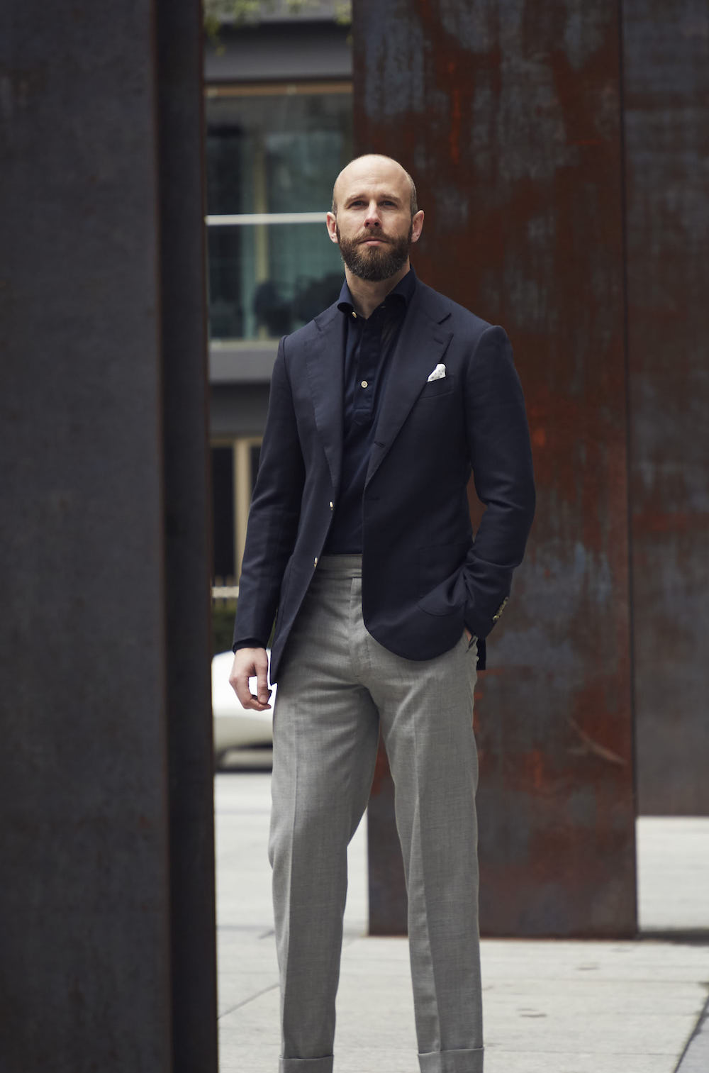
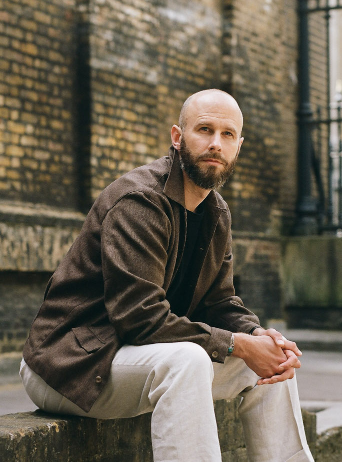
The second outfit, meanwhile, shows how nice it is with denim and with colour. It can look work with much stronger colours than that PS Yellow Oxford as well.
Of course, the M-65 is not that warm, being just two layers of cotton. But when you combine it with the fur lining I had made a couple of years ago, it gives you three casual outer layers - jungle jacket, unlined M-65, lined M-65 - that cover most of the year.
The only obvious disadvantage of the jungle jacket here is that you can’t cinch the waist, which I always felt was one reason sartorial dressers particularly took to the M-65.
It meant you could mimic the waisted shape of a tailored jacket, and buy a fairly big size to fit over a jacket’s shoulders without it being too shapeless elsewhere.
But then, the jungle jacket is a summer piece, where the main consideration is coolness rather than shape, and you're less likely to be wearing it over anything else.
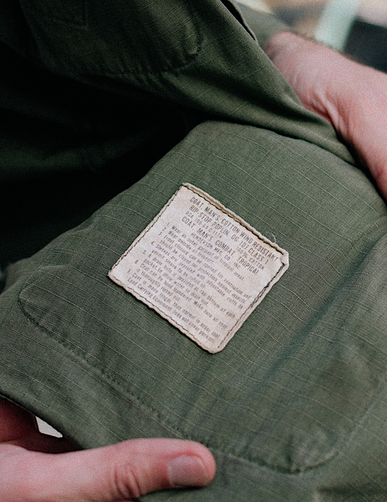
There were three different versions of the jungle jacket made by the US, from the early sixties into the seventies. But we’re not vintage collectors here on PS - we don’t care which is rarer, the version with the slanted chest pockets or the straight ones.
We care more about which looks good, which is most useful, and what the fit is like. On that score, it's worth noting that the third iteration was made in a plain cotton poplin rather than the ripstop. You can see the differences on the Broadway & Sons website - they have a ripstop here and a poplin here.
I personally prefer the ripstop (below), because it feels a touch lighter and I like the texture, but it’s not a big difference.
In terms of sizing, my advice would be to avoid the Large, which is so long that even friends that are taller than me (so over 6’1’’) find it too long.
The jacket was designed to cover the seat and then some, with the option of a belt between the two sets of pockets - as a lot of military jackets have been over time. But those proportions look odd today.
Mine is a Medium Regular, which has a perfect length. There is a slight compromise on the sleeve, which would ideally be an inch longer, but it’s a small point on vintage, which is often so hard to size right. Plus I often push the sleeves up in warm weather.
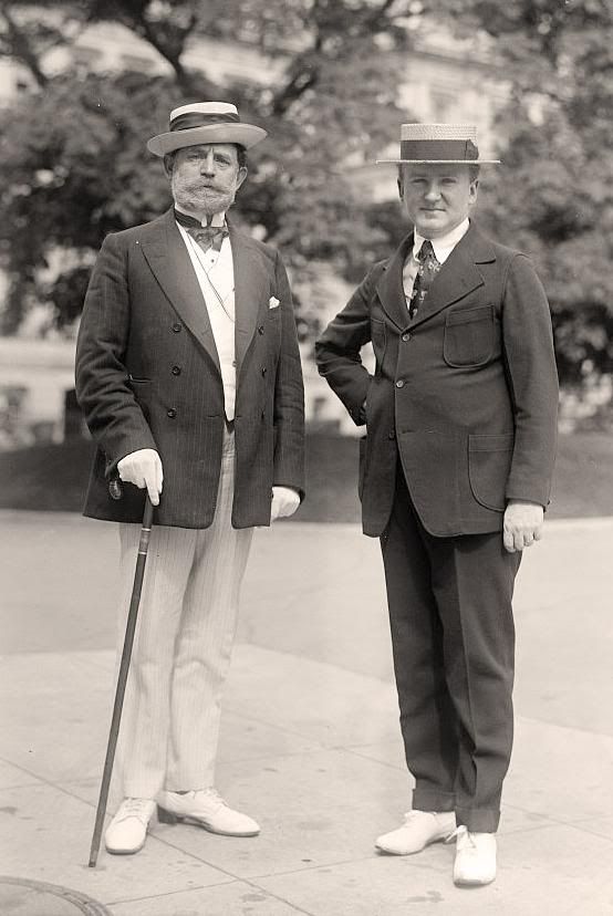
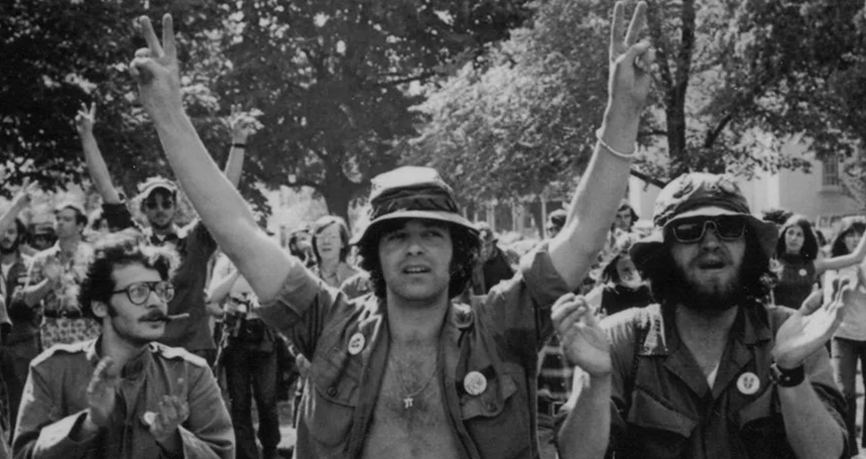
Also, note that the shirt from the OG-107 US fatigues is sometimes referred to as a jungle jacket. This is a different style, having just two pockets on the chest and mostly worn tucked into the matching trousers. It’s still nice, but more of an overshirt.
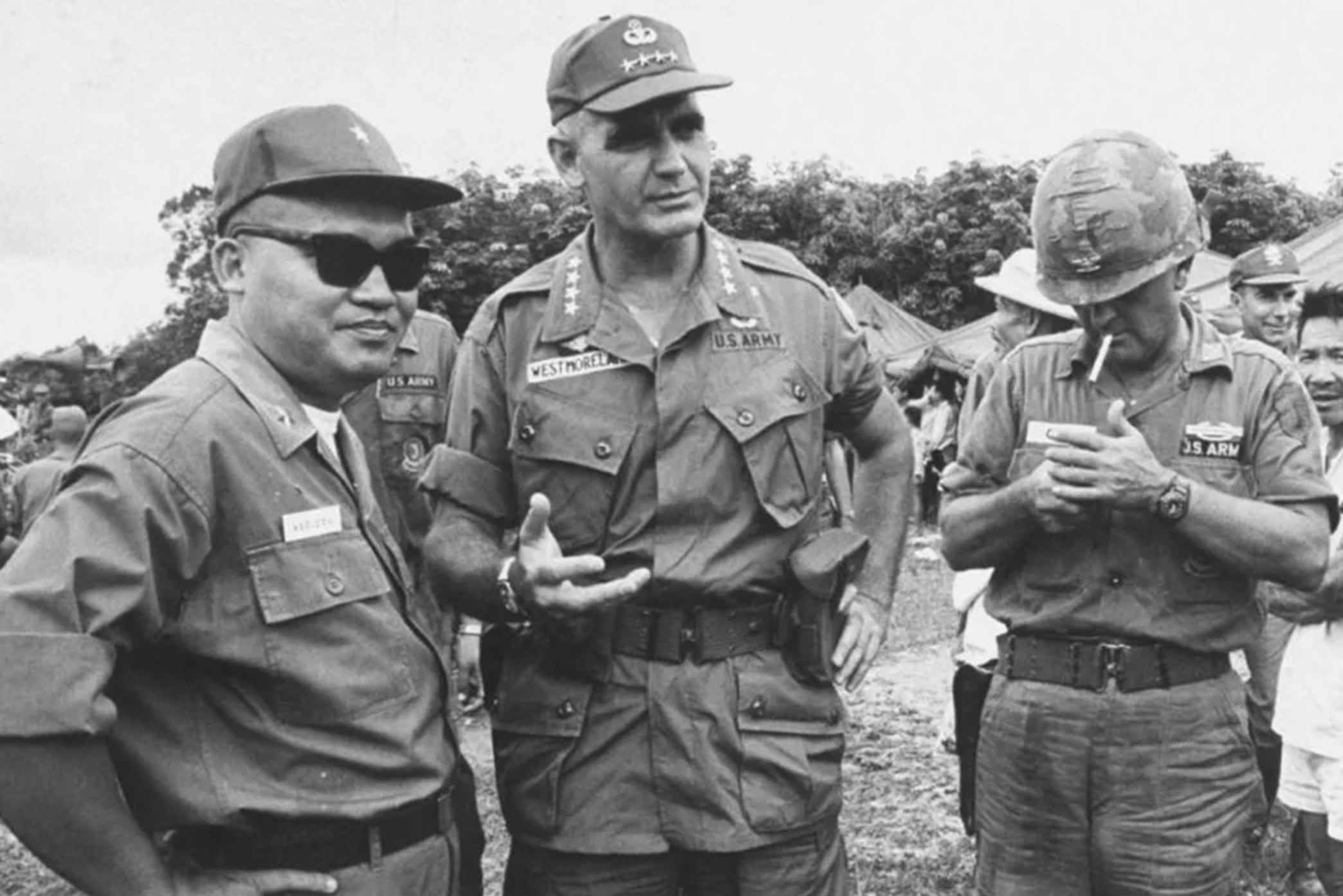
Below, it is worn on the soldiers on the left and right, while General Westmoreland in the middle wears the four-pocketed jungle jacket.
The shirt varieties were also those most associated with protests against the Vietnam War, and John Lennon in particular (second image below). This probably gives them the most countercultural feel, but still, the jungle jacket and the field jacket still have a bit of that.
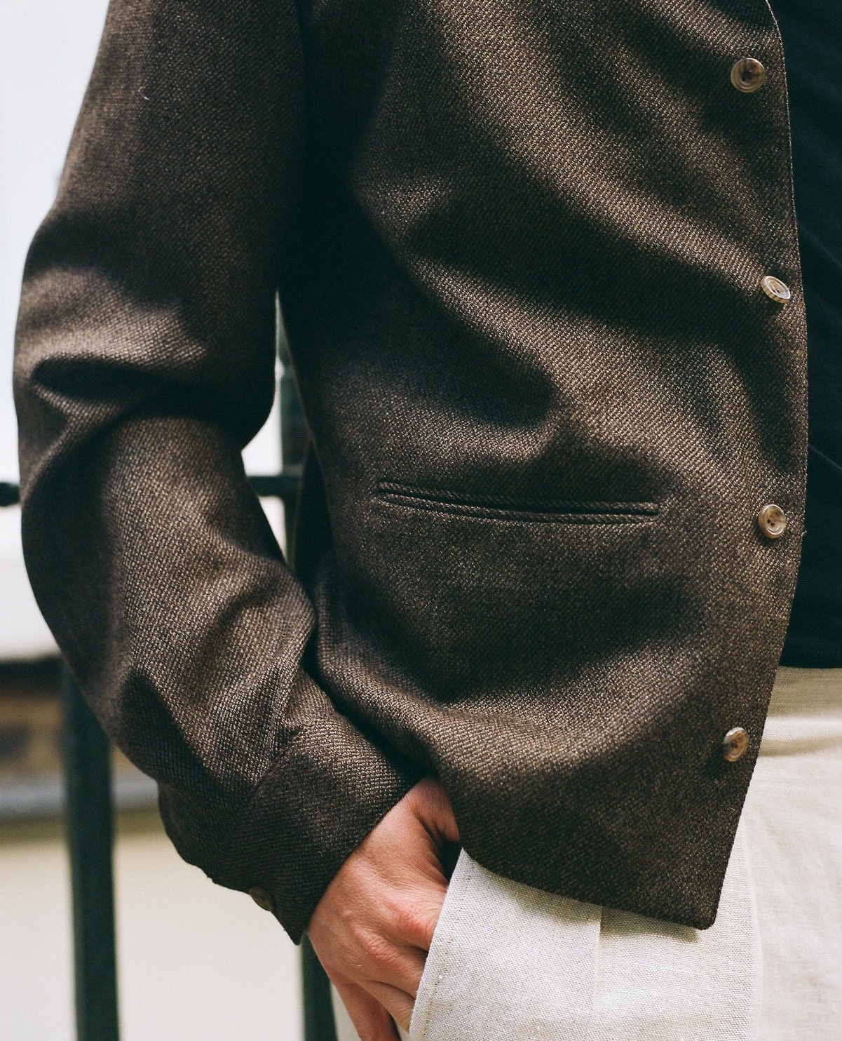
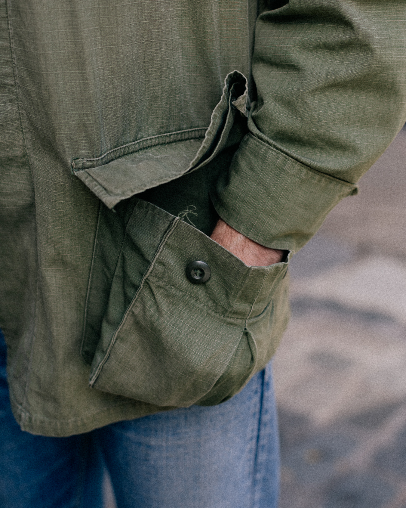
One of the few annoying aspects of the jungle jacket is that the hip pockets are extravagantly bellowed, in order to fit in as much as possible (see below). This can make the jacket a little ungainly if those are used and left unbuttoned.
In fact, I find this is one of the main issues of modern reproductions, which often keep that sizing of the pockets, but in a new and heavier material that means they look especially bulky.
I tend to keep my hip pockets partly buttoned as a result. But that still means they're usable - in fact, I was wearing it so much over the summer that I developed a habit of using each pocket for a particular thing.
My phone went in the top-left pocket, with one button closed so it wouldn’t slip out when I bent over; wallet went in the top right, with no need to button at all as it is so light; my face mask went in the bottom left, with one button closed for easier access; and keys were in the bottom right, with both buttons fastened to avoid any chance of them slipping out and hold the weight better.
I’m sure that kind of organisation will please the geeks/obsessives out there. I’m rarely that systematic, but I did notice it was the one time I never forgot the leave the house without something!
The volume of jungle jackets originally made means they’re not hard to find - it’s often particular sizes that can be tricky, or if you want just one of the iterations.
They’re also not expensive. I saw a few when I was at Hang-Up Vintage recently, all priced at £95, though the website only shows a deadstock poplin one for £155. The ones at Broadway & Sons noted earlier are €199 and €149.
There are camouflage versions too, but I don’t like camo as much. It’s very subjective, but camo for me is more obviously military, without the countercultural associations of the plain OG. It feels more towards glorifying warfare.
In fact, that can be an issue with names and badges on a lot of vintage military clothing. But that’s probably a debate for another day.
Clothes shown:
- Vintage jungle jacket from the Vintage Showroom, Medium Regular
- Colhay’s navy tennis polo, size 40
- White bespoke jeans, Levi’s
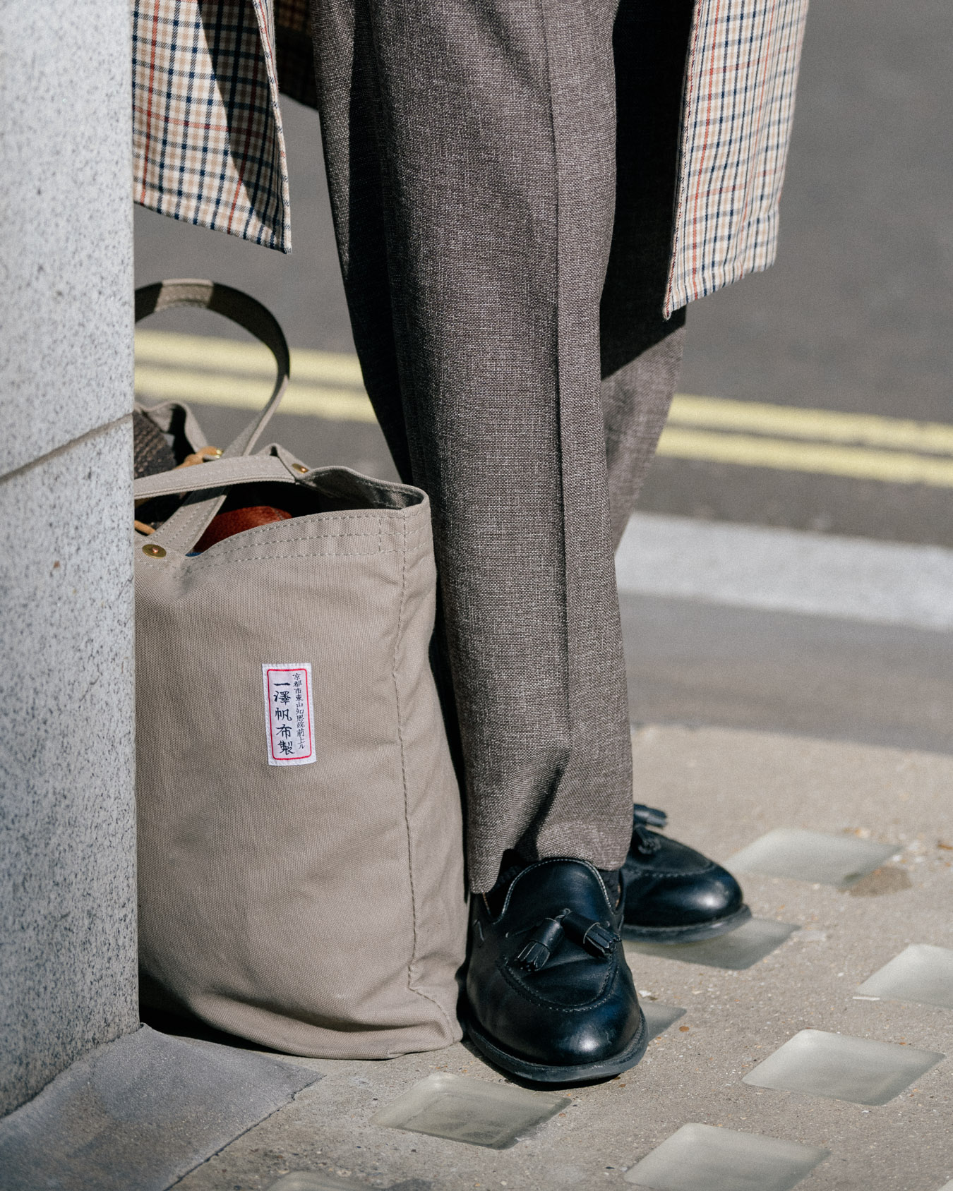
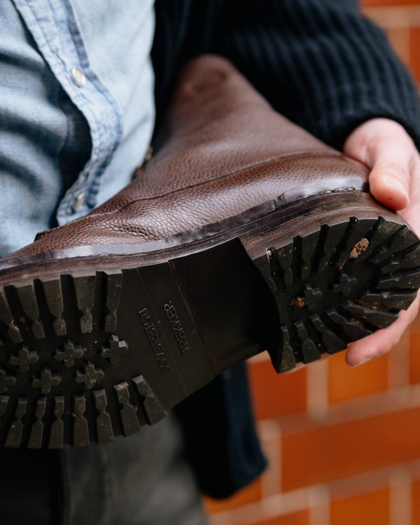
- Brown-suede Belgravia loafers, Edward Green
- Frank Clegg large working tote, in chestnut
- Yellow PS Oxford shirt, size Medium
- Vintage 501 Levi’s
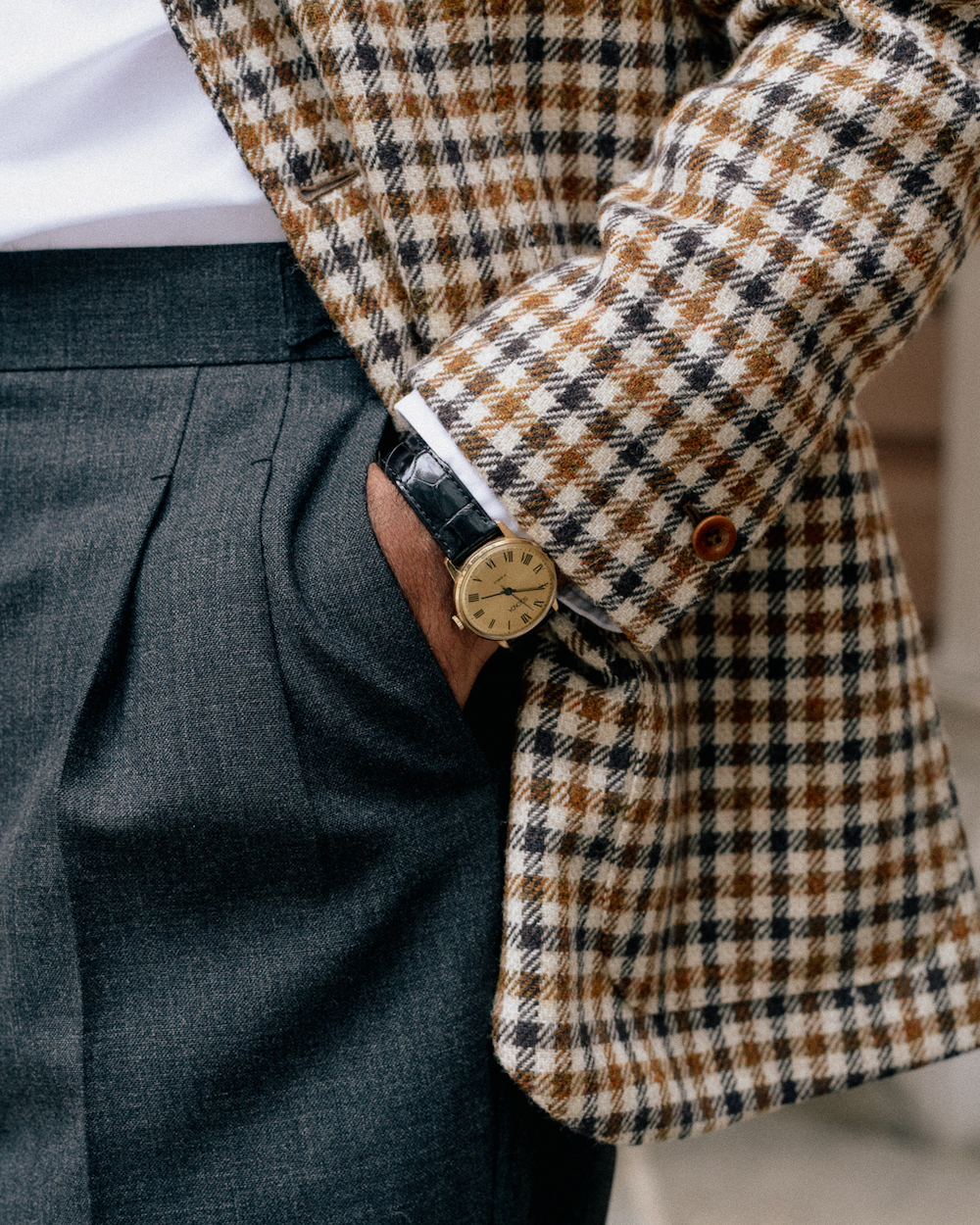
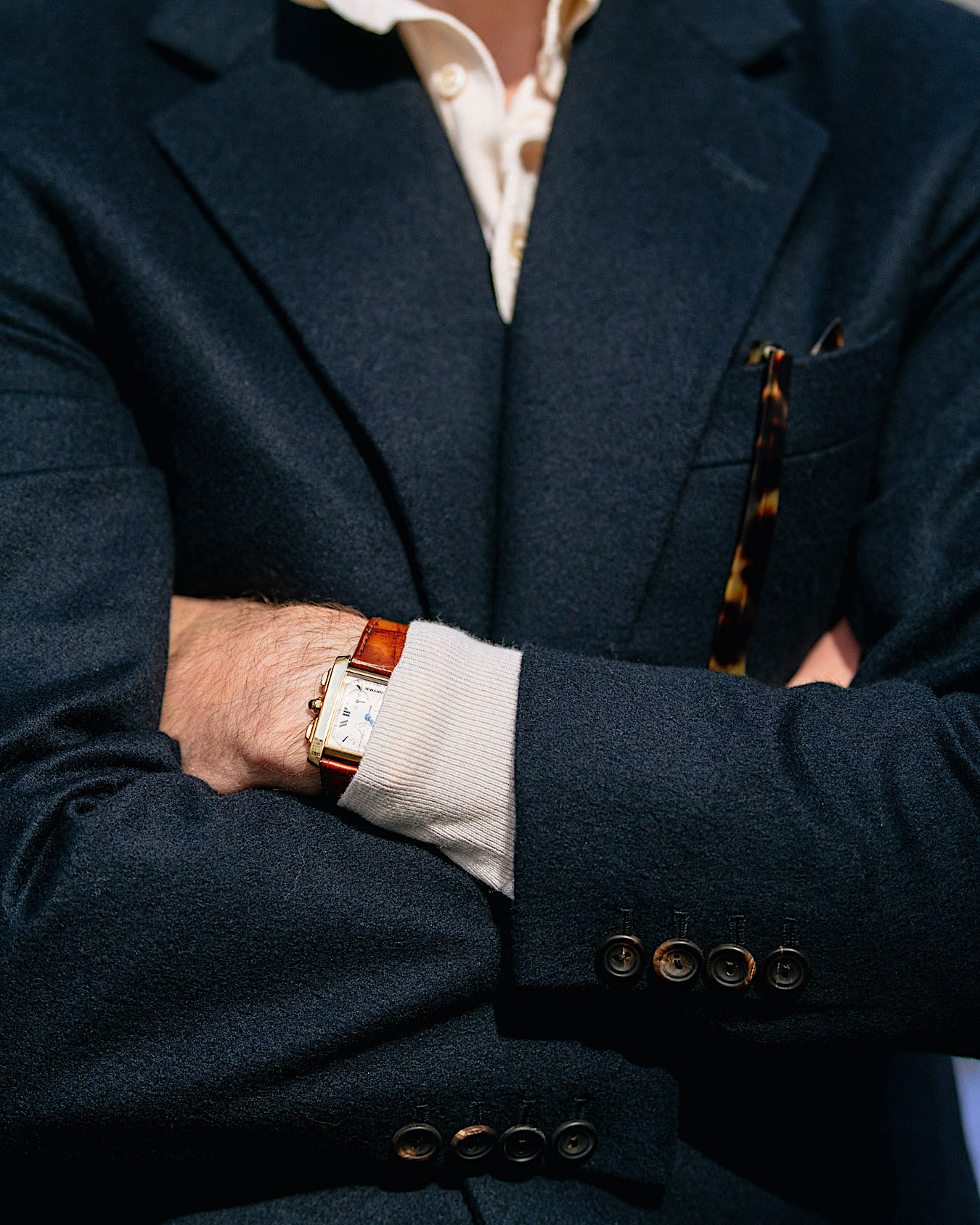
- Cartier Chronoflex Tank watch, with patina alligator strap
Photography: Alex Natt @adnatt