The Guide to Tweed

The Guide to Tweed

Share
Monday, April 2nd 2018
||- Begin Content -||

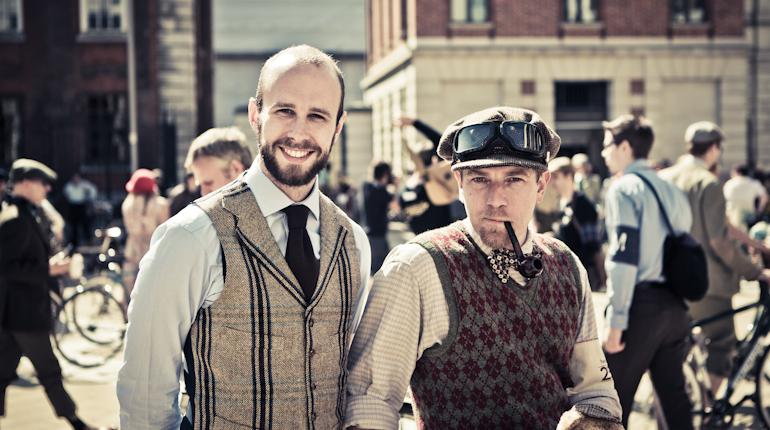
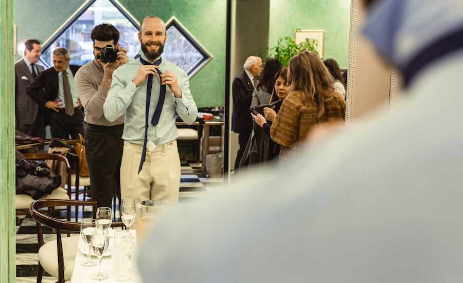
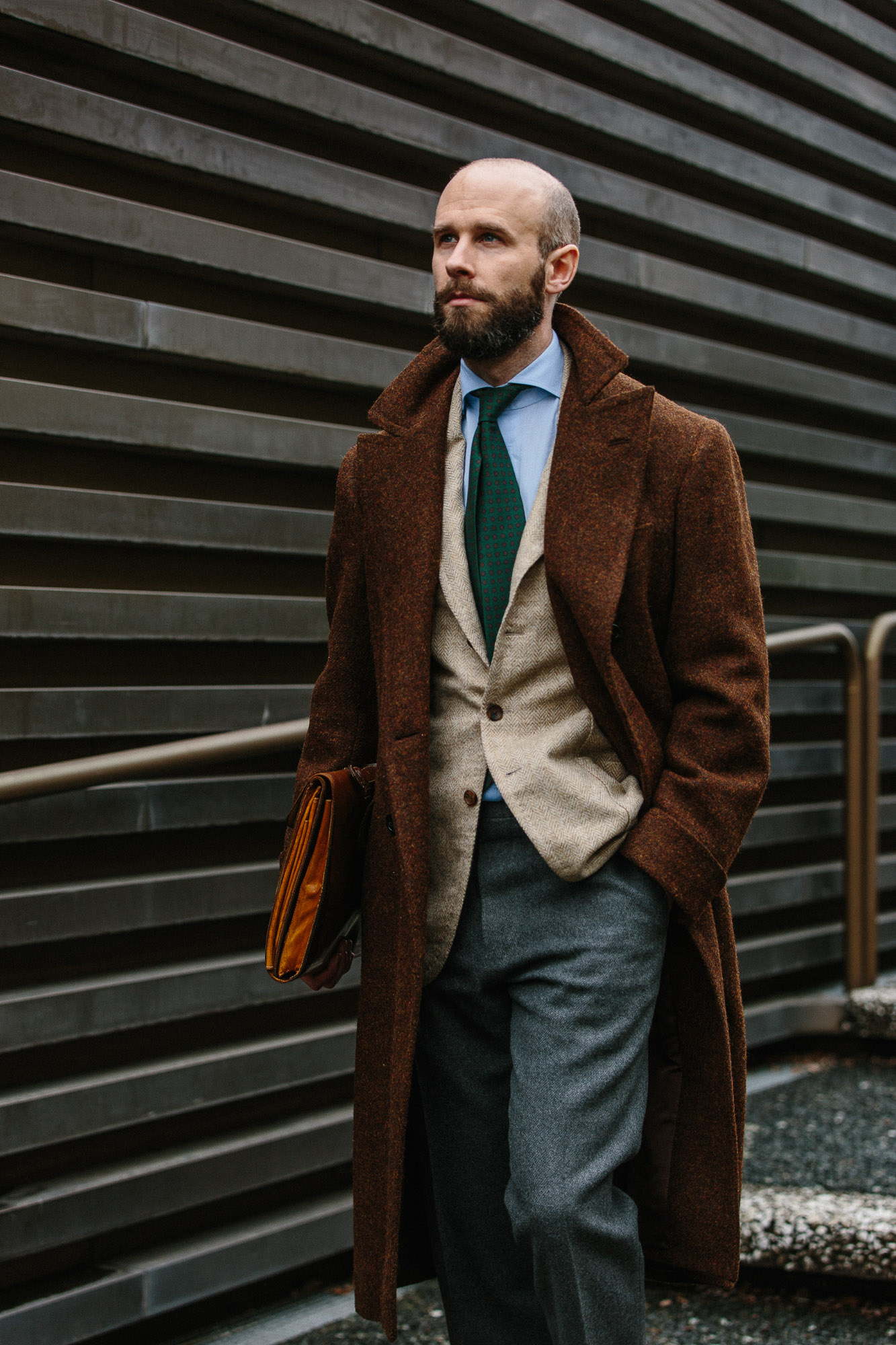
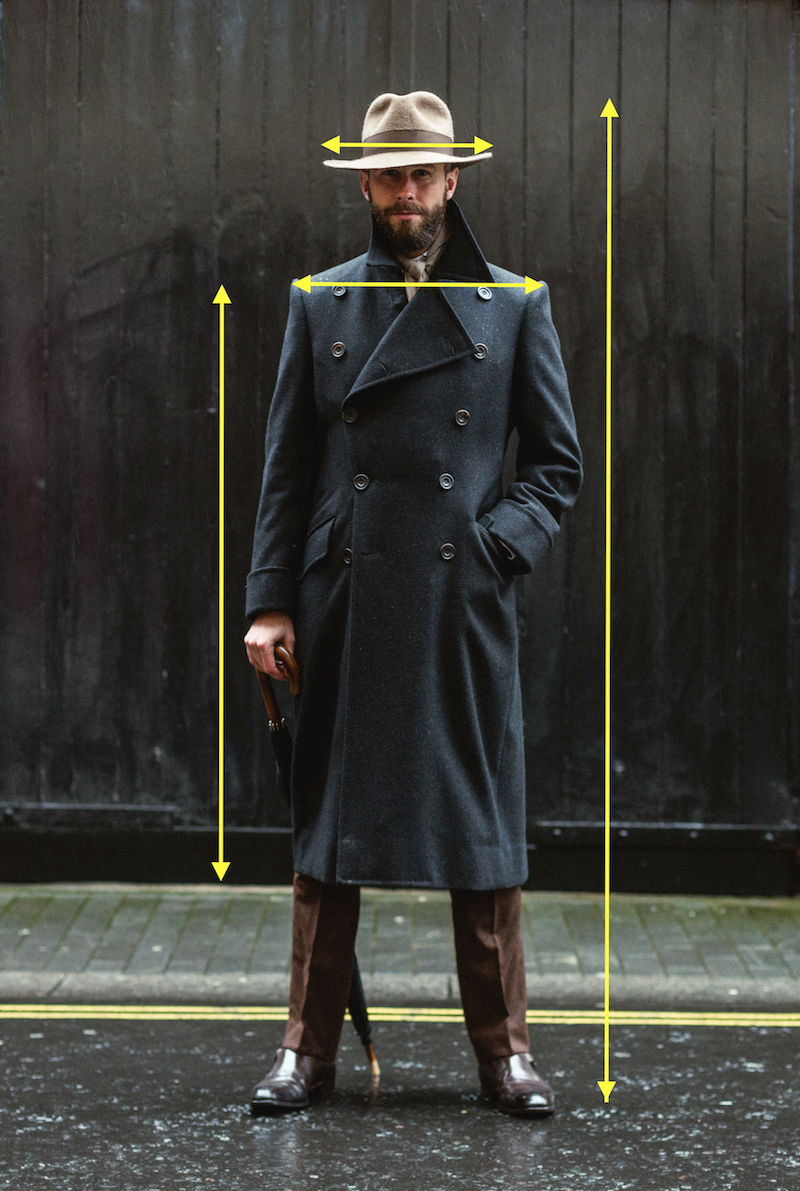
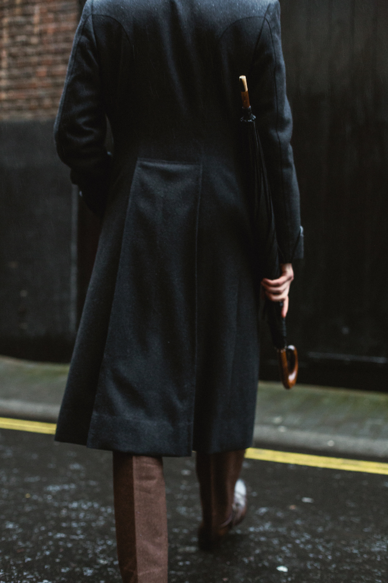
In many ways, tweed should be the perfect material for a modern man. It is practical, hard wearing, and can be dressed up or down, from almost-formal to definitely-casual.

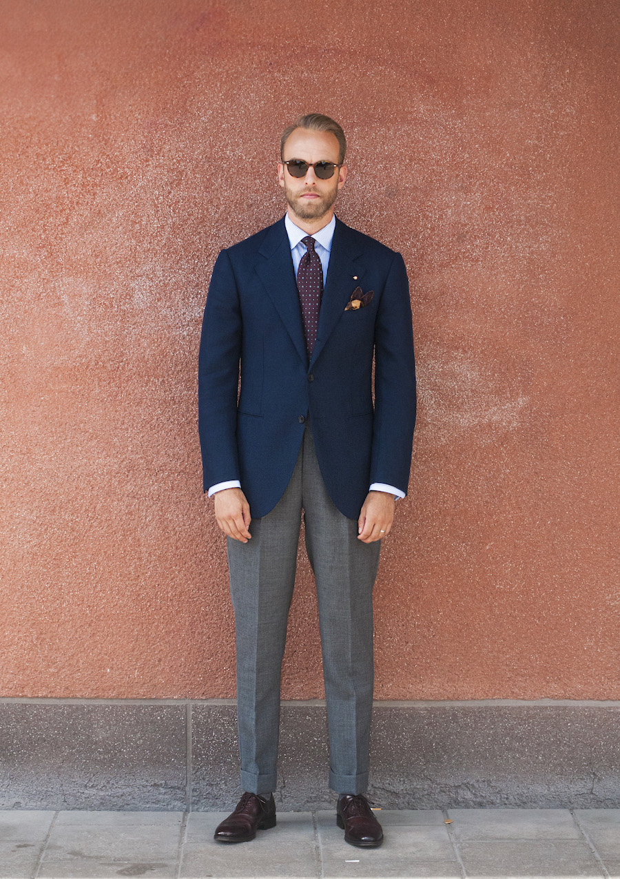
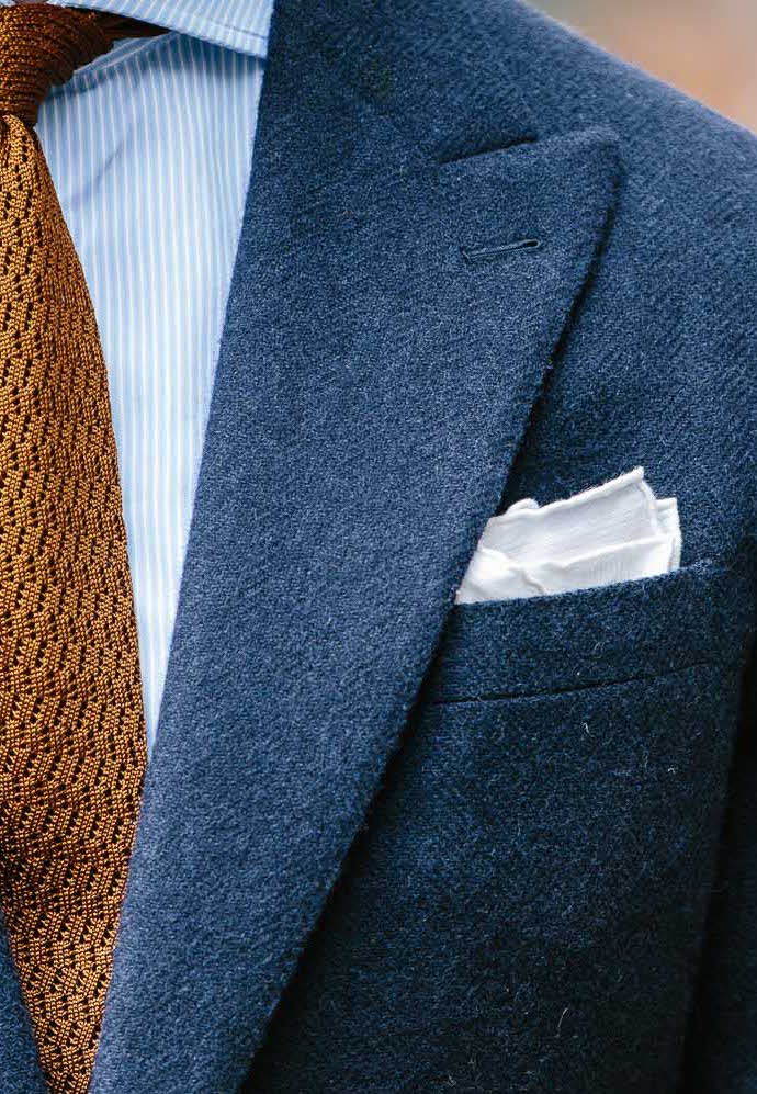
On the formal side, a navy tweed jacket, grey worsted trousers and button-down shirt is the smartest dress most men outside professional offices require.

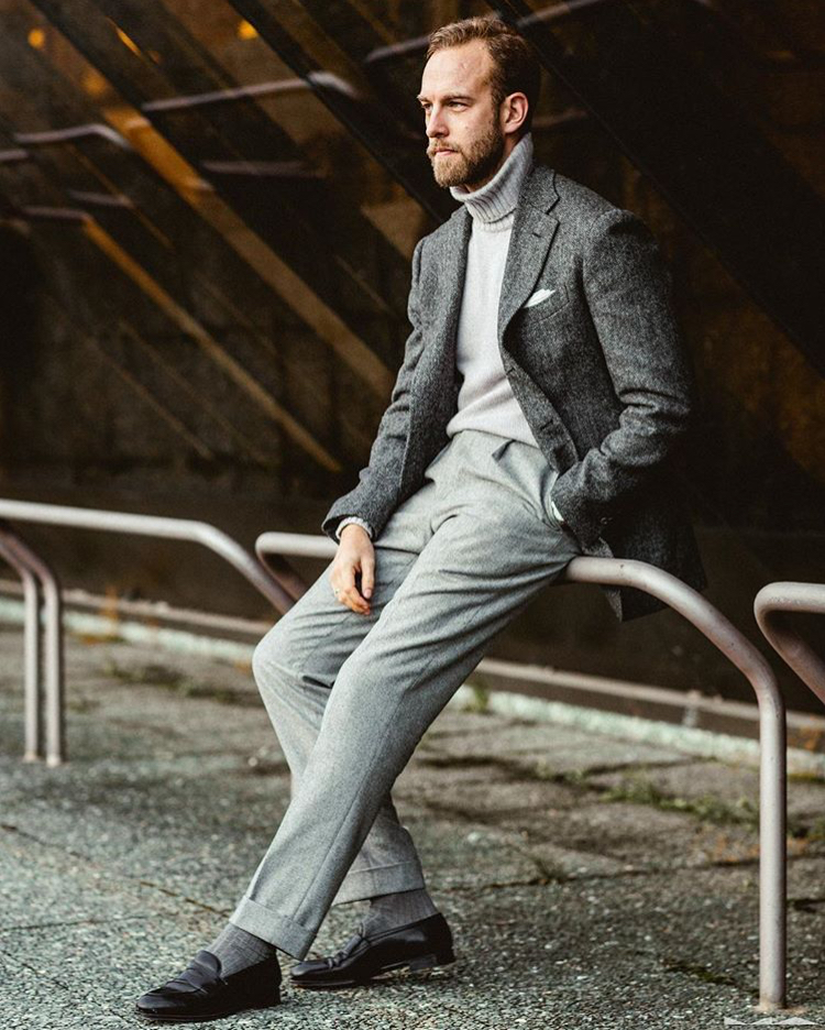
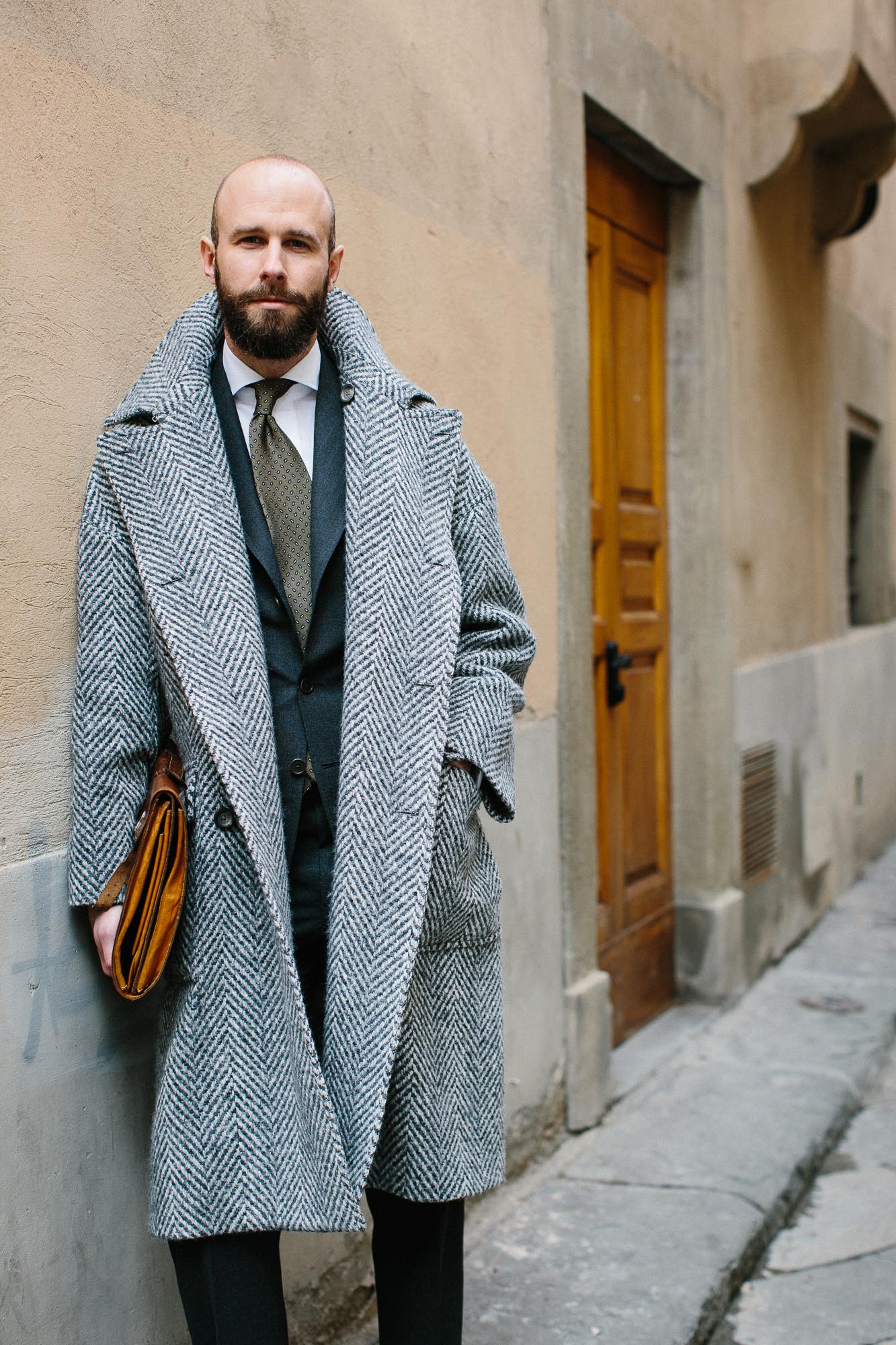
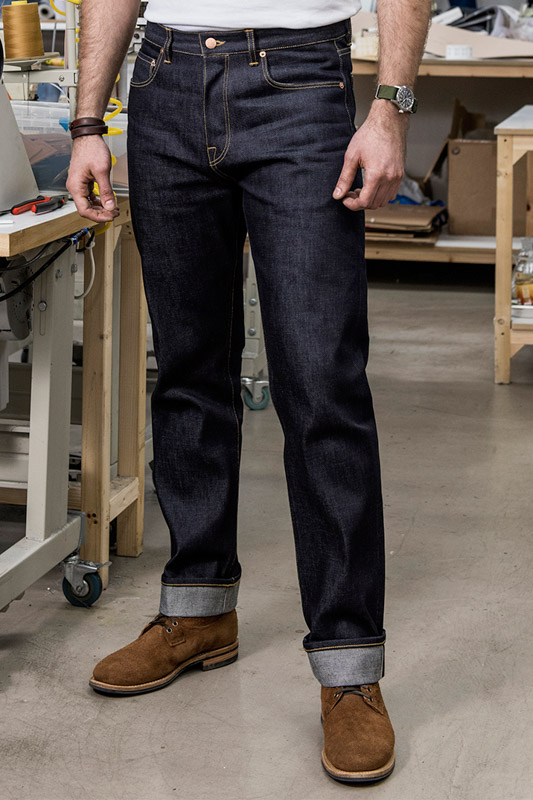
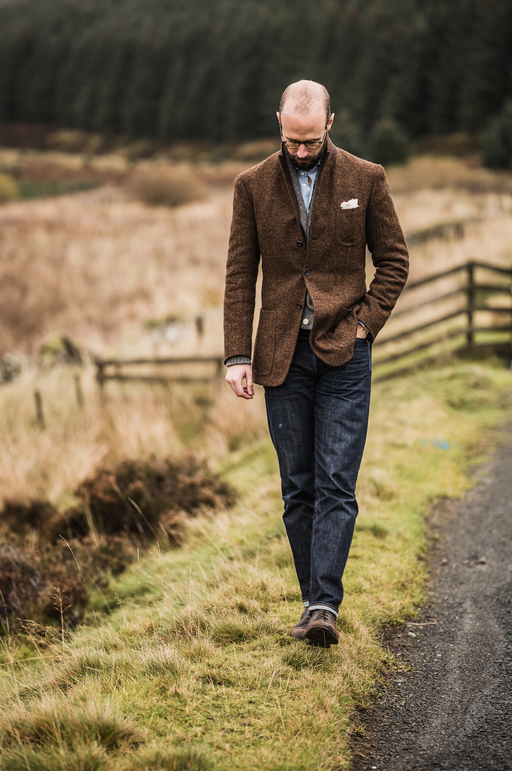
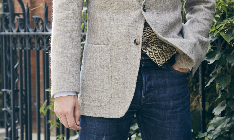
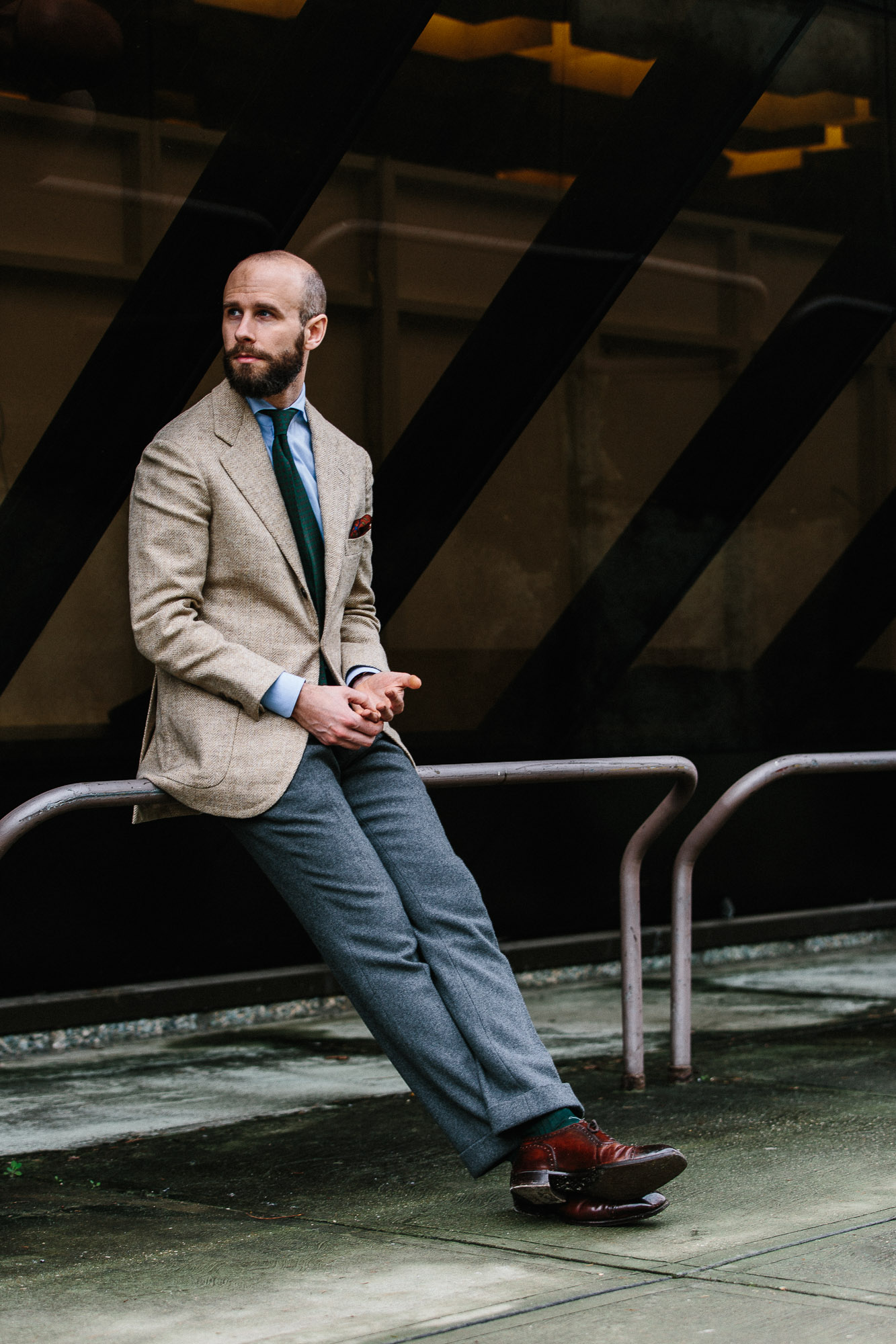
And for a casual look, a softly made jacket in perhaps a grey herringbone suits a crewneck sweater, jeans and boots, making an informal outfit that still looks considered.

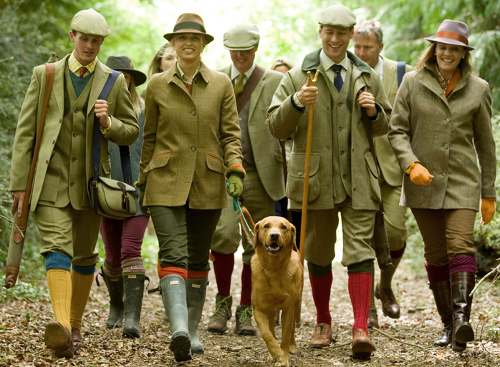
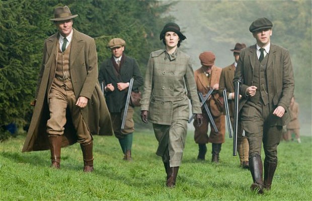
But tweed has an image problem. Despite its variety of uses over the years, it is still strongly associated with country pursuits, with an older generation, and with the English upper class.

Indeed, the very name can put off younger guys - tell them something is a ‘wool’ jacket rather than tweed, and they will often look at it in a different light.

“These popular associations largely come from the media and from fashion designers,” comments Fiona Anderson, author of Tweed (Bloomsbury, 2016).

“Tweed has always been worn by a range of classes, but it is the upper classes that are featured in films and TV, such as Downton Abbey, and that are romanticised in fashion advertising, particularly by Ralph Lauren.”

These old-fashioned associations are a pity, because tweed is so practical - the original performance fabric. Nothing compared to modern synthetics for waterproofing of course, but still very windproof, water-resistant and breathable.

“Tweed owes its weather-resistant properties largely to the hairy, springy texture,” says Anderson. “It means that water is more likely to stay on the surface rather than soaking in.”

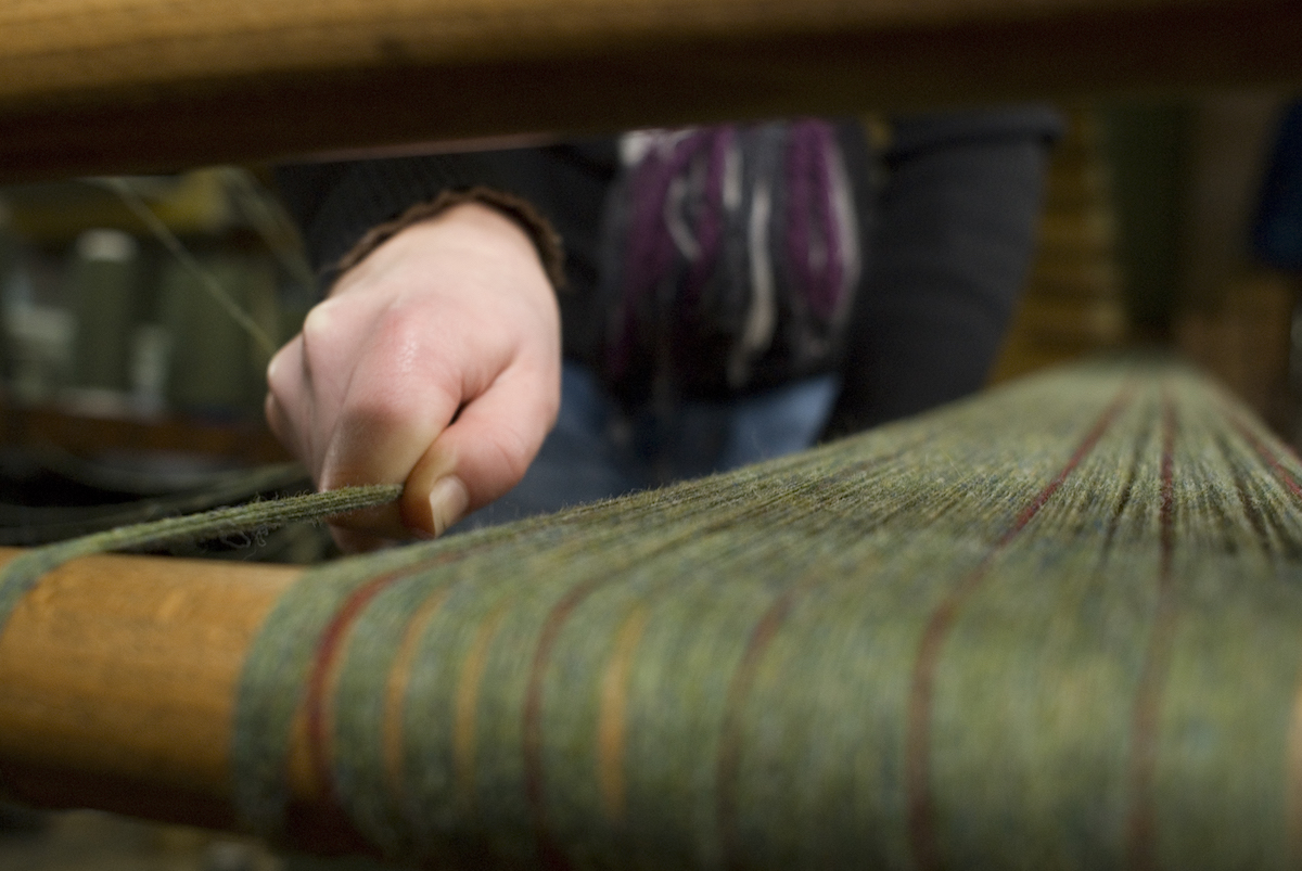
She adds that tweed first became popular in the 1830s, when Scottish field sports started to be fashionable and the alternative cloth - a brushed wool broadcloth - soaked up water much faster.

Tweed’s spongy feel also makes it lovely and comfortable to wear - certainly more so that those synthetic alternatives.

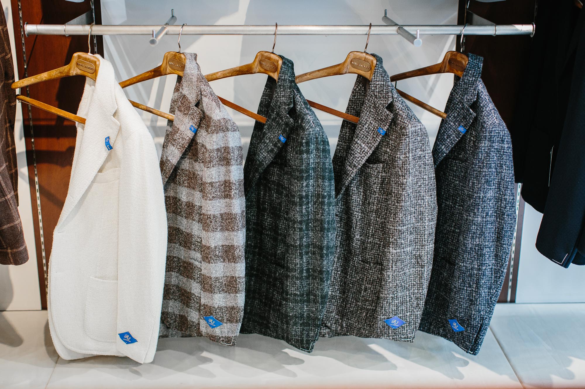
And in all its flecked, nepped and multi-coloured variants, it has to be one of the most diverse and beautiful fabrics in the world.

Permanent Style don’t need to be convinced of these pleasures. But the broader world does - and those that tell them should use this language of versatility, practicality, and subtle beauty.

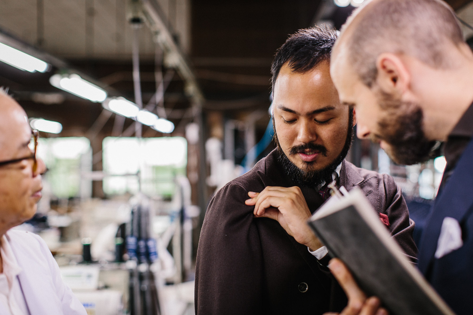
Once a man starts to love tweed, there is a huge amount of information to delve into, including the history, the estates and the different weaves.

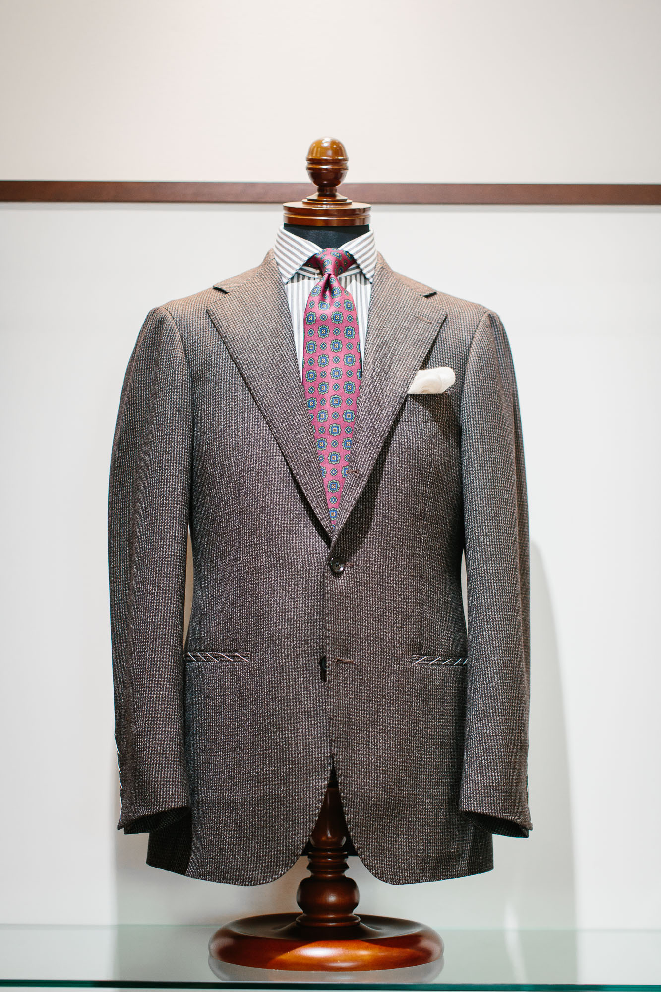
In many cases, these have little impact on what he selects - as a ready-made garment or to be made bespoke. Looking at the colour and texture is enough to tell whether the tweed is smart or casual, and feeling it quickly establishes whether it is light or heavy, soft or rough.

But knowledge can be useful in communication.

Knowing the basic terminology enables one to understand what a tailor or retailer is talking about when they describe a tweed as a donegal or gun-club - whether it’s about the pattern, the finish, or simply the heritage.

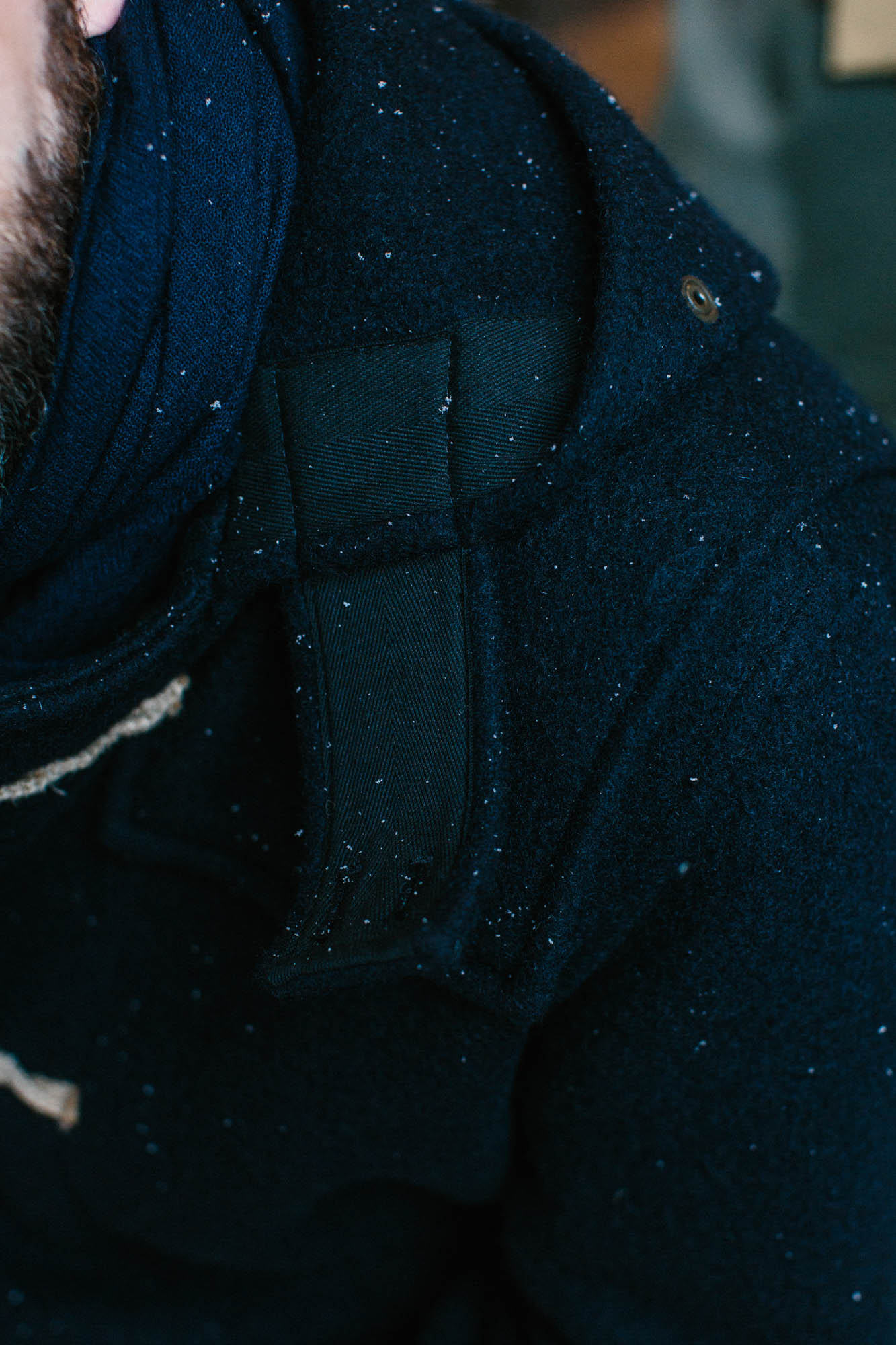
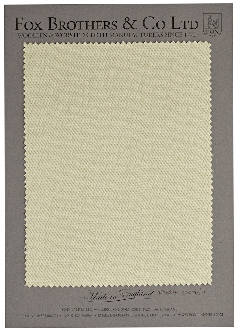
Tweed today is a generic term for a flecked fabric made of woollen (rather than worsted) yarn, with a rough surface, and made in mixes of earthy, natural colours.

Its influence is so broad, however, that these various elements are often used in other cloths, and referred to as tweed or ‘tweed-like’.

For example, Italian mills occasionally offer a jacketing that has the same nepped style as donegal tweed, but woven from cashmere. This is lovely, and a very versatile material for a jacket - but it is unlike tweed in every other way.

In the United States, and sometimes even in the UK, simply having a windowpane check can be enough for a jacket to be called tweed.

And there are many cloths made of worsted yarn that lack the rough finish of a traditional tweed, but use worsted to make a smoother, smarter cloth.

So traditional tweed is perhaps best thought of as a reference point, an archetype from which many others draw inspiration.

Whether they really deserve to be called ‘tweed’ isn’t that important. As long as we all understand the traditions they're drawing on.

So what are the different types?

Well, the two best-known varieties are theoretically defined by their origins: Harris Tweed from the island of Lewis and Harris in Scotland, and Donegal Tweed from the Donegal region of Ireland.

However, while Harris has been closely guarded as a label, Donegal has not. Harris created its own trademark in 1909 that defined which wool could be used to make the cloth, and where it could be made.

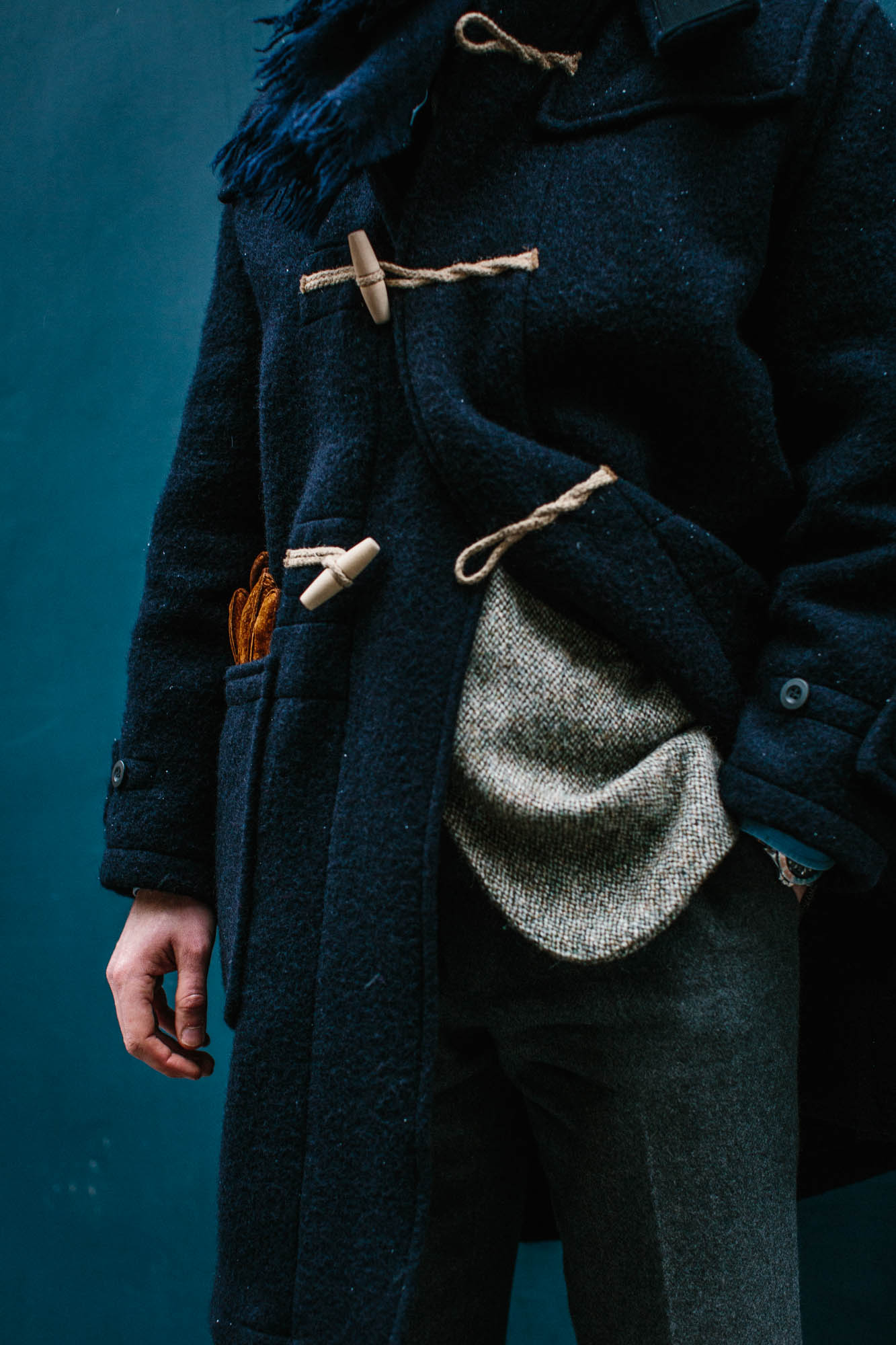
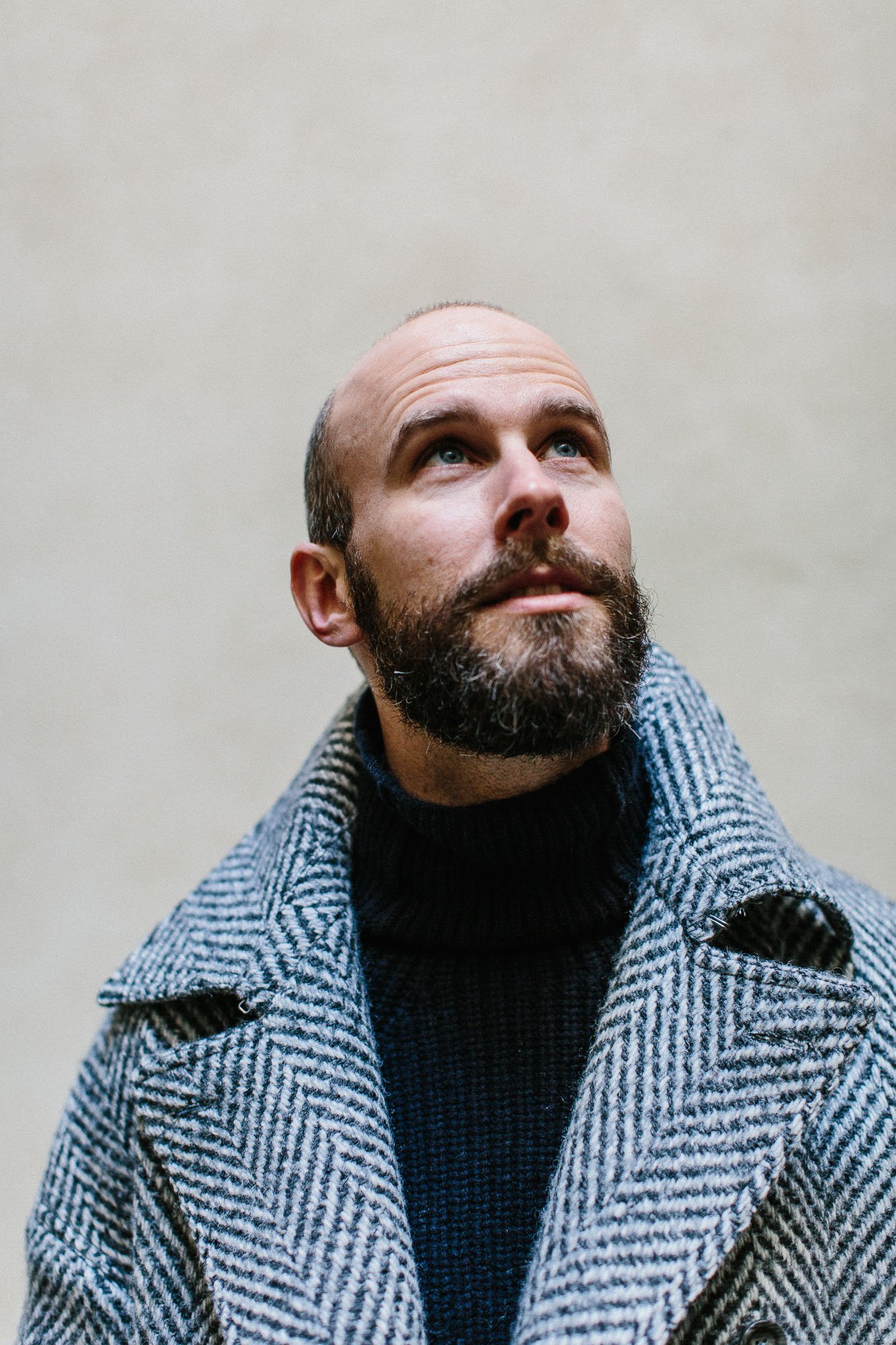
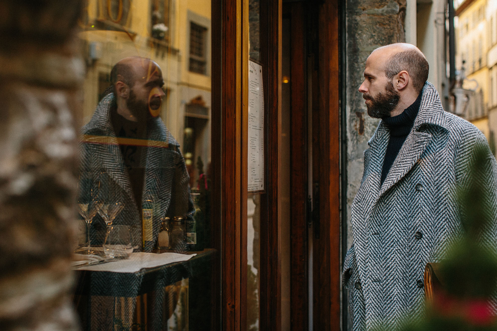
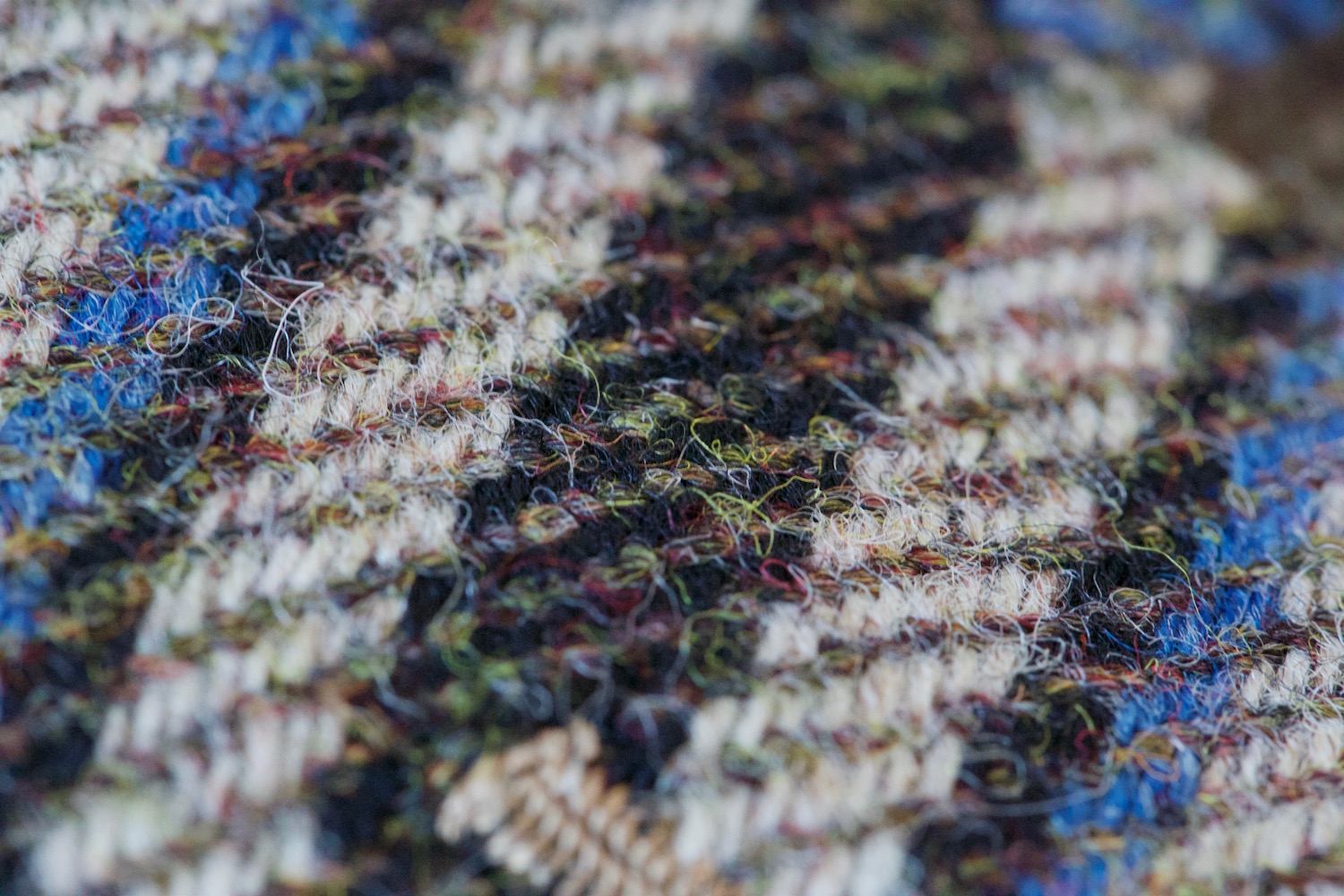
As a result, Harris Tweed is now more consistent - with that traditional roughness of finish and an open weave that makes it spongy and naturally stretchy.

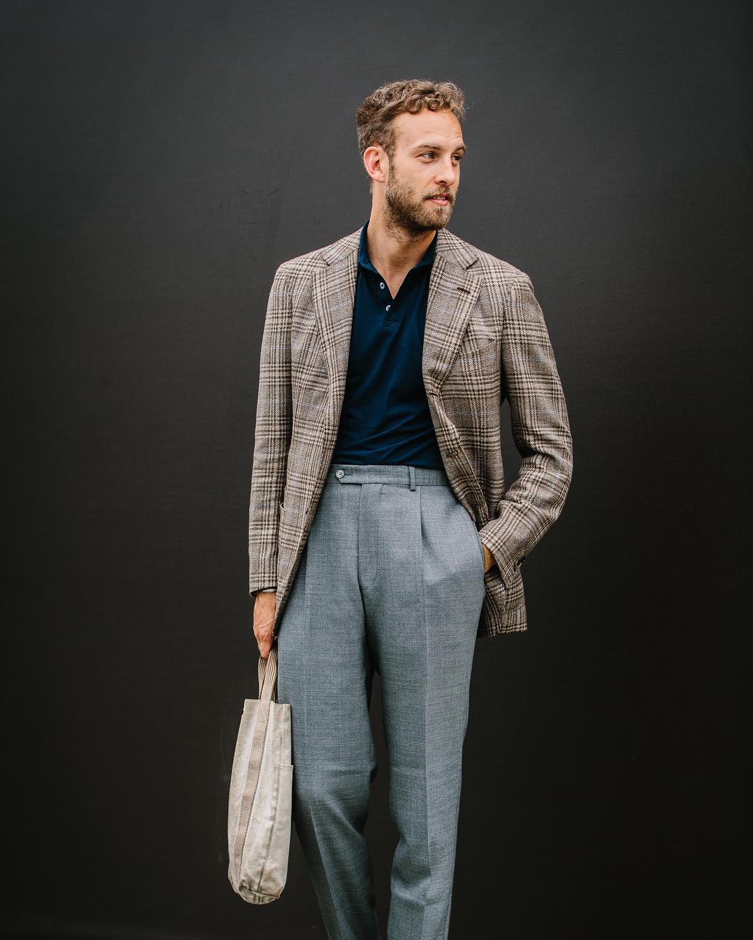
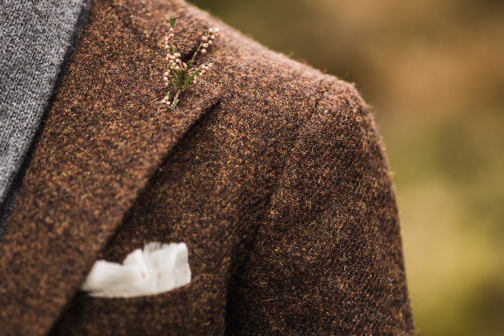
Harris tweeds also tend to have a lot of colours woven through them - often up to 12 coloured yarns even making a simple brown (above).

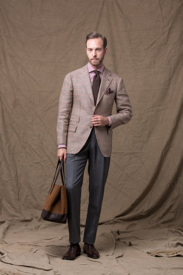
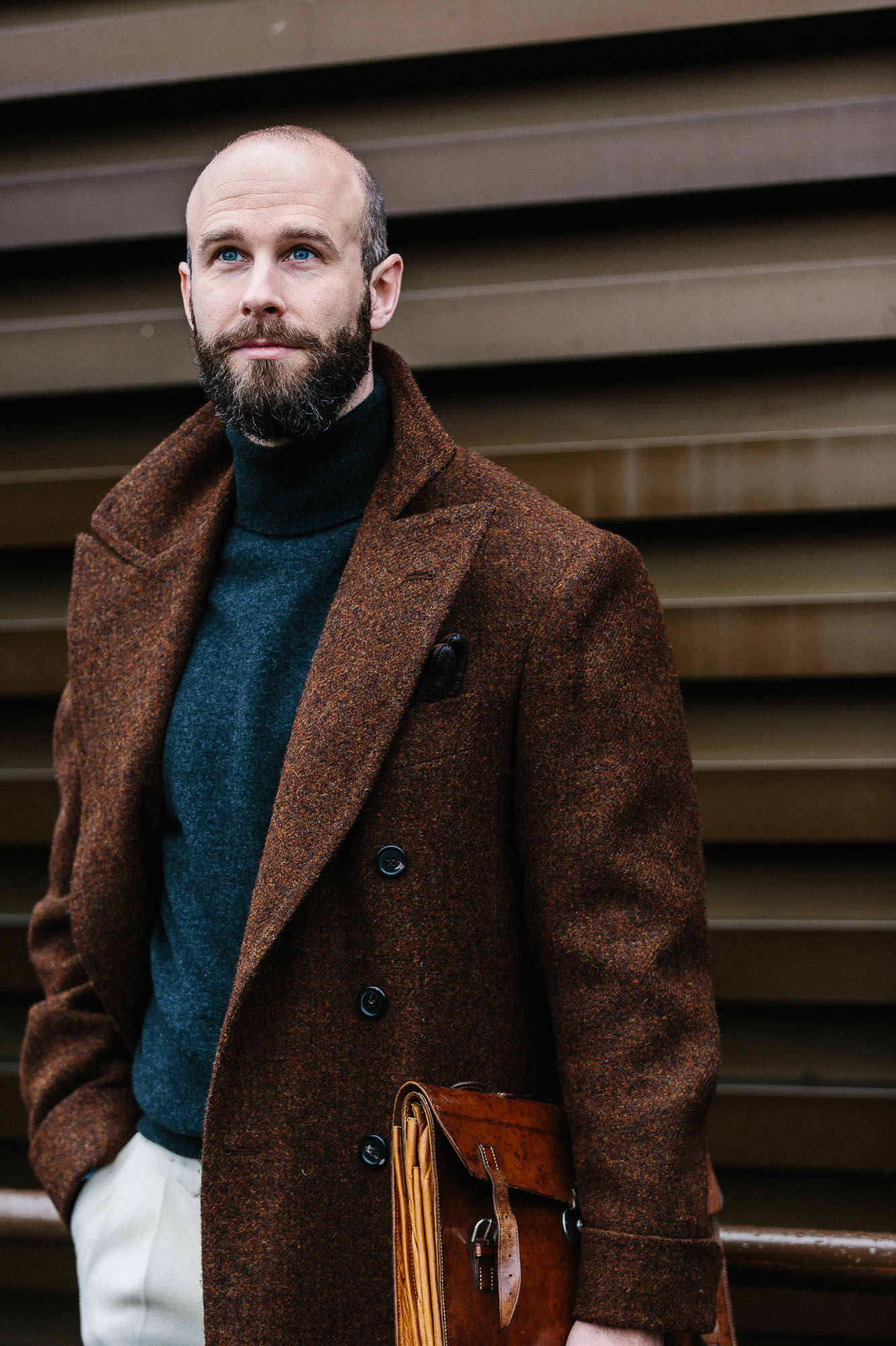
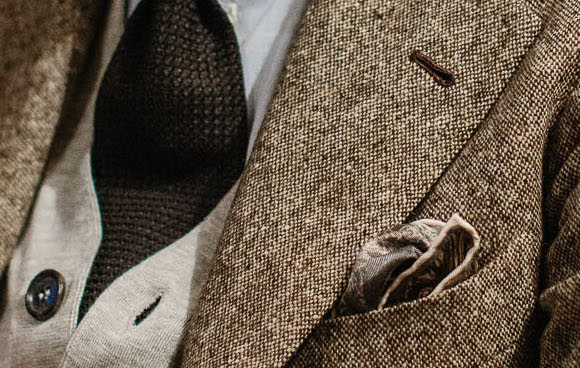
Donegal, by contrast, is used today to refer to any cloth with the flecked pattern of the original Irish tweed (below). Very attractive, but not necessarily as deserving of the original label.

Other tweeds can be defined by a variety of things, from location to sheep to functionality. They include:

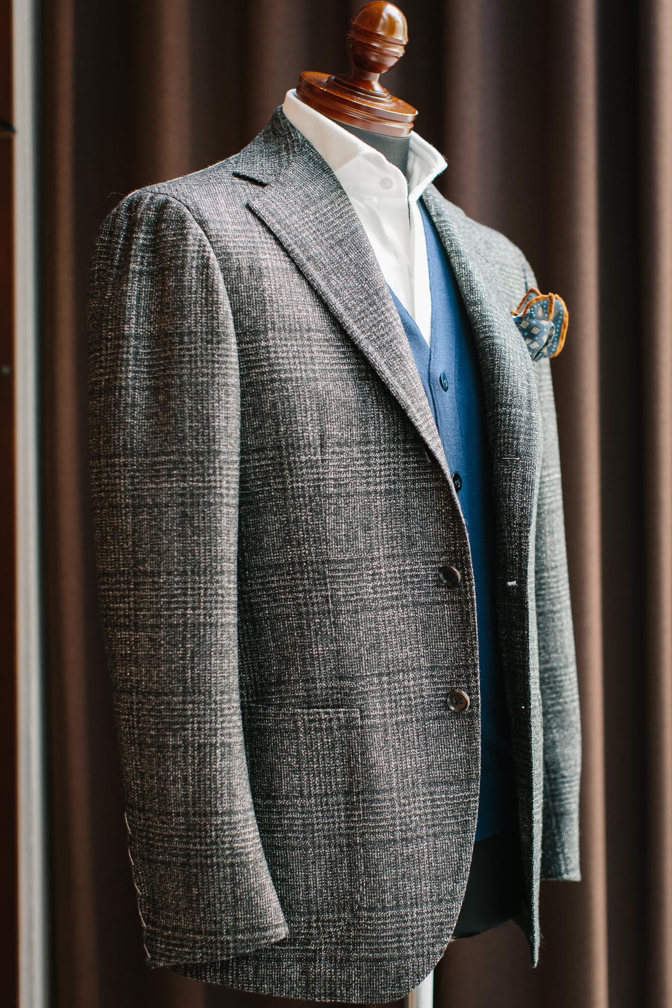
  • Saxony: A fine, soft tweed usually using merino wool. Sometimes Saxony uses a mix of woollen and worsted fibres, which can make it appropriate for suits. It was originally made in Saxony, Germany but is woven quite broadly.
  • Cheviot: A thicker, rougher tweed than most, named after the British sheep it takes its wool from. Cheviot is now the wool used for most Harris tweeds, replacing the Scots Blackface  used in the past. 
  • Shetland: One of the softer tweeds to come from Britain, but not particularly fine. Often spongy and good for jackets, it originally used wool from Shetland in Scotland, but often doesn’t today.
  • Thornproof: Actually a trademark, like Solaro, and just a type of shooting tweed that has become a little generic. Like other shooting tweeds, it uses higher-twist yarn that most others, in order to make it tougher and harder. Usually made in the muted green colour of hunting suits.
  • Estate tweed: This concerns design rather than location or animal. Estate tweeds are usually unique to a particular estate and worn by their staff. They all tend, however, to have a windowpane check, usually over a herringbone weave.
  • Gun club: A type of estate tweed, but woven as a shepherd’s check with various coloured checks over the top. It originated with the New York Gun Club, which modified a Scottish estate tweed.

Other designs (eg Glenurquhart) or weaves (eg barleycorn) are not that specific to tweed, being used in other suit or jacket cloths. But they are so prevalent in tweed that they are often used as names of different types.

Today, tweed is slowly becoming more popular, and witnessing its own trends and fashions.

For example, mills say they are seeing increasing demand for brighter colours. Traditional tweed echoed the colours of the Scottish countryside - browns and pale greens, the blues and greys of heather. It was originally a form of camouflage.

But once in the city, browns and greens don’t necessarily make as much sense - and don’t help with the old/rural/posh associations.

Darker blues and navy have been used for a while, but designers today say they are using more soft pastel colours like pink or yellow, and weaving them into more muted, urban versions of grey, blue and brown.

Arguably these modern tweeds are subtler and more wearable than their rural ancestors, given the latter tended to use bright red and yellow overchecks that couldn’t be seen at a distance, but were quite stark up-close.

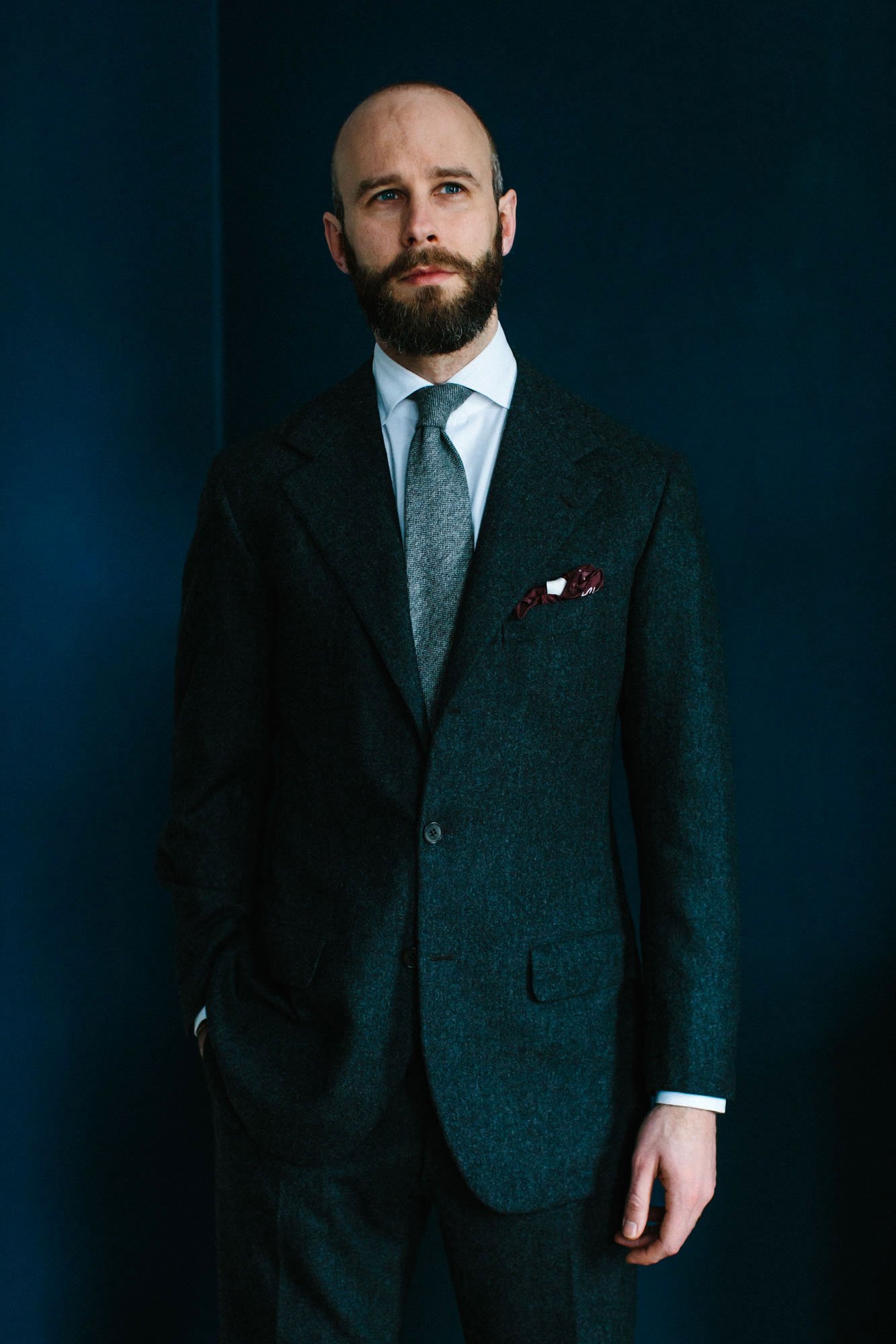
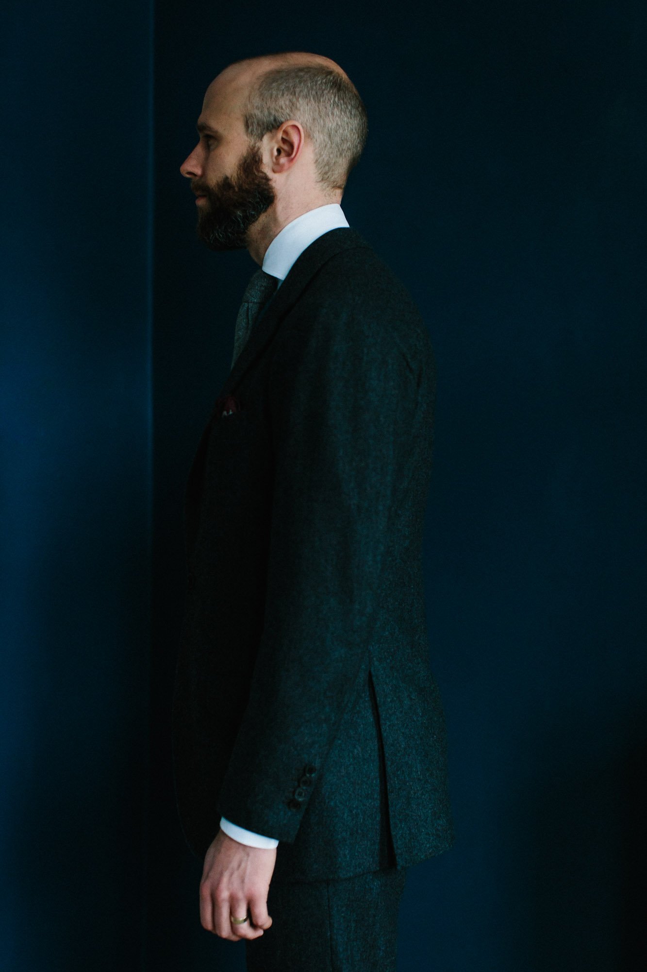
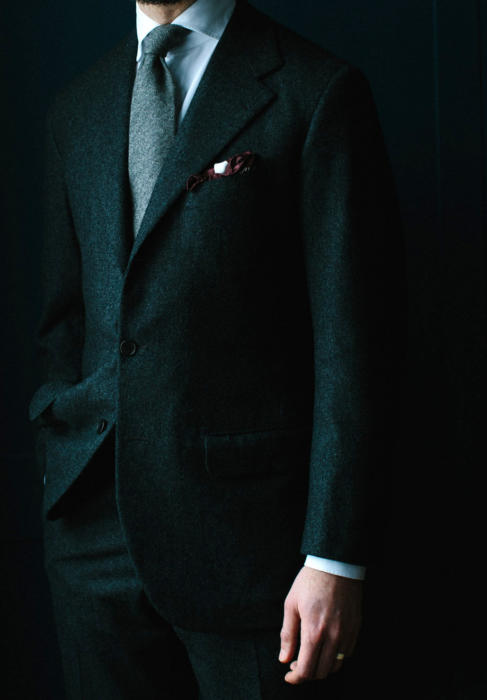
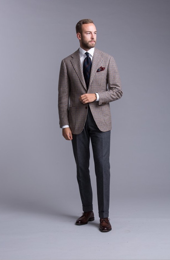
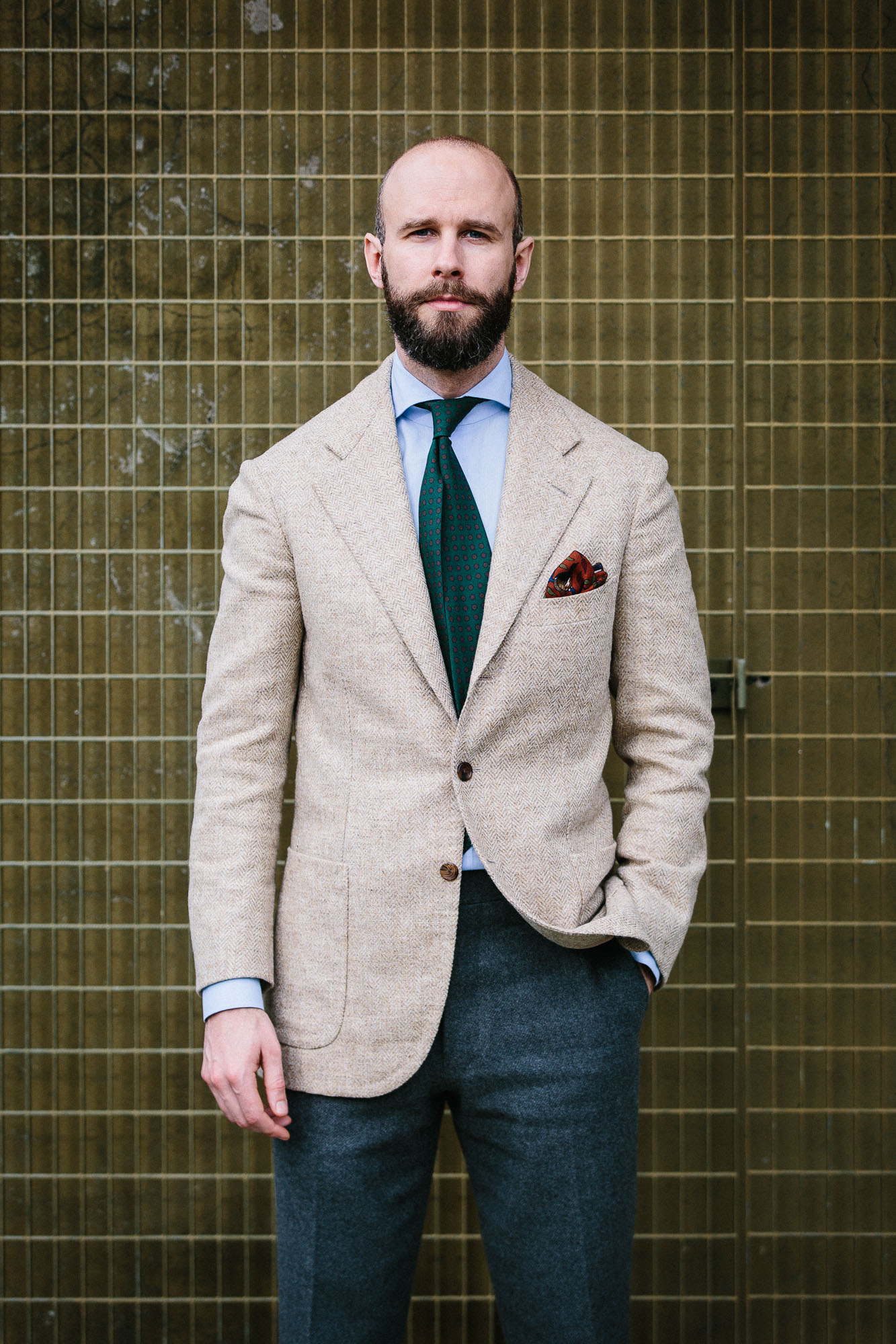
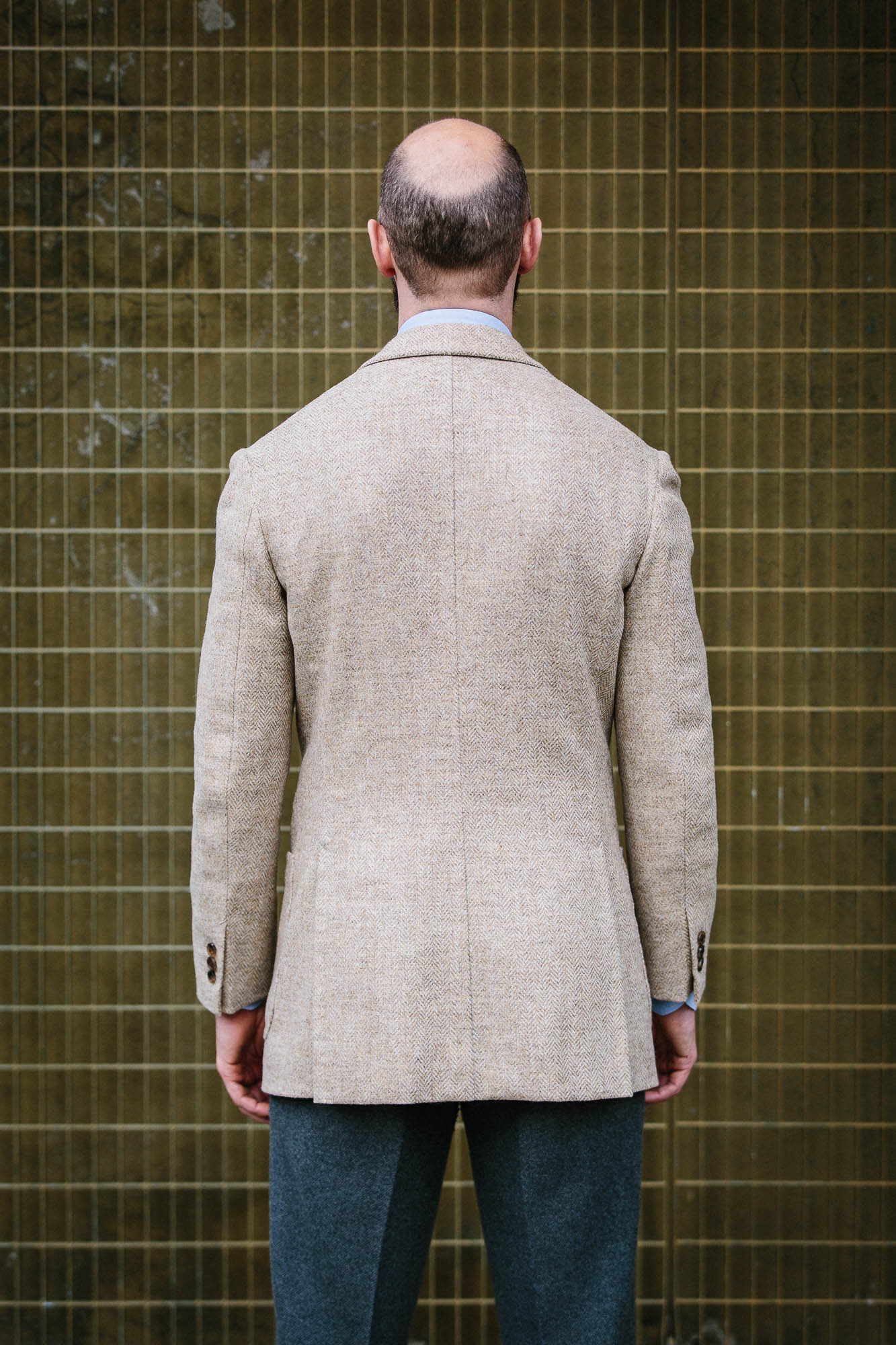
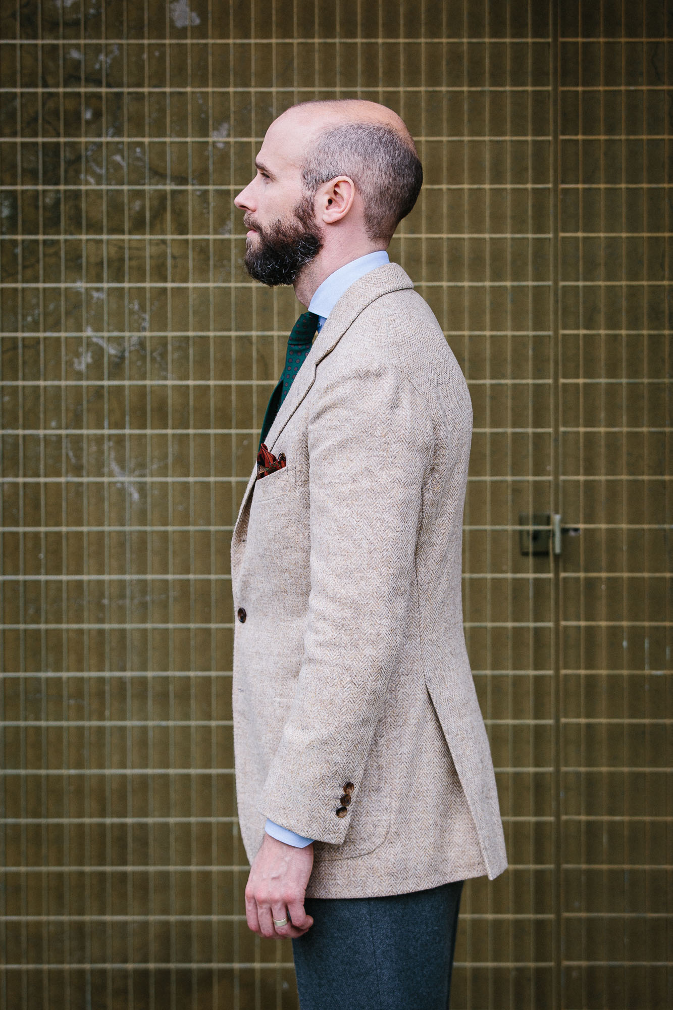
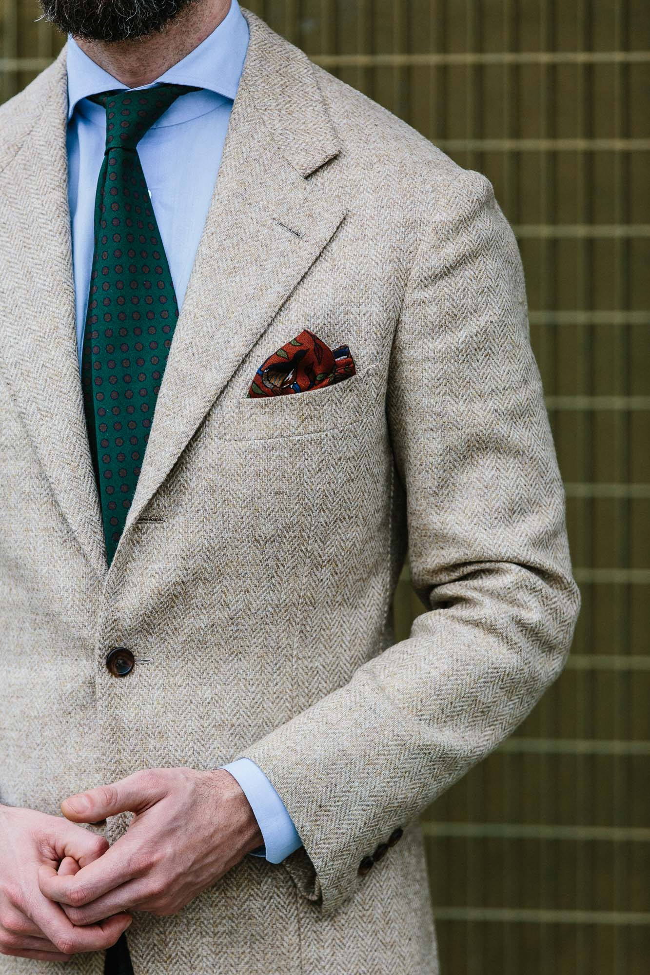
I have a few tweed jackets that could fall into this modern category, including my pale-yellow shetland tweed from B&Tailor (below). It mixes a sherbet-y yellow with several different shades of grey, making something that feels light but also quite modern.

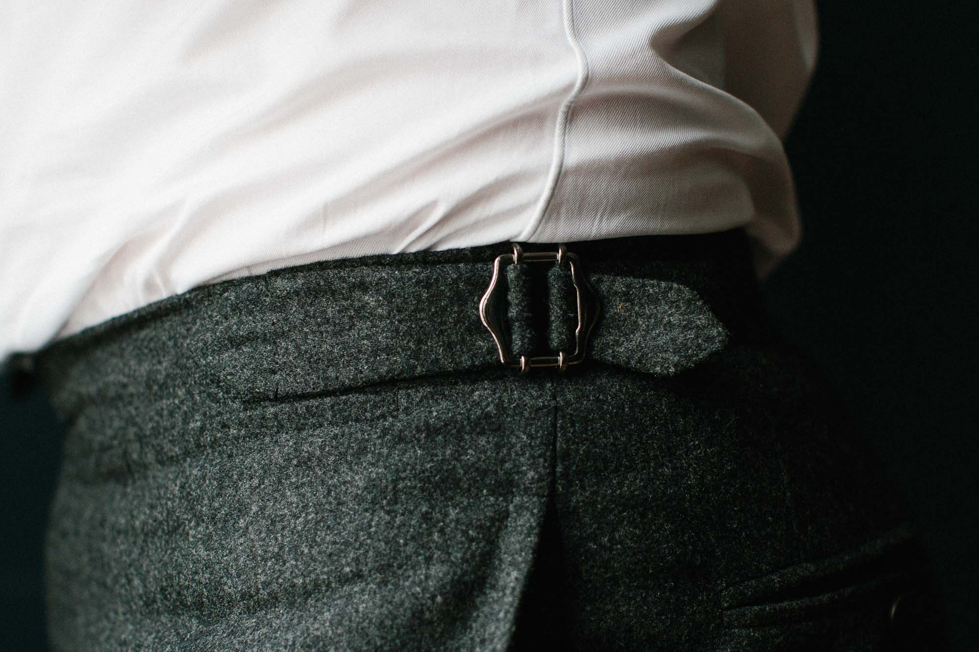
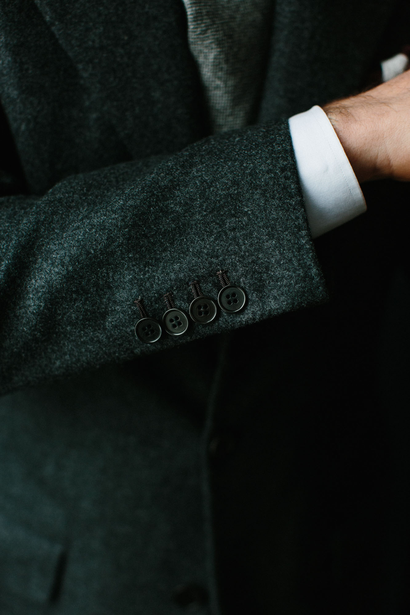
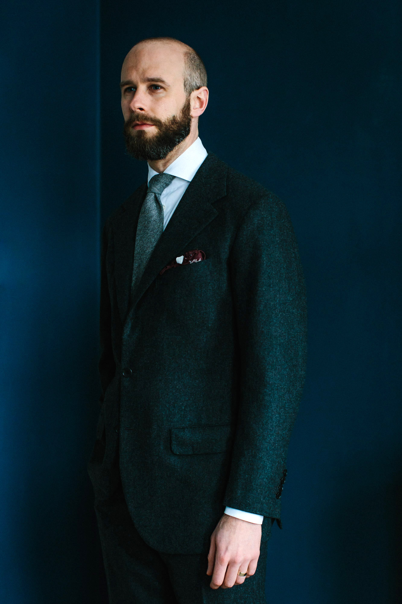
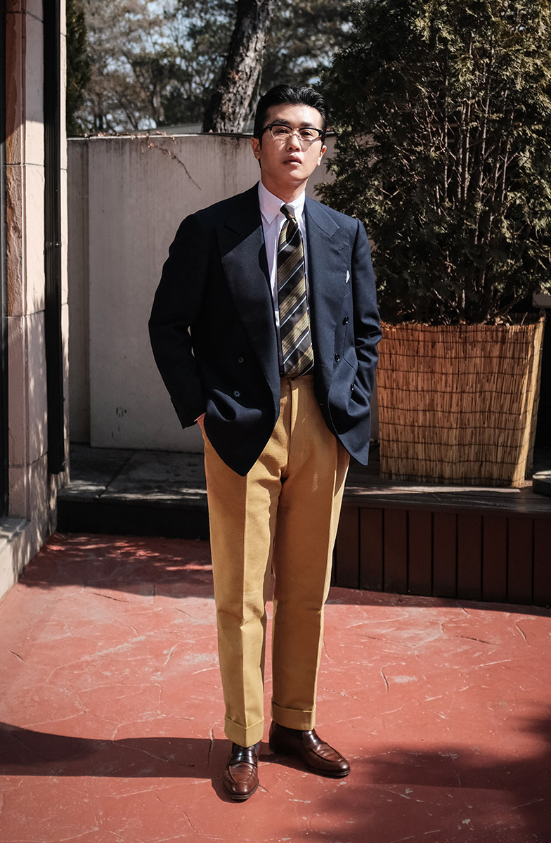
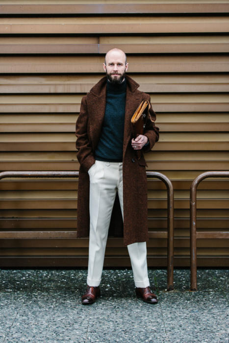
Elsewhere, I tend to favour browns and greens, but in darker shades than most traditional tweeds. I also have a dark-blue tweed that has proven very useful as a modern version of a navy blazer.

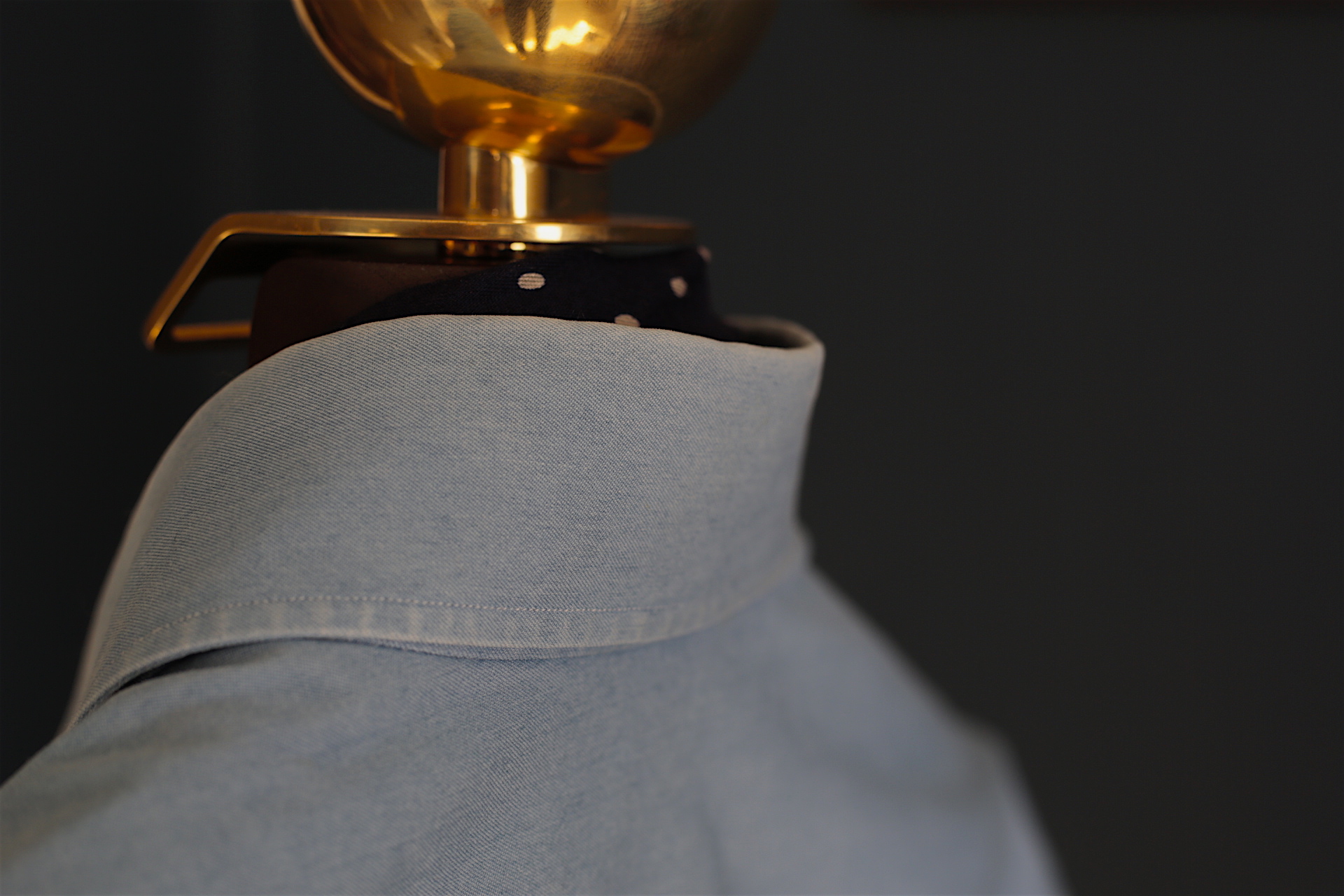
I also find I consistently shy away from checks on tweed jackets, and from tweed suits. In both cases, the desire is to avoid standing out too much - and I usually wear them with an open-necked shirt (oxford or chambray), and jeans or flannels, for the same reason.

Many thanks to Fiona Anderson and the dozen or so other contributors to this article, some from England and Scotland’s finest tweed mills.

Tweed, by Fiona Anderson, can be found here.

Sartoria Panico fitting (and a roll neck for a long, hard day)

Sartoria Panico fitting (and a roll neck for a long, hard day)

Share
Friday, March 30th 2018
||- Begin Content -||

One of the less-discussed sides of Pitti Uomo is the number of tailors that set up in a hotel or appartment at the same time as the fair, in order to see customers.

Although most visitors to Pitti are buyers from around the world, those buyers are often good bespoke customers - and sometimes, as with the Japanese for example, it’s the only time of the year they are in Europe.

Sartoria Panico and shirtmaker Anna Matuozzo set up in Hotel Minerva, on one corner of Piazza Santa Maria Novella - a nice location and only a few minutes walk from the fair.

I had my second fitting there with Antonio Panico (above), on the mid-grey flannel suit we are making (and had been fitted once already in Naples).

The suit is progressing nicely, with only a couple of small tweaks required at this stage. A nip in at the waist and a bit of ironwork around one shoulder blade.

The feeling I had is very similar to that discussed on my recent Sartoria Ciardi suit - of being in good hands, and of the fit and pattern being good from the very start.

The shape is pleasing, the back clean but with still enough room to move, and the collar nice and flush on the neck.

Look at the number of stitches on the collar, by the way (below).

Although it’s debatable how much difference this makes to a jacket, it is more stitching than most Neapolitans, and certainly shows you how much work is going into the suit.

Incidentally, I decided to make two pairs of trousers with this suit, one high-waisted and one low.

Although I generally don’t wear high-waisted trousers with braces (see my logic here), I do recognise how flattering they can be, and I thought grey flannel would be a very versatile cloth to experiment with.

Even if I don’t end up wearing them with this suit, I will wear them elsewhere (eg with shorter casual jackets perhaps - such as my Gieves bespoke leather).

I’m also trying double forward-facing pleats for the first time.

Although I don’t like the look quite as much as backward-facing ones, they may well be more practical on me given how much my seat and thighs pull at the cloth.

Looking back on these photos now, I remember how exhausted I was after a long day of rushing around Florence - and yet how comfortable in my cream trousers and roll neck.

I think it’s another point in favour of the roll neck, as a very smart, sartorial piece in the wardrobe, that is also extremely comfortable and therefore good for travel or long days of walking.

The charcoal roll neck, by the way, is from Drake’s, and the trousers are from Pommella in the ecru Fox cloth that they re-wove recently (still a waiting list being operated for that, here).


Pictured with me is Simone Ubertino Rosso from Vitale Barberis Canonico (above).

Simone is always a great ambassador for VBC cloth - here in his charcoal worsted, blue/white striped shirt and bright orange tie with a small geometric design.

The always enthusiastic Francesco Vitale Barberis (below) was there with Simone, being measured for a Panico suit. He went for a more widely striped blue/white shirt.

Elsewhere Panico had on display a few more unusual bespoke designs they offer (something so few tailors do well).

These included a raincoat and a flannel hunting jacket.

The full review of the Panico suit should be ready will be in a month or so.

Photography: Milad Abedi @milad_abedi (below)


Sartoria Vestrucci charcoal-flannel suit: Review

Sartoria Vestrucci charcoal-flannel suit: Review

Wednesday, March 28th 2018
Share
||- Begin Content -||

Right. Let’s do this by first running through the Vestrucci style and cut, and then going into the more subjective areas of reaction and experience.

The suit being discussed is a Holland & Sherry charcoal flannel  that I had made over the past 9 months, and was covered previously here.

Shot at home, in slightly moody lighting, by Jamie.

The style of the jacket is most obviously Florentine (Loris Vestrucci was trained by Giuntini, among others, who was one of the last great Florentine tailors).

That style is characterised by:

  • An extended shoulder (running just beyond the end of my natural shoulder)
  • A generous lapel, curving slightly inwards (concave)
  • A straight breast pocket
  • Light padding and chest canvas
  • and, A curved front dart that finishes at the hip pocket

This style, which Tommaso and Tommaso at Vestrucci describe as 'Italian character with English modesty', is an effective way of combining comfort and masculinity.

The make is soft and that, combined with the drape, make it very comfortable. But the large lapel and extended shoulder give an impression of strength and size that is rather flattering.

The Italian side is perhaps most seen in that flair of lapel and general curviness, and the English in the closed quarters and general subtlety.

The obvious comparison is with Liverano, which readers will be more familiar with as an example of Florentine style.

In comparison to that, Vestrucci has:

  • More drape (more than most Italians or French)
  • More closed front quarters
  • Less padding, and is generally softer

Overall it feels like a less striking style - softer and rounder - but still with that masculinity in the shoulders and lapel.

I particularly like the image above as an illustration of this. You can clearly follow the line of the slightly convex lapel, into a relatively long and straight line through the waist button, and then the little curve at the bottom.

There is little to say about the style of the trousers, except that Loris likes a rather long fly. This has the advantage of opening up more, making the trousers easier to get on. But makes little noticeable difference to the look.

I've been wearing the suit for the past couple of months, and I have got very used to its softness, drape and general comfort.

It reminds me most of a lighter and softer Anderson & Sheppard. Both have that extended shoulder and drape, and I can happily sit and work in both all day. A&S just has more padding and canvas.

The only area of the Vestrucci I would like more structure is the trouser waistband, which has a very soft, folded over lining. This would be more attractive, and no less comfortable I think, with something thicker.

The make is good without approaching the fineness of anyone further north, in Milan, Paris or London.

Nice buttonholes but not super-fine, and good finishing inside without any of the flair of a Cifonelli or Camps de Luca.

My experience too, was good. Tommaso Capozzoli measured me in London, and apart from one or two small issues, it was a good base for Loris to work from in Florence. I had one fitting there late last year, and then another in January during Pitti.

I feel this consistency and accuracy should be emphasised given recent discussions - Vestrucci is still a small tailor, but has the professionalism of a large one.

The only outstanding issue we have is a small one with the trousers. The rise was initially too high, and although it has been reduced, it still needs to be a little more.

I might also look at the drape in the back of the jacket (don't have a picture of that, sorry) as it is more than the front, and could perhaps be cleaned up and still be comfortable.

I'll look at both with Loris and Tommaso next time I'm in Florence.

Vestrucci don't do trunk shows to London at the moment but are considering it for later in the year. They are already in the US of course, with the base of the Stefano Bemer showroom on 67th street (Stefano Bemer shoemakers owns Sartoria Vestrucci).

I should also mention that Vestrucci offer a ready-to-wear and made-to-order service, which is made to the same cut and style as the bespoke, but of course not the same quality level.

This may prove helpful for anyone that likes the style, as the bespoke is fairly expensive, at €3,500 for a jacket and €4,000 for a suit.

The MTO is €1,800 and €2,400, the RTW €1,500 and €2,000.

I've wanted a charcoal-flannel suit for a while. (Even if it does mean I'm ordering a lot of grey suits at the moment - with the 4-ply Ciardi and mid-grey Panico.)

I had a Polo Ralph Lauren one when I was younger, and loved the style. The flannel is so dark that it feels smart and serious, yet the texture is unexpected in most smart or professional environments.

I'd generally wear it with black shoes (which is why I went for grey corozo buttons, not brown), and it's nice with a white shirt and a tie, as here.

A grey tie is a bit more of a fashion look (grey on grey), but a navy tie is also nice and charcoal flannel is great with deep, rich colours like purple.

I also find that it compliments a blue shirt with a burgundy tie, or a bright acidic colour like lime.

Here, I have that burgundy in the silk handkerchief (from Huntsman), while my Jaeger Le-Coultre watch with tan ostrich strap also adds a little colour.

-

Shirt: White cotton from Luca Avitabile

Handkerchief: White and burgundy silk from Huntsman

Tie: Grey untipped cashmere from Drake's

Shoes: Black Corthay chelsea boots (again, a little French and fashion-y. I'll cover those separately.)

Website www.sartoriavestrucci.com

Combining colours and patterns: How to dress like Andreas Weinas


This is the latest in my somewhat infrequent series on the style of my favourite people in the menswear industry. For those that want to catch up, the previous instalments have been:

The next to feature is Andreas Weinås, editor of Swedish style guide Manolo.se and menswear magazine King Magazine. He is of course also a frequent and influential poster on Instagram.

Andreas has a subtler and perhaps more conservative style than some people we feature here, and is a master of everyday, highly wearable clothing.

We have used this piece as an excuse to revisit some of the fundamentals of combining colours, patterns and textures in menswear outfits.


“In terms of background, my interest in clothing began quite late (early twenties) and developed quickly in the direction of tailoring. I wanted to know more about the foundations so I studied textile economics in Sweden for three years, resulting in a deeper knowledge about textiles (fibres, weaving, knitting and pattern making) and the financial side of the business.

Normally this education leads to a position as buyer at fashion companies like H&M but instead I was recruited by Egmont Publishing as the Editor for the niche publication called Manolo.

I was honoured when Simon asked me to write some of the thoughts and ideas I have when combining colours, patterns and garments in my outfits.

Please do not consider this a set of rules, however. Rather it should be seen as a source of inspiration, about which you should constantly ask yourself whether it’s relevant to your style and to your personality.


Combining patterns

Everyone probably has an opinion about whether you should match stripes with stripes, checks with checks and if so, in what way.

My personal approach is to try and have a least one solid garment out of the “triangle” of shirt, jacket and tie. If I wear a checked jacket and patterned tie I tend to prefer a solid shirt; or if a Bengal-stripe shirt and checked jacket, then a solid tie.

The other important part about combining patterns is to look at the scale of each one.

A narrow pinstripe suit is hard to combine with a Bengal stripe shirt, where a block-stripe tie with that stripe is rarely a problem because of the difference in scale.

In the example above, the checked jacket and striped shirt are balanced by a solid brown-grenadine tie. I feel a block stripe or heavily patterned tie would put the already busy outfit over the edge. The dark and solid grey trouser helps add contrast.

(Total look by Orazio Luciano)


I also like to always have one part textured or patterned in the above-mentioned triangle.

Wearing a solid shirt, suit and tie can obviously look great (just look at Cary Grant) but it can sometimes feel a little flat (politicians in dark suits, white shirts and bright-red ties come to mind).

Just adding a small pattern to the tie or texture in the jacket can create some depth and bring the outfit to life.

The image above is an example of how important I believe texture and/or a small pattern can be.

The look of mainly solid garments would be less interesting if the tie was a solid orange instead of a discrete floral print. The same thing goes for the texture of the tweed jacket against the plain shirt.

  • Bespoke Jacket: Sartoria Corcos in a vintage green tweed
  • Shirt: Fray
  • Tie: Shibumi
  • Trousers: A design collaboration between Manolo and Ströms in Sweden


Combining colours

I like to pick up colours and shades from different parts of the outfit in a subtle way. For example, in the image above the light blue of the shirt is picked up in the small flower of the tie.

This is one reason why I find patterned ties and pocket squares, with multiple shades and nuances, to be easier to combine than solid ones.

In the picture I also matched the colour of the tie with the dark burgundy shoes. Since the two pieces are quite far apart, with different textures and material, it tends to feel like less obvious matching.

The rest of the outfit could be called the ‘menswear uniform’. A navy jacket with grey trousers (fresco for summer, flannel for winter) is probably the combination I wear most frequently.

To some it might be boring, but I call it consistent. I find it a great base out of which to elaborate with shirts, ties and shoes.

  • Bespoke jacket: B&Tailor through Robin Pettersson in a VBC Navy Hopsack
  • Bespoke trousers: Zaremba in a grey Minnis fresco
  • Shirt: Eton
  • Tie: Shibumi
  • pocket square: R Culturi
  • Shoes: Yanko


Combining textures

Sometimes, and especially in a more casual outfit, texture can be even more important than colour or pattern.

Wearing a turtle neck or polo shirt with tailoring, for example, limits the possibilities for pattern and therefore puts more emphasis on textures and tones.

In these more monochrome outfits I also think it’s important to get the right amount of contrast. In the outfit above I wear three or even four shades of grey, but every garment has a different texture to help separate them.

  • MTM tweed jacket: Saman Amel “Napoli” in an Abraham Moon lambswool tweed
  • 4-ply cashmere sweater: Fedeli for Michael Jondral
  • Trousers: Design collaboration between Manolo and Ströms in Sweden.
  • Loafers: Edward Green


Adding contrast

A few years back I always tended to have my trousers a lighter shade than my jacket.

These days I think it’s more about finding the right amount of contrast between the two: too much and I would be uncomfortable; too little and the garments tend to blend together.

I think the contrast between jacket and trousers is the most important since they are the most prominent pieces of the outfit, although the shirt also plays an important role.

In general I would recommend wearing a lighter shirt than both the jacket and tie – but this is one of those rules I tend to consider differently in a casual outfit.

I think most people would agree that a dark-coloured dress shirt (especially with a light-coloured tie) is something more associated with the Eurovision song contest than sartorial elegance.

However, if the look is casual with, for example a polo shirt, I think navy, forest green or dark brown can look wonderful, even with light coloured jackets (as above) – and add that contrast against a light coloured trouser.

This is especially true if the contrast created against the jacket is balanced out by a pair of trousers in a shade just in between the two.

That image has a navy polo shirt under a lighter jacket. I believe the key here is to create a balance in contrast between shirt, trouser and jacket. A navy trouser would need a white or light-coloured polo to balance out the contrast.”

  • Bespoke jacket: Zaremba in a Loro Piana wool/linen/silk fabric
  • Polo shirt and trousers: Oscar Jacobson
  • Tote bag: Hermès

Many thanks to Andreas for his thoughts. You can find more of Andreas’s writing at Manolo.se and his Instagram at @andreasweinas.

Some of these topics were covered historically on Permanent Style in more detail, such as:

All photography Ted Olsson, except (numbering from the top) 4 Milad Abedi, 5 Viola Weinås, 6 Milad Abedi, 7 Jamie Ferguson

Saint Crispin’s shoes: Reflections two years later

Saint Crispin’s shoes: Reflections two years later

Friday, March 23rd 2018
Share
||- Begin Content -||

I now have three pairs of Saint Crispin’s shoes: the alligator/calf wing-tips pictured above; brown-suede chukka boots; and most recently a pair of dark-brown suede cap-toes.

I have ordered steadily and regularly, each time gaining in confidence based on my experience with how the shoes have aged, and on the consistency and service of the Saint Crispin’s team.

We had a couple of real issues with the first pair, as mentioned in my review.

But those were corrected (that pair being re-lasted) and it is telling that when I received my second pair and my third, those same issues were still fixed.

Given that this gradual creation of a perfect fit is such an attraction of bespoke, it’s incredible how many bespoke artisans are inconsistent with it.

Although Saint Crispin’s at this level isn’t strictly speaking bespoke, they absolutely succeed in this regard.

In this post I wanted to focus on two other points that are distinct about Saint Crispin’s, and upon which my thinking has developed over the past two years.

The first is structure.

In that first review, I mentioned how stiff Saint Crispin’s shoes are to start with. This is largely down to how they hand-peg the waist of the shoe, and then use a longer, firm stiffener through the waist.

When you first put a pair on, and for the first dozen or so wears, this feels pretty constrictive. In my review I said it was the one thing I wasn’t sure I could ever get used to.

Two years later, my opinion has probably changed. Those first wing-tips are just as comfortable as any other shoe, but are more supportive and have a cleaner look through the waist.

When I received by suede cap-toes (below) I knew exactly what to expect, and I’m wearing them in gradually and satisfyingly. 

The second area is hand dying.

Saint Crispin’s start with natural-coloured crust leathers for their shoes, and then dye them individually, once the leather has been cut into the shoe’s constituent pieces.

This creates a natural variation in the finish, and makes it a little less colour-fast.

Most other makers get dyed leathers from the tanneries instead, and add variation with burnishing, finger polishing, or a painted patina.

When I first bought my wing-tips, and in my first review, I talked about how much I liked this process because it meant the shoes had a personal colour, and looked aged very quickly - as some of that colour faded with wear.

Over the past two years it has occasionally been annoying, largely because the shoes need more cream and polish than other brands to maintain the same look.

I know this is something that puts others off too, particularly if they didn’t realise this in advance and were buying into Saint Crispin’s more for the value or the personalised last.

However, I’ve come to accept this aspect of the shoes, and even love it.

I’ve learned to use cream (such as Saphir Pommadier) a little more than I would on other shoes, and to leave areas like the vamp to crack and fade while I keep the heel and the toe polished.

It’s also worth pointing out that any brand that does a hand-patina finish on their shoes is doing a very similar dying process, and that too needs more careful upkeep (as mine, for example from Berluti, G&G or Corthay, also have).

Compared to my original review, I’d say this is the area that potential customers need to carefully consider whether they like or not. (Although, it should be noted that Saint Crispin's can do other leathers if requested, such as aniline calfskin.)

Elsewhere, my view hasn’t changed that Saint Crispin’s is great value for money, given it is hand welted and handmade generally, with a personalised last that can approach bespoke for fit.

The design choices and ranges of materials are also great.

With my cap-toes, for example, I went for a finer, more closely cropped suede (‘Hunting’) than with my chukka boots, given they were a smarter model.

I just need to find a way to get Saint Crispin’s stocked in London now, so I don’t have to do everything remotely.

I may well have experimented with a different last, for example, if I had a range of them close by.

Trousers worn:

  • With wing-tips: Green cotton Loro Piana, from Whitcomb & Shaftesbury
  • With chukkas: Cream heavy-wool Pardessus from Holland & Sherry, by Elia Caliendo
  • With cap-toes: Grey heavy-wool Pardessus from Holland & Sherry, by Whitcomb & Shaftesbury

Photography: wing-tips, Hannah Miles @photographybymiles; cap-toes and chukka boots, Jamie Ferguson @jkf_man

Video: Sartoria Ciardi in conversation

Video: Sartoria Ciardi in conversation

Wednesday, March 21st 2018
Share
||- Begin Content -||

This is the film of our small presentation with Sartoria Ciardi a couple of weeks ago - at Mark's Club in London.

We had 25 readers in the audience, with Poppy Charles kindly translating, and the result was a nice, intimate-feeling event with the Ciardi brothers, Enzo and Roberto.

We cover everything from the childhoods and their father Renato, to how the Neapolitan shoulder originated, to Roberto's new electric-blue mohair suit.

Thank you to those that came, to Mark's Club for hosting us, and to the Ciardi brothers for their time.

There was a trunk show the next day, and the brothers will be back in June for fittings. Contact for them is [email protected]

I am wearing:

  • Sartoria Ciardi suit in VBC four-ply worsted
  • Luca Avitabile spread-collar shirt
  • Tom Ford silk houndstooth tie
  • Permanent Style pearl cufflinks
  • Anderson & Sheppard grey/white pocket handkerchief

Unexpected texture and colour – Denim and linen

Unexpected texture and colour – Denim and linen

Share
||- Begin Content -||

I think it’s telling that the thing that makes me happiest about this outfit is the oatmeal-linen shirt, a piece made bespoke by D’Avino.

I’ve been doing this for a while - trying to combine pieces of classic menswear in ways that I find pleasing - and it’s not hard to do the basics.

A dark-blue jacket with grey trousers is as classic as it comes. A brown shoe with those trousers equally so. 

It is the details, therefore, and I tend to find subtlety of texture more enjoyable than subtlety of pattern.

So the double-breasted jacket from Cifonelli pleases me because it is in a soft but heavy Japanese denim, rather than wool or cashmere.

However, that pleased me most the first time I wore it, which was here. I am rather impatient for someone into bespoke tailoring, and I constantly seek a new combination, a new idea.

Hence the happiness in the linen shirt, which is not blue, white or white/blue, but a natural, earthy, undyed-feeling oatmeal.

It is still pale enough to have enough contrast with the jacket and trouser, but softens the whole, adds character, and is suggestive of something vintage and worn-in.

The shot was part of a series for Parisian tailor Cifonelli, and it was a nice coincidence that the simple-but-striking backdrop we chose (the colonnade of London’s Institute of Contemporary Arts) reflected the tone of the shirt.

That Cifonelli denim jacket is getting quite a lot of wear. The trousers it can go with are quite limiting (as discussed in the initial post here) but otherwise it’s almost as versatile as a navy blazer and far more unusual.

The denim is also wearing pleasingly, with the cuffs, label tips and front edge all fraying and whitening slightly. It’s one of the key attractions of denim, and nice to see it happening here.

The loafers are dark-oak antique Belgravias from Edward Green, which are unusual in that I rarely wear tassels. However, I do find that they can be a nice additional detail in an outfit that is otherwise quite plain, like this one.

And the handkerchief is a navy wool/silk mix from Drake’s, with a white motif and pale-yellow border.

A dark handkerchief can be a nice way to anchor an outfit - a metaphor I’ve always liked and first used back in 2009 (though the images seem to have gone missing from that post for some reason).     

It becomes a little more dramatic when it is puffed a little out of the pocket like this, though that is largely enforced by the cut of a Cifonelli DB lapel, which reduces the visible breast pocket to perhaps 25% of its actual width.

Photography: Jamie Ferguson @jkf_man

The fashions of classic menswear

The fashions of classic menswear

Friday, March 16th 2018
Share
||- Begin Content -||

Although we sartorial enthusiasts aspire to style that lasts decades, not seasons, I think it's important to recognise the fashions we still follow.

While we shun band T-shirts or 'ugly' trainers, we are still strongly influenced by our peers and those we see around us.

[B&Tailor (Chad is pictured above) have been more adept than most tailors at picking up on these sartorial trends]

Take the lapel.

Most tailoring enthusiasts today will tend towards a wider lapel than is seen on a high-street suit. It may be 9cm, it may be 8cm, but it will certainly be wider.

[Above: Relatively wide lapel on Shibumi Firenze suit at fitting stage]

They tell themselves it is more stylish. I tell myself the same thing. But of course there is nothing fundamentally better or more flattering about a wider lapel.

Very skinny lapels are certainly silly, but so are overly large ones.

The only thing that is consistently stylish and flattering is balance - not too far one way or the other.

The same thing goes for the height of a lapel. 

A few years ago we seemed to reach peak lapel height, with collars shrinking and lapels flying off the back of shoulders.

Today the most progressive suits seem to be dropping their lapels, with the gorge sitting somewhere mid-chest.

[Pictured above, a Dalcuore jacket on the left and Ethan at Brycelands in a Liverano on the right - with different lapel heights]

There is a vintage influence here, and arguably it makes the chest seem larger.

But fundamentally it is a fashion, and we should recognise it as such.

The other obvious fashion is the width of trousers.

[Tom Stubbs and Nick Foulkes pictured above for How to Spend It]

Skinny trousers that cling to the leg are rarely flattering, but wide trousers can be taken to extremes too. The fashion today seems to be towards wider and higher styles.

What other sartorial fashions are there?

The most obvious are big waistbands and extended waistbands, and recently gurkha-style waistbands. Less obvious perhaps are deep turn-ups or cuffs, and three-roll-two jackets.

There are also trends in shoes (double monks seem to have had their day); trends in shirt collars (longer and pointier) and of course shorter-lived fads for cloths (such as navy seersucker or tobacco linen).  

[Below: A Drake's point-collar shirt]

There’s nothing necessarily wrong with any of these.

As I wrote back in 2008, I think you should be aware of your fashion cycle you're in - and enjoy it.

But I would add that moderation is paramount.

Savile Row tailors used to say that they followed trends in suits - just slowly. When the trend was for five-inch lapels in the seventies, theirs were 3 ¾. When it was two inches in the nineties, theirs were 3 ¼.

I think this is a good rule to follow, and we shouldn't pretend that we're not following our own, low-level trends. 

I have most of my non-English jackets made in a three-roll-two style. I also tend to have 5cm turn-ups and patch pockets. But I eschew gorge lines that are too high, and double breasteds that are taken to extremes.

Don't pretend you don't follow fashions. Just be aware of it and enjoy it in moderation.

As an aside, it is possible (and perhaps interesting) to break down these fashions into groups based on how long they last.

(Almost like colours grouped together by wavelength.)

There is the long-wave, generation-spanning menswear trend that has seen the lounge suit replace the frock coat and now, arguably, replace the dinner jacket.

There are trends that last a decade or so, and tend to be seen in lapel widths, trouser widths and collar shapes (most of those mentioned above).

And there are also fashions that last 2-3 years. The trends around cloths probably fall into this group, as do things like tie bars, or trouser pleats.

US Esquire did a lovely piece in 2015 that used Google data to measure the popularity of various items of menswear, such as pocket squares (below). It was fascinating to see tie bars go up as fedoras went down.

Of course, that piece is about mainstream trends, and we are not mainstream.

Indeed, there is an argument that just as the internet makes trends more global, it also enables subcultures like classic menswear to carry on outside of the mainstream, as global websites and forums group a few hundred like-minded souls together to reassure each other.

So perhaps we are setting our own fashions now.

Everyday Denim shirts available

Everyday Denim shirts available

Share
Wednesday, March 14th 2018
||- Begin Content -||

I know I'm biased, but this shirt made in the Everyday Denim cloth we developed with Albiate/Albini last year is now easily my favourite. 

It has faded slowly and nicely, while stopping short of bleaching completely. The fading around the cuffs, placket, sleevehead and collar are subtle, but distinct - unmistakable up close but invisible at a distance.

After around 25 washes it is still fading, but very slowly, almost settling on a final patina. 

If I could, I'd wear it pretty much every day.

My daily uniform is usually an open-necked shirt, flannels or cavalry twills, with a jacket or shawl-collared knitwear over the top - and the Everyday Denim shirt goes with all of it.

It's smart enough for a navy blazer, and casual enough for a vintage-style RRL shawl. The button-down collar is cut to frame the face, but also have enough curl to sit around a tie if needs be. 

And of course it's nice that it's unique to Permanent Style.

A new batch of the shirts, in sizes S to XL, is now available on the Shop site

I've deliberately included images here of my shirt to give readers an idea of how it fades over time. 

And of course, as always the shirts are made by Luca Avitabile in Naples and have several hand-stitching steps. Both the practical (hand-attached collar, hand-attached sleeve) and the aesthetic (hand-sewn buttonholes, hand-attached buttons). 

There is no denim cloth to buy on its own at the moment, as that had its second batch at the end of last year. We will do another one, but not for a couple of months. 

I should say, by the way, that a couple of readers that don't have access to a shirtmaker have e-mailed saying they darted their Everyday Denim shirts.

The nice thing about a shirt (compared to a jacket) is that it can be darted quite deeply and almost from top to bottom, significantly changing the shape through the chest, waist and hips. 

If anyone is going to do this, do make sure to buy the right size for your neck and shoulders, given you can adjust much of the rest. 

For anyone that is new to the Everyday Denim shirts, here's a summary:

  • 'Everyday Denim' is so-called because it is a denim shirt a man in a modern office can wear every day. It is made in the same pale-blue colour as a regular office shirt but rendered more casual by its denim texture.
  • It uses a denim shirting from Albiate (part of the Albini group) that is exclusive to Permanent Style. A re-weaving of a cloth that wasn't commercial enough for mainstream stores because of its fading, but perfectly suits more advanced PS readers.
  • The shirts are made by Neapolitan bespoke shirtmaker Luca Avitabile, using several stages of hand-stitching to give it more of a bespoke fit (eg a smaller, hand-sewn armhole)
  • The buttons are flat, yellowed mother-of-pearl in order to give a vintage look to the shirt, which suits the fading denim
  • And the button-down collar is a style I developed with Luca on my bespoke shirts. It curves subtly outwards when worn open, rolling around the collar of the jacket and framing the face; but when the shirt is buttoned up, it also has enough shape to curve around a tie knot, rather than sitting flat against the body.
  • The cloth is a cotton twill, using 60/2 yarn in the warp and 120/2 in the weft. Being 2-ply is significant with denim, as most brands use cheap, single-ply yarn for denims - but 2-ply softens and wears better. 
  • Everyday Denim shirts are slightly more expensive than the Friday Polos, reflecting the exclusivity of the cloth, at £180 (ex-VAT).
  • Ships from the UK.

The full, original post on Everyday Denim can be found here.

Shirts available here.

Sizing:

  Chest Waist Yoke Neck Sleeve length Body length
Small 100cm 94 45 37 64 79
Medium 108 100 47 39 66 81
Large 116 108 49 41 68 83
Extra large 124 116 51 43 70 85


Other images:

Photography: Portrait image, Jamie Ferguson; other images, Permanent Style

The Style Lookbook

The Style Lookbook

Monday, March 12th 2018
Share
||- Begin Content -||

This was an idea that a reader suggested to me a few months ago. (Readers are the best...)

It's called The Lookbook, and it's a collection of all of my outfits from the past 10 years of Permanent Style. 

One hundred and sixty-five outfits, all with titles indicating an interesting aspect of them, and linked to the post in which they appeared. 

There are double-breasted suits, sports jackets, coats and knitwear; for summer, winter, rain and shine. Smart outfits and casual outfits, classic combinations and unusual ones. 

You can scroll through them all, and refer back whenever you want. 

And of course new outfits will be added constantly, every time a new one is featured on the main site. 

The page is here, and it is also in the Style menu of the site's navigation bar.

It was fun going back through the archive and collecting the images together. There were many I'd forgotten.

It made me realise how often I wear green ties, how little I wear white shirts, and how many of my favourites feature A&S double-breasted suits. 

I hope you enjoy the Lookbook, and find it useful. 


The duffle coat

The duffle coat

Friday, March 9th 2018
Share
||- Begin Content -||

It was freezing in London last week. Temperatures below zero consistently; more snow than we’ve had in a decade.

Of course, it’s nothing compared to the US east coast - or Scandinavia - but it was rather a shock.

I had an odd feeling on the second day of the snow, when I set out for the photoshoot pictured here, with Jamie.

Although the weather was still very cold, the wind chill factor seemed to have gone. It felt like 0 degrees rather than -5.

It was the duffle coat, which I had had for a few weeks but never worn in high winds. The thick, combed wool/polyamide mix was extremely wind-resistant, and although a loose coat like this doesn’t trap heat inside, the lack of wind chill was extremely welcome.

I only started wearing a duffle for the first time this winter.

Historically I had associated them with Paddington Bear and my daughters (whose school coats are both duffles); and while I could see the heritage appeal, I didn’t think they would work sartorially.

Of course, you regularly see the Japanese wear duffles over tailoring, but that is more fashion. Not for a regular guy in a regular office.

(Image below taken from The Style Guide.)

I changed my view when I bought this navy Gloverall duffle - the original Monty style - from John Simons on Chiltern Street.

It was fantastic value, at £225 reduced from £450 (sale still on I believe), and was something of an impulse buy.

I was interested to try such an iconic piece of menswear, and see what it could work with.

I find it works over most casual tailoring - so sports jackets and trousers, or casual suits like corduroy or tweed - as well of course more casual things like jeans and knitwear.

Here I am wearing it with my Cifonelli green-tweed jacket, an Everyday Denim shirt and grey-flannel trousers.

The navy is so deep and dark that it looks relatively smart (certainly far more than camel - the other colour the Monty comes in). And this despite the fact it has jute-and-wood toggles rather than the leather-and-horn of most other models.

I do find, however, that it looks best with a scarf at the neck. The duffle sits so open around the shoulders that it can be a little unflattering on someone with a long neck like myself.

Mine is a washed-kishorn scarf from Begg & Co via Trunk.

A duffle coat is also of course extremely practical.

Not only is it windproof, but it holds up well in rain, with the brushed finish stopping too much water soaking into the cloth.

Like most (largely) natural-fibre coats, you just have to hang it up if it gets soaked, and let it dry fully before wearing it again.

The Monty is also long enough to go over any jacket, but short enough to be able to cycle in comfortably.

And it has a hood - something you almost never have with sartorial clothing - which means you don’t need to carry a hat or umbrella.

I had dinner with Michael Hill and the guys from Drake’s on Tuesday, and Mike was wearing exactly the same navy Monty over an olive-cotton suit.

He’d just come back from Italy, and praised it for exactly these points of practicality.

Many other brands do a duffle coat. But looking at them all this past season, I find I prefer the Monty, even if some of its design points are a little quirky.

For example, the Monty’s throat latch leaves a gap between it and the body when fastened, which lets in unwelcome cold air. It also sits very square when undone, and can get in the way of the toggles.

Designer versions tend to iron out these issues. Polo Ralph Lauren had a model this past season, for example, with a throat latch that left no gap, and which buttoned back under the hood when not in use.

Its method of tightening the hood was also nicer, where the Monty’s poppers are a little crude.

But the Polo version also lost a lot of the traditional style along the way.

Its buttoning was centred, rather than asymmetric; it was neater in the shoulders, rather than oversized; and perhaps most important of all, the material was a smooth twill with none of the brushed, 900g character of the original.

That oversized style, by the way, is something I also didn’t get at first.

I originally bought a Small, finding that it fit better (or rather closer, neater) on the shoulders and chest.

But it seemed to lack something, and not have the appeal of the styles I had seen on Japanese gentleman. I swapped it for the Medium (pictured here) and that was much better.

It can be hard sometimes to give up the bespoke-driven assumptions we have about the ‘right’ fit.

I think the important thing is to first try and understand why a particular design has such appeal - such as the duffle coat - and only then compare it to those principles of tailoring. That way you recognise the similarities (such as a strong, extended shoulder) and understand the differences (a straight, tubular fit through the waist).

I had a chat to the Gloverall team after this shoot, to learn a little bit about the production and the direction of the company.

It was nice to know these coats are still made in the UK (even though I always say location doesn’t matter) and to learn that they do a repair service to replace toggles when they break.

In fact, there is a collection of deadstock toggles at the factory that visitors can pick from when they need replacements, which was enough on its own to make me want to visit.

Gloverall, of course, did not invent the duffle coat. It was used by militaries across Europe during the 19th century, and got its name from the thick, coarse material, which originated in Duffel, Belgium.

The British Navy was best known for wearing it, but it was Army officer Lord Montgomery who became the best-known individual wearer, and the Monty is named for him.

Gloverall (a combination of gloves/overalls) was given a load of Army surplus duffles in 1950, and they sold so well that it started developing its own version - the first with those leather-and-horn toggles.

Since the company has been the best-known maker, and has generally kept the original, Monty version of the coat in production in the UK.

The red watch cap, by the way, is an old one of mine from school, which still seems to fit pretty well (and is also worn by my daughter on occasion).

Red makes for a great pop of colour in a hat, and is probably a better use of the colour than in a handkerchief or tie. It also means you can channel a bit of The Life Aquatic with Steve Zissou.

The gloves are tan carpincho from Merola - a wonderfully soft material, although like suede not very practical in a glove, as it gets dirty quickly (and doesn’t look as good as peccary when it does - more dirt than patina).

Although I love the gloves, in retrospect they were perhaps a little too bright for this outfit, given the brightness of the hat. Dark brown might have been better.

Photography: Jamie Ferguson @jkf_man

How to look after suede jackets – Video

How to look after suede jackets – Video

Wednesday, March 7th 2018
Share
||- Begin Content -||


This is the second in our series of videos looking at practical aspects of menswear.

The first, available here, explained the basics of good shoe care, with Edward Green on London's Jermyn Street. 

In this second instalment we turn our attention to suede jackets, using a Valstar brown-suede jacket of mine.

I know men are often afraid of buying suede for fear of damaging it. But actually suede can hold up pretty well in the rain, if it is looked after properly.

You just need to protect it in advance and then clean it delicately, starting with just the back of your hand or a soft sponge. There are then various stages of more abrasive techniques, but all stop well short of actually damaging the skin. 

I spoke to several experts in leather and suede, in Italy and the UK, to put together the recommendations in this video, so hopefully it will prove to be a good synthesis of the various tips out there. 

Many thanks to Trunk Clothiers and to the Monocle cafe for allowing us to film in and around the shops, all on lovely Chiltern Street in Marylebone. 

Ring Jacket, Japan – Factory visit

Ring Jacket, Japan – Factory visit

Monday, March 5th 2018
Share
||- Begin Content -||

Given Japan’s reputation for quality and craft - particularly in denim and bespoke menswear - it would be natural to assume its suit manufacturing was of the same level.

But until recently, most factories in Japan produced at a fairly low quality, and in very traditional, square styles.

The first to change was Ring Jacket, whom we visited at their factory when we were in Japan.

It’s interesting how many different menswear trends Ring Jacket has embodied over the past decade.

The shift to softer tailoring; the raising of quality levels and craft; the use of Italian cuts (particularly in its Armoury styles); and the move from being a pure manufacturer to a brand.

Ring Jacket was founded in 1954 and for a long time specialised in making Ivy-style clothing, with many designers and stores such as Beams and Barneys clients in recent decades. It then started working on its own brand just over 10 years ago.

It now has several stores in Japan (Osaka shown above and below), 17 stockists across the US, and is in Fenwick’s and Richard Gelding in London.

The change in making style was led by factory manager Murakami-san (below).

Murakami worked in Italy at a few different factories (including Kiton and Attolini) and assiduously absorbed their techniques.

It reminds me of the point about Japanese apprentices we made in our Sasuke swordmaking article. Their traditional role is to watch and observe - to learn that way rather than to ask questions, or to be specifically taught.

Murakami says that served him well in Italy, where he watched carefully but was never in the way.

Japanese bespoke tailors also sometimes say this is key to them be able to learn in Italy despite not speaking the language.

(Although Aki, pictured below, our guide and an employee of the Osaka store, also pointed out that this has a common disadvantage - that the Japanese can have a tendency to copy rather than create.)  

The new Ring Jacket style Murakami pioneered had softer pads and canvas, and was generally geared towards comfort.

“For example, a Japanese suit traditionally had 1cm of extra cloth on either side of the back,” says Murakami. “We increased that to 2cm, so 4cm in total. It's quite a big difference.”

He also increased the size of the sleeveheads and reduced the armholes (shown above), creating more of that freedom of movement bespoke customers are familiar with.

And for Japanese customers, more of that fullness was kept at the front of the armhole, as the Japanese have a tendency to forward-leaning shoulders.

In terms of quality, the factory began offering a line with a greater level of handwork, such as sewing the gorge line between the lapel and collar by hand, and attaching the collar itself by hand.

I found it particularly interesting looking at all the stages involved in pressing a jacket. Seeing the difference between a jacket before pressing and after was striking.

Although I haven’t covered this aspect of suit manufacture at other factories I’ve visited - and so can’t make a comparison - Ring Jacket clearly put a lot of emphasis on these finishing stages.

Murakami has slowly been training new people in the factory - not necessarily by hiring staff, but by moving people around.

So when a worker has mastered one area of the new system, he will often move them to something else, and begin training another person on that first area. That way the techniques slowly permeate through the team.

“I find we have a lot of young men from around Japan who want to come and learn now,” he says. “Guys in their 20s - and a lot more than women.”

Bespoke customers will be aware of this from the various bespoke tailors, such as Kotaro Miyahira at Sartoria Corcos in Florence, who worked in the factory at one stage.

Hopefully this influx of young people will mean a bright future for the area.

The Osaka region traditionally had lots of clothing factories (though not exactly where Ring Jacket is, in Kaizuka). But most of these have closed in the past 20 years.

Tanimachi was the clothing heartland. “I used to work there and there was a real pride in our reputation,” says Murakami. “Ring Jacket was actually helped by the fact that it was in a different area to everyone else.”

His hope, of course, is that Ring Jacket’s growth can help bring back fashion manufacturing to the whole region.

Photography: Jamie Ferguson @jkf_man

The Armoury's range of Ring Jacket here

Full list of Ring Jacket stockists here

Monochrome and concrete: Styling grey, charcoal and white

Monochrome and concrete: Styling grey, charcoal and white

Share
||- Begin Content -||

Although I love rich, natural colours (particularly in Autumn) I've always been fascinated by the subtleties of monochrome dressing. 

It has such strong style, and yet there is so little too it. It's striking and unusual, and yet quiet. 

These photos were part of a series in an advertising campaign for Cifonelli, the Parisian bespoke tailor that I've used fairly regularly for the past seven years, and certainly one of the best in the world in terms of fit and finish. 

They were taken by photographer Jamie Ferguson around the National Theatre - one of London's best-known pieces of brutalist architecture.  

The textured greys of the concrete, the metal railings and the shadows under the balconies reflected nicely the greys and charcoal in the jacket, shirt and trousers. 

I find the key to monochrome outfits is to make sure there is enough contrast (in shade, texture or shine) between the tie and shirt or jacket. 

The shirt and jacket can be similar (both perhaps greys in similar tones or textures) but there needs to be some contrast - and the tie is the most effective way to do that. 

Here the tie is a navy grenadine, which I find adds much-needed richness compared to a charcoal or black. But still dark enough to seem part of the tonal whole. 

There must also of course be sufficient contrast between jacket and trouser, and so a charcoal worsted works well below the waist.

In fact these trousers contrast with the pale-grey cashmere herringbone jacket in all three of: tone (dark/light), pattern (herringbone/plain) and texture (smooth/fluffy). 

A white handkerchief also helps with contrast, being particularly stark. 

The alligator shoes meanwhile play a similar role to the tie: dark enough to provide contrast, but being brown rather than black, adding a touch of richness and depth.

Anyway, that's why I like it and I how I think it through. 

Not one for the office, but perhaps for an evening event - such as the theatre, in fact.  

In terms of details on the pieces:

  • The Cifonelli jacket was covered on an old blog post
  • The shirt is from Simone Abbarchi and was covered here
  • The tie is a 9cm big-knot grenadine that I had made to order at Drake's. 
  • The trousers are from Elia Caliendo, in a Loro Piana charcoal worsted twill. 
  • And the alligator shoes are an old pair of Lodgers that Gaziano & Girling kindly re-made on my bespoke last. 

Photography: Jamie Ferguson @jkf_man

Five paradigms of casual clothing: Which do you wear?

Five paradigms of casual clothing: Which do you wear?

Share
||- Begin Content -||

Although casual clothing is far more susceptible to fashions than tailored clothing, it is possible to organize it into certain groups, or paradigms.

These groups, such as preppy clothing or workwear, often have their roots in particular parts of the world or periods of history - but such is the variety of brands today that they are all effectively on offer.

I would suggest that it is worth the reader keeping these paradigms in mind when deciding what casual clothing to buy into.

Because while many of them overlap, each has its own aesthetic – in terms of cut, texture and colour – and this can make them hard to mix together.

An Italian lambskin-leather jacket may look too polished and smooth to mix with rough, broad-legged cargo pants - slim, sharp chinos might be better. And the cargo pants could better suit a battered old horsehide jacket.

Below I’ve suggested five rough paradigms of modern casual clothing.

They come with a lot of caveats. Each overlaps with the other to some extent. Each has splinter groups that could be subsumed or split off, depending on your definitions. Each has sub-groups that are often easier to define (polo, motorbikes, Mods).

They pretty much all derive from sport or war.

But I do think this division is a good starting point, as a way for men to start working out why that Canali blouson doesn’t work with those Cabourn jeans, or on the flip side, why a Shetland sweater is a natural match for corduroy trousers.

As ever, interested to hear everyone’s views.


Paradigm 1: British country

Images: Drake's, Cordings and Barbour

The style of the British landed gentry has arguably been the dominant force in western menswear since the ‘great renunciation’ of the late 18th century. And it's certainly influenced hundreds of brands and designers, particularly in the US.

This is elegant clothing, often tailored, but in cloths suited to country pursuits. Greens and browns with pops of bright colour; traditional waterproofing techniques and lots of emphasis on texture.

Primary clothing: Tweed, corduroy or moleskin trousers, waxed jackets, checked jackets and tattersall shirts, pops of colour, suede footwear, and decoration with pictures of animals.

Secondary clothing: Cardigans, fisherman’s sweaters, covert coats, wellingtons or riding boots, flat caps, quilted jackets, Shetland sweaters, and tweed suits or hunting jackets (bellows pockets, bi-swing back, poacher's pocket).

Sample brands: Drake’s, Cordings, Barbour


Paradigm 2: American prep

Images: Ralph Lauren, J Press and Tommy Hilfiger

In many ways, American preppy clothing is a re-working of English country clothing, with clothing such as bright trousers and tweed jackets in common.

But such has been the growth of American fashion over the past 50 years that brands such as Ralph Lauren and Tommy Hilfiger have made some of these items their own. And the way they are worn (often involving more sports, and in a more urban context) is also quite distinct.

Primary clothing: Oxford button-down shirts, boat shoes, club ties, varsity jackets and polo shirts, cordovan and saddle shoes, and madras made into anything.

Secondary clothing: Seersucker, shorts with embroidered symbols, cable-knit jumpers, ropes or ties used as belts, the baseball cap and polo coat, white ducks, bow ties, boating blazers and horizontal-stripe knit ties, the navy blazer and go-to-hell brightly coloured trousers

Sample brands: Ralph Lauren, Tommy Hilfiger, J Press


Paradigm 3: Italian smooth

Images: Zegna Couture, Corneliani, Ermenegildo Zegna

It’s often striking, given their number, how similar most Italian menswear brands are.

Without the label you’d be hard pressed to say whether a grey-cashmere sweater with brown-suede details was Brioni, Corneliani or Cucinelli.

They do vary, of course, but there is a definite Italian aesthetic in casual clothing. It can be characterized as simple pieces in muted colours (particularly navy and grey), in sharp, clean cuts and often soft, luxurious materials.

The simple, chic aesthetic is also to an extent Scandinavian and French; but the Italians dominate.

Primary clothing: Cashmere sweaters, loafers, white trousers, rollnecks, smooth leather jackets and brown suede. 

Secondary clothing: Half-zip sweaters, perhaps worn over the shoulders, chinos, exotic leathers, micro-fibre waterproofs, shirts undone one button more than usual. And bare ankles

Sample brands: Zegna, Brunello Cucinelli, Canali


Paradigm 4: Workwear

Images: RRL, Nigel Cabourn, Filson

Functionality without those associations with the upper classes. Working the cattle and working the railroads. Tough, practical clothing where style is a coincidence.

A heavy influence from military clothing and from everyday pursuits: leather flight jackets to neckerchiefs to duck boots.

This is a broad category, but its materials and cuts are largely distinct. Lots more cotton (particularly denim and canvas) and leather; bigger, higher or shorter cuts to aid the practicalities of use.

Primary clothing: Jeans and denim jackets, khakis and leather jackets, checked shirts, waxed boots and T-shirts

Secondary clothing: Overalls and cargo pants, neckerchiefs and watch caps, elements of old sportswear like baseball caps and sweatshirts

Sample brands: Nigel Cabourn, Filson, Levi’s


Paradigm 5: Sportswear 

This is clearly the fifth paradigm. It has probably had the biggest influence of all five over the past 50 years, from the dominance of the trainer/sneaker to modern athleisure. 

However, it is not an area we cover much, so I’ll leave it without definition or explication.


There are many things these groups leave out and many they subsume.

All overlap: 1 and 2 share club ties and tweed; 2 and 3 share loafers and sweaters-over-the shoulders; 4 and 1 share quilted jackets and flat caps.  

Brands overlap too. Although Drake’s is perhaps mostly defined by English country, it also indigo scarves and Italian polo shirts.  

But separating them is useful. It’s the reason I usually wear my Chapal flight jacket with my Armoury chinos, but my Valstar suede jacket with Incotex chinos. Each pair is cut with the same look in mind.

So when a reader asks whether he should buy Chapal or Valstar, my response is not normally about quality or price – it’s about style.

They can all be mixed and mixed well; but as with any area of menswear, it’s best to master the classic, established combinations, before moving on.

Which do you wear most - and which do you mix?

Watch caps back in stock

Watch caps back in stock

Monday, February 26th 2018
Share
||- Begin Content -||

An evening with Ciardi

An evening with Ciardi

Saturday, February 24th 2018
Share
||- Begin Content -||

In a couple of weeks (Wednesday, March 7) Sartoria Ciardi will be coming to London for the first time. 

They will be holding a trunk show all day on Thursday 8th, but we thought it would also be nice to have an event the night before. 

So on the Wednesday evening, from 7pm, I will be interviewing Enzo and Roberto Ciardi at Mark's Club - discussing their heritage and style - in front of a small audience of PS readers. 

If you would like to come, please RSVP to [email protected]. Only 20 places are available - it's a small space, and we want to keep it quite intimate. 

If you would like to book an appointment with Ciardi for the next day, you can contact them at [email protected]

Mark's Club, by the way, requires a jacket to be worn and admits no one in sportswear or trainers. But PS readers are surely one group that should revel in that.

I look forward to seeing everyone. 

Simon


Sartoria Ciardi Neapolitan bespoke suit: Review

Sartoria Ciardi Neapolitan bespoke suit: Review

Friday, February 23rd 2018
Share
||- Begin Content -||

A friend used to say that he knew whether a suit was going to be good at the first, basted fitting.

I’m not sure I entirely agree. The first fitting is largely for the tailor, to make sure the fundamentals of balance etc are correct. It is at the second fitting that you start to see the style, and get an idea of whether the suit is going to be really good.

But at the first fitting you do get a sense of whether the tailor knows what they’re doing. If the fundamentals are good, you know you’re in safe hands.

When I had my first fitting on this Sartoria Ciardi suit last summer (above), I had that exact, reassuring feeling. Everything in the right place; already most of the way towards a great piece.

It felt like Enzo and Roberto had been doing this for a very long time, which of course they have (albeit until recently, under the supervision of their father Renato).

I had a second fitting on the suit in Naples in the Autumn, and took delivery of it at Pitti in January.

We did fit the suit in Florence, and had planned to adjust it if required, but it wasn’t needed. The suit lived up to all its initial promise.

As usual, the pictures here are only partially reflective of the fit. It hugs the neck and top of the back beautifully and has perfect clean lines through the waist. There could be a touch less drape in the back, but not much without the jacket becoming too tight.

Like most high twists, the cloth is also fantastic at keeping a sharp line, but its crispness means even a slight movement will produce an instant fold across the body.

It’s a VBC four-ply cloth (853.601/56, 390g), which I really like for its performance - like a heavier version of Crispaire with more body as a result of the weight.

The suit is fairly typical of the Ciardi house style.

Very lightly padded shoulders and light chest canvas, with a shirt-style (spalla camicia) sleeve head and only a little fullness (and therefore ripples) at the top.

The lapels are broad, but not extremely so - still balanced across the width of the chest. And a relatively high gorge, cut a little square, but again not extreme.

It is a three-roll-two style, with the top button just hidden as the lapel rolls over. The top buttonhole is not fully reversed.

The length is about 1cm shorter than most English tailors would cut, but also at least 1cm longer than some other Neapolitans (Formosa, Solito, Ettore de Cesare) tend to do.

As I was interested in exploring the idea of a very casual, Neapolitan suit, I had the jacket with a welt breast pocket but patch hip pockets.

I had 5cm cuffs in the same vein, but also because it's the style Ciardi most commonly makes.

The same goes for the brown corozo buttons, which I like for corozo (they have some nice pattern in the surface) but may yet change to my usual matte-brown horn.

Interestingly, it's not often these days that people focus on how comfortable this soft style is.

Comfort is generally less about weight and structure, and more about freedom of movement.

But, if you combine a high armhole, good-sized sleeve head and not-too-tight chest with that lightness, the result is extremely comfortable.

There’s a sense of that in the photograph below. The movement and pliability of the style is obvious when I cross my arms, with both sleeve heads crumpling into service.

This outfit was a first attempt to wear such a casually styled suit with fairly formal accessories, and I think it works well.

Dark greys are generally good with a white shirt and dark tie, with the latter here an old olive silk.

The shirt from D’Avino has double cuffs, which I rarely wear but give me a chance to show off some Permanent Style pearl cufflinks (white pearl, gold bar in between).

And that gold is reflected in the case of my Armoury lapel chain and Jaeger-LeCoultre Reverso watch.

Interestingly, as mentioned in my post on watch style, I find such a formal outfit either requires a pretty dark or pretty light-coloured strap. Dark brown would look odd, but this pale-orange ostrich is OK.

Light-blue linen handkerchief with white shoestring; black-suede shoes on the feet for something a tiny bit unusual. You can find my views on black-suede footwear here.

I mentioned in a recent comment that larger, older houses tend to be more reliable for bespoke, and I do think that on average that holds true.

The likes of Henry Poole, Liverano, Dege & Skinner, Cifonelli, Anderson & Sheppard and Panico all made me very well-fitted suits with pretty much no mistakes.

There will always be exceptions, but the larger houses usually have experienced cutters and tailors, as well as well-oiled workflow systems. 

The problem with larger, traditional houses often comes when there is an attempt to change those personnel, systems or style, or when a customer asks for something that throws a spanner into that machinery.

Ciardi definitely falls into the well-oiled camp, and if you like the style I can highly recommend them.

The value is also good, at €2800 for a suit fitted in Naples (like this one) and €3200 for one abroad.

Enzo and Roberto are friendly, and although Enzo’s English is not perfect, he is taking intensive English lessons and really cares (unlike some artisans) about understanding the nuances of every word that comes up during the fitting process.

The brothers will be coming to London for a trunk show and event in 10 days' time, on March 7th. More details on that tomorrow. 

How great things age: Gieves & Hawkes bespoke pea coat


This post could come under the ‘How great things age’ or the ‘Reflections on bespoke’ heading.

Whatever the category, readers have asked frequently about this pea coat, how it has held up and – more specifically – whether I ever changed the buttons.

I did.

Much as I loved the vintage gilt buttons I sourced from The Button Queen, the coat was a bit too ostentatious with 10 of them running up the front. Too military vintage; not enough contemporary elegance.

I swapped them for dark-brown horn (with Graham Browne).

I had assumed I’d use black horn, to reflect the colour of the embroidery, and had said so at the time. But when we looked at both on the coat, either worked. And I prefer the varied colour of the dark brown.


There is very little I would change about this coat if I did it all over again.

One, however, would be the angled welt pocket under the lapels (which you can see on the chest in the image below).

This is very functional, at the perfect height for my right hand and a good size. But I find I fold that left-hand lapel up a lot, which then exposes the pocket.

Davide (Taub, Gieves head cutter) and I had assumed this would be a rarity, but we were wrong. If I designed it again, I’d stick with the internal pocket underneath that lapel, which is only just hidden and almost as convenient (when the lapel is down).


The only other thing I might reconsider is the cloth.

It’s loden, which is an alpaca/wool mix and traditionally used for the Austrian coats of the same name.

Loden’s key virtue is that it holds a nice sharp line even in light weights, and with no other structure in the coat. That suited my aims, as I was afraid of having something too heavy.

In retrospect, however, a heavier weight would have been fine, and a slightly thicker, spongy wool (as more commonly used for pea coats) might have been nicer.


That’s a relatively small point, however, and overall I love this coat: it’s proved incredibly useful, been widely admired, and I’ve hugely enjoy wearing it.

One reason it’s so useful is that (as with all pea coats) it bridges formal and casual rather nicely.

It’s long enough to cover a jacket, and although I wouldn’t wear mine with jeans, it covers most other eventualities.

Given I cycle a lot (often going to appointments on a Boris Bike in London), a coat this length is also particularly practical: not as long as a regular overcoat, and not the slightly awkward in-between length of a car coat.


Interestingly, the embroidery (above – in black, by Hawthorne & Heaney, drawing on Gieves archives) is rarely remarked upon.

I was a little afraid that, even in black, it would stand out too much. But often it’s not noticed unless I point it out.

The fit and cut, however, immediately set it apart.

No pea coat would ever have this much shape through the waist. Partly because ready-to-wear can’t do that and cater to a broad range of men, and partly because pea coats were historically much squarer and so tend to be designed that way.


The bespoke make also gives it a natural shape in the chest, which is very flattering, and allows things like the collar to be the perfect height and shape for me.

The undulating curve of the front edge, although achievable outside bespoke, is also very distinctive.

I love the way it starts quite tight at the neck, runs a broad, deep curve around the chest, then dives straight through the waist and hips, before kicking out ever so slightly at the bottom.


Other subtle but highly enjoyable points include the hip pockets, which were positioned at the perfect height for me to plunge my hands into. And the quilting detail on the inside, which of course no one normally sees.

If you want to, you can read the full step-by-step process of designing and fitting the coat back in 2013 in these posts:

1 The inspiration, design, and ‘Who dares wins, Rodney’

2 The first fitting, including sizing for a jacket and knitwear

3 The making details, with quilting and embroidery

4 The final coat, where I first start ranting about that front edge

5 Details: The buttons, the designs, and the outfit it was worn with


In the images in this post, I am also wearing:

  • Olive-green cotton-twill trousers from Whitcomb & Shaftesbury (Loro Piana cottons bunch)
  • Silver/cream Kishorn scarf from Begg & Co
  • Brown oxfords with alligator insert from Saint Crispin’s (also getting their own post soon)

Photography: Hannah Miles @photographybymiles


How to pick shirt fabric


This is the first in an occasional series on shirtings, following a similar model to our Guide to Cloth on tailoring fabrics. As with that, we start with the basics here and will then burrow ever deeper in the coming months…


Picking cloth for a shirt can be a little tricky, perhaps even more so than for a suit.

You may have an opinion on shades of grey suits, but few will have given much thought to casts of blue poplin.

Fortunately, this is a good thing.

Selecting shirt cloth can be confusing because so many of the options look similar – and that’s because often there isn’t much to choose between them.

Most men, at least for a formal business shirt, will want some blues, some whites, and maybe a pink. They will want – at least for their first shirts – a standard cotton that feels nice but lasts well. And the pattern of the weave is unlikely to be their top priority.

But even if this is all you want, it’s worth knowing the basics, so you can have confidence in your decision and easily navigate the various bunches. 

Anyone that cares about the finer details will find some interesting tips here – and can then bury themselves in the details as we get into raw fibres, and the technical aspects of spinning and weaving.


Perhaps counter-intuitively, the first thing to consider when selecting a shirt is weave pattern and formality. 

This is because shirt books tend to be divided up this way.

There will be a book or two with casual cloths (denims, flannels, strong colours and big patterns), and then the rest will be divided by a combination of weave – poplin, oxford, twill – and fineness of the cotton (100, 120, 140).

If you’re after a casual cloth, go for those books and your choice will be largely down to colour, pattern and texture. Not too many varieties by weave or fineness. 

If you’re looking for something more formal, you’ll need to make a choice in weave and fineness, before moving onto colour and pattern.


We will go into weaves in more detail later, but the biggest difference they make is to the texture and the feel of the shirt.

Have a look at that texture, to see if there is any pattern you instinctively prefer.

Then feel the cloth between your fingers. Twills tend to feel richer and have a little more shine; oxfords are rawer and usually more casual; poplins are the most popular for smart shirts, and feel a little crisper.

These are relatively small differences, but considering them is part and parcel of enjoying the shirting you are selecting. It’s worth doing, even if you just end up going for a poplin – the most popular and probably most versatile weave.


Next, the fineness. When a shirting says ‘120/2’ beside it, this means that it used 120-count thread and two-ply yarn.

Most quality shirtings will be two ply, so you can largely ignore that. The other number, the thread count, makes a big difference. Something like 80 thread count will feel rugged and strong; a 140 will feel silky and soft.

It’s up to you which feeling you prefer, but bear in mind that coarser fabrics will often wrinkle less and drape better over the day – and that’s often something men prioritise.

Most shirtmakers will start customers off with something in the middle, say 100 or 120. 

Again, we’ll go into more detail on fineness in a separate post. There’s a lot to say there. (And we haven’t even mentioned the different cottons yet.)


So we wanted a basic, office-ready blue and white. We’re happy with 120/2 poplin. How do we pick the colour?

Whites are fairly easy. Although there are many different casts of white (and they go through fashions, like everything else) most books will offer just one plain white for a particular fineness and weave.

Blues are harder. Often there will be three choices of light blue, and the selection can make a big difference.

I have at least one shirt where I picked the wrong shade of blue, and rarely wear it as a result. It’s a little too strong. Only a little, but that stops it looking as good with all my ties and jackets.


Two tips here. First, wear a blue shirt you already know you like the shade of. This is the easiest and quickest method of selecting the right one again. (And indeed, many men re-order the same shade again and again with a shirtmaker, to be on the safe side.)

Second, try the potential shade against the suit, jacket or tie you are wearing. Colour can often be quite relative. You don’t realise how strong a blue colour is until you put it against something lighter – or against a light-coloured tie.

Also, some of the basic advice of selecting a suit cloth applies.

So look at the shirting in natural light, as well as inside; try to see the biggest swatch available; and if in doubt, see if you can take a small swatch away to compare to things at home.

If in doubt, go for the lighter of the two shades you’re deciding between – any blue, no matter how light, will still be fine with a navy jacket. And stronger, brighter colours will always tend to be more casual.


As I said, this is just the beginning of the journey.

But understanding these basics should allow you to make that first, slightly surreal selection of a fine shirting.

Many thanks to Albini and to the various shirtmakers and suppliers that contributed their thoughts to this piece

Photography: Jamie Ferguson @jkf_man except numbers 3 4, Luke Carby.

The roll neck

The roll neck

Share
||- Begin Content -||

The Spring/Summer collections may be arriving, but it’s 2 degrees outside in London, and I’m continuing a season-long love affair with roll necks.

The wonderful thing about a roll neck is that it is both very practical and very stylish; not many sartorial pieces fulfil both criteria so completely.

It’s practical because in cold weather a roll neck protects both the throat and chest. And because, being knitwear, it allows great movement than a shirt or jacket.

That also makes it great for travel.

On the style front, a roll neck succeeds because it looks smart, ‘dressing the neck’ in a similar way to a shirt and tie.

And because it frames the face. Framing the face is flattering, as any shirtmaker will tell you, in particular for anyone with an average to long neck (such as me).

Roll necks also have nice historical associations of relaxed, elegant chic. 

The downside of a roll neck is that it really looks best underneath a jacket or coat, rather than on its own.

This is particularly true with larger men, where a shirt gives them a flattering V-shaped opening and a long vertical line in the placket, but a roll neck presents nothing but a big, dark block.

Fine-knit versions are particularly unforgiving.

A roll neck is therefore best on a day when you will be outside more than in.

Or if inside, wearing a thicker model, perhaps with more vertical lines such as a rib or cable.

On the subject of different styles and weights, I tend to have two in a colour: one that is thin enough to wear under a jacket, and one that is not, really being a substitute for a jacket.

In the image above, I am wearing the thicker type - a ‘funnel neck’ style from Anderson & Sheppard.

This is chunky, short and ribbed, and can be worn folded down (in which case a shirt collar would show above it) or up, jutting against the chin.

In the latter case a close observer will notice the seams showing on the outside, but I don’t mind this in something so dark. 

In the second example, above, I’m wearing the lighter weight - a charcoal cashmere model from Drake’s.

This works under a coat, but is particularly good under a jacket. 

There is also perhaps a third category: an ultra-thin version that is aimed at being closer to the thickness of a shirt, something like a 30 gauge.

I have a lovely navy model like this from Edward Sexton, picked up in our pop-up shop last November.

Even I, being tall and slim, would think twice about wearing this weight on its own, however. Best under something else, including under another layer of knitwear like a big shawl-collar cardigan.

I know a lot of people find roll necks uncomfortable against the neck, particularly with stubble.

I used to as well, but find I’ve got used to them over the years.

I also sometimes wear a shirt underneath them (above), rather than a T-shirt, which means a collar sits between the neck and the wool. Unless the model is of the super-thin variety, the shirt shouldn’t disrupt the surface.

Finally, there is the Italian look of popping the collar of your shirt, so it sticks up out of the top. This is a bit too much for me, but if you can make it look like you’ve been doing it for years, it can look good.

If you do adopt this look, try to use a relatively small or cutaway collar, so the points don’t stick too far out.

Of course, given the time of year, there aren’t many roll necks available now.

Drake’s and Trunk don't have any (I'm wearing a Howlin' model from Trunk Clothiers in the navy watch-cap shot above).

However, Anderson & Sheppard largely eschews the seasons and has a few roll necks and funnel necks left, and Sexton actually has its on sale (£165 down from £275).

At its core, I think I love the roll neck because (like most menswear I love) it has a distinctive style without resorting to loud pattern or other extremes.

It is simply chic, warm and comfortable.

Other clothes pictured:

Photography: Jamie Ferguson @jkf_man except popped-collar shot, Street FSN

Last shot above: With Benedikt Fries of Shibumi

Blackhorse Lane – innovative, sartorial jeans

Blackhorse Lane – innovative, sartorial jeans

Share
Wednesday, February 14th 2018
||- Begin Content -||

Although I applaud the resurrection of British craft, it is the quality of the work itself - rather than where it takes place - that I’ve always thought should be the consumer’s priority.

So while it was lovely to know Blackhorse Lane Ateliers was producing jeans in London, it wasn’t until the difference in craft was pointed out to me that I really became interested.

BLA focuses on improving the finishing and functionality of its jeans in every way possible, rather than copying copying old styles for their own sake.

So in the image below, for instance, you can see a pair of high-end Japanese jeans (Momotaro, right) compared with BLA (left).

Note how clean the Blackhorse Lane fly is, largely as result of replacing the big yellow overlock stitches of the Momotaro with a neater felled stitch.

It wouldn’t be too much to call this a more tailored, or sartorial finish.

And functionality is just as important. In that same image above, note how the chain stitching on the waistband (bottom right) runs an inch down the fly, then jags diagonally back in, ending on the copper rivet.

This method of attaching a waistband, with chain stitching that runs all the way around the waist, integrates the leather patch on the back, and ends on the rivet, is stronger.

It’s used by both of these jeans, but by no means all jeans.

BLA also tend to use heavier pocket bags, line the bottoms of their rear pockets, and tack their belt loops to seams rather than the body of the jean.

Then some refinements improve finish and functionality. The best example here is the one-piece fly (above), which is very rare.

This comparison is between Levi’s 501s (bottom) and BLA on the top. You can see how the fly of the BLA jean is made of a single strip, while the Levi’s are two pieces stitched together, which creates a weak point.

It’s both neater and stronger.

Although I’ve bought many pairs of jeans over the years - British, American, Japanese - my focus has always been different denims or different fits. (It was the drive to find a perfect fit that led me to use the Levi’s bespoke service - which I still use and recommend).

But I’ve never seen much of an argument for different levels of make in a jean. Blackhorse Lane changes that - largely by rethinking the assumptions of the industry.

Global high-end denim is largely driven by a desire for heritage and authenticity. It’s what launched the Japanese industry and what still drives many denim obsessives.

But in the same way I’d question location of manufacture as a factor in rating a product, I’d also question old methods of working. In many cases they were better, at least for functionality. But not always.

Blackhorse Lane began their journey just over two years ago, by going to the legendary Rudy Budhdeo of Son of Stag and asking for his top 12 pairs of jeans.

They analysed all of them, noted the things they all did better or worse, and put together the best composite jean.

And then they started innovating on top.

The factory’s owner, Bilgehan ‘Han’ Ates (pictured above), had been running garment manufacturing in London for 30 years, on and off, but largely for tailored garments rather than workwear.

So he and his workers naturally tidied up a lot of the traditional ways of making jeans - such as the overlock stitching.

And some innovations came from original research. The one-piece fly, for example, was in a 1896 pattern for jeans that Han found.

The other reason I hadn’t been sure about covering Blackhorse Lane before was that the jeans I had tried - the Drake’s model and the ones The Rake had at our pop-up - didn’t fit me that well. 

However, I tried the full range at the factory, and the NW1 is actually a good fit (high enough in the rise, big enough in the leg). Not bespoke, but very good.

I’m currently gradually beating the 18oz NW1 into submission.

I should also say a word about the value for money at Blackhorse Lane.

Although my jeans were £290, which is a lot, models like the E5 start at £155.

(The saving is largely a result of using Turkish-woven denim rather than Japanese. There's a really interesting point here about how they weigh up quality, price and environmental impact; but that will have to wait for another day.)

If you’re a first-time customer, BLA also offers 17% off your first purchase if you sign up to the newsletter.

“We recognise that going with a new jeans brand, particularly for guys, is a big step,” says head of digital and retail David Giusti. “So we wanted to reward people for putting that trust in us.”

And they also offer free repairs. Which is amazing, given the whole beauty of jeans is wearing the cr*p out of them and then patching or stitching them back up again. They might never sell you a second pair. 

Below are some on the pile to be repaired.

Much as I play down the importance of location, Blackhorse Lane is a lovely place and definitely worth a visit.

There are weaving studios at the back, making and dying workshops, and ‘Dine and Denim’ evenings that apparently do some wonderful food.

It’s also, of course, the best way to see all the fits and other products (accessories, coats and some shirts coming soon).

And that’s a much better reason for focusing on location.  

Fox re-weave my ecru cavalry twill

Fox re-weave my ecru cavalry twill

Share
||- Begin Content -||

*Cloth now sold out. Fox are taking pre-orders for the next batch*

At our pop-up shop back in April 2017, Fox Brothers brought up some vintage bolts to offer readers, including a rather beautiful ecru cavalry twill.  

I bought a length myself, and subsequently had it made up into some plain-front trousers with Pommella. Those trousers have proved very popular, with inquiries to both myself and Fox about the possibility of getting more of it.

So late last year we decided to go ahead and re-weave the cloth, and I’m happy to say that a limited run is now available on the Merchant Fox website.

There is only 14 metres available, so with men needing on average 1.5 metres for trousers, there will only be about 10 cuts on offer.

However, Fox have been careful to make sure they have access to the yarn, so another batch can be woven relatively quickly.

If you find the cloth is sold out, therefore, please follow the instructions on the Fox site to be on the list for the next batch. They will then be in touch with details. We're waiting to confirm when that next batch will be ready.

There is a drop-down menu where you can select the length you require, but if you want other options (or want to ask further questions) you can email Amy Haines at [email protected].

I love my trousers, in particular the slightly unusual double twill and the super-sharp creases it produces.

They are heavy, at 16/17 ounces, and are therefore really only for Autumn/Winter. (Think sunny, chilly days.)

And of course cream is not the most practical colour. But if you have most other colours in your wardrobe, cream is a lovely addition. It’s a way to make a statement without strong patterns or loud colours.

I tend to wear mine with dark, simple colours elsewhere - in particular greys.

In the image above they work well with a grey brushed-cotton shirt and brown nubuck jacket. It's all about texture and contrast of tone.

And in the outfit below the combination is actually quite similar - with a charcoal rollneck on top and my brown-tweed ulster coat over it.

Again, texture and contrast.

Finally, in my piece ‘How to wear trainers’ I wore the trousers with a denim shirt (which I think works particularly well, subverting the formality of the trousers) and a navy cardigan.

The lack of pattern is not coincidental.

The cloth is 450/480g (16/17oz), 100% pure new wool, code FS684-C2076/11. It costs £140 a metre.

I had my trousers half lined, and I’d recommend that - the wool isn’t coarse, but it’s not super-soft either.

Cloth on the Merchant Fox website here.

B&Tailor jacket via Robin Pettersson: Review

B&Tailor jacket via Robin Pettersson: Review

Share
||- Begin Content -||

I had this tweed jacket made by South Korean house B&Tailor over the past 18 months, using Robin Petterson - a Swede who does their fittings in London and at home in Stockholm.

Unfortunately, although the end result isn’t too bad (just a couple of outstanding issues) the process has been pretty poor - it took five fittings to get to this stage.

I originally met Changjin and the rest of the B&Tailor team at our Young Tailors Symposium back in June 2016. Sponsors Holland & Sherry offered to pay for a suit with them (or jacket and trousers in this case) in order to cover the service, and B&Tailor measurements there.

We had the first fitting that Autumn, when Robin was in London for a trunk show. There were some fairly large issues immediately - in particular the balance left to right, which was causing the jacket to collapse under the arm on one side.

The flannel trousers, which I had asked to have with ‘kissing’ pleats having seen these on Chad, were also rather too small in the seat, forcing those pleats open.

At the next fitting in December, these issues seemed not to have been corrected, and this was a pattern that would repeat itself over the next six months.

Robin noted the issues, chalked the cloth, took photographs, and made his own notes to send back to the team in Seoul. But at each fitting some changes seemed not to have been made, with Robin sometimes unsure why this was.

The jacket continued to improve in some ways, with the length correct and the collar sitting well, for instance, but fundamental issues around the balance and the sleevehead remained, with a fitting in March and then again in June.

The trousers proved hopeless. The seat was taken out twice, but there wasn’t enough inlay to do so to the extent needed, and they had to be remade. I’ve had one fitting so far on the new pair.

After a fifth fitting in October, I asked for the jacket to be sent to me, so I could at least have it photographed and cover it.

The result, shown here, has only two significant issues: the right sleevehead is pulled too tight and as a result creases horizontally; and the front/back balance is a little off, with the back too short compared to the front.

The sleeves are also around 2cm too short (probably from alterations to try and fix those sleeveheads) but that can be changed fairly easily.

Otherwise, I quite like the B&Tailor style, as I know a lot of others do.

It draws on influences from both Florence and Naples (again, as many other new tailors do) with a relatively wide lapel, low gorge and slightly extended shoulder.

The construction is very soft, and I’d be comfortable wearing something this casual and lightly padded with jeans.  

The only thing I don’t like is the slimness of the sleeve. This is always a little restrictive and in fact is not as flattering as a larger sleeve, despite many men’s instincts.

As to what has gone wrong with the fitting of the jacket, B&Tailor say they aren’t sure having never seen me in it. Robin says the process would have been different had he taken the measurements initially (though you might have thought five fittings could correct things).

Certainly, I can’t recommend the service based on this experience. And while I’ve seen some other good pieces on friends, I’ve also heard some negative experiences.

Given the issues, I will likely go somewhere local, such as Graham Browne, to have the remaining issues fixed. 

Robin charges SEK19,000 (£1,700) for a sports jacket through B&Tailor, and SEK24,500 (£2,200) for a suit (including most cloths). He is usually here every couple of months.

Robin has been training himself with a tailor in Sweden, and offers a full range of tailoring under his own name. He also offers bespoke shirts through 100 Hands and a range of custom jeans.

In terms of B&Tailor, he spent three weeks with them in Seoul learning fitting with their garments. B&Tailor also work with other remote fitters in other parts of the world.  

The jacket cloth, by the way, is a really nice yellow herringbone tweed from Holland & Sherry that I was excited about using. 

I see it as the casual equivalent of my oatmeal-cashmere jacket from Elia Caliendo. It is similarly versatile, working with every colour of trouser except the paler tans and greys.

And it manages to be a casual jacket that works with jeans, without being the usual country brown or green (or indeed, anything brighter or more unusual).

Unfortunately, the bunch has been discontinued by Holland & Sherry since the jacket was originally commissioned (another disadvantage of it taking so long!). It was 883205, from the SherryTweed range, 100% wool at 11oz. 

Holland & Sherry are bringing out a replacement tweed bunch in the Autumn. 

Elsewhere in the outfit I am wearing:

Photography: Jamie Ferguson @jkf_man

How a hat should fit (with Stephen Temkin fedora)

How a hat should fit (with Stephen Temkin fedora)

Wednesday, February 7th 2018
Share
||- Begin Content -||

Every man thinks hats don't suit him. Yet every man, of every shape and size, used to wear a hat - and they looked good. Conclusion: men don't know how to pick a hat. 

I know I've run through that before, but it bears repeating in the name of re-popularising the hat.

Hats are hard to wear today, given no one else does so. But they certainly aren't anachronistic, and they are very practical: warm, excellent rain protection, and not as awkward as an umbrella. 

So how should you pick a hat? Well, first of all ignore the brim and focus on the crown (the top). 

Broadly, this should echo the shape of the rest of your head. If you drew an oval around the bottom of your chin, past your ears and over the top of the hat (as I have done above), the crown should sit cleanly in that oval, reflecting the shape of your lower face. 

So if your face is long, you need a taller crown. If it's thin, that crown should taper (so it's thinner at the top). 

In the picture above, you can see the height is pretty good for my relatively long, thin face.

The front view (below) is also pretty good, although arguably the crown could be tapered a tad more.

Most hat shops don't offer a big variety of crown heights and shapes. Given they also need to vary the colour, materials and brim width, it may not be practical to have many. 

So rather like finding a good shoe last, you may have to try different brands to find a crown that suits you.

Once you've got a sense of the crown shape, consider the width of the brim.

This is far more subjective, and driven by style and formality as well as bodily proportions.

So I wear both trilbies and fedoras, for instance, with the trilby pretty much always having a smaller brim. The trilby is also generally seen as a more casual hat, partly because of that smaller brim. 

However, the proportions of your body and the clothes you're wearing (below) should also be borne in mind. 

I consider that I can wear a slightly larger brim because of my height. A smaller man might look slightly top heavy and disproportionate in a big fedora.  

I also tend to wear a hat like the one pictured (from Stephen Temkin, aka Leon Drexler) with longer, more structured clothing. 

It looks fine with my big-shouldered Sexton coat - indeed, I could probably wear an even larger brim (perhaps 8cm, the Temkin being 7cm). I have a charcoal hat from Anderson & Sheppard at that width that works well.  

But that A&S charcoal definitely looks too big with a raincoat, for instance, or a raglan-sleeved coat. 

I should say again that these latter points on brim width are much more subjective. Benedikt at Shibumi is much smaller than me and wears big brims with aplomb. 

They also apply less when the hat is worn on the back of the head (more casual, and not something I like on myself). Agyesh at Stoffa and Jamie do this well. 

But the factors you need to consider - bodily proportions, formality and (with the crown) shape of your face - are not in doubt.

If you want to find out if you really are a man that can't wear hats, these are things to look at in the mirror. 

A few details on the hat - for I've never done a full review, following my initial post back in 2016

It was made bespoke by Stephen, who works out of his home in Toronto, Canada. The company name is Leon Drexler (a composite of his father's first name and mother's maiden name). 

It is made in beaver felt with an angora finish (the slightly longer nap on the surface). This gives a slightly more casual effect, and requires occasional brushing to keep the hairs separated and stop them matting.  

More details on the making process in that original post

I have what's known as a 'long oval' head, and with ready-made hats usually have to size up and then use foam pieces inside the sweatband to fill out the sides. 

Stephen managed to partially correct this in his hat, but it's not easy - hatmaking requires a solid wooden block for every size and style, so bits must be added to the block to adapt it. Stephen does it using (very Canadian, this) hockey tape. 

I couldn't be more pleased with my hat, with the fit, the material and the style.

The colour is more muted and urban than most greens, and I like the little design touches such as the flat, square bow at the back of the head (shown above) rather than something more decorative at the side. 

Some details on Stephen's service:

  • Felt hats start at C$625 and take around 20 weeks to make - this is current backlog, which is a little longer than usual. 
  • Additional elements like curled brims and binding add C$15 to C$120  
  • Fittings are not usually needed but a visit with the finished hat can be useful
  • Stephen does take orders by phone or email, with the customer measuring their own head and making decisions remotely about colour and style
  • More on the Leon Drexler website

I am also wearing: 

  • My Edward Sexton overcoat, which has had five inches cut from the bottom. It is much more practical now, but hasn't lost much of its drama. 
  • Wispy-square scarf by Begg & Co (a piece I designed for them - available on their site here)
  • Black silk umbrella from Michel Heurtault
  • Brown-flannel trousers from Anderson & Sheppard
  • Dark brown ('bronze') monk-strap shoes from Edward Green

Photography: Milad Abedi @milad_abedi